

When sharing new blog posts on your website, it’s important to make the reading experience as easy as possible for your visitors. That means getting rid of as many distractions as possible, while still matching the branding on of your website. It’s also important to allow visitors to control the text size through their browser, that’s where the relative rem font unit comes in handy. It allows people to adjust the size of the font that is displayed inside their browser. In this tutorial, we’ll build a beautiful and simple blog post template that takes user experience highly into account. You’ll be able to download the JSON file for free as well!
Let’s get to it.
- 1 Preview
- 2 Download The Simple UX-Friendly Blog Post Template for FREE
- 3 Download For Free
- 4 You have successfully subscribed. Please check your email address to confirm your subscription and get access to free weekly Divi layout packs!
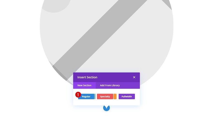
- 5 1. Go to Divi Theme Builder & Create New Template
-
6
2. Start Building Blog Post Body
- 6.1 Add Row #1 to Existing Section
- 6.2 Column 1 & 2 Border
- 6.3 Add Text Module to Each Column
- 6.4 Add Row #2
- 6.5 Add Text Module #1 to Column
- 6.6 Add Text Module #2 to Column
- 6.7 Add Row #3
- 6.8 Add Image Module to Column 1
- 6.9 Add Text Module to Column 2
- 6.10 Add Row #4
- 6.11 Add Text Module to Column
- 6.12 Add New Section
- 6.13 Add Row #1
- 6.14 Add Post Content Module to Column
- 6.15 Add Row #2
- 6.16 Add Comment Module to Column
- 7 3. Save Template & Theme Builder Changes
- 8 Preview
- 9 Final Thoughts
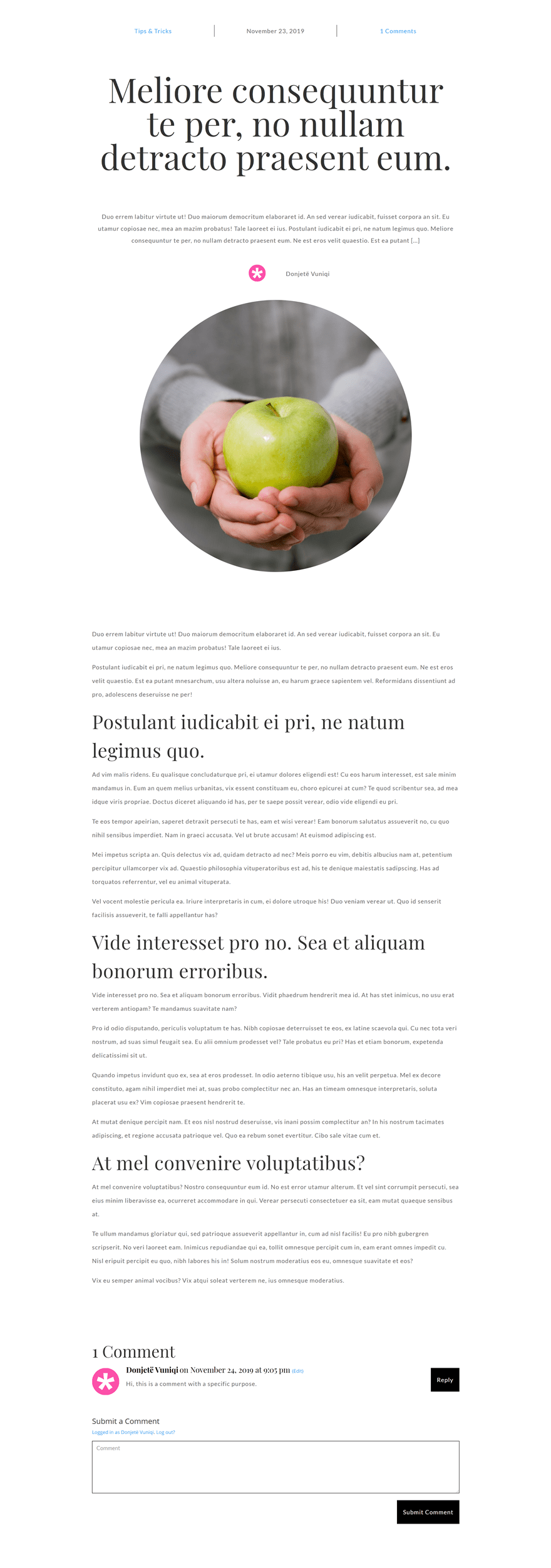
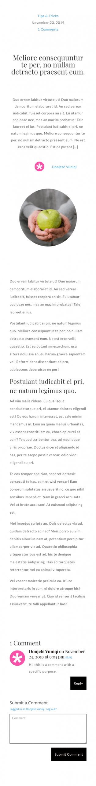
Preview
Before we dive into the tutorial, let’s take a quick look at the outcome across different screen sizes.
Desktop
Mobile
Download The Simple UX-Friendly Blog Post Template for FREE
To lay your hands on the free simple UX-friendly blog post template, you will first need to download it using the button below. To gain access to the download you will need to subscribe to our newsletter by using the form below. As a new subscriber, you will receive even more Divi goodness and a free Divi Layout pack every Monday! If you’re already on the list, simply enter your email address below and click download. You will not be “resubscribed” or receive extra emails.

Subscribe To Our Youtube Channel
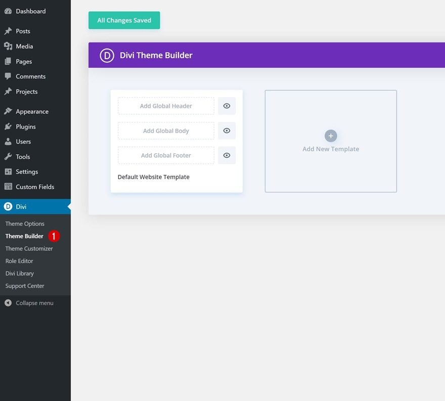
1. Go to Divi Theme Builder & Create New Template
Go to Divi Theme Builder
Start by going to the Divi Theme Builder.
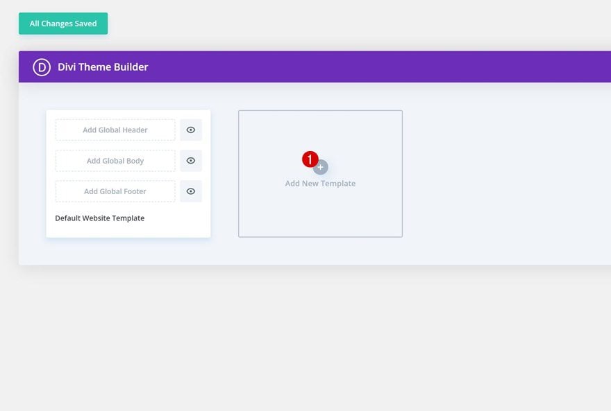
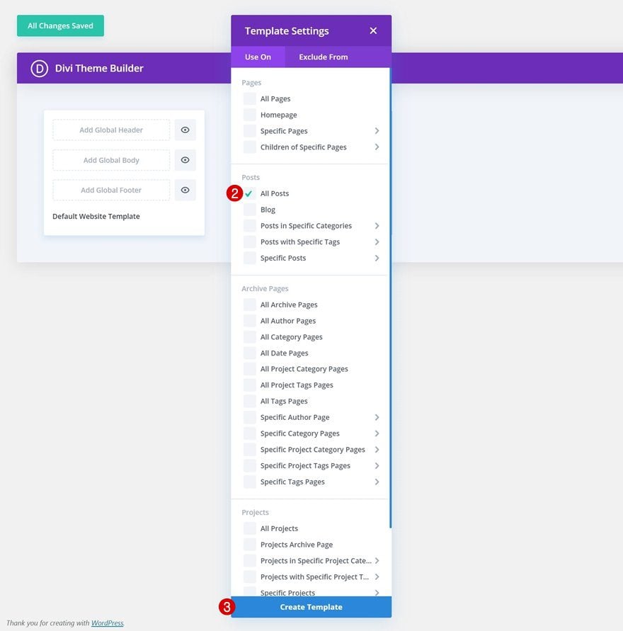
Create New Template
Create a new template and use it on all your posts.
- Use On: All Posts
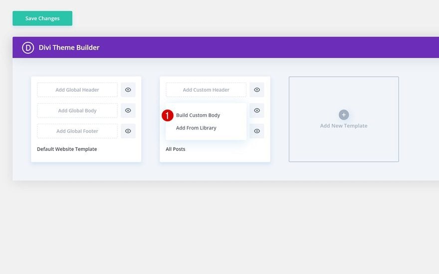
2. Start Building Blog Post Body
Then, start building the custom body of your post template.
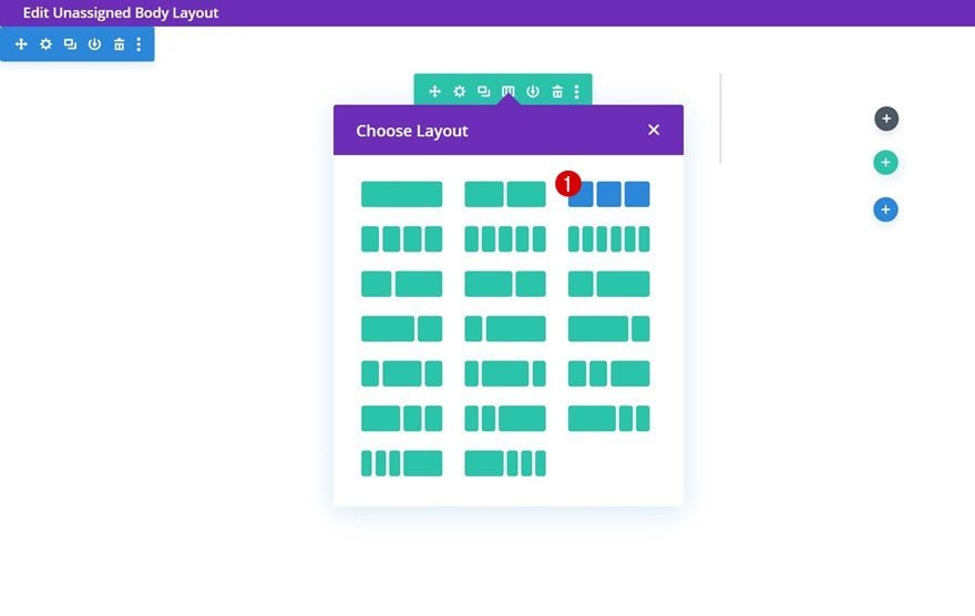
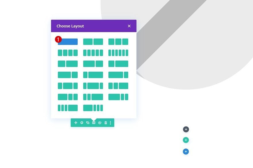
Add Row #1 to Existing Section
Column Structure
Inside the template editor, add a new row to the section that’s already there using the following column structure:
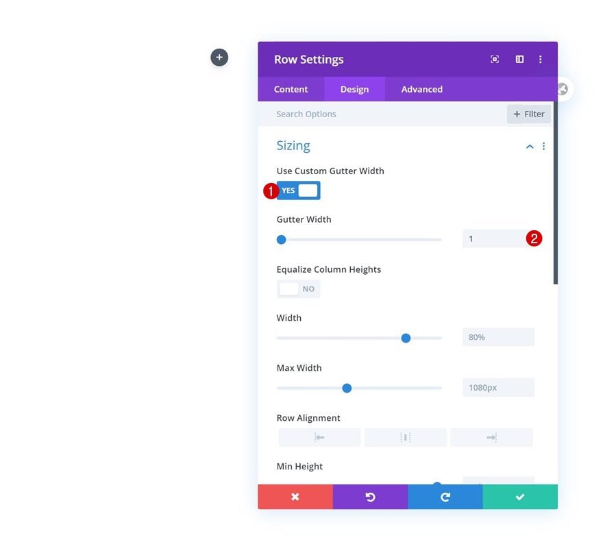
Sizing
Without adding any modules yet, open the row settings and change the sizing settings as follows:
- Use Custom Gutter Width: Yes
- Gutter Width: 1
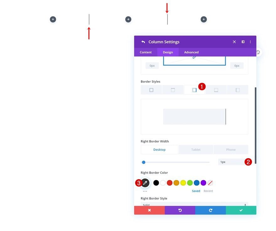
Column 1 & 2 Border
Add a right border to the first and second column next.
- Right Border Width: 1px (Desktop), 0px (Tablet & Phone)
- Right Border Color: #333333
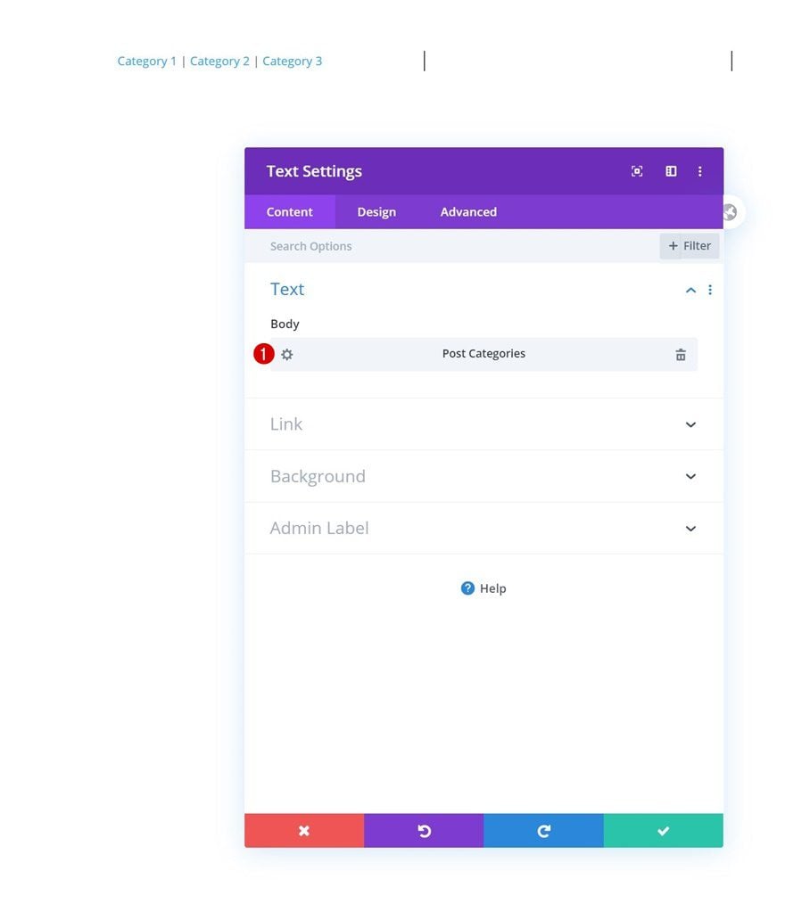
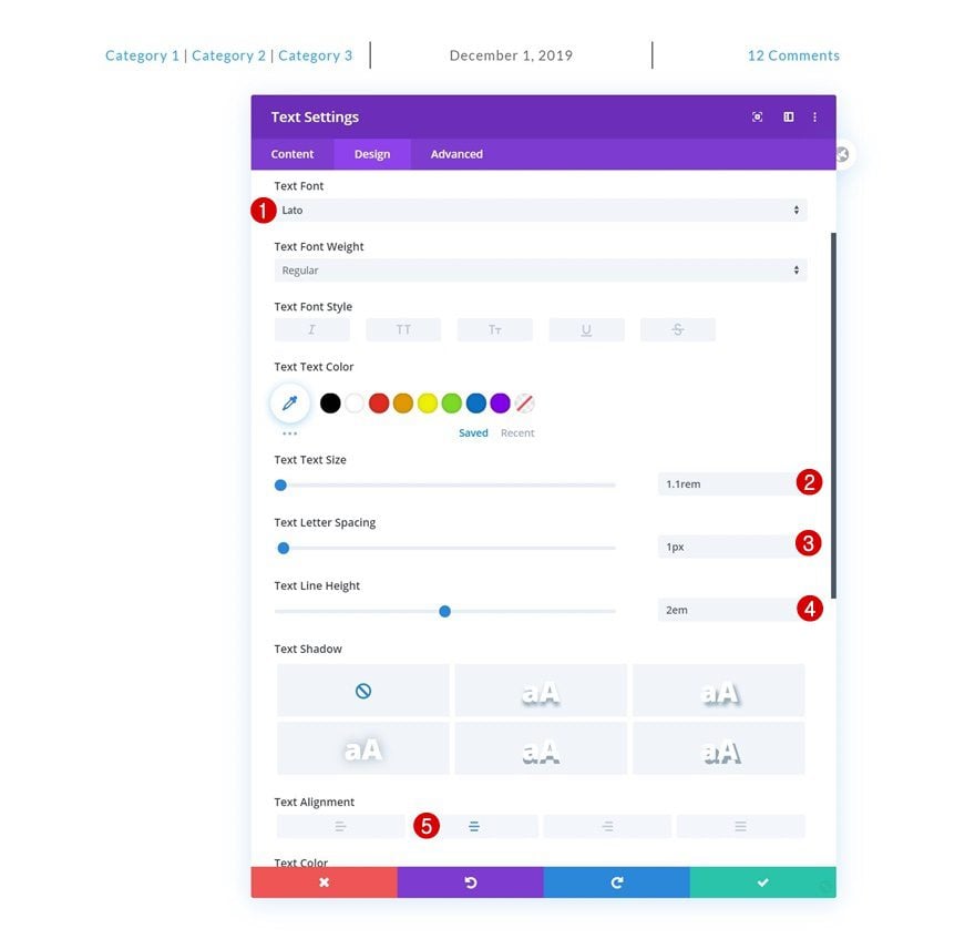
Add Text Module to Each Column
Dynamic Content
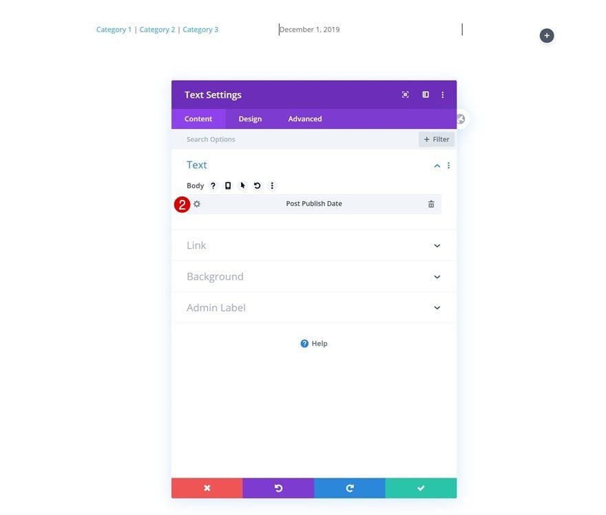
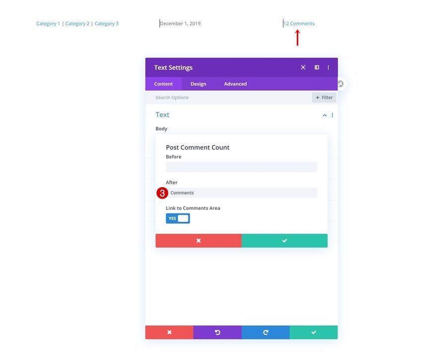
Continue by adding a Text Module to each column and select some dynamic content for each module individually.
- Text Module in Column 1: Post Categories
- Text Module in Column 2: Post Publish Date
- Text Module in Column 3: Post Comment Count
- After: Comments
Text Settings
Move on to each module’s design tab and change the text settings as follows:
- Text Font: Lato
- Text Size: 1.1rem
- Text Letter Spacing: 1px
- Text Line Height: 2em
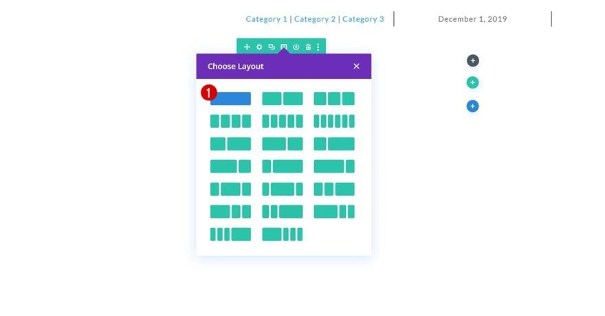
Add Row #2
Column Structure
Continue by adding a new row to the section using the following column structure:
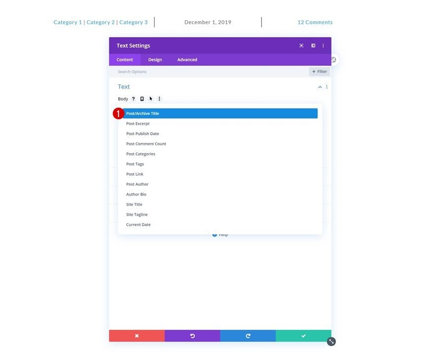
Add Text Module #1 to Column
Dynamic Content
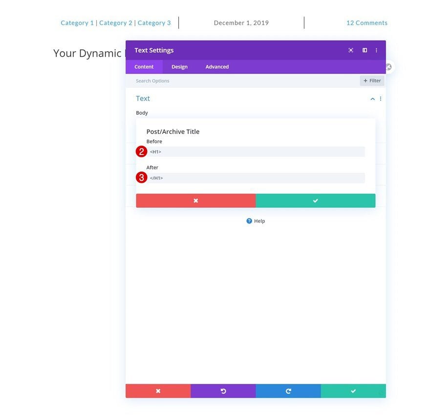
Add a Text Module and select the post title dynamic content.
- Dynamic Content: Post Title
- Before: <H1>
- After: </H1>
H1 Text Settings
Move on to the module’s design tab and change the H1 text settings as follows:
- Heading Font: Playfair Display
- Heading Text Alignment: Center
- Heading Text Size: 6.2rem (Desktop), 3.2rem (Tablet), 2.3rem (Phone)
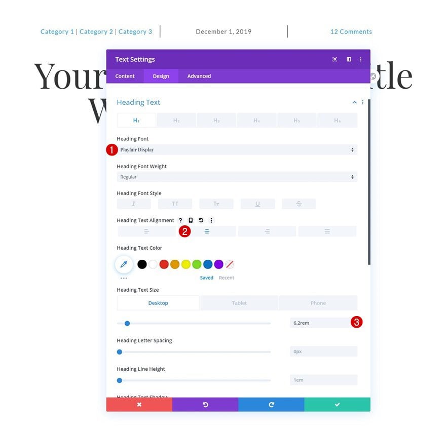
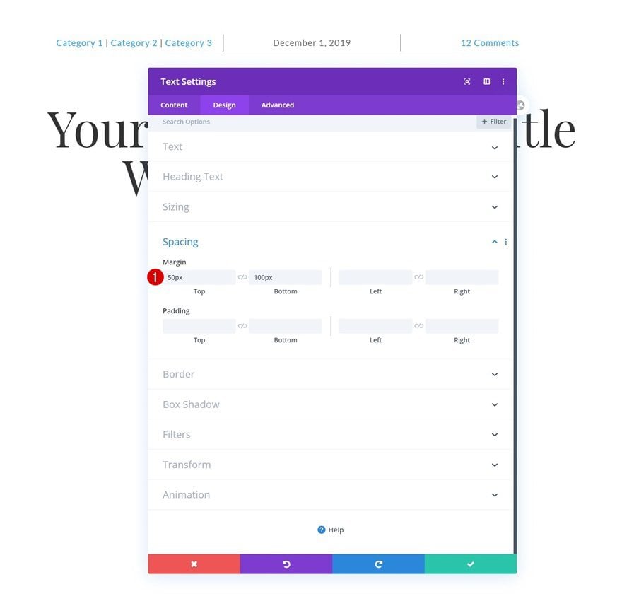
Spacing
Add some custom top and bottom margin next.
- Top Margin: 50px
- Bottom Margin: 100px
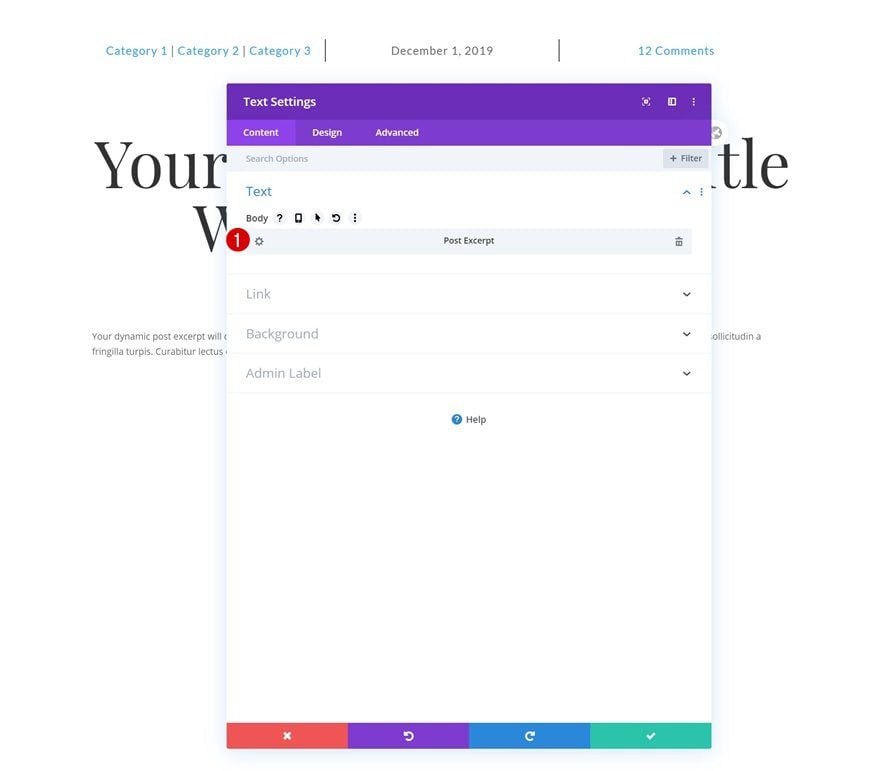
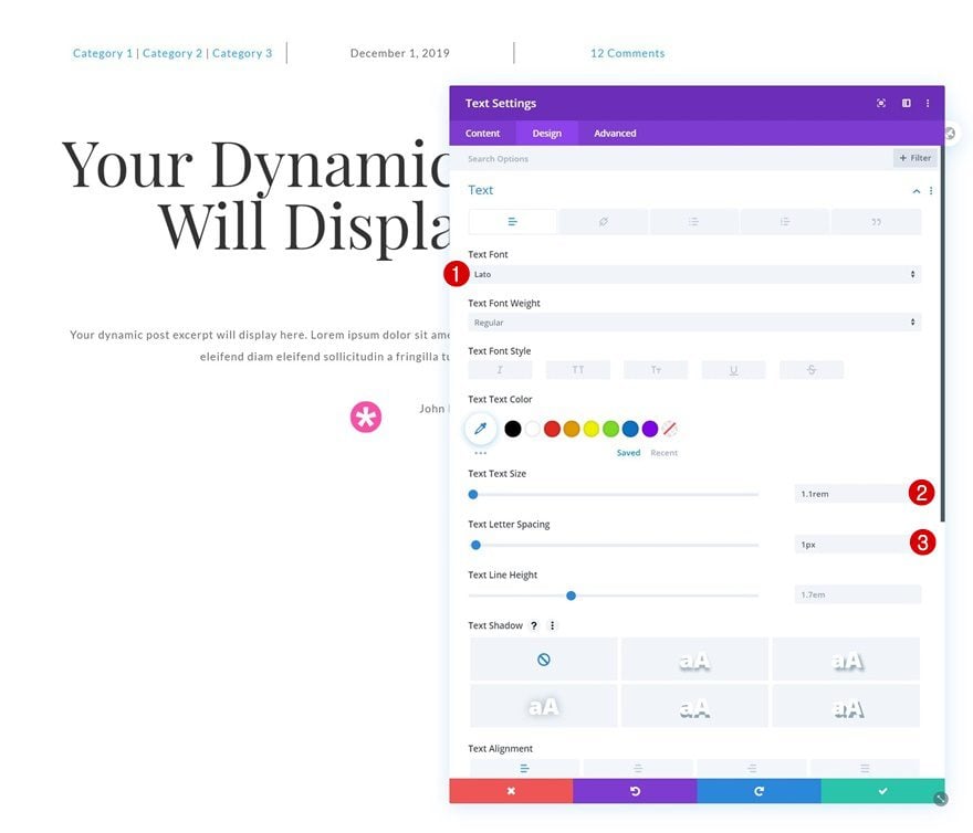
Add Text Module #2 to Column
Dynamic Content
Add another Text Module right below the previous one and select the post excerpt dynamic content.
- Dynamic Content: Post Excerpt
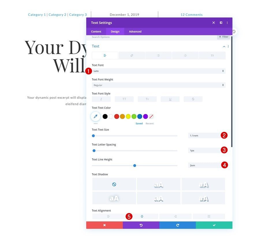
Text Settings
Change the module’s text settings as follows:
- Text Font: Lato
- Text Size: 1.1rem
- Text Letter Spacing: 1px
- Text Line Height: 2em
- Text Alignment: Center
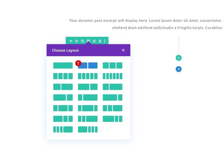
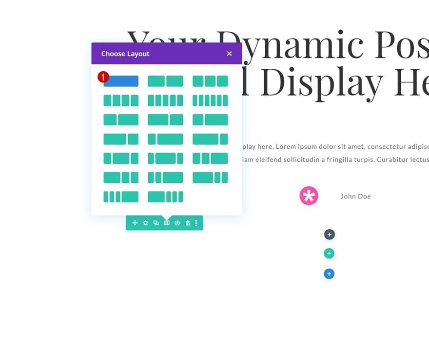
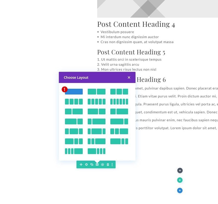
Add Row #3
Column Structure
Add another row to the section using the following column structure:
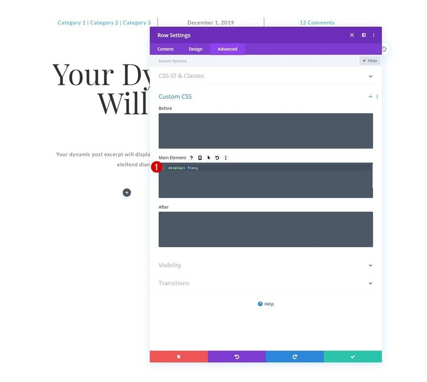
Display
Make sure the columns remain next to each other by adding one line of CSS code to the row’s main element.
display: flex;
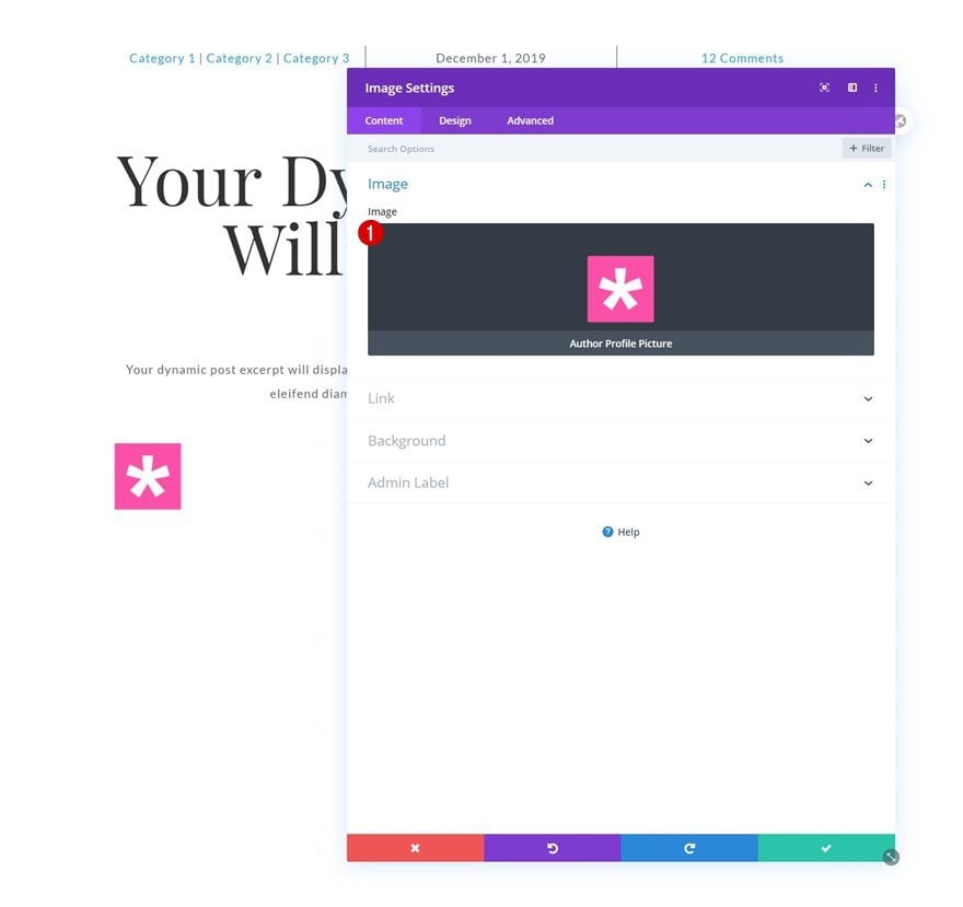
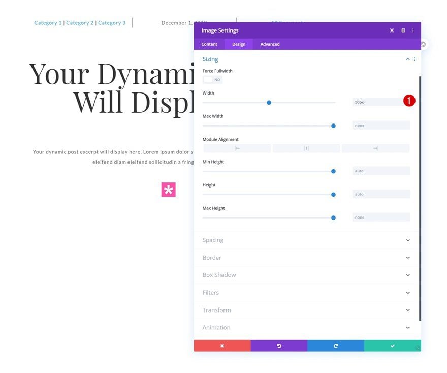
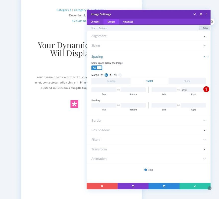
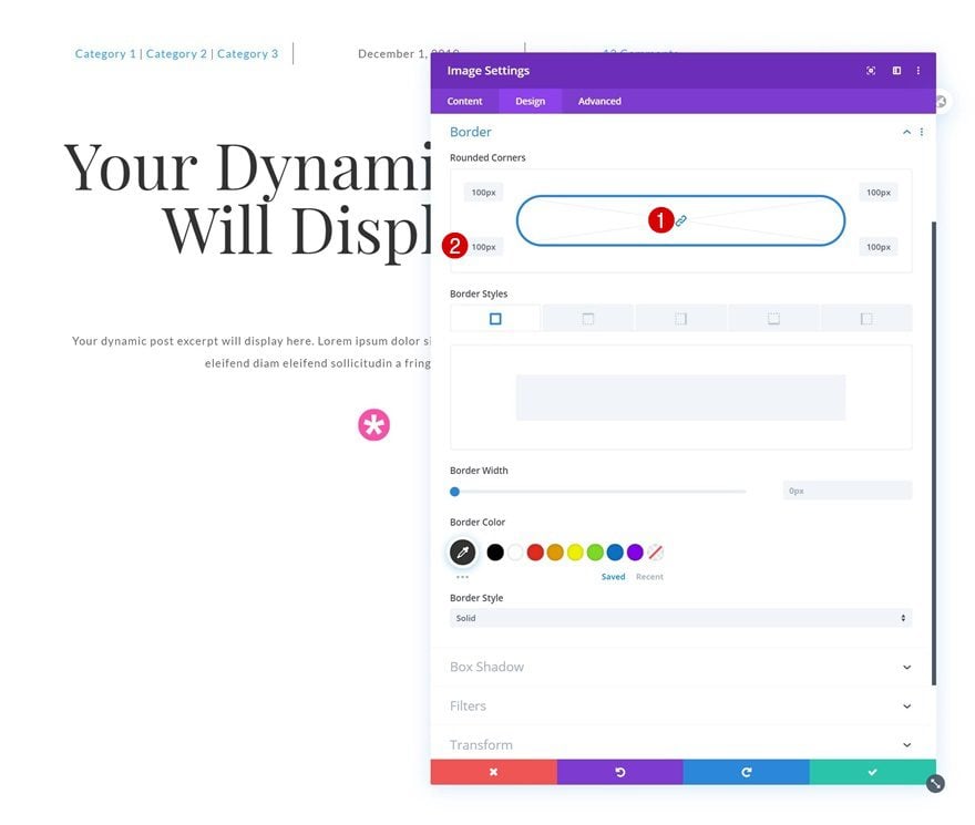
Add Image Module to Column 1
Dynamic Content
Continue by adding an Image Module to column 1 and select the author profile picture dynamic content.
- Dynamic Content: Author Profile Picture
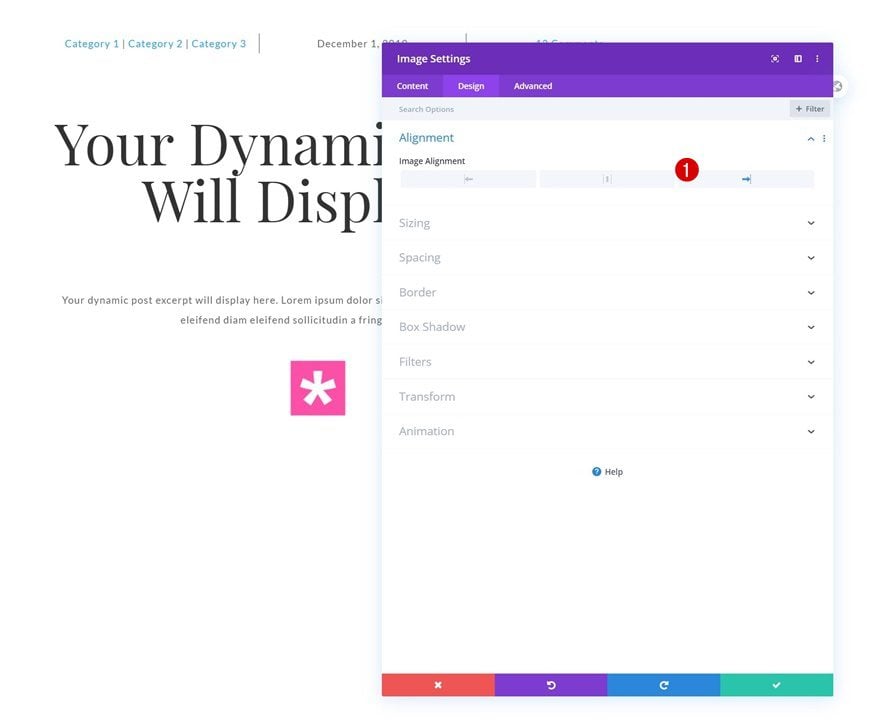
Alignment
Move on to the module’s design tab and change the image alignment.
- Image Alignment: Right
Sizing
Modify the width next.
- Width: 50px
Spacing
Add some right margin on tablet and phone.
- Right Margin: 20px (Tablet & Phone)
Border
And complete the module’s settings by adding some border radius to the border settings.
- All Corners: 100px
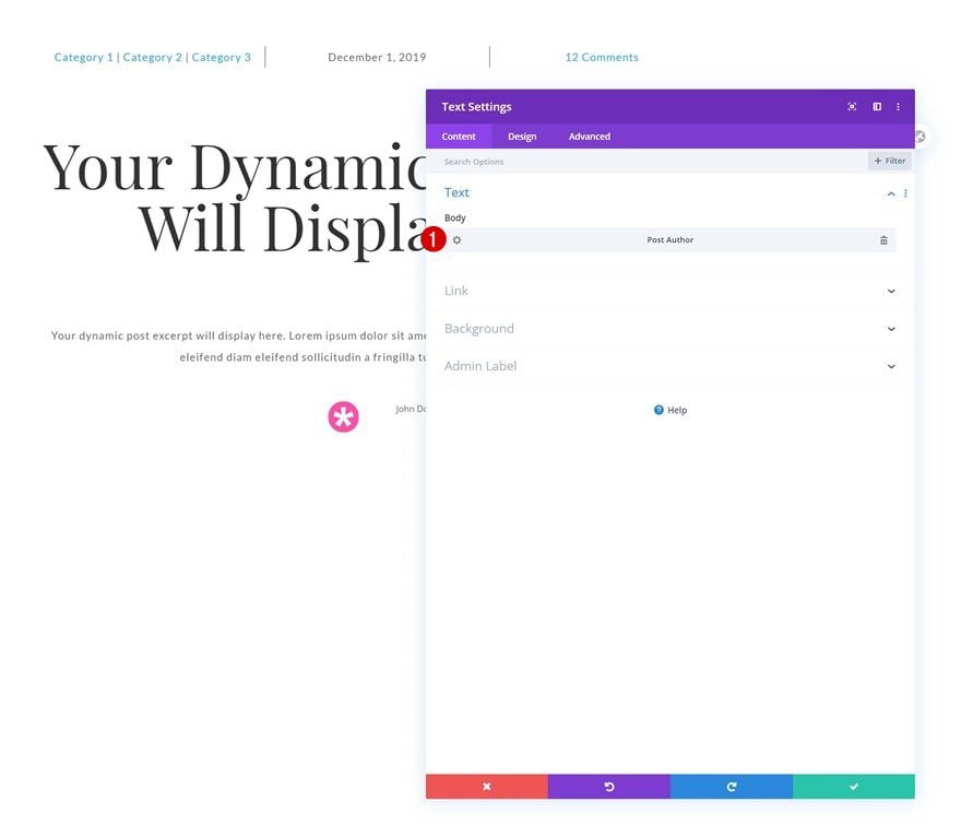
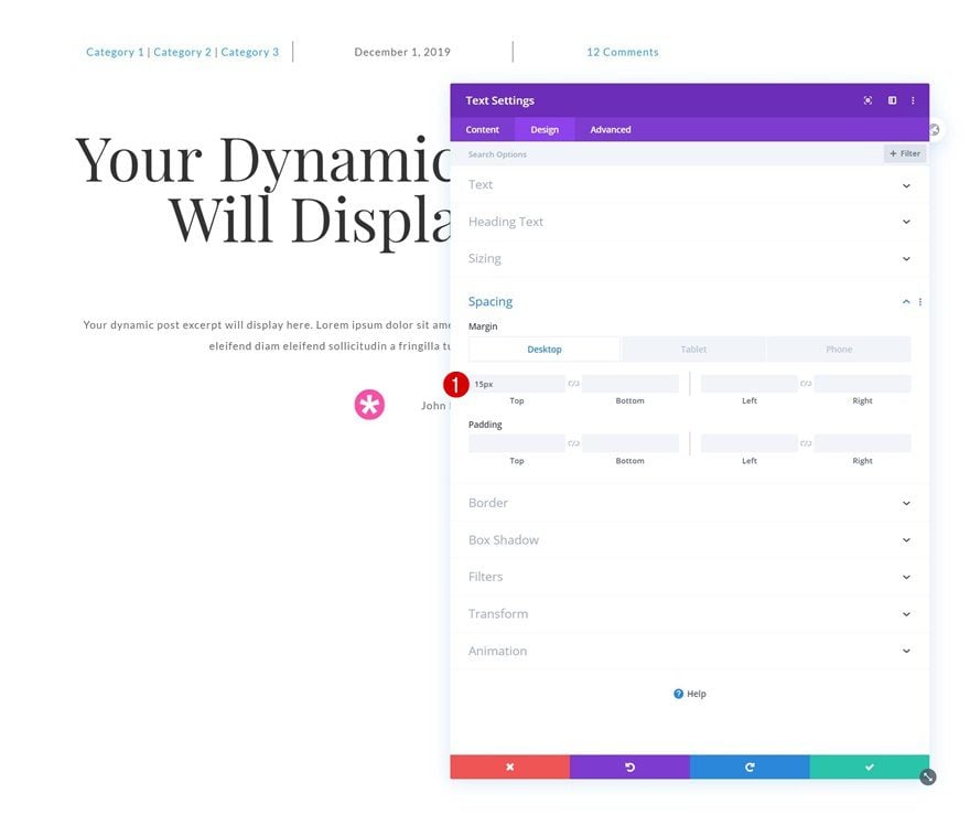
Add Text Module to Column 2
Dynamic Content
In the second column, we’ll need a Text Module. Select the post author dynamic content.
- Dynamic Content: Post Author
Text Settings
Move on to the design tab and change the text settings accordingly:
- Text Font: Lato
- Text Size: 1.1rem
- Text Letter Spacing: 1px
Spacing
Add some custom margin values next.
- Top Margin: 15px
- Left Margin: 20px (Tablet & Phone)
Add Row #4
Column Structure
Add another row to the section using the following column structure:
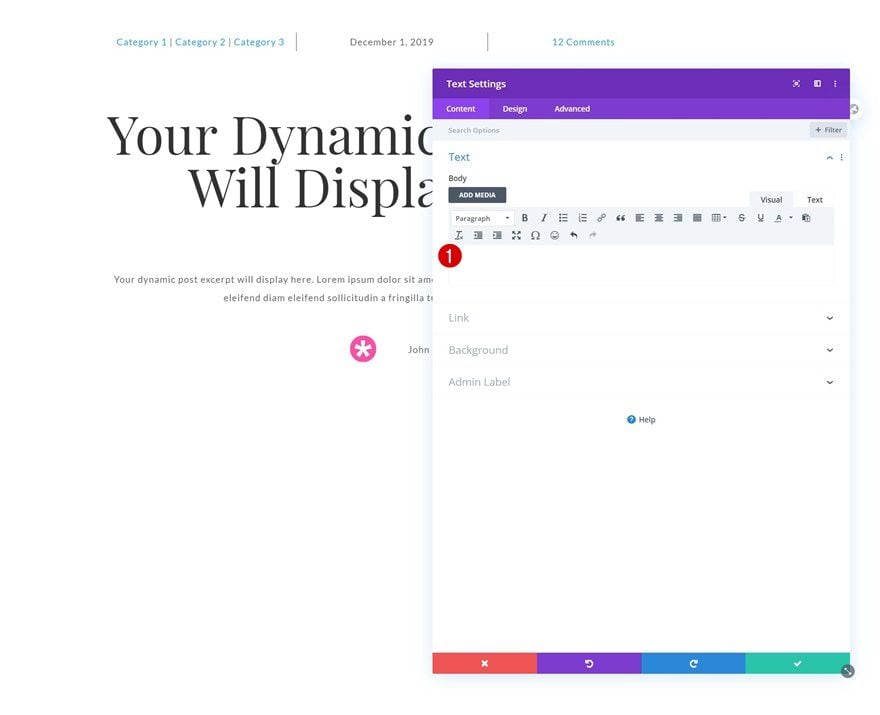
Add Text Module to Column
Leave Content Box Empty
Add a Text Module to the column and make sure you leave the content box empty.
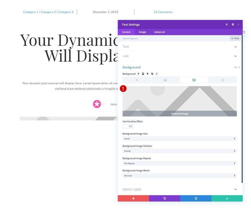
Dynamic Background Image
Add the featured image dynamic content to the module’s background image next.
- Dynamic Content: Featured Image
Sizing
Continue by modifying the module’s sizing settings across different screen sizes.
- Width: 800px (Desktop), 500px (Tablet), 300px (Phone)
- Module Alignment: Center
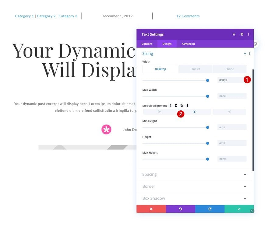
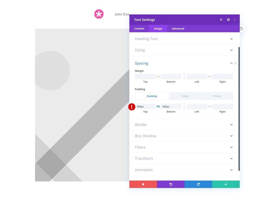
Spacing
Add some custom top and bottom padding across different screen sizes too.
- Top Padding: 400px (Desktop), 250px (Tablet), 150px (Phone)
- Bottom Padding: 400px (Desktop), 250px (Tablet), 150px (Phone)
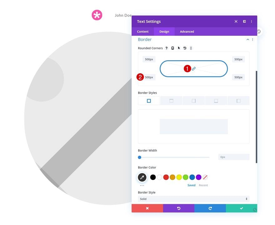
Border
And add some border radius to the border settings to turn the module into a circle.
- All Corners: 500px
Add New Section
On to the next regular section.
Add Row #1
Column Structure
Add a new row using the following column structure:
Add Post Content Module to Column
Text Settings
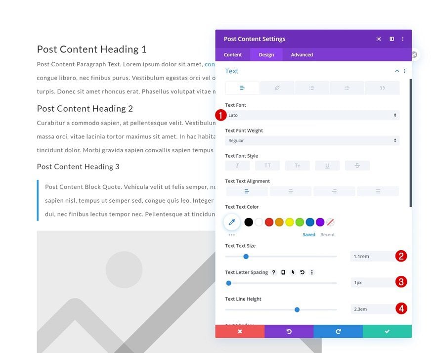
Add the Post Content Module to the column, move on to the module’s design tab and change the text settings accordingly:
- Text Font: Lato
- Text Size: 1.1rem
- Text Letter Spacing: 1px
- Text Line Height: 2.3em
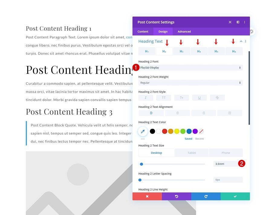
Heading Text Settings
Modify the heading text settings too.
- Heading Font: Playfair Display
- H2 Text Size: 3.5rem (Desktop), 2rem (Tablet & Phone)
- H3 Text Size: 2.5rem (Desktop), 1.5rem (Tablet & Phone)
- H4 Text Size: 2.3rem (Desktop), 1.3rem (Tablet & Phone)
- H5 & H6 Text Size: 2rem (Desktop), 1rem (Tablet & Phone)
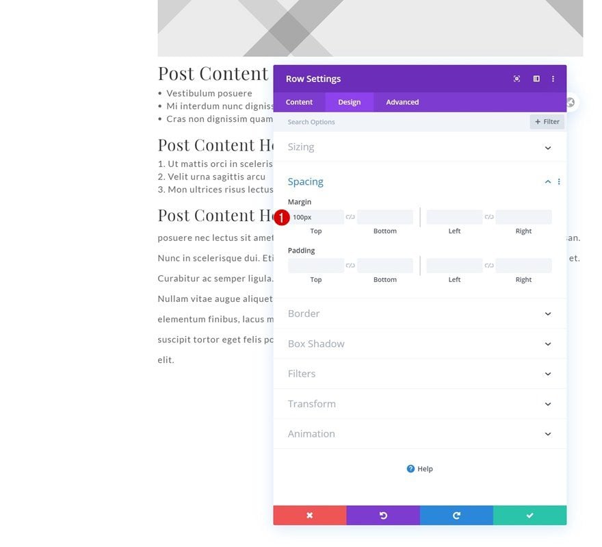
Add Row #2
Column Structure
Add another row to the section using the following column structure:
Spacing
Add some custom top margin to the row.
- Top Margin: 100px
Add Comment Module to Column
Fields Settings
The only module we need in this row is a Comment Module. Change the fields settings as follows:
- Fields Background Color: #ffffff
- Fields Font: Lato
- Fields Text Size: 1.1rem
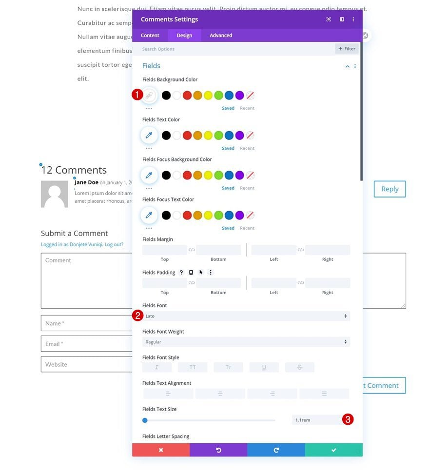
- All Corners: 0px
- Fields Border Width: 1px
- Fields Border Color: #000000
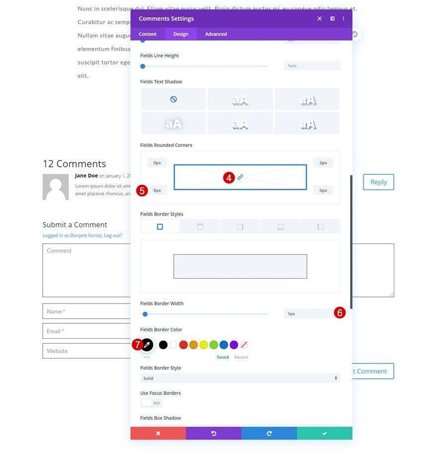
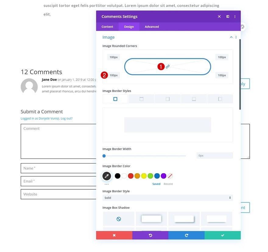
Image Settings
Change the image settings too.
- All Corners: 100px
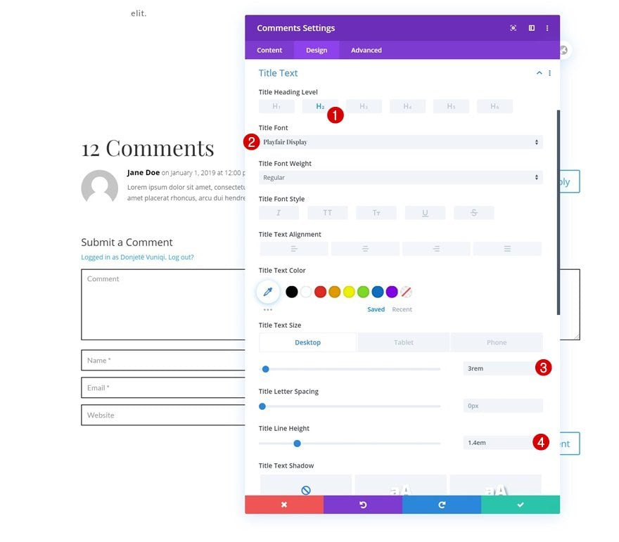
Title Text Settings
Then, modify the title text settings.
- Title Heading Level: H2
- Title Font: Playfair Display
- Title Text Size: 3rem (Desktop), 2rem (Tablet & Phone)
- Title Line Height: 1.4em
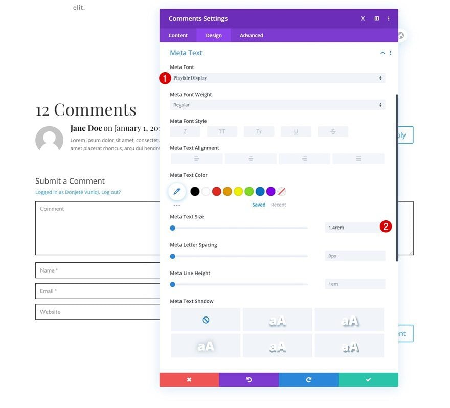
Meta Text Settings
Style the meta text as well.
- Meta Font: Playfair Display
- Meta Text Size: 1.4rem
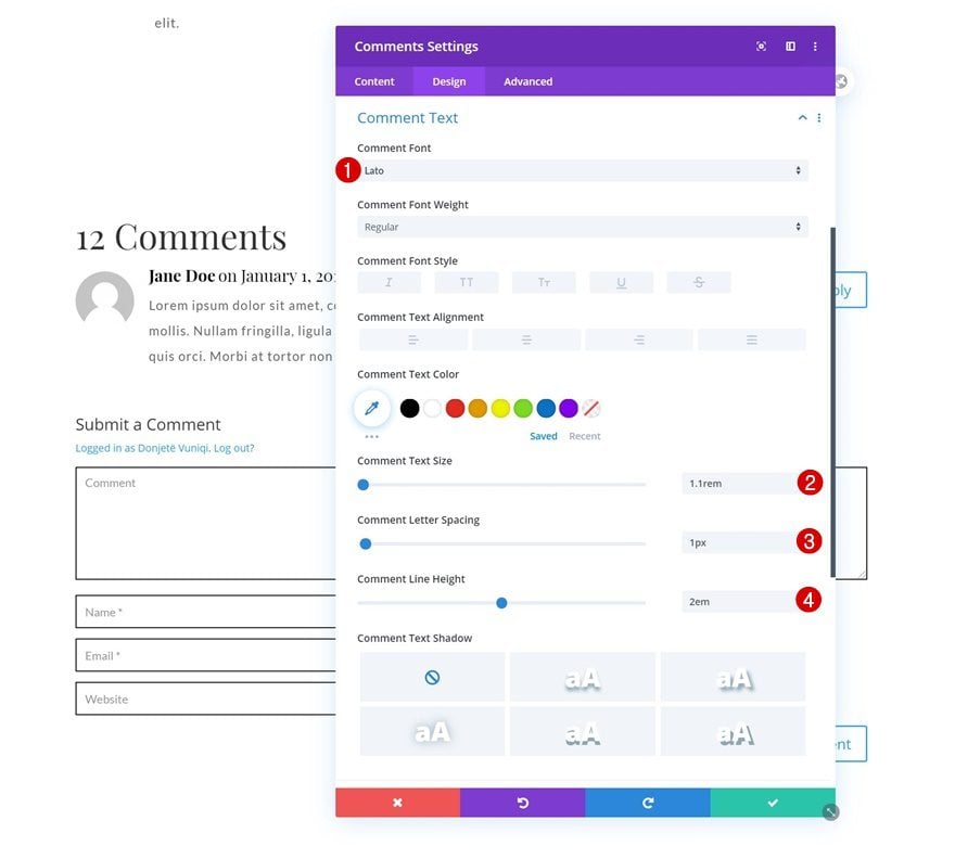
Comment Text Settings
We’re using the following settings for the comment text settings:
- Comment Font: Lato
- Comment Text Size: 1.1rem
- Comment Letter Spacing: 1px
- Comment Line Height: 2em
Button Text Settings
And complete the module’s settings by styling the button as follows:
- Use Custom Styles For Button: Yes
- Button Text Size: 1.1rem
- Button Text Color: #ffffff
- Button Background Color: #000000
- Button Border Width: 0px
- Button Border Radius: 0px
- Button Letter Spacing: 1px
- Button Font: Lato
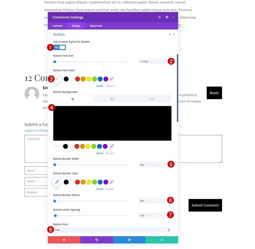
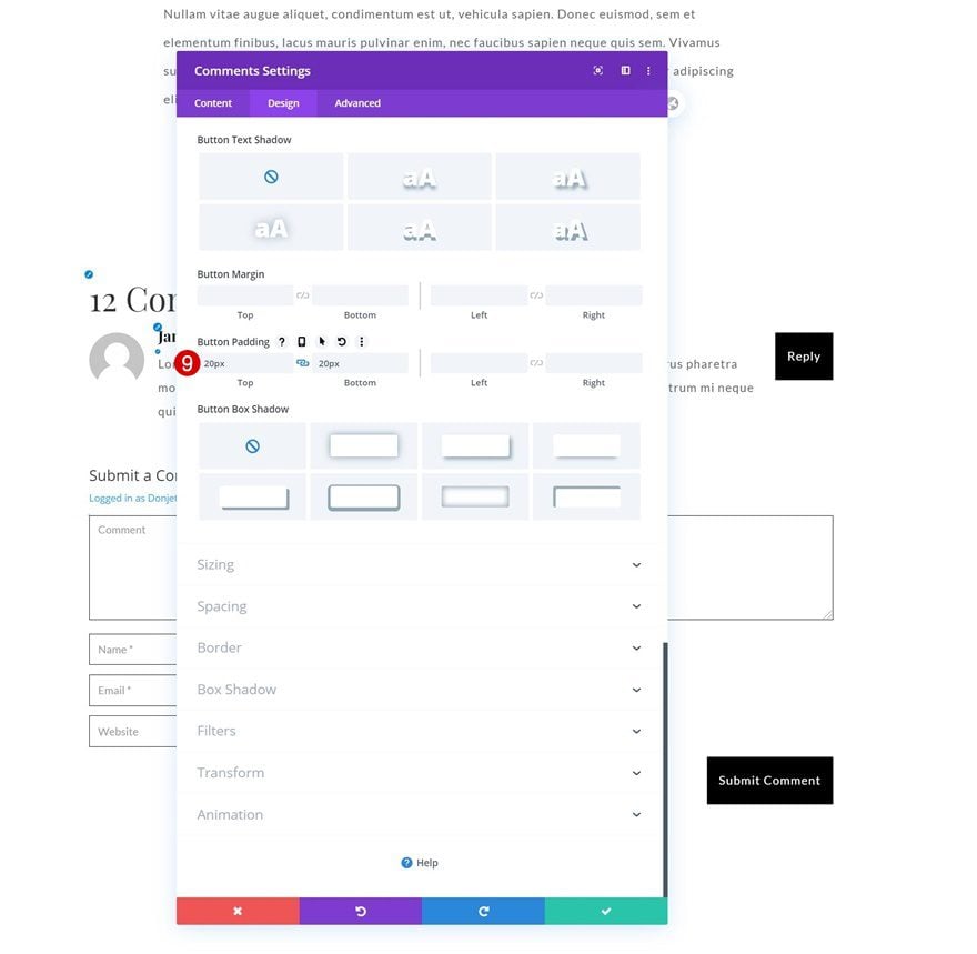
- Top Padding: 20px
- Bottom Padding: 20px
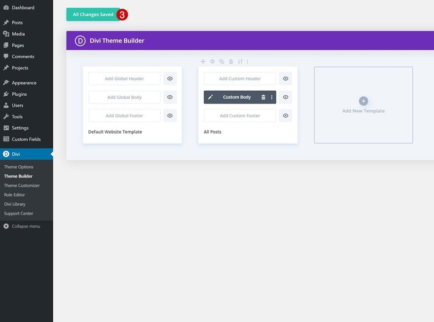
3. Save Template & Theme Builder Changes
Once you’ve completed the template design, save all Divi Theme Builder changes and preview the outcome on your posts!
Preview
Now that we’ve gone through all the steps, let’s take a final look at the outcome across different screen sizes.
Desktop
Mobile
Final Thoughts
In this post, we’ve shown you how to create a beautiful and simple blog post template that is focused on the user experience your visitors have while reading. Modify this post template using Divi’s built-in options to match it with your website’s branding. You were able to download the template JSON file for free as well! If you have any questions or suggestions, feel free to leave a comment in the comment section below.
If you’re eager to learn more about Divi and get more Divi freebies, make sure you subscribe to our email newsletter and YouTube channel so you’ll always be one of the first people to know and get benefits from this free content.


Amazing work. Very good explanation. Pretty template.
Thanks DIVI.
How do I get a header to appear as well as a footer? The global headers and footers won’t appear.
Thanks for the inspiration.
Clearly not easy to do simple things.
Well done D. V….
Excellent explanation, It’s simple and focuses. Keep up the great work!