

Creating a diagonal layout for your page content can be a little tricky to pull off, especially in responsive web design. But, with the Divi Builder, I’ve found that it can actually be fun. With the right combination of section dividers, column spacing, and vw length units, you can add a diagonal layout to any Divi section. And surprisingly, this design technique will scale nicely on different browser sizes.
In this tutorial, I’m going to show you how to create a layout with diagonal rows of content (modules) that look great and scale nicely with your browser window size.
Let’s get started.
Sneak Peak
The Plan of Attack
Each section you create in Divi has the option of adding those wonderful section dividers to add beautiful transitional design elements between sections. This would allow you to easily create diagnonal dividers to separate your sections. Simple enough. The challenge comes when you want to use those section dividers to add a diagonal frame to your content. You have to make sure the diagnonal design remains consistent without breaking symmetry or content visibility.
The key to this design is the consistent use of the vw length unit to size our dividers and space our modules within each column. The vw length unit is relative to the width of your browser viewport/window. If you need, feel free to learn more about using length units with Divi when you get a chance.
Once we settle on the size and angle of the section dividers, we need to incrementally apply padding to each column so that our modules match the diagonal progression of the dividers. Any images or content you add to each column should to the same size/amount in order to keep things lined up and visible.
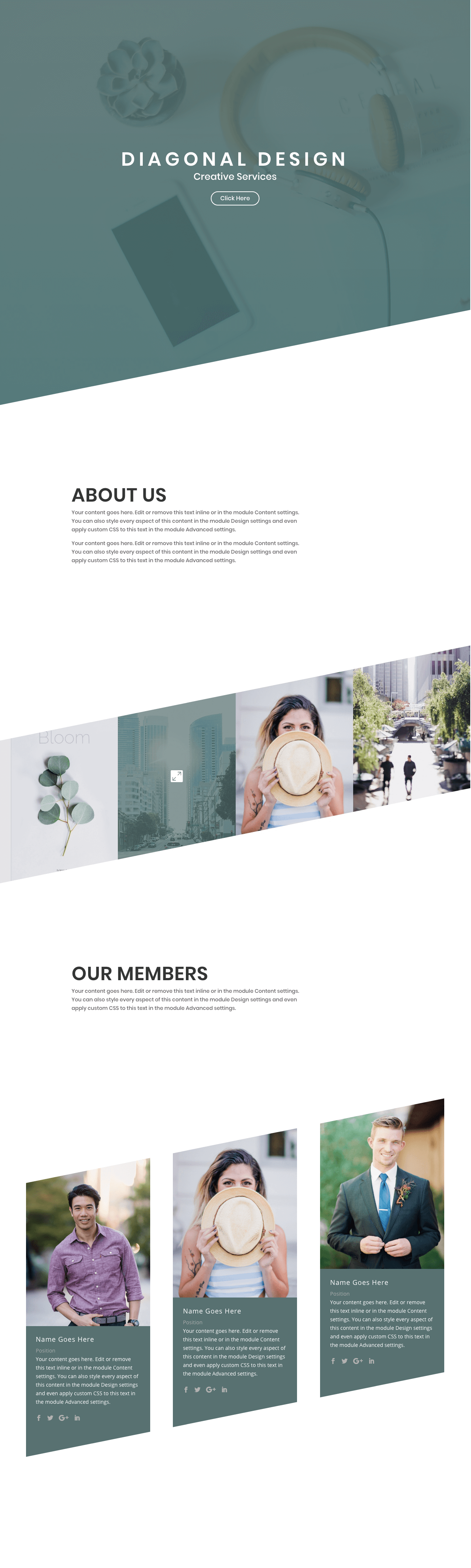
Creating the Header Section
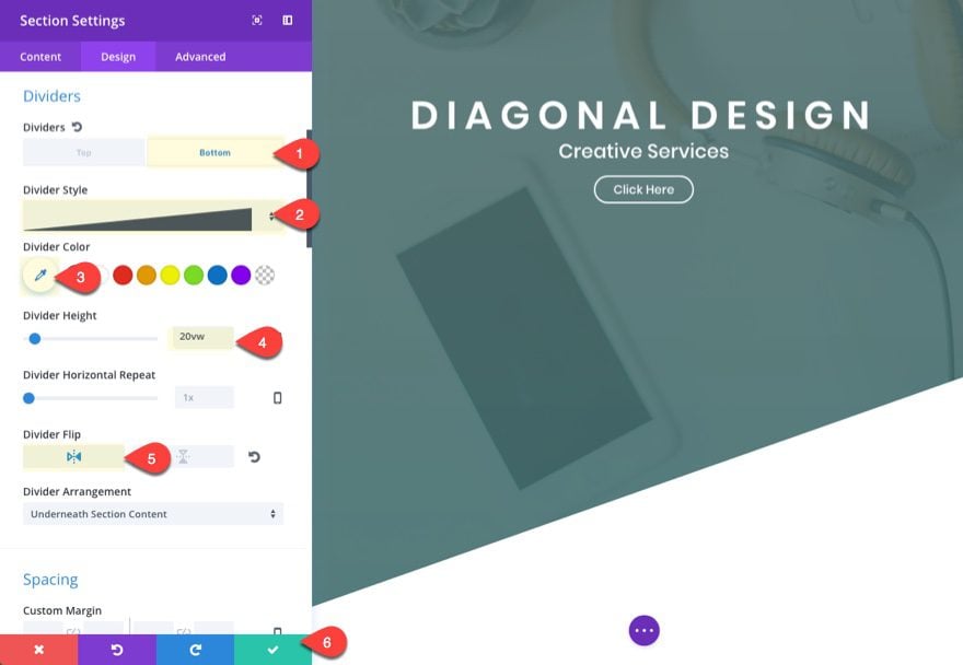
This first section is pretty straight forward. The main design element I want to highlight is the bottom section divider height of 20vw. This height will serve as the standard size for all of our section dividers throughout the design of the layout. It is important to keep this size the same to keep the diagonal design symmetrical and parallel throughout.
To create the first section, add a new page, give it a title, and deploy the visual builder. Add a regular section with a one-column row (or just use the one that shows by default).
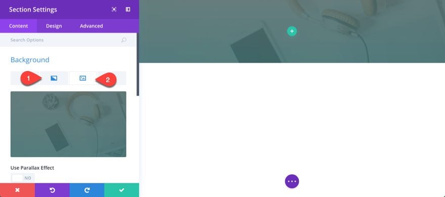
Before you add a module, update the section settings to have a background image and gradient overlay.
Background Image: [enter 1920 x 1080 image]
Background gradient left color: rgba(87,113,113,0.89)
Background gradient Right color: rgba(68,112,112,0.9)
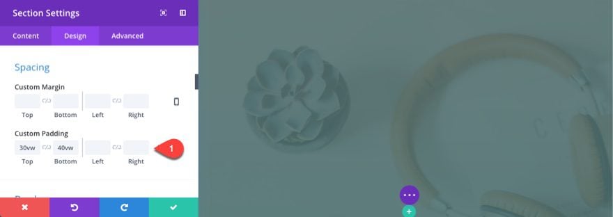
Then add some custom padding using the vw length unit:
Custom Padding: 30vw Top, 40vw Bottom
Save settings.
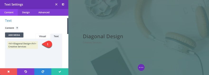
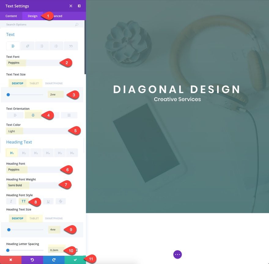
Now add a text module to your one-column row with the following content:
<h1>Diagonal Design</h1>
Creative Services
Update the design settings as follows:
Text Font: Poppins
Text Text Size: 2vw (desktop), 20px (tablet)
Text Orientation: center
Text Color: Light
Heading Font: Poppins
Heading Font Weight: Semi Bold
Heading Font Style: TT
Heading Text Size: 4vw (desktop), 30px (tablet)
Heading Letter Spacing: 0.2em
The em length value for the letter spacing will scale nicely with the font size vw value.
Save Settings
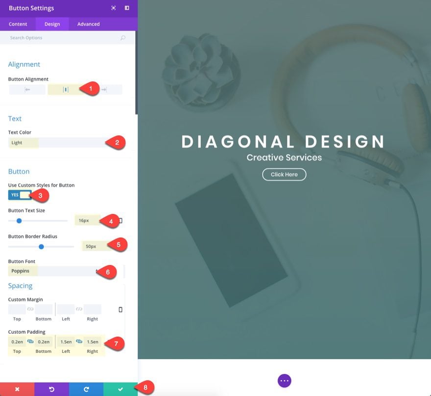
Under the text module, add a button module with the following settings:
Button Alignment: center
Text color: Light
Use Custom Styles for Button: YES
Button Text Size: 16px
Button Border Radius: 50px
Button Font: Poppins
Custom Padding: 0.2em Top, 0.2em Bottom, 1.5em Left, 1.5em Right
Save settings.
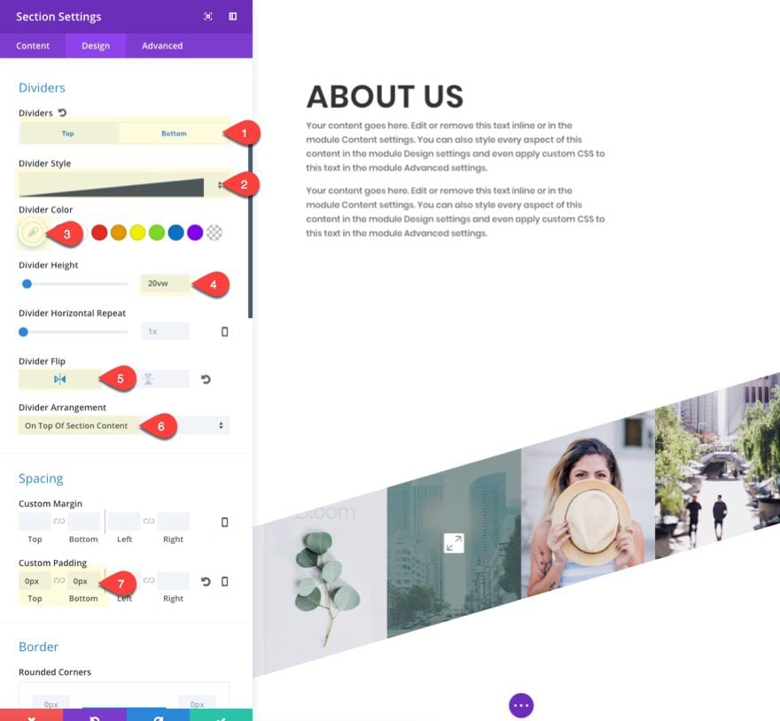
Now that we have all our header section elements in place, go back to the section settings and add the bottom divider that will kick off our diagonal design.
Dividers: Bottom
Divider STyle: see screenshot
Divider Color: #ffffff
Divider Height: 20vw
Divider Flip: vertical
Save settings.
Creating the Second Section
For the next section, this is nothing fancy or complicated. Just add a new regular section with a one-column row.
Make sure the section has the following custom padding:
Custom Padding: 15vw Top, 15vw Bottom
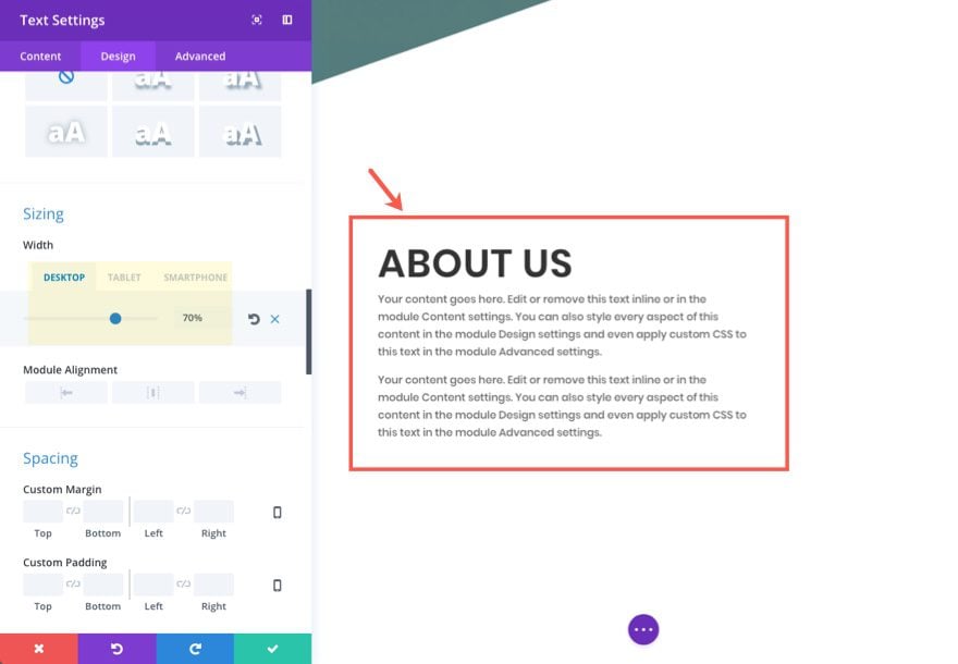
Then add a text module to the row with the following mock content:
<h2>About US</h2>
<p>Your content goes here. Edit or remove this text inline or in the module Content settings. You can also style every aspect of this content in the module Design settings and even apply custom CSS to this text in the module Advanced settings.</p>
<p>Your content goes here. Edit or remove this text inline or in the module Content settings. You can also style every aspect of this content in the module Design settings and even apply custom CSS to this text in the module Advanced settings.</p>
Update the design settings as follows:
Text Font: Poppins
Heading 2 Font: Poppins
Heading 2 Font Weight: Semi Bold
Heading 2 Font Style: TT
Heading 2 Text Size: 4vw
Width: 70% (desktop), 80% (tablet), 100% (smartphone)
Creating Section Two: A Diagonal Layout for Images
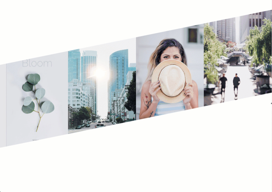
For this next section, we are going to create a diagonal section with 4 images. Keep in mind that in order for this design to work properly, you must be purposeful with your vw length unit values and use the same size images throughout.
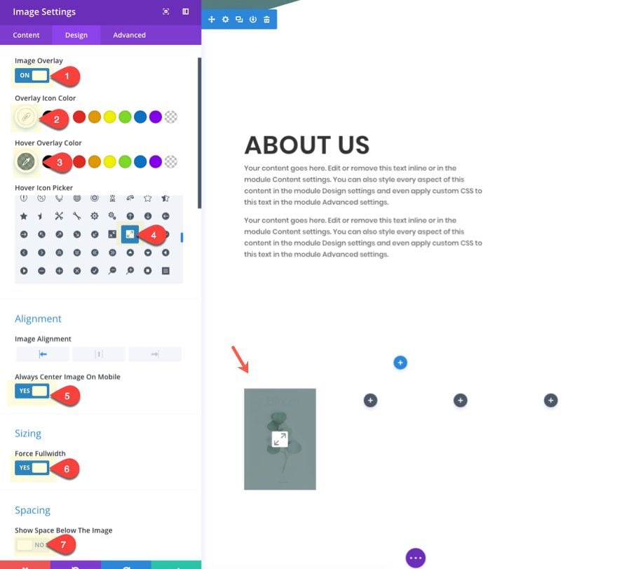
Add a new regular section with a four-column row structure. Then add an image module to the left column. Update the module with the following settings:
Update in Lightbox: YES
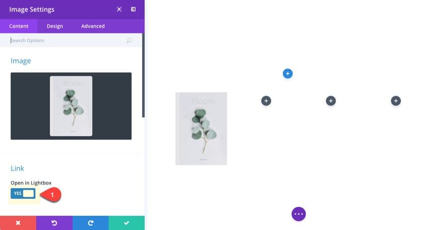
Image Overlay: ON
Overlay Icon Color: #ffffff
Hover Overlay Color: rgba(87,113,113,0.69)
Force Fullwidth: YES
Show Space Below Image: NO
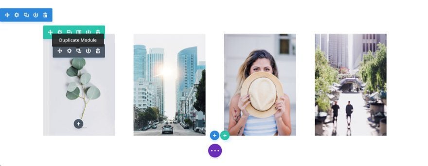
Once you have one image added with the settings in place, duplicate the image module to create the other three images and put them in each column. That way you don’t have to update the settings for each one.
Then upload new images for each. Make sure your images are the exact same dimensions (600px by 850px).
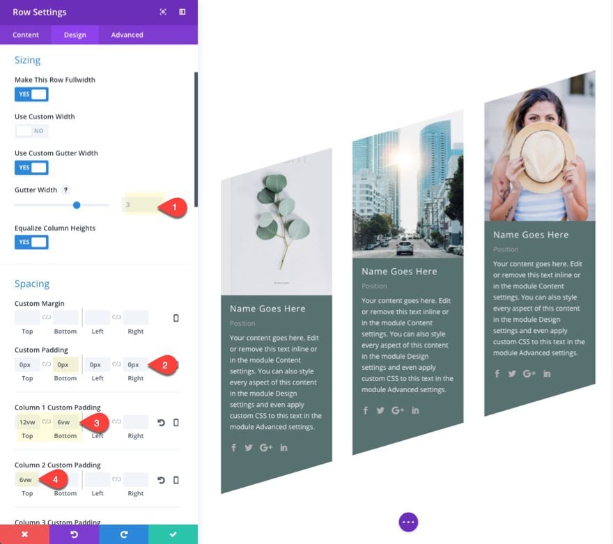
Now we are going to update the row settings to create a fullwidth layout and stagger the images with custom padding.
Update the row settings as follows:
Make This Row Fullwidth: YES
Use Custom Gutter Width: YES
Gutter Width: 1
Custom Padding: 0px Top, 0px Bottom, 0px Left, 0px Right
Column 1 Custom Padding: 15vw Top (desktop), 0px Top (tablet)
Column 2 Custom Padding: 10vw Top (desktop), 0px Top (tablet)
Column 3 Custom Padding: 5vw Top (desktop), 0px Top (tablet)
Notice how the first three columns have a custom top padding that decreases incrementally in order to create the diagonal image layout.
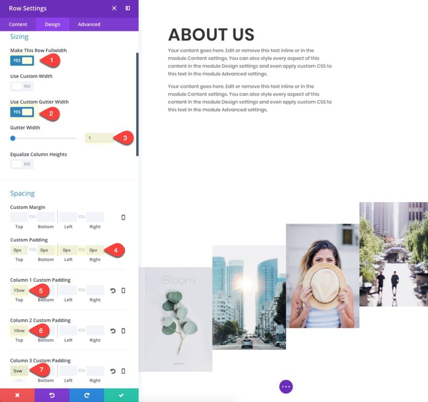
Save settings.
With our images in place, let’s add our section dividers to complete the design. Go to the section settings and update the following:
Dividers: Top
Divider Style: see screenshot
Divider Color: #ffffff
Divider Height: 20vw (desktop), 0px (tablet), 0px (smartphone)
Divider Flip: horizontal
Divider: Bottom
Divider Style: see screenshot
Divider Color: #ffffff
Divider Height: 20vw (desktop), 0px (tablet), 0px (smartphone)
Divider Flip: horizontal
Custom Padding: 0px Top, 0px Bottom
NOTE: If your images have a dimension other than 600×850, you will have to adjust the row padding in order to get the dividers to overlap the images correctly.
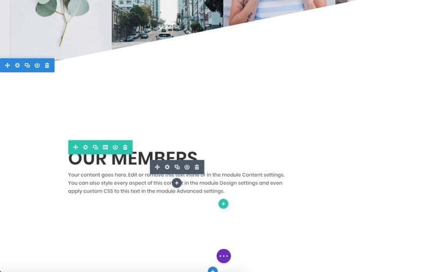
Creating Section Four
To create section four, simply copy section two and paste it under section three.
Then update the content with the following:
<h2>Our Members</h2>
Your content goes here. Edit or remove this text inline or in the module Content settings. You can also style every aspect of this content in the module Design settings and even apply custom CSS to this text in the module Advanced settings.
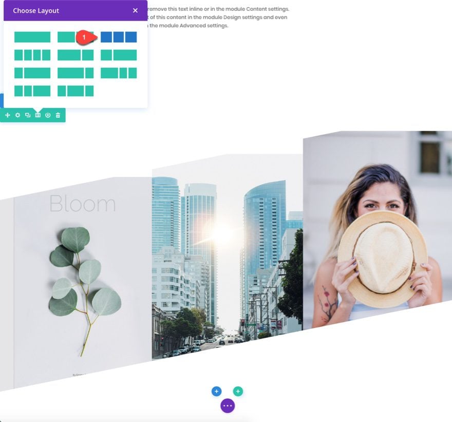
Creating Section Five: A Diagonal Layout for Team Members
For this next section, we are going to create a section for showcasing members on your page. To speed up the design process, go ahead and copy section three (the one with your images) and paste it at the bottom of the page.
Delete the image module in the fourth column and change the row column structure to three columns instead of four.
Under the image module in the first column, add a person module.
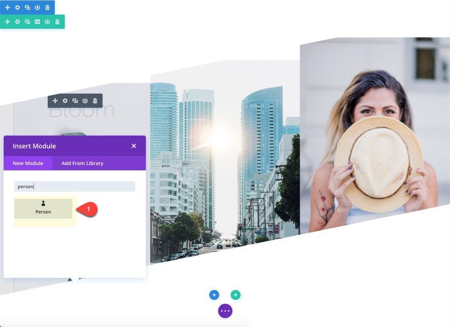
We are going to keep the default text content. But go ahead and add social profile URLs so that they show up in the module. Then delete the image since we are going to use the image module above for our person image.
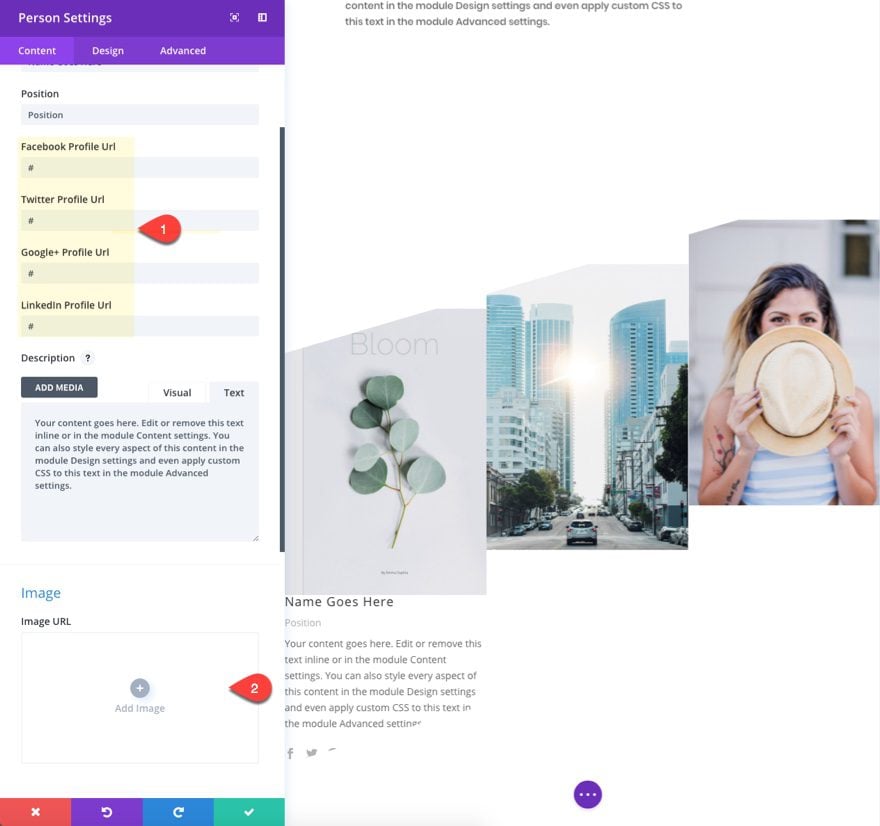
Under the design tab, update the following:
Text Color: Light
Custom Padding: 8% Top, 8% Bottom, 8% Left, 8% Right
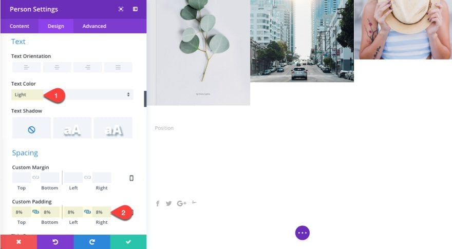
You won’t be able to see the text yet, but it will become visible once we add the background color to each of the three columns.
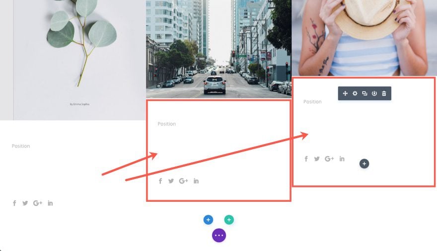
Now copy the person module and add it under the other two image modules in other two columns
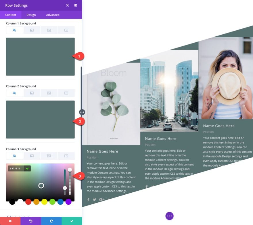
Go to the row settings and update the following:
Column 1 Background Color: #577171
Column 2 Background Color: #577171
Column 3 Background Color: #577171
Under the design tab, update the size and spacing as follows:
Gutter Width: 3
Equalize Column Heights: YES
Custom Padding: 0px bottom
Column 1 Custom Padding (desktop): 12vw Top, 6vw Bottom
Column 1 Custom Padding (tablet): 0vw Top, 0vw Bottom
Column 2 Custom Padding (desktop): 6vw Top
Column 2 Custom Padding (tablet): 0vw Top
Column 3 Custom Padding: 0px Top
Save settings.
Don’t forget to update your images with new ones.
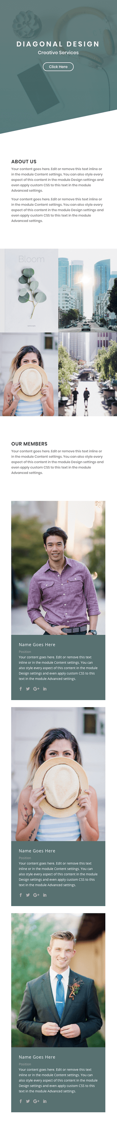
Now check out the final result…
A Responsive Diagonal Layout
This design highlights the power of the vw length unit. Because we used vw throughout the design to space and size elements, the result will scale perfectly on all browser sizes for desktop.
And on tablet and smartphone, the layout will adjust to a normal clean design without the diagonal elements.
Final Thoughts
Designing a diagonal layout with Divi can produce strikingly unique results. The secret is using the right combination of divider height, image size, and spacing using the vw length unit to scale the design to your browser width.
This is simply the tip of the iceberg of possible designs you can create with different modules, dividers, and colors. I hope this will inspire you to create your own geometric masterpiece.
I look forward to hearing from you in the comments below.
Cheers!


Love the tutorial! implemented it with relatively ease.
Having an example site with that layout up and running would be really useful. As learning by example is much better if you have a ready to go example at your hand and you can compare every single step with it.
So why not simply post the working example just with those tutorials – It would help a lot!
Hi Jason,
Great tutorial! I’m using it on a site I’m building! Quick question… I keep seeing 1 pixel of the image behind the angled divider on the screen, but only at certain page width. It seems like there’s some kind of rounding error going on in the width calculation that is causing the photo to bleed over.
Any tips on this?
Thanks Gregory. Try adding this custom CSS in the page settings:
.et_pb_bottom_divider .et_pb_bottom_inside_divider { bottom: -1px !important; }Thanks Jason, that worked! Might be worth adding in the tutorial, I was surprised no one else saw this issue.
And my two cents is that I really like the Tutorials as they are. There’s always something small learned in each one no matter how experienced the developer is. It seems like the purpose of these tutorials is to teach, not to provide templated designs, which is what some people seem to be asking for. It also provides a barrier of entry for deploying nicer custom designs like this, which means they won’t start showing up on every website on the net.
Great! I will try and add this update to the tutorial. And thanks for the valuable feedback. I agree that going through the tutorial and building it yourself will make it easier to pinpoint more unique design changes/opportunities.
Thanks!
Thanks Jason! That works great. I was surprised no one else saw the issue, maybe this step should be added to the tutorial.
By the way, I like the tutorials the way they are. It might take 30 minutes but there’s always something new discovered when doing them. Adding that level of buy-in also stops the nicest designs from showing up everywhere!
why 4vw? what does it means?
Sorry 4 this stupid question 🙁
vw is a length unit relative to 1% of your browser’s viewport width. So 4vw is 4% of the browser’s viewport (or window) width.
https://www.elegantthemes.com/blog/divi-resources/a-guide-to-understanding-and-applying-css-length-units-in-divi
This is a cool design idea, but I’d suggest adding fall back values to vw for legacy browsers. There are still quite a few folks using browsers that don’t support it. Might even add browser specific css to square up the design in browsers that don’t support vw.
Great tip John. Thanks
+1
It’s a pity but almpost all of current pre-made layouts have the same look with different images. Plase attach json file to download some design masterpieces you’re creating.
Thanks,
Igor
Hey Jason:
Love this tut! I knocked it out on my dev server (per your instructions) in about 30 minutes. Easy to get creative with this one.
Thanks.
In desktop mode I see a ice a looking design if you like loads upon loads of white space.
Richard,
The white space definitely can be decreased with spacing options for those sections.
I hope this makes it into a future layout pack.
Perhaps the new theme builder that’s coming could offer up some of these types of layouts that are ready to use instead of following these “28.5 million” steps tutorials.
I like the look and appreciate the tutorial.
Could I offer a thought?
Since these tutorials are rarely available for download, how about this?
1. Conduct the tutorials using a section that is already included in DIVI
2. Eliminate steps that don’t directly relate to achieving the core idea of the tutorial.
If the idea is to use dividers to create the diagonal, do we need the steps for selecting fonts, letter spacing, text color, etc? I look at the 28.5 million steps in these tutorials and am intrigued but know I will never do it because DIVI is a bit tedious, visual builder is still a bit clunky, and using my text/images will probably throw the whole thing off anyway.
Since DIVI is marketed as an easy way to create a website, the tutorials should be a bit easier for those of us who are not expert designers.
This isn’t a criticism. I intend it as a suggestion. There are many basics in DIVI that I have figured out from trial and error because there is no central depository of documentation. For example, I discovered yesterday that the title on my contact form was H1. Unlike the text module, I did not know I could make it H2 by simply choosing H2 in the design tab. I thought that only set the parms for an H2 in the module, not that it made the title H2.
Thank you,
Chris
Chris,
Thanks for the detailed response. I appreciate your thoughts. In regards to using premade layouts for these tutorials, I will definitely consider that for certain tutorials, especially those more focused on a new design technique or concept rather than a completed layout design. As for eliminating steps not related to the core idea, I understand the thinking behind this but I also know that many (especially beginners) will benefit from going through the process from beginning to end because they will pick up new things along the way that they (or I) did not expect. And, in general, a more detailed post in many ways can be easier to follow and implement, even though it can get repetitive for those more familiar with Divi.
Anyway, I hope future tutorials will continue to improve and find the right balance for our Divi audience.
I think providing step by step for newbies is great.
I think providing a layout pack with everything completed except for topical steps would be MUCH appreciated by many.
“You can follow steps 1-8 or use the XYZ layout and pick up at step 9”
Layout pack should have a ‘working’ layout and ‘completed’ layout so we have one to work in and one completed if we just want to use the concept.
Totally agree with Chris re the structure of the tutorials. I often want to do them but find it tedious going through all the obvious stuff and also trying to find correctly sized/style images to use to make it work. It would be much better to apply the concept to a pre-made layout already available.
How about a compromise? Use colors or something to show which sections are the “core” (pic size, padding, margin, module type, etc.) and which sections are the “fluff” (fonts, colors, etc.)
Kind of like they do in the “Dummies” guides.
I skim through these articles and try to find out how complicated it is and whether it’s in my time-budget, but after two scrolls of the mouse wheel I loose interest. If i could skim it and find the details that I need quickly, then, if it’s something I want, I would take the time to read through all the extra fluff.
+1
I totally disagree. For the sake of all those who are new to Divi the tutorials are perfect and for those not so new it’s never a bad idea to get a refresher. I’ve been using Divi for 3 years or so and with every new upgrade there comes a newer and faster way of doing things. And besides, you can alway click on the progress bar to move it along.
+1
As I do love downloadable content. A tutorial is a good way to make your chest wet and try it yourself. Only with that, you encounter issues and you need to come up with a solution.
On the other hand, downloadable content helps beginners to understand the thought process and workflow behind it all.
Oddly, I was just going to post how much I enjoy the structure of these tutes. I always come away learning something new and re-enforcing where to find the elements I want/need to change. I realize that for some, there might be repetitive stuff, however many who purchase Divi are still, by default, newbies or not full time web-designers. There are also those who are more visual learners vs auditory learners… The elements in these tutes seem to stick with me a lot more than some of the other types. As XXY said above – it’s a way to try stuff for one’s self. I managed a cool “mistake” with one of the previous tutes because I made an error following the instructions.
Thanks Allie. I agree, and I too have discovered many cool things through my many mistakes.
I love all of the detail – I hear what the OP is saying but even with my time pressures, I like to follow one of these each week. With the detail given, it’s easy to see how I can change it to fit my site.
I agree with Les. I am a beginner and I really appreciate all the small steps in these tutorials.
+1