

Whether you have a podcast or are hosting a WordCamp (or any speaker event), it’s always a good idea to have a guest speaker section for your website. Like testimonials, showcasing guest speakers is an effective way to promote value and establish credibility with your audience. A guest speaker section is also a key spot for reeling in some new candidates for your next event or episode. This tutorial shows you how to design a guest speaker section that not only showcases speakers in an elegant fashion, but also encourages new speakers to apply with an effective call to action.
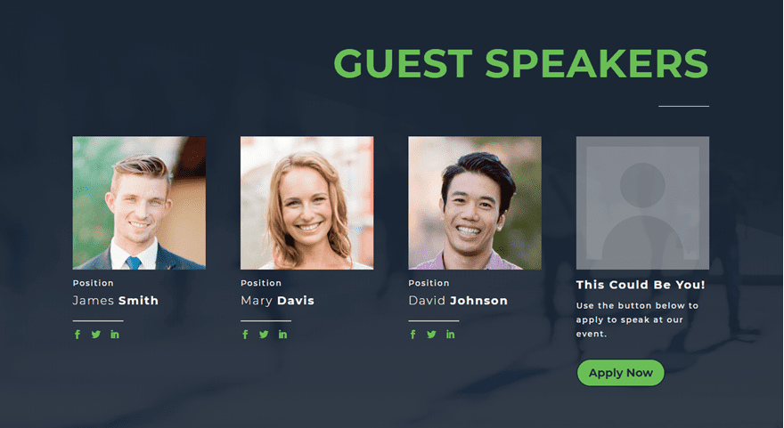
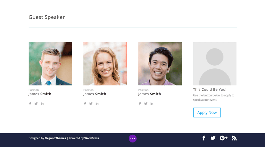
But before we jump in, here is a sneak peek at the final design.
Sneak Peek
And here is a bonus hover effect I’ll show you as well.
Let’s get started!
Subscribe To Our Youtube Channel
Building the Basic Structure and Content
If you haven’t done so already, create a new page and deploy the Divi Builder to build on the front end.
The, add a new section with a one column row.
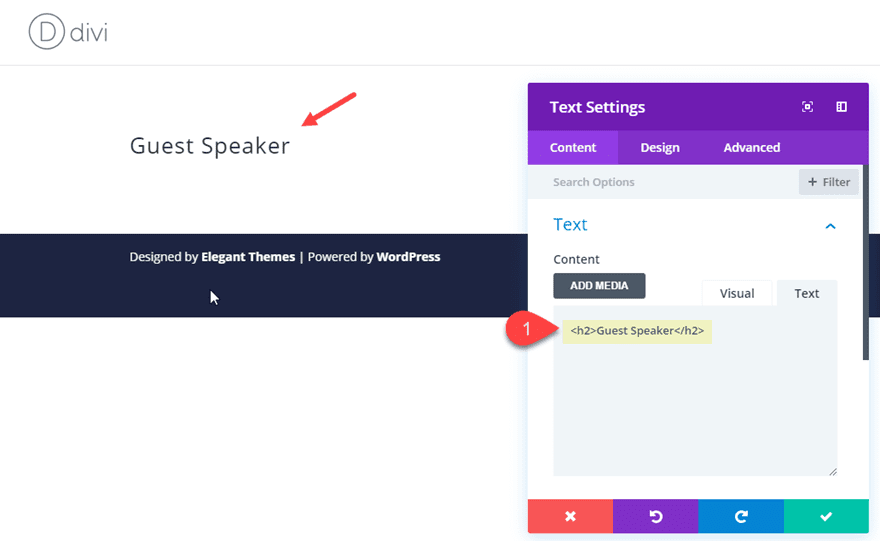
Add a text module to the row with the following Content:
<h2>Guest Speaker</h2>
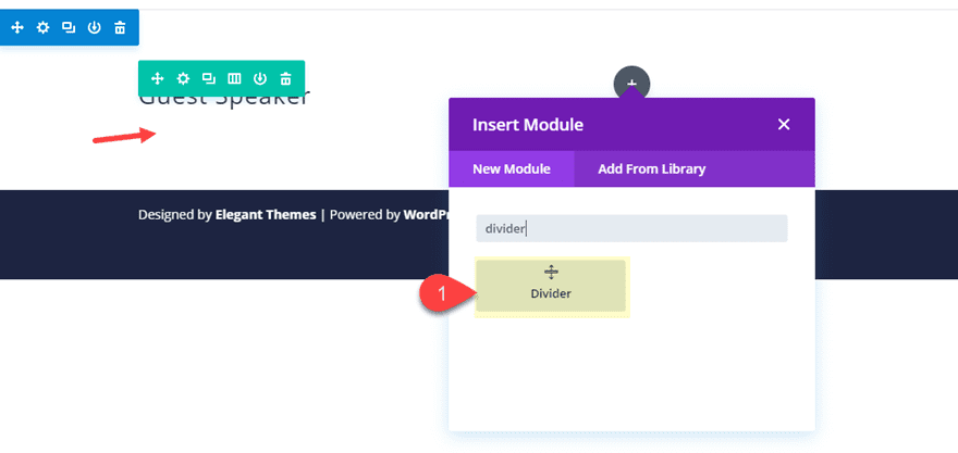
Next, add a divider module directly under the text module.
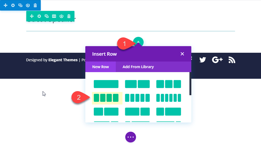
Now we are going to add a new row with a four-column structure to hold our guest speakers.
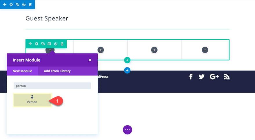
In the first column of the row, add a person module.
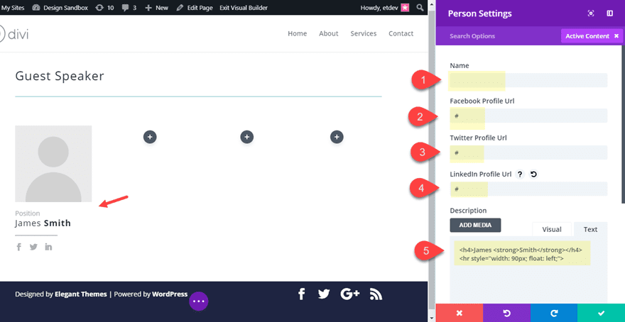
Update the Person module content as follows:
Name: [blank]
Facebook Profile URL: [add “#” for now]
Twitter Profile URL: [add “#” for now]
LinkedIn Profile URL: [add “#” for now]
For the description, add the following:
<h4>James <strong>Smith</strong></h4>
<hr style="width: 90px; float: left;">
Note: the hr tag generates a divider line that has some inline styling to make is 90px wide and float to the left. The strong tag that is wrapped around the last name makes it bold for a unique design element.
Now that you have the content in place, save the person module settings.
Copy the person module you just created and paste it into each of the remaining columns so that you have the same person module in each of the four columns. To copy and paste you can use the right click menu options or the shortkeys cmd+c cmd+v (mac) or ctrl+c ctrl+v (win).
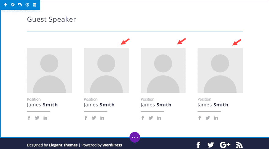
Open the setting of the person module in column 4 and update the content so that in only contains the following:
Name: “This Could Be You!”
Description: “Use the button below to apply to speak at our event.”
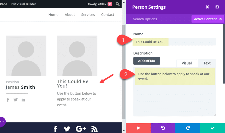
Save your settings.
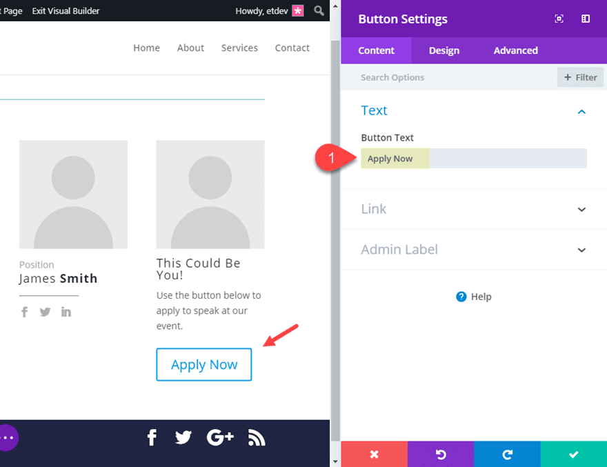
Next, add a button module directly under the person module in column 4 and update the button text content to “Apply Now”. And save your settings.
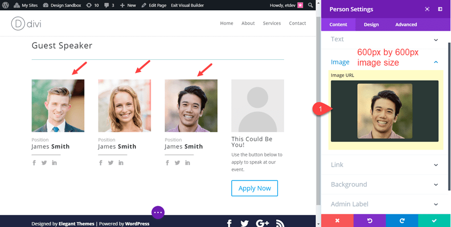
Go back to the first three person modules in columns 1-3 and add the images for each of the guest speaker portraits. Make sure they are the same size with equal height and width dimensions and that they are large enough to account for column widths on all browser sizes (ideally 600px by 600px).
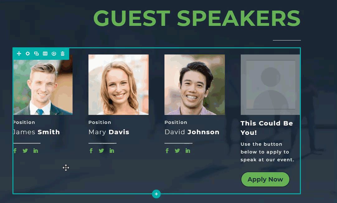
This is what your Guest Speak layout should look like at this point.
Styling the Guest Speaker Layout
Styling the Section
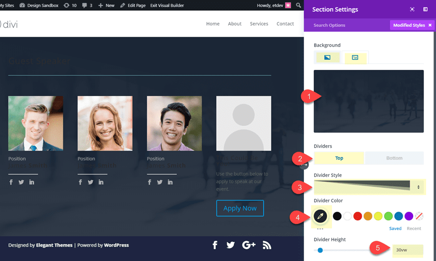
Open the section settings and update the following:
Background Image: [I’m using one from our Agency Layout]
Background Gradient Left Color: #293039
Background Gradient Right Color: rgba(41,48,57,0.89)
Top Divider Style: see screenshot
Top Divider Color: #293039
Top Divider Height: 30vw
Changing the Row Widths
Since we want both of our rows to have the same width, use multiselect to select both of the rows and click on one of the settings icons to open the element settings.
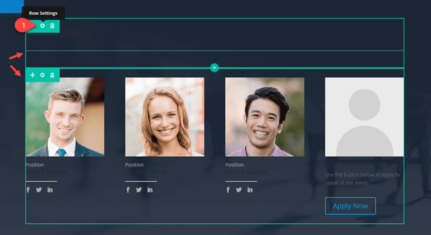
Then update the following:
Custom Width: 80%
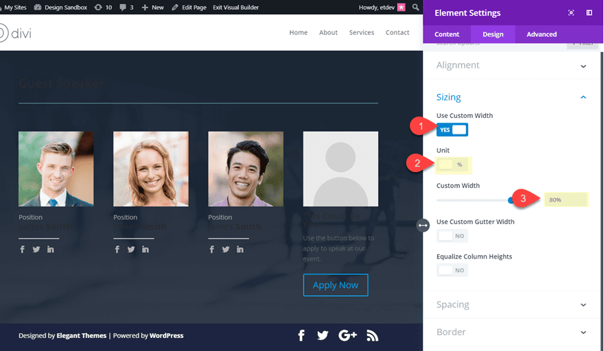
Now both of your rows will have the same custom width.
Styling the Headline
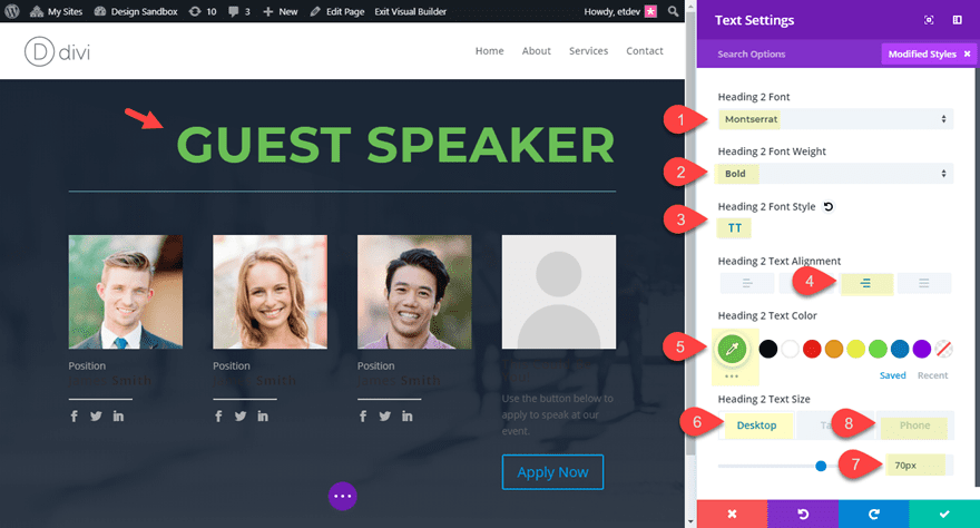
Open the settings of the text module containing your section headline “Guest Speakers” and update the following:
Heading 2 Font: Montserrat
Heading 2 Font Weight: Bold
Heading 2 Font Style: TT
heading 2 Text Alignment: right
Heading 2 Text Color: #74bf46
Heading 2 Text Size: 70px (desktop), 50px (smartphone)
Save settings.
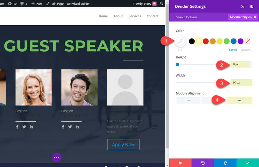
Now open the Divider settings and update the following:
Color: #ffffff
Height: 0px
Width: 90px
Module Alignment: right
Styling the Person Modules
Since we want to give the same initial styling to all of our person modules, use multiselect to select each one and then click on the settings icon of one of the modules to deploy the element settings modal.
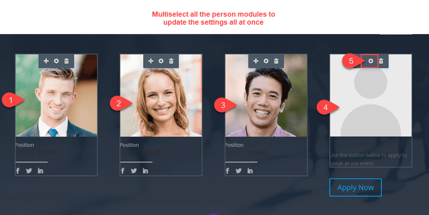
Update the following element Settings:
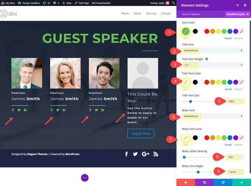
Icon Color: #74bf46
Title Font: Montserrat
Title Font Weight: Light
Title Text Color: #ffffff
Title Text Size: 20px
Body Font: Montserrat
Body Text Color: #ffffff
Body Letter Spacing: 2px
Body Line Height: 1.8em
Styling the CTA Person Module
We are using this person module as a call to action that draws in new guest speakers to apply for a speaking engagement. So, we can leave the default image (silhouette) active as a creative way to display an empty spot. But there are a few style adjustments we need to add to complete the design. Open the settings of the person module in column 4 and update the following.
Image Border Width: 18px
Image Border Color: #d2d2d2
Image Opacity: 50%
Title Font Weight: Bold
Title Line Height: 1.5em
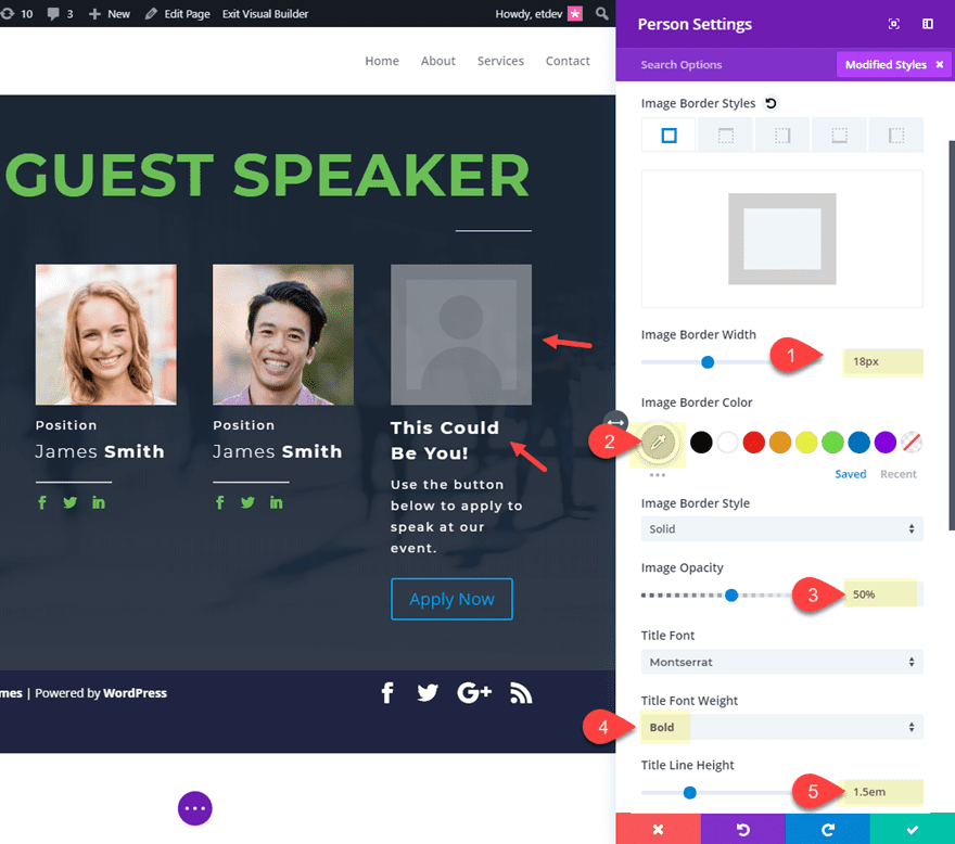
Now all there is left to do is style our button. Open the button module settings and update the following:
Button Text Color: #293039
Button Background Color: #74bf46
Button Border Radius: 50px
Button Font: Montserrat
Font Weight: Bold
Now let’s take a look at the final result.
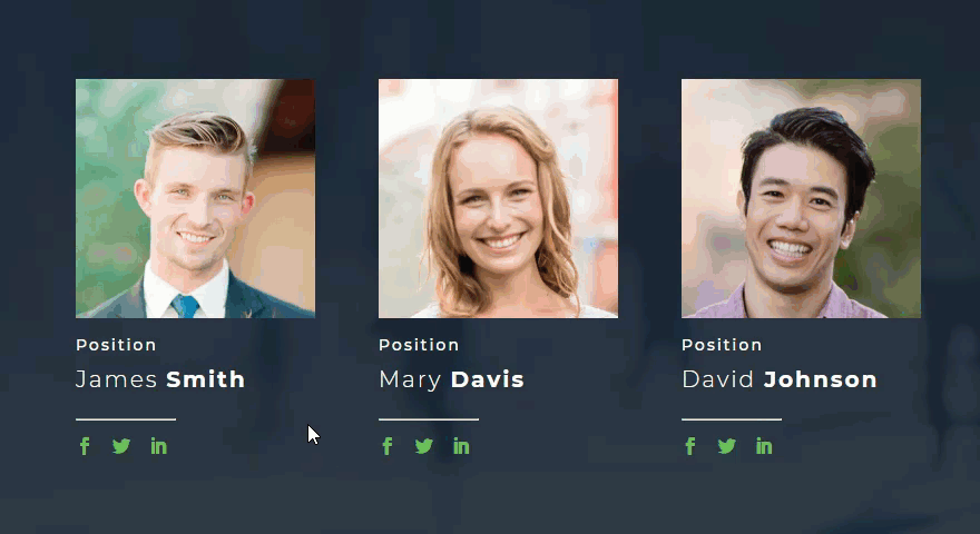
Bonus Tip: Image Zoom Hover Effect
Don’t forget about all of the built-in hover options available in Divi. In fact, you can view some inspiring tutorials on these hover effects on our blog. But for this design, I thought I would think outside the box a little and give you a few snippets of CSS that will cause your person image to zoom (or scale) slightly on hover.
If you are looking for a subtle hover effect to set your person modules apart, here is how to do it.
Use multiselect to select the person modules in columns 1, 2 and 3. The open the element settings. Under the advanced tab enter the following CSS under the Main Element:
overflow: hidden;
This code will keep the expanding image from extending outside the module container.
Next add the following CSS under Member Image:
transition: all 0.3s;
This adds a smooth transition when the image scales in size.
To add the css on hover, click the hover icon and select the hover tab and enter the following CSS:
transform: scale(1.1) translateY(-4.5%);
This scales (or expands) the image to a slightly larger size and moves it up a bit.
Now the images will have a subtle zoom effect on hover.
Final Thoughts
Well, I hope you enjoyed this tutorial or at least left with a few useful design tips. This guest speaker section layout can be used in a variety of ways. Another perfect application would be for an employee page to simultaneously list current employees and encourage others to apply for a position. Feel free to share some ideas with us.
I look forward to hearing from you in the comments below.
Cheers!


The timing of the tutorial could not have been any better. Great work and thanks for sharing!
Thanks, Richard. That’s great to hear! I love it when that happens.
Hi,
Helpful information, Thank you for sharing this.
Thanks Ashraf. Glad you like it.
Really helpful step by step guide – hope you will make more of those for Divi users!
Thanks Izabela! I will definitely do my best.