

Using mockups is one of the easiest ways to bring a much needed sense of professionalism to your website. There are plenty of sites out there that offer free mockups that you can adjust to your specific needs; we’ve created a list of some of the best ones out there in this post.
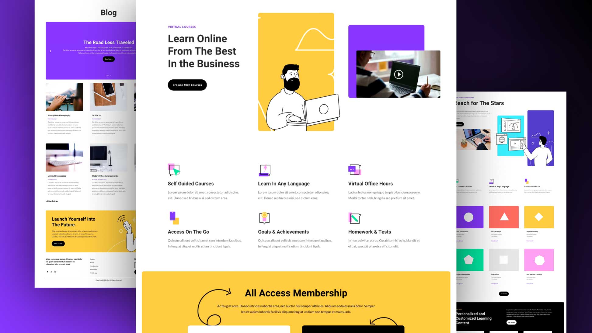
And to help you get started with mockups, we’re going to show you how you can make use of a laptop screen mockup, along with Divi and its best built-in design options, to make your website shine. This tutorial is great if you’re building a portfolio page where you showcase previous work.
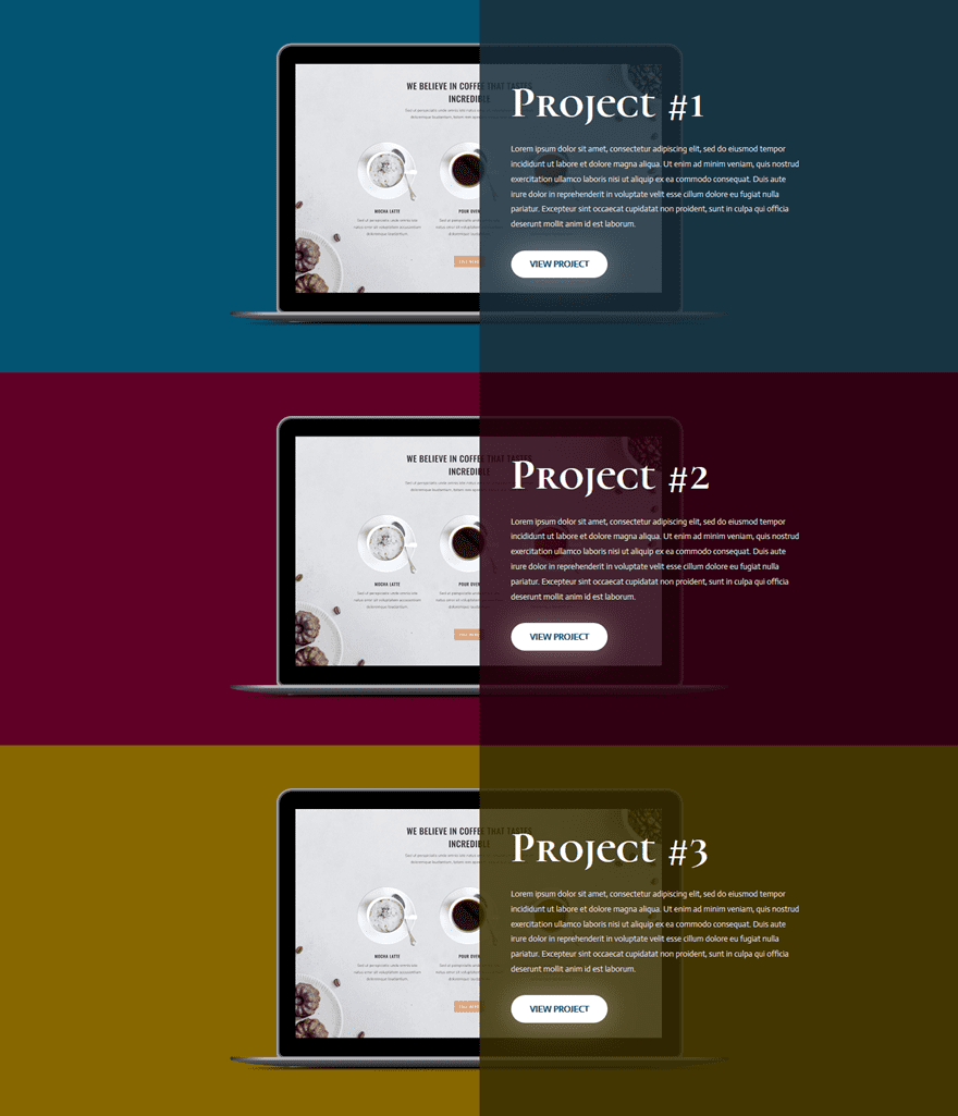
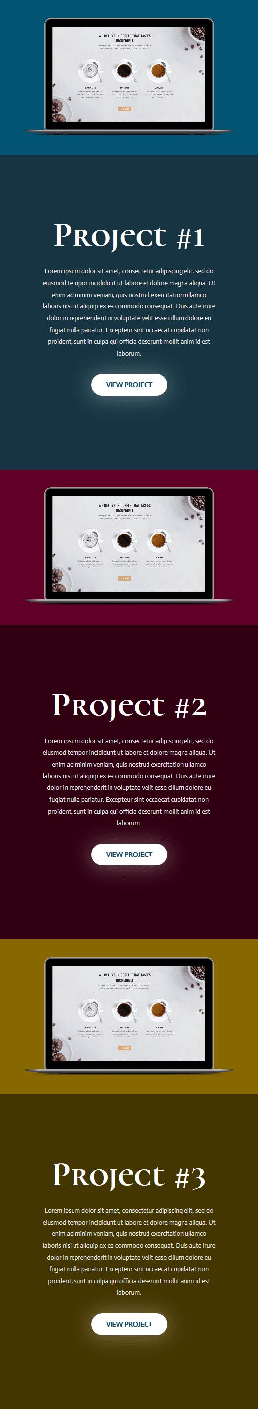
Before we dive into the tutorial, let’s take a look at the result we’ll be achieving.
Result on Desktop
Result on Mobile
Download This Tutorial’s Free Screen Mockup
To help you bring this tutorial to a good end, we’re going to provide you with the mockup that is being used in this tutorial for free. Actually, we’re providing you with two device mockups and several high quality images since the resource we’re (re)sharing is actually from our Design Agency Layout Pack. When you download the image resources below, you can unzip the folder and locate the file called MB-purefront.psd to follow along.
Download the Free Screen Mockup
How to Creatively Use Device Screen Mockups within Divi Layouts
Subscribe To Our Youtube Channel
Change Mockup with Photoshop
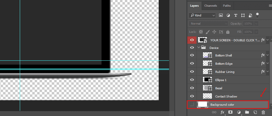
Once you’ve downloaded the mockup, you can change it to your needs. Start by opening the file.
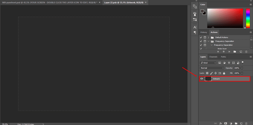
Hide Background Layer
Once you’ve opened the file, the first thing you’ll need to do is disable the layer with the background color at the bottom of your layers:
Double Click on the Screen Layer
Next, double-click on the following layer’s icon:
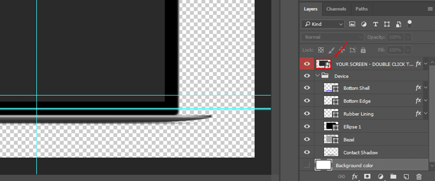
You’ll see a new tab appear that contains the image that appears in your screen mockup.
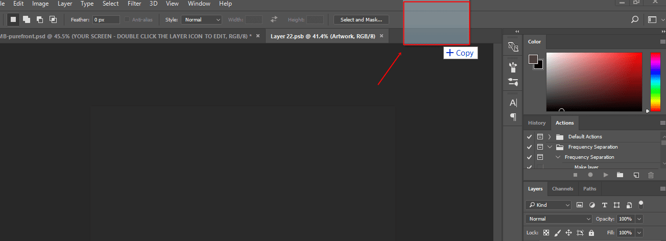
Drag Your Image to Create a New Tab
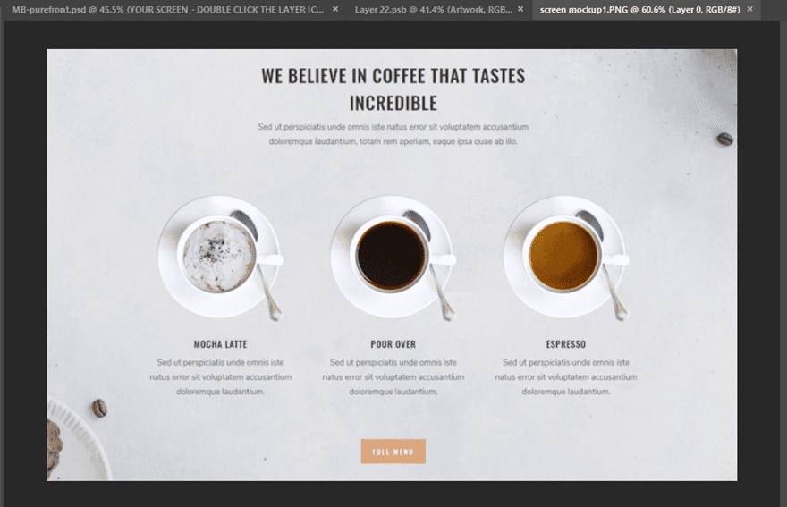
Then, drag the image you want to use for your screen to the tabs. You’ll watch a new tab appear that contains this image. The image that you are using must preferably have a width of ‘1440px’ and a height of ‘900px’ to fit the screen perfectly.
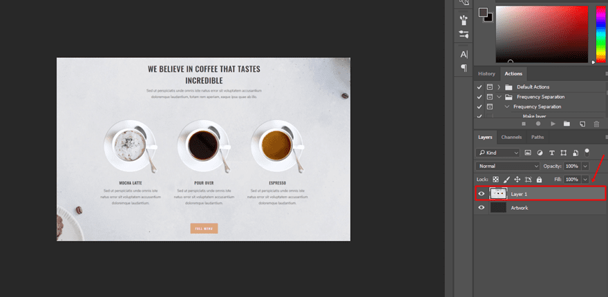
Copy Image & Paste in Screen Layer
Next, copy the image and paste it into the screen layer you have opened. You’ll see that, if you’re using the right width and height, the image will fit perfectly and a new layer will be created. However, if your image is larger than expected, you can always adjust it by using CTRL + T (on Windows) or Command + T (Mac) to make the image fit.
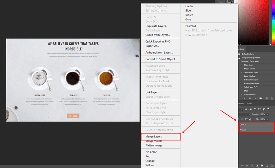
Merge Layers
Once you have added the new image to your screen layer, select both layers and merge them.
CTRL + S or COMMAND + S
Once the layers are merged, you can go ahead and save the layer by using CTRL + S (on Windows) and Command + S (on Mac).
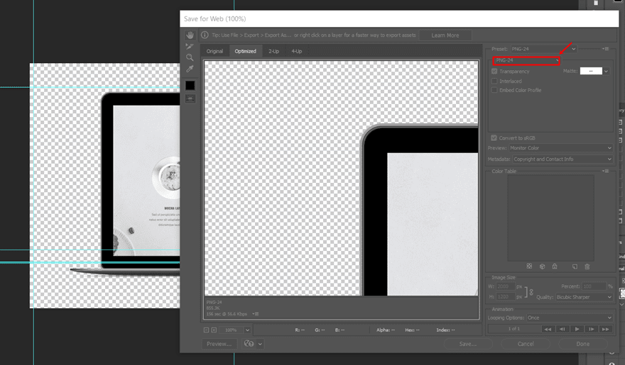
Save Image for Web
If you, then, return to your mockup, you’ll see that your screen has been changed.
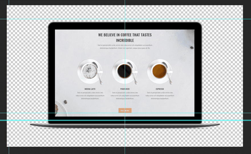
You’re now ready to export the image. To do that, go to File > Export > Save for Web > Save as PNG file.
Add New Section
Now that we’ve gone through the part where we use Photoshop, it’s time to switch over to Divi.
For this tutorial, we’ll only be needing one standard section. Go ahead, add a new page and create a new standard section without any additional settings.
Create Desktop Row
As mentioned before in this post, we’re going to show you how to create a portfolio page with screen mockups that match desktops, tablets and phones. We’ll start with the desktop version, and once you go through this part, you’ll see that creating the mobile version will be a lot easier as we will be reusing most of the desktop’s settings.
Row Settings
Start by adding a new row to your section with two equal columns.
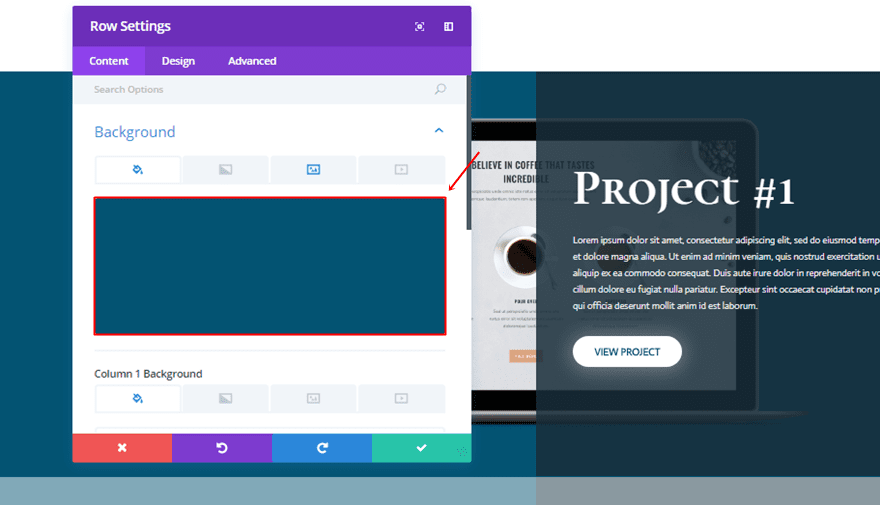
Row Background Color
Open the settings of the row and choose ‘#035372’ as the background color.
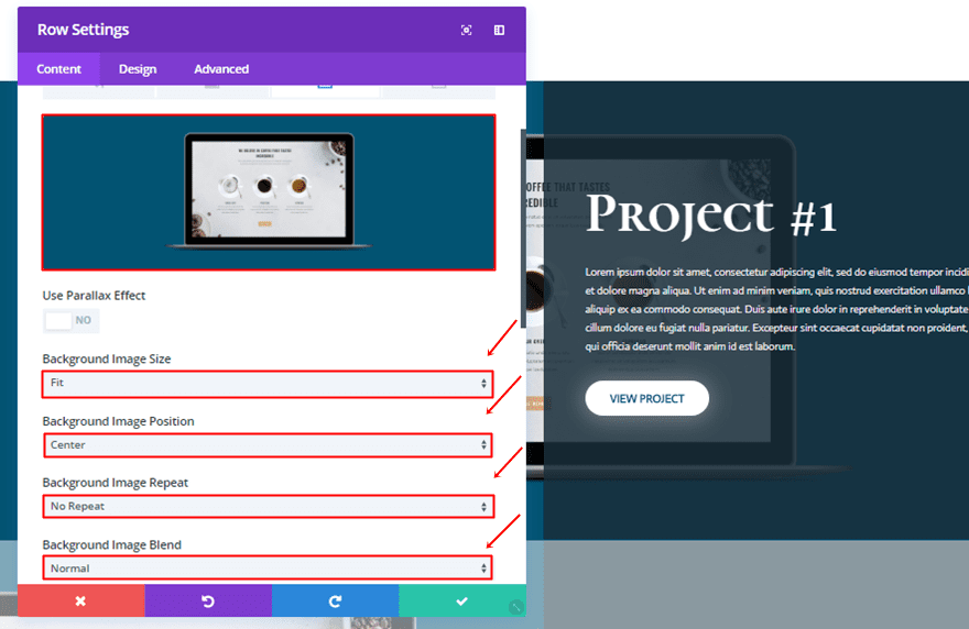
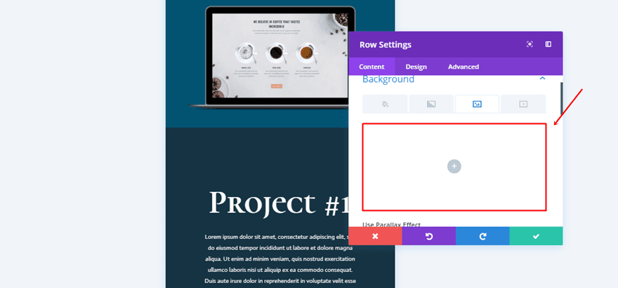
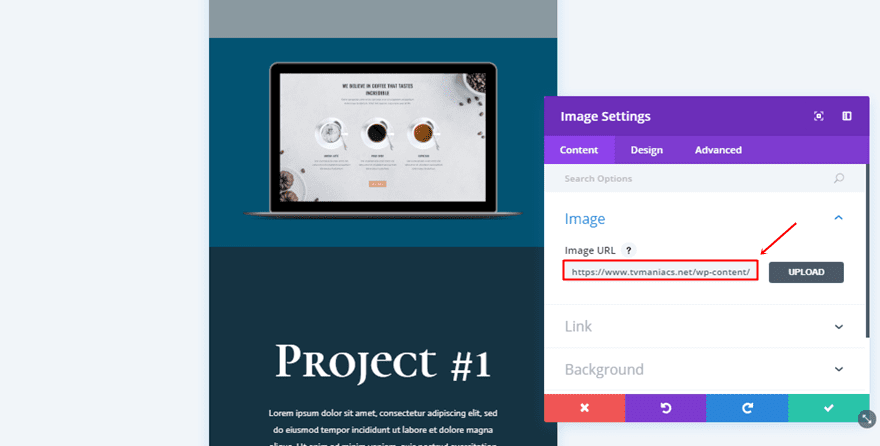
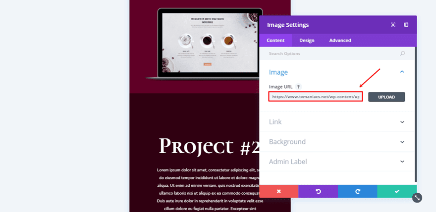
Row Background Image
Then, switch over to the background image tab, upload the screen mockup and choose the following settings:
- Background Image Size: Fit
- Background Image Position: Center
- Background Image Repeat: No Repeat
- Background Image Blend: Normal
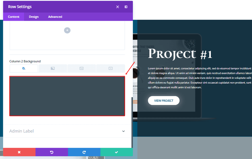
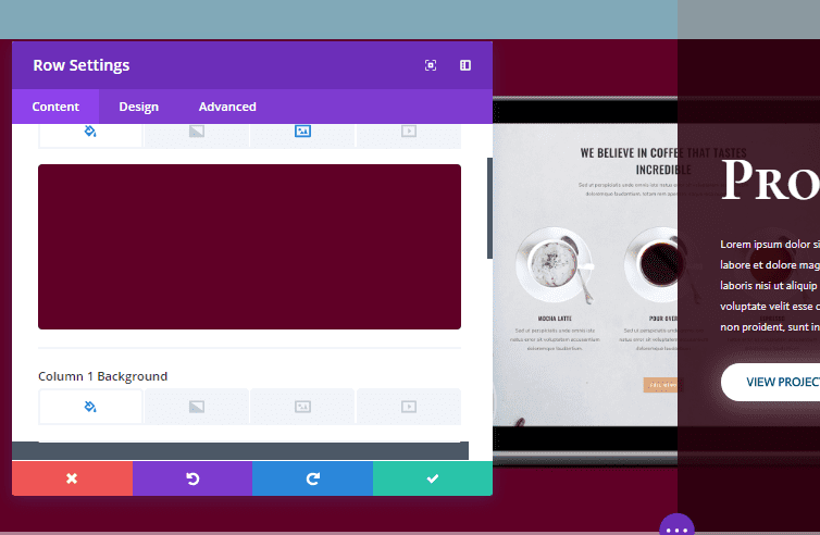
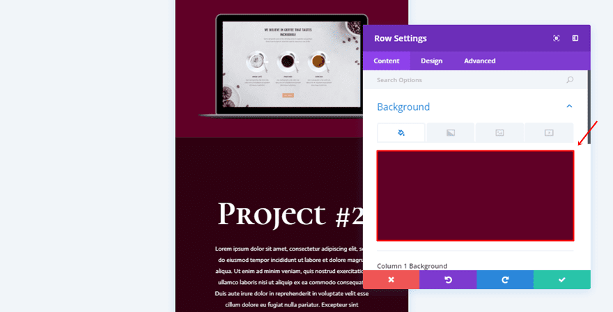
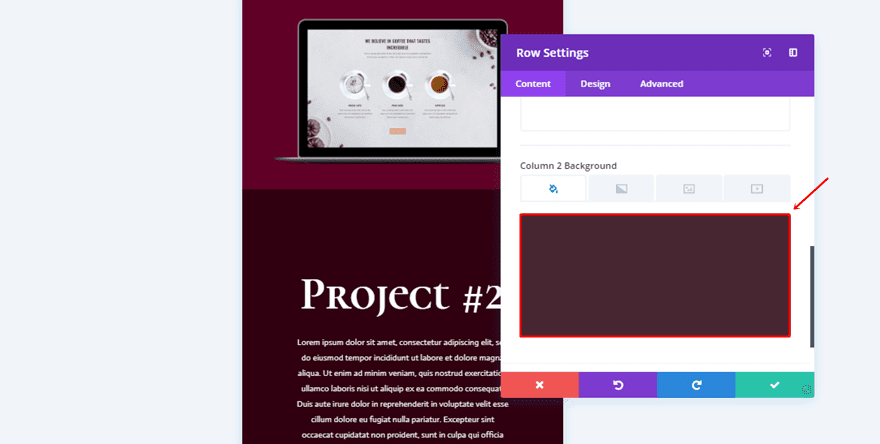
Column 2 Background Color
Scroll down the Content tab and use ‘rgba(25,46,58,0.85)’ as the Column 2 Background Color.
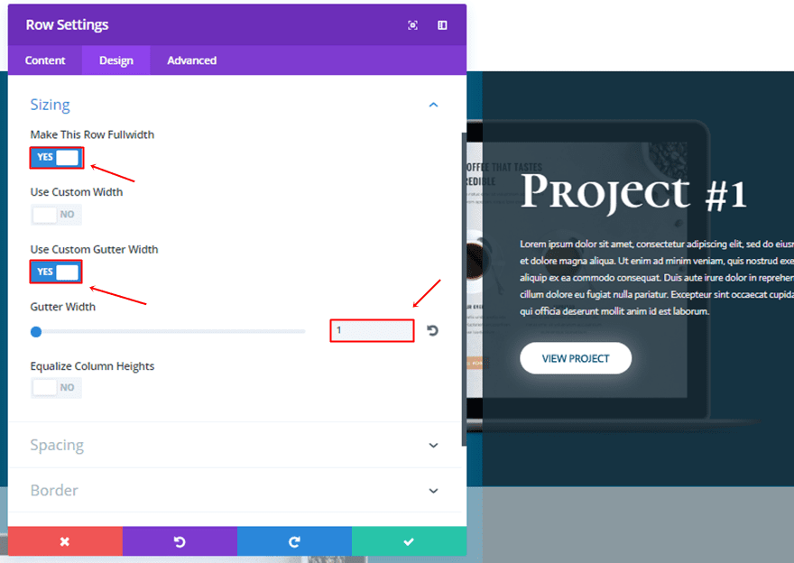
Sizing
Then, move on to the Design tab and use the following settings for the Sizing subcategory:
- Make This Row Fullwidth: Yes
- Use Custom Gutter Width: Yes
- Gutter Width: 1
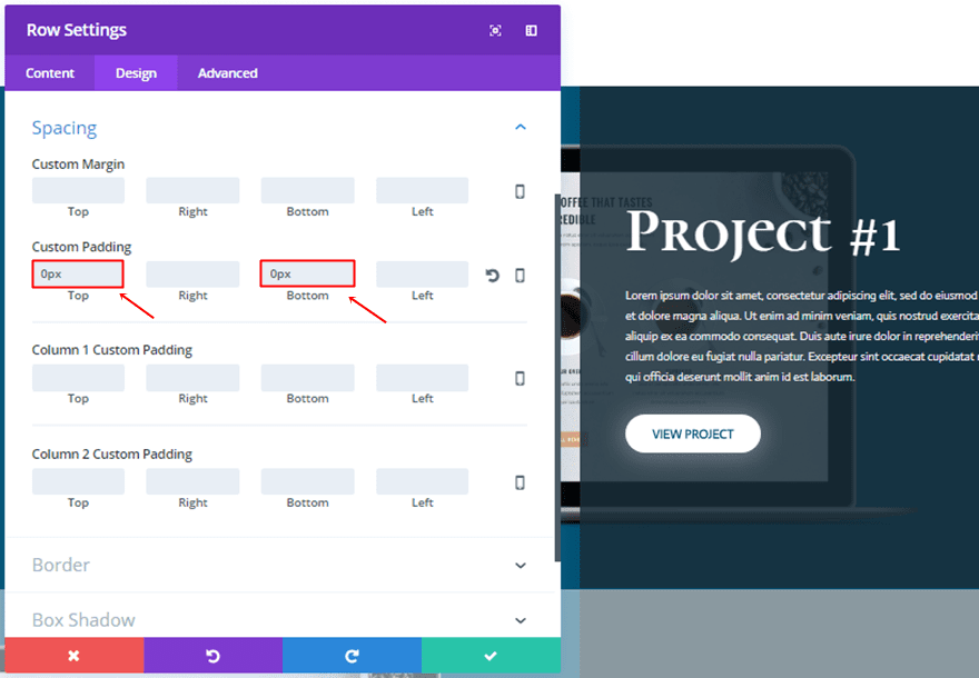
Spacing
Moving on, add a custom padding of ‘0px’ to the top and bottom.
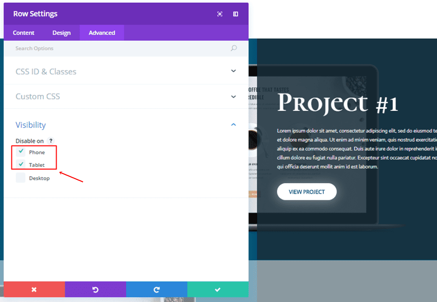
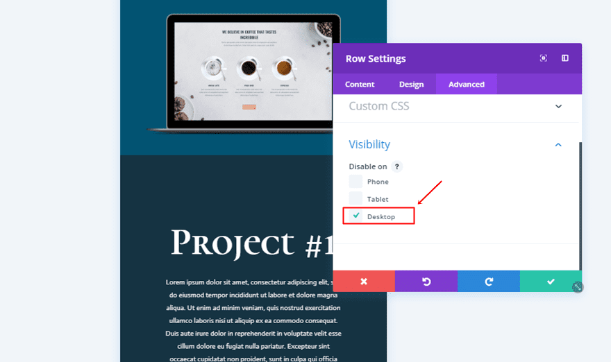
Visibility
Lastly, disable the row on phone and tablet.
Add Title Text Module
Once you have all the row settings in place, add a first Text Module to the second column of your row.
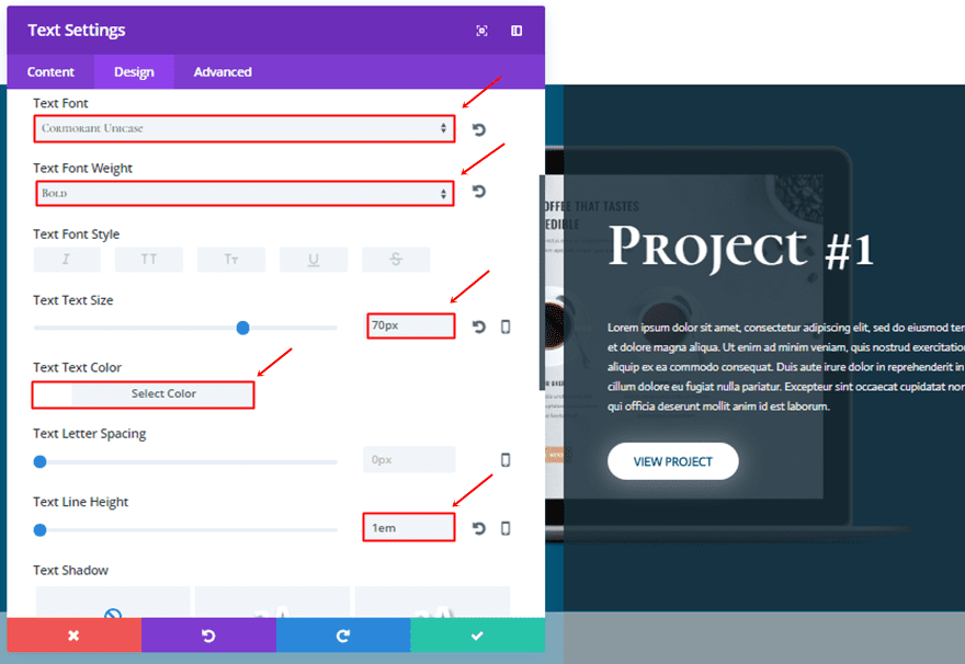
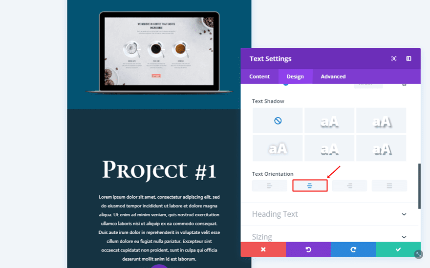
Text Settings
After having added the text to the Content Box, move on to the Design tab and use the following settings for the Text subcategory:
- Text Font: Cormorant Unicase
- Text Font Weight: Bold
- Text Size: 70px
- Text Color: #FFFFFF
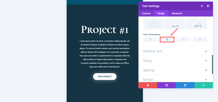
- Text Line Height: 1em
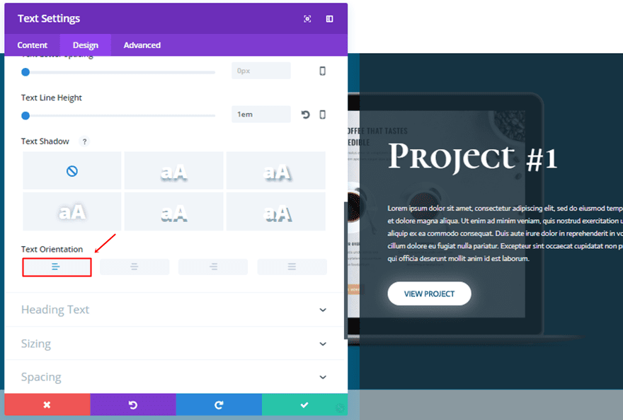
- Text Orientation: Left
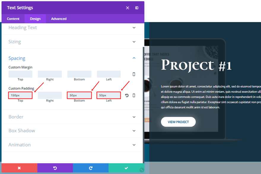
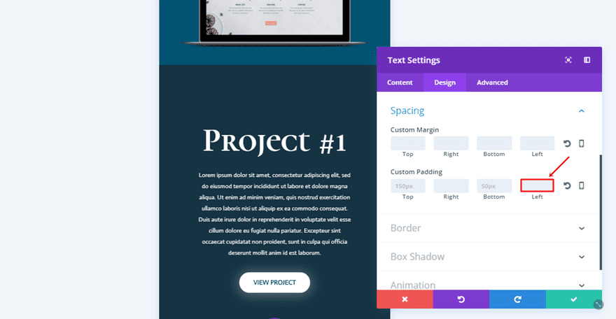
Spacing
And use the following custom padding:
- Top Padding: 150px
- Bottom Padding: 50px
- Left Padding: 50px
Add Description Text Module
Add another Text Module right below the previous one.
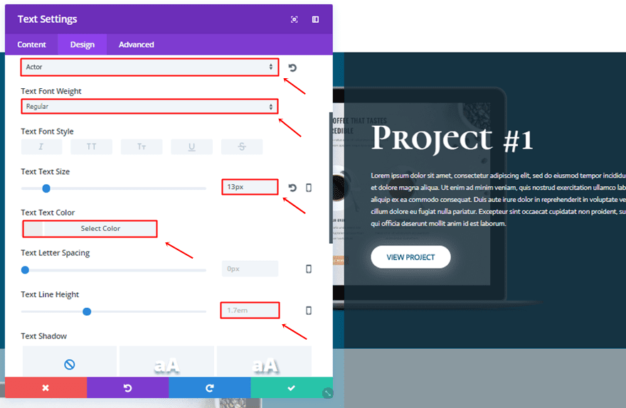
Text Settings
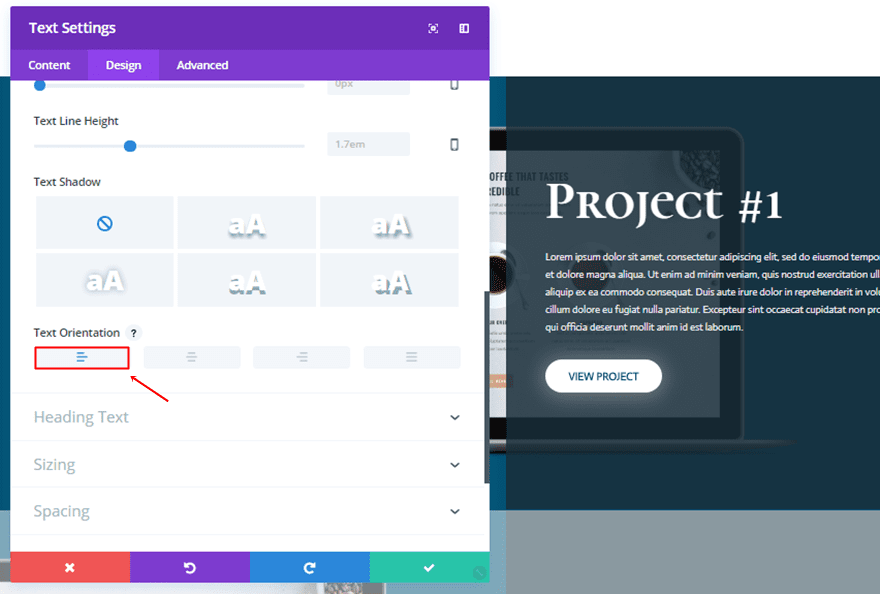
Use the following settings for the Text subcategory of this Text Module:
- Text Font: Actor
- Text Font Weight: Regular
- Text Size: 13px
- Text Color: #ededed
- Text Line Height: 1.7em
- Text Orientation: Left
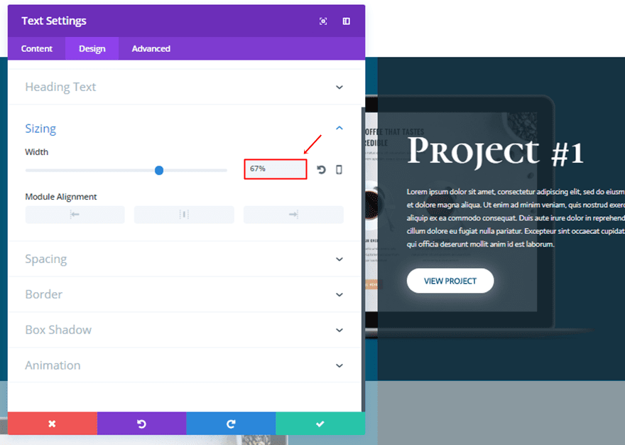
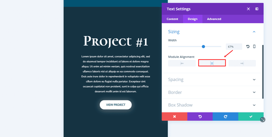
Sizing
Next use a width of ‘67%’ within the Sizing subcategory.
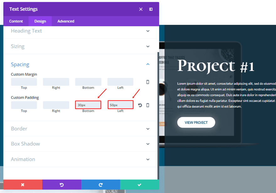
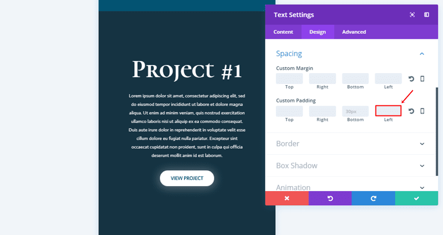
Spacing
Lastly, add a bottom padding of ’30px’ and a left padding of ’50px’.
The last module we’ll need to add to this row is the Button Module.
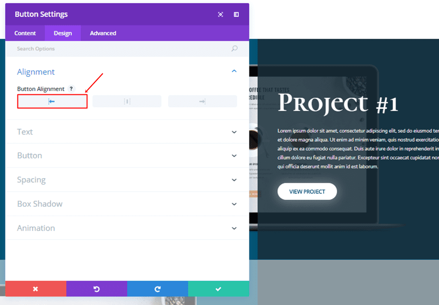
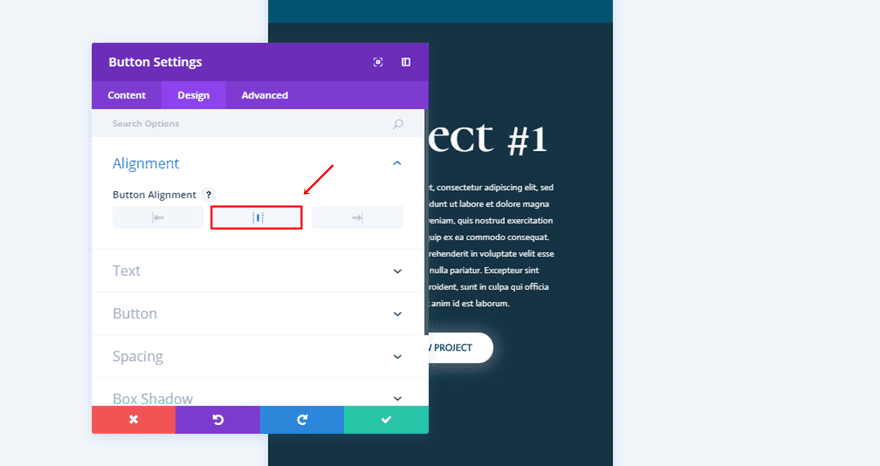
Alignment
The first thing you will need to do after adding the Button Module is choosing a left Button Alignment.
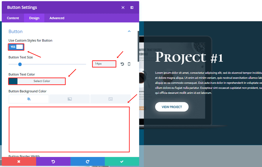
Button
Then, move on to the Design tab and use the following settings for the Button subcategory:
- Use Custom Styles for Button: Yes
- Button Text Size: 14px
- Button Text Color: #035372
- Button Background Color: #FFFFFF
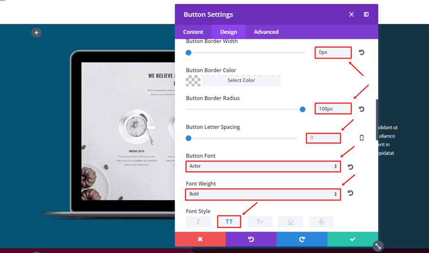
- Button Border Width: 0px
- Button Border Radius: 100px
- Button Letter Spacing: 0px
- Button Font: Actor
- Font Weight: Bold
- Font Style: Uppercase
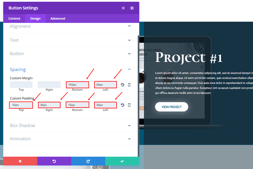
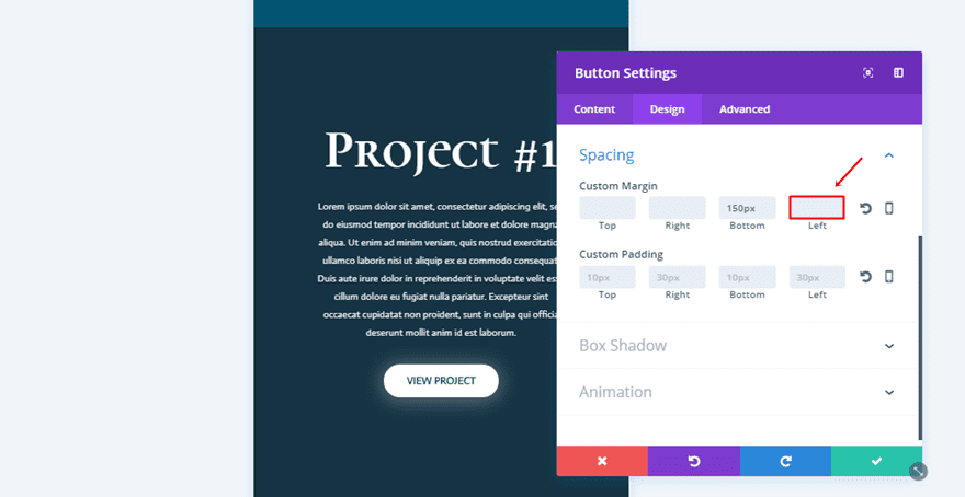
Spacing
Next, add the following custom margin and padding to the Button Module:
- Bottom Margin: 150px
- Left Margin: 50px
- Top Padding: 10px
- Right Padding: 30px
- Bottom Padding: 10px
- Left Padding: 30px
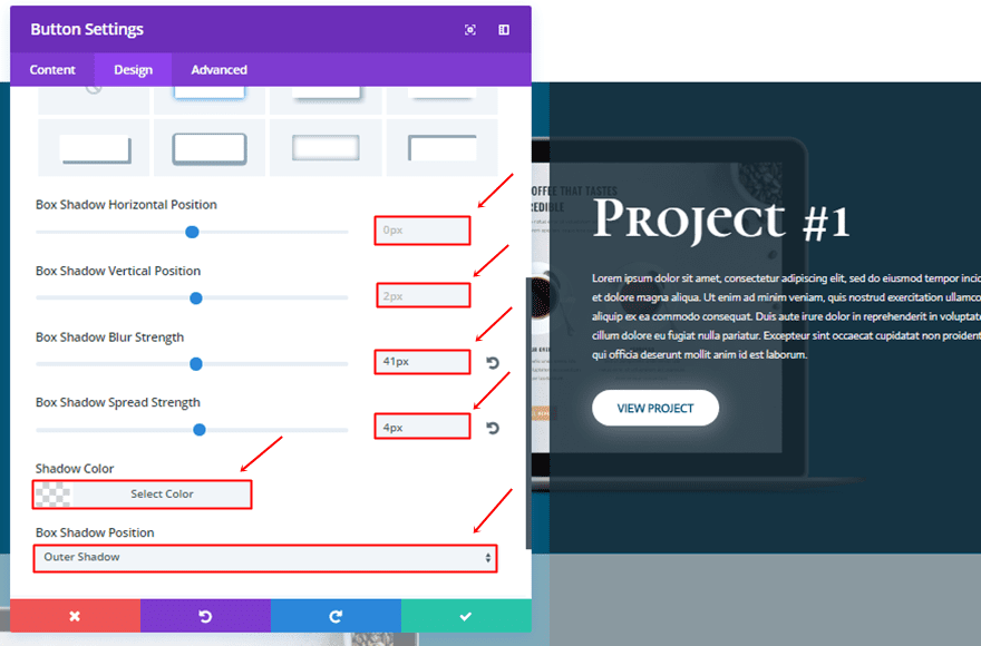
Box Shadow
Lastly, add the following box shadow to give the button some extra glow:
- Box Shadow Horizontal Position: 0px
- Box Shadow Vertical Position: 2px
- Box Shadow Blur Strength: 41px
- Box Shadow Spread Strength: 4px
- Shadow Color: rgba(255,255,255,0.3)
- Box Shadow Position: Outer Shadow
Clone Row as Many Times as Needed
Once you’ve completed all the steps that are mentioned above, you can go ahead and clone the row as many times as you need. You’ll only have to make some slight modification which we’ll mention below.
Change Row Background Color & Image
The first thing you will need to do is change the screen mockup and background color of your row. For the example that we’re recreating, we’re using ‘#600026’ for the second row and ‘#876700’ for the third row.
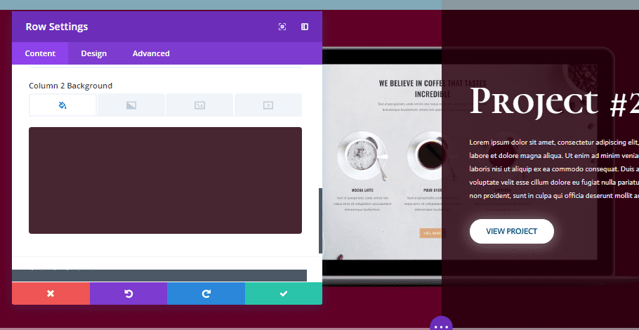
Change Column 2 Background Color
The Column 2 Background Color needs to be changed as well. The second row in our example uses ‘rgba(40,0,14,0.85)’ and the third row uses ‘rgba(56,46,0,0.85)’.
Create Mobile Row
Now that we’ve created the desktop version, creating the mobile and tablet version will go a lot quicker.
Clone Desktop Row
Start by cloning the desktop row you’ve created in the previous part of this post.
Remove Row Background
Once you do that, you’ll need to open the row settings and delete the screen mockup in the Background subcategory of the row.
Disable on Desktop
Then, you’ll need to go to the Advanced tab and disable the row on desktop, instead of on tablet and phone.
Add Image Module to First Column
Next, go ahead and add an Image Module to the first column of this row. This Image Module will sort of ‘replace’ the row background image that we used in the desktop version.
Change Title Text Module
Center Text Orientation
Then, open your Text Module and change the Text Orientation to ‘Center’ in the Text subcategory.
Remove Left Padding
And remove the left padding as well.
Change Description Text Module
Center Text Orientation
Moving on, open the second Text Module in your second column and put the Text Orientation to ‘Center’.
Center Module Alignment
Then, open the Sizing subcategory and choose a center Module Alignment.
Remove Left Padding
Lastly, remove the left padding of this Text Module as well.
Center Button Alignment
You will also need to change the Button Alignment of your Button Module into ‘Center’.
Remove Left Margin
And remove the left margin.
Clone Row as Many Times as Needed
Again, you can clone this mobile version as many times as you need and make some small modification to it.
Change Row Background Color
One of those changes is changing the row background color into ‘#600026’ for the second row and ‘#876700’ for the third row in the example.
Change Column 2 Background Color
And change the Column 2 Background Color to ‘rgba(40,0,14,0.85)’ for the second row and ‘rgba(56,46,0,0.85)’ for the third row.
Change Image in Image Module
Lastly, you will also need to change the screen mockups in each one of the new versions that you create. Of course, make sure that these are in line with your desktop version.
Result
Result on Desktop
Result on Mobile
Final Thoughts
In this post, we’ve shown you how you can creatively use screen mockups along with Divi’s design options to create beautiful results. The layout we’ve shown you how to create is ideal for portfolio pages where you showcase previous work to your visitors. If you have any questions or suggestions; make sure you leave a comment in the comment section below.
Be sure to subscribe to our email newsletter and YouTube channel so that you never miss a big announcement, useful tip, or Divi freebie!


Greetings!
I’d like to know the page load stats using this method in contrast to using javascript to load different page version based upon tablets/phones. With the hidden items (tablet/phone display), they are still being loaded.
Thank you.
Love your voice and your easy way to communicate.
Thks for this tutorial.
Great instructor/communicator. Easy to follow. Thank you.
These look lovely. You could also just use a site like placeit.net or smartmockups.com which saves a lot of time photoshopping!
Check the links. Just what I need. Thanks.
Cool.
This is another excellent tutorial. Thank you, Donjete and ET, for continuing to provide so many resources for design inspiration!
As a question/suggestion for a related technique to explore, I’m curious how one might be able to integrate a slider within the laptop screen; that would allow one to highlight multiple images for each project, and have them scroll beautifully within the laptop screen.
Thanks again so much for all your outstanding work!
So helpful! thank you so much