

Many websites get tons of visitors from mobile devices. This leads to the question of whether or not your designs are sufficiently optimized for smaller screen sizes. With Divi, a design that is built for a desktop experience ends up being instantly responsive as well. But just because something is responsive doesn’t mean it’s optimized as well.
If mobile is your main source of visitors, it can really help to start designing and building from a mobile perspective instead of a desktop one. In this post, we’ll show you exactly how to do that. After going through some tips and tricks that you should keep in mind, we’ll also recreate an example from scratch that takes these tips into account.
Let’s get to it!
- 1 Preview
-
2
Approach
- 2.1 1. Switch Over to Mobile View Right After Adding a New Page
- 2.2 2. Enable Responsive Options for Each Design Element & Modify the Mobile Values First
- 2.3 3. Remove Default Space Between Columns & Add Padding Manually if Needed
- 2.4 4. Place 2 or 3 Columns Next to Each Other to Create a Horizontal Design
- 2.5 5. Modify Desktop & Tablet Views Along the Way or Afterwards
-
3
Let’s Start Recreating the Example!
- 3.1 Add New Section
- 3.2 Add Row #1
- 3.3 Add Text Module to Row
- 3.4 Add Divider Module to Row
- 3.5 Add Row #2
- 3.6 Add Text Module to Column 1
- 3.7 Add Divider Module to Column 1
- 3.8 Add Button Module to Column 1
- 3.9 Add Image Module to Column 2
- 3.10 Clone Row #2
- 3.11 Clone Both Rows
- 3.12 Modify Duplicate #1
- 3.13 Modify Duplicate #2
- 4 Preview
- 5 Final Thoughts
Preview
As mentioned before, we’ll start off by going over some tips and tricks. Afterwards, we’ll recreate an example from scratch that makes use of these tips. Let’s take a look at the outcome.
Mobile
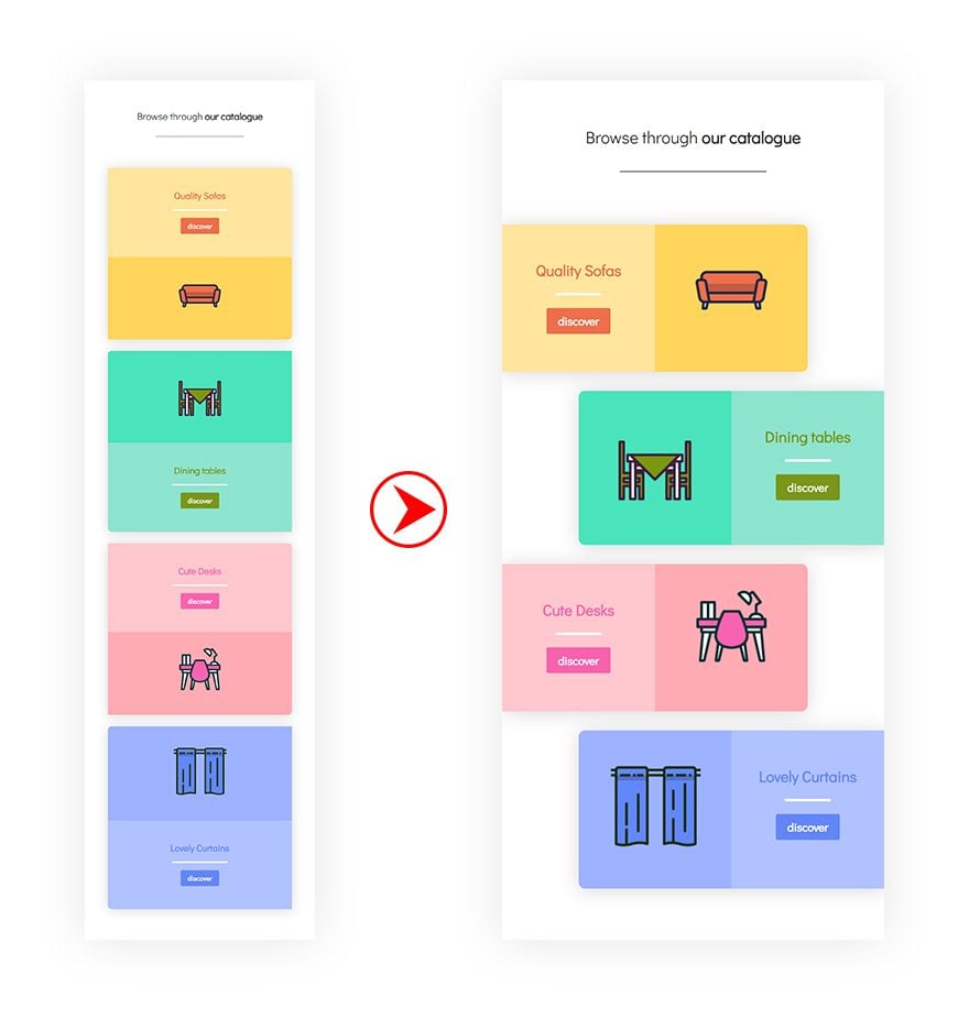
Desktop
Approach
Subscribe To Our Youtube Channel
1. Switch Over to Mobile View Right After Adding a New Page
The first thing you need to do, after adding a new page, is immediately switching over to mobile view. This will allow you to create a design that is mobile-oriented and accurate.
2. Enable Responsive Options for Each Design Element & Modify the Mobile Values First
Once you start designing whatever design you’re going for, you’ll want to enable the responsive options for design elements. This includes but is not limited to text size, padding and margin. The first values you’ll add will be the mobile values (instead of the desktop ones) to make sure the design is optimized for mobile first.
3. Remove Default Space Between Columns & Add Padding Manually if Needed
To create more horizontal space, it’s also recommended to remove all of the default custom padding between columns. If needed, you can always add the padding manually to each column or design element and choose for yourself how much distance you want there to be.
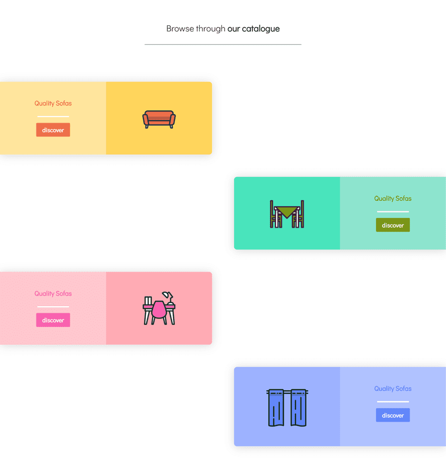
4. Place 2 or 3 Columns Next to Each Other to Create a Horizontal Design
The responsive structure in Divi is vertically-oriented. This means that modules and columns appear below each other. This, however, requires more vertically scrolling. Depending on the design your working on, creating a more horizontal flow can really make the difference.
5. Modify Desktop & Tablet Views Along the Way or Afterwards
Even though you’re designing for a mobile-first purpose, it’s important to keep the other views in order as well. Responsive options that are included within each design element will help you accomplish that. You can choose to modify these values afterwards or throughout the designing process.
Let’s Start Recreating the Example!
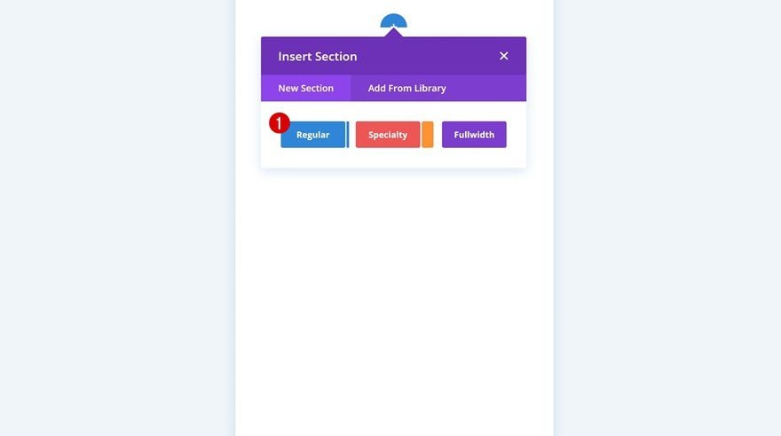
Add New Section
Open a new page, switch over to mobile view and add a new section to get started.
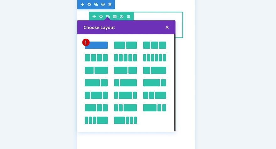
Add Row #1
Column Structure
Continue by adding a new row to your section using the following column structure:
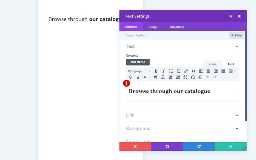
Add Text Module to Row
Add H2 Content
Add a Text Module to the column of your row and enter some H2 title content.
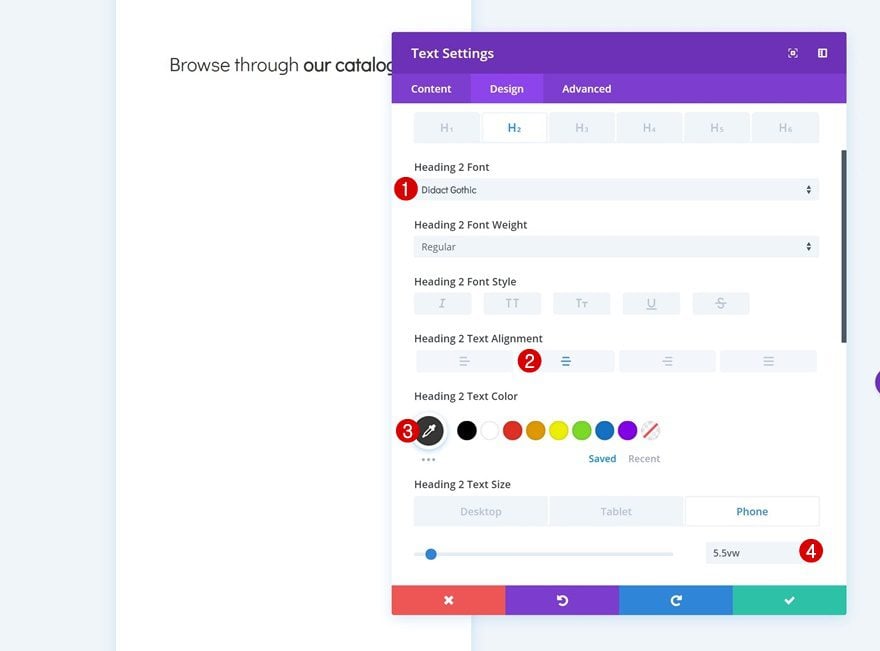
H2 Text Settings
Then, go to the heading text settings and change the appearance of the title.
- Heading 2 Font: Didact Gothic
- Heading 2 Text Alignment: Center
- Heading 2 Text Color: #333333
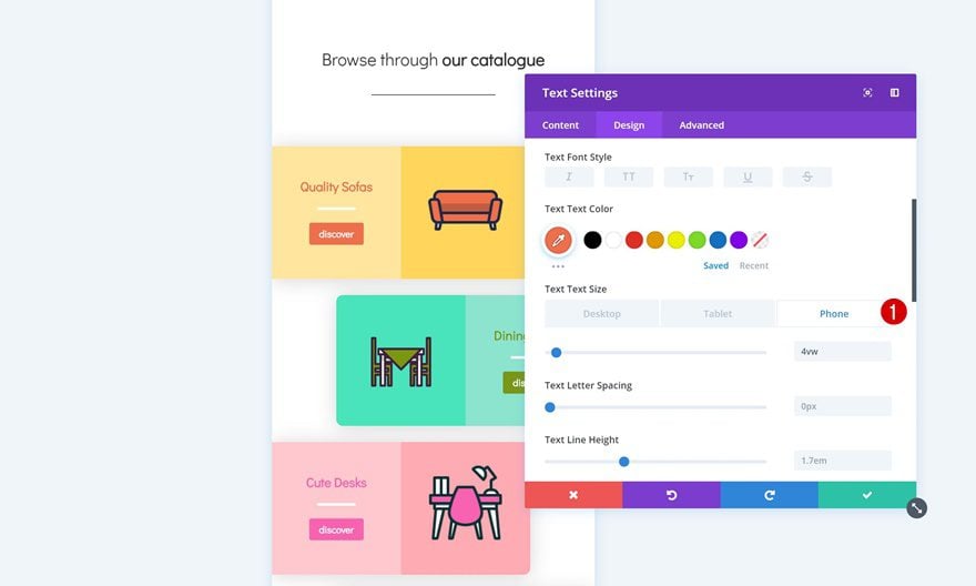
- Heading 2 Text Size: 5.5vw (Phone), 5vw (Tablet), 2vw (Desktop)
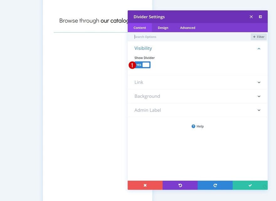
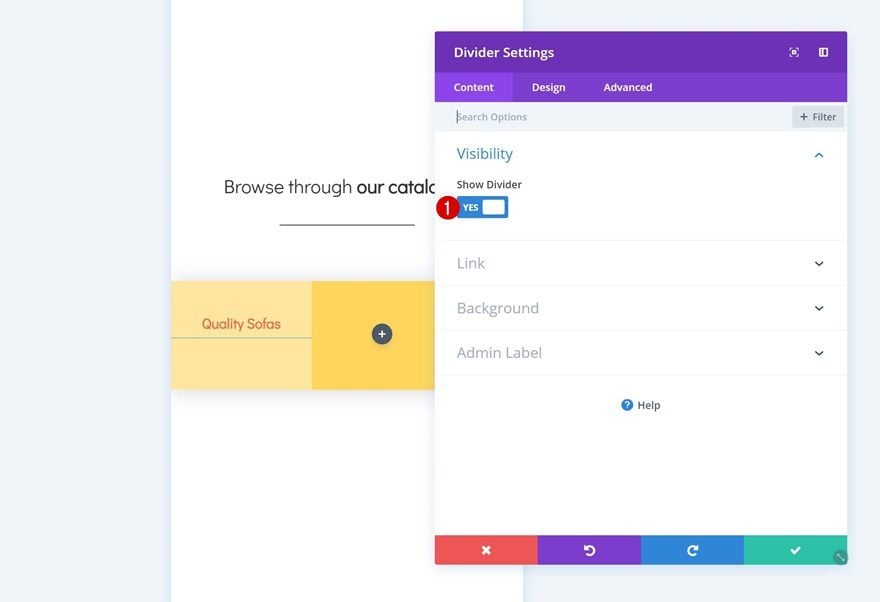
Add Divider Module to Row
Visibility
Right below the Text Module you’ve added, go ahead and add a Divider Module. Make sure the ‘Show Divider’ option is enabled.
- Show Divider: Yes
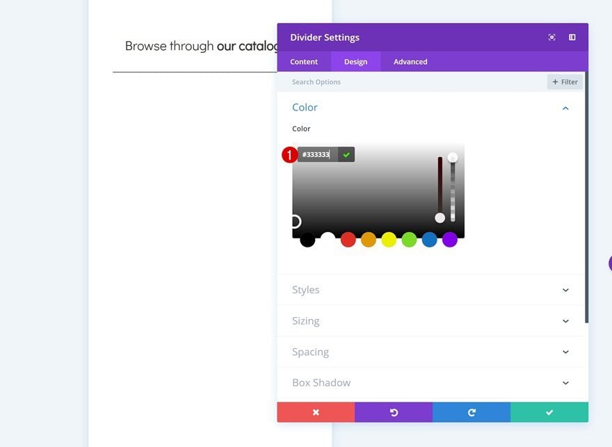
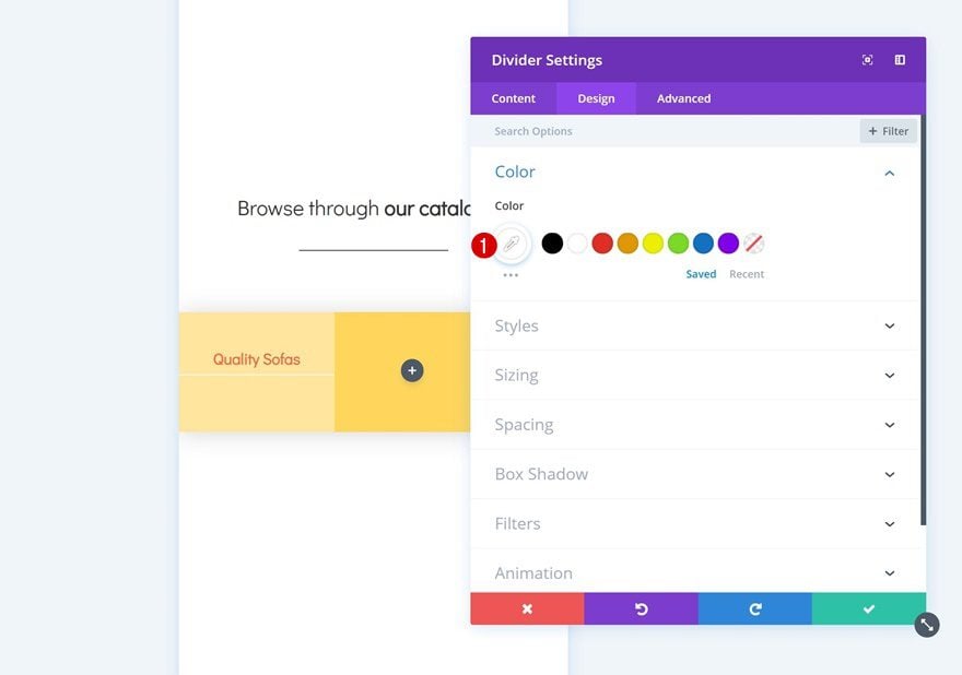
Color
Then, go to the design tab and change the color of the divider.
- Color: #333333
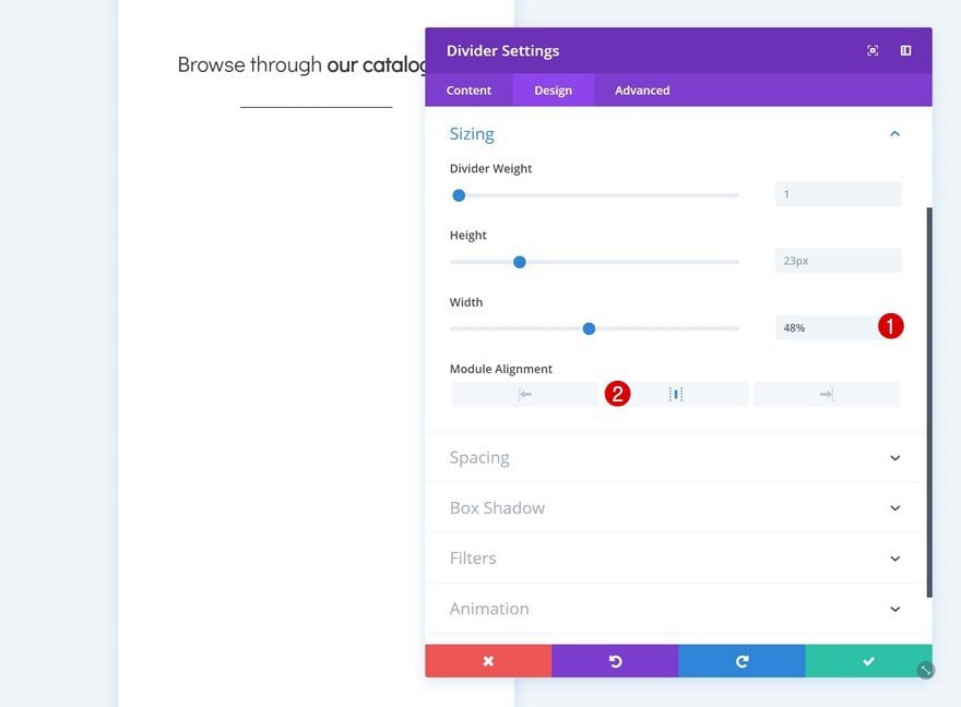
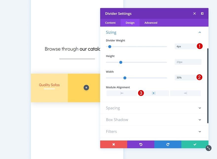
Sizing
Modify the sizing settings as well.
- Width: 48%
- Module Alignment: Center
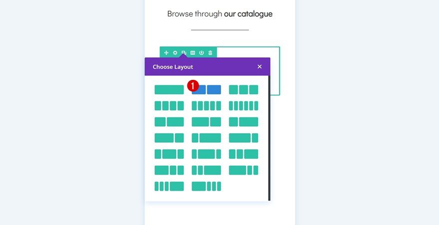
Add Row #2
Column Structure
Continue by adding another row to the section using the following column structure:
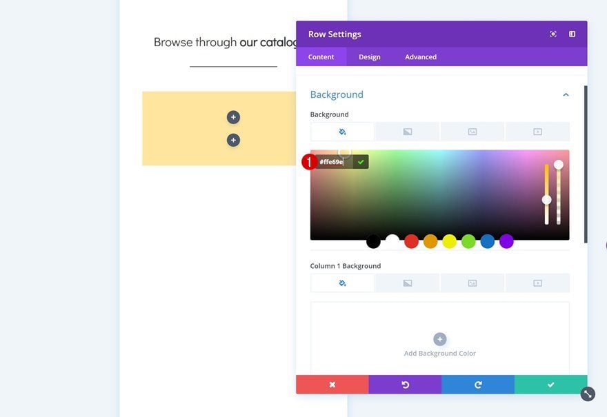
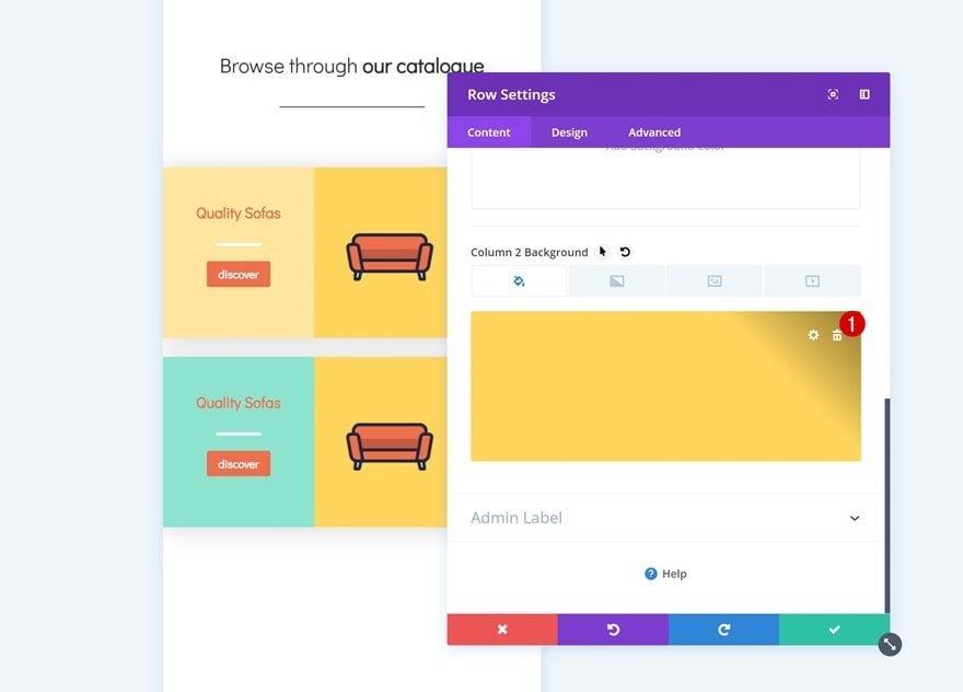
Background Color
Without adding any modules yet, open the row settings and add a background color to the row.
- Background Color: #ffe69e
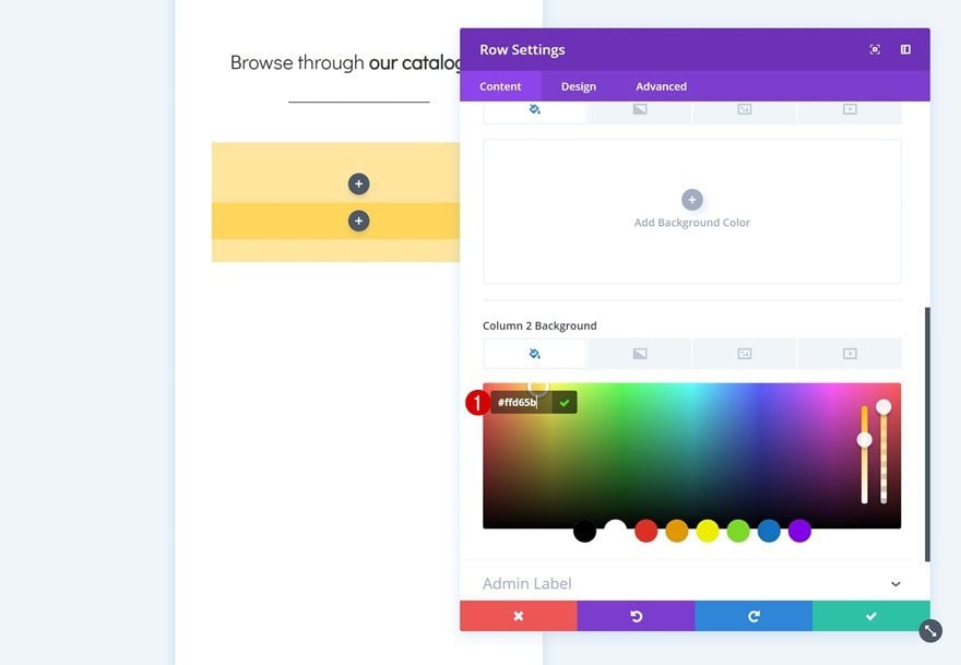
Column 2 Background Color
Add a background color to the second column of the row as well.
- Column 2 Background Color: #ffd65b
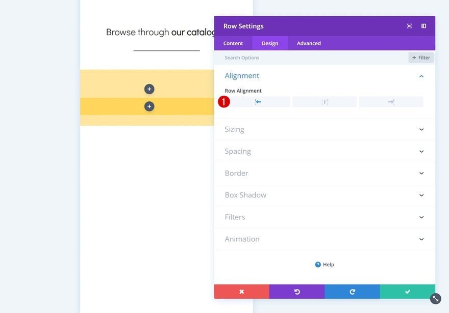
Alignment
Then, change the row alignment.
- Row Alignment: Left
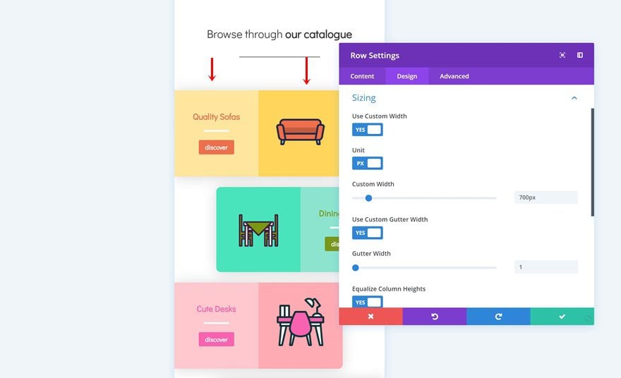
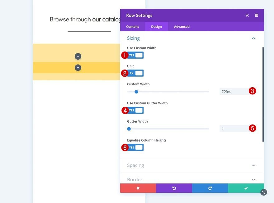
Sizing
Open the sizing settings next. Here, we’ll want to remove all the default space between columns. We’re also using custom width for the column to make it look good on desktop.
- Use Custom Width: Yes
- Unit: PX
- Custom Width: 700px
- Use Custom Gutter Width: Yes
- Gutter Width: 1
- Equalize Column Heights: Yes
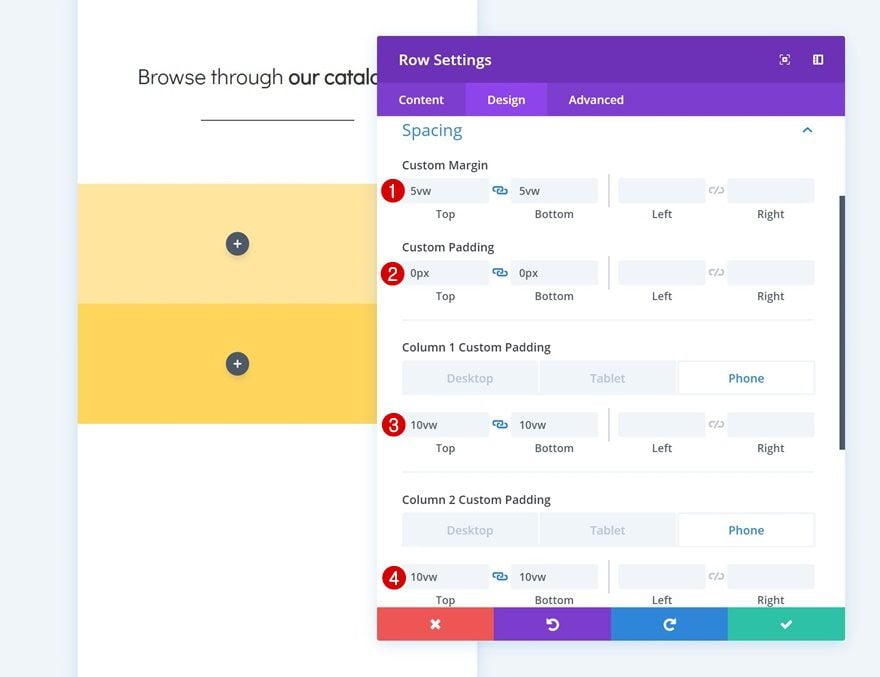
Spacing
Continue by going to the spacing settings and add some custom margin and padding values manually.
- Top Margin: 5vw
- Bottom Margin: 5vw
- Top Padding: 0px
- Bottom Padding: 0px
- Column 1 Top Padding: 10vw (Phone), 8vw (Tablet), 4vw (Desktop)
- Column 1 Bottom Padding: 10vw (Phone), 8vw (Tablet), 4vw (Desktop)
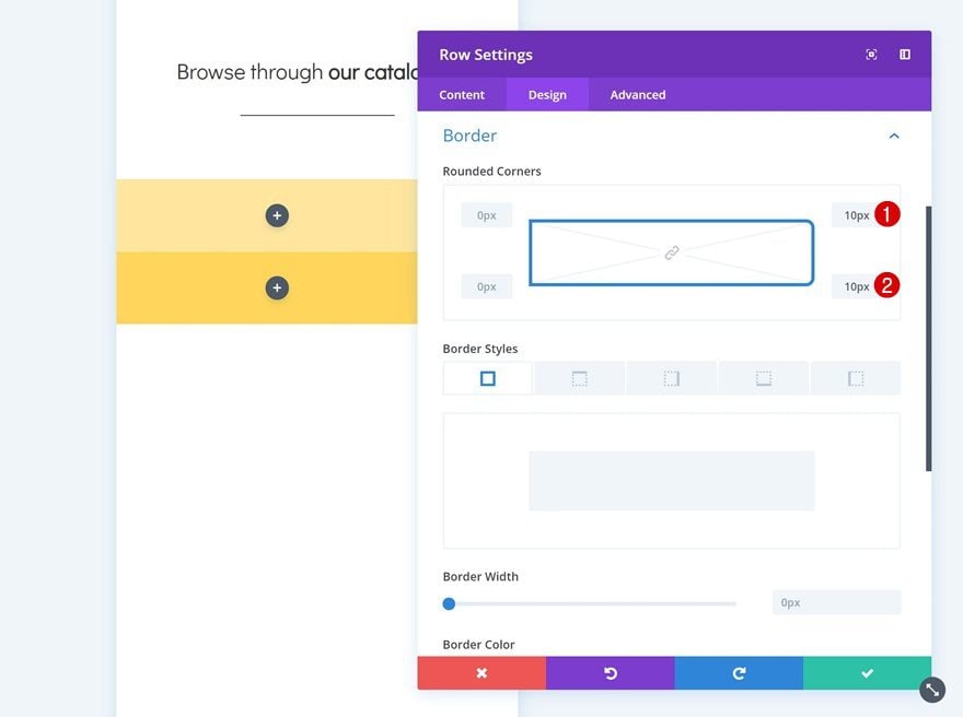
Border
Add some rounded corners to the row as well.
- Top Right: 10px
- Bottom Right: 10px
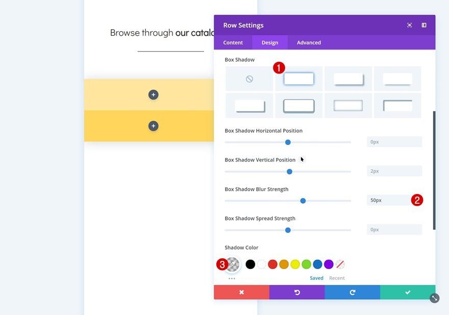
Box Shadow
And give it a subtle box shadow too.
- Box Shadow Blur Strength: 50px
- Shadow Color: rgba(0,0,0,0.16)
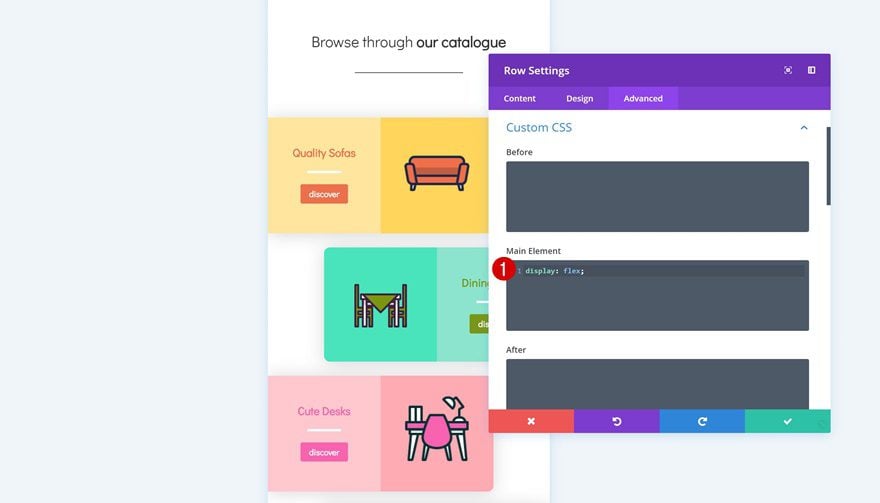
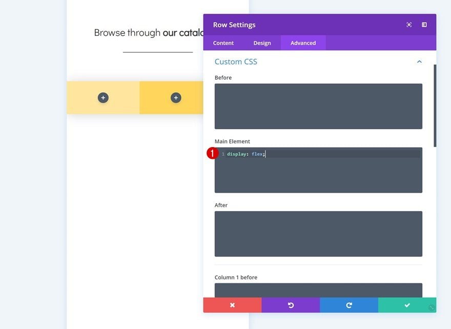
Custom CSS
Last but not least, we’re going to place the columns next to each other on smaller screen sizes to make sure we’re taking full advantage of the horizontal space we have. Go to the advanced tab and add a single line of CSS code to the main element.
display: flex;
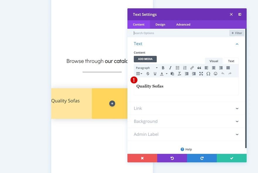
Add Text Module to Column 1
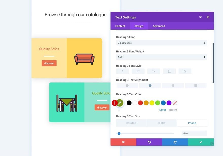
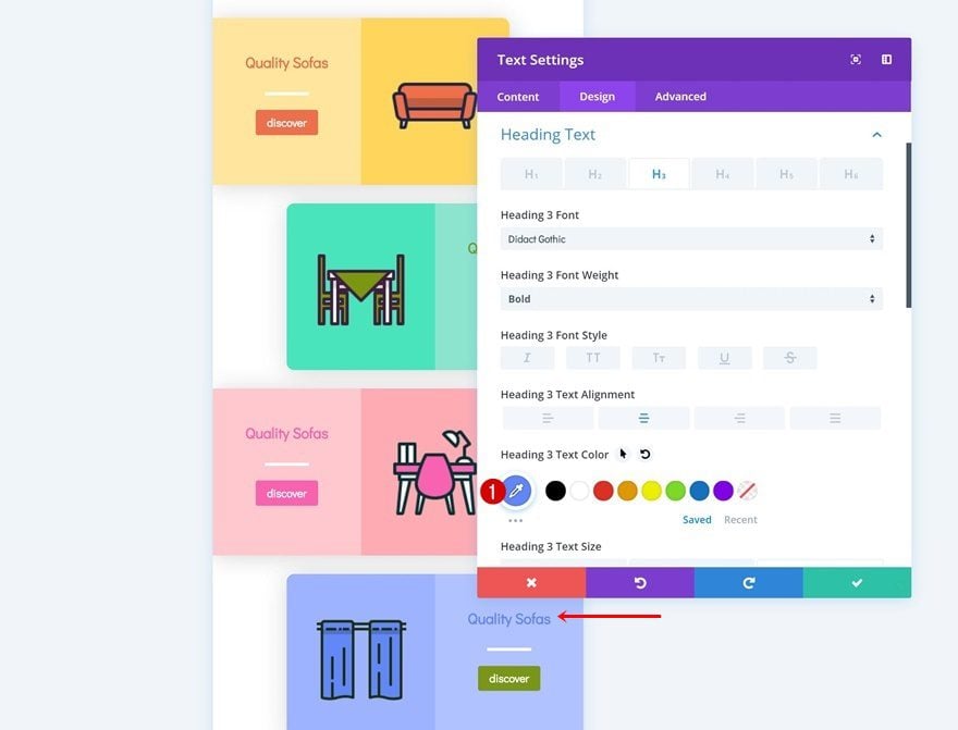
Add H3 Content
Time to start adding modules! Add a title Text Module to the first column and enter some H3 content.
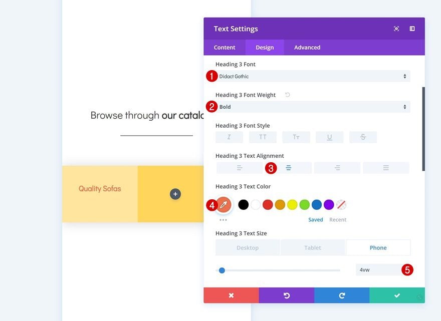
H3 Text Settings
Then, go to the design tab and modify the heading text settings.
- Heading 3 Font: Didact Gothic
- Heading 3 Font Weight: Bold
- Heading 3 Text Alignment: Center
- Heading 3 Text Color: #ee6f49
- Heading 3 Text Size: 4vw (Phone), 3vw (Tablet), 1.5vw (Desktop)
Add Divider Module to Column 1
Visibility
Add a Divider Module next. Make sure the ‘Show Divider’ option is enabled.
- Show Divider: Yes
Color
Then, change the color of the divider.
- Color: #ffffff
Sizing
Along with the sizing settings.
- Divider Weight: 4px
- Width: 30%
- Module Alignment: Center
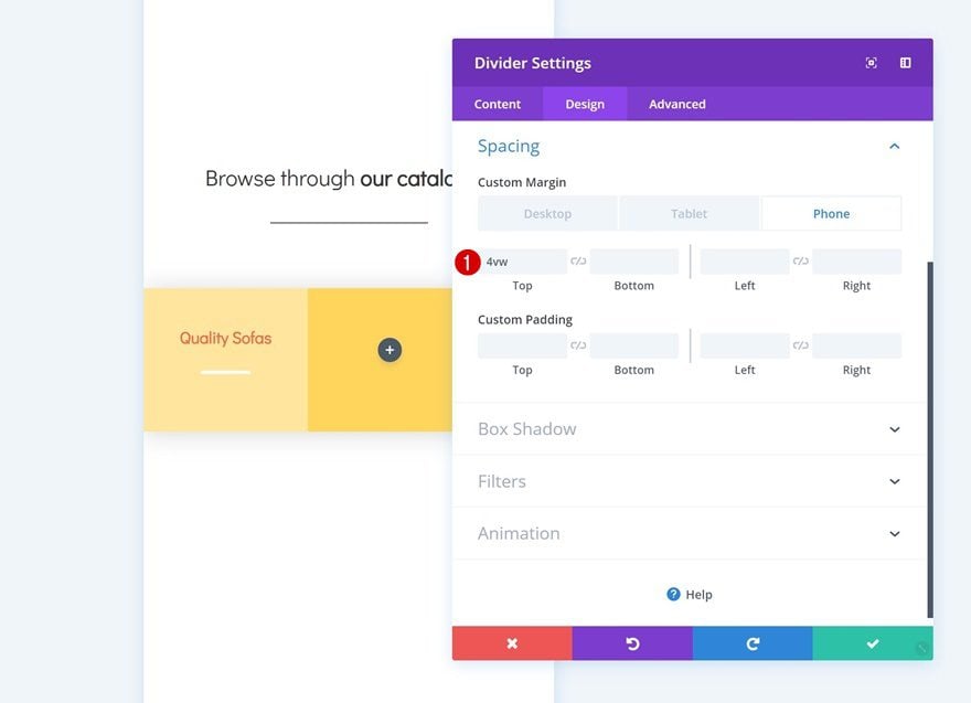
Spacing
Add some custom top margin to the module too.
- Top Margin: 4vw (Phone), 2vw (Tablet), 1.5vw (Phone)
Add Copy
The next and last module needed in the first column is a Button Module. Enter some copy.
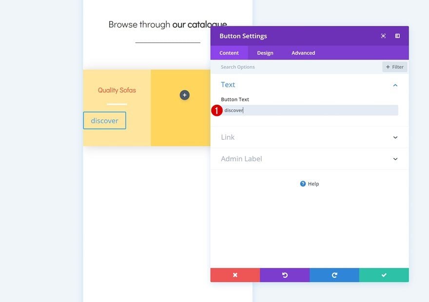
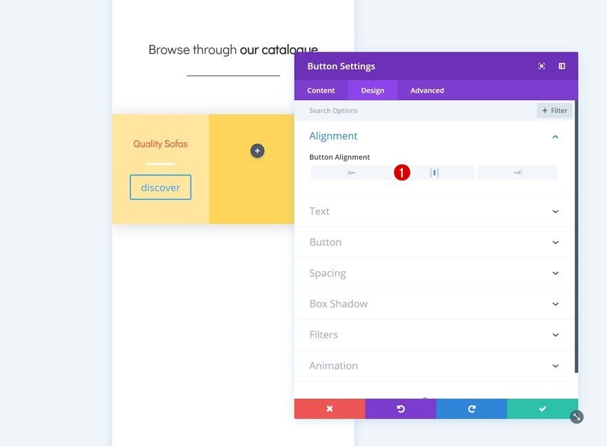
Alignment
Then go to the design tab and change the button alignment.
- Button Alignment: Center
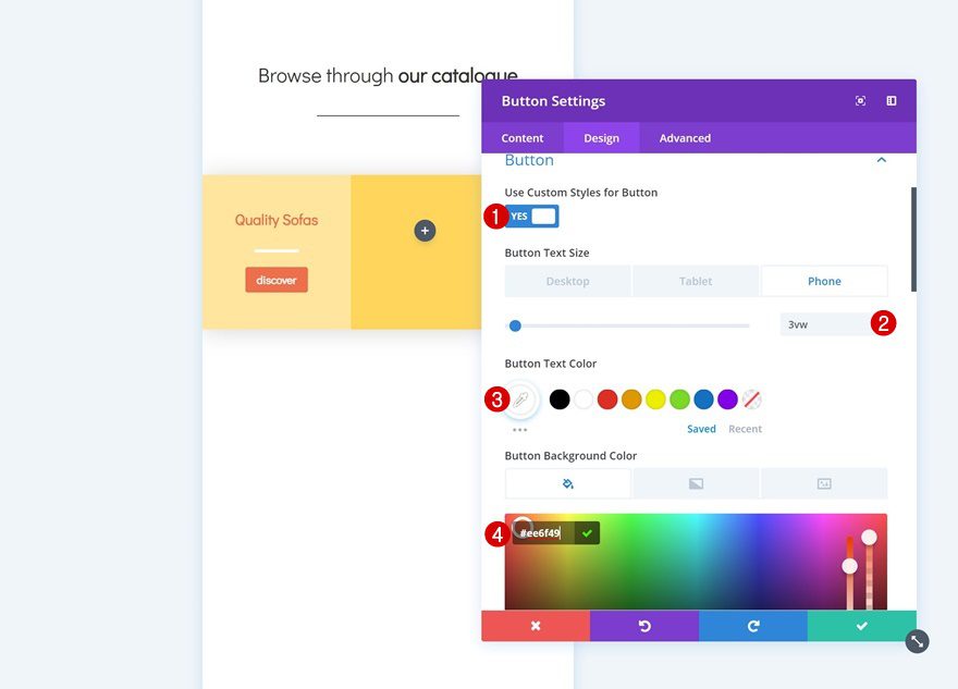
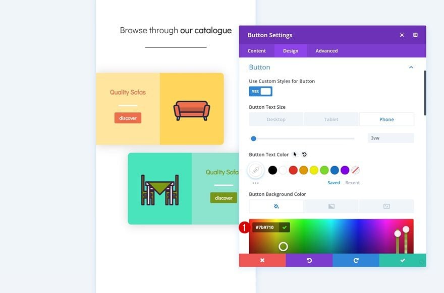
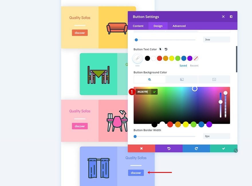
Button Settings
Modify the appearance of the button in the button settings as well.
- Use Custom Styles for Button: Yes
- Button Text Size: 3vw (Phone), 2vw (Tablet), 1.5vw (Desktop)
- Button Text Color: #ffffff
- Button Background Color: #ee6f49
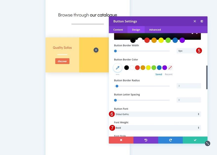
- Button Border Width: 0px
- Button Font: Didact Gothic
- Font Weight: Bold
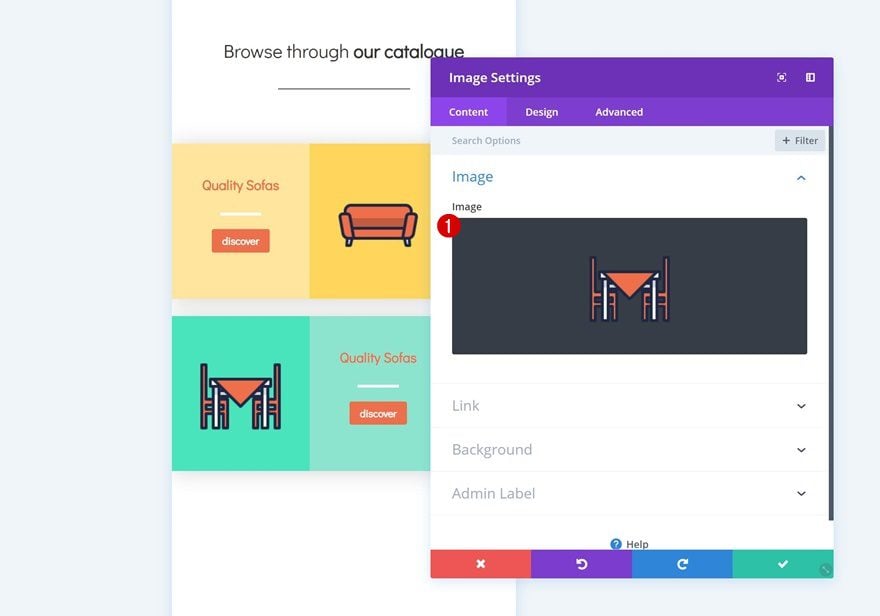
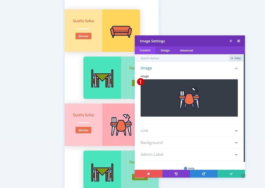
Add Image Module to Column 2
Upload Icon
The only module we’ll need in column 2 is an Image Module. You can use any image of your choice, but if you want to use the exact same icons that were used in this example, you can go to the Furniture Store Layout Pack and download them at the end of the post.
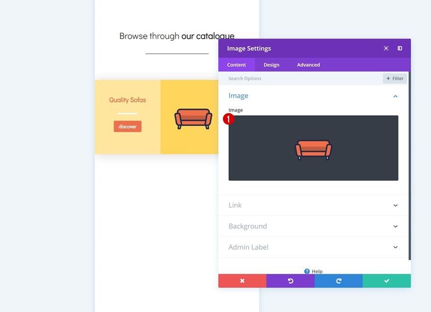
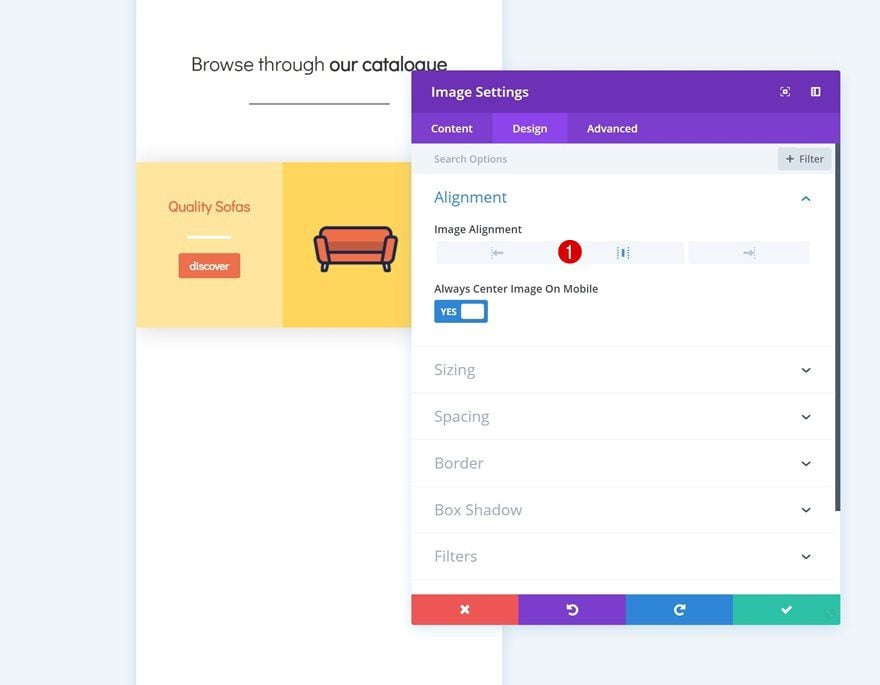
Alignment
Then, go to the design tab and change the image alignment.
- Image Alignment: Center
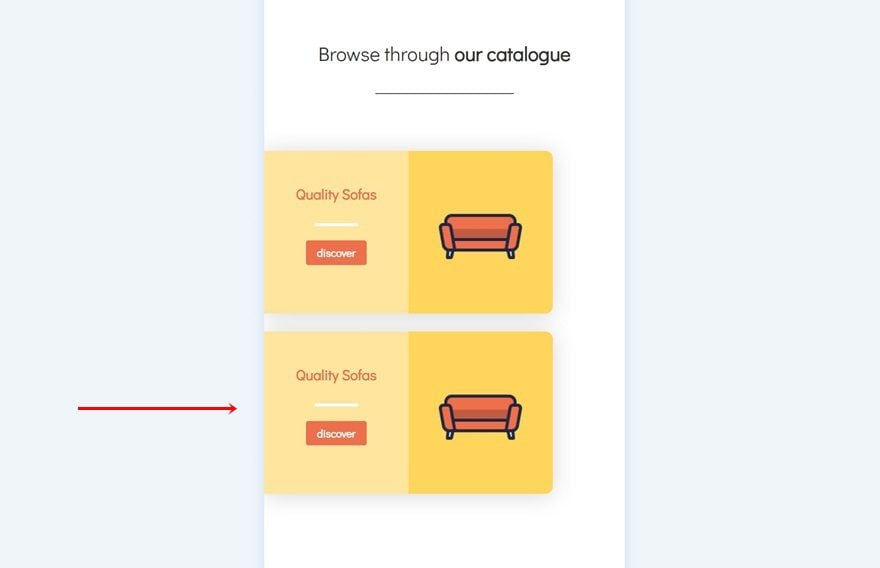
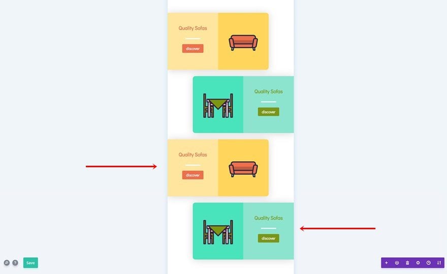
Clone Row #2
Once you’re done modifying the row, you can go ahead and clone it.
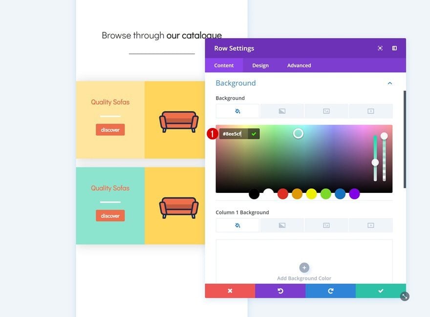
Change Row Background Color
We’ll need to make some changes to this duplicate, starting with the row background color.
- Background Color: #8ee5cf
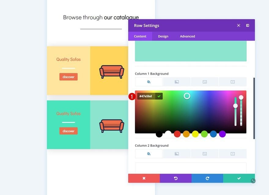
Remove Column 2 Background Color
Continue by removing the column 2 background color.
Add Column 1 Background Color
We’re adding a background color to the first column instead.
- Column 1 Background Color: #47e5bd
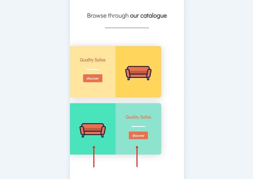
Change Modules in Columns
We’re also switching columns for the modules.
Change Icon in Image Module
Then, change the icon in the Image Module.
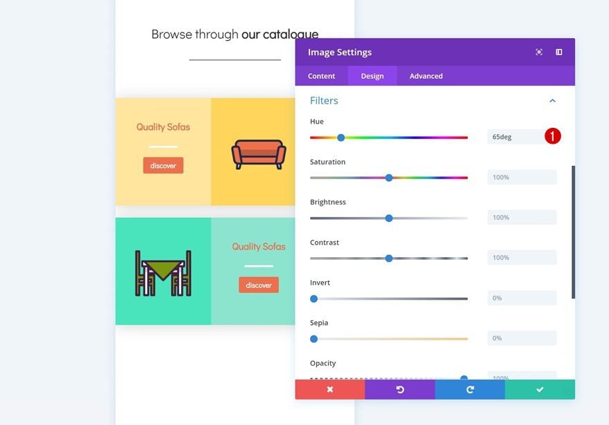
Add Filter to Image Module
And make it match with the new row and column background colors by changing the hue in the filters settings.
- Hue: 65deg
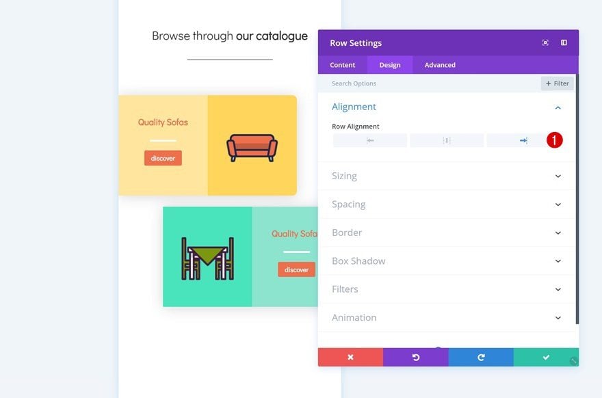
Change Row Alignment
Change the row alignment next.
- Row Alignment: Right
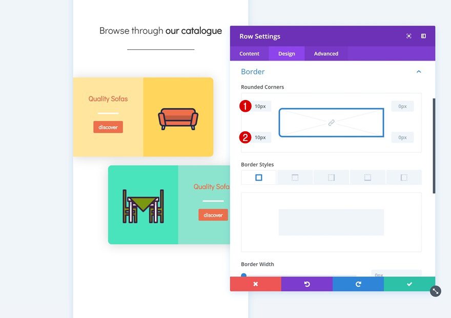
Change Row Border
Along with the rounded corners.
- Top Left: 10px
- Bottom Left: 10px
Change Text Color of Text Module in Column 2
We’re also using another text color for the Text Module in column 2.
- Heading 3 Text Color: #7b9710
Change Button Background Color
And we’re using that same color for the button background.
- Button Background Color: #7b9710
Clone Both Rows
Now that we have both sides of the row, we can clone both of them up to as many times as we need and place them in order.
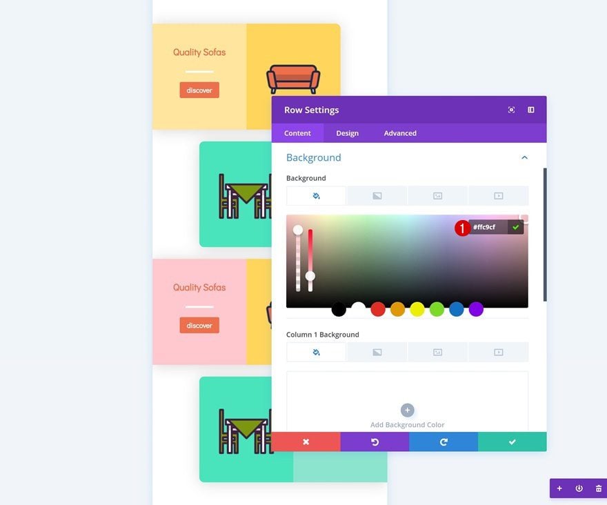
Modify Duplicate #1
Change Row Background Color
We’ll start by changing the row background color of the first duplicate.
- Background Color: #ffc9cf
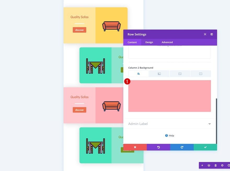
Change Column Color
Then, we’ll modify the column 2 background color as well.
- Column 2 Background Color: #ffadb6
Change Icon in Image Module
Change the icon in the Image Module to another one of your choice.
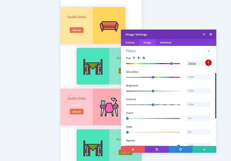
Add Filter to Image Module
And change the hue in the filters settings to make it match with the new row and column background colors.
- Hue: 309deg
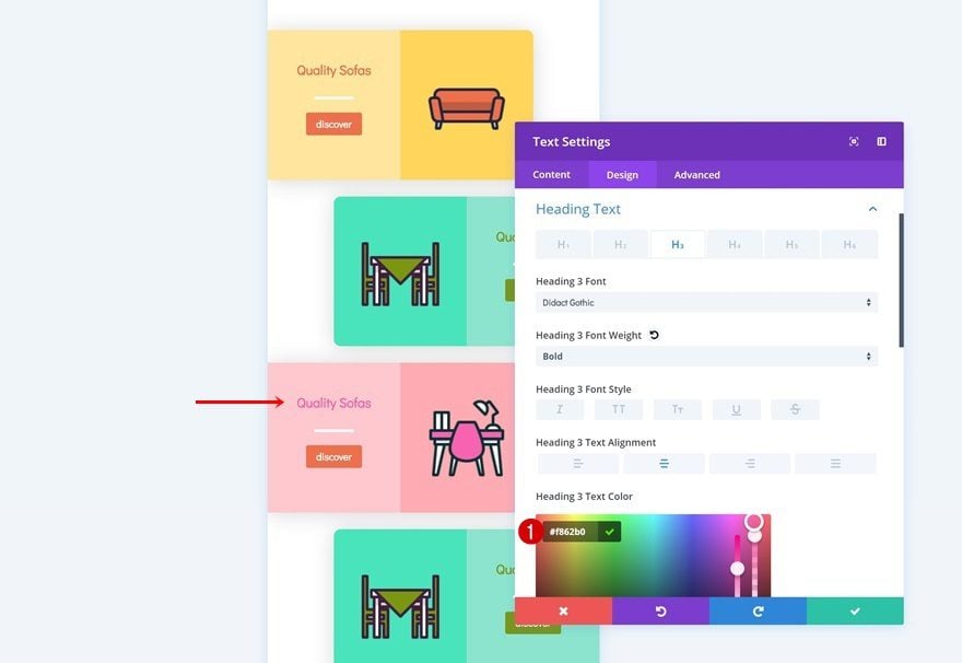
Change Text Color
We’re changing the text color too.
- Heading 3 Text Color: #f862b0
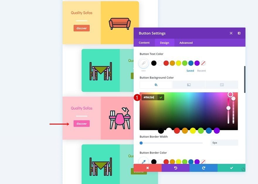
Change Button Background Color
And we’re using that same color for the button background.
- Button Background Color: #f862b0
Modify Duplicate #2
Change Row Background Color
On to the next and last duplicate! Change the row background color.
- Background Color: #b2c4ff
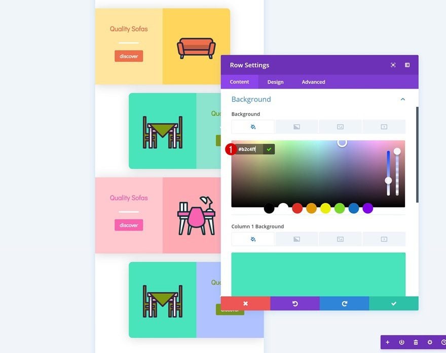
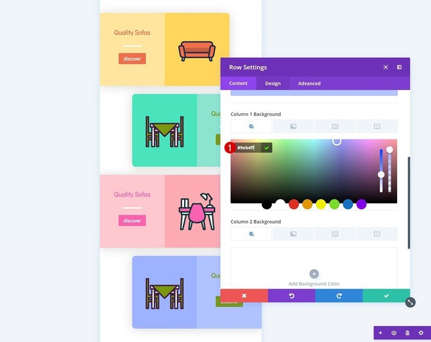
Change Column Color
Do the same thing for the column 1 background color.
- Column 1 Background Color: #9eb4ff
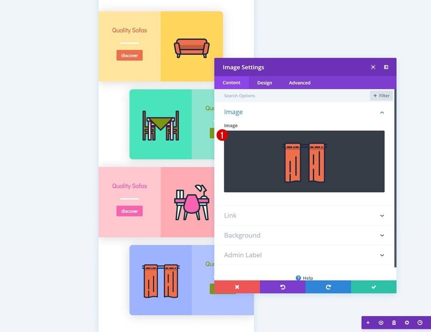
Change Icon in Image Module
Then, change the icon that is being used.
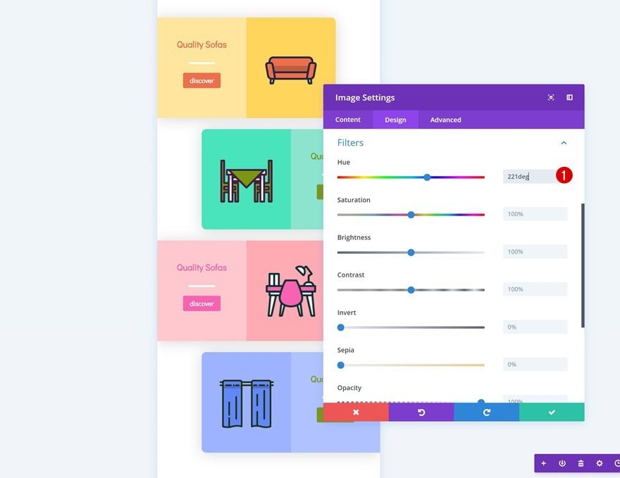
Add Filter to Image Module
Along with the hue in the filters settings of the Image Module.
- Hue: 221deg
Change Text Color
Modify the text color of the Image Module next.
- Heading 3 Text Color: #6287f9
Change Button Background Color
And use that same color for the button background.
- Button Background Color: #6287f9
Preview
Now that we’ve gone through all the steps, let’s take a final look at the outcome.
Mobile
Desktop
Final Thoughts
If your main source of visitors comes from mobile devices, it’s important to optimize everything for that particular screen size. With Divi, everything becomes instantly responsive. But just because something is responsive, doesn’t mean it is optimized for that particular screen size as well. Another way to approach designing for mobiles is by starting your design from a mobile-first perspective. In this post, we’ve shared some tips and tricks on how to do that. Afterwards, we’ve recreated an example that lives up to these rules and allows us to create a stunning outcome. If you have any questions or suggestions, make sure you leave a comment in the comment section below!


This is a very timely post and I want to thank you for sharing this.
In a recent update (January 1, 2019), I created sliders for my home page (using the Divi Builder) and being “old-school” I created the site for desktop and I shut off the photos for the mobile. I personally hate that everyone wants to do everything on their phone. I try to use great photos and they look great (resolution-wise) on the tablet and the desktop. I didn’t think that they looked good at all on the mobile app.
My question, is that if I enable the mobile app to see everything that I used in Divi (not a 3rd party plug-in), will they show up as well as they do in the desktop version?
I thought responsive meant responsive across all platforms. Now it looks like we get to be mobile app developers first…….
I also know that if people are doing everything on a phone, then I guess we have to design for that. Just frustrating because my time is limited on so many things in life, now I have to learn how to do my website for a phone (for some people) who won’t look at a desktop/tablet.
I guess that is just “welcome to technology.” :=)
Thank you for the information.
How can I have vw instead of px?
In some fields you can just write it. The same with em.
Divi, please listen to these respondents’ complaints about the fake “mobile views” your builder offers for once.
This is perhaps the HUGEST (that’s not a word is it? most hugest? *schwink*) problem with Divi to date. The mobile “views” are not at all that. They are just skinnier versions of desktop views. In a world where well over 50% of websites are viewed exclusively on mobile devices, this fake solution in Divi is mind-blowing. How has this not only NOT BEEN the #1 concern at Divi/Elegant Themes, it’s not even in the discussion? I read this blog every time it comes out, and it’s not even on the table. Fun to create all of these nifty time savers like extending module designs, etc. But ALL OF THE TIME SAVERS COMBINED so far, don’t save me a fraction of the time I would be saved if I didn’t literally have to check every mobile design by going thru this same rigamarole time and time again:
>save mobile design
>wake iPhone/iPad/Android phone
>refresh page
>observe the innumerable wackadoodles in actual mobile rendering of the design that I couldn’t see in the Divi builder
>rotate each mobile device from portrait to landscape to see even more wackiness
>guess what adjustments to make to correct what didn’t ACTUALLY work on a mobile device
>make change
>and repeat
>and REPEAT
>AND REPEAT until it finally looks good on an actual mobile device.
I feel like the smartest, simplest thing to do is just keep the builder up to date with various mobile specs, so when we choose a mobile view, we can next select the mobile device -or- at the very least set the builder’s defaults to match the smallest screen sizes for each smart device that is still updated by its OS provider. For example, I think Apple still sells the iPhone SE, and the iPad mini 4. But they are still updating the iPhone 5s and earlier iPad minis. Then, let the device scale up for its own screen. Scaling up never seems to cause problems, but the Divi defaults are not actually mobile-friendly, let alone mobile-optimized, for ANY mobile device I’ve ever used so far.
I find the mobile “views” in the Divi builder to be a cruel joke. (In fairness, maybe what I’m asking for is waaaaay outside the skillset of the coders at Divi. If so, feel free to say so.) These “mobile views” could be so great, but no, instead they just sit there taunting us with, “Wouldn’t it be great if we were useful? Aren’t you sooooo tempted to design mobile with us even though you know we’re just gonna lead you to ugly websites when viewed on mobile devices? Isn’t it HILARIOUS that you pretty much have to use us just to see what the website could look like on mobile but actually won’t. And don’t you love the risk of getting egg on your face if you forget to check literally every detail using a mobile device before your client sees it and has to wonder if they hired the right person for the job? Cortisol is fun! You’re welcome!”
Divi, fix it????? PLEASE????? I really don’t know how to be more emphatic about where this should fall in your priority list (NUMBER ONE, NUMERO UNO, AT THE TOP) and still adhere to your comments policy.
I didn’t have so many problems with mobile… Normally I adjust all from the builder, and later I make a general check from my mobile to see if there is something odd, but normally it is not too much…
Great post
Thanks for the post, I found a few things to be very helpful. I personally tend to start with the default view (desktop) and then I go back and edit the tablet and mobile version of the padding/margin/text etc. Is this way of doing it considered bad practice? If so, then I’ll start doing the mobile first option, as you described in the post. Would I get a different outcome (in terms of looks across the 3x device categories) when I start with desktop and then backtrack and optimize the mobile version, versus the mobile first route? In my head (extremely newbie head) I assumed that the outcome would be exactly the same?
Some more tips such as the display: flex code would be highly appreciated 🙂 I had never heard of that before I read your post. I struggle getting my sites to look GREAT across all screen sizes and the display flex will hopefully make it easier to get it looking good. So PLEASE more little code snippets like that in the future 🙂
Thanks again
Good article. I’d be interested in seeing some real-world Divi examples that take this approach.
Beautiful theme.
Hello! Total newbie here so my apologies in advance if my question(s) sound silly >.<
I'm in the midst of building my site right now and so far, I've been doing all my pages in desktop version with the intention to optimise the pages for mobile later. Based on this tutorial, it seems like I can modify the elements on a page individually for mobile display so that it's mobile-optimised and I can do so without affecting the desktop design, am I right?
How about for tablet display? What factors and properties should I look out for to ensure that the page displays nicely on tablets or will the default mobile-responsive function in Divi be sufficient for tablet display?
This is a really good topic, because well more than half the visitors to the site I manage are on mobile devices. I would like to take more advantage of the very high screen resolution available on mobile. I was confused by a few things in the tutorial. First I wondered why “display: flex;” is not built into the row module. Second thing is that we never see the before and after images as if they are on mobile screens of the same width. Or is the design on the right side of the arrow for tablets? Finally the desktop view is left looking, frankly, terrible. I guess that is easy to change?
My goodness that is a timely post just listened to an episode on divichat about mobile first.
It would be great to be able to set width preferences for mobile which could be done at setup just like setting up the colours etc.
This is a great post.
The information will be extremely valuable for my future builds.
Thank you.
I’d love to see the ability to select a Width value. The default DIVI mobile width is wider than what I need to design for. Example 320px wide instead of 414px
Thank you for bringing this up. I can’t figure out why Divi continues to gloss over this regular complaint about the builder. This is perhaps the HUGEST (that’s not a word is it? most hugest? *schwink*) problem with Divi to date. The mobile “views” are not at all that. They are just skinnier versions of desktop views. In a world where well over 50% of websites are viewed exclusively on mobile devices, this fake solution in Divi is mind-blowing. How has this not only NOT BEEN the #1 concern at Divi/Elegant Themes, it’s not even in the discussion? I read this blog every time it comes out, and it’s not even on the table. Fun to create all of these nifty time savers like extending module designs, etc. But ALL OF THE TIME SAVERS COMBINED so far, don’t save me a fraction of the time I would be saved if I didn’t literally have to check every mobile design by going thru this same rigamarole time and time again:
>save mobile design
>wake iPhone/iPad
>refresh page
>guess what adjustments to make to correct what didn’t ACTUALLY work on a mobile device
>make change
>and repeat
>and REPEAT
>AND REPEAT until it finally looks good on an actual mobile device.
I find the mobile “views” in the Divi builder to be a joke. And a cruel one at that because they could be so great, but no, instead they just sit there taunting us with, “Wouldn’t it be great if we were useful? Aren’t you sooooo tempted to design mobile with us even though you know we’re just gonna lead you to ugly websites when viewed on mobile devices? Isn’t it HILARIOUS that you pretty much have to use us just to see what the website could look like on mobile but actually won’t. And don’t you love the risk of getting egg on your face if you forget to check literally every detail using a mobile device before your client sees it and has to wonder if they hired the right person for the job? Cortisol is fun! You’re welcome!”
Divi, fix it????? PLEASE?????
Because with builders, you can fix this issue yourself by learning css and how to write custom breakpoints as many have been doing for a few years now. The people like Elegant Themes that dev builders cannot and do not know what all devices people will view sites on and is left up to the site developer as it should be. Google web site breakpoints and you should be able to find plenty of examples. 😉
This may be newbie question. If I design the site using Divi which is responsive and optimize the design for each viewport shouldn’t it be considered mobile first when viewed on mobile? Or is the fact that if I design for the mobile viewport first, Divi creates the that first which would be considered “mobile first”? I am a little confused lol.
Mobile first means that you design for mobile devices first, as visitors are more likely to be on mobile devices. THEN you switch to desktop mode and make further embellishments. (Be warned though, if you are not concientious about the edits you make being ONLY for desktop, you can easily screw up your mobile version)
Right, so it doesn’t matter the order I design in as long as I pay attention to the mobile edits.
Thanks!
I’d like to see a live example of a site you created in a Mobile First design.