

In today’s tutorial, we’re going to explore the new and elegant possibilities the new Divi background design features bring to your websites and more specifically; by using gradient background overlays.
With this new background update, a lot of new options have been added to the Divi builder which will help you meet your needs when designing a website of your own or for a client. These new options allow you to play around with the way your website looks and feels.
Before the release of this update, most of the changes–that can now be made within the Divi builder–had to be made through custom CSS code. Making design changes to your background has now become easier than ever. With a few simple clicks, you can create beautiful backgrounds for all the different sections of your website.
The Gradient Background Overlays Examples
We’ve created three sections with a before and after image that will show you how the new options can enhance the whole feeling your website reflects and give that certain “je ne sais quoi” factor to it.
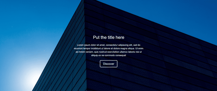
The Hero Section
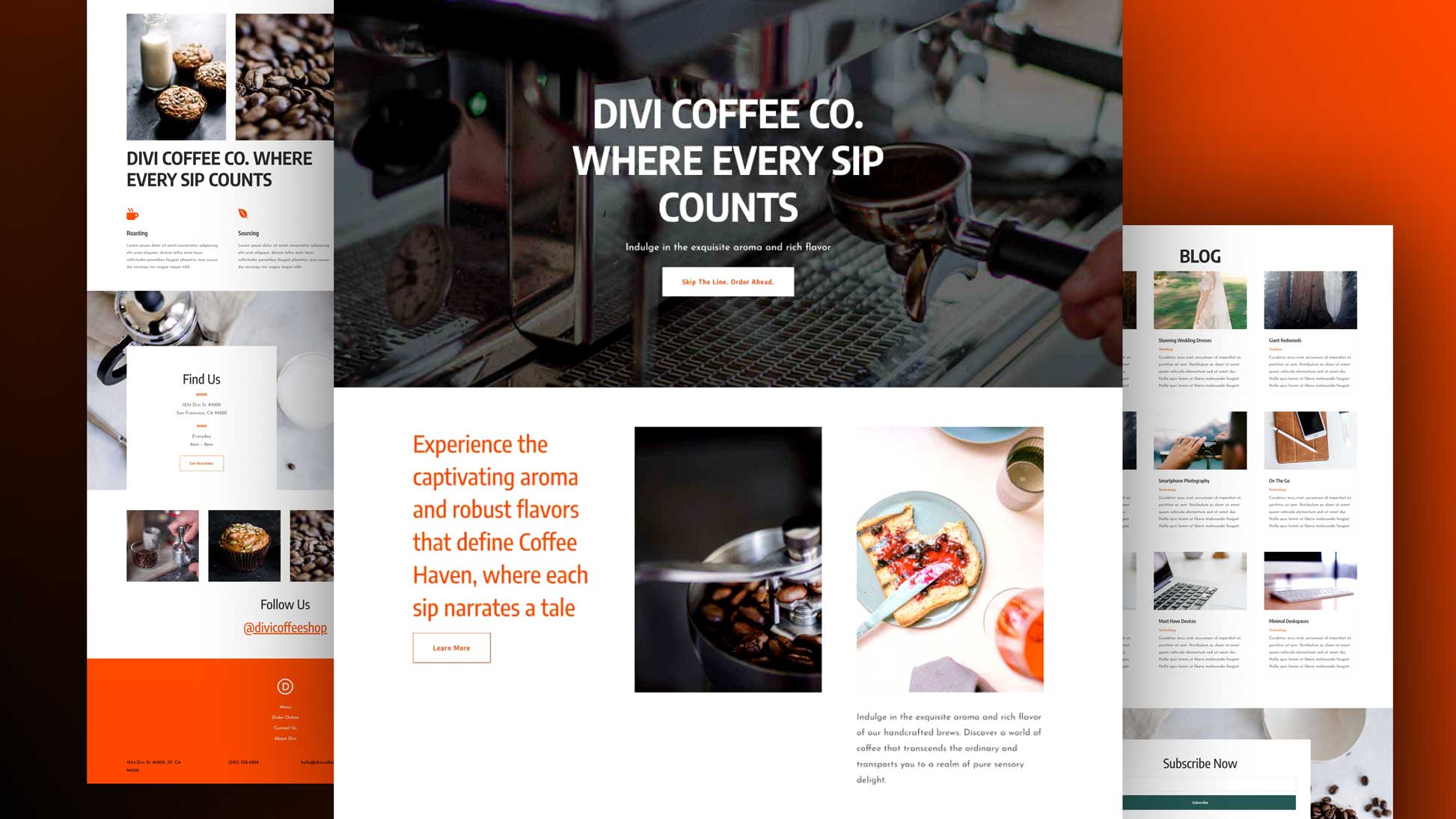
This is how the hero section looks like when adding a background image only:
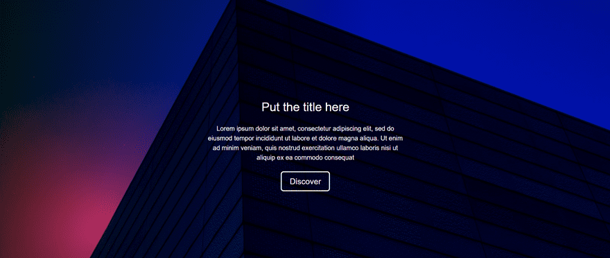
And this is how our end result will look like when we’ve added the gradient background overlay to the same background image that is used in the image above:
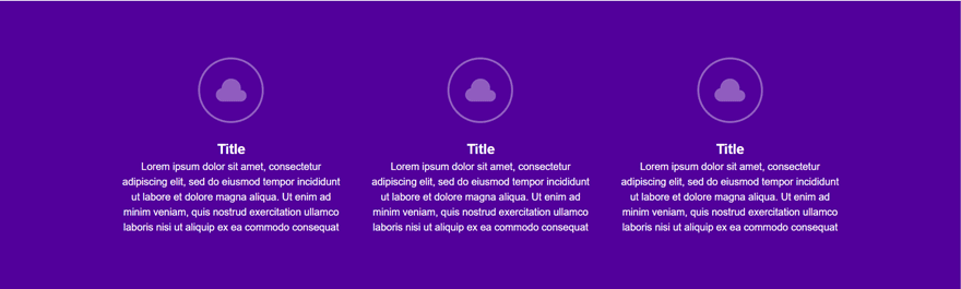
The Blurb Section
This is how the blurb section looks like when using a one-color background:
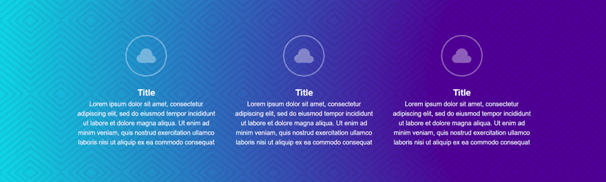
And this is how the end result looks like when we’ve added the gradient background overlay to a pattern background:
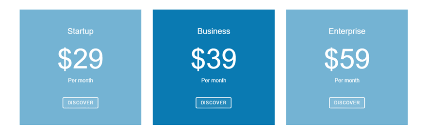
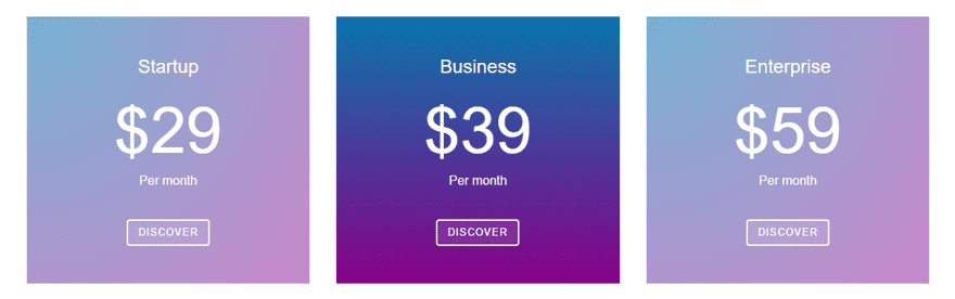
The Pricing Section
This is how the pricing section looks like when we use one color (in a lighter and darker tone):
And this is how the end result will look like after using the gradient background overlay:
Each one of them has different settings and we’ll show you exactly–and step by step–how to create this look so you can use it on your own websites.
Step by Step: The Hero Section
For the first section of this post, we’re recreating a hero section. This example will reflect how the background design feature can change the colors that are being used in the image. And although we’ve used a gradient background overlay, the changes we made are very subtle. We added a sense of darker tone to the image in combination with a differently colored sky.
Start Creating
Let’s start by creating a new page on your WordPress website. Now, add a standard section to that page with a fullwidth row. Next, place the different modules in your row. We used two Text Modules and one Button Module.
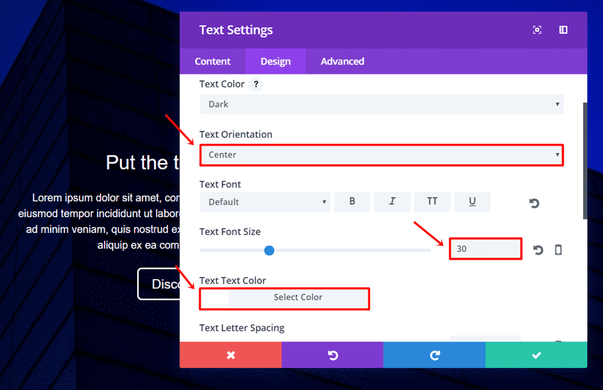
First Text Module Settings
The first Text Module is where the title of your hero section will appear.Type down the text you want to appear in the content box within the Text subcategory of the Content tab and move on to the Design tab.
Within the Design tab, make the following modifications to the Text subcategory:
- Text Orientation: Center
- Text Font Size: 30
- Text Font Color: #FFFFFF
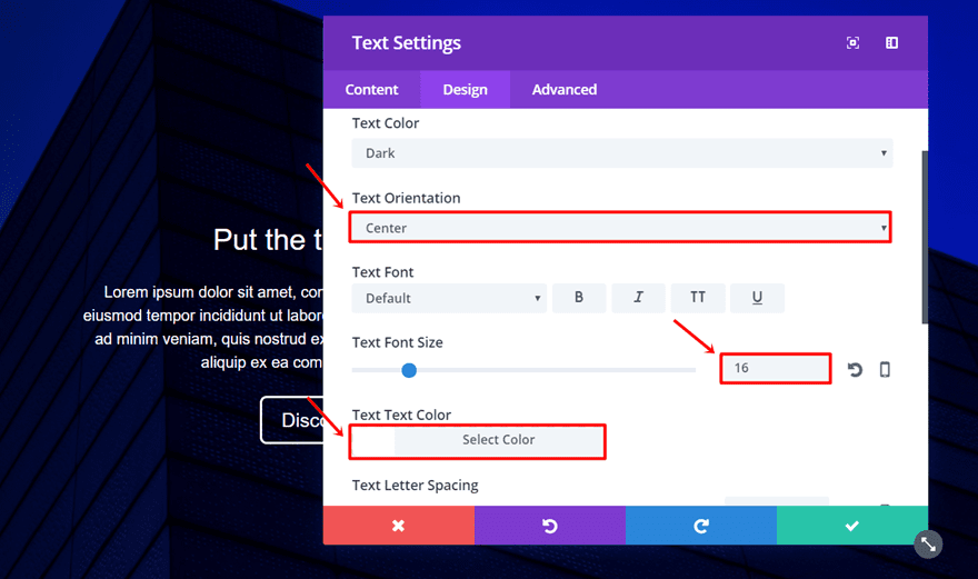
Second Text Module Settings
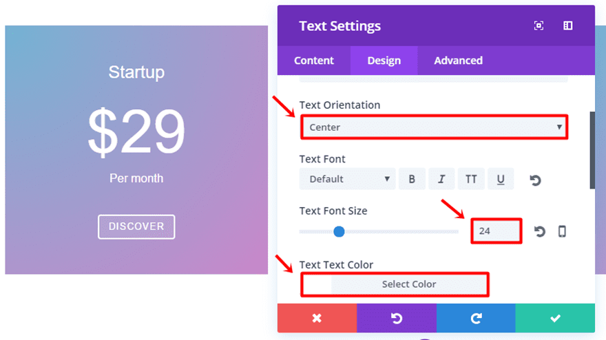
Now, open the next Text Module and enter the text in the content box as well. Next, go to the Design tab and make the following modifications to the Text subcategory:
- Text Orientation: Center
- Text Font Size: 16
- Text Font Color: #FFFFFF
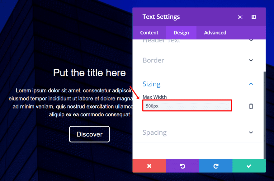
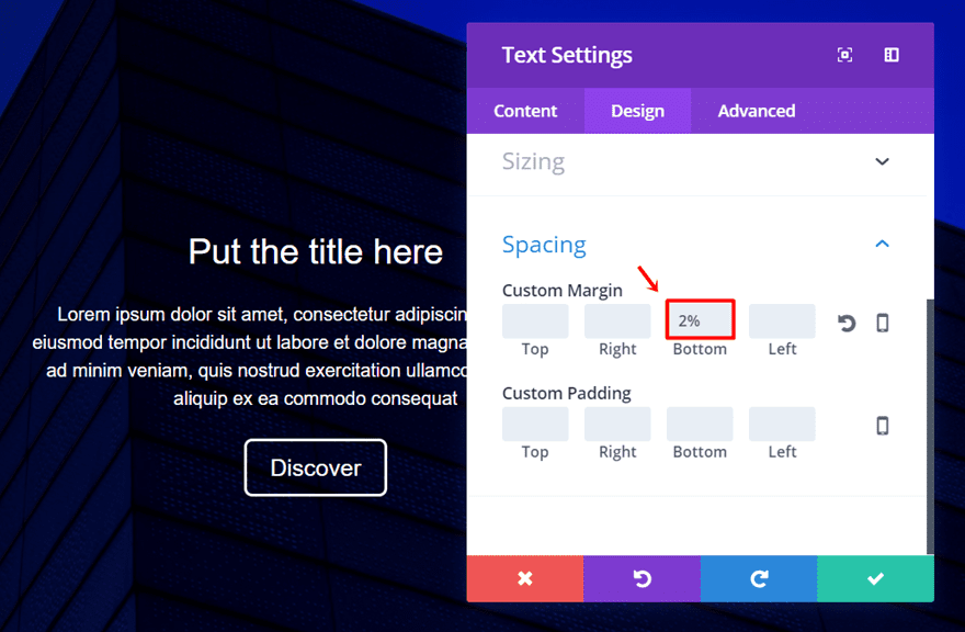
Scroll down the same tab and add ‘500px’ to the Max Width in the Sizing subcategory and ‘2%’ to the Bottom Margin in the Spacing subcategory.
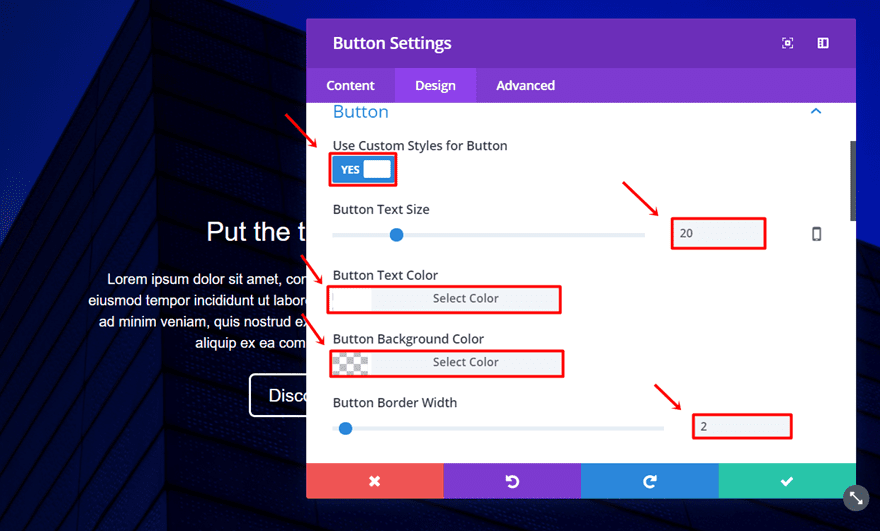
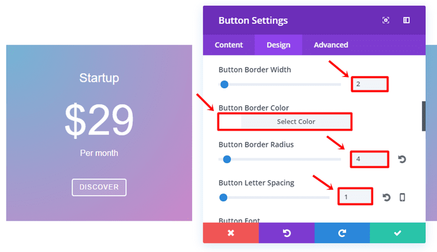
Last but not least, open the settings of the Button Module. Type down the CTA you want to link to your button in the Text subcategory of the Content tab and go to the Design tab.
Within the Design tab, make the following adjustments to the Button subcategory:
- Use Custom Styles for Button: Yes
- Button Text Size: 20
- Button Text Color: #FFFFFF
- Button Background Color: rgba(0,0,0,0)
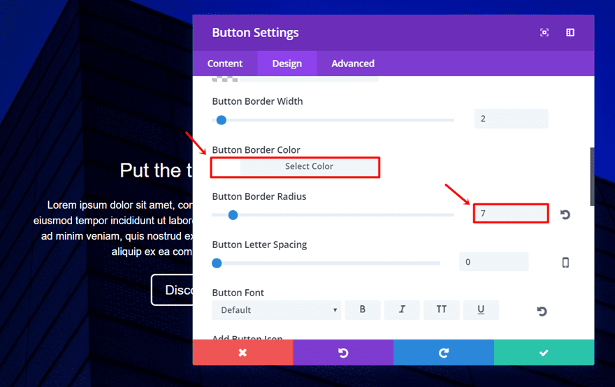
- Button Border Width: 2
- Button Border Color: #FFFFFF
- Button Border Radius: 7
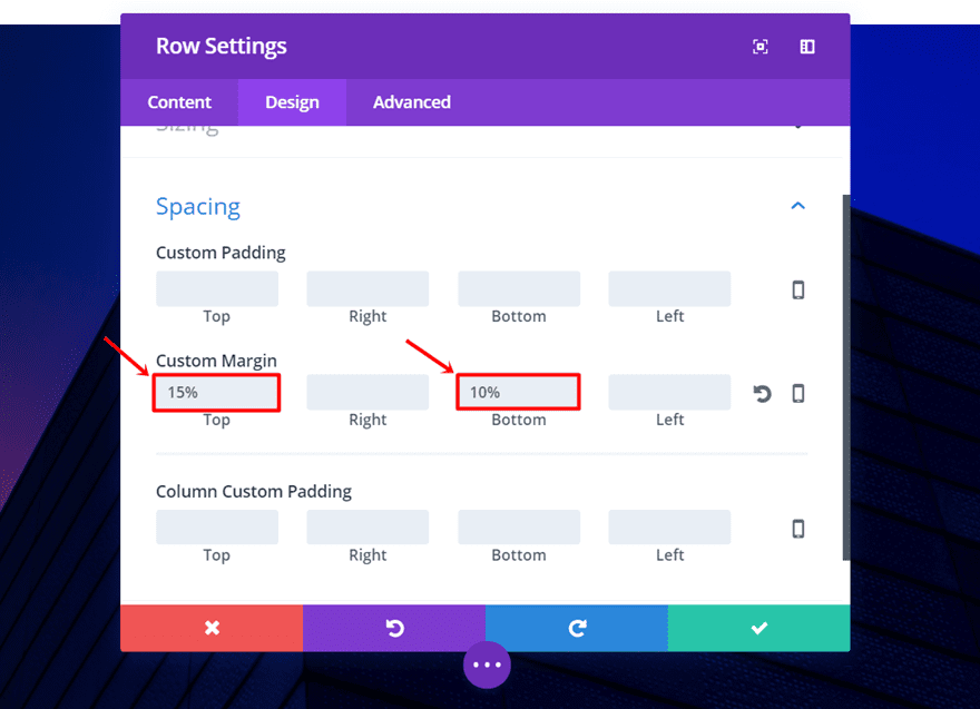
Now, open the row sections and make the following adjustments in the spacing subcategory of the Design module:
Top Margin: 15%
Bottom Margin: 10%
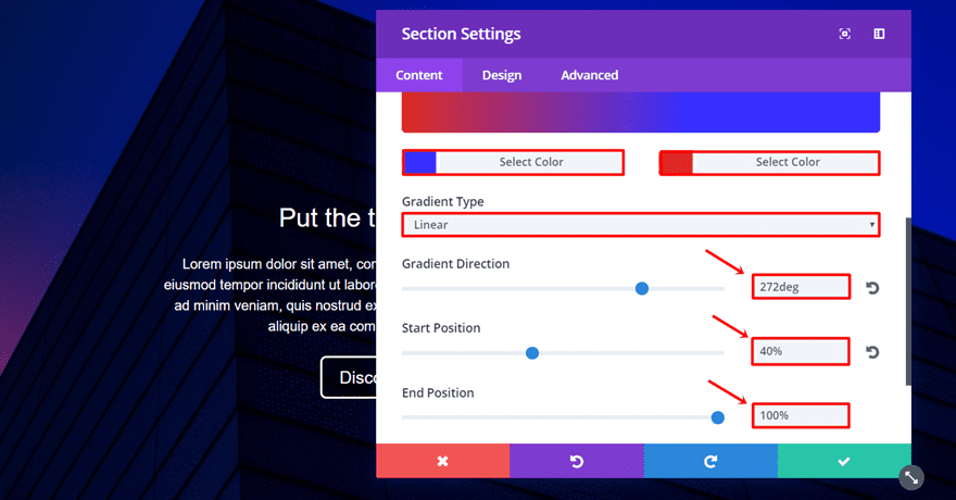
Gradient Background Overlay Settings
Now we get to the fun part; adding the gradient background overlay to the background image. Go ahead and open the setting of the section. Next, go to the Background subcategory and start by adding the gradient background.
For the example we made, we used the following settings:
- First Color: #3730ff
- Second Color: #e02b20
- Gradient Type: Linear
- Gradient Direction: 272deg
- Start Position: 40%
- End Position: 100%
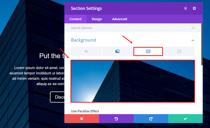
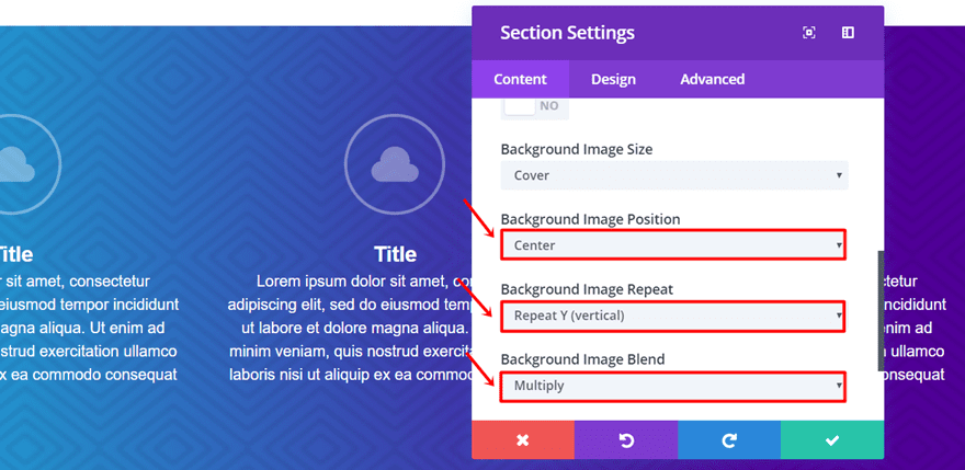
Now, go to the background image tab and add your image of choice. We deliberately chose an image that contains the sky to enhance the effect we’re trying to create.
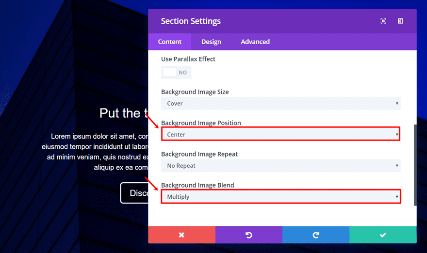
Now, scroll down the same tab. Center the background image and activate the Multiply option in the Background image blend drop-down menu. You have a lot of other options as well that can help you reach the exact result you want.
And, there you have the final result:
Step by Step: The Blurb Section
The second example we’re going to show you how to create is the blurb section. We want to keep the focus on the content of the blurb, that’s why we didn’t opt for a busy background but a pattern background instead.
The background pattern used in this example comes from Toptal. You can download the patterns you like to use them for all kinds of purposes–including the commercial ones. Just don’t forget to credit them in the source of your website as told in their FAQ.
We also made the blurb icons slightly transparent to make the gradient colors come through. Although each one of the blurbs has the same settings, the color that comes through the icons is slightly different and in line with the gradient colors that we’ve used.
Start Creating
Start by adding a standard section to a new page or an existing page. Within that section, we’ll need a row with three columns.
Continue by adding a Blurb Module in the first column of the row. We’ll use the same blurb module settings in each column. That’s why we only have to make the blurb module once and clone it for the two other columns.
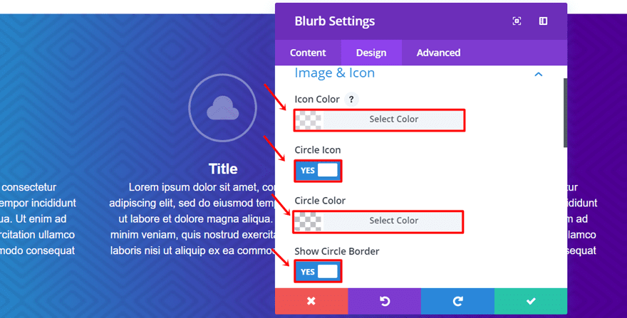
Blurb Settings
Open the settings of the Blurb Module and type down the title and content in the Text subcategory of the content tab. Move on to the Design tab and make the following adjustments to the Image & Icon subcategory:
- Icon Color: rgba(255,255,255,0.36)
- Circle Icon: Yes
- Circle Color: rgba(255,255,255,0)
- Show Circle Border: Yes
- Circle Border Color: rgba(255,255,255,0.36)
- Image/Icon Placement: Top
- Use Icon Font Size: Yes
- Icon Font Size: 96px
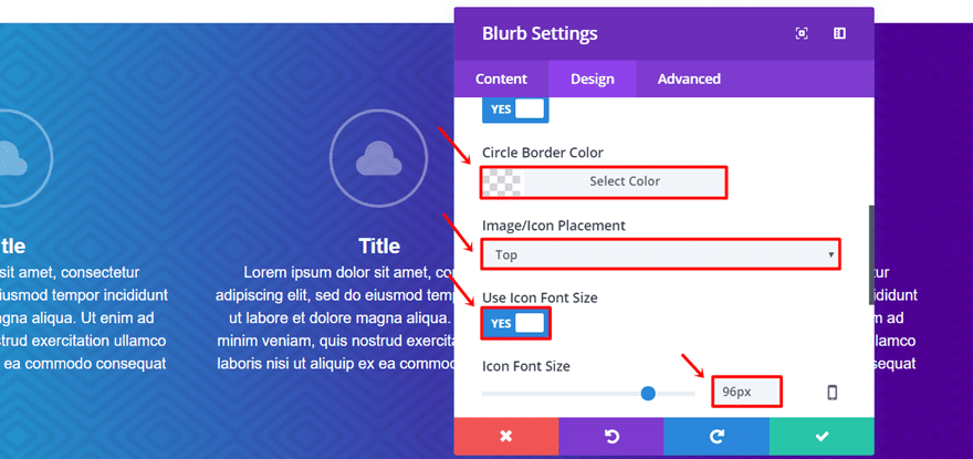
Scroll down the same tab and put the Text Orientation to ‘Center’ in the Text subcategory.
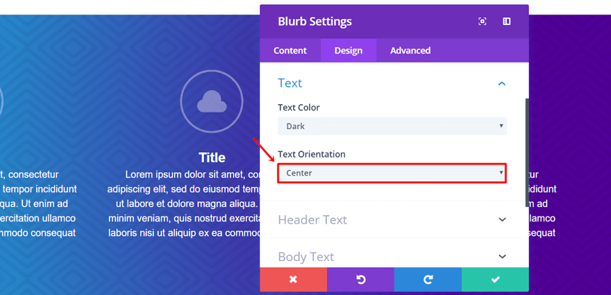
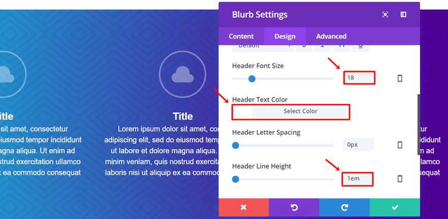
Continue scrolling and open the Header Text subcategory. Go ahead and use the following settings:
- Header Font Size: 18
- Header Text Color: #FFFFFF
- Header Line Height: 1em
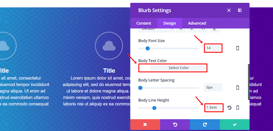
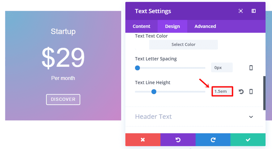
Now, the only thing left to change is the Body Text subcategory. Make sure the following settings apply:
- Body Font Size: 14
- Body Text Color: #FFFFFF
- Body Line Height: 1.5em
Don’t forget to clone the Blurb Module twice, place them in the other two remaining columns and change the content accordingly.
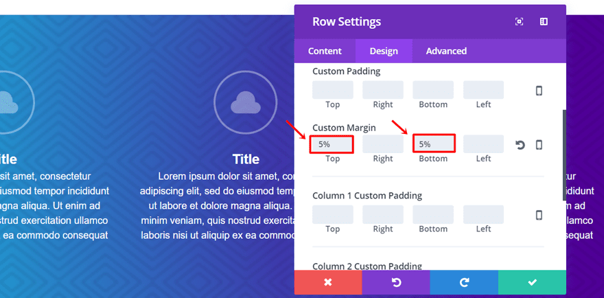
Row Settings
Open the row settings and go to the Spacing subcategory in the Design tab. The only thing you’ll have to do is change the top and bottom margin to ‘5%’.
Gradient Background Overlay Settings
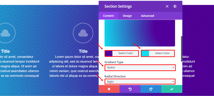
Last but not least, we’re going to add the background image with the gradient overlay. Open the settings of your section and go to the Background subcategory of the Content tab.
Next, make the following changes to the gradient option:
- First Color: #52009b
- Second Color: #0edeed
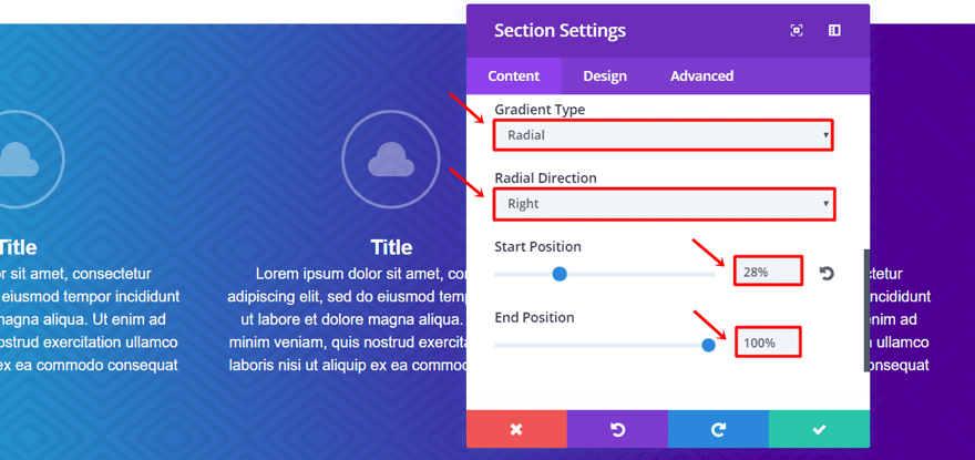
- Gradient Type: Radial
- Radial Direction: Right
- Start Position: 28%
- End Position: 100%
Move on to the background option, upload the pattern of choice and make the following changes:
- Background Image Position: Center
- Background Image Repeat: Repeat (depending on your pattern)
- Background Image Blend: Multiply
That’s it! You should now have the following stunning result:
Step by Step: The Pricing Section
The last example of this post is the pricing section. In this section, we wanted to show you that you can use the gradient background everywhere. It’s not just made to be used in sections but in columns as well. We’re only going to use the gradient background for two of the columns and do a gradient background overlay for the second column.
The reason why we do this is to emphasize the featured pricing package. We’re using intenser colors than in the other two columns and we’re adding a pattern background as well. These two things combined increase the odds of attracting people to your featured pricing package, which you want to promote the most.
Start Creating
Start by adding a new standard section to a new or existing page on your website. The section needs a row with three columns. The modules that we’ll be using are the same for each column and contain the same settings. That’s why we’re going to make them for the first column and clone them to the other two columns afterwards.
First Text Module Settings
Add a new Text Module to the first column, add the type of price package to the content box in the Text subcategory of the content tab and move on to the Design tab.
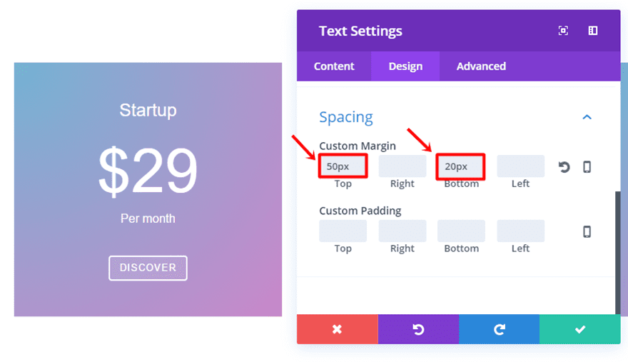
Apply the following changes to the Text subcategory of the Design tab:
- Text Orientation: Center
- Text Font Size: 24
- Text Font Color: #FFFFFF
- Text Line Height: 1.5em
Scroll down the same tab and make the following modifications to the Spacing subcategory:
- Top Margin: 50px
- Bottom Margin: 20px
Second Text Module Settings
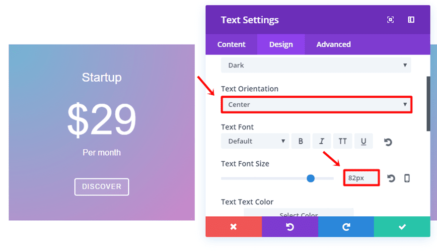
Add another Text Module to the same column. Write down the price of the package in the content box within the Text subcategory of the Content tab and move on to the Design tab.
In the Design tab, make the following adjustments:
- Text Orientation: Center
- Text Font Size: 82px
- Text Font Color: #FFFFFF
- Text Line Height: 1.1em
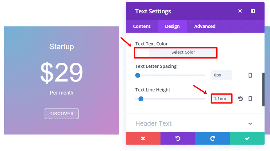
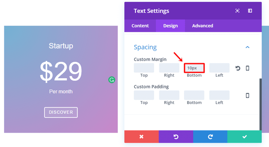
Scroll down the same tab and add ’10px’ to the bottom margin.
Third Text Module Settings
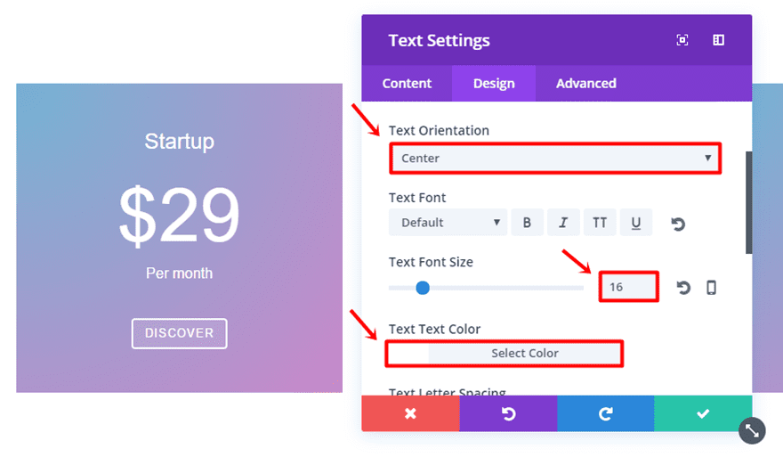
For our last Text Module, add the text to the content box in the Text subcategory of the Content tab. Then, go to the Design tab and make the following alterations to the Text subcategory:
- Text Orientation: Center
- Text Font Size: 16
- Text Font Color: #FFFFFF
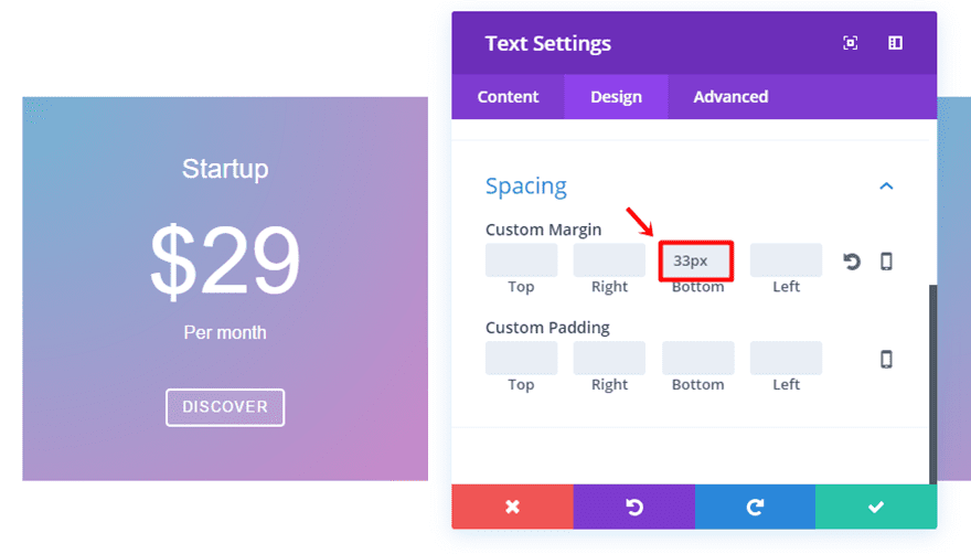
- Text Line Height: 1.1em
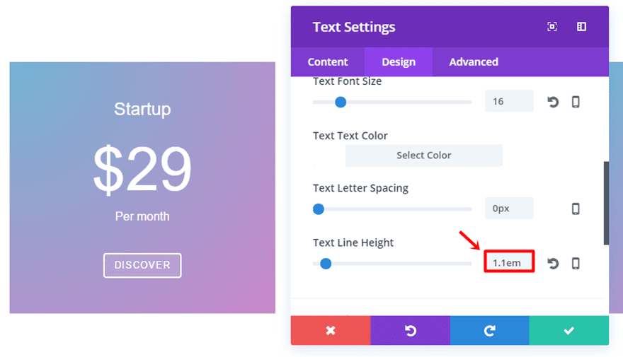
Scroll down the same tab and add ’33px’ to the bottom margin in the Spacing subcategory.
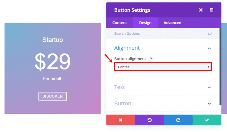
The next module we’ll be adding to this column is the Button Module. Type down the CTA you want to appear in the content box within the Text subcategory of the Content tab and move on to the Design tab.
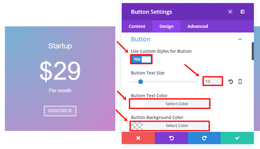
Within the Design tab, put the Button Alignment in the Alignment subcategory to ‘Center’ and make the following changes to the Button subcategory:
- Use Custom Styles for Button: Yes
- Button Text Size: 13
- Button Text Color: #FFFFFF
- Button Background Color: rgba(255,255,255,0.11)
- Button Border Width: 2
- Button Border Color: #FFFFFF
- Button Border Radius: 4
- Button Letter Spacing: 1
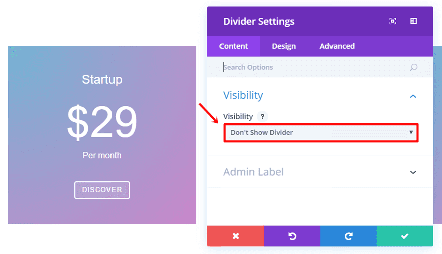
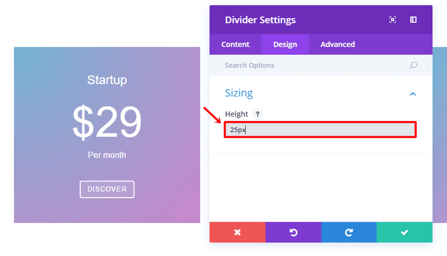
Divider Settings
Lastly, we’re going to add a divider to the column to create space. Select ‘Don’t Show Divider’ in the Content tab and go to the design tab where you put ’25px’ in the height field.
Now that we’ve added all the modules, make sure you clone them and put them in the other columns as well.
Gradient Background Overlay Settings
For this example, we’re going to use two different background settings for the different columns. The first and the last column will be the same and the second one will be a little bit different.
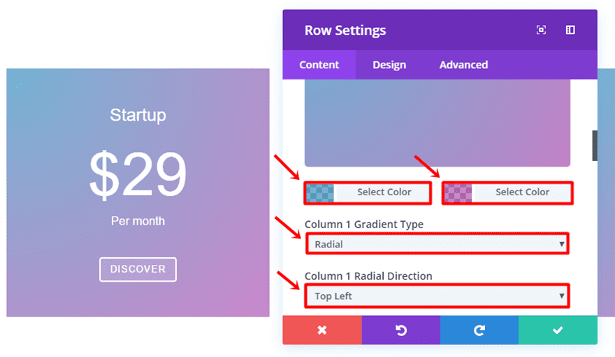
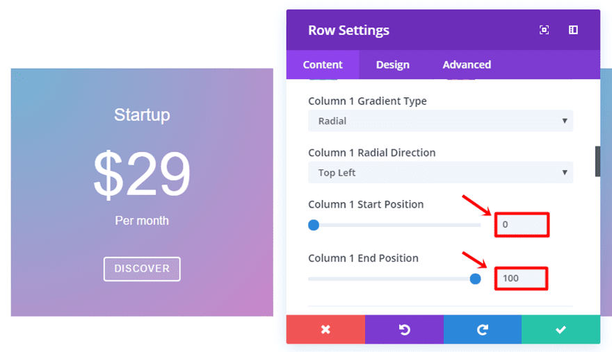
Go to the row settings and apply the following changes to the gradient option of the first and third column within the Background subcategory of the Content tab:
- First Color: rgba(10,122,178,0.57)
- Second Color: rgba(142,0,142,0.47)
- Column 1 Gradient Type: Radial
- Column 1 Radial Direction: Top Left
- Column 1 Start Position: 0
- Column 1 End Position: 100%
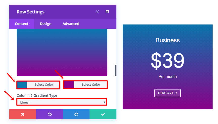
Next, go to Column 2 and make the following changes to the gradient option:
- First Color: #0a7ab2
- Second Color: #8e008e
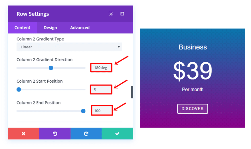
- Column 2 Gradient Type: Linear
- Column 2 Gradient Direction: 180deg
- Column 2 Start Position: 0
- Column 2 End Position: 100
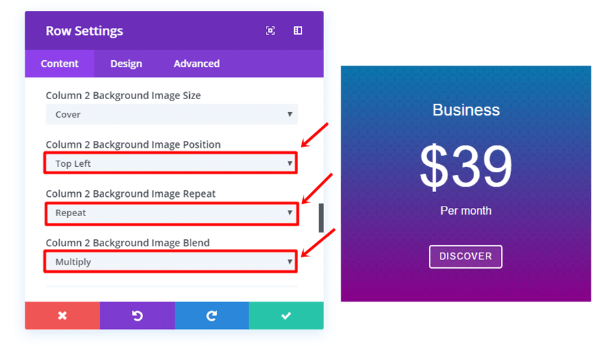
Move on to the background image option, upload the background image and change the settings:
- Column 2 Background Image Position: Top Left
- Column 2 Background Image Repeat: Repeat
- Column 2 Background Image Blend: Multiply
Final Thoughts
The examples we showed you in this blog post are just a fraction of what results you can get while using the new background design features. In upcoming posts, we’ll definitely handle other examples as well that will help you create great designs for the websites you make. If you have any questions, comments or suggestions; leave a comment in the comment section below!
Be sure to subscribe to our email newsletter and YouTube channel so that you never miss a big announcement, useful tip, or Divi freebie!


I completed every step and learned a lot…great tutorial. Thanks!
This may be a stupid question but how do you get these features? I just updated my theme and they aren’t showing up. Thank you!
The new Divi background updates are amazing! Thanks for all the awesome recent updates. Please keep it coming!
Awesome! Thank you Donjete. The gradient background just adds flavor to the content, it looks good.
Thanks!
I used background overlay with a transparant picture from a graphic. When you scroll (with parallex effect) you see different colors coming up in the graphic.
Robin – Netherlands-Amsterdam
Followed along and actually did it,thanks Donjete
Is there a fallback for Microsoft Edge Browser? This feature is a huge time saver, but because it doesn’t work on MS Edge, I can’t use it.
Maybe Edge will get an update soon hopefully.
I don’t understand how you can encourage the WORST practice ever by inlining CSS… It goes against coding best practices, since it is NOT cacheable, therefore all these additional lines of code have to be downloaded EVERY time a visitor comes back to the page…
perfect article. With it, my blog will look profesional
Thank you for the tutorial! Really nice effects!
I’m looking forward for the next examples!
Very good tutorial. Will try it on my website.
Thanks, Donjete Vuniqi, this is too good information to style any website. I will definitely try this on my website
thanx for this blog and useful info
Great tutorial Donjete !
Amazing…. small changes also moved big, a little example of your tutorial.
Very nice … I have been hoping for this for a while!
This is an awesome tutorial! Thank you so much. I am loving the new gradient feature on Divi. It makes my websites look so much better with just a few tweaks.
Thanks for your very informative article, Donjetë. Your examples are simple yet beautiful and inspirational. Perfect timing, this is exactly what I was trying to figure out. 😉
– Desirée
Thank’s for this tutorial. I thing gradient
deserves a place in web design language.
You’re welcome & I agree!
Great tutorial Donjete !
Sure will try this in my next project
You’re welcome! 🙂
Is it possible to put the gradient overlay over a background video? Thanks!
Great tutorial 🙂
Thanks, Dennis!
Can I ask if this works cross browser? And which IE versions this works for?
I’m guessing there’s a js fallback or something?
Thanks a lot Donjete, really nice tutorial. I’m gonna apply it in a new project.
Thank you, Oscar! 🙂
thank you, Donjetë! It´s great!
You’re absolutely welcome, Patricia! 🙂
Good ok