

Have you ever thought of creating an entirely horizontal page that uses swipe and anchor links to navigate? Well, if you have and didn’t exactly know how to approach it, this is the ideal post for you. We’re going to show you how to create an entirely horizontal swipe page using Divi. This technique really helps you make your website stand out from others and matches the web design trends of 2019. The outcome we’ll create will look great across all screen sizes.
Let’s get to it!
- 1 Preview
- 2 Approach
-
3
Let’s Start Recreating
- 3.1 Add New Section
- 3.2 Add Row #1
- 3.3 Add Blurb Module to Column 1
- 3.4 Add Text Module to Column 2
- 3.5 Add Button Module to Column 2
- 3.6 Add Blurb Module to Column 3
- 3.7 Add Row #2
- 3.8 Add Text Module to Column 1
- 3.9 Clone Text Module & Place in Column 2
- 3.10 Clone Row #1 Three Times
- 3.11 Clone Row #2 Three Times
- 3.12 Add CSS ID & CSS Code to Section
- 3.13 Hide Scrollbar
- 4 Preview
- 5 Final Thoughts
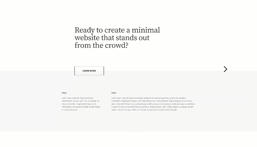
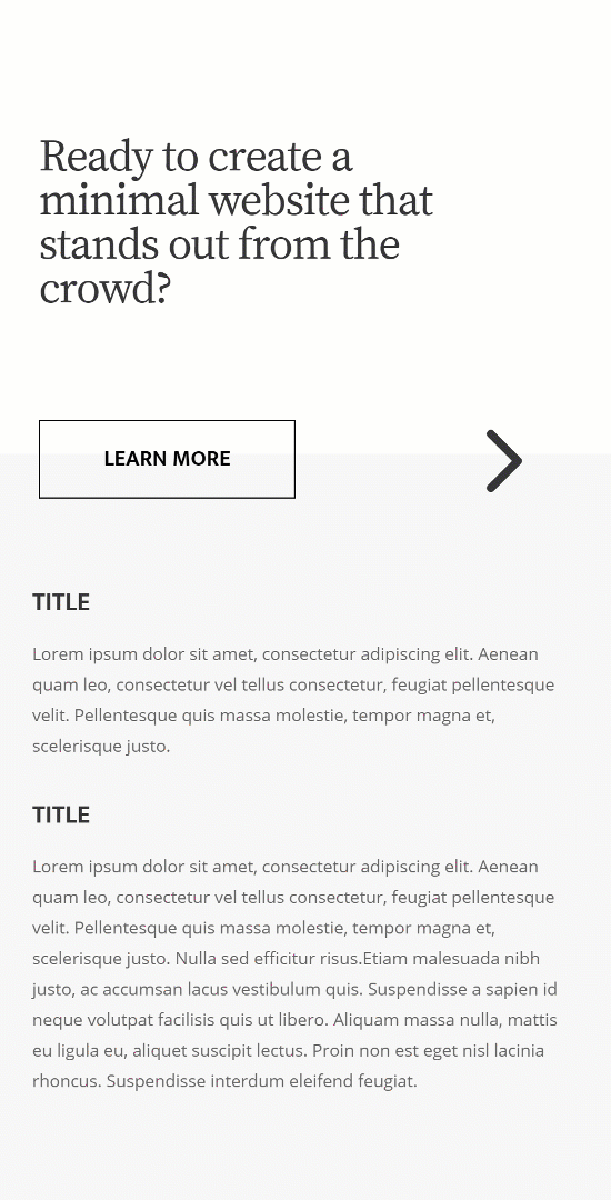
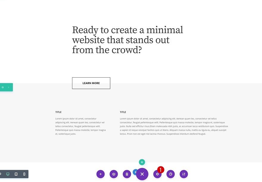
Preview
Before we dive into the tutorial, let’s take a quick look at the outcome across different screen sizes.
Desktop
Mobile
Approach
- We’ll create the entire page using one section only
- We’re turning that section into a horizontal grid using a few CSS code lines at the end of the tutorial
- The horizontal grid will place each one of the rows in a horizontally-placed column
- You get to decide how many horizontal columns a section contains
- In this case, we’ll make use of 4 different columns that’ll each consist of 2 rows
- You can modify the number of horizontal columns you create and determine how many rows each one of the section columns contain
- We’re also using anchor links to help people navigate through the different section columns
- On top of that, we’re adding a smooth scroll and a section scroll snapping effect that’ll easy the navigation for your visitors
Let’s Start Recreating
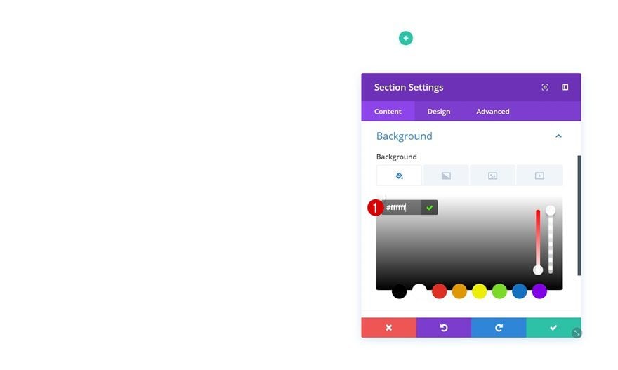
Add New Section
Background Color
Create a new page and add a regular section to it. Open the section settings and change the background color.
- Background Color: #ffffff
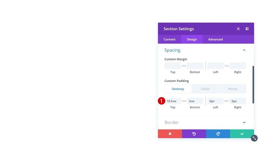
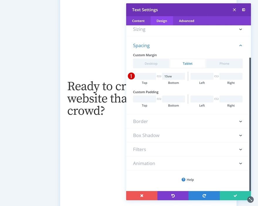
Spacing
Then, go to the spacing settings and add some custom padding across different screen sizes.
- Top Padding: 10.5vw (Desktop), 15vw (Tablet), 10vw (Phone)
- Bottom Padding: 3vw (Desktop & Tablet), 10vw (Phone)
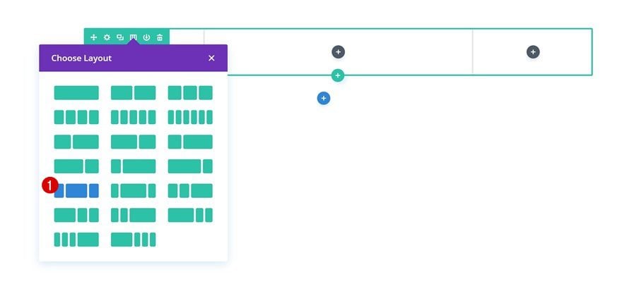
Add Row #1
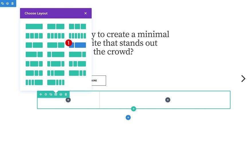
Column Structure
Continue by adding a new row using the following column structure:
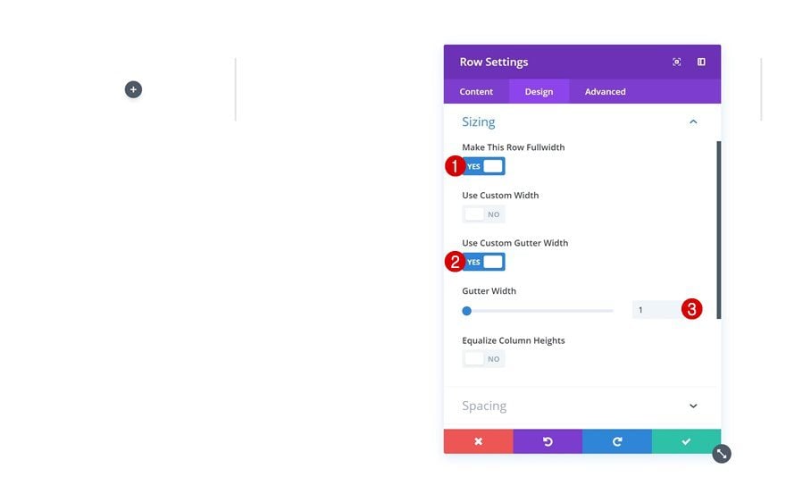
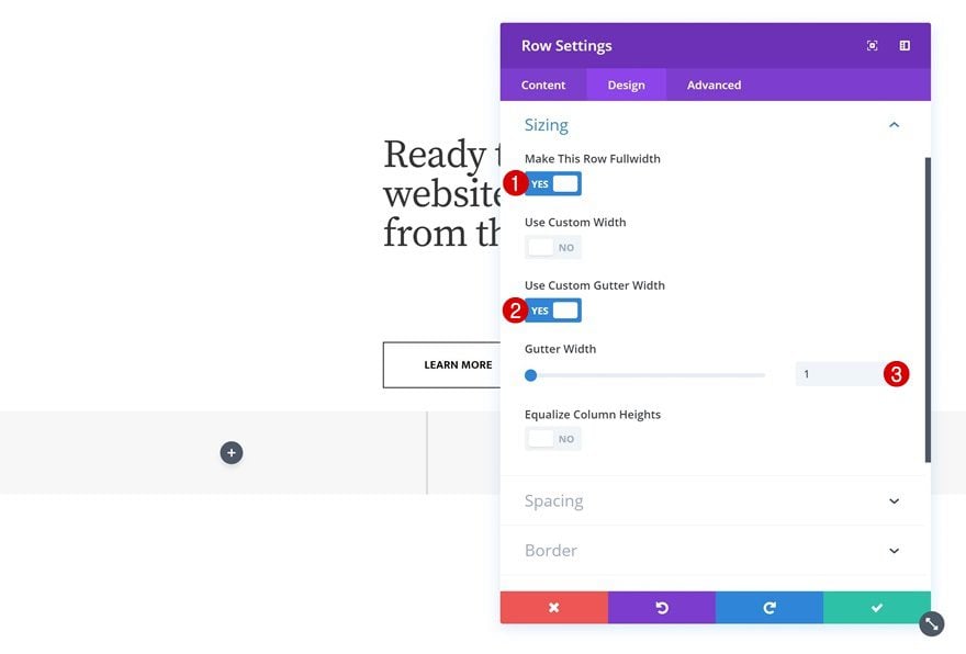
Sizing
Without adding any modules yet, open the row settings and allow the row to take up the entire width of the screen.
- Make This Row Fullwidth: Yes
- Use Custom Gutter Width: Yes
- Gutter Width: 1
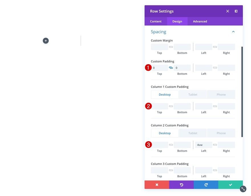
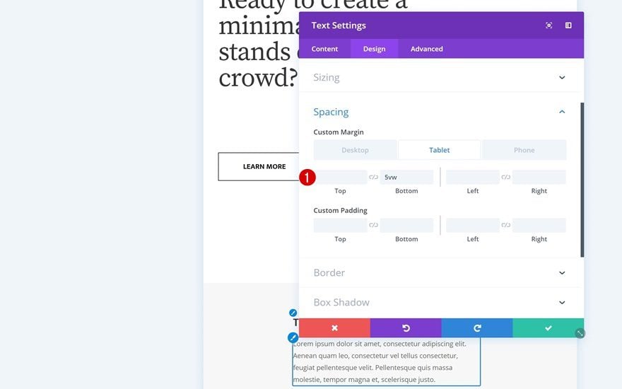
Spacing
Go to the spacing settings next and make some changes across all different screen sizes.
- Top Padding: 0px
- Bottom Padding: 0px
- Left Padding: 6vw (Tablet & Phone)
- Right Padding: 6vw (Tablet & Phone)
- Column 1 Bottom Padding: 15vw (Tablet & Phone)
- Column 2 Left Padding: 4vw (Desktop), 0vw (Tablet & Phone)
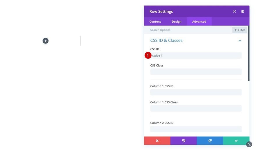
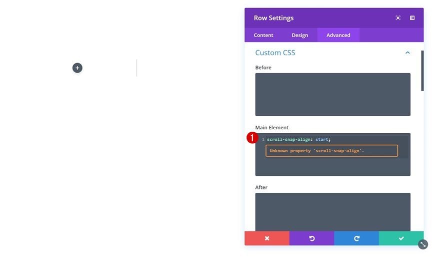
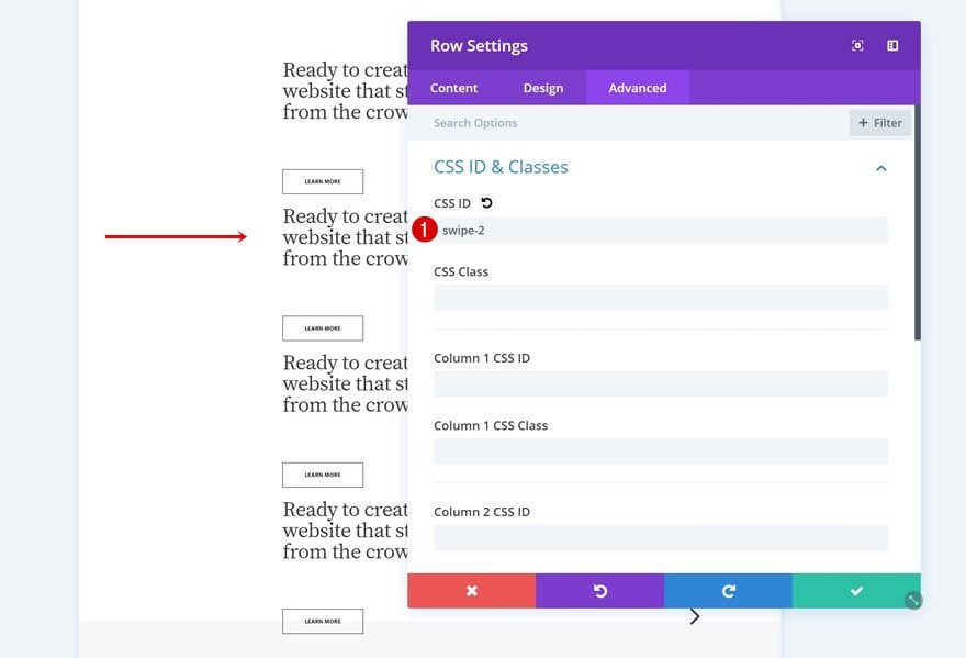
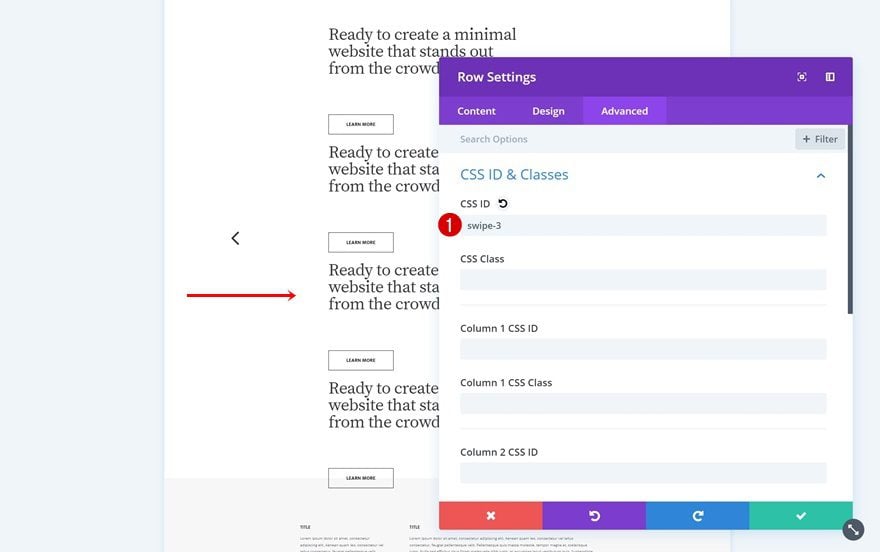
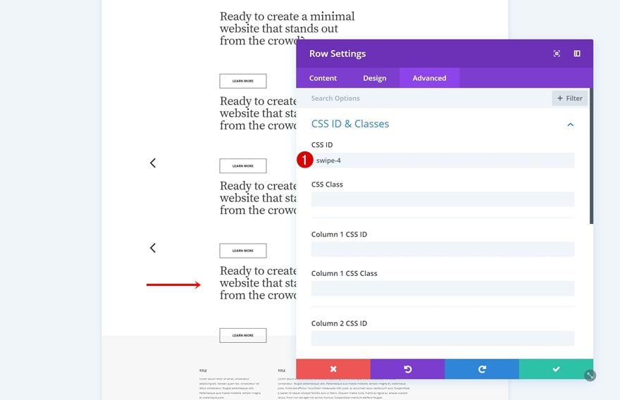
CSS ID
We’ll need to assign a CSS ID to the first row of each one of the section columns we create. This will help us create the anchor arrows later on this post.
- CSS ID: swipe-1
Custom CSS
As mentioned in the approach section of this post, we’re also applying a smooth scroll and snapping effect to the mechanism. To be able to do that, we’ll need to add a single line of CSS code to the first row of each one of the horizontal columns we create.
scroll-snap-align: start;
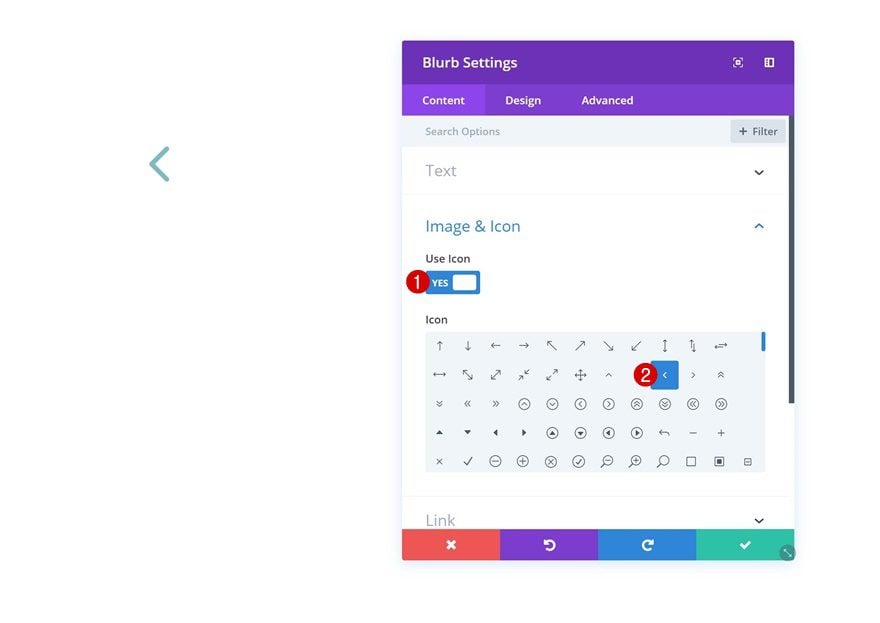
Add Blurb Module to Column 1
Select Icon
We can now start adding modules! Start with a Blurb Module in column 1. Open the module settings and select a left arrow icon.
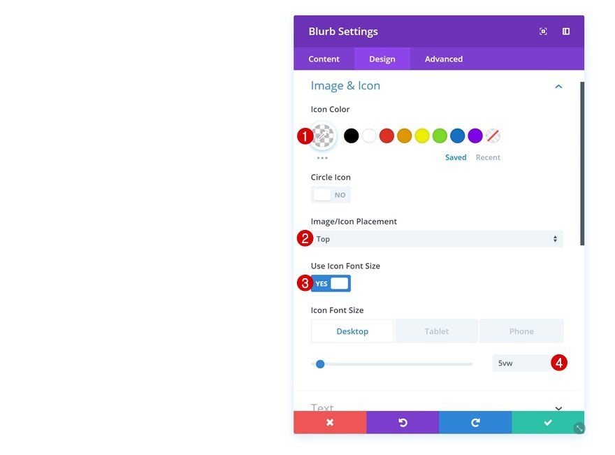
Icon Settings
Then, go to the design tab and make some changes to the appearance of the icon.
- Icon Color: rgba(255,255,255,0)
- Image/Icon Placement: Top
- Use Icon Font Size: Yes
- Icon Font Size: 5vw (Desktop), 13vw (Tablet), 21vw (Phone)
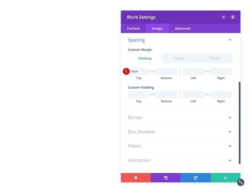
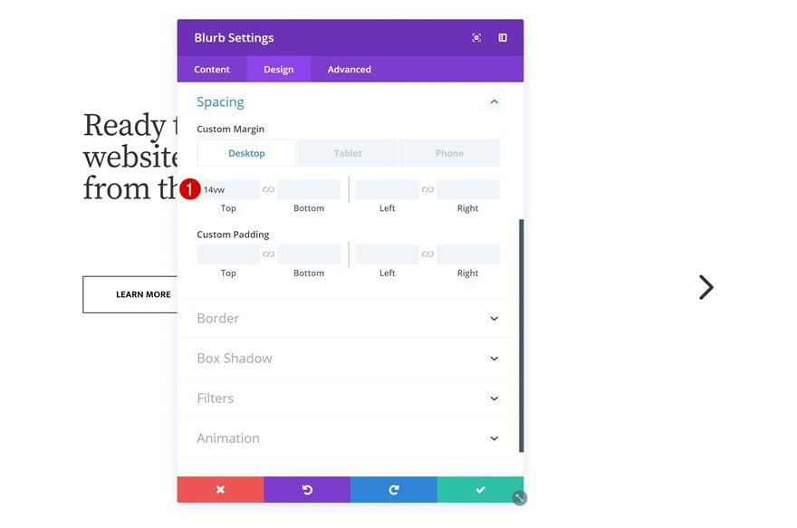
Spacing
Add some custom margin values next.
- Top Margin: 14vw (Desktop), -11vw (Tablet), -17vw (Phone)
- Left Margin: 60vw (Tablet & Phone)
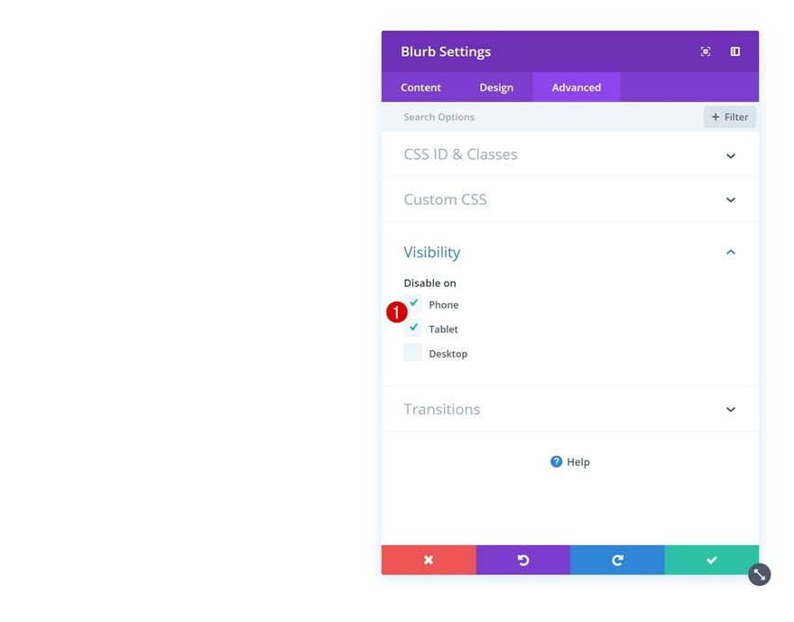
Visibility
We’re also hiding the module on smaller screen sizes.
Add Text Module to Column 2
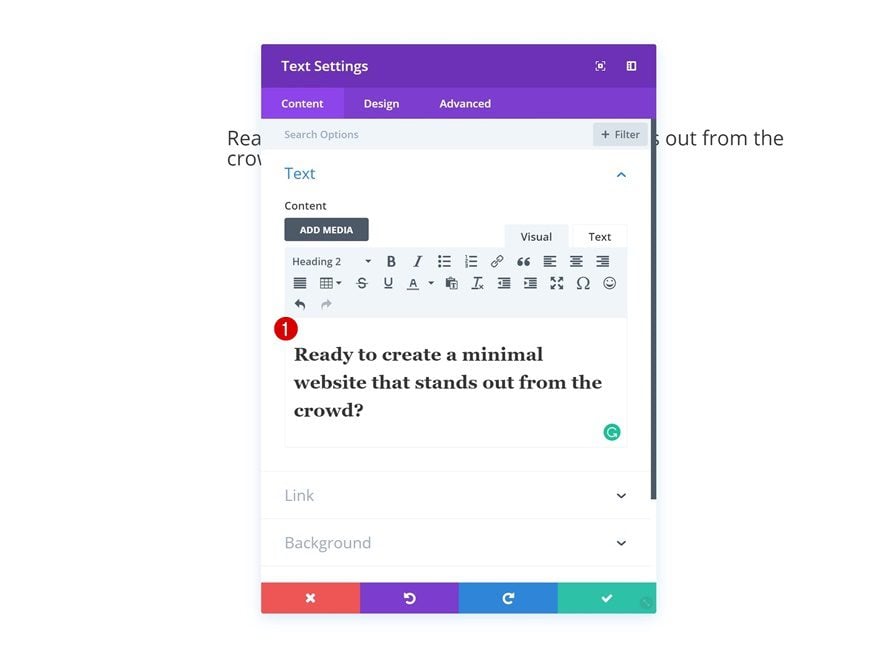
Add H2 Content
The next module we need is a Text Module in column 2. Add some H2 content.
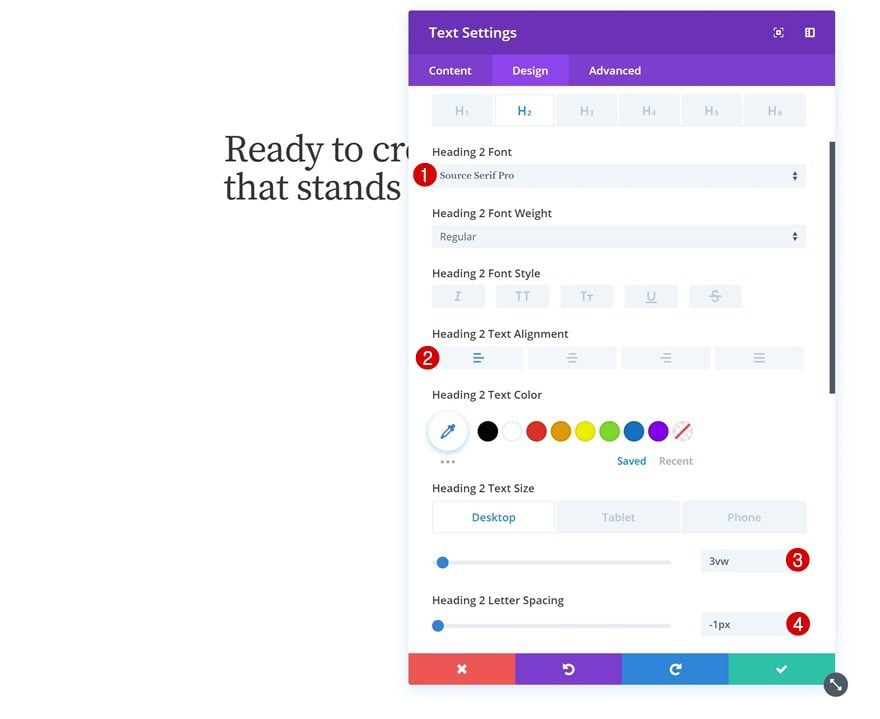
H2 Text Settings
Then, go to the design tab and modify the H2 text settings.
- Heading 2 Font: Source Serif Pro
- Heading 2 Text Alignment: Left
- Heading 2 Text Size: 3vw (Desktop), 7vw (Tablet & Phone)
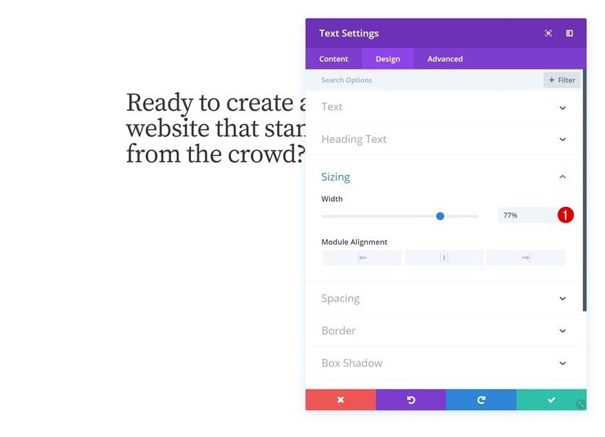
Sizing
Modify the width in the sizing settings next.
- Width: 77%
Spacing
And add some bottom margin for smaller screen sizes.
- Bottom Margin: 15vw (Tablet & Phone)
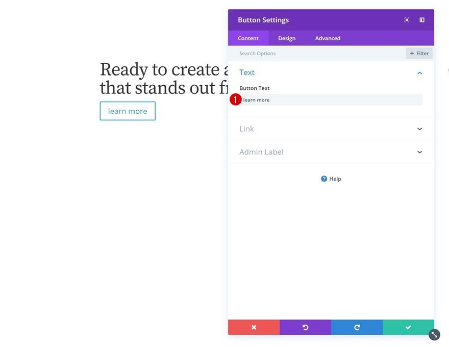
Add Content
Right below the Text Module you’ve added, go ahead and add a Button Module. Enter some copy.
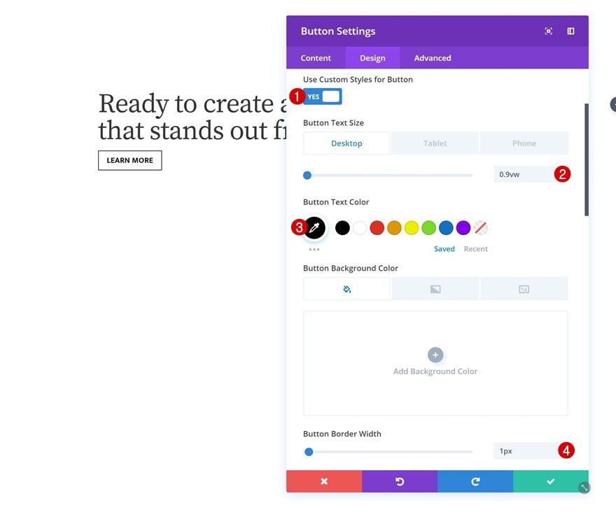
Button Settings
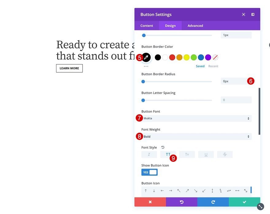
Then, go to the design tab and change around the button settings.
- Use Custom Styles for Button: Yes
- Button Text Size: 0.9vw (Desktop), 2vw (Tablet), 3.5vw (Phone)
- Button Text Color: #000000
- Button Border Width: 1px
- Button Border Color: #000000
- Button Border Radius: 0px
- Button Font: Mukta
- Font Weight: Bold
- Font Style: Uppercase
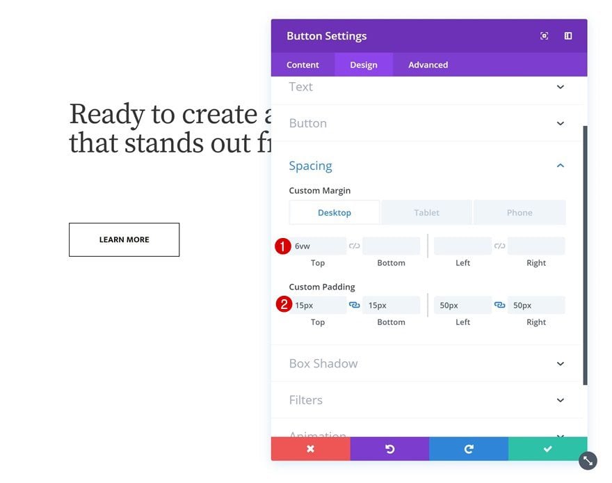
Spacing
Add some custom margin and padding next.
- Top Margin: 6vw (Desktop), 4vw (Tablet & Phone)
- Top Padding: 15px
- Bottom Padding: 15px
- Left Padding: 50px
- Right Padding: 50px
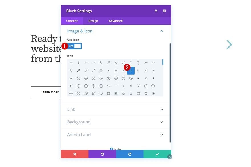
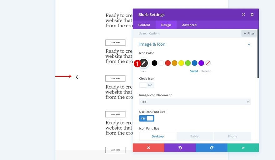
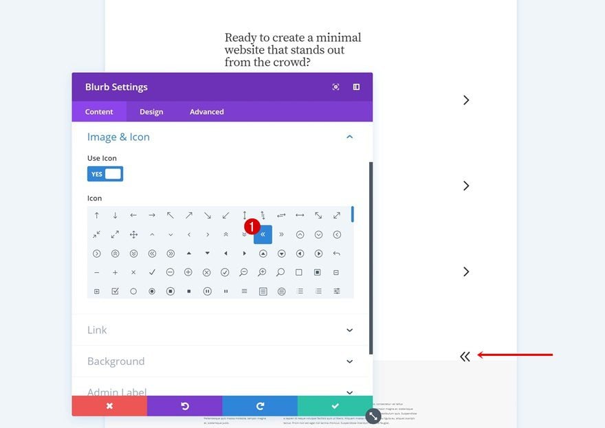
Add Blurb Module to Column 3
Select Icon
The next and last module we need in this row is another Blurb Module in column 3. Select an icon of your choice.
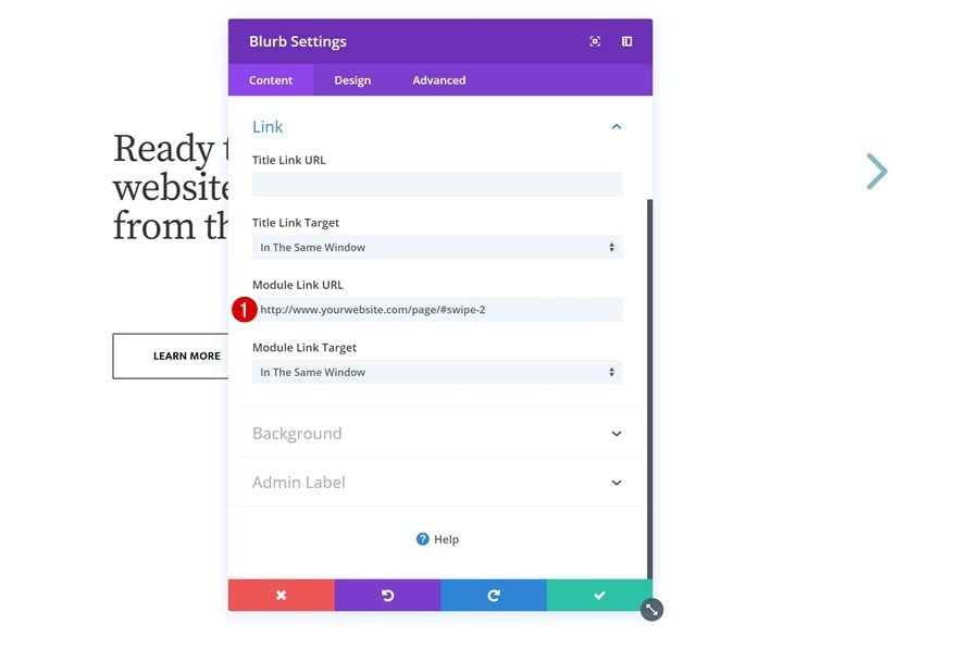
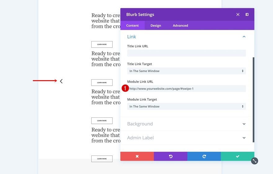
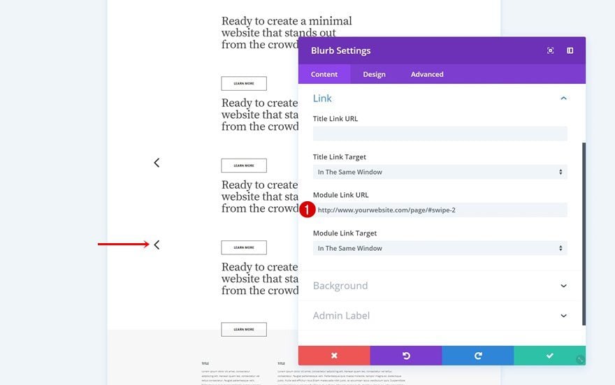
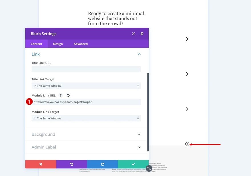
Link
Then, go to the link settings and add a link that’ll lead visitors to the second horizontal column of the section.
- Module Link URL: https://www.yourwebsite.com/page/#swipe-2
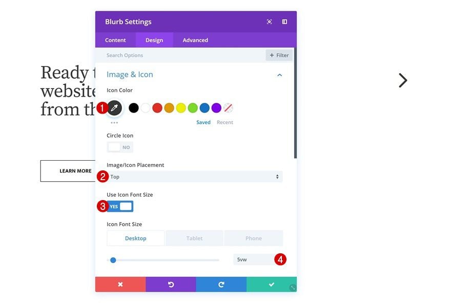
Icon Settings
Go ahead and change the icon settings too.
- Icon Color: #333333
- Image Icon Placement: Top
- Use Icon Font Size: Yes
- Icon Font Size: 5vw (Desktop), 13vw (Tablet), 21vw (Phone)
Spacing
Continue by adding some custom top and left margin across different screen sizes.
- Top Margin: 14vw (Desktop), -11vw (Tablet), -17vw (Phone)
- Left Margin: 60vw (Tablet & Phone)
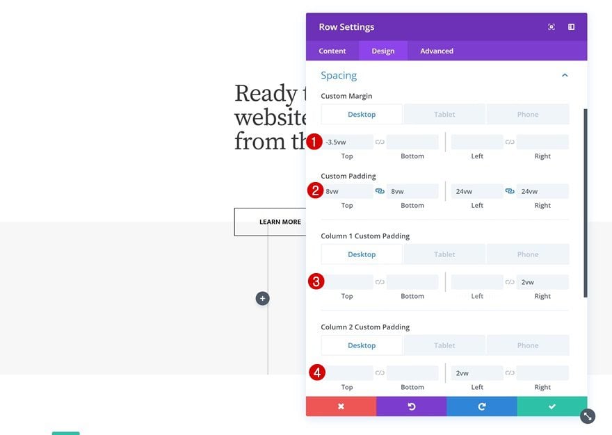
Add Row #2
Column Structure
The second row we need makes use of the following column structure:
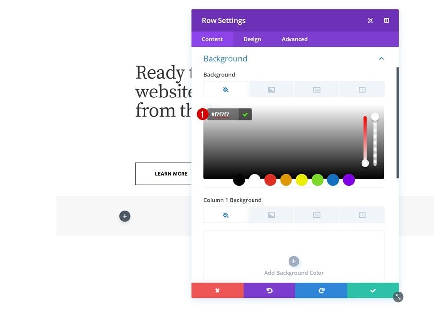
Background Color
Without adding any modules yet, open the row settings and change the background color.
- Background Color: #f7f7f7
Sizing
Modify the sizing settings next.
- Make This Row Fullwidth: Yes
- Use Custom Gutter Width: Yes
- Gutter Width: 1
Spacing
Along with the custom padding and margin values in the spacing settings.
- Top Margin: -3.5vw (Desktop), -10vw (Tablet), -17vw (Phone)
- Top Padding: 8vw (Desktop), 15vw (Tablet), 20vw (Phone)
- Bottom Padding: 8vw (Desktop), 15vw (Tablet), 20vw (Phone)
- Left Padding: 24vw (Desktop), 5vw (Tablet & Phone)
- Right Padding: 24vw (Desktop), 5vw (Tablet & Phone)
- Column 1 Right Padding: 2vw (Desktop), 0vw (Tablet & Phone)
- Column 2 Left Padding: 2vw (Desktop), 0vw (Tablet & Phone)
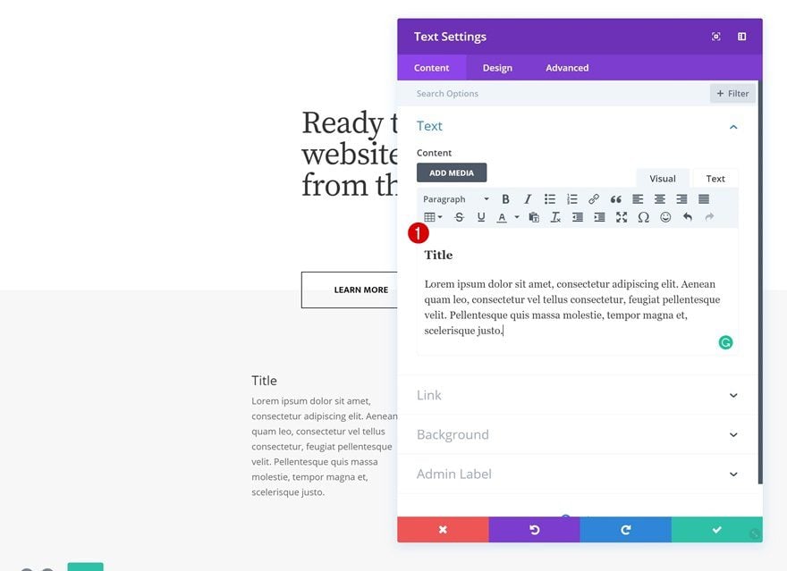
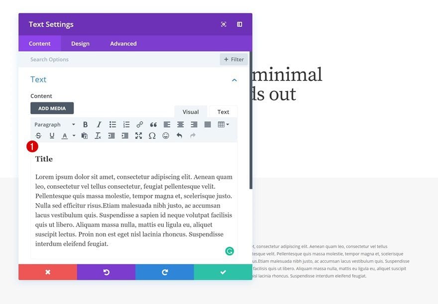
Add Text Module to Column 1
Add Content
Go ahead and add a Text Module to the first column. Enter some copy of your choice (including an H3 title).
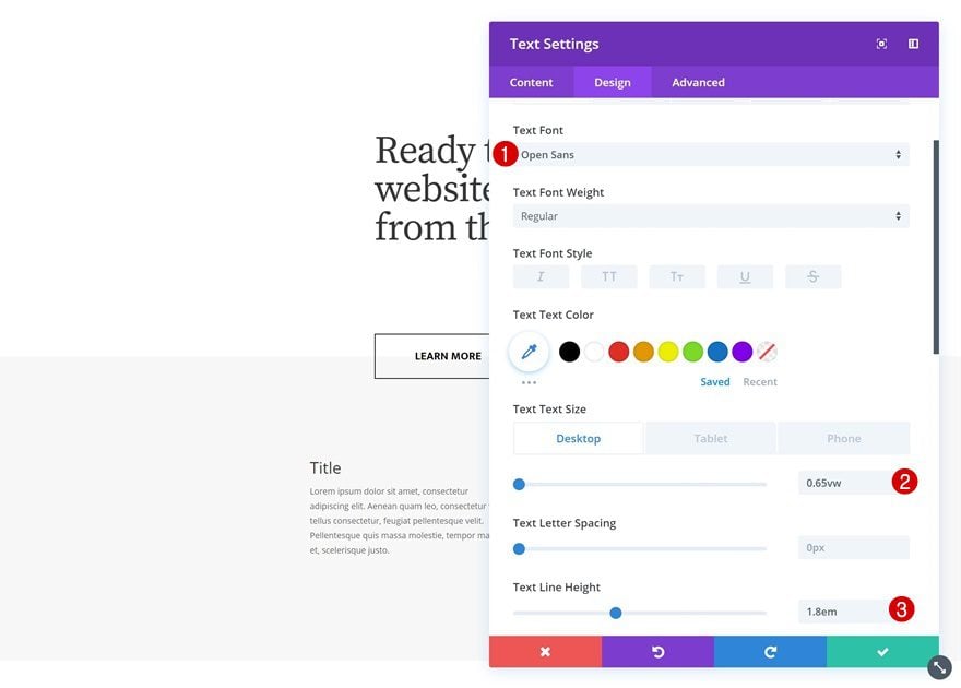
Text Settings
Go to the design tab and change the text settings.
- Text Font: Open Sans
- Text Size: 0.65vw (Desktop), 1.8vw (Tablet), 2.7vw (Phone)
- Text Line Height: 1.8em
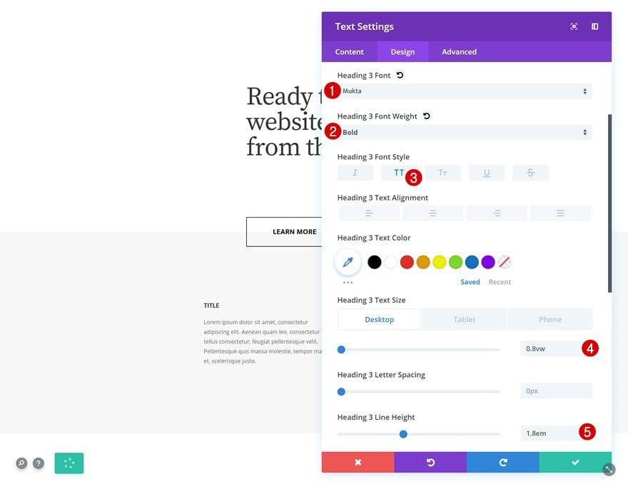
H3 Text Settings
Along with the H3 text settings.
- Heading 3 Font: Mukta
- Heading 2 Font Weight: Bold
- Heading 3 Font Style: Uppercase
- Heading 3 Text Size: 0.8vw (Desktop), 3vw (Tablet), 4vw (Phone)
- Heading 3 Line Height: 1.8em
Spacing
Add some bottom margin for smaller screen sizes too.
- Bottom Margin: 5vw (Tablet & Phone)
Clone Text Module & Place in Column 2
Once you’re done modifying the Text Module in column 1, you can clone it and place the duplicate in the second column.
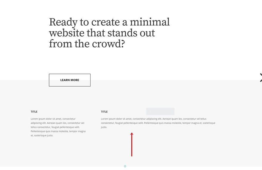
Change Content
Make sure you change the content.
Clone Row #1 Three Times
Once both your rows are done, you can clone the first row 3 times.
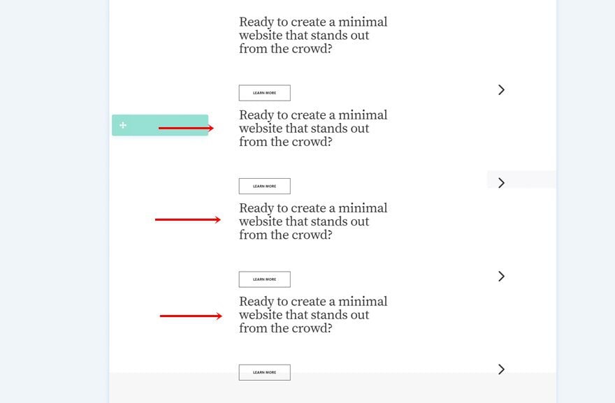
Change Duplicate #1
Change Row CSS ID
We’ll need to change the CSS ID of the first duplicate.
- CSS ID: swipe-2
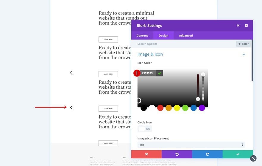
Change Blurb Module’s (Column 1) Icon Color
Along with the first Blurb Module’s color.
- Icon Color: #333333
Change Both Blurb Modules’ Links
To make the anchor links work, you’ll have to change the link of each one of the arrows accordingly:
- Module Link URL: https://www.yourwebsite.com/page/#swipe-1
- Module Link URL: https://www.yourwebsite.com/page/#swipe-3
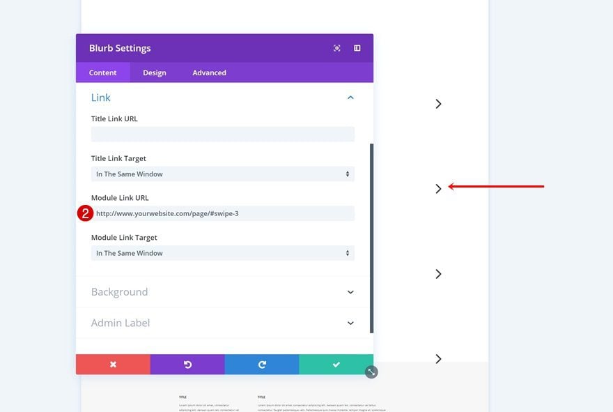
Change Duplicate #2
Change Row CSS ID
Change the CSS ID of the second duplicate.
- CSS ID: swipe-3
Change Blurb Module’s (Column 1) Icon Color
Along with the icon color of the first Blurb Module.
- Icon Color: #333333
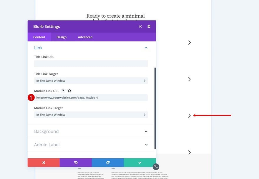
Change Both Blurb Modules’ Links
And again, change the links of each Blurb Module accordingly:
- Module Link URL: https://www.yourwebsite.com/page/#swipe-2
- Module Link URL: https://www.yourwebsite.com/page/#swipe-4
Change Duplicate #3
Change CSS ID
Change the CSS ID of the third row duplicate too.
- CSS ID: swipe-4
Change Blurb Module’s (Column 2) Icon
And select another icon for the Blurb Module in column 3.
Change Blurb Module’s (Column 2) Link
Make sure that on click, the visitor will be redirected to the first section column by modifying the Module Link URL accordingly:
- Module Link URL: https://www.yourwebsite.com/page/#swipe-1
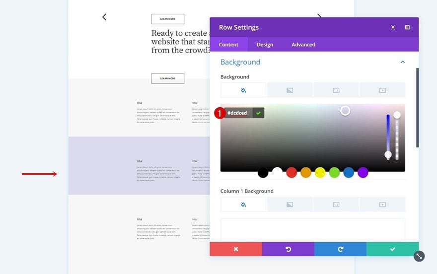
Clone Row #2 Three Times
On to the next row. Clone this row three times as well.
Change Row Background Color of Duplicate #1
Change the background color of the first duplicate.
- Background Color: #dcdced
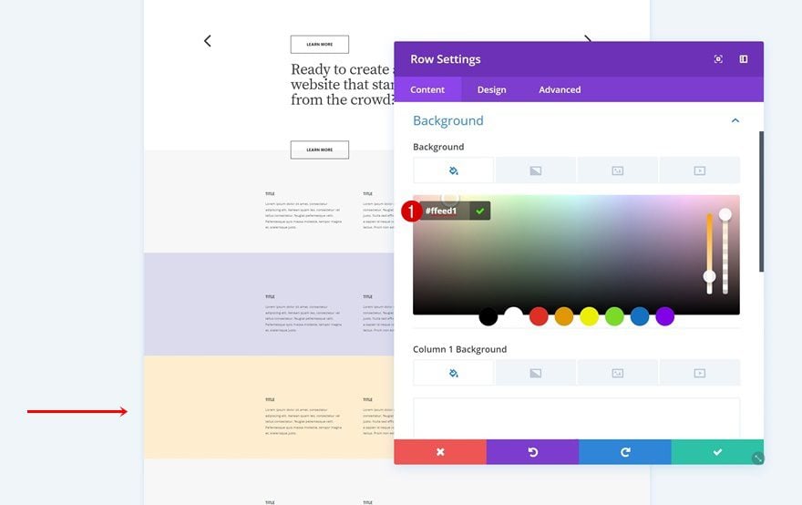
Change Row Background Color of Duplicate #2
The second duplicate makes use of the following background color:
- Background Color: #ffeed1
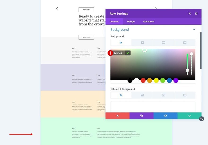
Change Row Background Color of Duplicate #3
Change the background color of the third row duplicate too.
- Background Color: #d6ffe5
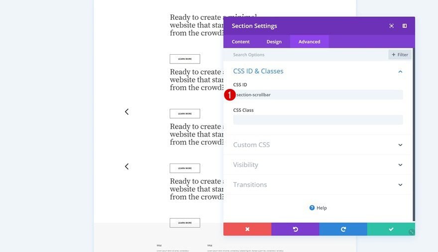
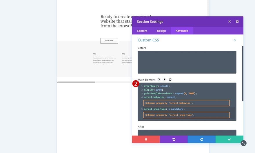
Add CSS ID & CSS Code to Section
Now that we have all the rows we need, we can make the magic happen. Add a CSS ID to the entire section. Later on this post, we’ll use this CSS ID to hide the scrollbar.
- CSS ID: section-scrollbar
Then, go to the Custom CSS options and add some lines of CSS code to the main element.
overflow-y: scroll;
display: grid;
grid-template-columns: repeat(4, 100%);
scroll-behavior: smooth;
scroll-snap-type: x mandatory;
The more section columns you want to create, the more columns you’ll have to add in the CSS code. So, say for instance you want to have the same structure but allow 7 swipes instead of 4, you’ll have to modify the grid template columns CSS code line accordingly:
grid-template-columns: repeat(7, 100%);
But bear in mind that you’ll have to add more rows if you’re increasing the column number. So in this case, if you want two rows to appear per section column, you’ll need 14 rows.
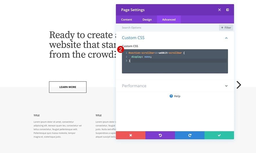
Hide Scrollbar
You can also choose to hide the scrollbar by using the section CSS ID and adding the following lines of CSS code to the page settings:
#section-scrollbar::-webkit-scrollbar {
display: none;
}
Preview
Now that we’ve gone through all the steps, let’s take a final look at the outcome on different screen sizes.
Desktop
Mobile
Final Thoughts
When designing websites with Divi, the most straightforward thing to do is build downwards. But just because it’s the most straightforward thing to do, doesn’t mean you’re limited to that option. You can create an entirely horizontal swipe page as well. In this tutorial, we’ve shown you how to achieve some stunning horizontal swipe web design using Divi. If you have any questions or suggestions, make sure you leave a comment in the comment section below!


Hi everyone,
It’s still working ? Anchors seems not to work.
Hi Donjete, any way to do this but vertically? Can’t find a tutorial for such a thing. Thanks!
Hi! is this way of doing horizontal scroll still works? Anchor links seem to not work w/ display:grid
Hi,
Thanks for the tutorial! It’s really nice. I tried to replicate it, followed every step but having an issue with the anchor link bringing me to the top of the second row instead of the top of the first row.
Here what it looks like:
https://www.useloom.com/share/0c9182dc98be471192d1edf1cb1e2c55
Any idea why it’s doing this?
you solve this already?
Hello,
Yeah its happening exactly the same to me, it brings the row to the top, ignoring menu’s height.
Have you found any solution?
Thanks!
This is really sweet. Just wondering how you’d implement another page for a privacy policy, for instance. Maybe with a small text link at the bottom? ?
FYI Not sure if the Z-Index option under visibility was available when you wrote this tutorial, but you have to make sure you make the Z-Index of row 1 large than row 2 in order for the button (row 1 column 2) to appear on top of row 2.
Also, out of curiosity, how are you determining what elemenents use VW and what elements use pixels?
Thanks
On my end, it worked without adding a z-index once I exited the Divi Builder so I didn’t think it was necessary. But of course, you can always make sure by adding it anyway.
And to answer your question: when I use vw, I tend to use it everywhere, except for button padding sometimes, when if I feel like there’s no big difference in the design on different screen sizes (but that’s just laziness I guess, because you do have to modify every value on desktop, tablet and mobile otherwise). While designing, I frequently zoom in and out in my browser to see if I’m missing something for larger or smaller screen sizes. I also get rid of all custom space between columns, rows and sections in the sizing settings (you can notice that in this tutorial too).
Hope that answers your question! 🙂
still an interesting tutorial, thanks
Good to hear, Bruno! 🙂
Nice Tutorial
Thanks, Shane! 🙂
Thanks For Showing the process to create dynamic swipe page design.
Really Helpful tutorial .
Glad to hear that! 🙂
Beautiful, Thank you so much 🙂
You’re welcome, Liz! 🙂
I can thank you enough, Donjete! So much love for this tutorial! Thank you!
You’re welcome, Elisandro! I’m happy to hear that you’re enjoying the Divi content we publish! 🙂
I have to try this. Very well-explained, nice tutorial! I like the color choices, too. Thanks!
That’s nice to hear. You should definitely try it! 🙂
OK.
Nice.
Going to try it this weekend.
Good to hear! 🙂
That’s awesome tips for Create an Entirely Horizontal Swipe Page.. by Divi just simple to implement here we go with new experience in WordPress .thanks guys for updating this useful tips…
All the best
Michel Joachim
You’re welcome, Michel! 🙂
This is great but adding the json file would be awesome!
Yes, agreed. 🙂
Okay, old-guy time again.
When I was producing “PM Magazine,” Chef Tell was a staple. When he showed the viewers how to make Chicken Cordon Bleu, it really wasn’t the recipe you learned how to do. What you REALLY learned was how to dice an onion quickly, simply, and easily. How to use the scrapings from the roasting pan to make a great-tasting gravy.
The same reality is true here. Only my suggestions is to have the teacher of the tutorial focus on the “magic” first and then, don’t repeat all the identical steps to change each of these rows. If you can do one, you can do all of them.
Finally, when the tut-genius does something, instead of making it a fiat, tell us the reasoning/thinking behind the process. THAT’s where we could all learn more. For example, if there is a 20 px padding added to the top, why? Why not 22? Why any, at all? Why padding and not margin? etc. Sadly, that thinking is overlooked in the process of making sure that every step is documented — in spite of the steps being repetitions of the previously explained actions.
The advantage of having a JSON CAN be that you will not have to create the base from scratch, just the details that conform you what you are trying to do, and that can save time. But if you as a designer are looking simply for easier and faster, you are not doing yourself any long-term favor with regard to increasing your understanding.
If that interests you at all.
Agree. Explaining the reasoning behind why of something is more valuable than just showing.
I really liked the introduction of css Grid in this and an earlier tutorial. Would like to see more of this, like we have seen with snippets including css Flex.
Form doing the tutorial, there are some issues with the design. From my result, when I click the arrow icons, the page scrolls up, obscuring the text under the top nav. That needs a fix.
While I am here. The above merits discussion and perhaps some continuity, with email notifications on updates to the conversation, would be useful. Contributors might be more inclined to make suggestions on how to iron out some of the creases, like the one mentioned above. As it is value is lost by posts being abandoned. To be honest I would probably not use this design on a site till the horizontal scroll jump was fixed. And I am sure there is one out there waiting to be explained.
I second it.
Agreed
i think that its even better that they are teaching us how to use the product. Otherwise we wouldnt learn anything, and try to take divi to a whole new level, on top of the fact that when you have cookie cutter layouts and do nothing to change them – then you are going against the whole ideal of design.
Baller, Donjete! This is one of the move clever uses I’ve seen for bolting on additional functionality into Divi using minimal CSS! Learned a lot with this. Thank you!
Happy to hear you’ve learned from this tutorial, Logan! 🙂