

Promoting a virtual event involves a number of promotional strategies. Creating an inviting landing page is one of them. Creating a landing page for your virtual summit is the perfect way to make your audience curious. With the right combination of sections, you can invite, inform, and collect registered attendees. Today we’ll show you how to create a virtual summit landing page with five sections. The design includes duotone images and scrolling section dividers. We’ve also included a downloadable JSON file if you want to skip the step-by-step tutorial. In the folder, you’ll also find the header and footer graphics in both PNG and AI.
Let’s get to it!
- 1 Preview
- 2 Download The Virtual Summit Landing Page for FREE
- 3 Download For Free
- 4 You have successfully subscribed. Please check your email address to confirm your subscription and get access to free weekly Divi layout packs!
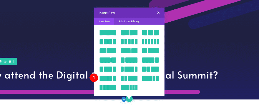
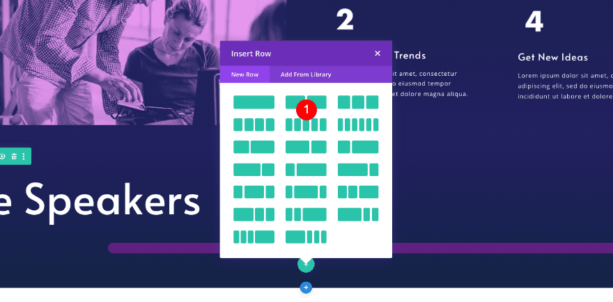
- 5 Virtual Summit Landing Page Sections
- 6 Create a Duotone Gradient Map with Photoshop
-
7
1. Create Header Section
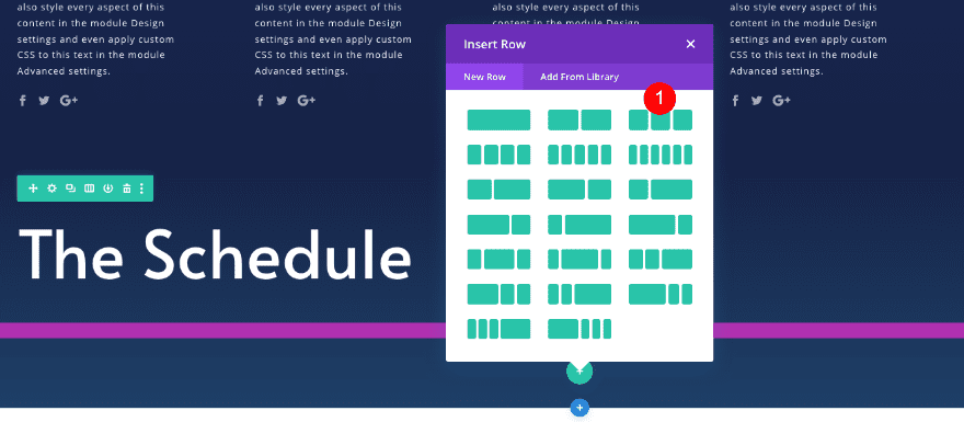
- 7.1 Add New Section
- 7.2 Add New Row
- 7.3 Column 2, 3 Settings
- 7.4 Add 1st Text Module To Column 1
- 7.5 Add 2nd Text Module to Column 1
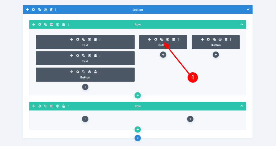
- 7.6 Add Button Module to Column 1
- 7.7 Add Button Module to Column 2
- 7.8 Clone Button Module to Column 3
- 7.9 Adjust Button Module
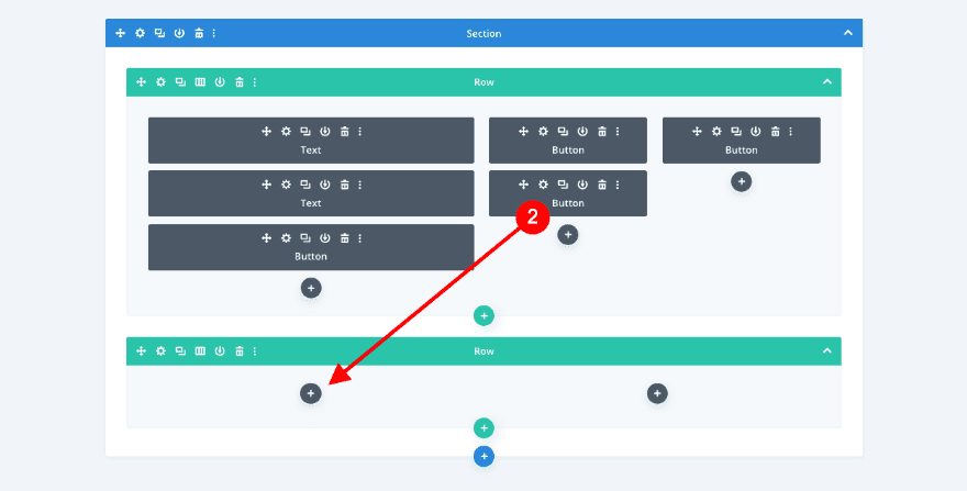
- 7.10 Add New Row
- 7.11 Clone Button Module & Place Duplicate in Column 1
- 7.12 Adjust Button Module
- 7.13 Add Cloned Button Module to Column 2
- 7.14 Adjust Button Module
-
8
2. Create Info Section
- 8.1 Add New Section
- 8.2 Add New Row
- 8.3 Add Text Module
- 8.4 Add Divider Module
- 8.5 Add New Row
- 8.6 Column 1 Settings
- 8.7 Add Image Module to Column 1
- 8.8 Add Blurb Module to Column 2
- 8.9 Clone Blurb Module & Place Duplicate in Column 2
- 8.10 Delete Column 3 & Clone Column 2
- 8.11 Adjust Blurb 1 in Column 3
- 8.12 Adjust Blurb 2 in Column 3
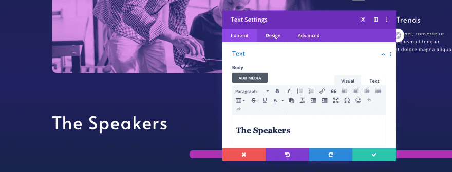
- 9 3. Create Speakers Section
-
10
4. Create Schedule Section
- 10.1 Add New Section
- 10.2 Clone Title Row 2
- 10.3 Adjust Text Module
- 10.4 Adjust Divider
- 10.5 Add New Row
- 10.6 Add Text Module to Column 1
- 10.7 Add Call To Action to Column 1
- 10.8 Add Text Module to Column 2
- 10.9 Clone Text Module 2 Times
- 10.10 Adjust New Text Modules
- 10.11 Remove Border of 3rd Text Module
- 10.12 Delete Column 3 & Clone Column 2
- 10.13 Remove & Adjust Text Modules
- 10.14 Clone Button Module & Place Duplicate in Column 3
- 10.15 Adjust Button Module
- 10.16 Clone 1st Row of Schedule Section
- 10.17 Adjust Text Module in Column 1
- 10.18 Adjust Call To Action Module
- 10.19 Adjust Text Modules
- 11 5. Create Register Section
- 12 Preview
- 13 That’s a Wrap
Preview
Let’s take a look at the landing page design on different screen sizes.
Desktop
Tablet

Mobile

Download The Virtual Summit Landing Page for FREE
To lay your hands on the free virtual summit landing page layout, you will first need to download it using the button below. To gain access to the download you will need to subscribe to our newsletter by using the form below. As a new subscriber, you will receive even more Divi goodness and a free Divi Layout pack every Monday! If you’re already on the list, simply enter your email address below and click download. You will not be “resubscribed” or receive extra emails.

Virtual Summit Landing Page Sections
In order for your landing page to do its job, it needs a specific set of sections. Apart from catching the viewer’s eye, landing pages must also convert. A virtual summit landing page, for example, needs to include relevant information and a call to action. All sections must flow from one to the other seamlessly for the viewer to feel inspired to act and sign up.
We’ve included the following sections in the Virtual Summit Landing Page:
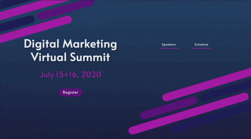
Header
The header section includes important information like the title of the summit and the date of the event. This is the most important information, that’s why it’s at the very top. No header is complete without a call to action and easy navigation to the rest of the page.
In our design, we’ve included two buttons with anchor links that navigate to the speakers and schedule sections. Most importantly, we’ve included a button with a link to the register section. Throughout the page, all the “register” buttons look the same, in order to have visual unity in the design.

Information
The second section is an informational section that incites the viewer to consider attending the virtual summit. In the design, we’ve added four blurbs and an image that can be easily changed into a video. The blurbs list four reasons to attend the summit and the image (or video) is the visual to support the decision.

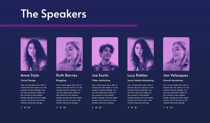
The Speakers
In the next section, you’ll find a set of six person modules. This is where you present the speakers that will participate in the summit. Each module includes the following elements:
- Image
- Name
- Position
- Description
- Social media links
Make sure to input all the relevant information for each speaker. Also, try and use the same amount of lines in the body text to keep the design looking crisp. As you can see, we used a duotone color effect on all the speakers’ photos to give the design an interesting look and feel. There is a step by step tutorial below on how to achieve this effect in Photoshop.
If you have more than six speakers, simply duplicate the row or clone modules into rows with more or fewer columns.
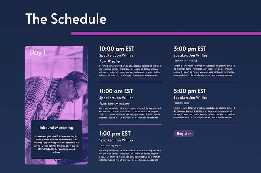
The Schedule
The schedule section is next. In this area, we’ve elegantly shared the summit’s schedule and made sure it’s structural. To keep the style of the text design, make sure to change the content but not the heading levels. Try and keep the content to about the same length so the design stays neat.
Rows are organized by days with a title image and a group of blurbs. At the bottom of the last column you can find a call to action button for the audience to register.
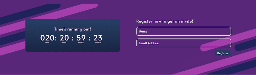
Register
Last but not least is the registration section. We’ve included a countdown timer to add a sense of urgency (you can use the Divi module or one of the top countdown plugins available with WordPress). The contact form should be directly linked to your RSVP list so that each invitee is registered automatically.
Throughout the virtual summit landing page design, you’ll find three buttons that navigate to this section for optimized lead generation.
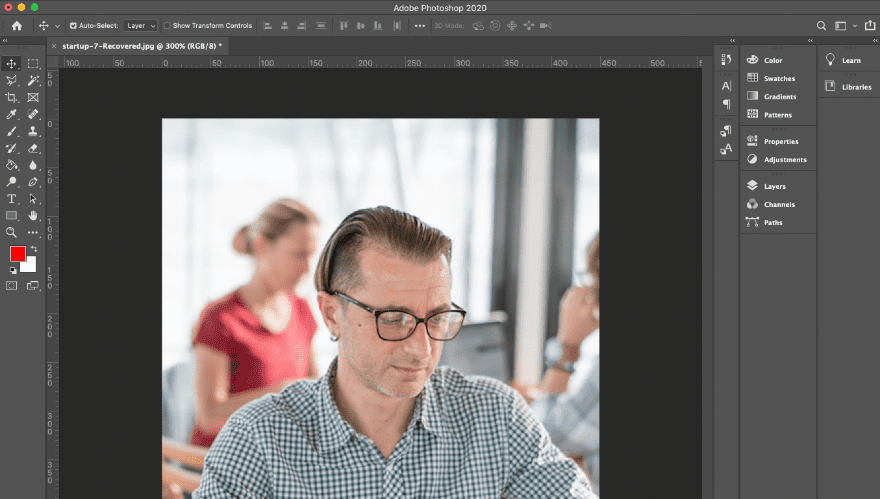
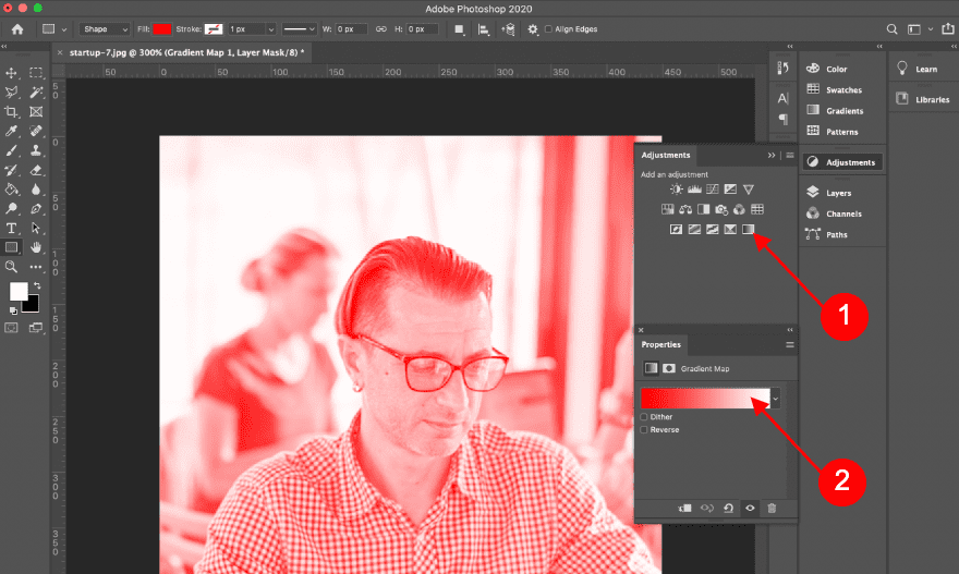
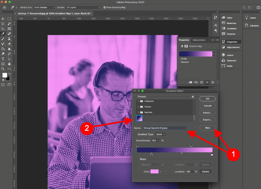
Create a Duotone Gradient Map with Photoshop
Open Image in Adobe Photoshop
If you’d like to mimic the duotone images in our design, follow the steps below. First, open an image in Photoshop.
Open Adjustments and Select Gradient Map
Open the adjustments toolbar and click on the gradient map. In the properties tab, double-click on the gradient bar to open the settings popup.
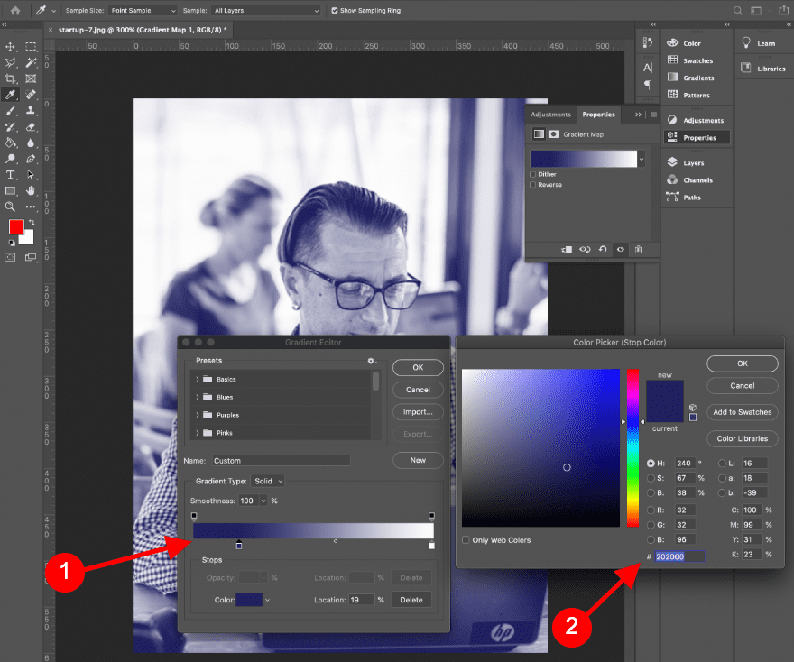
Adjust Gradient Colors
In the gradient settings, double-click on each color to customize the settings.
To achieve the effect of our design, adjust gradient as follows:
- Gradient Type: Solid
- Smoothness: 100%
- Opacity Stop #1: 100%
- Color Stop #2
- Dark Purple #202060
- Position: 19%
- Midpoint:
- Opacity Midpoint: 85%
- Color Midpoint: 50%
- Opacity Stop #2: 55%
- Color Stop #
- Violet #f895f8
- Position: 100%
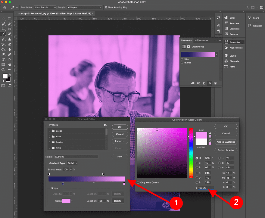
Save as a Custom Gradient Map
Add a name for your gradient and click on new to save it. It’ll then be stored in your gradient library. Save the image for the web at 700px tall. Repeat the process with as many images as you need. After applying the gradient map, select your saved gradient.
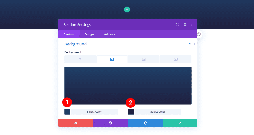
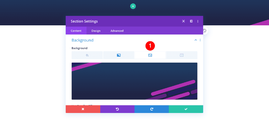
1. Create Header Section
Add New Section
Background
Let’s start recreating the virtual summit landing page. Create a new page and open it with the Divi Builder. Before adding rows, add a background image and gradient to a new section. You’ll find the background graphic in the downloadable folder above.
- Background Gradient
- Color 1: #1f4068
- Color 2: #202040
- Background Image: Header Graphic
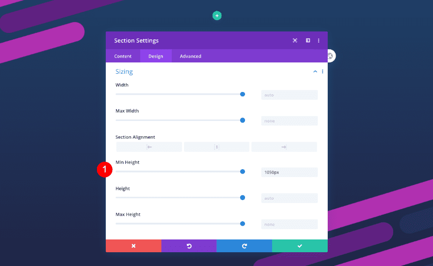
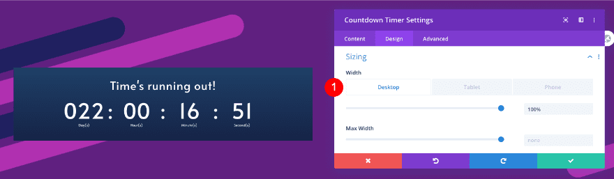
Sizing
Adjust the min height next.
- Min Height: 1050px
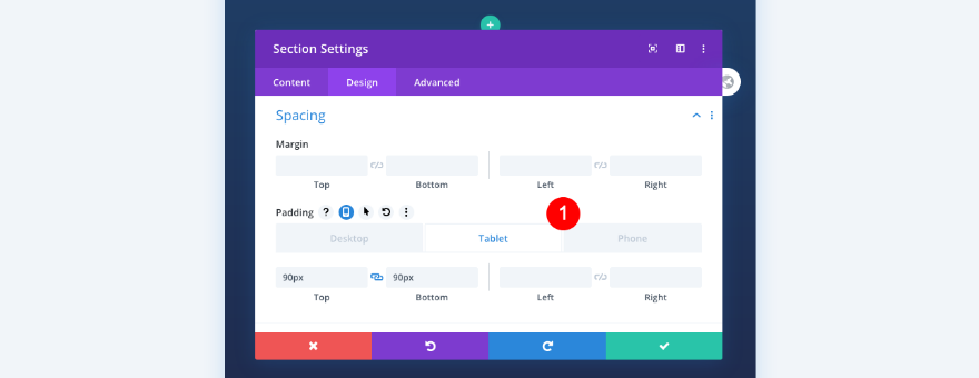
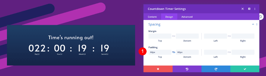
Spacing
The spacing as well.
- Top and Bottom Padding
- Table and Phone: 90px
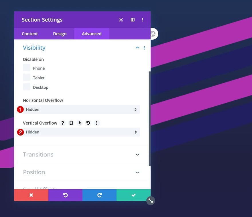
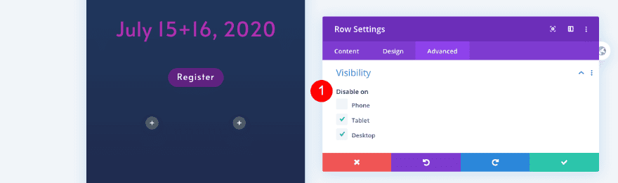
Visibility
Finally, adjust the visibility settings in the advanced tab.
- Horizontal and Vertical Overflow: Hidden
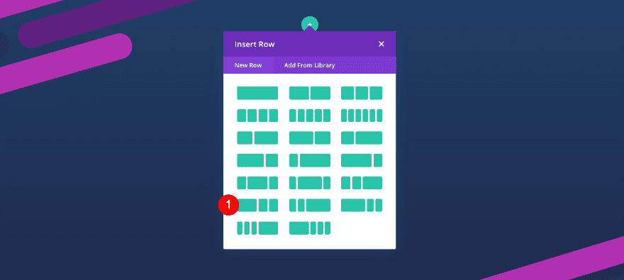
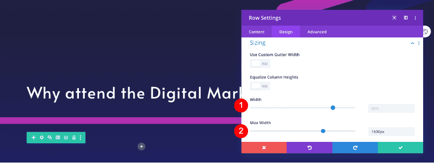
Add New Row
Column Structure
Add a row with three columns. Select the 1/2, 1/4, 1/4 column structure.
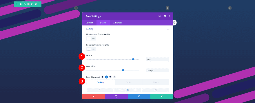
Sizing
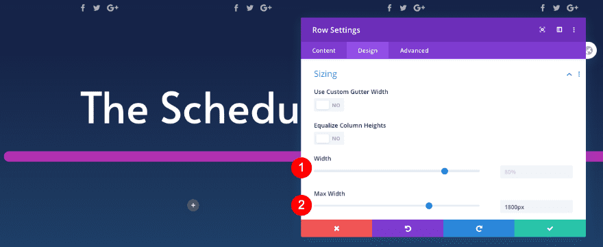
Adjust the sizing of the row as follows:
- Width: 90%
- Max Width: 1800px
- Alignment: Center
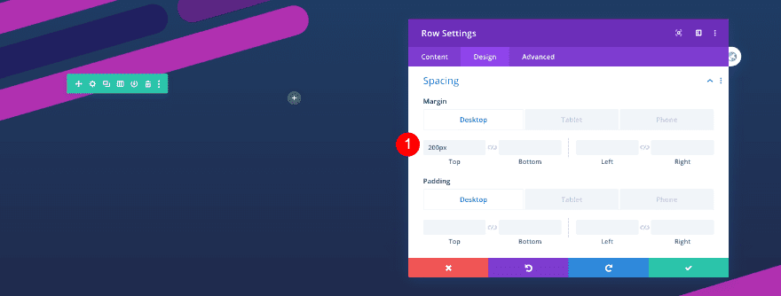
Spacing
\Add some top margin too.
- Top Margin: 200px
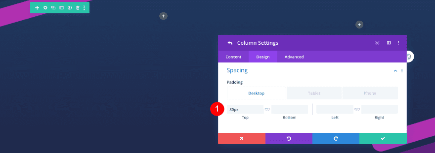
Column 2, 3 Settings
Spacing
Adjust the settings for columns 2 and 3. First the spacing
- Top Margin: 30px
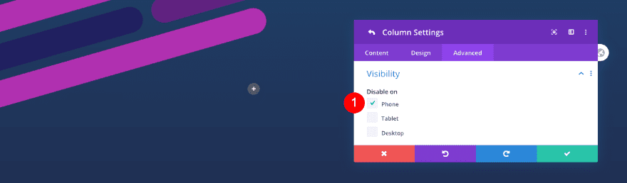
Visibility
Then, hide the columns on phone.
- Disable on: Phone
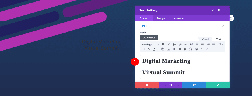
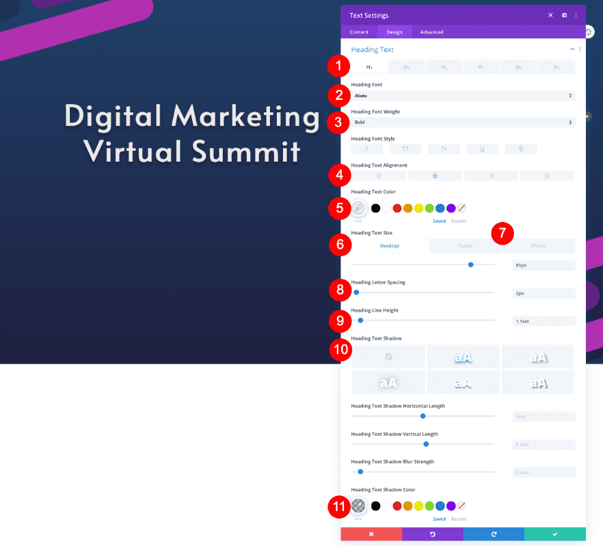
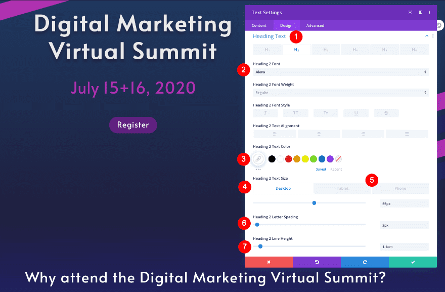
Add 1st Text Module To Column 1
Text
Add a first text module in column 1. Insert the title as H1 content.
- Body: H1 Content
Heading Text
In the design tab, style the heading text next.
- Heading Level: H1
- Font: Alata
- Weight: Bold
- Alignment: Center
- Color: Off White #eaeaea
- Size
- Desktop: 85px
- Tablet: 70px
- Phone: 44px
- Letter Spacing: 2px
- Line Height: 1.1em
- Text Shadow: 1st Option
- Shadow Color: rgba(o,0,0,0.26)
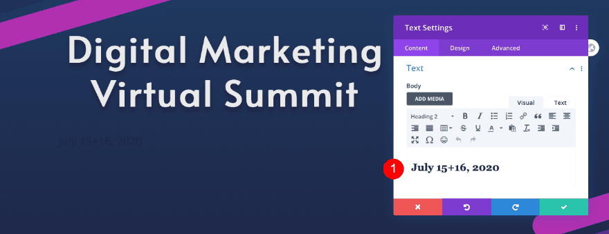
Add 2nd Text Module to Column 1
Text
Add a second text module. Insert the date as H2 content.
- Body: H2 Content, July 15+16, 2020
Heading Text
Style the heading text next.
- Heading Level: H2
- Font: Alata
- Weight: Regular
- Alignment: Center
- Color: Fucshia #b030b0
- Size
- Desktop and Tablet: 60px
- Phone: 45 px
- Line Height: 1.3em

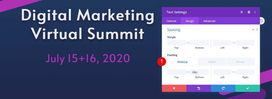
Spacing
Add some spacing too.
- Bottom Padding: 20px
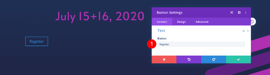
Text
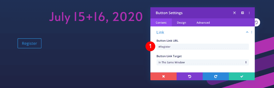
Add a button module for the call to action.
- Button: Register
Link
Add the anchor link.
- Link URL: #Register
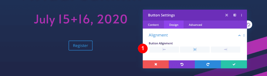
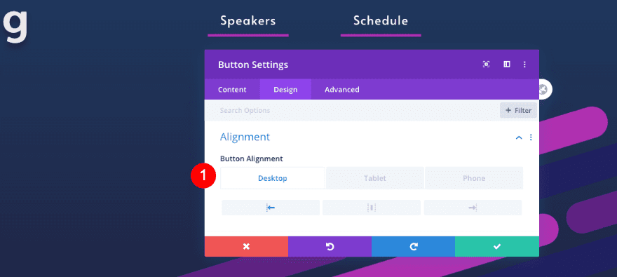
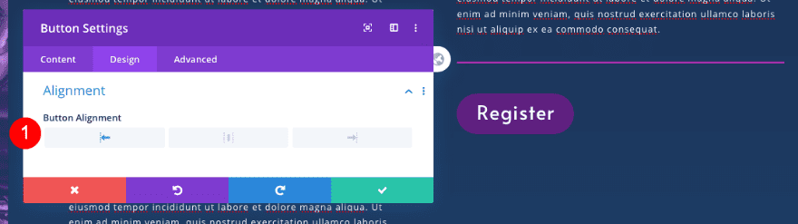
Alignment
Move over to the design tab and set the alignment.
- Button Alignment: Center
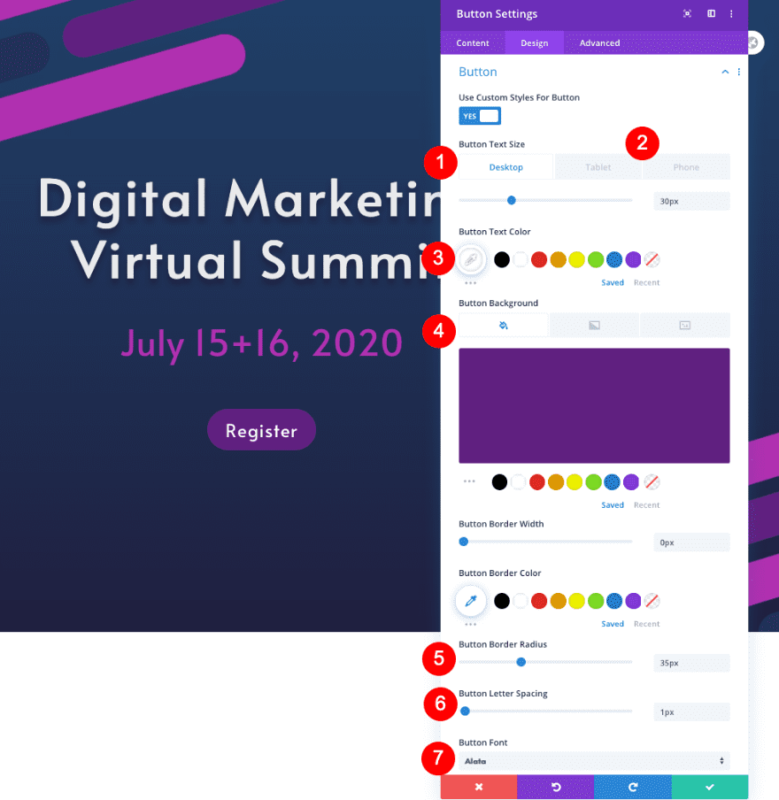
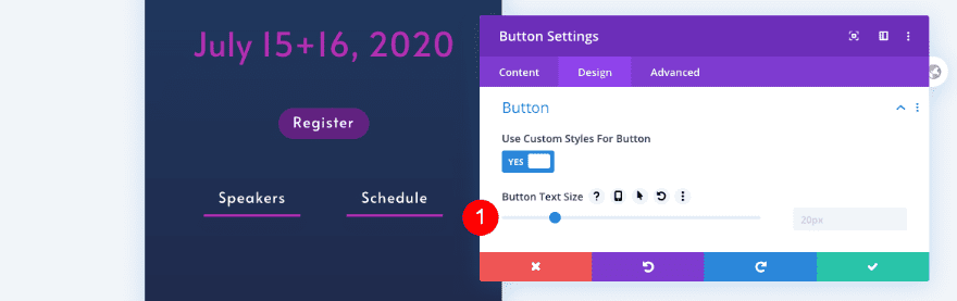
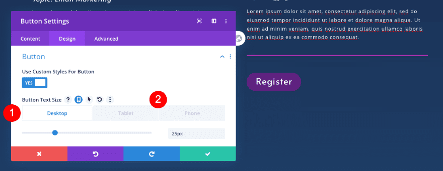
Button Custom Styles
Style the button too.
- Text Size
- Desktop: 30px
- Tablet: 25 px
- Phone: 20px
- Text Color: White #ffffff
- Background: Purple #602080
- Border Radius: 35px
- Letter Spacing: 1px
- Font: Alata
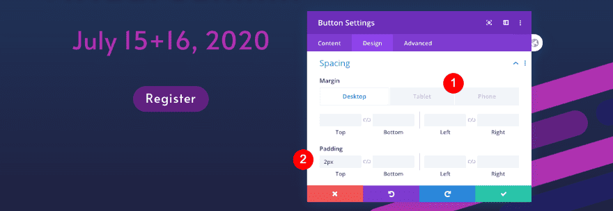
Spacing
Finally, adjust the spacing.
- Top Margin
- Tablet and Phone: 15px
- Top Padding: 2px
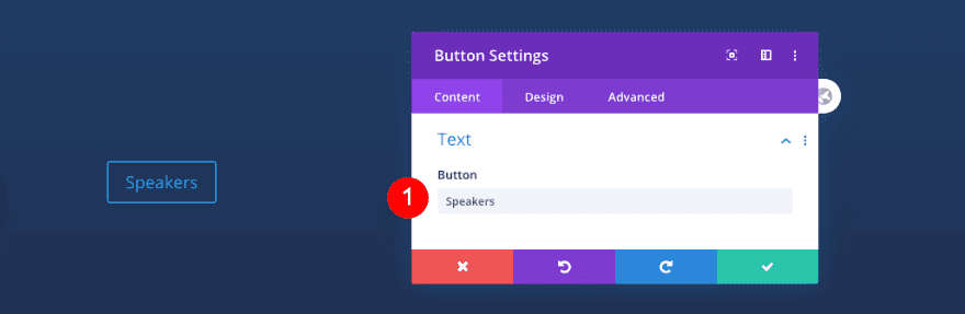
Text
Move over to column 2 and add a button module. Add the copy of your choice.
- Button: Speakers
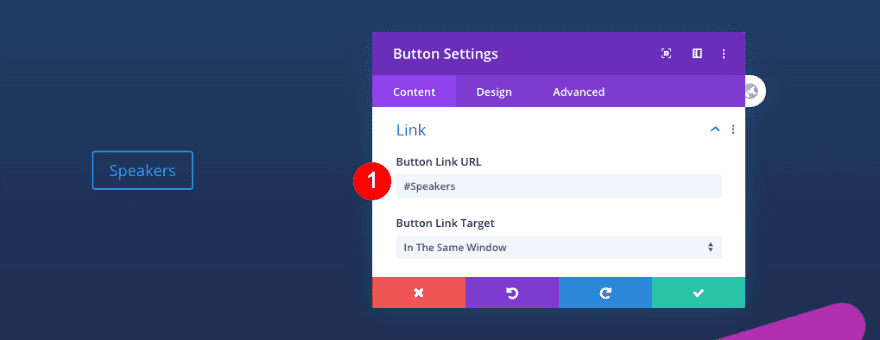
Link
Next, add an anchor link.
- Link URL: #Speakers
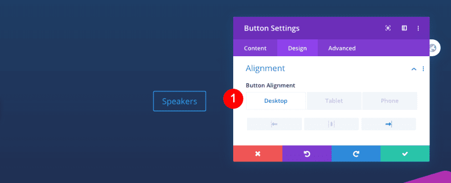
Alignment
In the design tab, set the alignment.
- Button Alignment
- Desktop: Right
- Tablet and Phone: Center
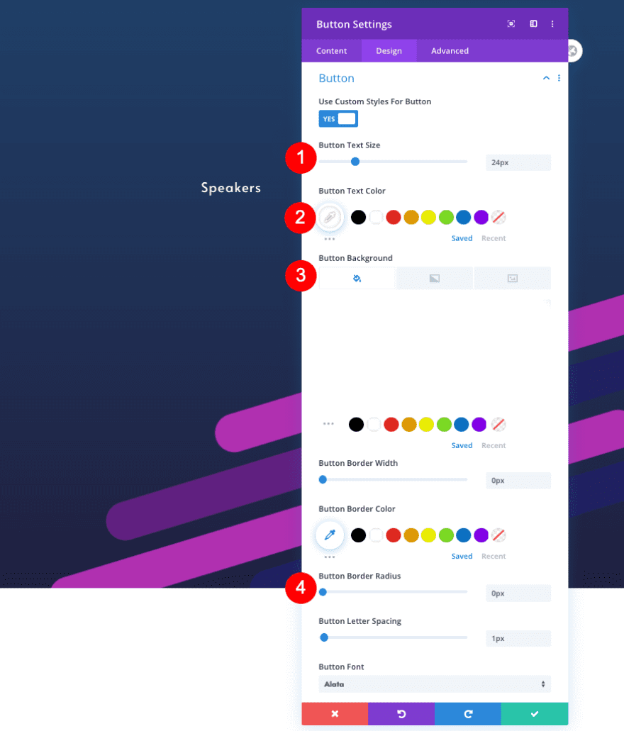
Button Custom Style
Adjust the custom button styles as well.
- Text Size: 24px
- Text Color: White #ffffff
- Background: Transparent
- Letter Spacing: 1px
- Button Font: Alata
- Border Radius: 0px
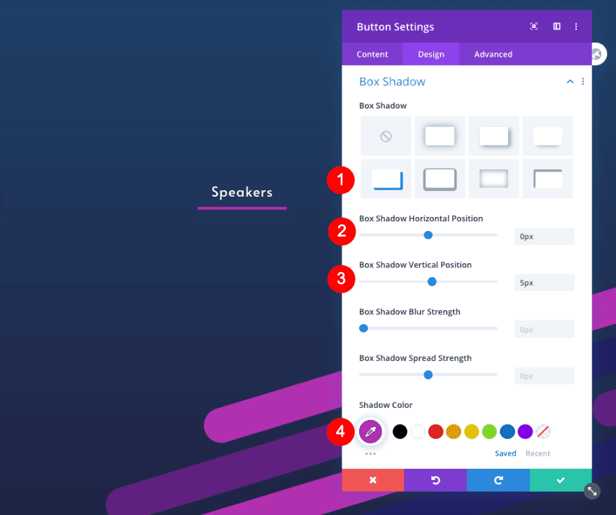
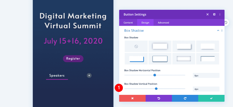
Box Shadow
Finally, add a box shadow.
- Box Shadow: 4th option
- Horizontal Position: 0px
- Vertical Position: 5 px
- Shadow Color: Fuchsia: #b030b0
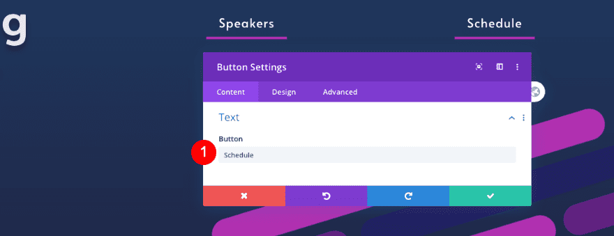
Clone Button
Clone the button in column 2 and place the duplicate module in column 3.

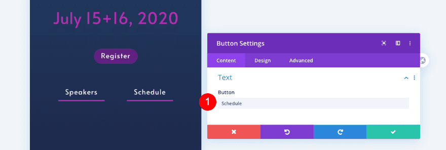
Text
Change the text in the cloned button.
- Button: Schedule
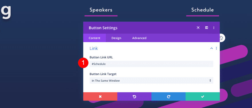
Link
Change the anchor link too.
- Link URL: #Schedule
Alignment
Don’t forget to change the alignment as well.
- Button Alignment
- Desktop Left
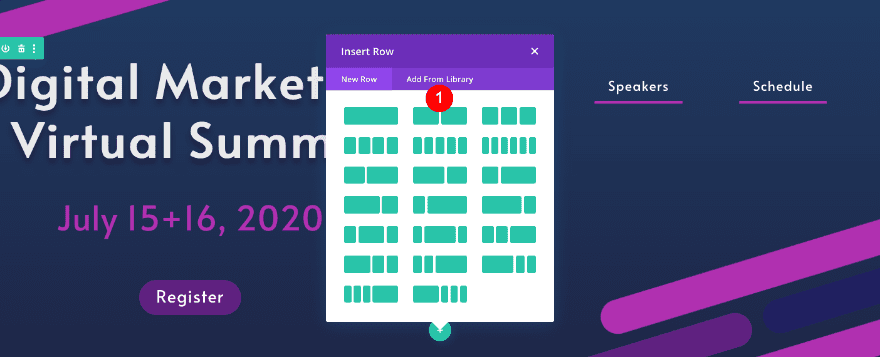
Add New Row
Column Structure
Add a new row with two equal columns.
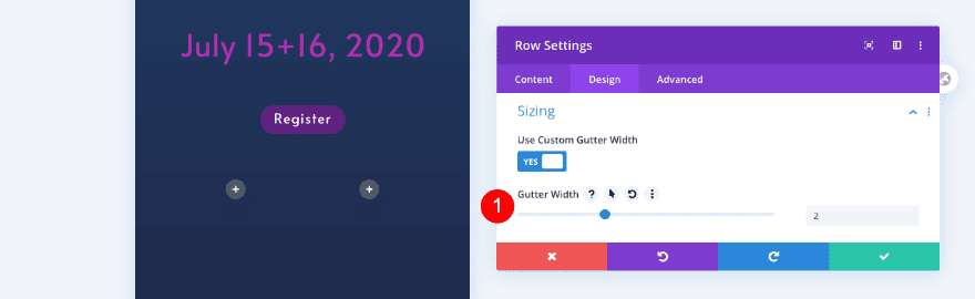
Sizing
Adjust the gutter width first.
- Custom Gutter Width: 2
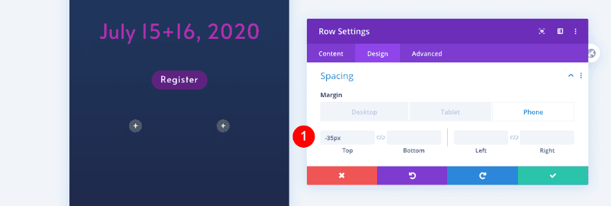
Spacing
Add spacing next.
- Top Margin
- Phone: -35px
Visibility
Then adjust the visibility of the row.
- Disable on: Tablet and Desktop
Clone Button
Clone the button module in column 2 of the previous row and place the duplicate module in column 1 of the new row.
Button Custom Style
Adjust the text in the new button.
- Text Size: 20px
Box Shadow
Modify the box shadow as well.
- Vertical Position: 4px
Clone Button
Duplicate button module from column 3 in the previous row. Paste it in column 2 of this row.
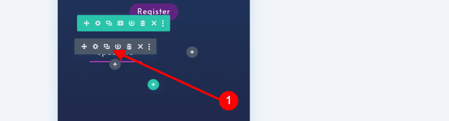

Text
Adjust the text content in the cloned button.
- Text: Schedule
2. Create Info Section
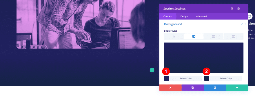
Add New Section
Background
To create the information section, add a new section and style the background first.
- Background Gradient
- Color 1: #202040
- Color 2: #202060
Spacing
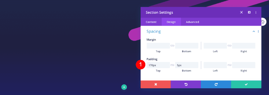
Add some padding too.
- Top Padding: 170px
- Bottom Padding: 5px
Visibility
Finally, adjust the visibility settings in the advanced tab.
- Horizontal and Vertical Overflow: Hidden
Add New Row
Column Structure
Add a new row with one column. We’ll call this the title row.
Sizing
Set the sizing next.
- Width: 80%
- Max Width: 1800px
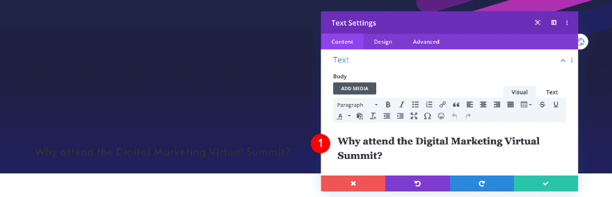
Add Text Module
Text
Add a text module.
- Body: H2 Content – Why attend the Digital Marketing Virtual Summit?
Heading Text
In the design tab, style the heading text.
- Heading Level: H2
- Font: Alata
- Text Color: White #ffffff
- Size
- Desktop: 55px
- Tablet: 45px
- Phone: 40px
- Letter Spacing: 2px
- Line Height: 1.1 em
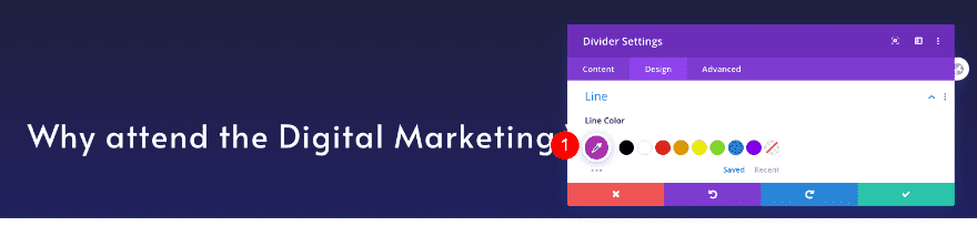
Add Divider Module
Line
Now add a divider module and style the line in the design tab.
- Line Color: Fuchsia #b030b0
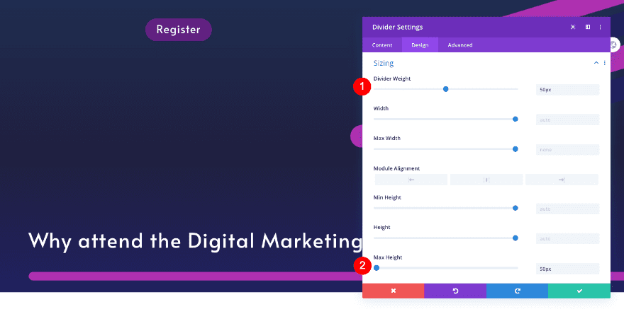
Sizing
Adjust the sizing next.
- Divider Weight: 50px
- Max Height: 50px
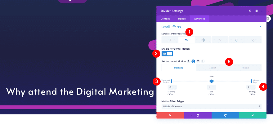
Scroll Effects
In the advanced tab, add a horizontal scroll effect.
- Enable Horizontal Motion
- Desktop
- Starting Offset: -6
- Mid Offset: 50% / 0
- Ending Offset: 6
- Tablet and Phone
- Stating Offset: -4
- Mid Offset: 50% /0
- Ending Offset: 4
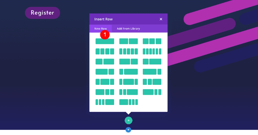
Add New Row
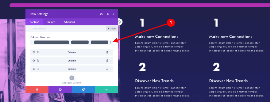
Column Structure
Now add a new row with three columns. Select the 1/2, 1/4, 1/4 column structure.
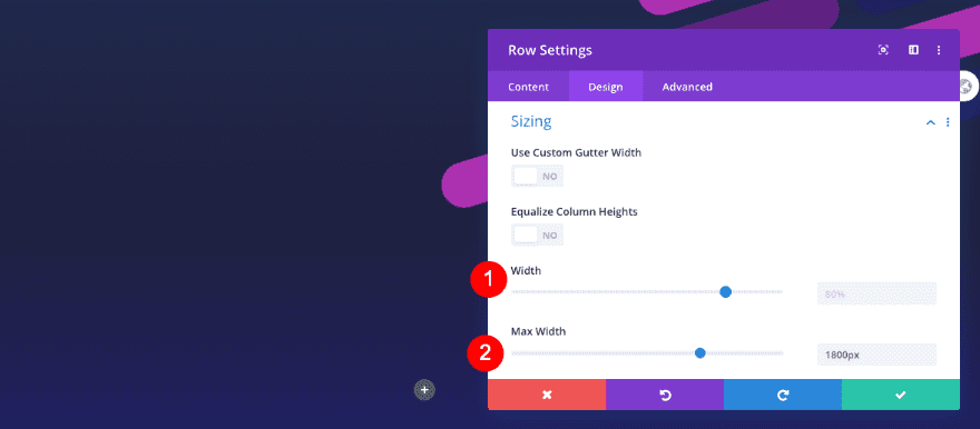
Sizing
Before adding modules, adjust the row sizing.
- Width: 80%
- Max Width: 1800px
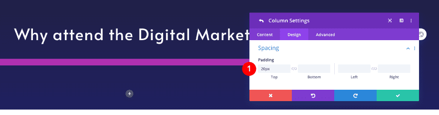
Column 1 Settings
Spacing
Also, adjust the spacing of the first column.
- Top Padding: 20px
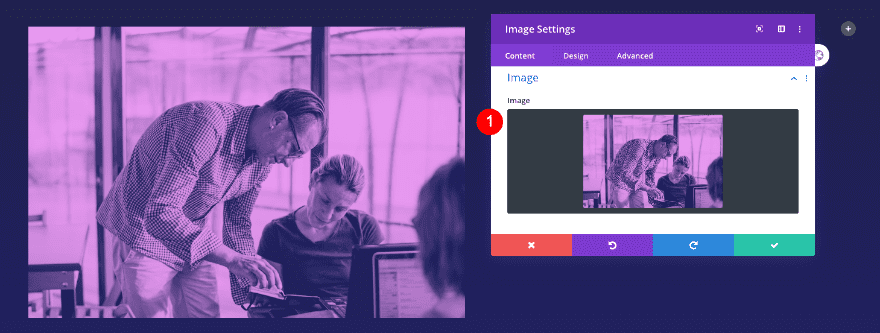
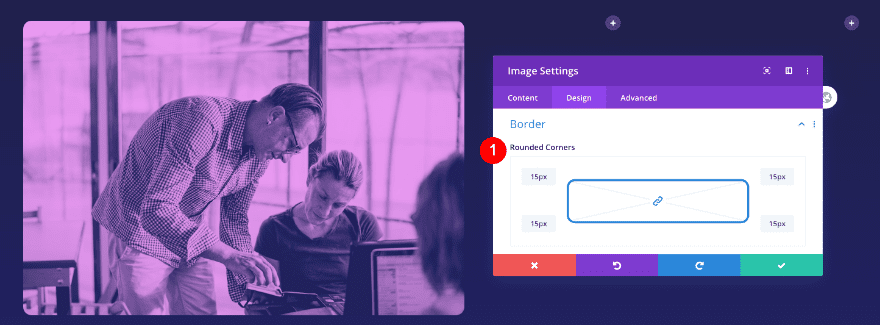
Add Image Module to Column 1
Image
Now add an image module to column 1. Use one of your images with the duotone effect.
- Image: Photo with duotone effect
Border
Adjust the borders too.
- Rounded Corners: 15px
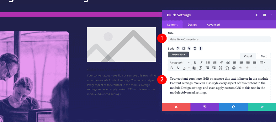
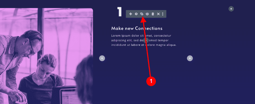
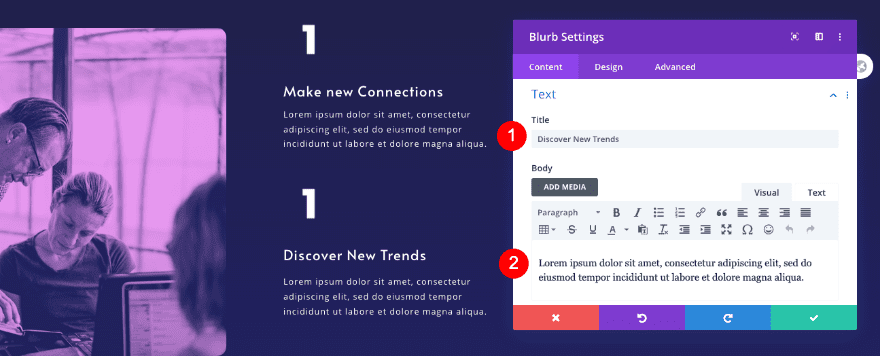
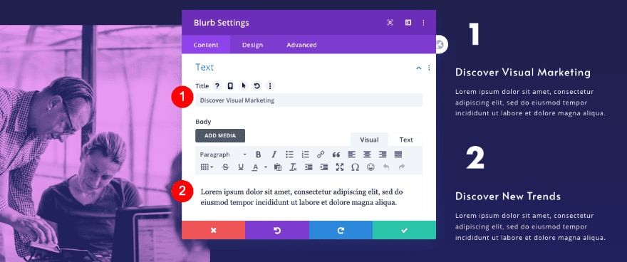
Add Blurb Module to Column 2
Text
Move on to column 2 and add a blurb module. Insert the content.
- Title: Make New Connections
- Body: Descriptive Content
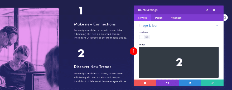
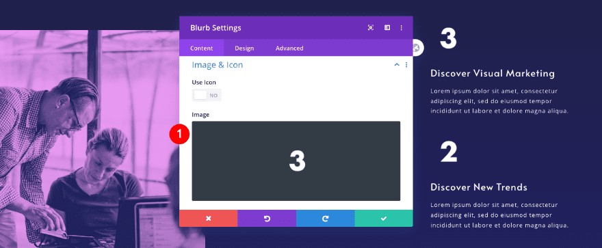
Image
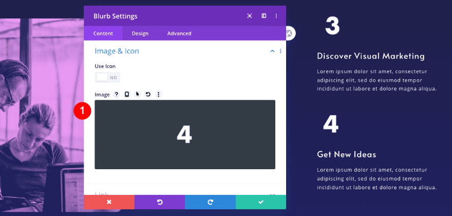
Upload the number 1 image which you can find in the downloadable folder.
- Image: PNG of #1
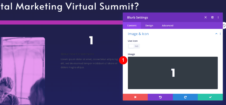
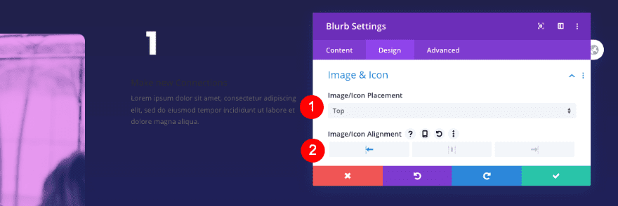
Image & Icon
Adjust the placement of the image next.
- Placement: Top
- Alignment: Left
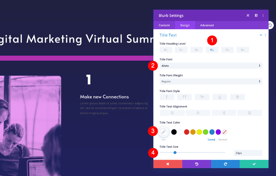
Title Text
Style the title text too.
- Heading Level: H4
- Font: Alata
- Color: White #ffffff
- Size: 23px
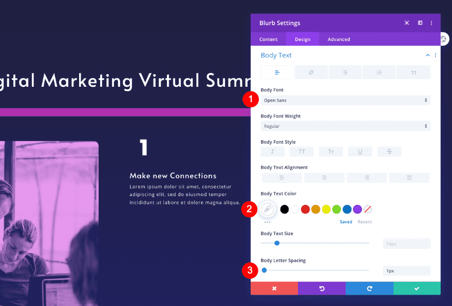
Body Text
Don’t forget to style the body text.
- Font: Open Sans
- Color: White #ffffff
- Size: 14px
- Letter Spacing: 1px
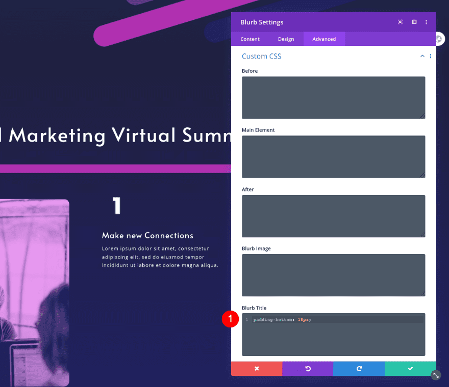
Custom CSS
Finally, add some extra padding with custom CSS to the blurb title in the advanced tab.
- Blurb Title: padding-bottom: 15px;
padding-bottom: 15px;
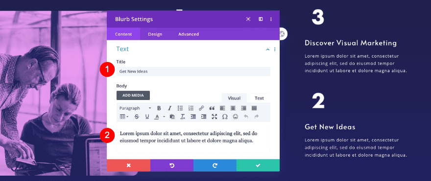
Clone Blurb Module & Place Duplicate in Column 2
Clone Blurb
Duplicate 1st blurb in column 2.
Content
Update the content.
- Title: New Title
- Body: New Descriptive Text
Image
Then, change the number image. You can find the new one in the downloadable folder.
- Image: PNG of #2
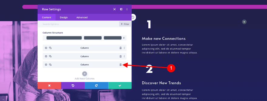
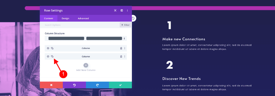
Delete Column 3 & Clone Column 2
Clone Column
In the row settings, delete the 3rd column and duplicate the 2nd. Make sure you return the column structure to 1/2, 1/4, 1/4.
Adjust Blurb 1 in Column 3
Content
Update the text content in the cloned blurb.
- Title: New Title
- Body: New Descriptive Text
Image
Change the number image as well.
- Image: PNG of #3
Adjust Blurb 2 in Column 3
Content
Modify the content of this blurb too. First the text.
- Title: New Title
- Body: New Descriptive Text
Image
Then, change the number image.
- Image: PNG of #4
3. Create Speakers Section
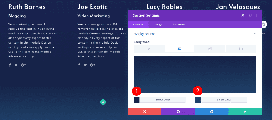
Add New Section
Background
Moving on to the section for the speakers. Add a new section and style the background.
- Background Gradient
- Color 1: #202060
- Color 2: #162447
Visibility
Adjust the visibility settings in the advanced tab.
- Horizontal and Vertical Overflow: Hidden
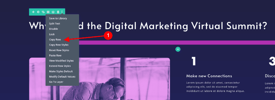
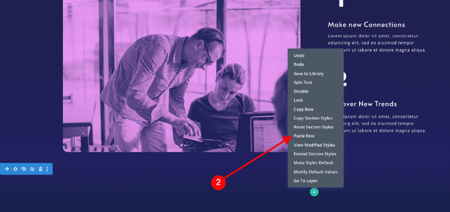
Clone Title Row & Place Duplicate in New Section
Duplicate Row
Duplicate the title row from the section above and place the duplicate in the cloned section. We’ll call this, title row 2.
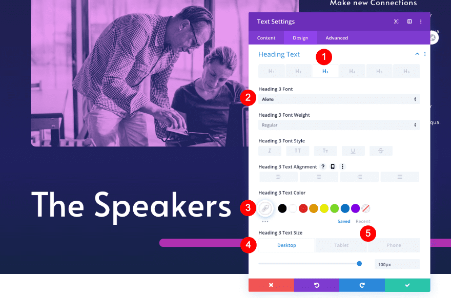
Adjust Text Module
Text
- Title: New title content – The Speakers
Heading Text
Then, style the H3 text settings in the design tab.
- Heading Level: H3
- Font: Alata
- Size
- Desktop: 100px
- Tablet: 80px
- Phone: 45px
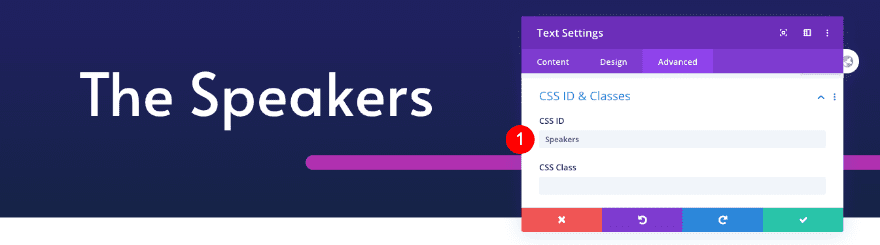
Custom CSS
Adjust the CSS ID in the cloned text module as well.
- CSS ID: Speakers
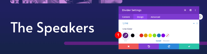
Adjust Divider
Line
Next, change the line color of the divider module.
- Line Color: Purple #602080
Add New Row
Column Structure
Now add a new row with 5 equally-sized modules.
Sizing
Adjust the sizing of the row as follows:
- Width: 80%
- Max Width: 1800px
- Equalize Column Height: Yes
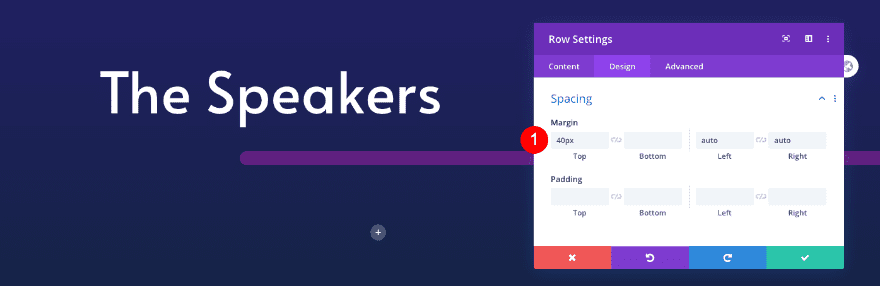
Spacing
Add some spacing too.
- Top Margin: 40px
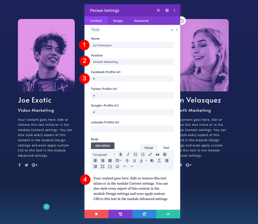
Add Person Module to Column 1
Text
Add the first person module to column 1.
- Name: Person’s Name
- Position: Person’s Position
- Social Media Profiles: Person’s Profiles
- Body: Descriptive Text
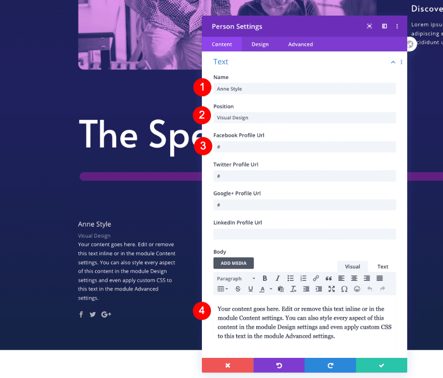
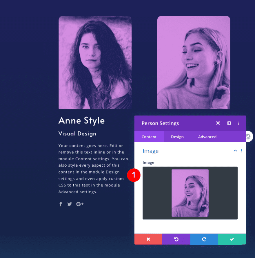
Image
Upload the image of the speaker with the color effect. We recommend a 550 x 770 px image size.
- Image: Photo with duotone effect
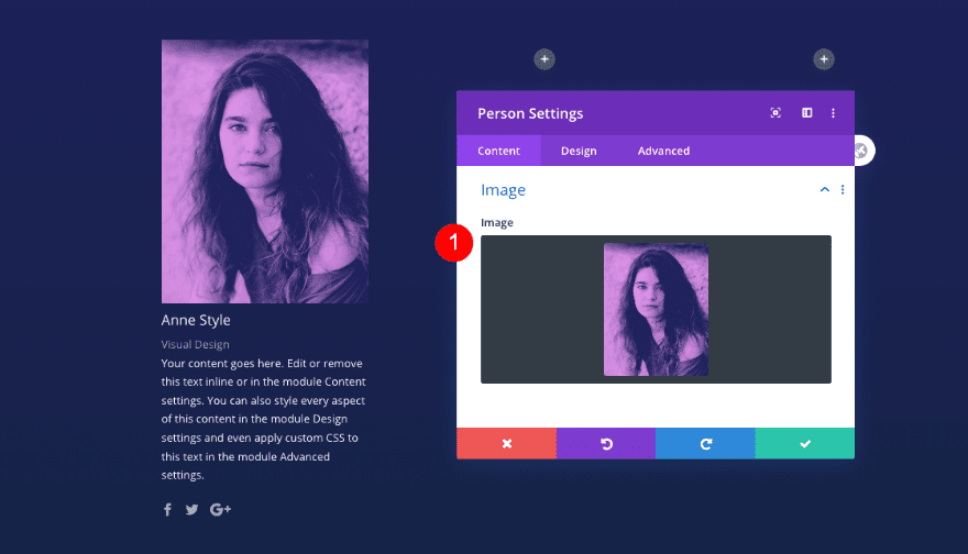
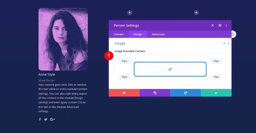
Image
Add some rounded corners to the image next.
- Image Rounded Corners: 15px
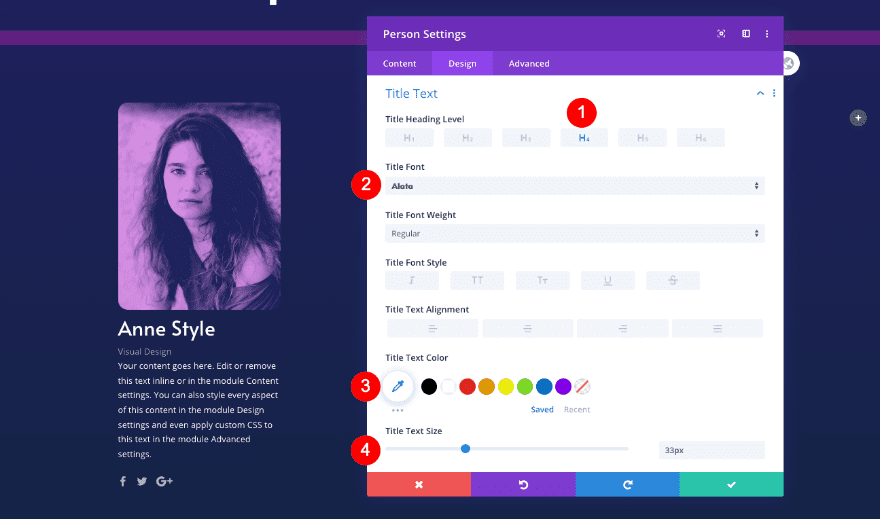
Title Text
Then, style the title text.
- Heading Level: H4
- Font: Alata
- Size: 33px
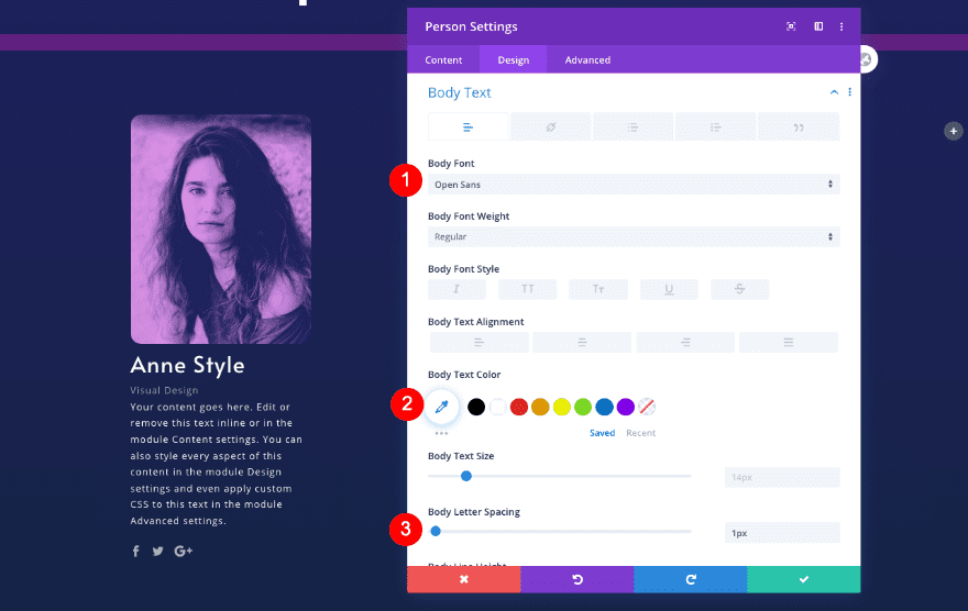
Body Text
Style the body text as well.
- Font: Open Sans
- Size: 14px
- Letter Spacing: 1px
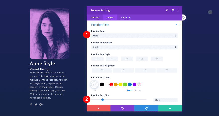
Position Text
Don’t forget the position text.
- Font: Alata
- Size: 20px
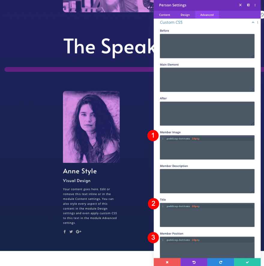
Custom CSS
Finally, add some custom CSS for extra padding.
- Member Image: padding-bottom: 10px;
padding-bottom: 10px;
- Title: padding-bottom: 20px;
padding-bottom: 20px;
- Member Position: padding-bottom: 20px;
padding-bottom: 20px;
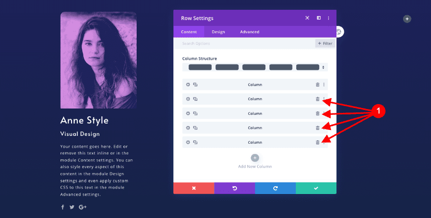
Duplicate Column 1
Clone Column
In the row settings, delete columns 2-5. Duplicate column 1 four times.
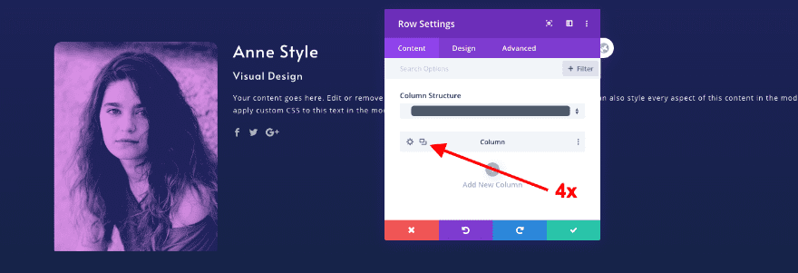
Adjust Content for New Person Modules
Text
Update the content in all the cloned modules. First the text.
- Name: New Person’s Name
- Position: New Person’s Position
- Social Media Profiles: New Person’s Profiles
- Body: New Descriptive Text
Image
Then the image.
- Image: New image with duotone effect (550x700px)
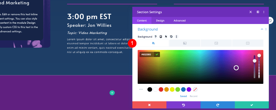
4. Create Schedule Section
Add New Section
Background
Now we’ll create the schedule section. Add a new section and style the background as follows:
- Background Gradient
- Color 1: #162447
- Color 2: #1f4068
Visibility
Adjust the visibility settings in the advanced tab.
- Horizontal and Vertical Overflow: Hidden
Clone Title Row 2
Duplicate Row
Clone the title row from the section above and paste it in this section.
Adjust Text Module
Text
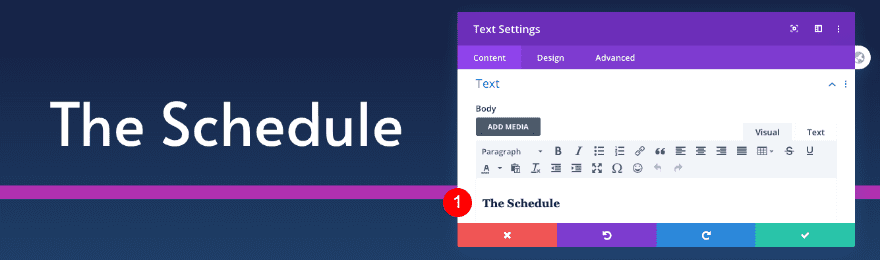
Change the title content.
- Title: The Schedule
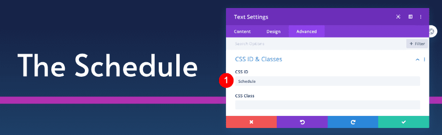
Custom CSS
Change the CSS ID in the cloned text module.
- CSS ID: Schedule
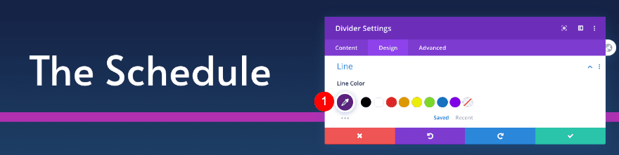
Adjust Divider
Line
Change the color of the divider as well.
- Line Color: Fuchsia #b030b0
Add New Row
Column Structure
Now, add a new row with three equally-sized columns.
Sizing
Adjust the sizing of the row.
- Width: 80%
- Max Width: 1800px
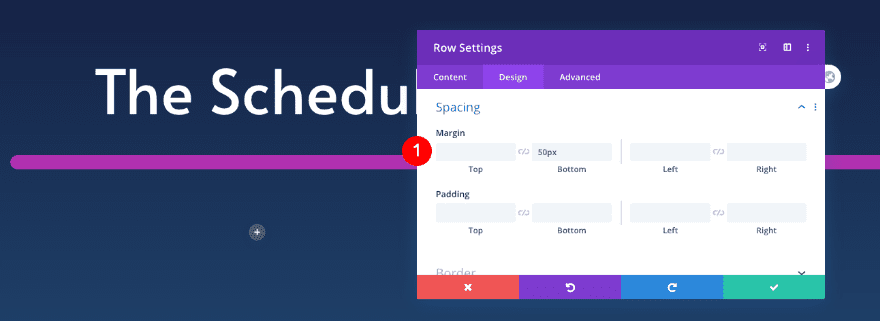
Spacing
Add some spacing too.
- Bottom Margin: 50px
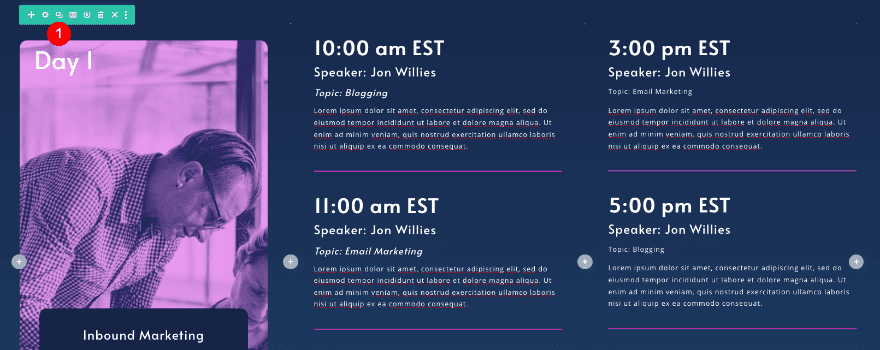
Add Text Module to Column 1
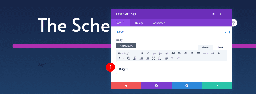
Text
Add a text module to the first column. Insert the content.
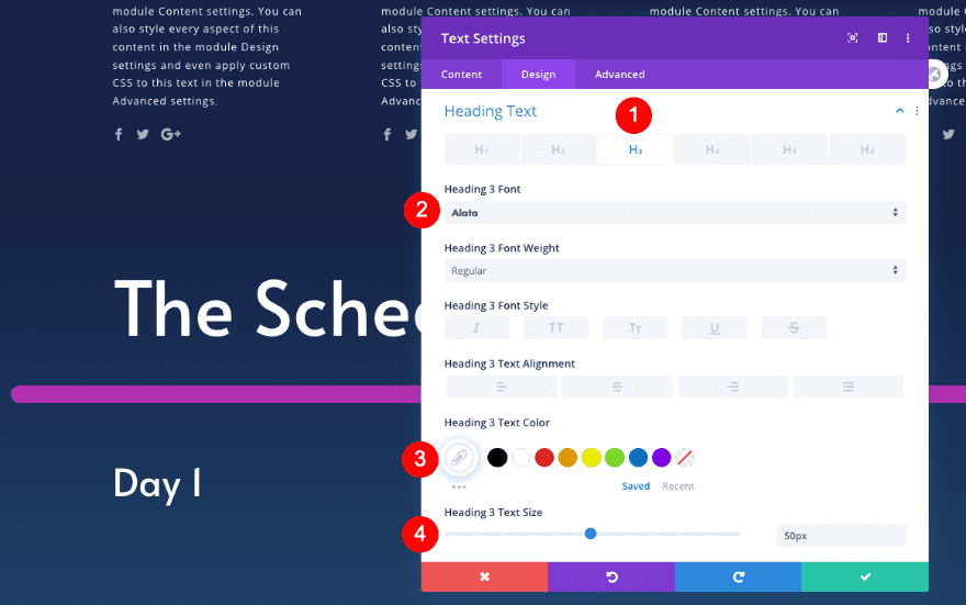
- Body: H3 Content – Day 1
Heading Text
Move over to the design tab and style the heading text.
- Heading Level: H3
- Color: White #ffffff
- Size: 50px
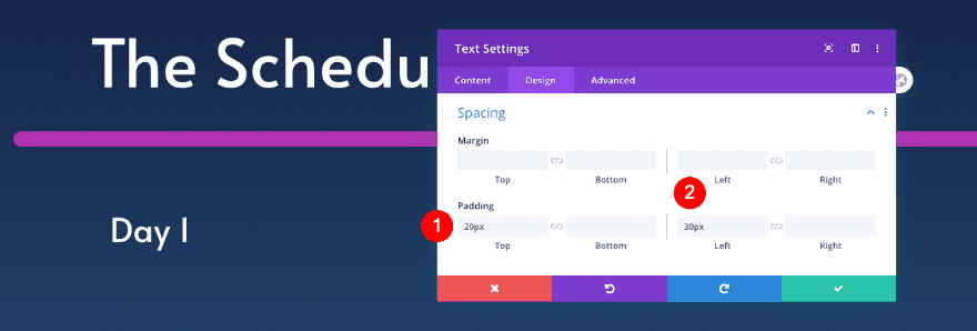
Spacing
Add some spacing next.
- Top Padding: 20px
- Left Padding: 30px
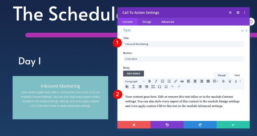
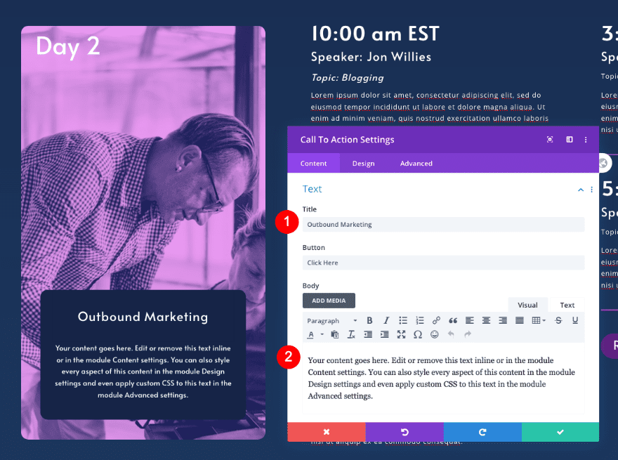
Add Call To Action to Column 1
Text
Now add a call to action module with some content of your choice.
- Title: Day’s theme title – Inbound Marketing
- Body: Descriptive Text
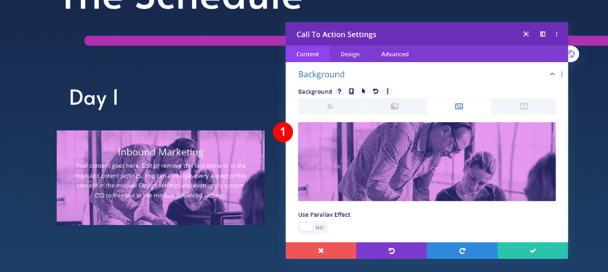
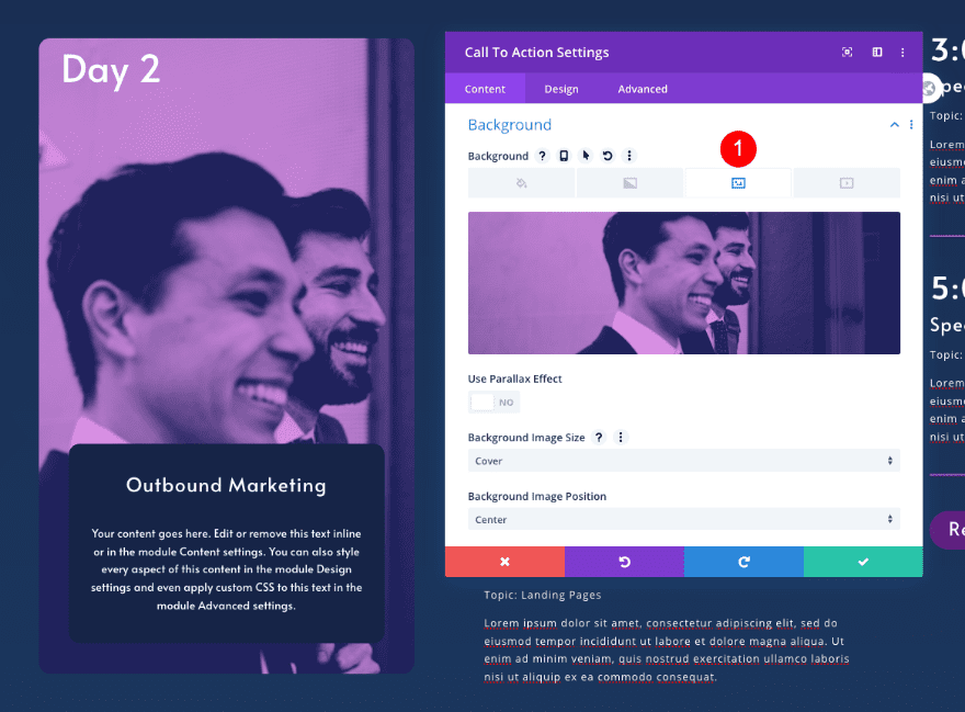
Background
Add an image background too.
- Background image: Image with duotone effect
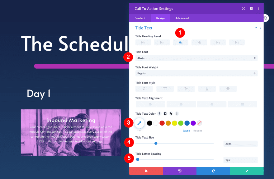
Heading Text
In the design tab, style the heading text.
- Heading Level: H3
- Font: Alata
- Color: White #ffffff
- Size: 26px
- Letter Spacing: 1px
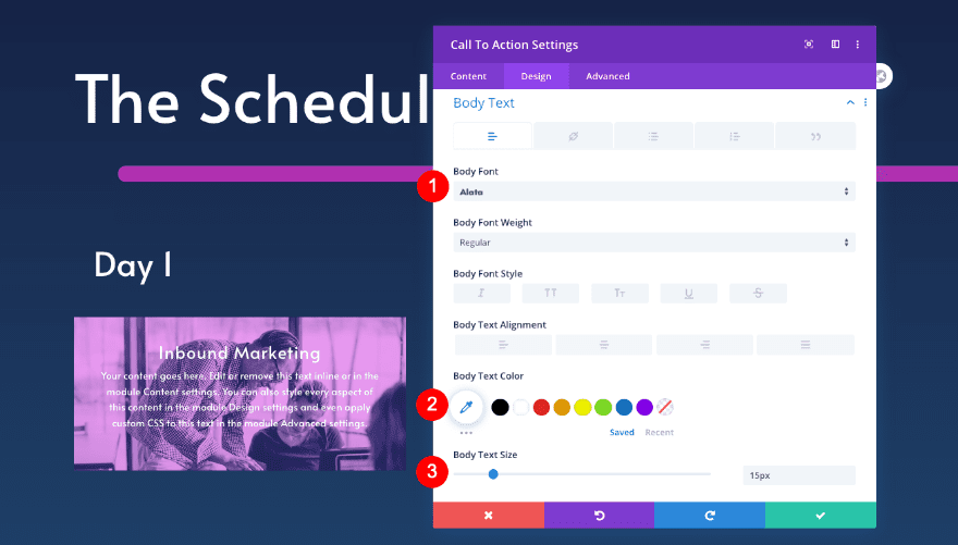
Body Text
Style the body text next.
- Font: Alata
- Color: White #ffffff
- Size: 15px
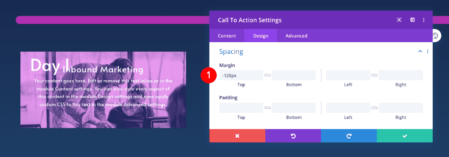
Spacing
Add some spacing too.
- Top Margin: -120px
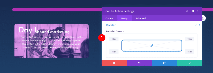
Border
Then, style the border.
- Rounded Corners: 15px
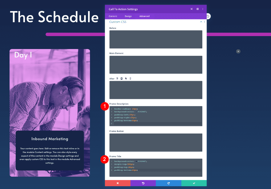
Custom CSS
Finally, add custom CSS for extra styling.
- Promo Description
- border-radius: 15px;
- background-color: #162447;
- padding-left: 25px;
- padding-right: 25px;
- padding-bottom: 40px;
border-radius: 15px;
background-color: #162447;
margin-top: 500px;
padding-bottom: 40px;
padding-bottom: 40px;
- Promo Title
- background-color: #q62447
- margin-top: 500px
- padding-bottom: 40px
- padding-bottom: 40px
background-color: #q62447;
margin-top: 500px;
padding-bottom: 40px;
padding-bottom: 40px;
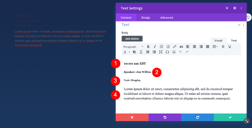
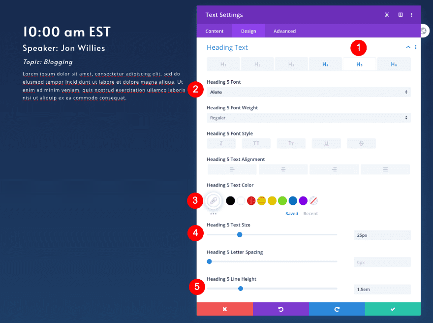
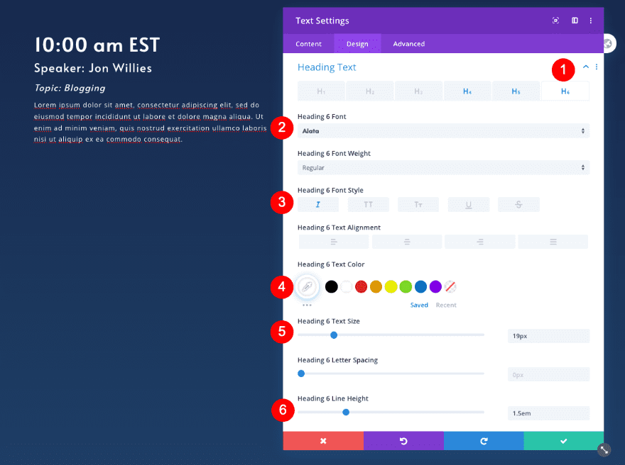
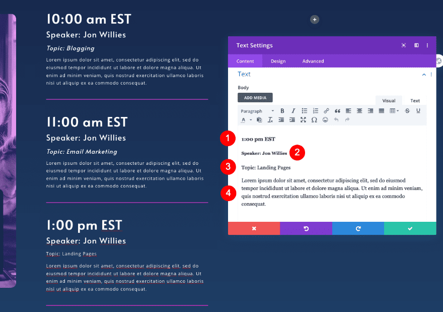
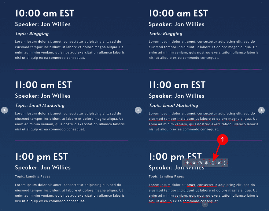
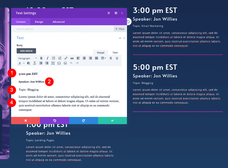
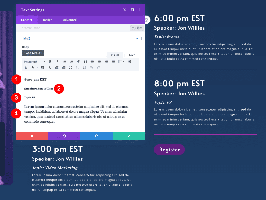
Add Text Module to Column 2
Text
Move over to column 2 and add a text module. Follow this content structure:
- Body
- Date: H4 Content
- Speaker: H5 Content
- Topic: H6 Content
- Description: Paragraph Content
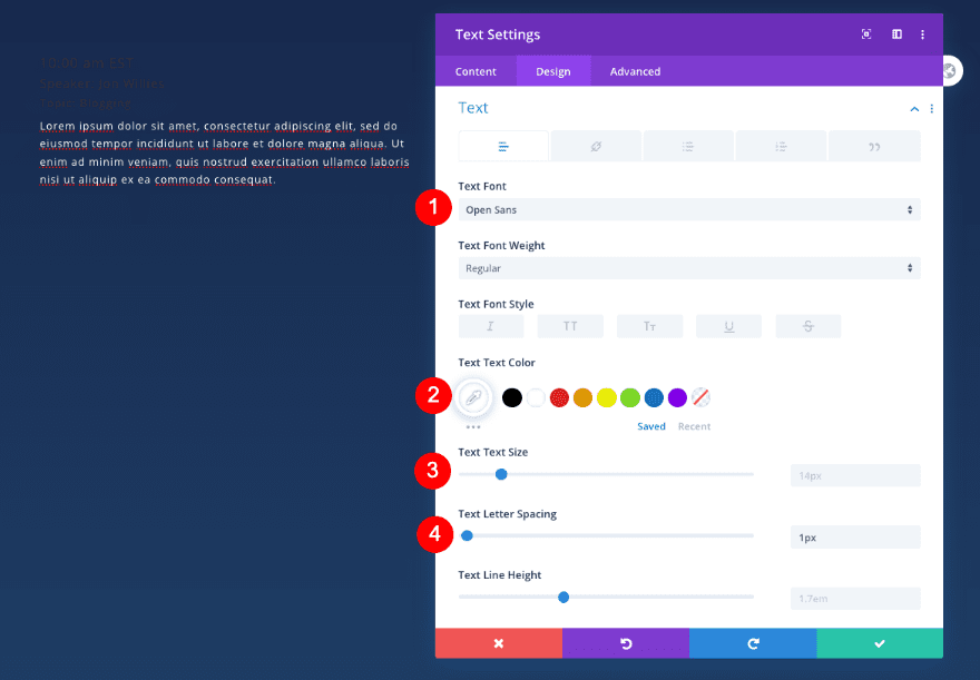
Text
In the design tab, style the text.
- Font: Open Sans
- Size: 14px
- Letter Spacing: 1px
- Alignment: Left
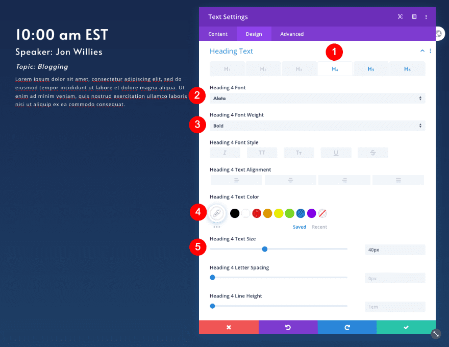
Heading Text
Then style all the heading levels.
- Heading Level: H4
- Font: Alata
- Weight: Bold
- Size: 40px
- Heading Level: H5
- Font: Alata
- Size: 25px
- Line Height: 1.5em
- Heading Level: H6
- Font: Alata
- Style: Italics
- Size: 19px
- Line Height: 1.5em
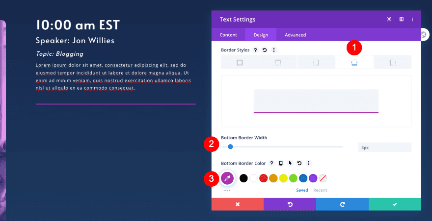
Border
Style the border too.
- Style: Bottom Border
- Width: 3px
- Color: Fuchsia #b030b0
Clone Text Module 2 Times
Clone Text Module
Duplicate the 1st text module twice.
Adjust New Text Modules
Text
Change the content in the cloned text modules.
- Body
- Date: New H4 Content
- Speaker: New H5 Content
- Topic: New H6 Content
- Description: New Paragraph Content
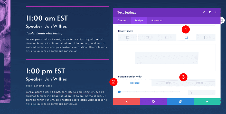
Remove Border of 3rd Text Module
Border
Remove the border of the last module in the column.
- Bottom Border Width
- Desktop: 0px
- Tablet and Phone: 3px
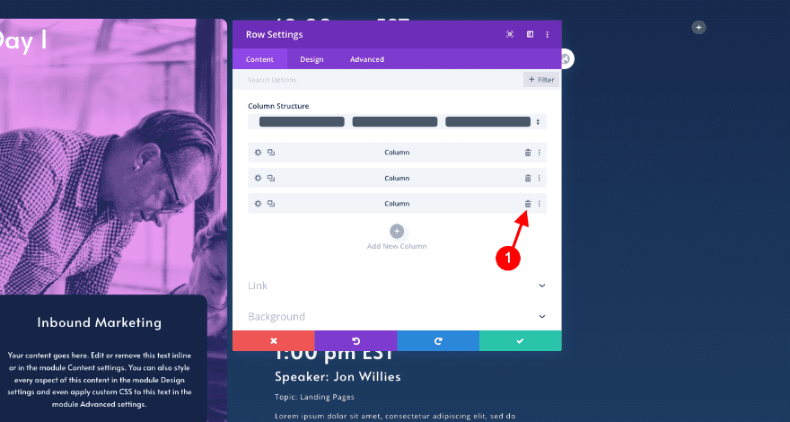
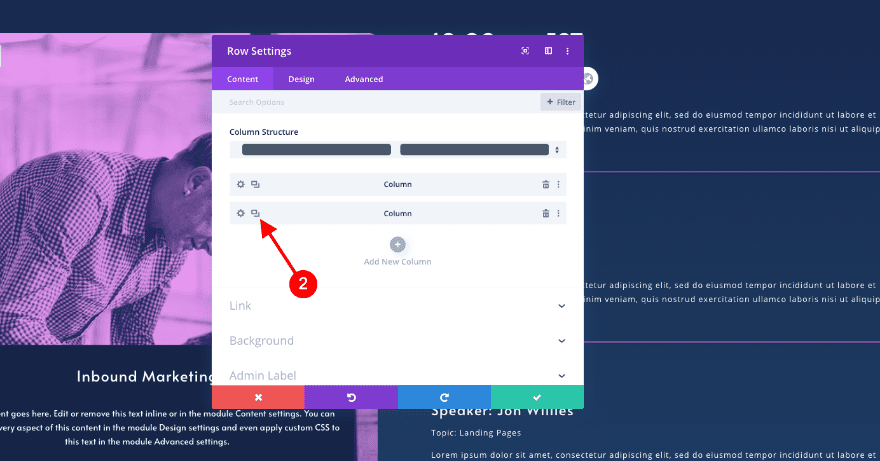
Delete Column 3 & Clone Column 2
Clone Columns
In the row settings, delete column 3. Duplicate column 2.
Remove & Adjust Text Modules
Delete Text Module
Erase the 3rd text module in the cloned column.
Adjust Content
Update the content in each new text module.
- Body
- Date: New H4 Content
- Speaker: New H5 Content
- Topic: New H6 Content
- Description: New Paragraph Content
Clone Button
Copy the “register” button in the header section and paste it below the last text module in column 3.
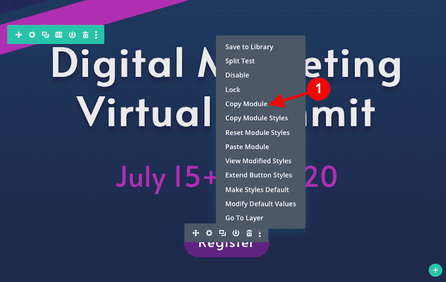
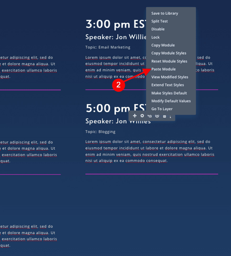
Alignment
Change the alignment of the button to left.
- Button Alignment: Left
Button Custom Style
Adjust the text size a little.
- Text Size
- Desktop and Tablet: 25 px
- Phone: 20px
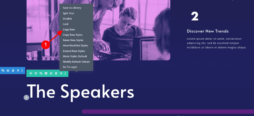
Clone 1st Row of Schedule Section
Clone Row
Duplicate the 1st row in the schedule section.
Adjust Text Module in Column 1
Text
Change the content in the cloned text module.
- Body: Day 2
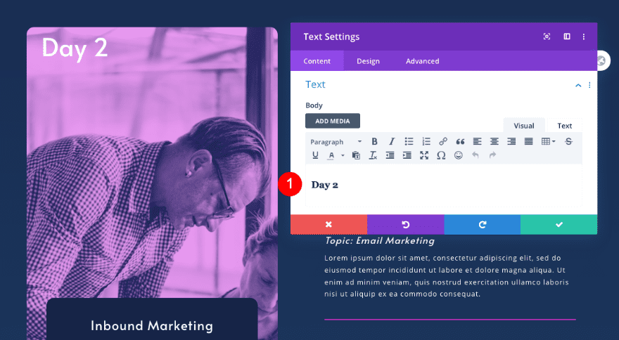
Adjust Call To Action Module
Text
Adjust the content of the call to action module.
- Title: New day’s theme title
- Description: New descriptive content
Background
Change the background image as well.
- Background Image: New image with duotone effect
Adjust Text Modules
Text
Adjust the content in the text modules too.
- Body
- Date: New H4 Content
- Speaker: New H5 Content
- Topic: New H6 Content
- Description: New Paragraph Content
5. Create Register Section
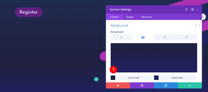
Add New Section
Background
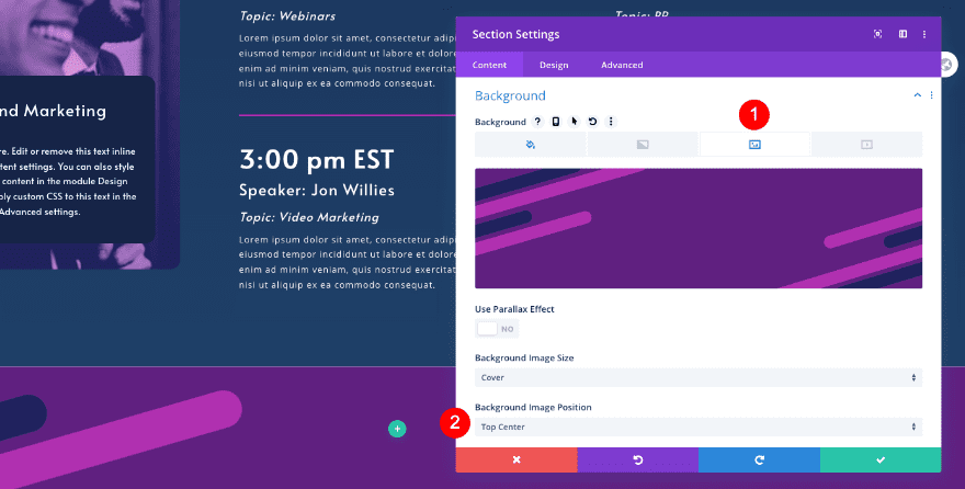
The final section is dedicated to the registration. Add a new section and style the background as follows. You’ll find the footer graphic in the download folder above.
- Background Color: Purple #602080
- Background Image: Footer Graphic
- Image Position: Top Center
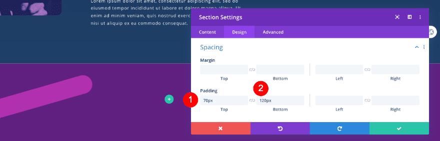
Spacing
Adjust the spacing of the section as well.
- Top Padding: 70px
- Bottom Padding: 120px
Visibility
And change the visibility settings in the advanced tab.
- Horizontal and Vertical Overflow: Hidden
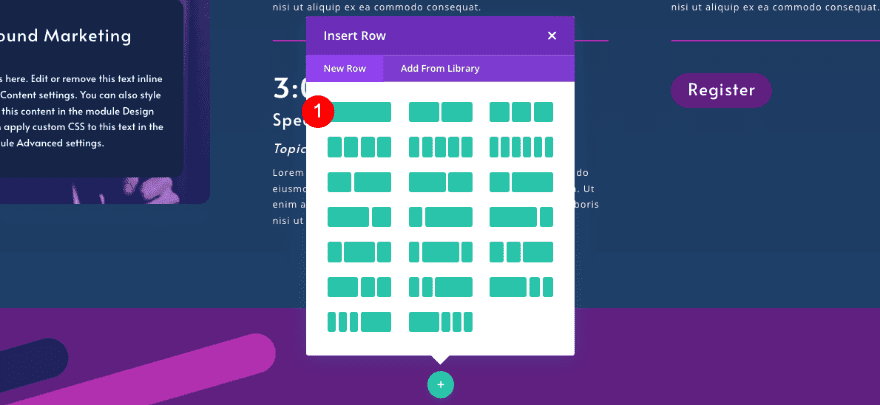
Add New Row
Column Structure
Now add a new row with one column.
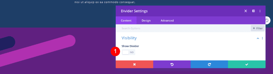
Add Divider Module
Visibility
Add an invisible divider to act as the anchor link for the section.
- Show Divider: No
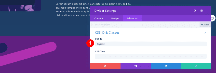
CSS ID
Insert the CSS ID that links to all the “register” buttons.
- CSS ID: Register
Add New Row
Column Structure
Add a second row with two equal columns.
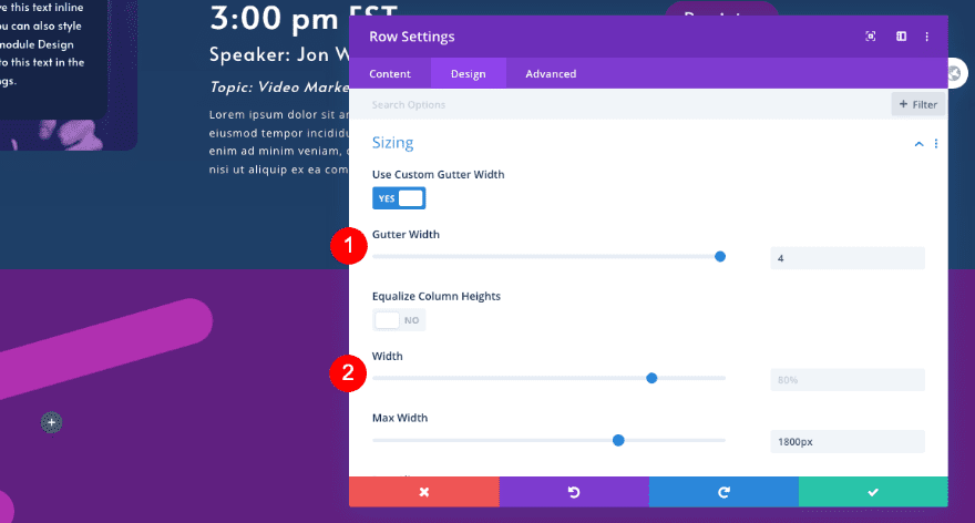
Sizing
Adjust the row’s sizing settings.
- Custom Gutter Width: 4
- Width: 80%
- Max Width:: 1800px
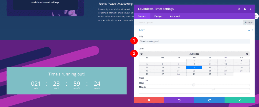
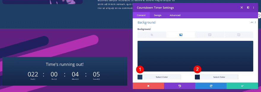
Add Countdown Timer Module to Column 1
Text
Add a countdown timer module to the first column. Add the content and date of the event.
- Title: Descriptive Title
- Date: Starting Date
Background
Style the background next.
- Background Gradient
- Color 1: #1f4068
- Color 2: #162447
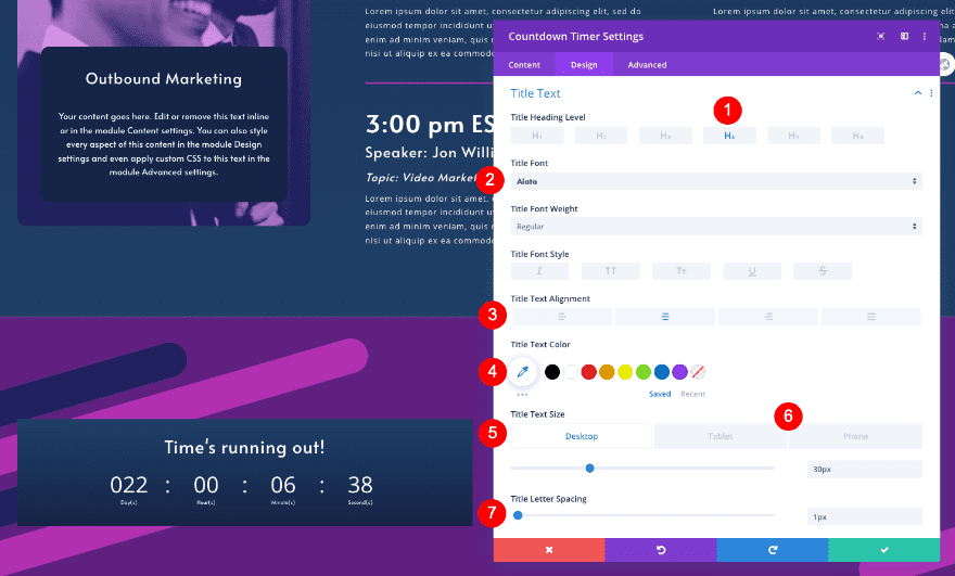
Title Text
In the design tab, style the title text.
- Heading Level: H4
- Font: Alata
- Alignment: Center
- Color: White #ffffff
- Size
- Desktop and Tablet: 30px
- Phone: 25x
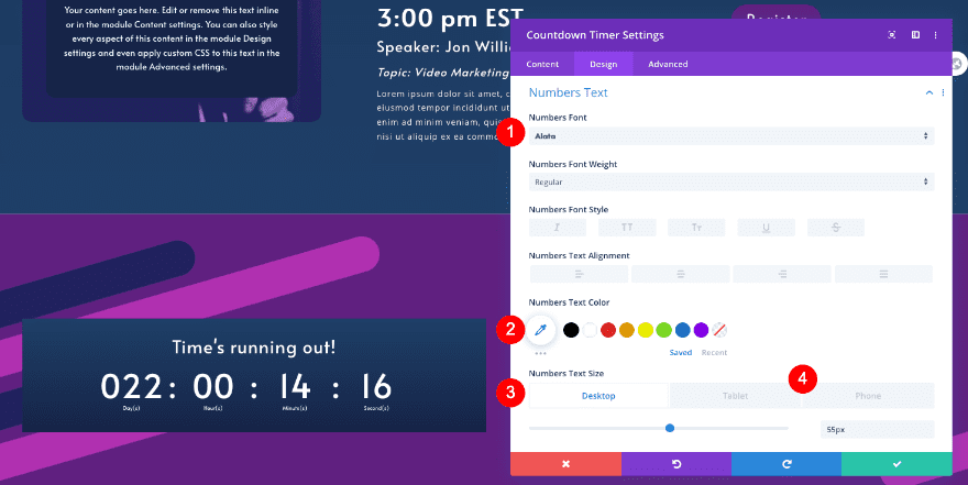
Numbers Text
Style the numbers text too.
- Font: Alata
- Color: White #ffffff
- Size
- Desktop: 55px
- Tablet: 35px
- Phone: 25px
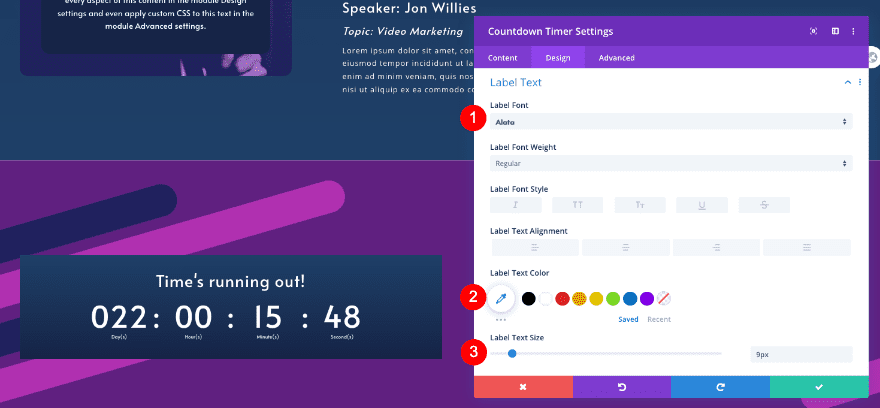
Label Text
Also, the label text.
- Font: Alata
- Size: 9px
Sizing
Then, adjust the sizing of the row.
- Width
- Sizing: 100%
Spacing
Add some padding too.
- Top and Bottom Padding: 60px
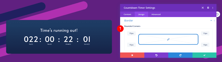
Border
Finally, style the border.
- Rounded Corners: 15px
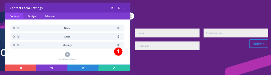
Add Contact Form Module to COlumn 2
Elements
Add a new contact form module to column 2. Remove the message field.
- Message Field: Remove
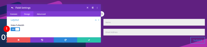
Fields Layout
Enter the settings for each field. In the design tab, under layout, click on “make fullwidth”. Do the same for the second field.
- Layout: Make fullwidth
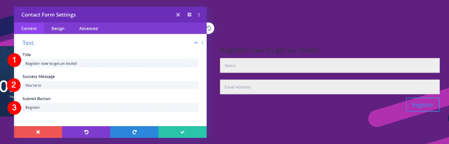
Text
Go back to the general contact form settings and add some content.
- Title: Descriptive title
- Success Message: Your message
- Submit Button: Register
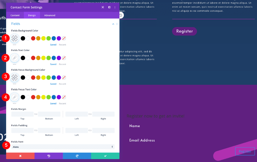
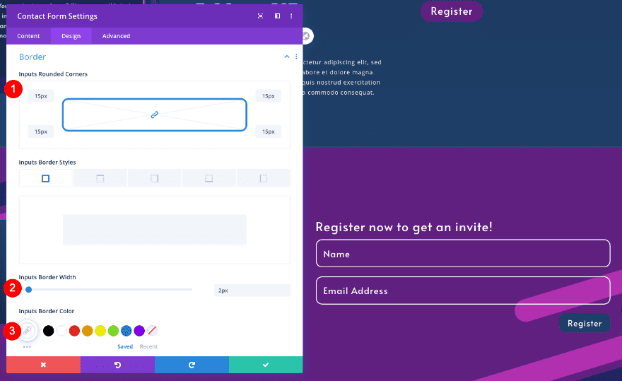
Fields
Then, style the fields as follows:
- Background Color: Transparent
- Text Color: White #ffffff
- Focus Background Color: Transparent
- Focus Text Color: White #ffffff
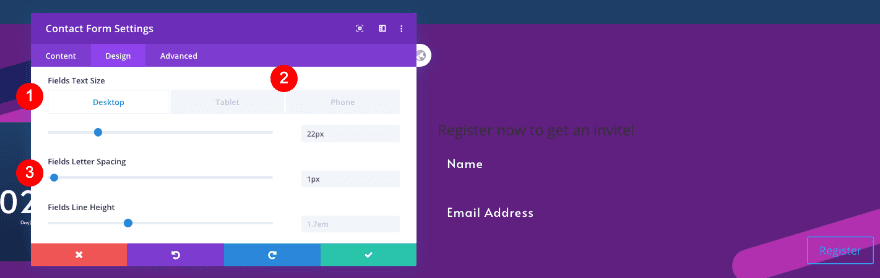
- Font: Alata
- Size
- Desktop: 22px
- Tablet and Phone: 18px
- Letter Spacing: 1px
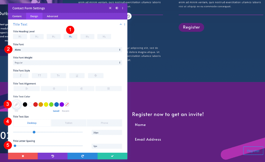
Title Text
Style the title text as well.
- Heading Level: H4
- Font: Alata
- Color: White #ffffff
- Size
- Desktop and Phone: 30px
- Phone: 24px
- Letter Spacing: 1px
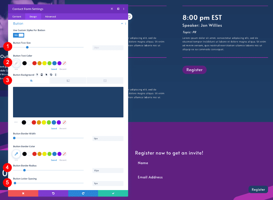
Button Custom Styles
Adjust the button custom styles too.
- Text Size: 20px
- Text Color: White #ffffff
- Background Color: Blue #1f4068
- Border Radius: 15px
- Letter Spacing: 1px
- Font: Alata
- Top Margin: 10px
- Top Padding
- Tablet and Phone: 60px
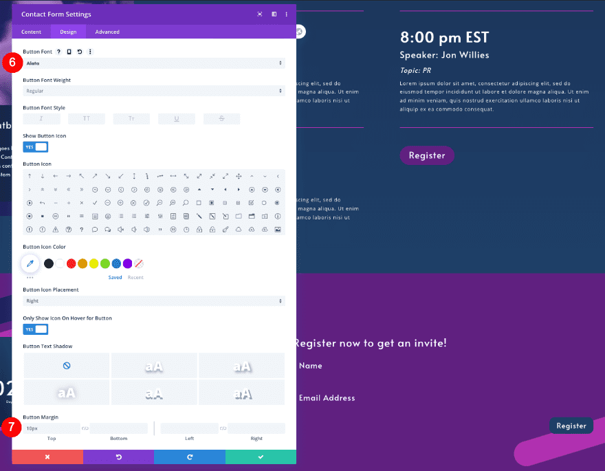
Border
Don’t forget to adjust the border-radius.
- Rounded Corners: 15px
- Border Width: 2px
- Color: White #fffff
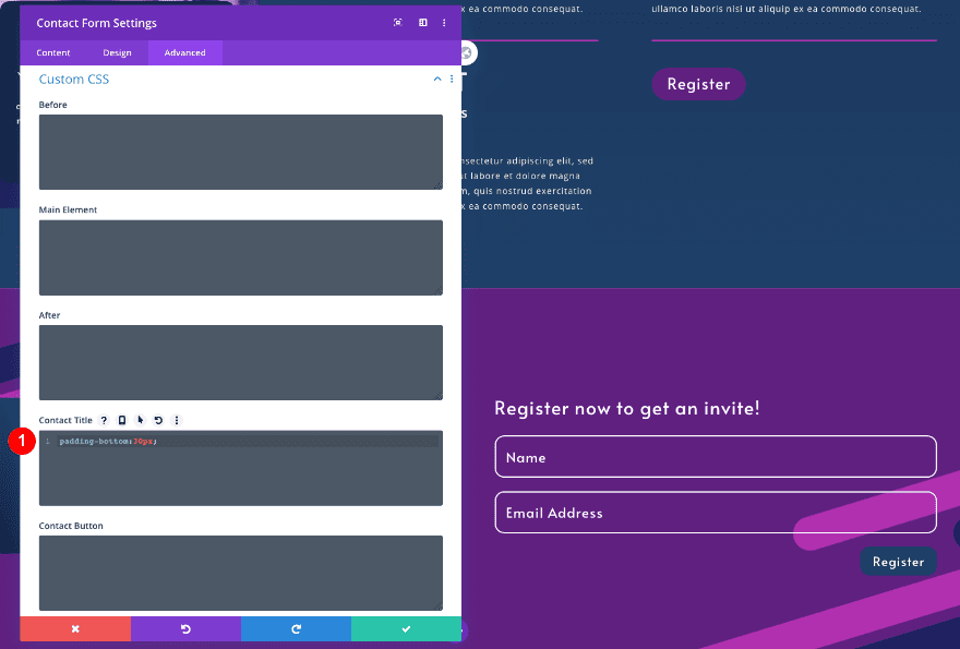
Custom CSS
Finally, add custom CSS for extra padding.
- Contact Title: padding-bottom: 30px;
padding-bottom: 30px;
Preview
We’re done! Let’s take a look at the landing page design again across different screen sizes.
Desktop
Tablet
Mobile
That’s a Wrap
You made it! How does your virtual summit landing page look? Use this design for your own virtual summit or for a web design client. The navigation is optimized for conversion with just the right amount of information. We added scrolling section dividers for a little visual extra too.
Let us know what you think in the comments. Did you download the layout or did you follow the steps?


Trying to install this theme but I received this error
“The package could not be installed. The theme is missing the style.css stylesheet.
Theme installation failed.”
Is it possible to update the theme with the right style.css?
Hi John
You’re absolutely right. I did mess that up didn’t I?
The CSS for the Promo Description is the one in the bullet list
Promo Description
border-radius: 15px;
background-color: #162447;
padding-left: 25px;
padding-right: 25px;
padding-bottom: 40px;
That number #q162447 should be #162447
The Promo Title is correct. That 500px margin is what’s giving all that space above the boxed text.
Thanks so much for the heads up. I’ll get the copy fixed straight away.
there are errors in your CSS code for the Call to Action Promo Title. What you tell us to write in the CSS is different from the example directly underneath it. This section of your otherwise excellent blog post is all messed up and confused me mightily! Also there is no color #q62447, and are you sure you want the margin-top in the promo title to be 500px? I don’t know if that’s right or not :
Custom CSS
Finally, add custom CSS for extra styling.
Promo Description
border-radius: 15px;
background-color: #162447;
padding-left: 25px;
padding-right: 25px;
padding-bottom: 40px;
01 border-radius: 15px;
02 background-color: #162447;
03 margin-top: 500px;
04 padding-bottom: 40px;
05 padding-bottom: 40px;
Promo Title
background-color: #q62447
margin-top: 500px
padding-bottom: 40px
padding-bottom: 40px
01 background-color: #q62447;
02 margin-top: 500px;
03 padding-bottom: 40px;
04 padding-bottom: 40px;