

Large headers with a lot of navigation links can take up a lot of valuable real estate on your site (especially above the fold). That’s why menus that popup and slide-in are becoming more and more popular. Most of the time, menus that slide in to view stay above the content of the page, hiding certain elements. However, a sliding push menu works a little differently. The sliding push effect is unique in that the menu slides in from the top of the page while simultaneously pushing the page content down so nothing is hidden from view.
In this tutorial, we are going to show you how to build a sliding push menu from scratch using the Divi Theme Builder. Once the menu is built, it becomes a versatile tool for all types of applications since you will be able to fill the section with any content you want using the Divi Builder.
Let’s get to it!
- 1 Sneak Peek
- 2 Download the Layout for FREE
- 3 Download For Free
- 4 You have successfully subscribed. Please check your email address to confirm your subscription and get access to free weekly Divi layout packs!
- 5 Building the Sliding Push Menu with the Divi Theme Builder
- 6 Final Result
- 7 Making it Sticky
- 8 Final Thoughts
Sneak Peek
Here is a quick look at the sliding push menu we’ll build in this tutorial.
Download the Layout for FREE
To lay your hands on the designs from this tutorial, you will first need to download it using the button below. To gain access to the download you will need to subscribe to our newsletter by using the form below. As a new subscriber, you will receive even more Divi goodness and a free Divi Layout pack every Monday! If you’re already on the list, simply enter your email address below and click download. You will not be “resubscribed” or receive extra emails.

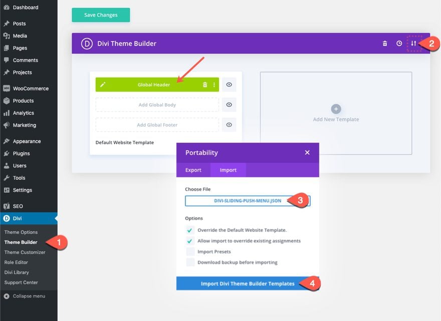
To import the section layout to your Divi Theme Builder, navigate to the Divi Theme Builder.
Click the portability icon.
In the portability popup, select the import tab and choose the download file from your computer.
Then click the import button.
Once done, the section template will appear in the Divi Theme Builder.
Let’s get to the tutorial, shall we?
To create the menu, we will build a new global header within the Divi Theme Builder.
Navigate to Divi > Theme Builder.
Then click on the “Add Global Header” area within the Default Website Template. From the dropdown, select “Build Global Header”.
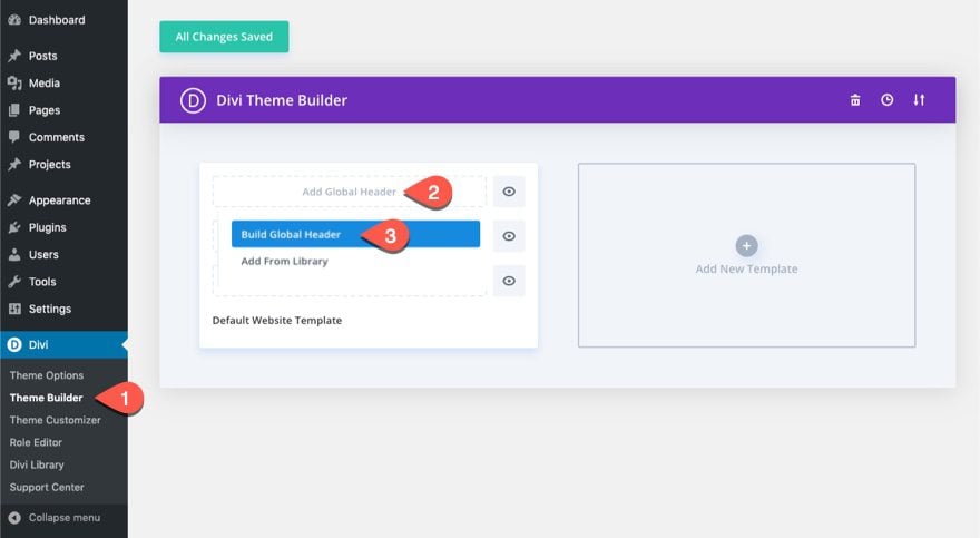
This will bring you to the global header layout editor.
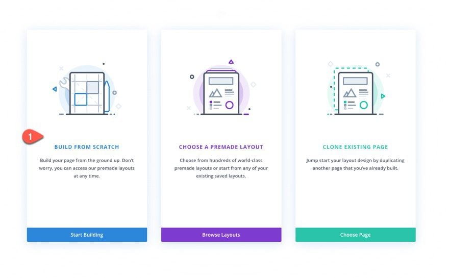
Once you are in the Global Header Layout Editor, choose the option “Build From Scratch.
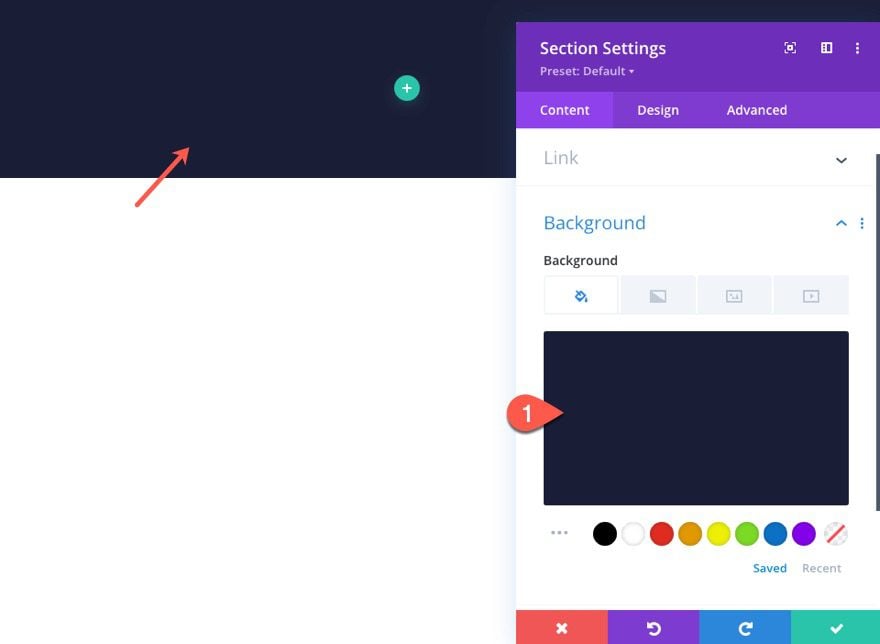
The first element we will build together is the push menu section. This section will hold the menu items that will toggle down and up when clicking the menu toggle button.
Section Settings
Open the settings of the default section and update the settings as follows:
Background
- Background Color: #1a1e36
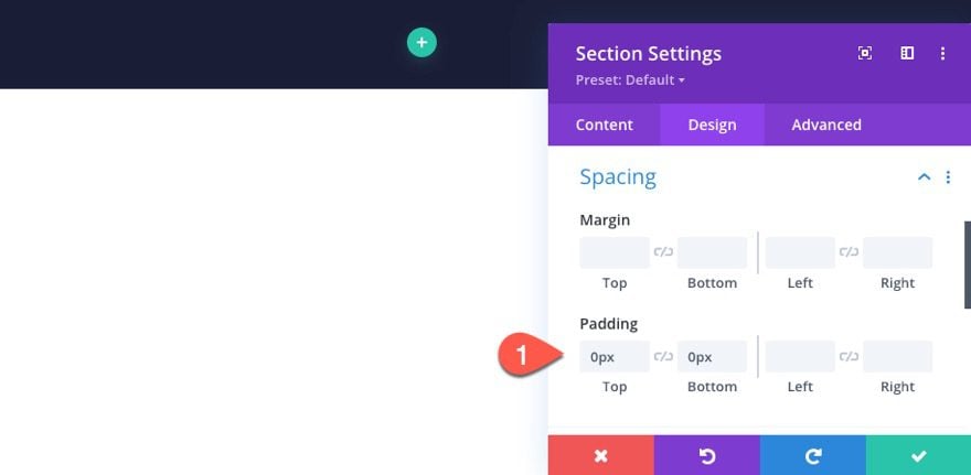
Padding
- Padding: 0px top, 0px bottom
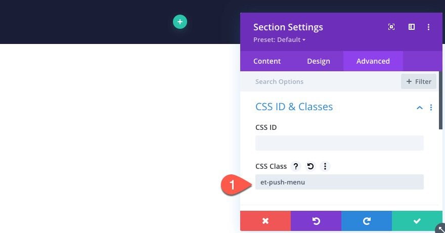
CSS Class
Under the advanced tab, add the following CSS Class which will be used later in our JS code.
- CSS Class: et-push-menu
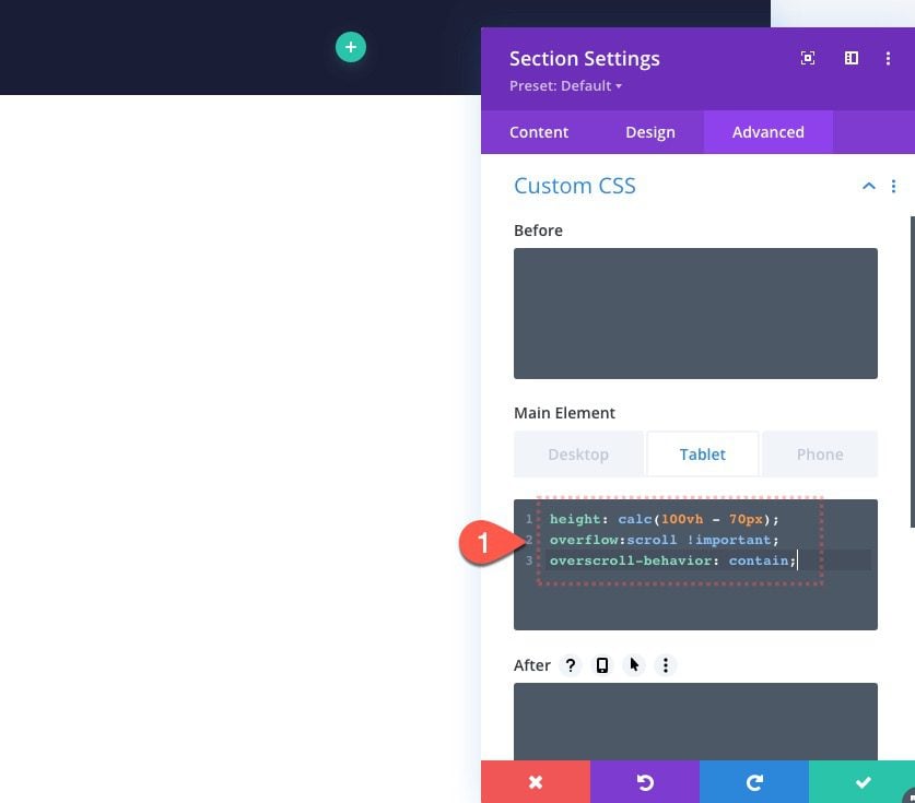
Custom CSS (tablet)
Next, we need to adjust the height of the section on mobile using a calculated height to accommodate for the main header bar we will add. This will essentially make the section span the full height of the window on mobile when the user toggles the menu open.
Add the following custom CSS to the Main Element on tablet only:
height: calc(100vh - 70px);
overflow:scroll !important;
overscroll-behavior: contain;
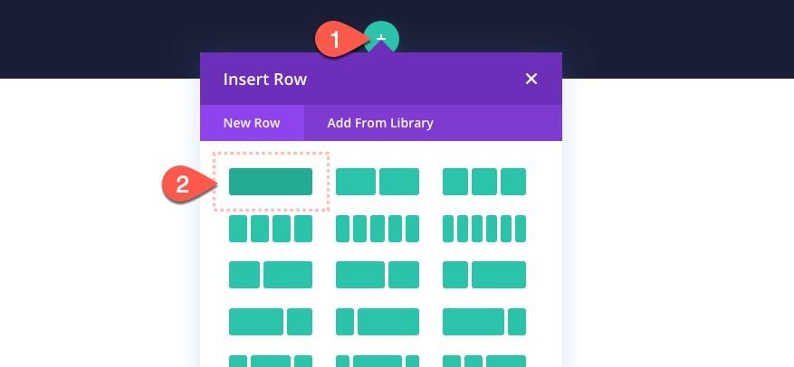
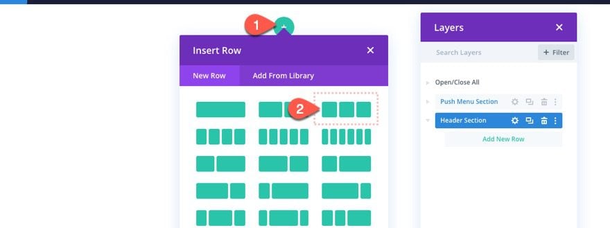
Add Row 1
Once the section settings are finished, create a one-column row within the section.
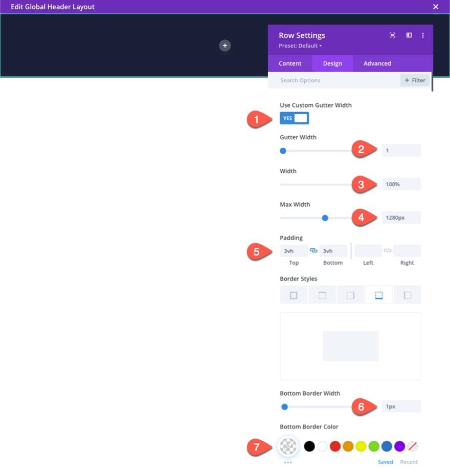
Row 1 Settings
Then update the row settings as follows:
Design
- Gutter Width: 1
- Width: 100%
- Max Width: 1280px
- Padding: 3vh top, 3vh bottom
- Bottom Border Width: 1px
- Bottom Border Color: rgba(255,255,255,0.2)
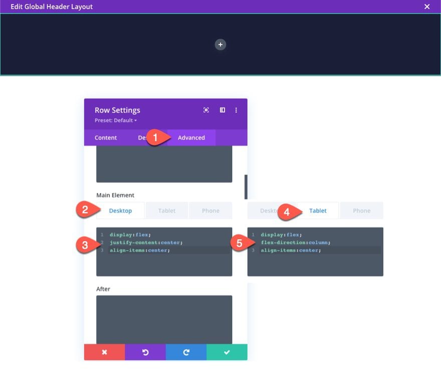
Custom CSS
Under the advanced tab, add the following custom CSS to the main element:
Under Desktop…
display:flex;
justify-content:center;
align-items:center;
Under Tablet…
display:flex;
flex-direction:column;
align-items:center;
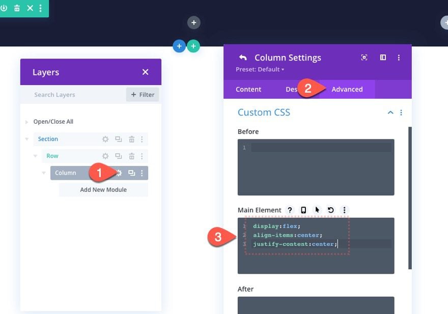
Column Settings
After the row settings are done, open the settings for the column and add a custom CSS snippet to the main element:
display:flex;
align-items:center;
justify-content:center;
This will center the contents of the column both vertically and horizontally.
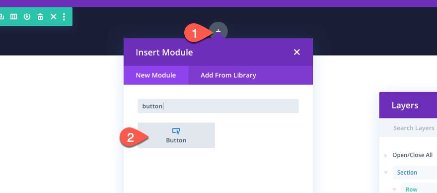
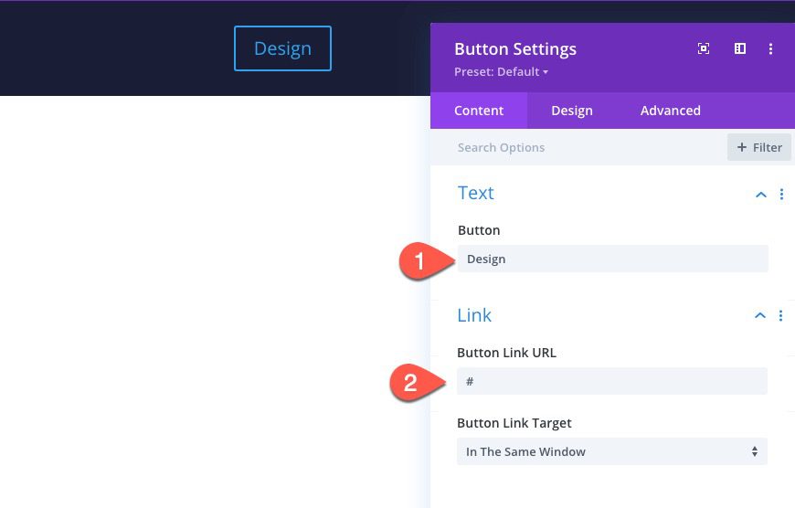
Add Button
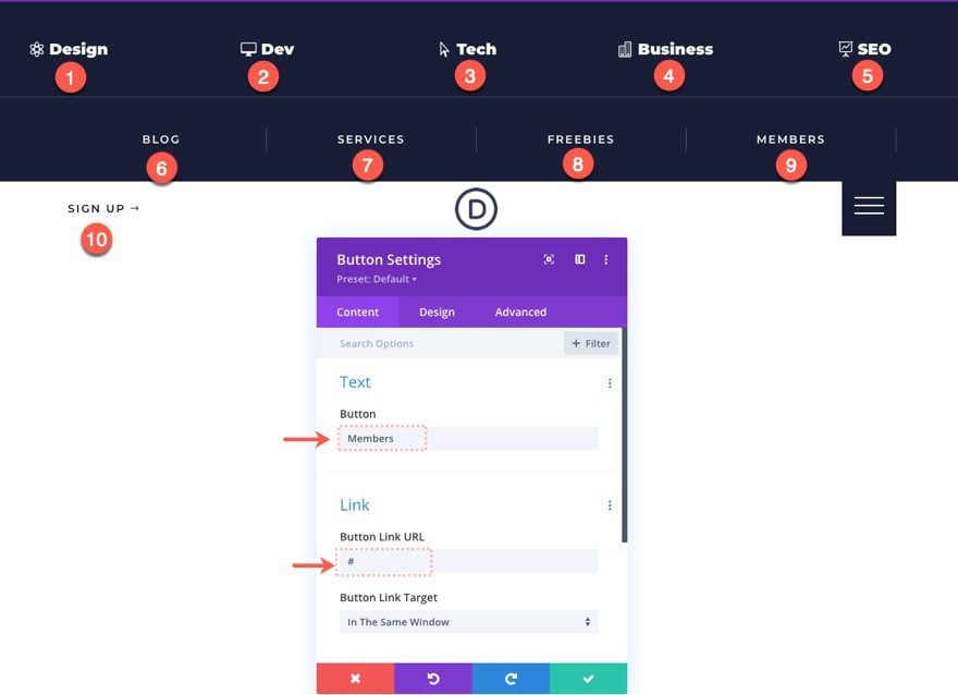
Now we are ready to start adding our menu items using button modules. Start by adding a new button to the column.
Button Settings
Then update the button settings as follows:
Content
- Button Text: Design
- Button Link URL: # (replace this with your own custom URL later)
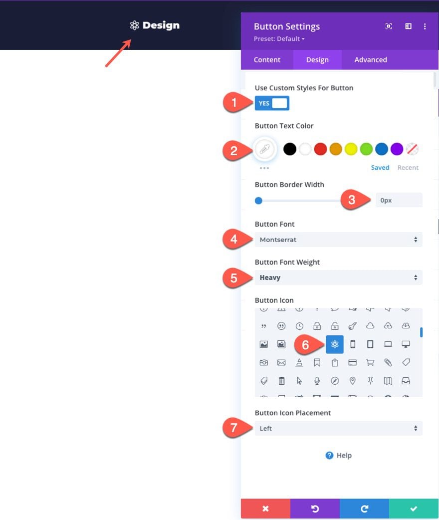
Design
- Button Text Color: #ffffff
- Button Border Width: 0px
- Button Font: Montserrat
- Button Font Weight: Heavy
- Button Icon: [your choice]
- Button Icon Placement: Left
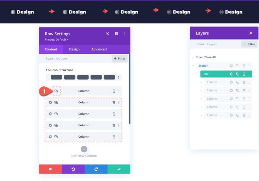
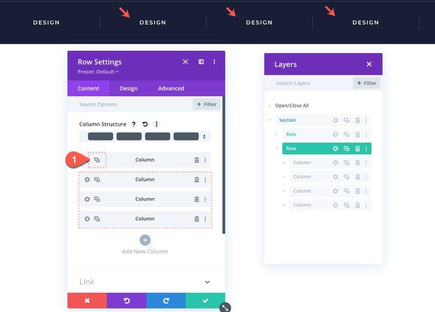
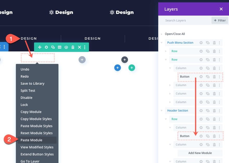
Duplicating the Column
Now to create the additional buttons for the menu, we can duplicate the column. For this design, let’s duplicate the column 4 times to give us a total of 5 menu items/buttons. in a five-column row.
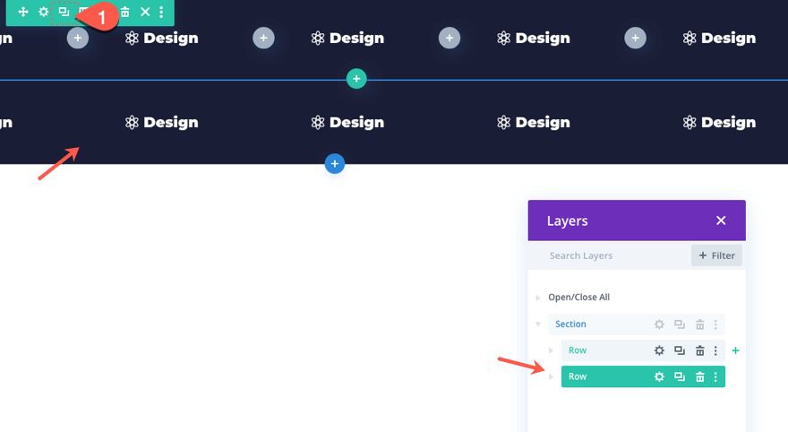
Add Row 2
Once the first row is complete, we are ready to add another row of buttons that can be used for a different set of menu items.
To create the next row, duplicate row 1.
Delete All Columns Except One
Then delete all the columns except one within the duplicate row.
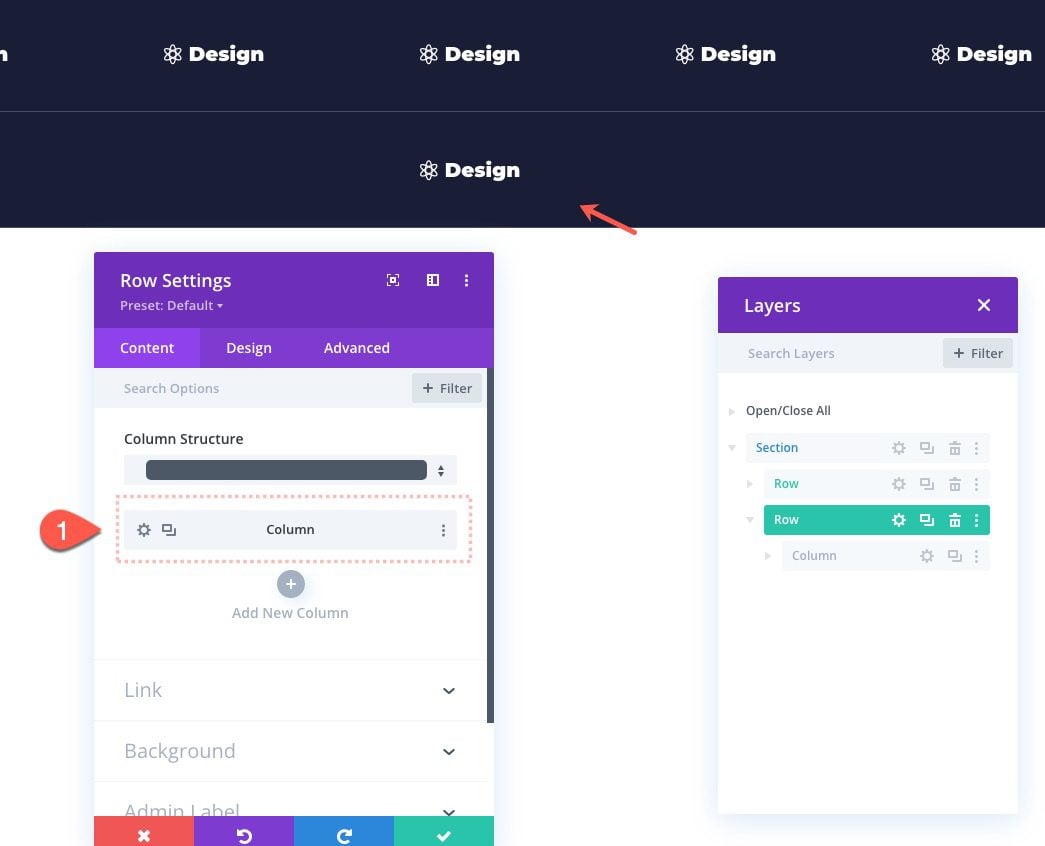
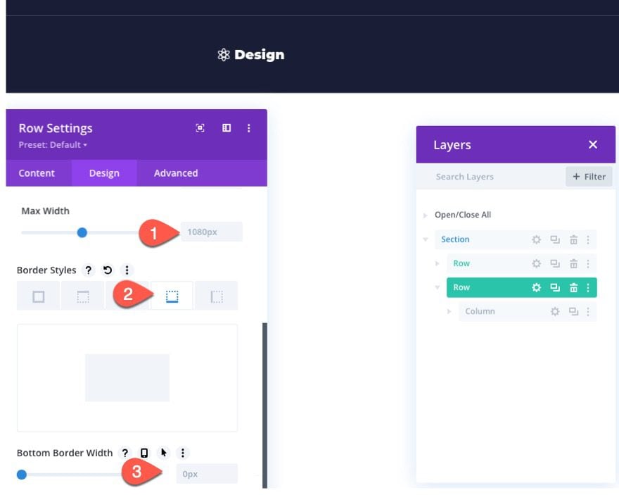
Row 2 Settings
Update the settings for Row 2 as follows:
- Max Width: 1080px
- Bottom Border Width: 0px
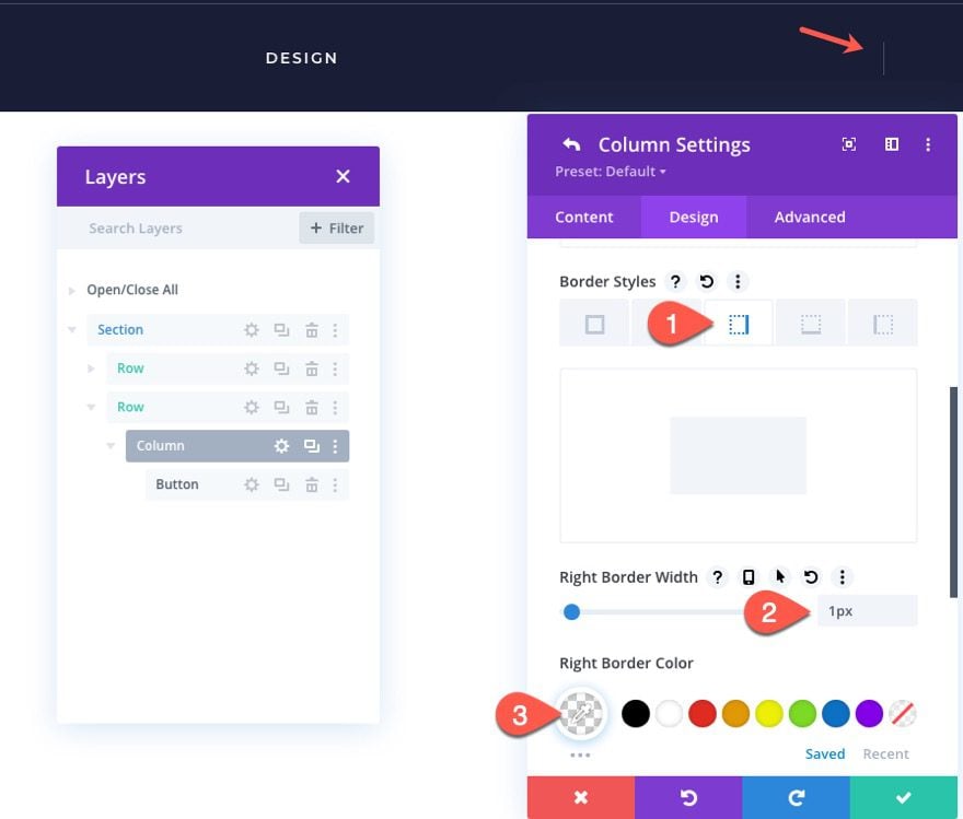
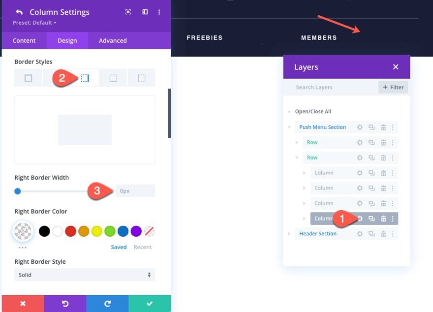
Column Settings
Then add a border to the column as follows:
- Right Border Width: 1px
- Right Border Color: rgba(255,255,255,0.2)
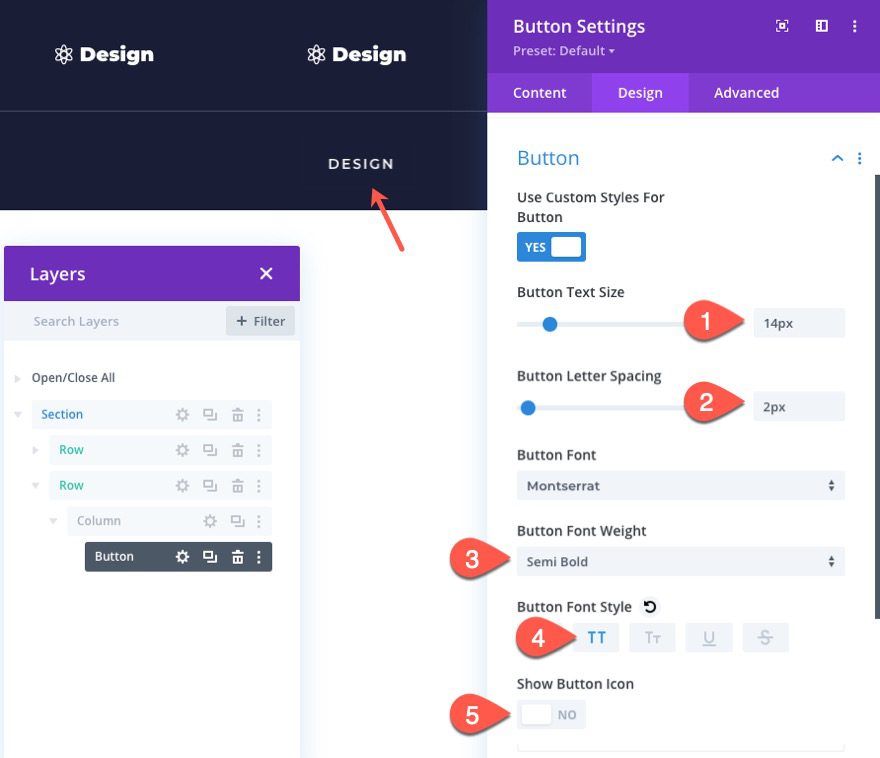
Update Button Settings
After the column has the right border, open the settings for the button and update the following:
- Button Text Size: 14px
- Button Letter Spacing: 2px
- Button Font Weight: Semi Bold
- Button Font Style: TT
- Show Button Icon: NO
Duplicate the Column
Just like we did before, let’s duplicate the column to create additional buttons and columns. For this design, let’s duplicate the column 3 times to give us a total of 4 buttons in a 4-column row.
Deleting the Last Column Border
Since we don’t want the last column to have the right border, open the settings for column 4 and update the border width:
- Right Border Width: 0px
Creating the Main Header Bar
Next, we are going to create the section for the main header bar. This header bar will remain visible always and will be what holds our site logo, a CTA, and our Menu toggle button.
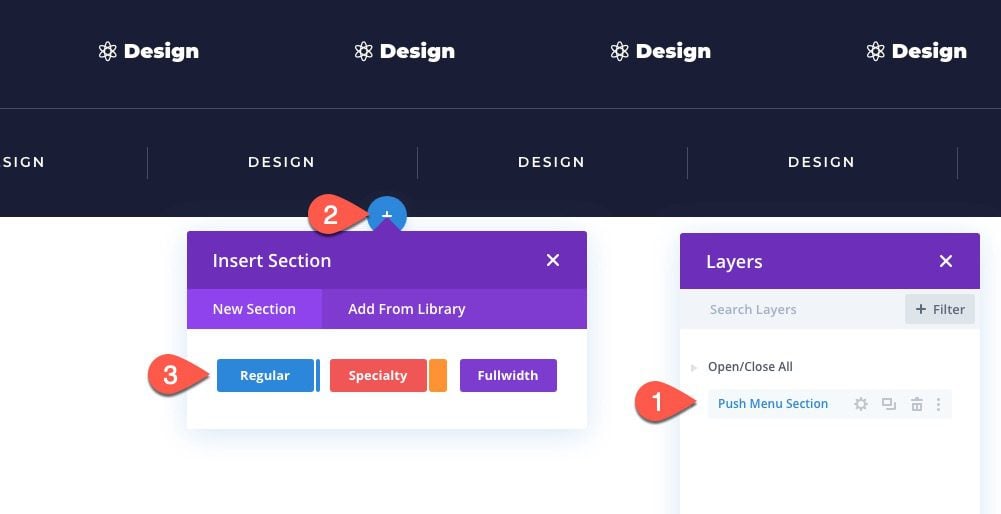
Add Section
Before we add the new section, it is a good idea to update the label of the previous section to read “Push Menu Section”.
Then create a new section below the first section.
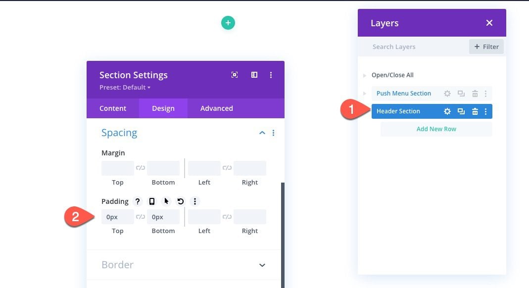
Section Settings
Now update the label on the new section to read “Header Section”. Then open the section settings and update the following:
Padding
- Padding: 0px top, 0px bottom
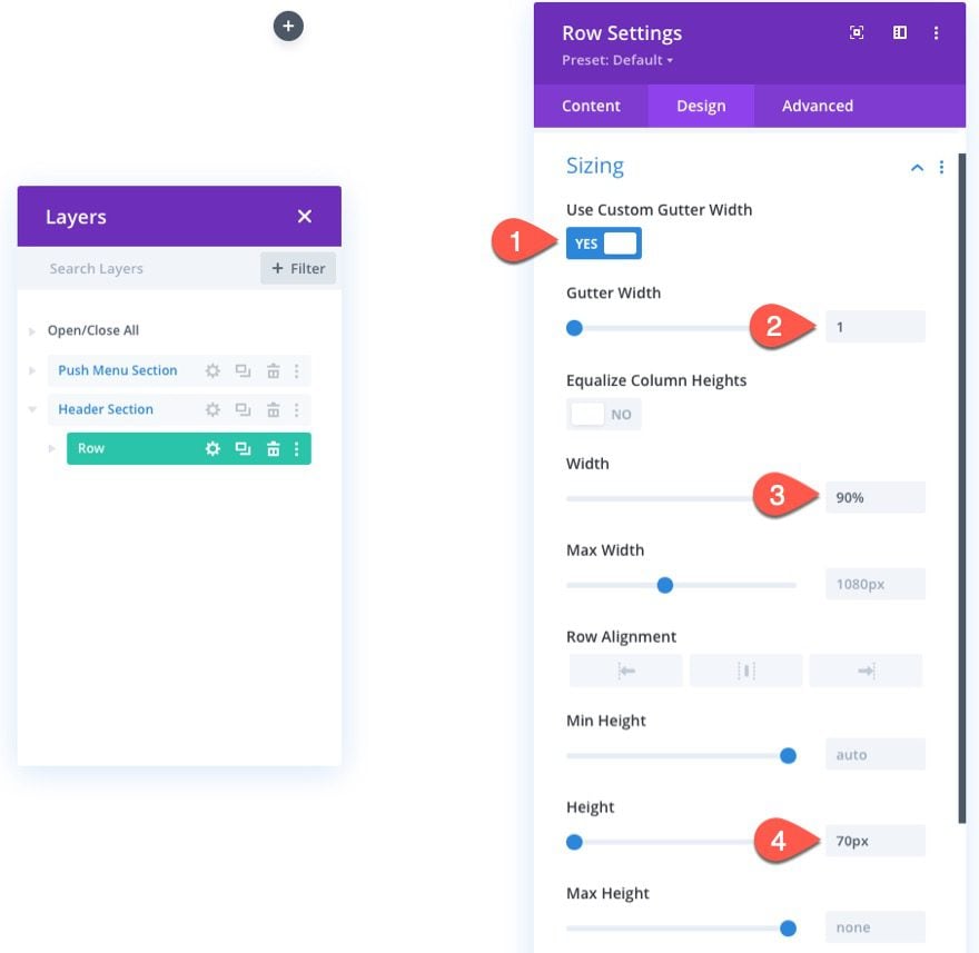
Add Row
After the section padding has been added, add a three-column row to the section.
Row Settings
Open the row setting and update the following:
Sizing
- Gutter Width: 1
- Width: 90%
- Height: 70px
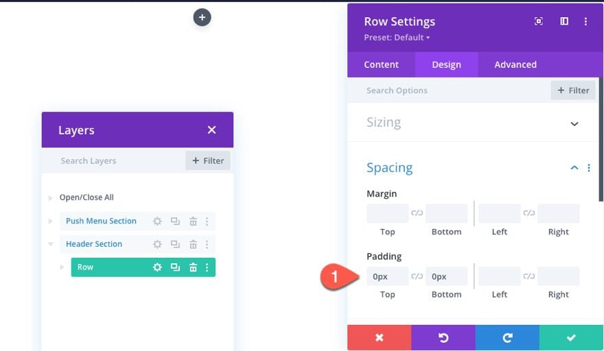
Padding
- Padding: Padding: 0px top, 0px bottom
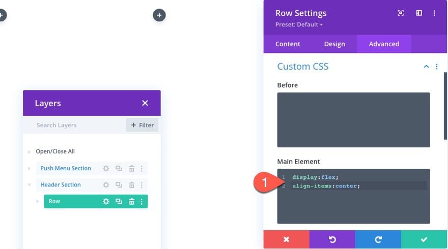
Custom CSS
Under the advanced tab, add the following Custom CSS to the Main Element:
display:flex;
align-items:center;
This will vertically center the columns within the row.
Add Button
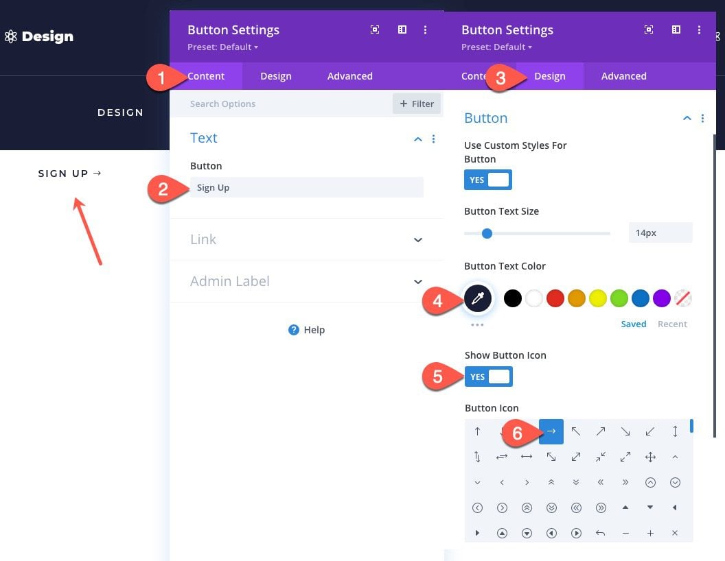
To create the main CTA on the header section, we can use a button from the second row in the top section. Copy the button from column 1 in row 2 of the top section and paste it into column 1 of the row in the header section.
Update Button Settings
Then open the button settings for the duplicate button and update the following:
- Button Text: Sign Up
- Button Text Size: 14px
- Button Text Color: #1a1e36
- Show Button Icon: YES
- Button Icon: Right Arrow (see screenshot)
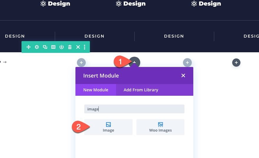
Add Logo
In the middle column, add an image module. This will be how we add the site logo dynamically.
Hover over the image box and click the “Use Dynamic Content” icon. From the dropdown, select “Site Logo”.
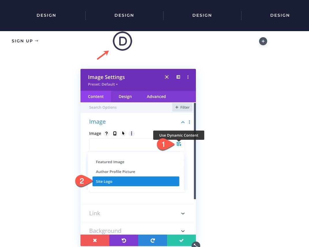
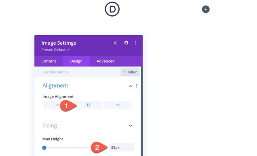
Image Settings
Then, under the design tab, update the following:
- Image Alignment: center
- Max Height: 55px
Add Custom Hamburger Icon
We could use a regular icon via a blurb module as our menu toggle, but for this tutorial, I thought we would add a custom menu toggle with a cool transition effect.
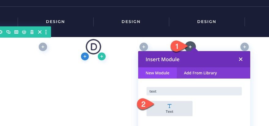
Add Text Module
To create the menu icon, we will use a text module with some custom HTML that will be styled with external CSS.
Go ahead and add a text module to column 3.
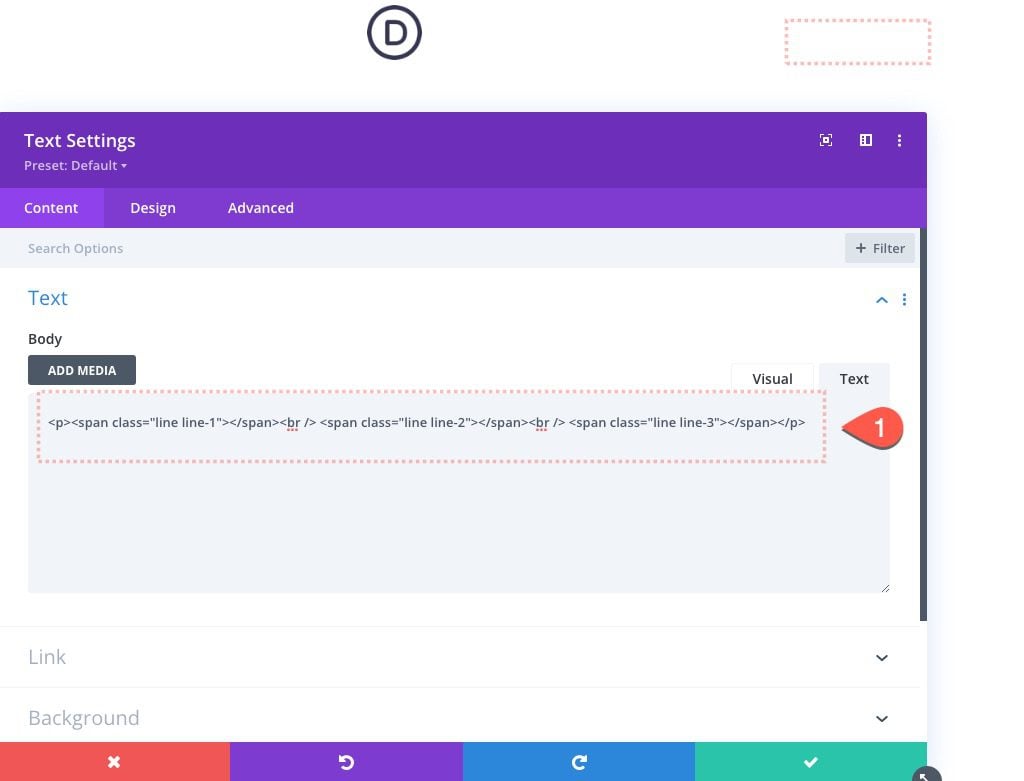
Add Text Module HTML
Then add the following HTML to the content of the text module:
<p><span class="line line-1"></span><br /> <span class="line line-2"></span><br /> <span class="line line-3"></span></p>
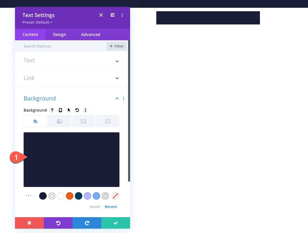
Background
Give the text module a background color:
- Background Color: #1a1e36
Text Design
Then update the design settings as follows:
- Width: 70px
- Module Alignment: right
- Height: 70px
- Padding: 20px top, 20px bottom, 16px left, 16px right
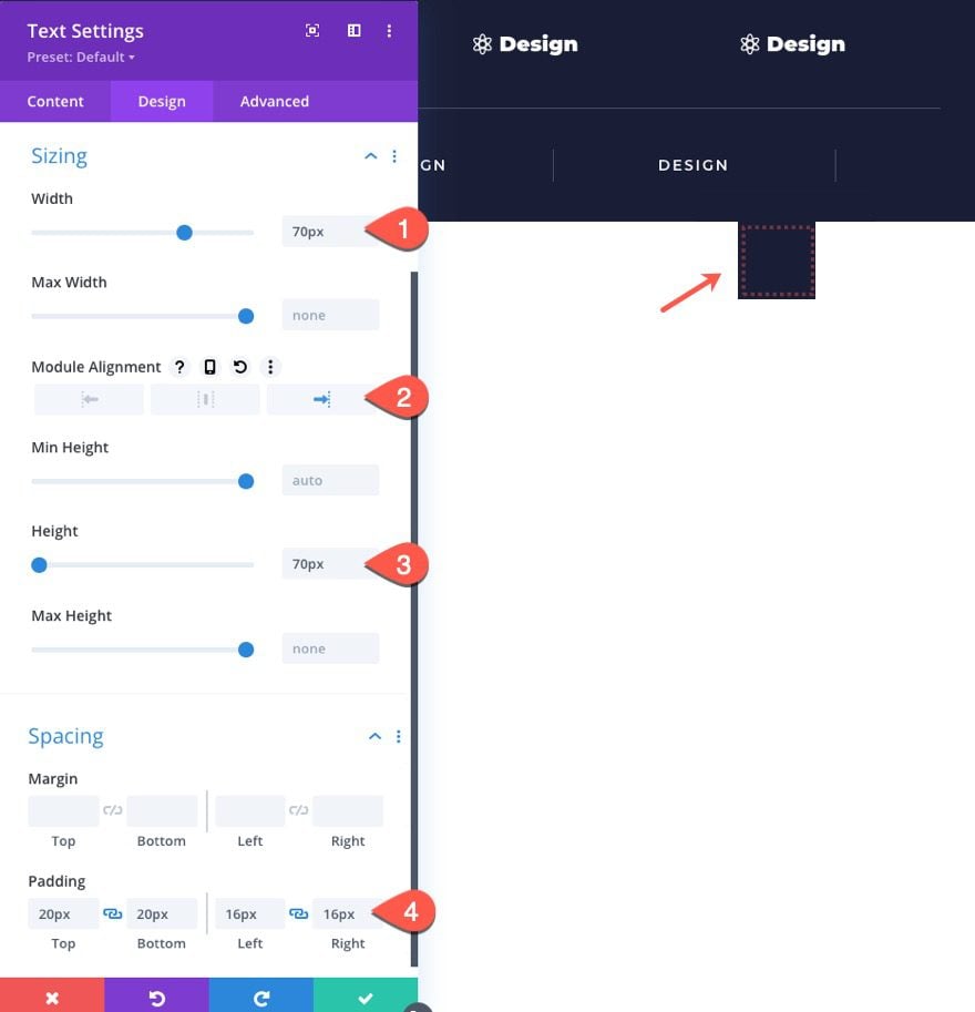
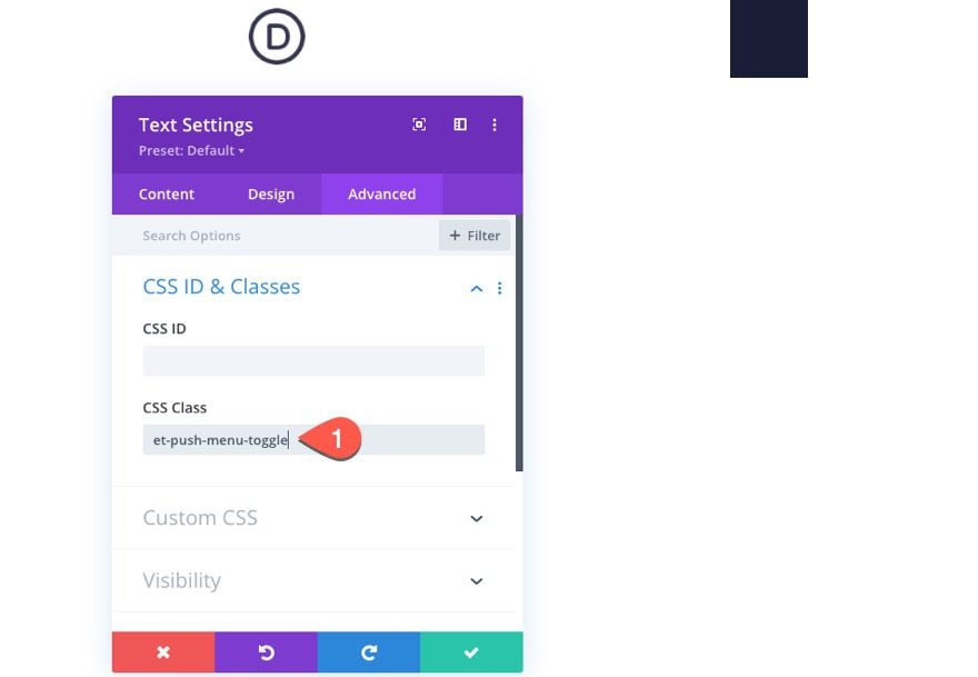
CSS Class
Under the advanced tab, add the following CSS Class:
- CSS Class: et-push-menu-toggle
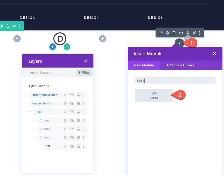
Add Code
To bring home the functionality we need for this sliding push menu to work, we will add our custom CSS and jQuery to a code module.
Go ahead and add a code module to column 3 under the text module.
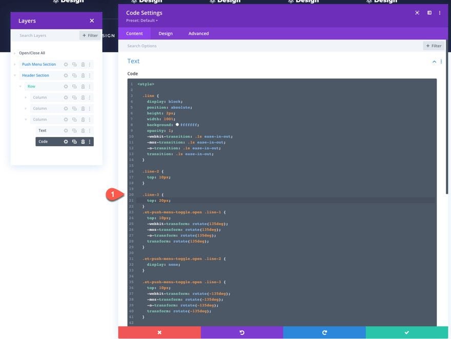
Then paste in the following code (important: wrap this code in style tags for it to work correctly):
  .line {
    display: block;
    position: absolute;
    height: 2px;
    width: 100%;
    background: #ffffff;
    opacity: 1;
    -webkit-transition: .1s ease-in-out;
    -moz-transition: .1s ease-in-out;
    -o-transition: .1s ease-in-out;
    transition: .1s ease-in-out;
  }
  .line-2 {
    top: 10px;
  }
  .line-3 {
    top: 20px;
  }
  .et-push-menu-toggle.open .line-1 {
    top: 10px;
    -webkit-transform: rotate(135deg);
    -moz-transform: rotate(135deg);
    -o-transform: rotate(135deg);
    transform: rotate(135deg);
  }
  .et-push-menu-toggle.open .line-2 {
    display: none;
  }
  .et-push-menu-toggle.open .line-3 {
    top: 10px;
    -webkit-transform: rotate(-135deg);
    -moz-transform: rotate(-135deg);
    -o-transform: rotate(-135deg);
    transform: rotate(-135deg);
  }
  .et-push-menu {
    display:none;
  }
  .et-fb .et-push-menu {
    display:block;
  }
  .et-push-menu-toggle {
    cursor:pointer;
  }
Next, copy and paste this code directly below it (important: wrap this code in script tags for it to work correctly):
(function($) {
  $(document).ready(function(){
    $('.et-push-menu-toggle').click(function(){
      $(this).toggleClass('open');
      $('.et-push-menu').slideToggle( "300").toggleClass('et-push-menu-active');
    });
  });
})( jQuery );
Finally, we can update all of the buttons with the necessary button text and link URLs.
That’s it!
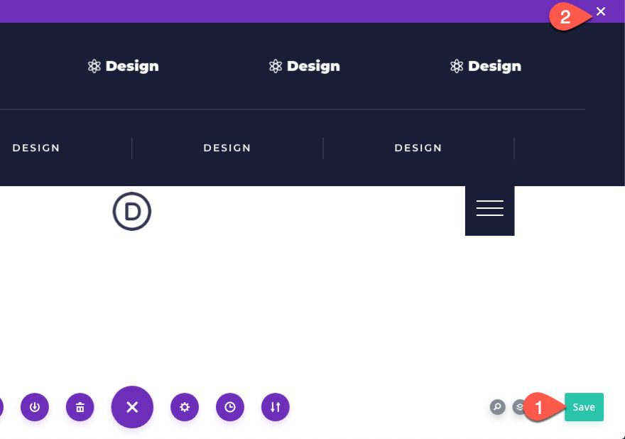
Save Settings
Don’t forget to save the layout and the theme builder settings.
Final Result
To view the final result, check out a live page on your site.
Making it Sticky
If you want “sticky” version of the menu, all you need to do is add the following snippet of CSS to the code module (between the style tags):
  header {
    position: sticky;
    top:0;
    z-index:9999;
  }
  #page-container {
    overflow-y: visible !important;
  }
And here is the result.
Final Thoughts
I hope you enjoy this sliding push menu. The effect is unique and it opens the door for more creative headers down the road.
I look forward to hearing from you in the comments.
Cheers!


Hi there – it works a charm but… somehow the toggle is mixed: I get the “cross” when the menu is closed and the “Hamburger” when open… what is wrong with the css?? Could you provide some help? I was downloading it and did not change anything at the code so far. Thank you very much in advance!!
I am sorry… It was just in the preview internal – it works perfectly with a regular view. Thank you for this cool feature – I would really love more of this!!
Thank you very much Jason!
Awesome article and all information is very useful what you shared through this article so thanks for sharing such a valuable information
Thanks for this tutorial it was really helpful
Look great Jason, Thank you!
Great tutorial! I’m not sure what I did wrong, but I can’t get the button to open on click once I applied the header to the whole site.
same problem here… =)