

If you’re looking for a way to create a global header for your website that doesn’t take up a lot of space, you’re going to love this tutorial. We’ll show you how to create a fullscreen global header using Divi’s Theme Builder. While scrolling down the page, the only two things additional you’ll notice on your post/page are 1) a clickable hamburger icon in the top left corner and 2) a logo in the top right corner. These two items will follow your visitors throughout their navigation process and once the hamburger icon is clicked, a custom fullscreen menu will open and allow visitors to go to other pages on your website. The outcome of this design is highly responsive and you’ll be able to download the JSON file for free as well!
Let’s get to it.
- 1 Preview
- 2 Download The Fullscreen Global Header Template for FREE
- 3 Download For Free
- 4 You have successfully subscribed. Please check your email address to confirm your subscription and get access to free weekly Divi layout packs!
- 5 1. Go to Divi Theme Builder & Start Building Global Header
- 6 2. Dedicate Section #1 to Fullscreen Navigation
- 7 3. Dedicate Section #2 to Top Right Corner Logo
- 8 4. Additional Section Settings
- 9 5. Save Builder Changes & View Result
- 10 Preview
- 11 Final Thoughts
Preview
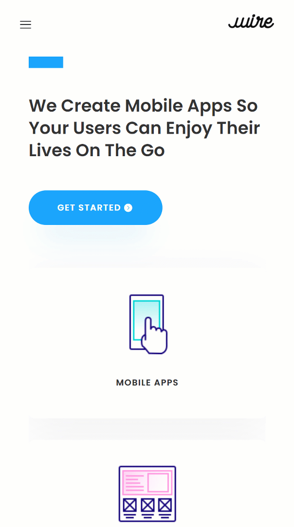
Before we dive into the tutorial, let’s take a quick look at the outcome across different screen sizes.
Desktop
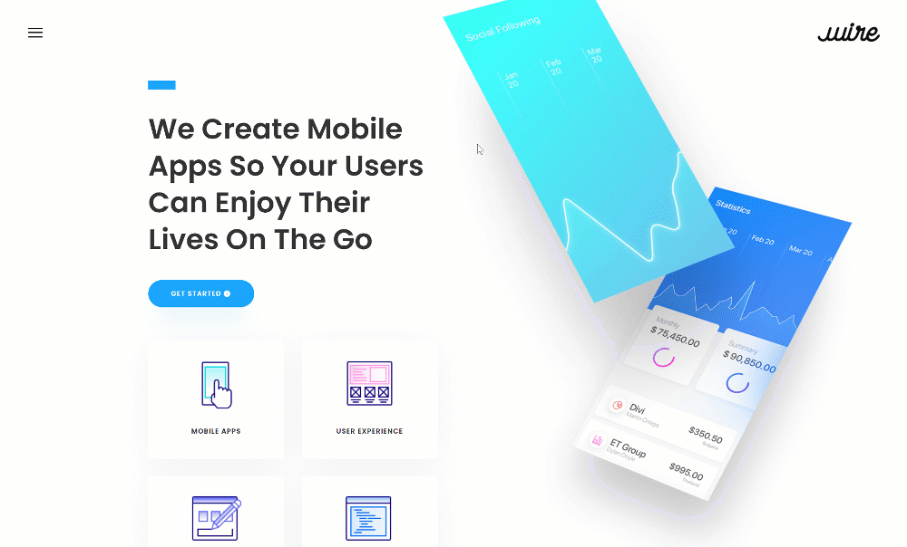
Mobile
Download The Fullscreen Global Header Template for FREE
To lay your hands on the fullscreen global header template, you will first need to download it using the button below. To gain access to the download you will need to subscribe to our newsletter by using the form below. As a new subscriber, you will receive even more Divi goodness and a free Divi Layout pack every Monday! If you’re already on the list, simply enter your email address below and click download. You will not be “resubscribed” or receive extra emails.

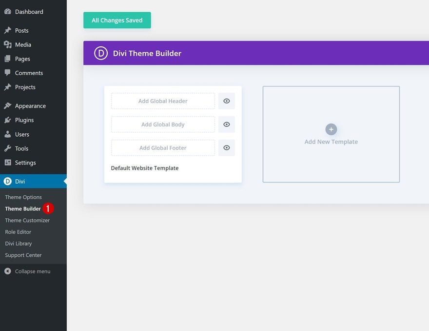
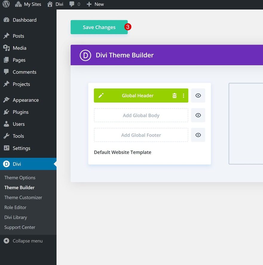
1. Go to Divi Theme Builder & Start Building Global Header
Go to Divi Theme Builder
Start by going to the Divi Theme Builder.
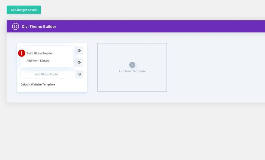
Start Building Global Header
Then, click on ‘Add Global Header’ and proceed to click on ‘Build Global Header’.
Section Settings
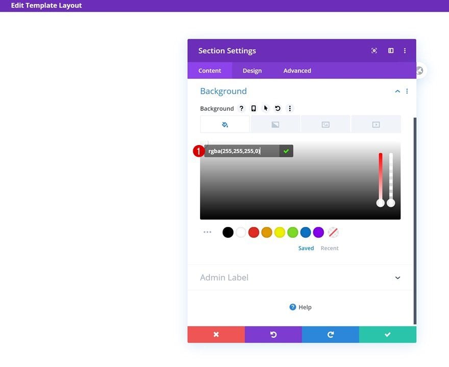
Background Color
Time to start creating! Open the settings of the section you can notice inside the template editor and change the background color into a completely transparent one.
- Background Color: rgba(255,255,255,0)
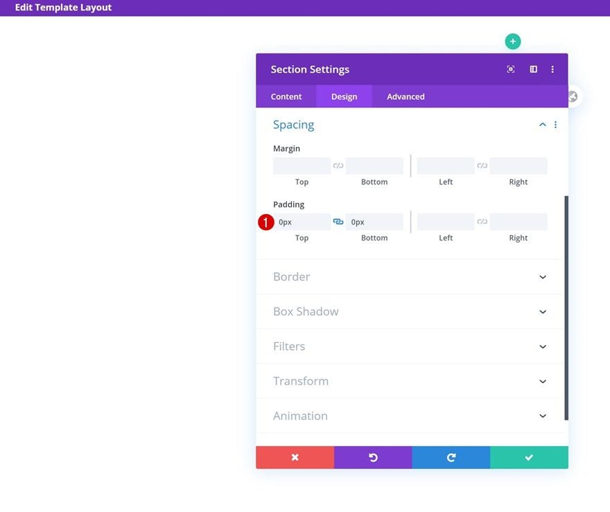
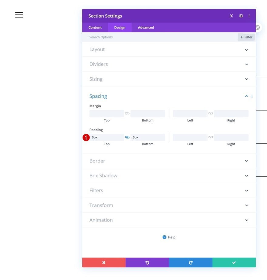
Spacing
Remove the section’s default top and bottom padding next.
- Top Padding: 0px
- Bottom Padding: 0px
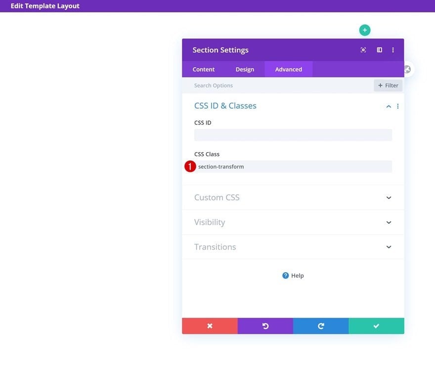
CSS Class
Continue by adding a CSS class to the section. Later on this post, we’ll need this CSS class to turn the menu fullscreen.
- CSS Class: section-transform
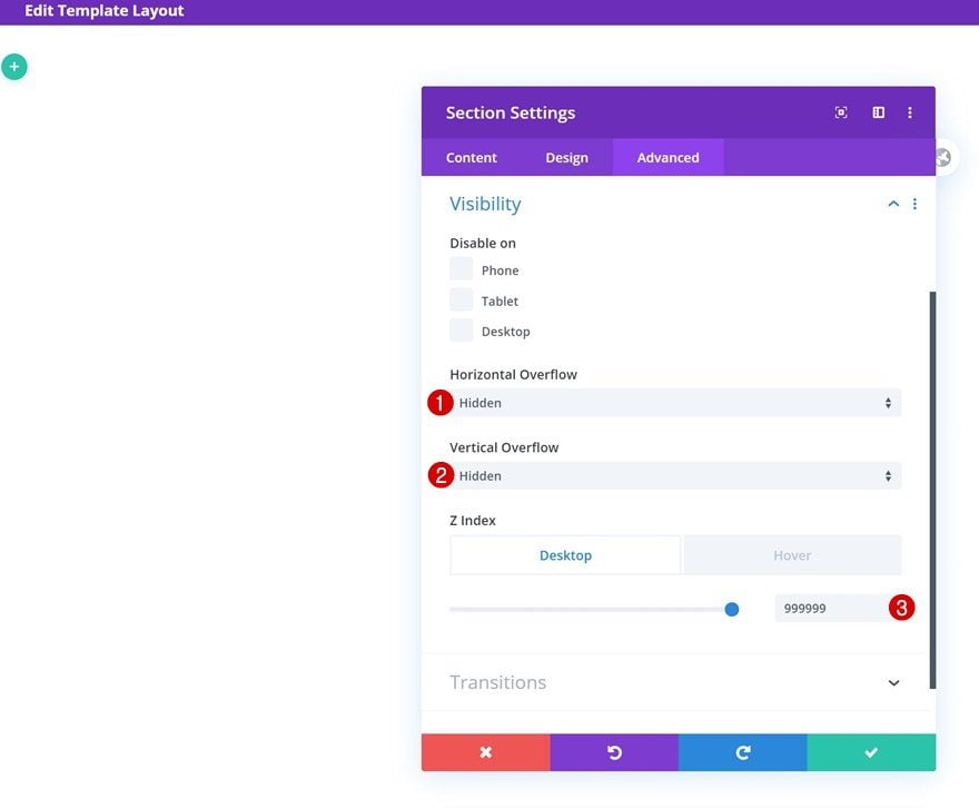
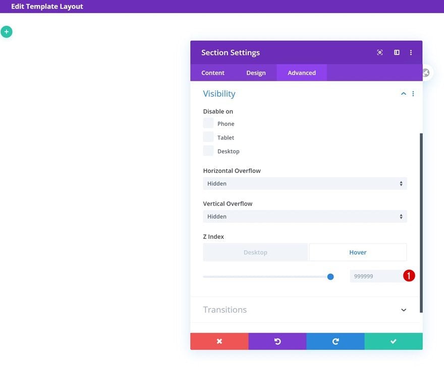
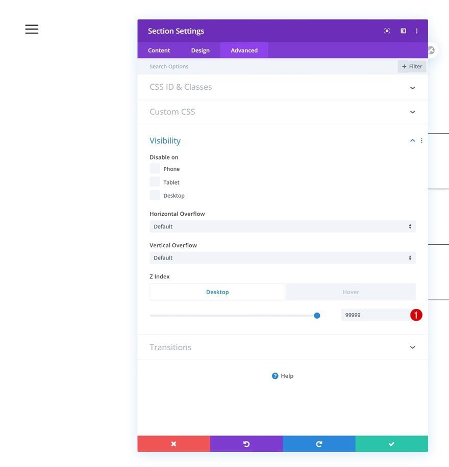
Default Visibility
Then, go to the visibility settings and hide the overflows. Make sure you increase the z index of the section too, this will ensure the section will remain on top of all page and post content.
- Horizontal Overflow: Hidden
- Vertical Overflow: Hidden
- Z Index: 999999
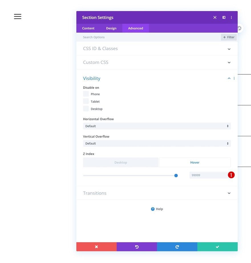
Hover Visibility
Once you’ve added the z index, enable the hover option and make sure the same z index is applying there too.
- Z Index: 999999
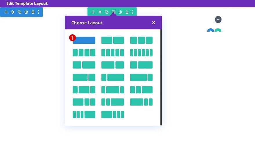
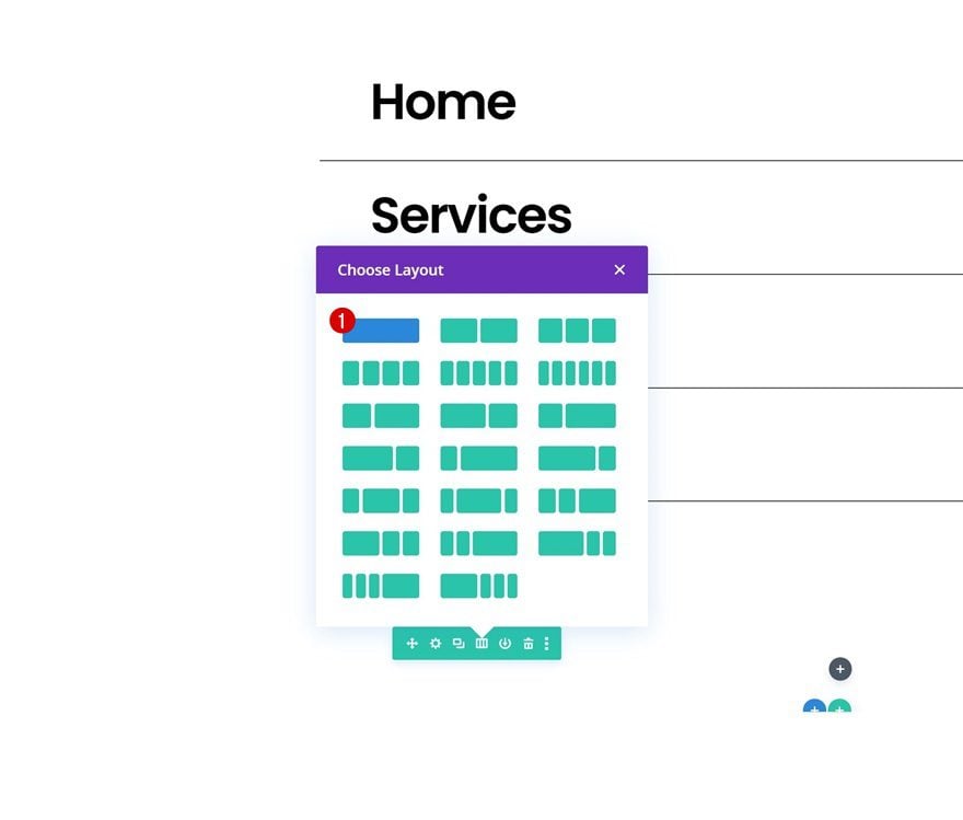
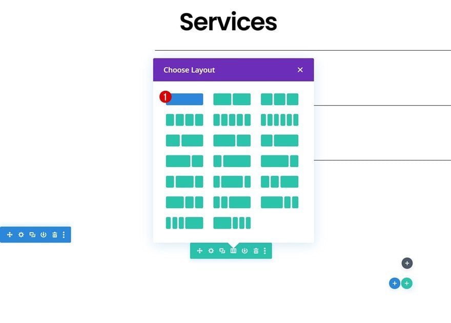
Add Row #1
Column Structure
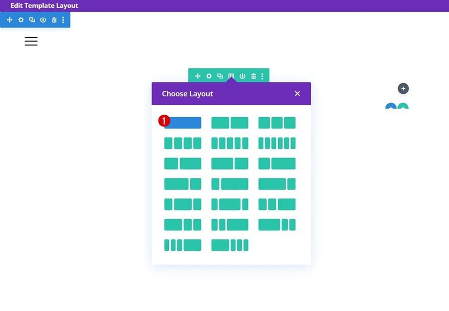
Continue by adding a first row to the section using the following column structure:
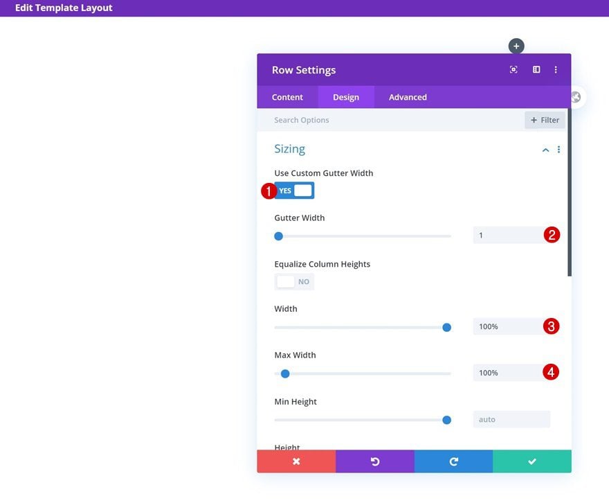
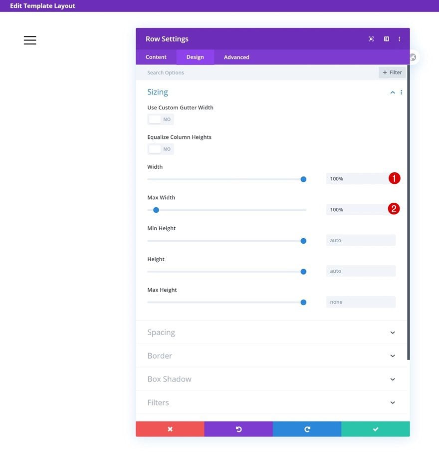
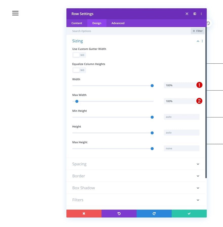
Sizing
Without adding any modules yet, open the row settings and allow the row to take up the entire width of the screen.
- Use Custom Gutter Width: Yes
- Gutter Width: 1
- Width: 100%
- Max Width: 100%
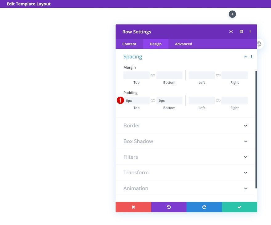
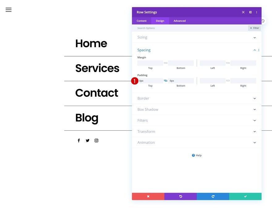
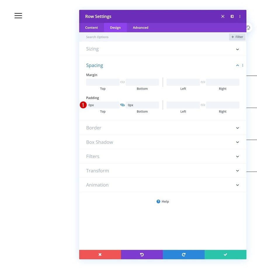
Spacing
Remove all default top and bottom padding next.
- Top Padding: 0px
- Bottom Padding: 0px
Add Text Module to Column
Add Content
The only module we need in this row is a Text Module. Add a menu symbol of your choice to the content box. In this tutorial, we’re using ‘≡’.
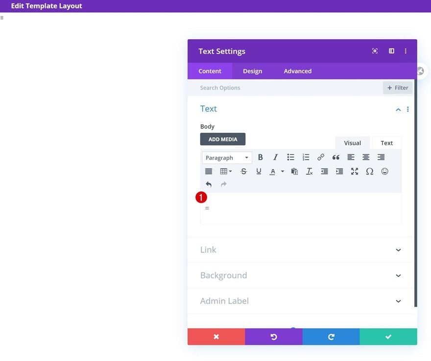
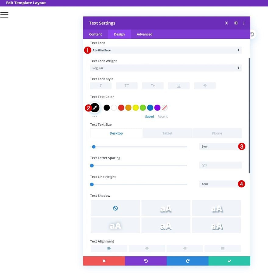
Text Settings
Move on to the module’s design tab and change the text settings as follows:
- Text Font: Abril Fatface
- Text Color: #000000
- Text Size: 3vw (Desktop), 5vw (Tablet), 7vw (Phone)
- Text Line Height: 1em
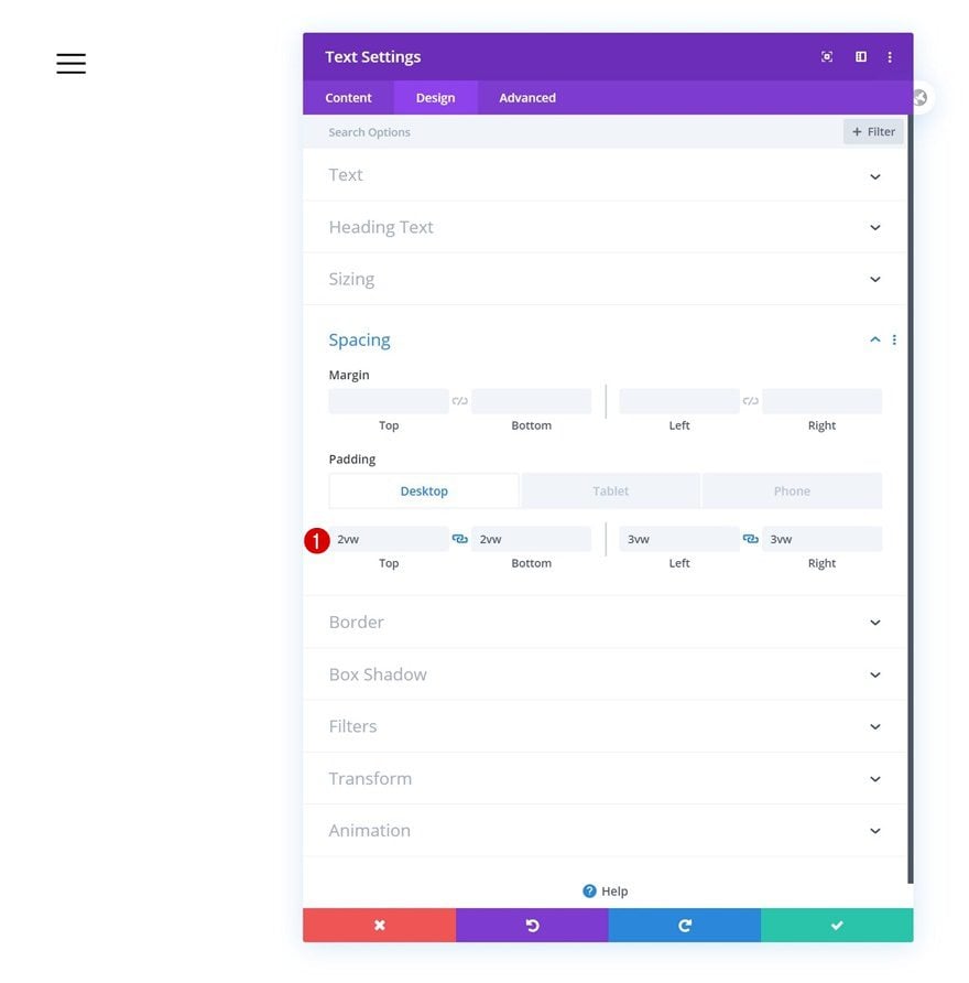
Spacing
Modify the spacing values across different screen sizes next.
- Top Padding: 2vw (Desktop), 3.5vw (Tablet), 5vw (Phone)
- Bottom Padding: 2vw (Desktop), 3.5vw (Tablet), 5vw (Phone)
- Left Padding: 3vw (Desktop), 4vw (Tablet), 7vw (Phone)
- Right Padding: 3vw (Desktop), 4vw (Tablet), 7vw (Phone)
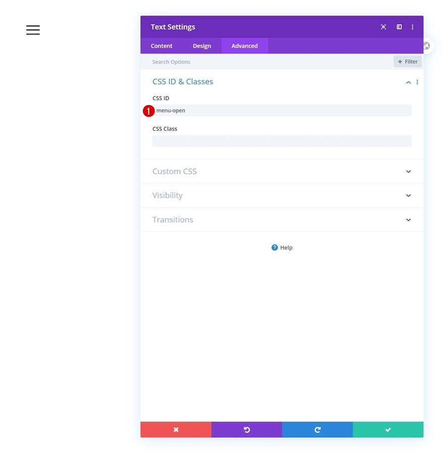
CSS ID
This text module will serve as a trigger for the fullscreen menu. That’s why we’ll need to assign a CSS ID to the text module. Later on the tutorial, we’ll use the CSS ID in our code.
- CSS ID: menu-open
Add Row #2
Column Structure
Continue by adding a second row to the section using the following column structure:
Sizing
Open the row settings and change the sizing settings as follows:
- Width: 100%
- Max Width: 100%
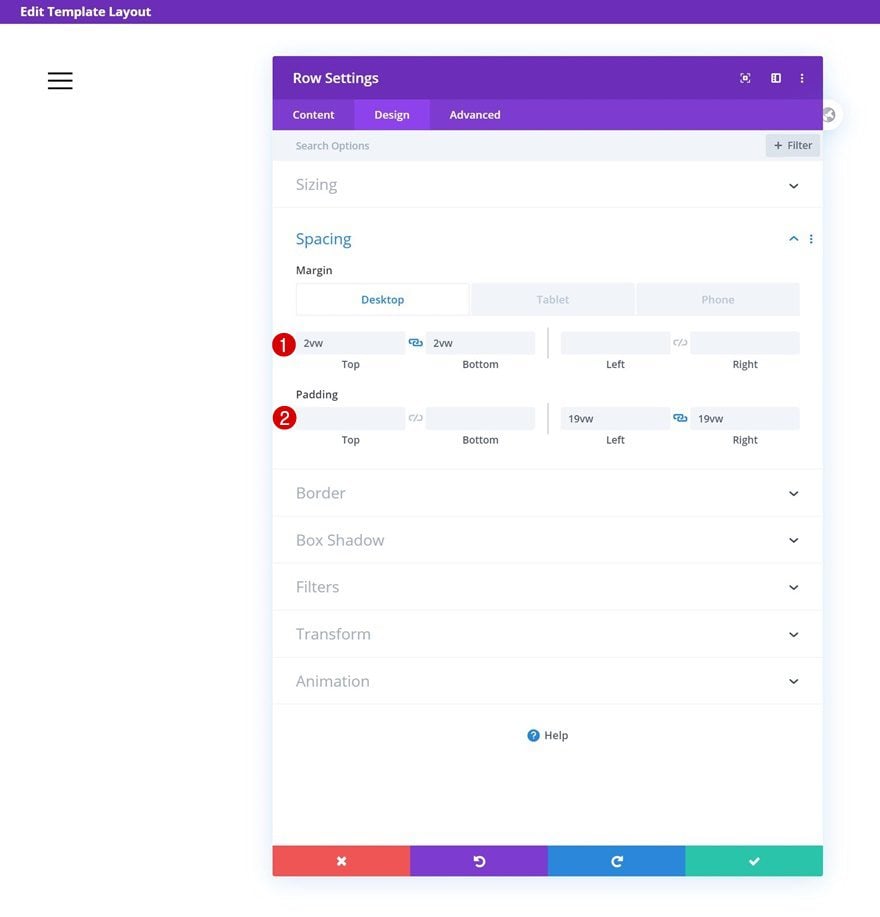
Spacing
Modify the spacing values too.
- Top Margin: 2vw (Desktop), 4vw (Tablet), 6vw (Phone)
- Bottom Margin: 2vw (Desktop), 4vw (Tablet), 6vw (Phone)
- Left Padding: 19vw
- Right Padding: 19vw
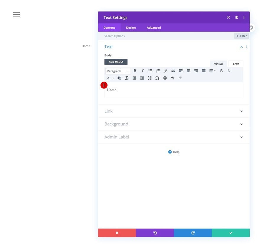
Add Text Module to Column
Add Content
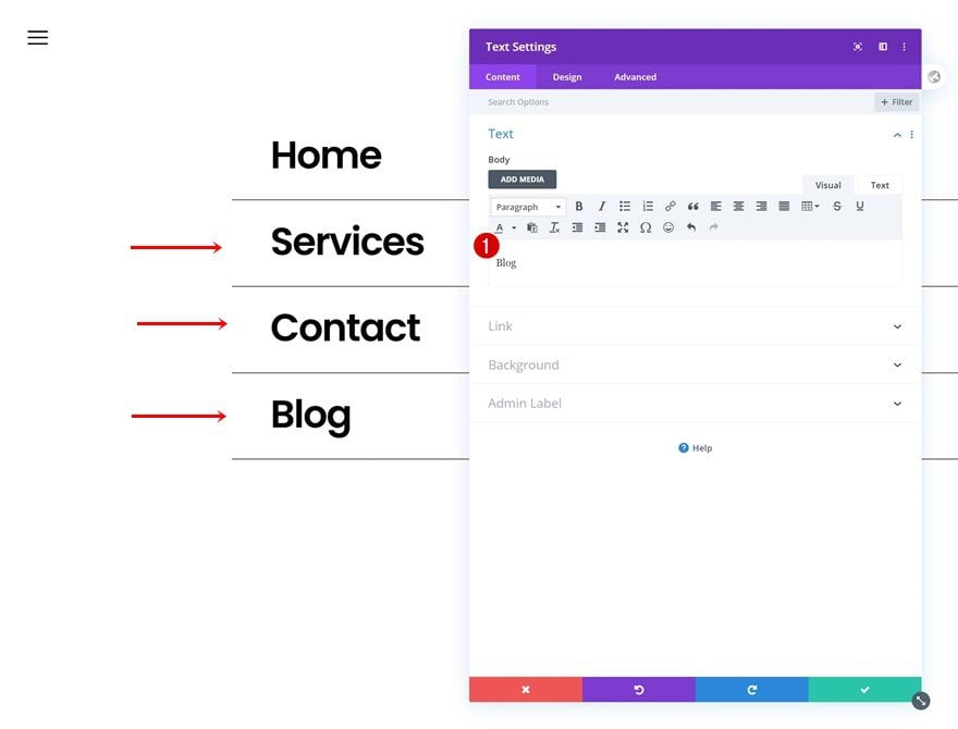
Then, add a new Text Module to the column. This Text Module represents your first menu item.
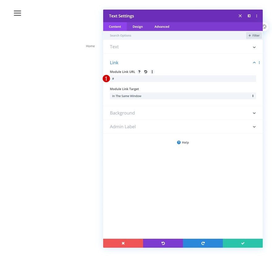
Add Link
Make sure you add a proper link to the module next.
- Module Link URL: #
Text Settings
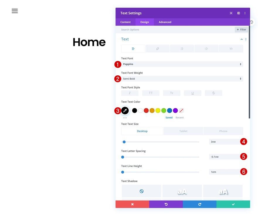
Move on to the module’s design tab and change the text settings accordingly:
- Text Font: Poppins
- Text Font Weight: Semi Bold
- Text Color: #000000
- Text Size: 3vw (Desktop), 7vw (Tablet), 8vw (Phone)
- Text Letter Spacing: -0.1vw
- Text Line Height: 1em
Spacing
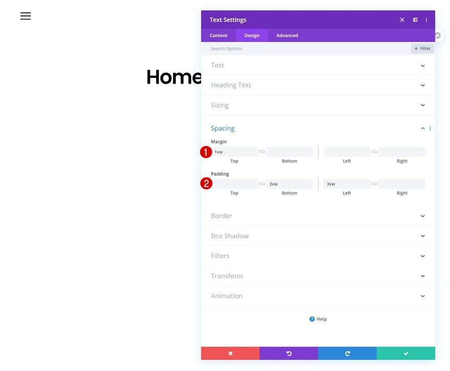
Modify the module’s spacing settings next.
- Top Margin: 1vw
- Bottom Padding: 2vw
- Left Padding: 3vw
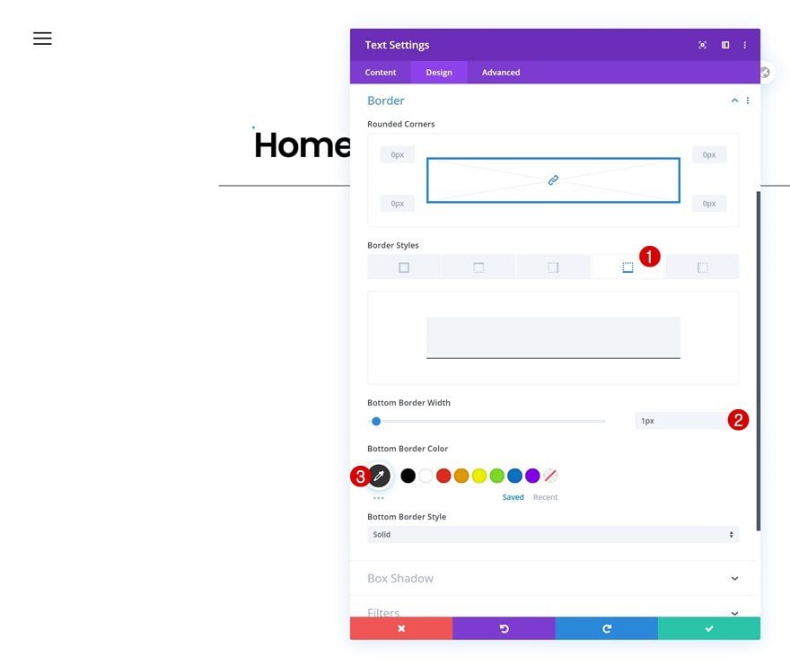
Border
Add a bottom border too.
- Bottom Border Width: 1px
- Bottom Border Color: #333333
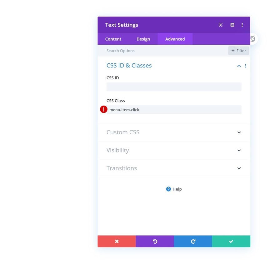
CSS Class
And complete the module’s settings by adding a custom CSS class. You’ll need to add this CSS class to each and every menu item you place in your section.
Clone Text Module Three Times
Once you’ve completed the first Text Module, you can clone it as many times as you want (depending on the menu items you want to show in your menu). However, make sure the modules don’t surpass the height of your screen.
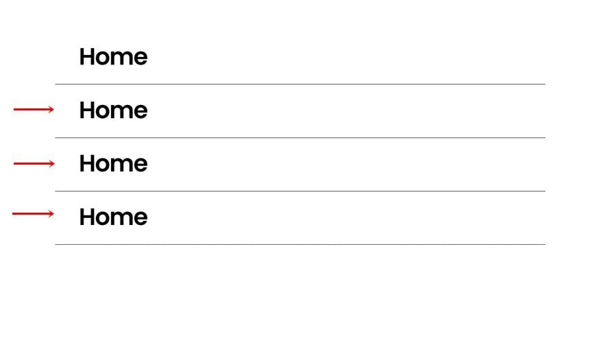
Change Content & Link of Each Duplicate
You’ll have to change the content and link of each duplicate.
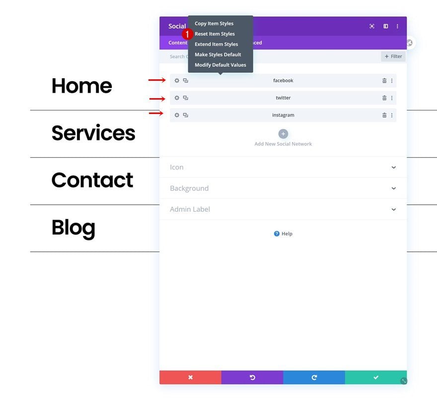
Add Social Networks of Choice
The next and last module we need in this row is a Social Media Follow Module. Add all the social networks you want to display.
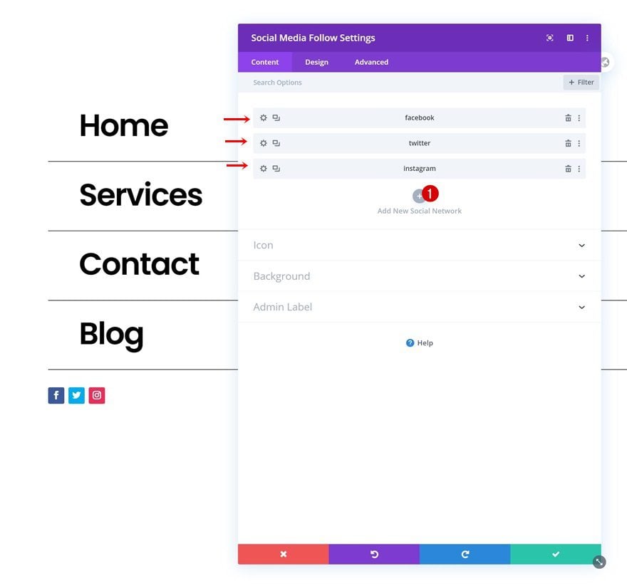
Reset Individual Social Network Styles
Continue by resetting the styles of each social network individually.
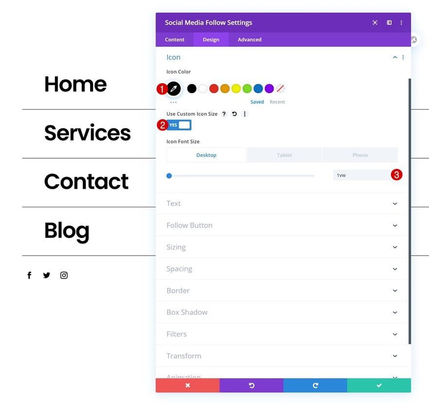
Icon Settings
Then, go to the module’s design tab and modify the icon settings as follows:
- Icon Color: #000000
- Use Custom Icon Size: Yes
- Icon Font Size: 1vw (Desktop), 2vw (Tablet), 3vw (Phone)
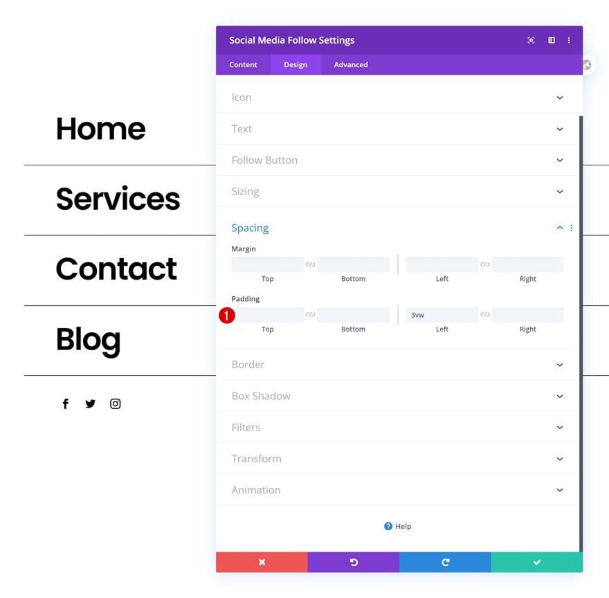
Spacing
Add some left padding too.
- Left Padding: 3vw
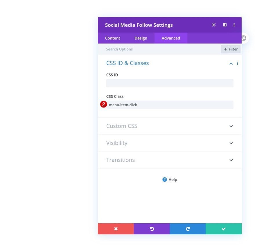
CSS Class
Complete the module’s settings by adding a CSS class.
Add Row #3
Column Structure
The last row we need in this section contains the following column structure:
Spacing
Limit the space that is taken up by this row by removing all default top and bottom padding.
- Top Padding: 0px
- Bottom Padding: 0px
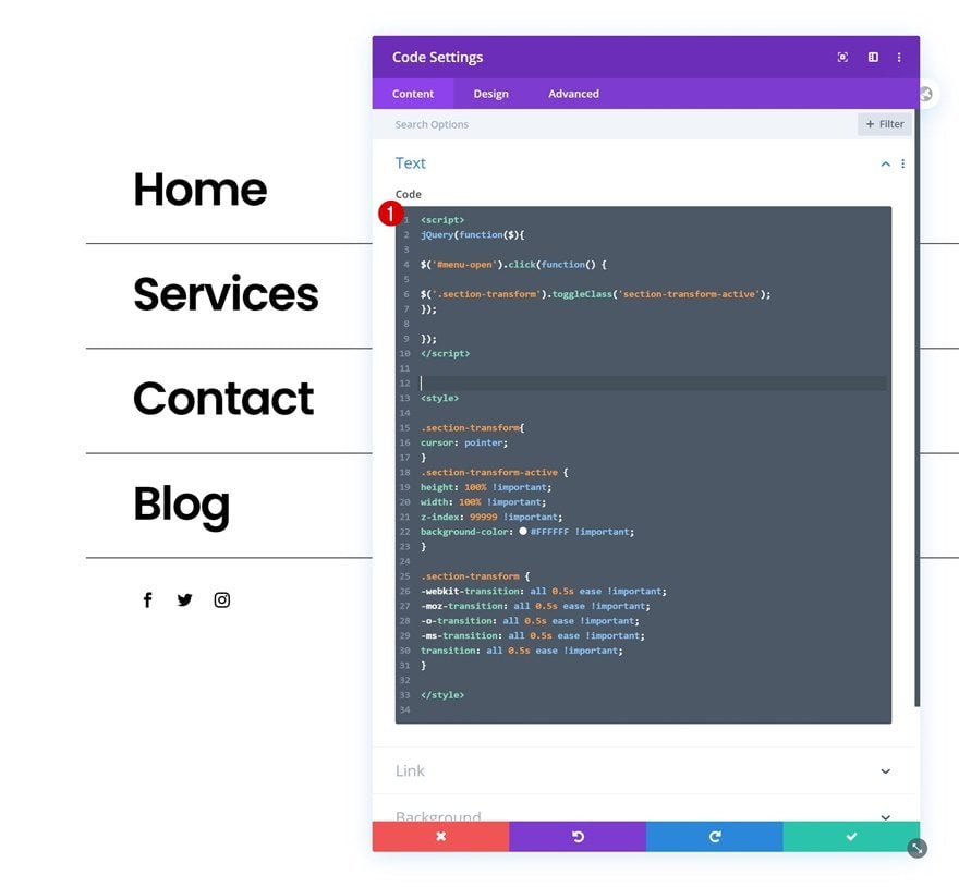
Add Code Module to Column
Insert JQuery & CSS Code
Then, add a Code Module and insert some CSS and JQuery code to make the fullscreen menu function. Make sure you manually place the JQuery code between script tags and the CSS code between style tags as you can notice in the print screen below.
jQuery(function($){
$('#menu-open').click(function() {
$('.section-transform').toggleClass('section-transform-active');
});
$('.menu-item-click').click(function() {
$('.section-transform').removeClass('section-transform-active');
});
});
.section-transform{
cursor: pointer;
}
.section-transform-active {
height: 100% !important;
width: 100% !important;
z-index: 99999 !important;
background-color: #FFFFFF !important;
}
.section-transform {
-webkit-transition: all 0.5s ease !important;
-moz-transition: all 0.5s ease !important;
-o-transition: all 0.5s ease !important;
-ms-transition: all 0.5s ease !important;
transition: all 0.5s ease !important;
}
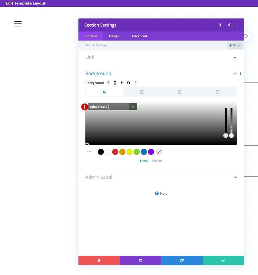
3. Dedicate Section #2 to Top Right Corner Logo
Section Settings
Background Color
On to the next section! This section will contain the logo in the top right corner. Open the section settings and change the background color into a completely transparent one.
- Background Color: rgba(0,0,0,0)
Spacing
Remove the section’s default top and bottom padding next.
- Top Padding: 0px
- Bottom Padding: 0px
Default Visibility
Increase the section’s z index too.
- Z Index: 99999
Hover Visibility
Enable the hover option on the z index and make sure that same value applies on hover as well.
- Z Index: 99999
Add New Row
Column Structure
Continue by adding a new row to the section using the following column structure:
Sizing
Open the row settings and change the sizing settings as follows:
- Width: 100%
- Max Width: 100%
Spacing
Remove the row’s default top and bottom padding too.
- Top Padding: 0px
- Bottom Padding: 0px
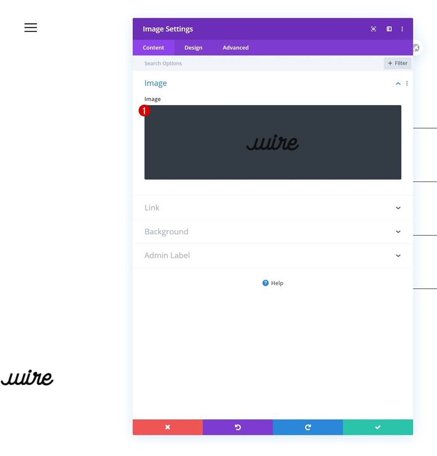
Add Image Module to Column
Upload PNG Logo Image
The only module we need in this row and section is an Image Module. Upload your semi-transparent logo image file.
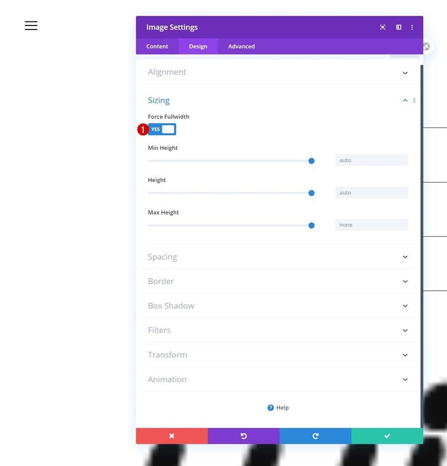
Sizing
Go to the module’s sizing settings and force fullwidth.
- Force Fullwidth: Yes
Spacing
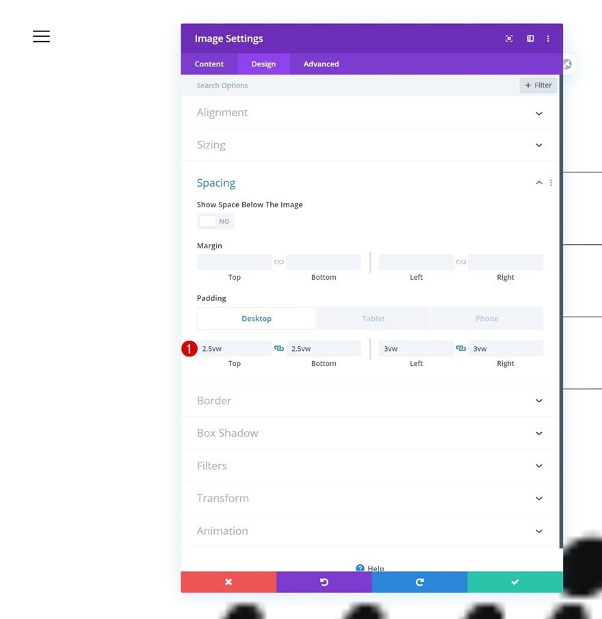
Complete the module’s settings by adding some custom padding across different screen sizes.
- Top Padding: 2.5vw (Desktop), 3.5vw (Tablet), 5vw (Phone)
- Bottom Padding: 2.5vw (Desktop), 3.5vw (Tablet), 5vw (Phone)
- Left Padding: 3vw (Desktop), 4vw (Tablet), 7vw (Phone)
- Right Padding: 3vw (Desktop), 4vw (Tablet), 7vw (Phone)
4. Additional Section Settings
Section #1
Sizing
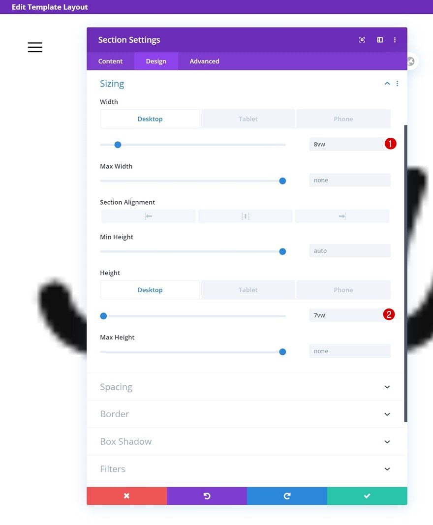
Once you’ve completed both sections and all modules in it, it’s time to change their sizing. Open the first section and apply the following width and height values:
- Width: 8vw (Desktop), 11vw (Tablet), 18vw (Phone)
- Height: 7vw (Desktop), 11vw (Tablet), 18vw (Phone)
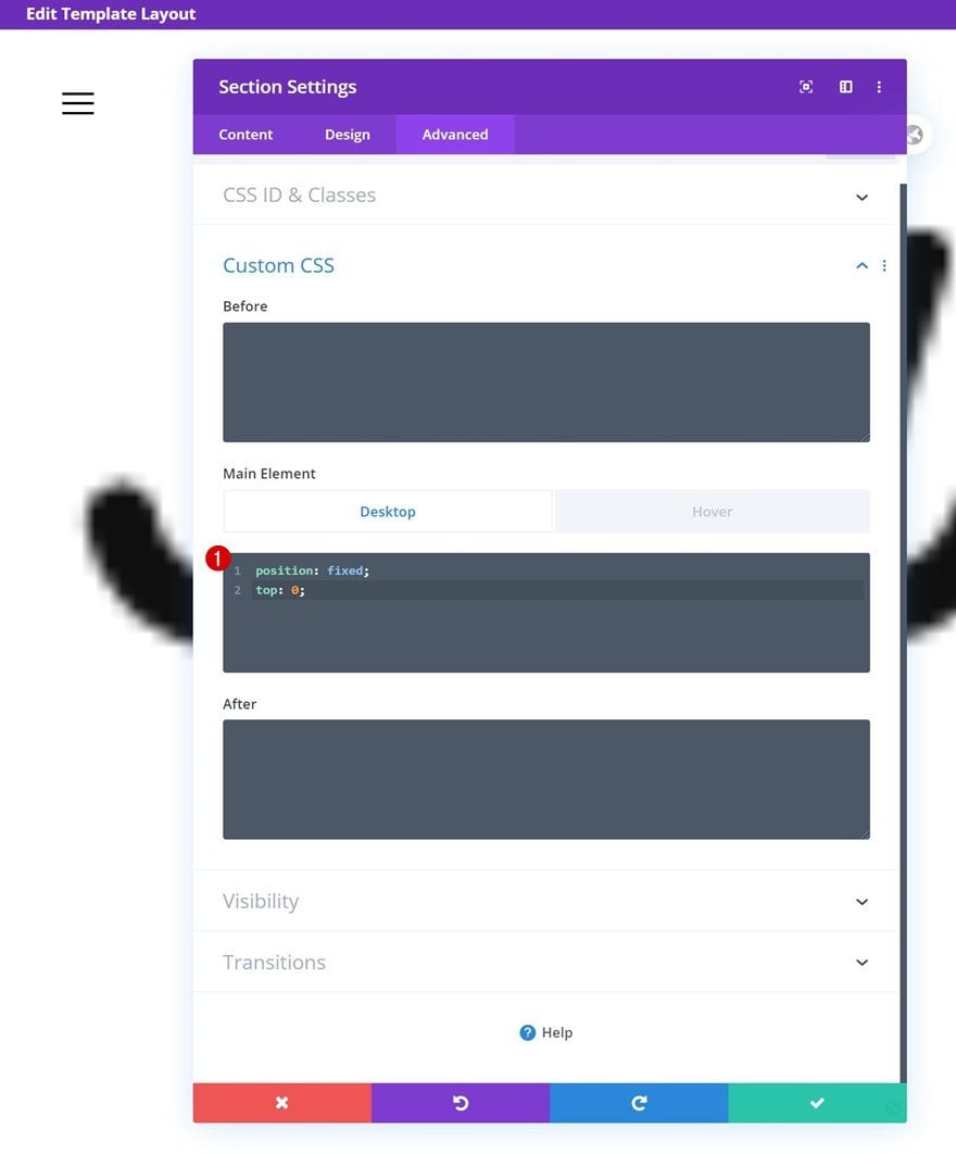
Default Main Element
Then, go to the section’s advanced tab and add the following lines of CSS code:
position: fixed;
top: 0;
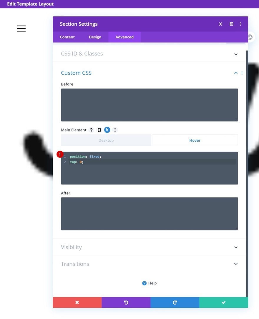
Hover Main Element
Make sure those same CSS code lines apply on hover.
position: fixed;
top: 0;
Section #2
Sizing
Continue by opening the second section’s settings and change the width across different screen sizes.
- Width: 13vw (Desktop), 21vw (Tablet), 30vw (Phone)
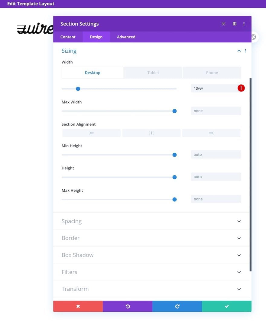
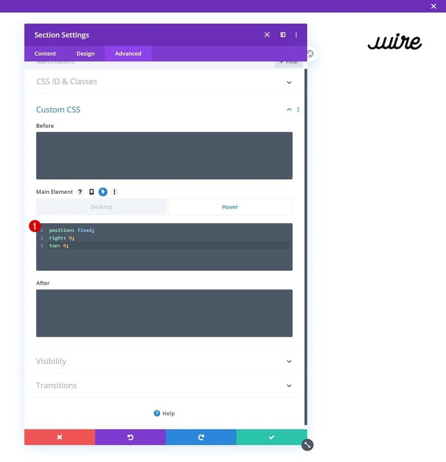
Default Main Element
Then, go to the advanced tab and add the following lines of CSS code:
position: fixed;
right: 0;
top: 0;
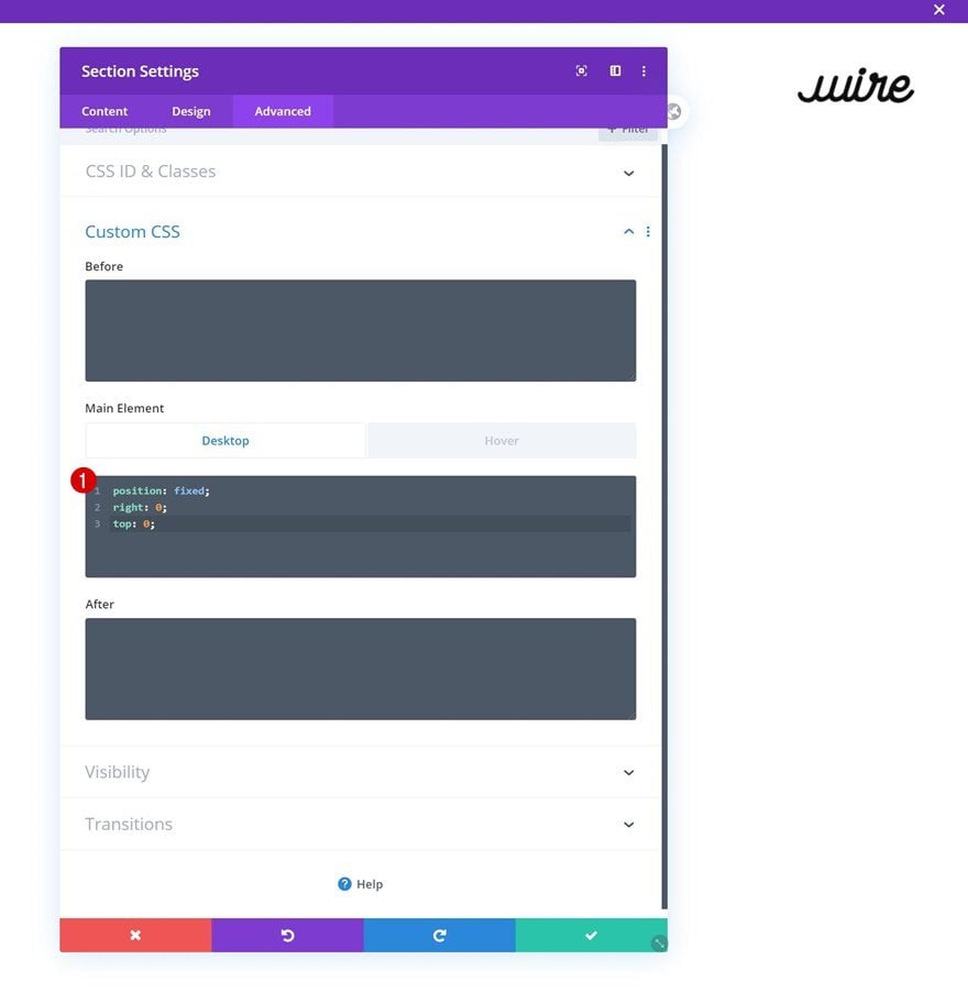
Hover Main Element
Make sure those same CSS code lines apply on hover.
position: fixed;
right: 0;
top: 0;
5. Save Builder Changes & View Result
Once you’ve completed all the steps above, you can save the global header template and view the result on your website!
Preview
Now that we’ve gone through all the steps, let’s take a final look at the outcome across different screen sizes.
Desktop
Mobile
Final Thoughts
In this tutorial, we’ve shown you how to create a fullscreen global header using Divi’s Theme Builder. We’ve added two fixed elements to our design; a hamburger icon in the top left corner and a logo in the top right corner. On click, the hamburger icon opens a fullscreen menu that is made using Divi’s built-in elements. You’re free to use Divi to design this fullscreen menu however you want! At the beginning of this tutorial, you were able to download the JSON file for free as well. If you have any questions, feel free to leave a comment in the comment section below.
If you’re eager to learn more about Divi and get more Divi freebies, make sure you subscribe to our email newsletter and YouTube channel so you’ll always be one of the first people to know and get benefits from this free content.


Hey, this isn’t working, neither the exported template neither following the tutorial. Could be because of dependencies of jQuery? It’s open the whole time.
this was really cool and works the only thing is in the actual theme builder everything is still piled up on the left side, why is that?
That is unfortunate. I recommend contacting the Support Team. They will undoubtedly assist you with this.
I would of thought changing the #FFFFF in the code to a different color would enable you to make the menu background a different color….buut it does not. Any clue on how to change the default White to another color background when you press the hamburger?
Does anyone know how to swap the menu icon for a ‘X’ icon to close the menu?
Hello, due to my logo color, i changed the background color to white. However, about 50% of the header background is still transparent. How to rectify?
Thanks so much, this is very cool! I’ve noticed that when the page is first loaded, the full screen menu will flash momentarily, before it is hidden. Any ideas on how to make sure the ‘expanded’ menu stays hidden on page load?
Hi, Nice tutorial, however, I have a small issue.
When on a smartphone the navigation scroll work fine but will not allow me to scroll when in landscape orientation.
Do you have any suggestions?
Hi! Great tutorial, almost exactly what I was looking for. I have one question: how can I make section#1 ‘s background to go from transparent to white when I activate the menu? I tried to set the background to transparent, but somehow it seems to prevent the whole section to turn white upon clicking on the hamburger…
Thanks!
Quite the tutorial. Not bad. I might come back to this.
Downloaded divi-landing-page-kit (5,17 MB) not global header 🙂
Are all these SEO friendly?
Is there any HTML markup that is actually a header, or to all search engines out there now Divi websites look like one pager?
How did you put in an icon into the content box? Did you make your own icon ?
Great example! Just one thing, when importing the layout into the Theme Builder the script and style tags were not added to the code module and had to be added manually.
That’s fantastic but there’s a way to adopt it just for a specific section of my website? I cannot use this json file for it.
Ty in advance
Kind regards
Hello developer,
Do you have any sale off plan for the next Black Friday event?
Yes we will have our biggest sale of the year on Black Friday 🙂
Nice work!
Thanks you.
Hello, could someone explain to me how I can leave my Top Menu fixed, so it doesn’t disappear when I scroll through the website
Hello, cool tutorial, thanks!
I have a one-pager site so the menu isn’t closing when clicking a section link.
How do i make the full-screen menu close when clicking a menu item?
Thanks.
Very cool tutorial, thanks for that!
Question though: in case my site is a one-page scroller, how do I make the function close the full-screen menu when clicking on a menu item? For now, it scrolls to any section but the full screen menu keeps covering the page.
Thank you.
Hi Hess, that’s a good point, I initially created the tutorial to work on a multi-page website but I’ve updated the post and JSON file to make sure the menu works on one-pagers as well! 🙂
Things I’ve changed in case you’re curious:
– added a CSS class to the menu items (text modules & social media follow module)
– updated the JQuery code
Hi,
it doesn`t work. I see the 3 lines, but nothing happens when I click on them…
You have to manually add your links to the menu item modules.
The same situation. It doesn`t work.
Nice tutorial. What I need is a header/menubar like in http://www.remmerden.nl
Logo; some socmed icons; some menu items; hamburger slide in menu.
Can that be created with Divi? (I have to redesign that website)
This looks way better than the tutorial, did you get any chance to replicate this header?
Maybe you could add and style a Menu Module to the first row and move the social icons to the first row as well. Easier said than done, but you could give it a try.