

A lot of company websites out there share a preview of their approach at some point. When creating an approach section, you can handle it in the traditional way, or you can try to add more interaction to it. If you’re looking for a way to make the second option happen, you’re going to love this post.
In this tutorial, we’ll show you how to create a 3-step blurb reveal using Divi and its new sizing options. We’ll start off by showing the title, continue by displaying three arrows that lead to the steps, and complete the effect by revealing the animated blurbs. You’ll be able to download the JSON file for free as well!
Let’s get to it.
- 1 Preview
- 2 Download the 3-Step Blurb Reveal Layout for FREE
- 3 Download For Free
- 4 You have successfully subscribed. Please check your email address to confirm your subscription and get access to free weekly Divi layout packs!
-
5
Let’s Start Recreating!
- 5.1 Add New Section
- 5.2 Add Row #1
- 5.3 Add Text Module to Row
- 5.4 Add Row #2
- 5.5 Add Arrow Text Module to Column 1
- 5.6 Add Arrow Text Module to Column 2
- 5.7 Add Arrow Text Module to Column 3
- 5.8 Add Row #3
- 5.9 Add Number Text Module to Column 1
- 5.10 Clone Number Text Module Twice & Place Duplicates in Remaining Columns
- 5.11 Add Blurb Module to Column 1
- 5.12 Clone Blurb Module Twice & Place Duplicates in Remaining Columns
- 5.13 Modify Row #3 Sizing Settings
- 5.14 Modify Section Sizing Settings
- 6 Preview
- 7 Final Thoughts
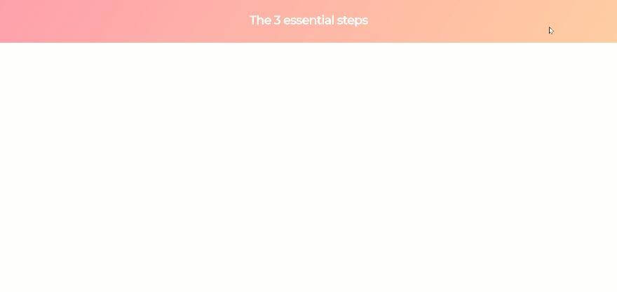
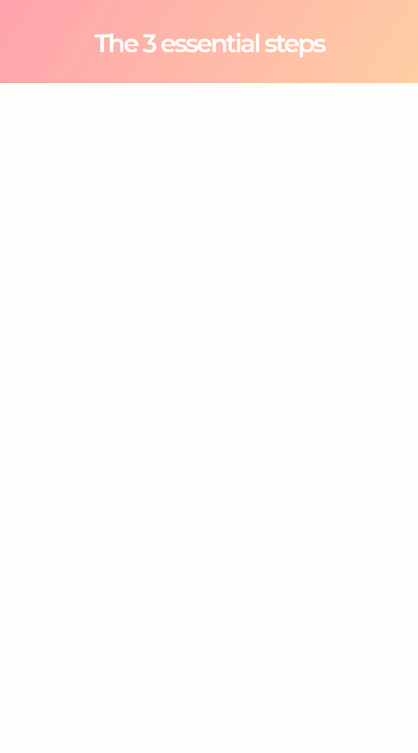
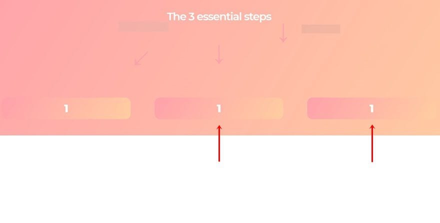
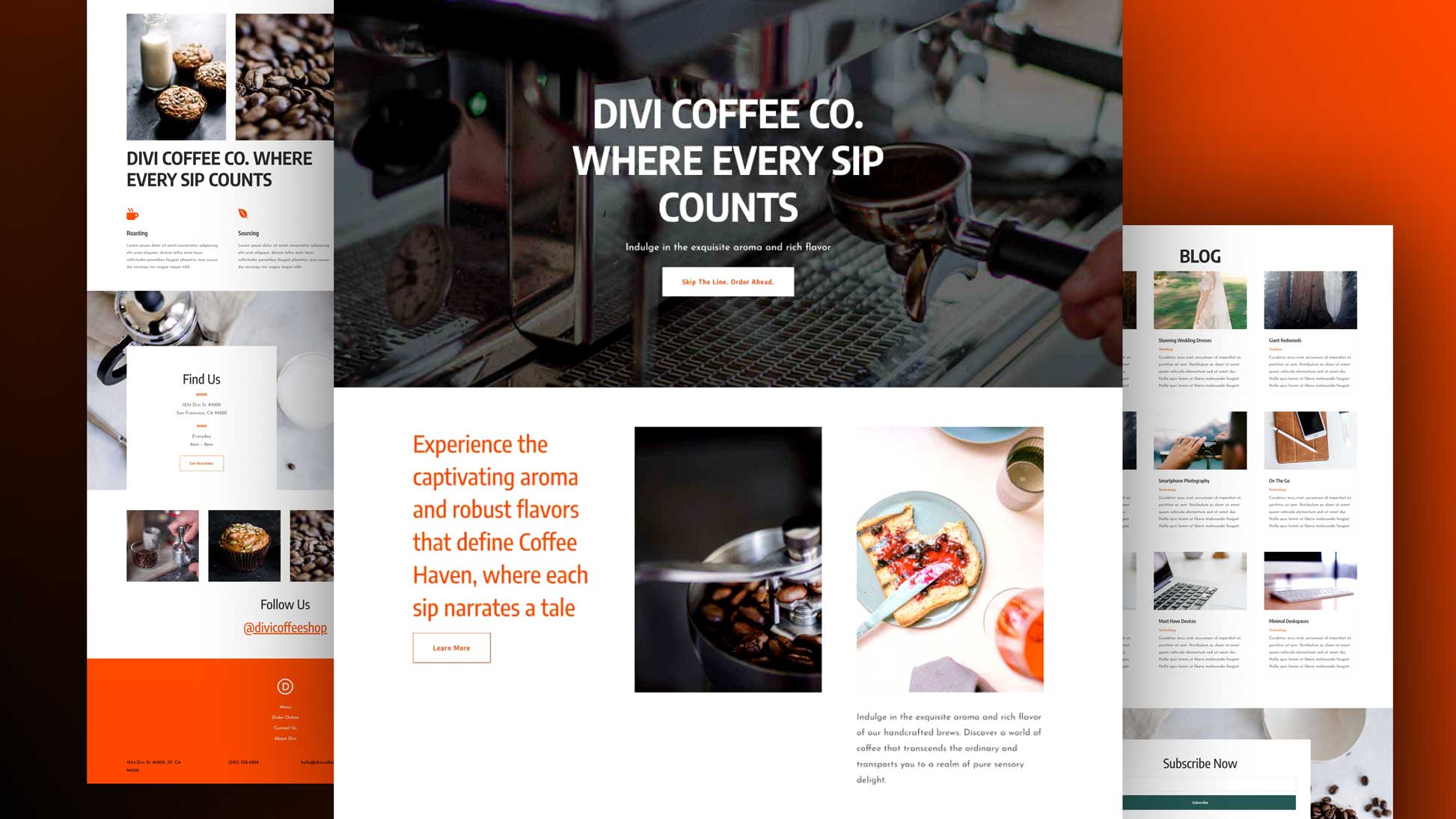
Preview
Before we dive into the tutorial, let’s take a quick look at the outcome across different screen sizes.
Desktop
Mobile
Download the 3-Step Blurb Reveal Layout for FREE
To lay your hands on the 3-step blurb reveal layout, you will first need to download it using the button below. To gain access to the download you will need to subscribe to our newsletter by using the form below. As a new subscriber, you will receive even more Divi goodness and a free Divi Layout pack every Monday! If you’re already on the list, simply enter your email address below and click download. You will not be “resubscribed” or receive extra emails.

Let’s Start Recreating!
Subscribe To Our Youtube Channel
Add New Section
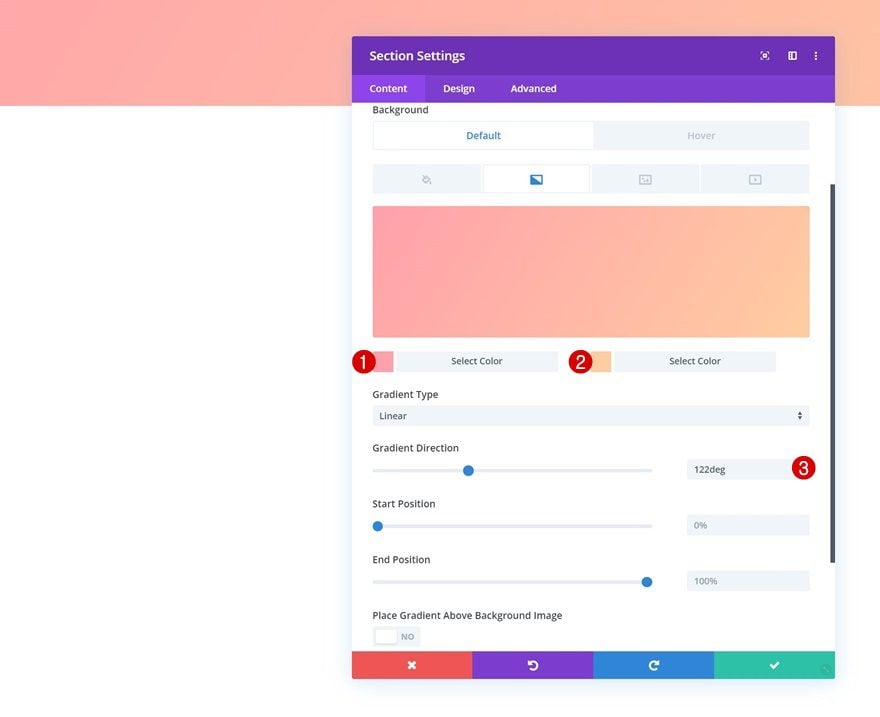
Default Gradient Background
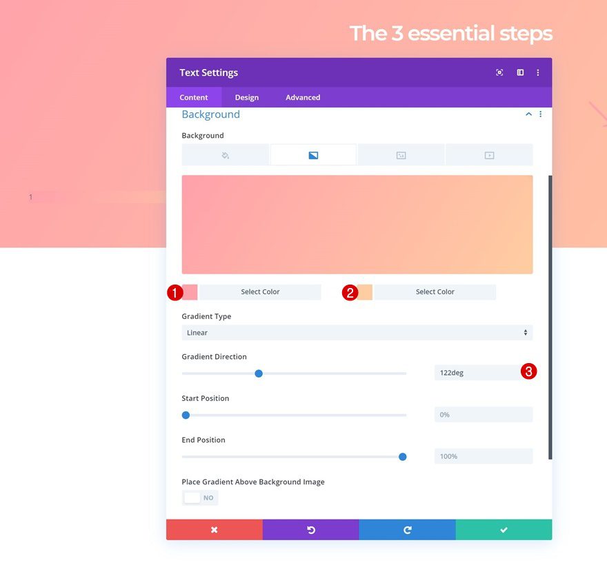
The first thing you’ll need to do is add a new section to the page you’re working on. Open the section settings and add the following gradient background to it:
- Color 1: #ffa3ad
- Color 2: #ffcea3
- Gradient Direction: 122deg
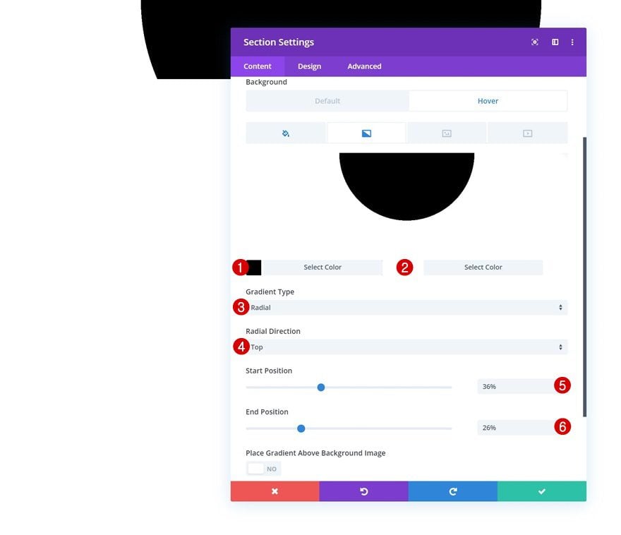
Hover Gradient Background
Modify the gradient background on hover:
- Color 1: #000000
- Color 2: #ffffff
- Gradient Type: Radial
- Radial Direction: Top
- Start Position: 36%
- End Position: 26%
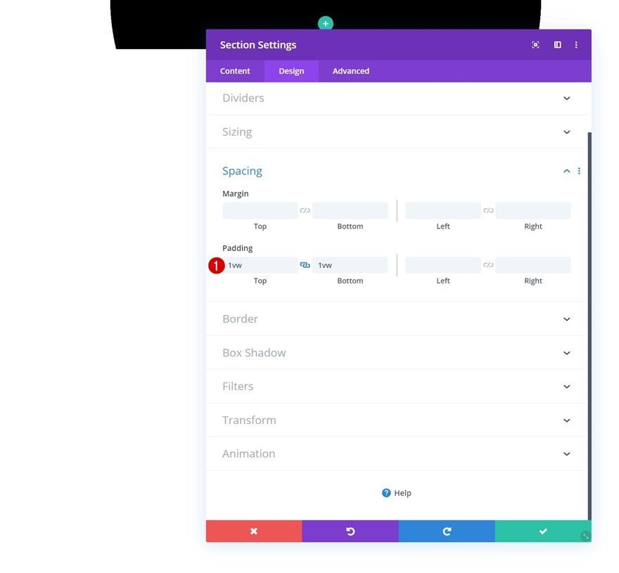
Spacing
Move on to the design tab and add some custom top and bottom padding next.
- Top Padding: 1vw
- Bottom Padding: 1vw
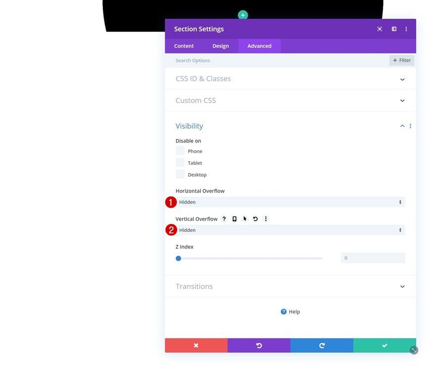
Overflow
Later on this post, we’ll play around with the height of the section. To make sure nothing exceeds the section container, we’re going to hide the overflows in the visibility settings.
- Horizontal Overflow: Hidden
- Vertical Overflow: Hidden
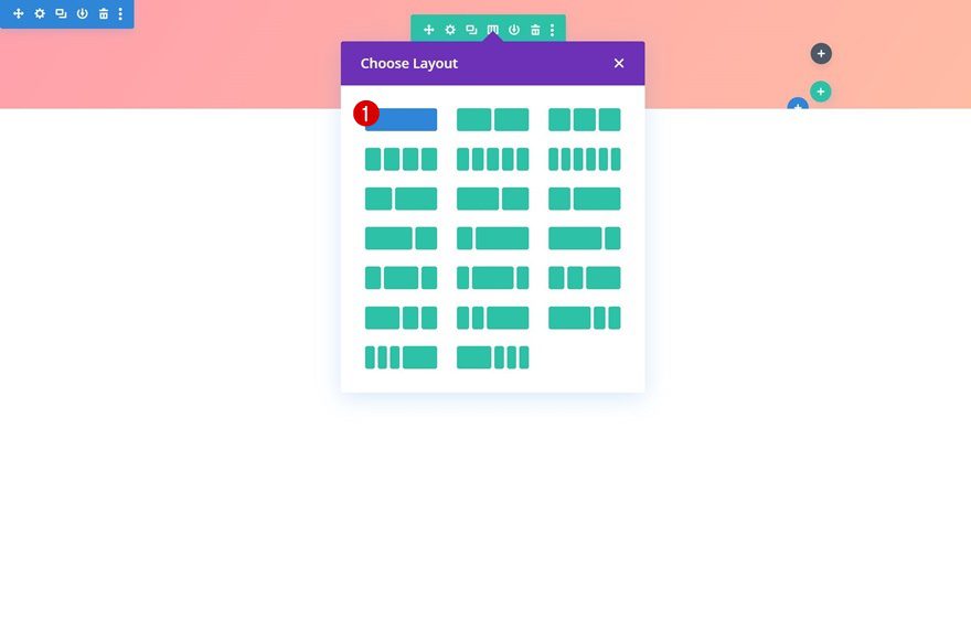
Add Row #1
Column Structure
Once you’ve completed the section settings, you can continue by adding the first row to the section using the following column structure:
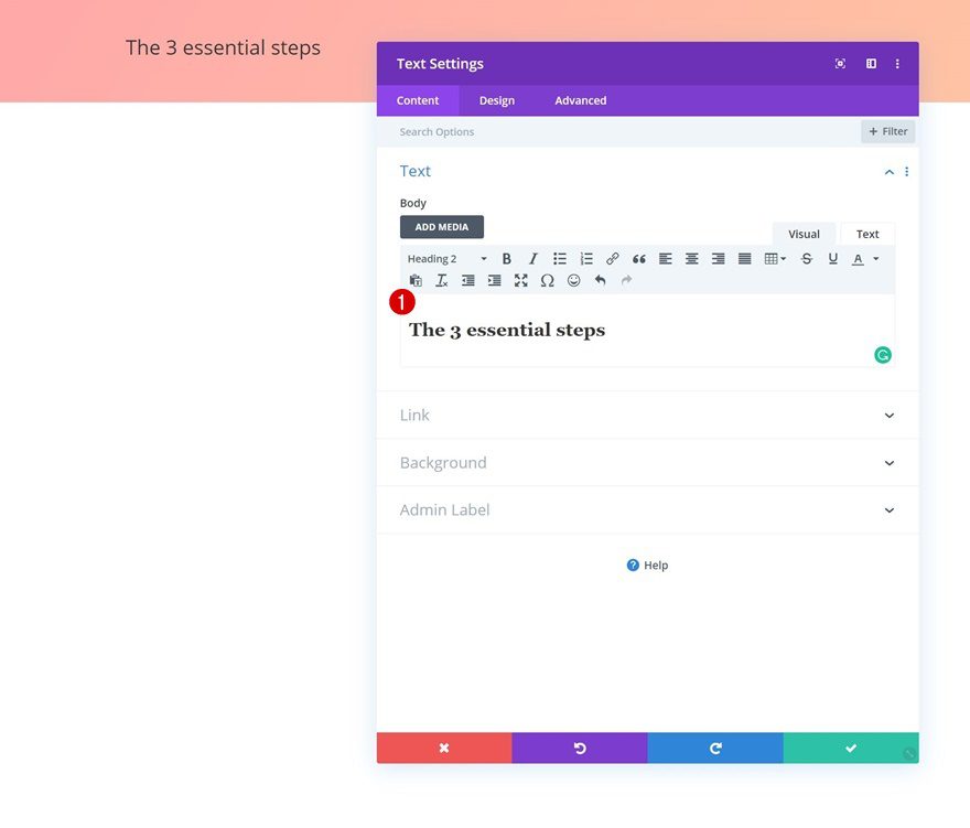
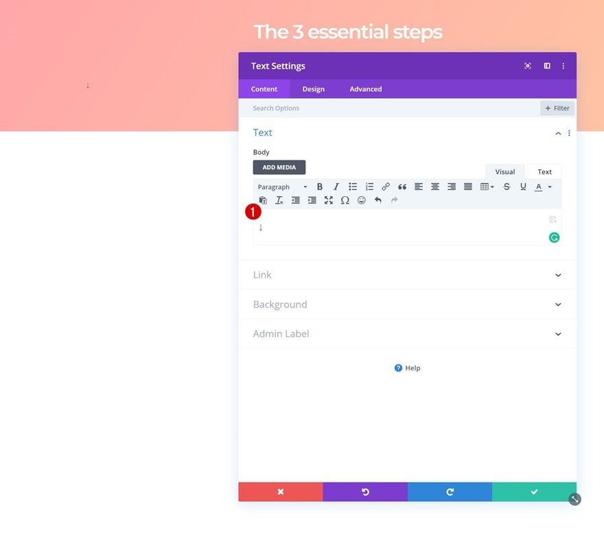
Add Text Module to Row
Add H2 Content
Add a new Text Module to the row’s column and enter some H2 content of your choice.
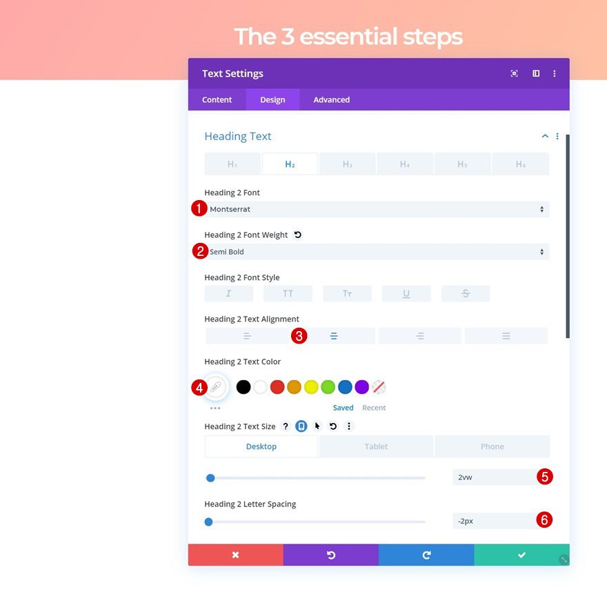
H2 Text Settings
Move on to the design tab and change the H2 text settings accordingly:
- Heading 2 Font: Montserrat
- Heading 2 Font Weight: Semi Bold
- Heading 2 Text Alignment: Center
- Heading 2 Text Color: #ffffff
- Heading 2 Text Size: 2vw (Desktop), 5vw (Tablet), 6vw (Phone)
- Heading 2 Letter Spacing: -2px
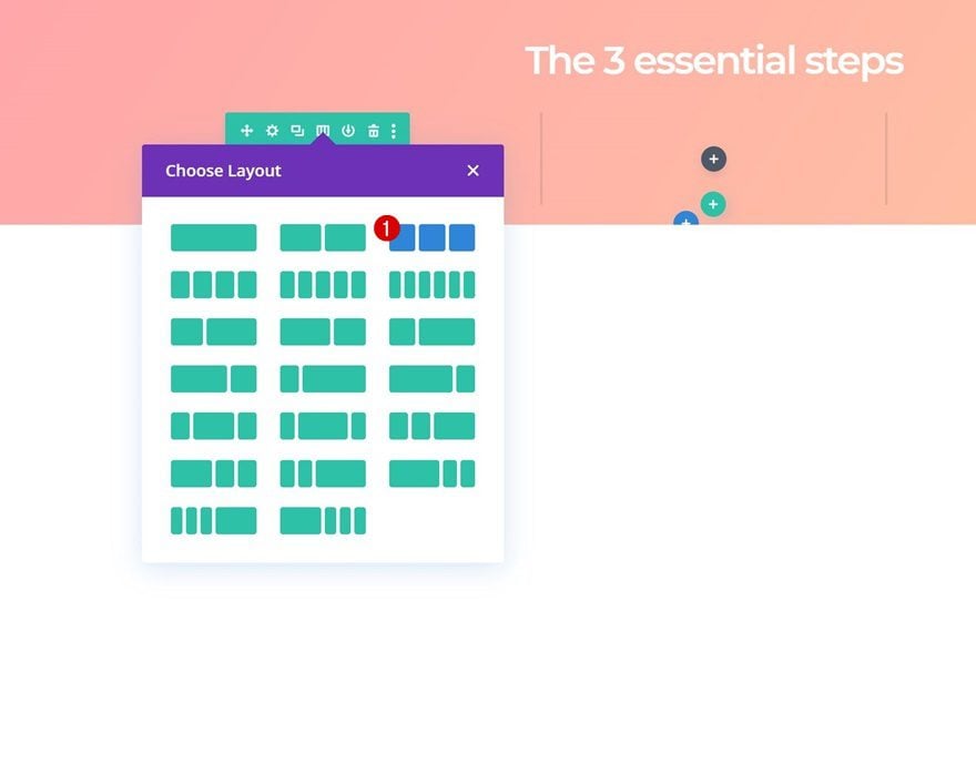
Add Row #2
Column Structure
Continue by adding the second row using the following column structure:
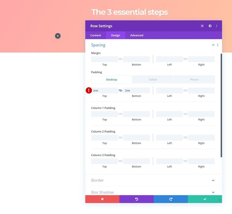
Spacing
Without adding any modules yet, open the row settings and add some custom top and bottom padding across different screen sizes.
- Top Padding: 2vw (Desktop), 4vw (Tablet), 5vw (Phone)
- Bottom Padding: 2vw (Desktop), 4vw (Tablet), 5vw (Phone)
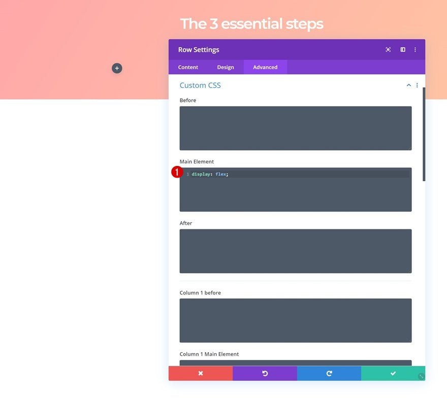
Display
To make sure all columns appear next to each other on smaller screen sizes, we’re going to add one single line of CSS code to the main element of the row.
display: flex;
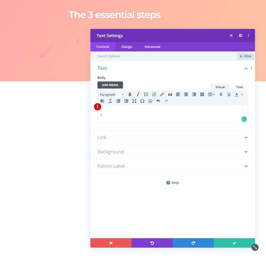
Add Arrow Text Module to Column 1
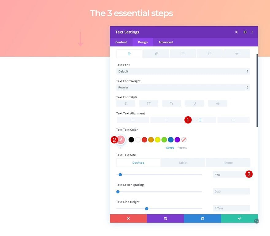
Add Symbol
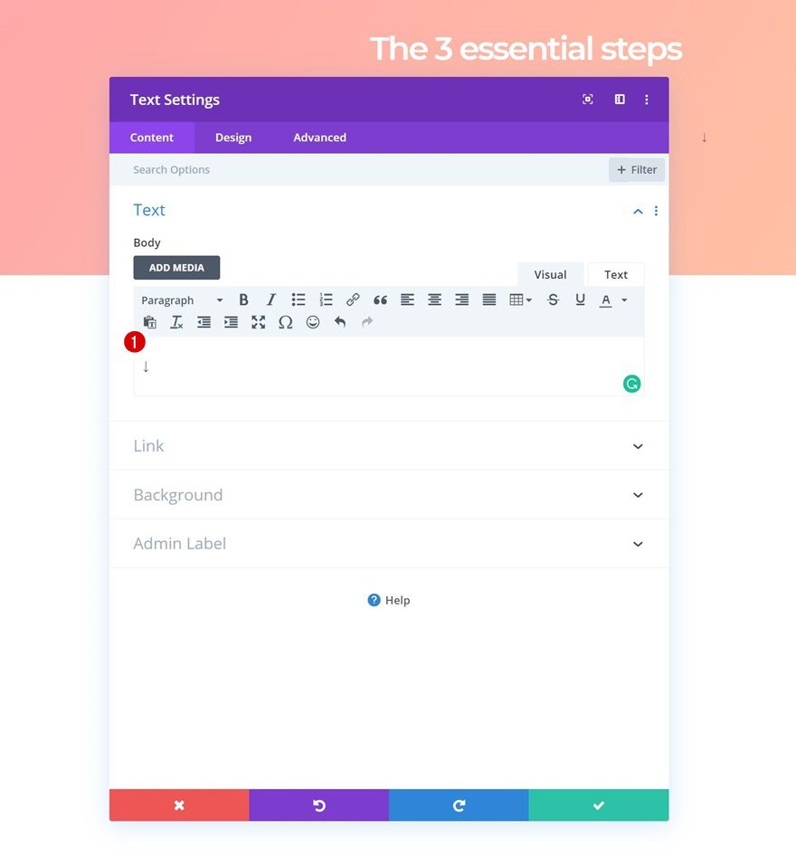
We’ll use this row to add the animated arrows. Add a new Text Module to the first column of the row and add the ‘↓’ symbol to the content box.
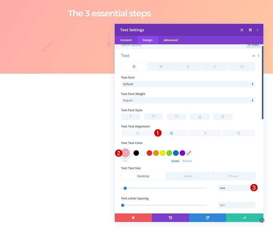
Text Settings
Move on to the design tab and change text settings.
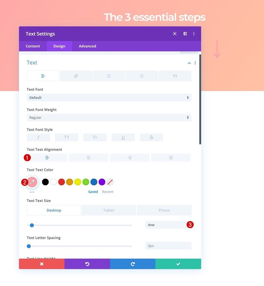
- Text Alignment: Right
- Text Color: #ffa3ad
- Text Size: 4vw (Desktop), 6vw (Tablet), 8vw (Phone)
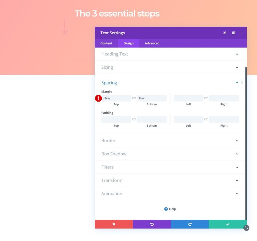
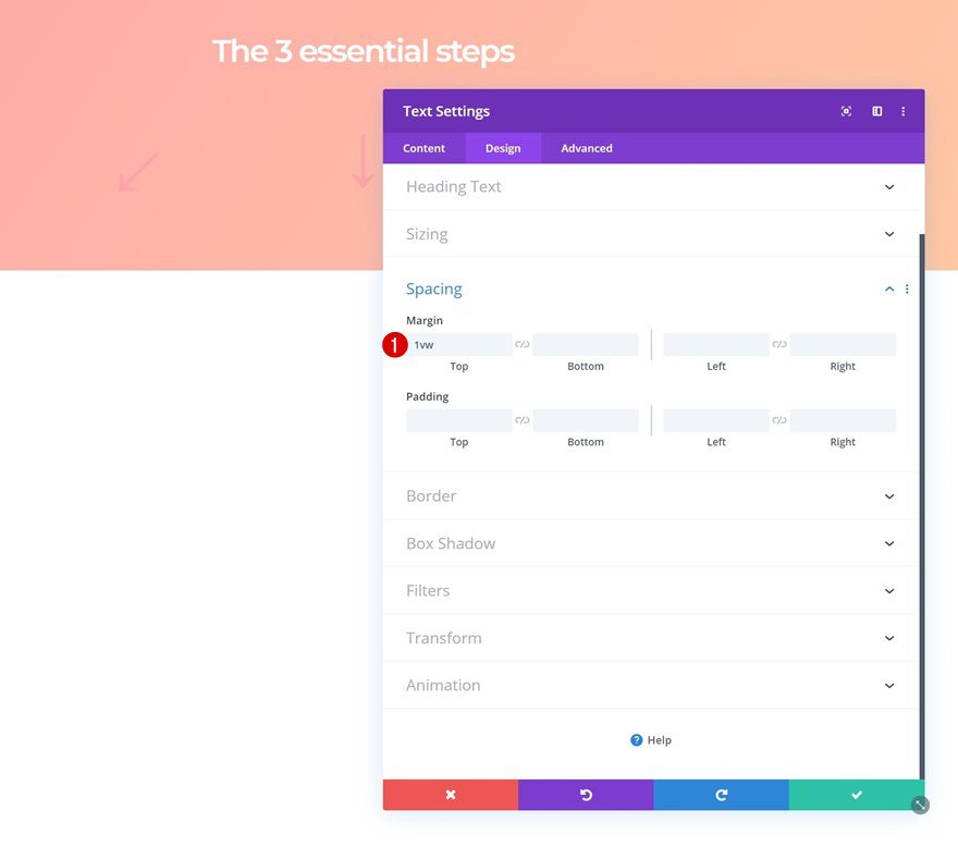
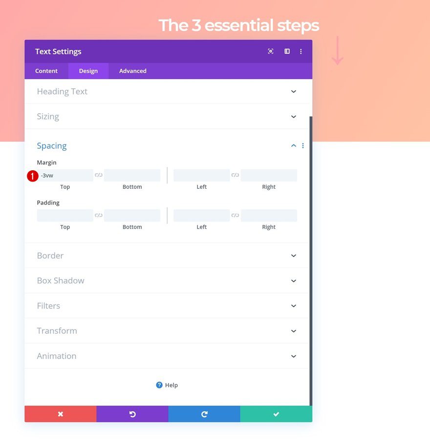
Spacing
Add some custom margin values to the spacing settings next.
- Top Margin: -3vw
- Bottom Margin: 8vw
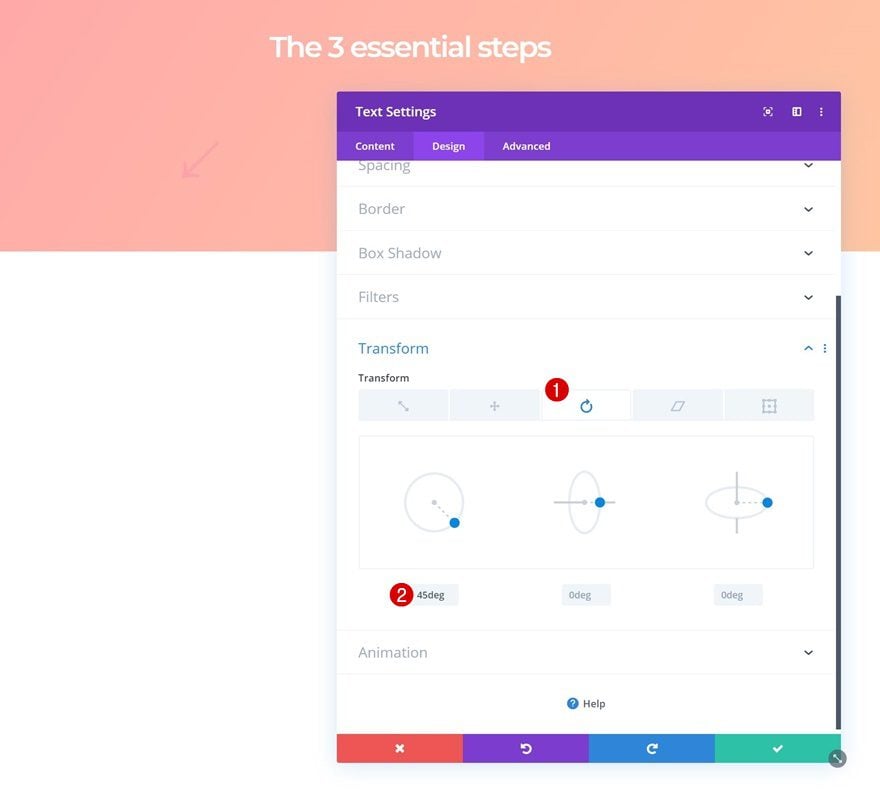
Transform Rotate
Rotate the module in the transform settings.
- Left: 45deg
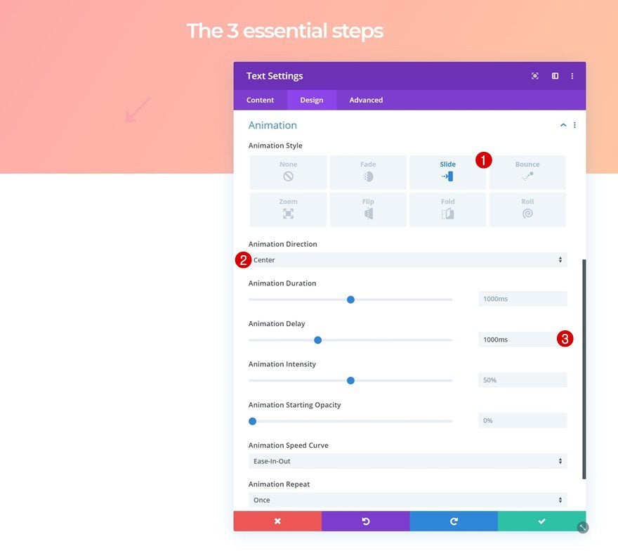
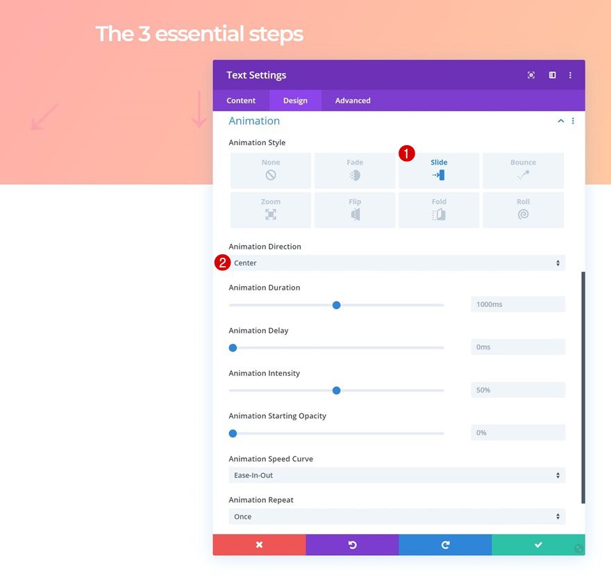
Animation
And add a custom animation using the following settings:
- Animation Style: Slide
- Animation Direction: Center
- Animation Delay: 1000ms
Add Arrow Text Module to Column 2
Add Symbol
Continue by adding a new row to the second column and add the ‘↓’ symbol to the content box.
Text Settings
Move on to the design tab and change the text settings accordingly:
- Text Alignment: Center
- Text Color: #ffa3ad
- Text Size: 4vw (Desktop), 6vw (Tablet), 8vw (Phone)
Spacing
Add some custom top margin next.
- Top Margin: 1vw
Animation
And apply the following animation settings:
- Animation Style: Slide
- Animation Direction: Center
Add Arrow Text Module to Column 3
Add Symbol
On to the last arrow Text Module in column 3. Add the ‘↓’ arrow to the content box.
Text Settings
Move on to the design tab and change the text settings accordingly:
- Text Alignment: Left
- Text Color: #ffa3ad
- Text Size: 4vw (Desktop), 6vw (Tablet), 8vw (Phone)
Spacing
Add some negative top margin next.
- Top Margin: -3vw
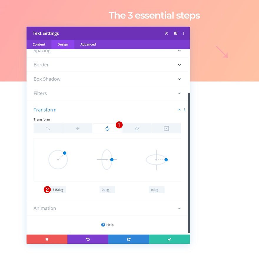
Transform Rotate
Rotate the module in the transform settings.
- Left: 315deg
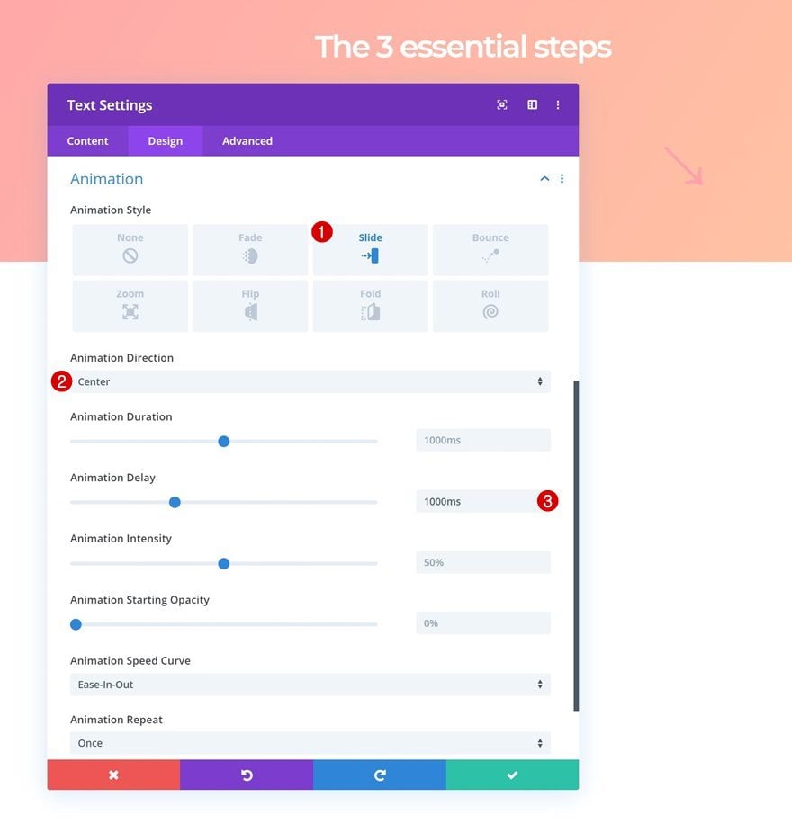
Animation
And complete the module’s settings by adding the following animation:
- Animation Style: Slide
- Animation Direction: Center
- Animation Delay: 1000ms
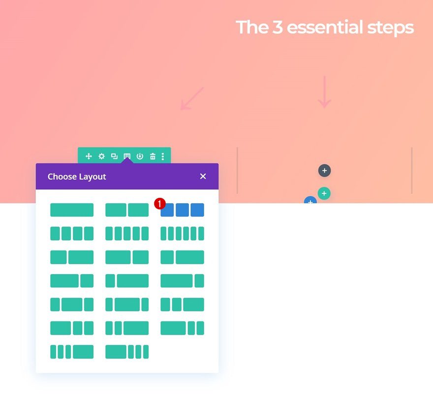
Add Row #3
Column Structure
Once you’ve completed the second row, you can continue by adding a new row using the following column structure:
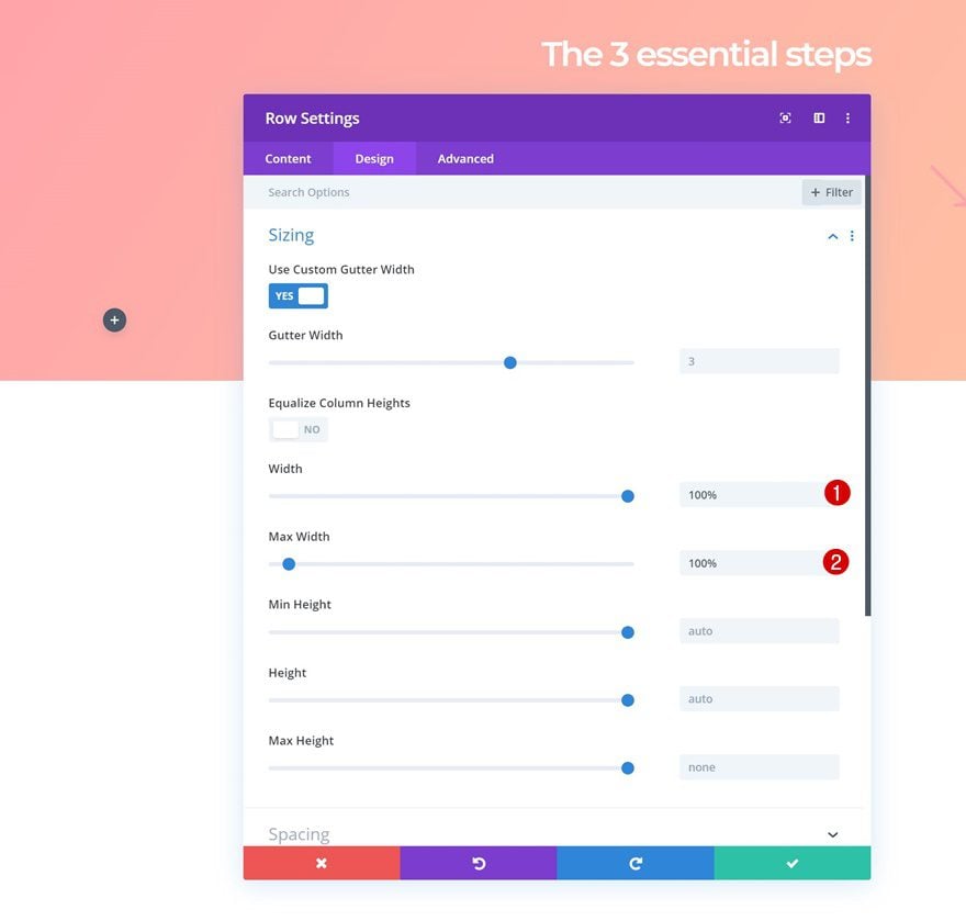
Sizing
Without adding any modules yet, open the row settings and modify the width and max width values in the sizing settings.
- Width: 100%
- Max Width: 100%
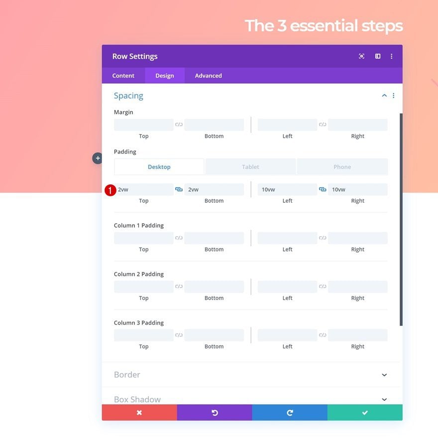
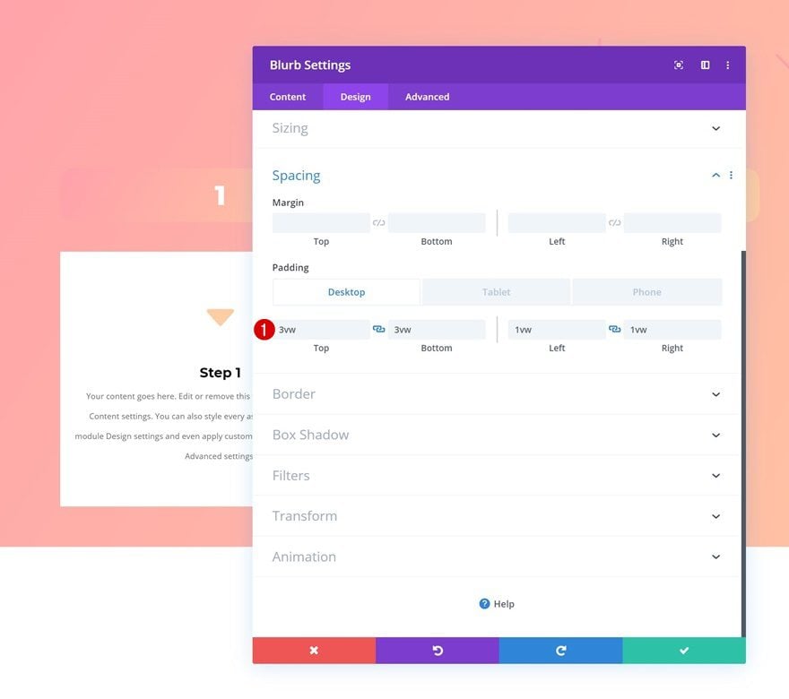
Spacing
Add some custom padding values across different screen sizes next.
- Top Padding: 2vw (Desktop), 8vw (Tablet), 6vw (Phone)
- Bottom Padding: 2vw (Desktop), 8vw (Tablet), 6vw (Phone)
- Left Padding: 10vw (Desktop), 0vw (Tablet & Phone)
- Right Padding: 10vw (Desktop), 0vw (Tablet & Phone)
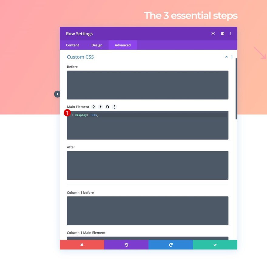
Display
Add one single line of CSS code to the main element of the row to make sure all columns appear next to each other on smaller screen sizes.
display: flex;
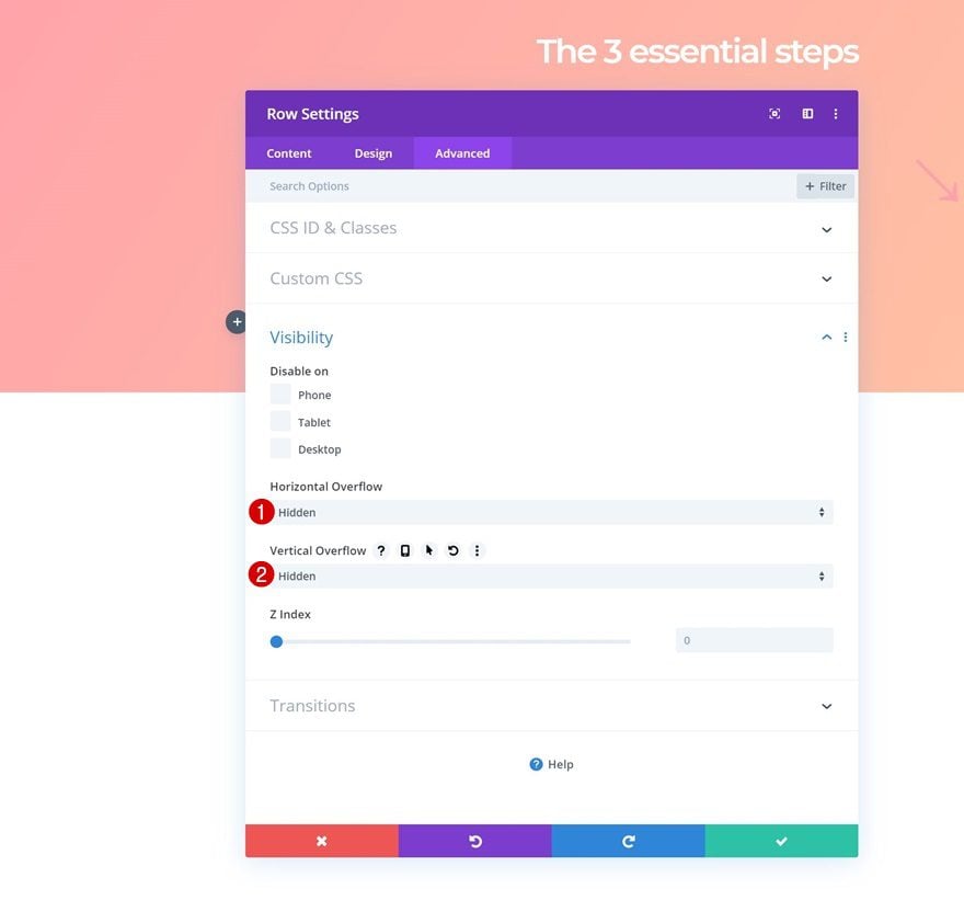
Overflow
In the last part of this tutorial, we’re going to change the row’s height. To prepare for that, we’ll need to make sure nothing exceeds the row container by hiding the overflows in the visibility settings.
- Horizontal Overflow: Hidden
- Vertical Overflow: Hidden
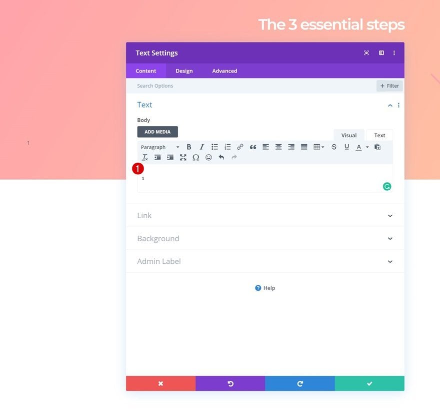
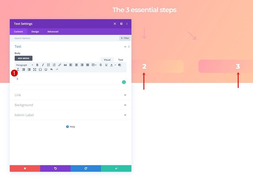
Add Number Text Module to Column 1
Add Content
Time to start adding modules! Add a new Text Module to the first column and enter a number.
Gradient Background
Add a gradient background to the module using the following settings:
- Color 1: #ffa3ad
- Color 2: #ffcea3
- Gradient Direction: 122deg
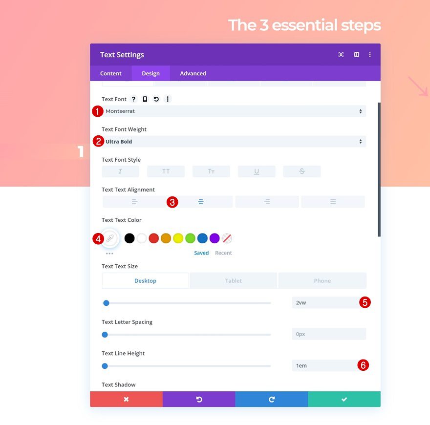
Text Settings
Move on to the design tab and change the text settings accordingly:
- Text Font: Montserrat
- Text Font Weight: Ultra Bold
- Text Alignment: Center
- Text Color: #ffffff
- Text Size: 2vw (Desktop), 4vw (Tablet), 8vw (Phone)
- Text Line Height: 1em
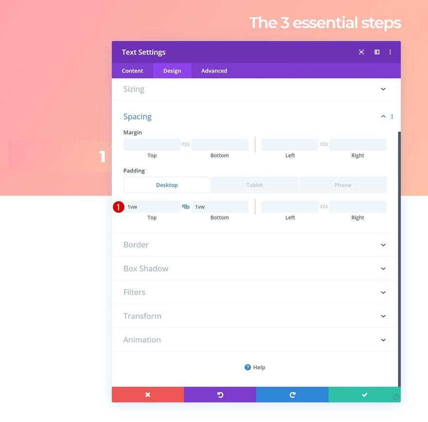
Spacing
Add some top and bottom padding across different screen sizes as well.
- Top Padding: 1vw (Desktop), 2vw (Tablet), 3vw (Phone)
- Bottom Padding: 1vw (Desktop), 2vw (Tablet), 3vw (Phone)
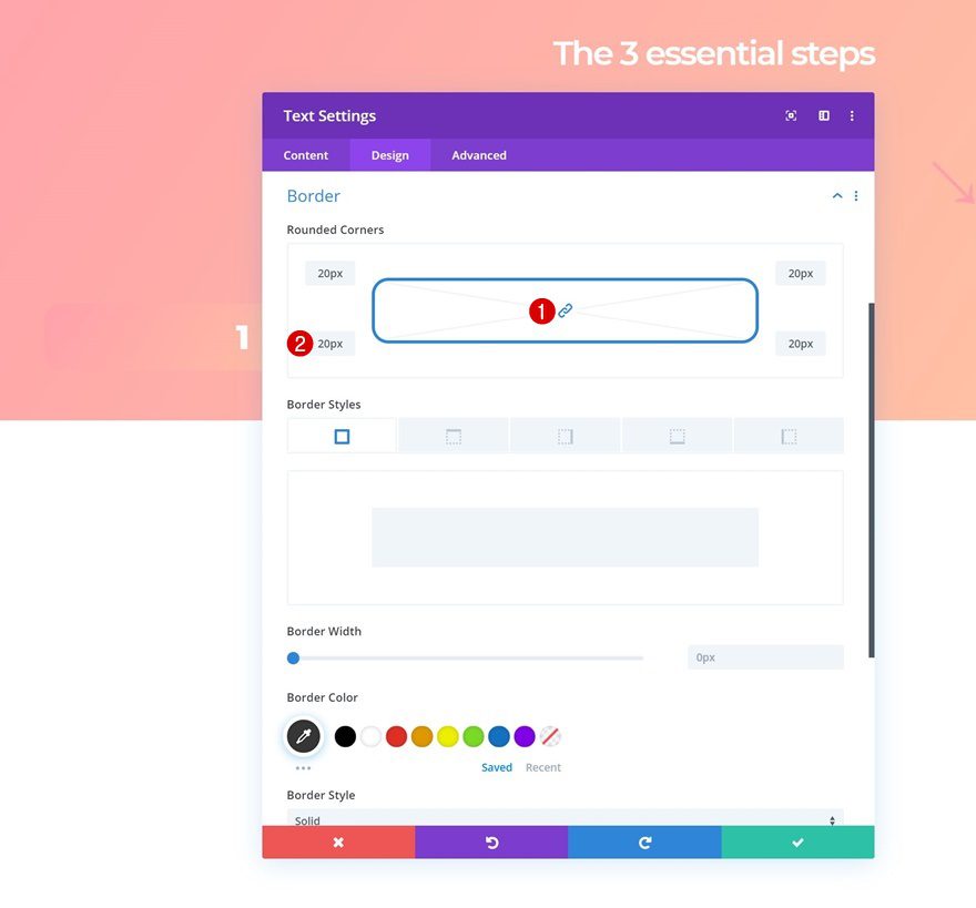
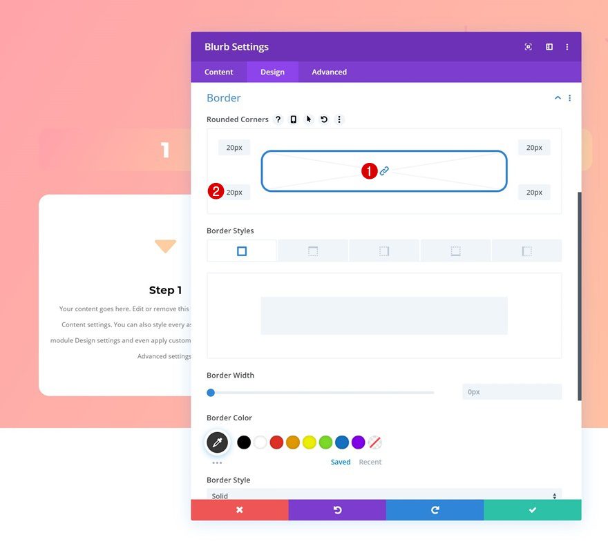
Border
And complete the module’s settings by adding ’20px’ to each one of the corners in the border settings.
Clone Number Text Module Twice & Place Duplicates in Remaining Columns
Continue by cloning the Text Module in column 1 twice and place the duplicates in the two remaining columns of the row.
Change Numbers
Make sure you change the number in each one of the duplicates.
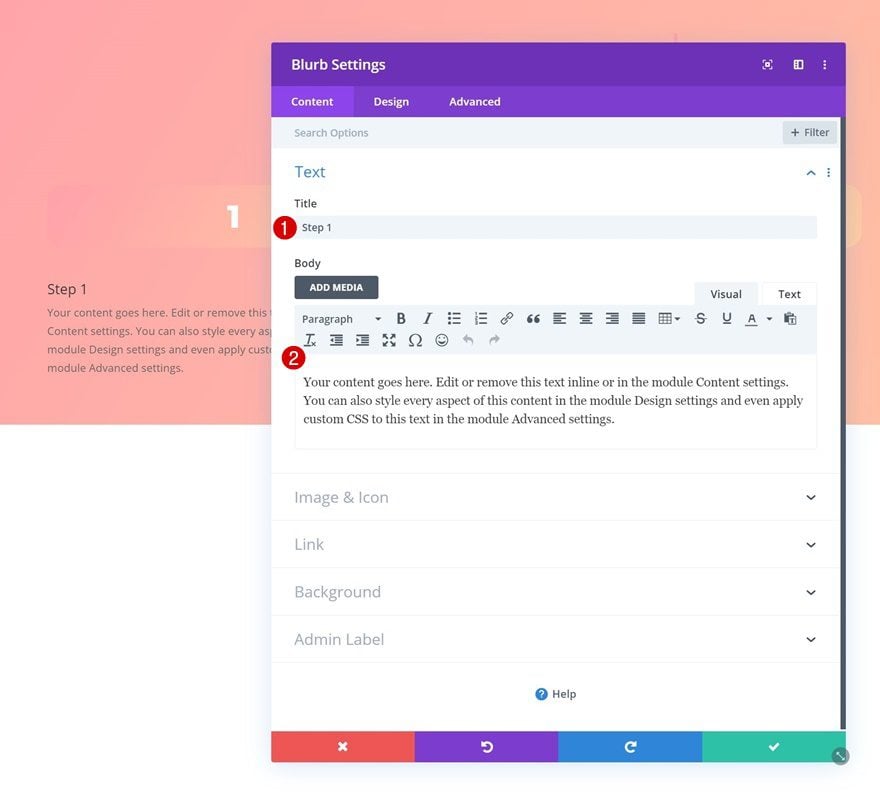
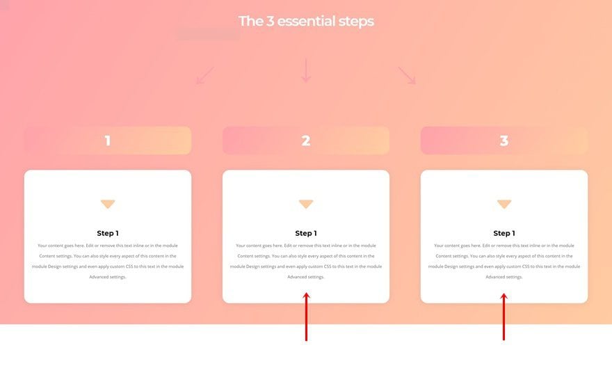
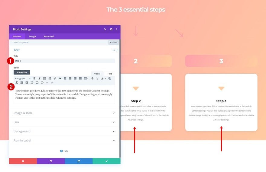
Add Blurb Module to Column 1
Add Content
The second module we need in the first column is a Blurb Module. Enter some content of your choice.
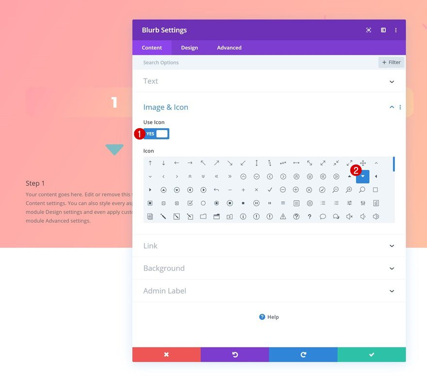
Select Icon
Continue by selecting an icon.
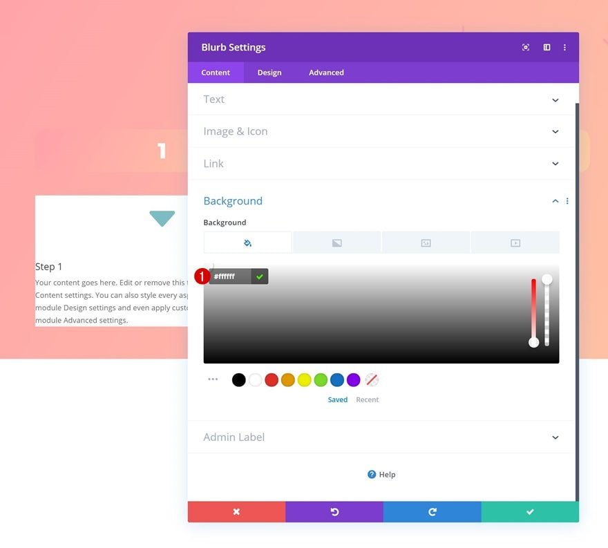
Background Color
And change the background color into white.
- Background Color: #ffffff
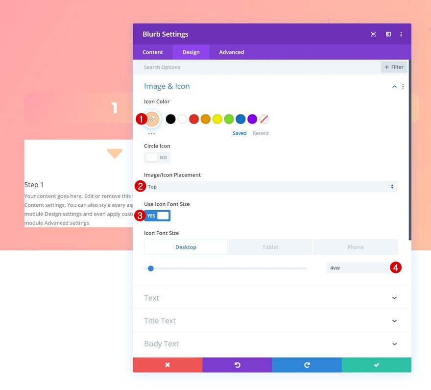
Icon Settings
Move on to the design tab and change the icon settings accordingly:
- Icon Color: #ffcea3
- Icon Placement: Top
- Use Icon Font Size: Yes
- Icon Font Size: 4vw (Desktop), 5vw (Tablet), 6vw (Phone)
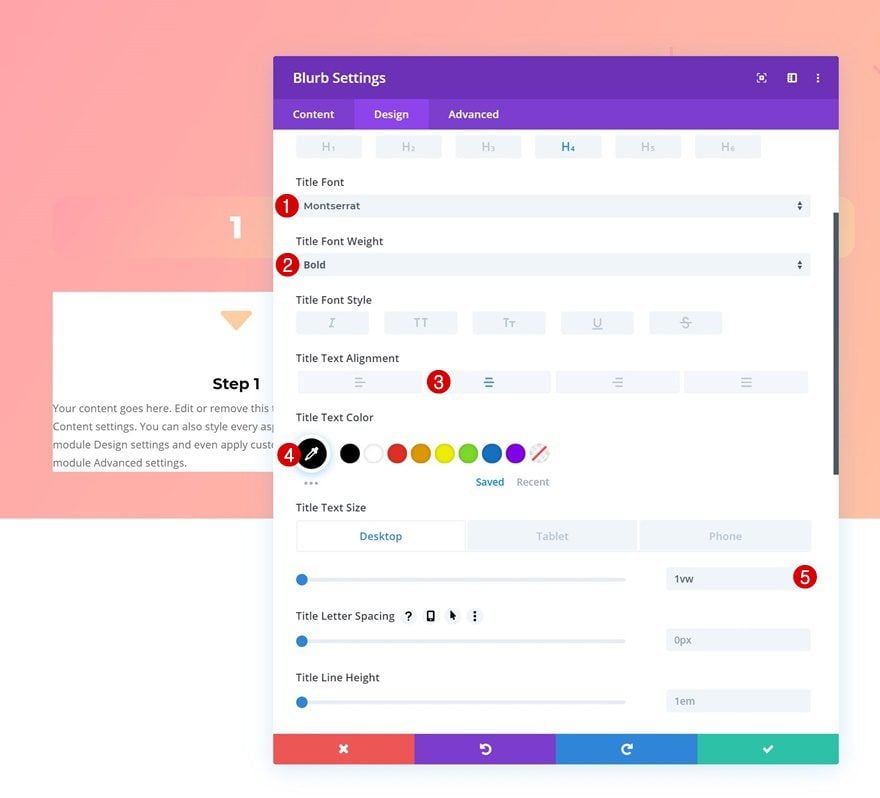
Title Text Settings
Modify the title text settings too.
- Title Font: Montserrat
- Title Font Weight: Bold
- Title Text Alignment: Center
- Title Text Color: #000000
- Title Text Size: 1vw (Desktop), 2vw (Tablet), 4vw (Phone)
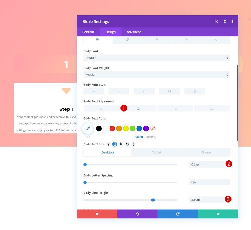
Body Text Settings
Along with the body text settings.
- Body Text Alignment: Center
- Body Text Size: 0.6vw (Desktop), 1.3vw (Tablet), 2vw (Phone)
- Body Line Height: 2.5em
Spacing
We’re also giving our module the desired shape by adding the following custom padding values across different screen sizes:
- Top Padding: 3vw (Desktop), 5vw (Tablet), 7vw (Phone)
- Bottom Padding: 3vw (Desktop), 5vw (Tablet), 7vw (Phone)
- Left Padding: 1vw
- Right Padding: 1vw
Border
Add ’20px’ to each one of the corners in the border settings next.
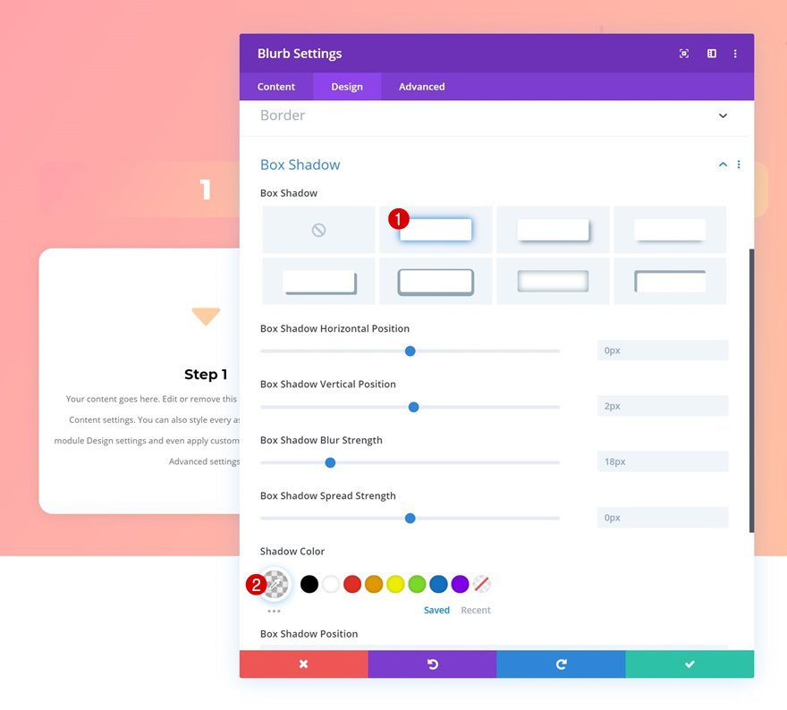
Box Shadow
And create a bit of depth by adding a subtle box shadow.
- Shadow Color: rgba(0,0,0,0.07)
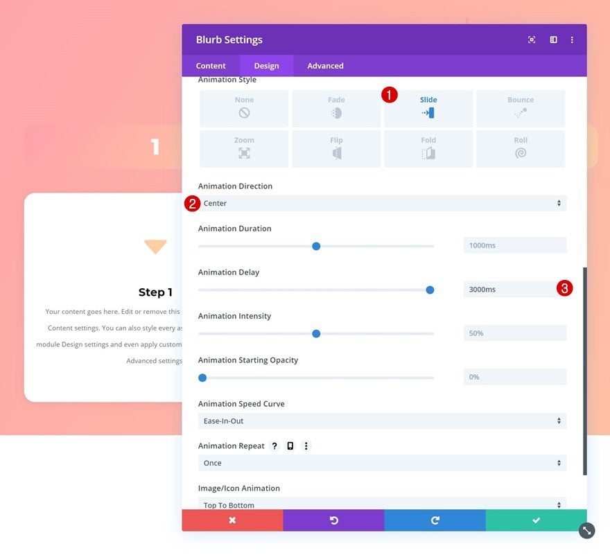
Animation
Last but not least, add an animation to the module.
- Animation Style: Slide
- Animation Direction: Center
- Animation Delay: 1000ms
Clone Blurb Module Twice & Place Duplicates in Remaining Columns
Once you’ve completed the Blurb Module in column 1, you can clone it three times and place the duplicates in the two remaining columns of the row.
Change Content of Both Duplicates
Make sure you change the content for each one of the duplicates.
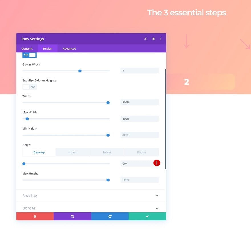
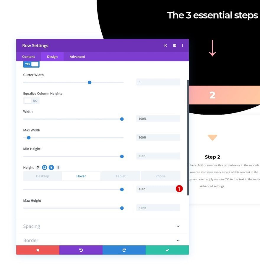
Modify Row #3 Sizing Settings
Default Height
Now, to make the hover effect work, we’re going to open the last row’s settings and go to the sizing settings. Once there, we’ll modify the height across different screen sizes.
- Height: 6vw (Desktop), 18vw (Tablet), 24vw (Phone)
Hover Height
We’ll bring back the height to normal on hover.
- Height: auto
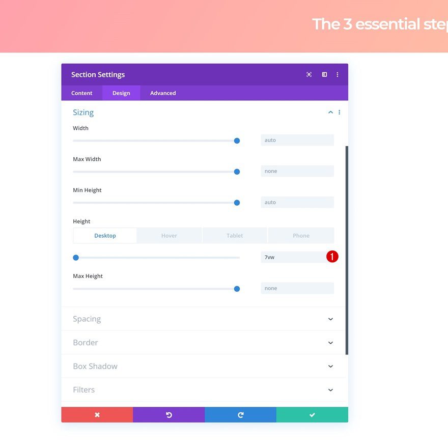
Modify Section Sizing Settings
Default Height
Open the section settings next and change the height accordingly:
- Height: 7vw (Desktop), 15vw (Tablet), 20vw (Phone)
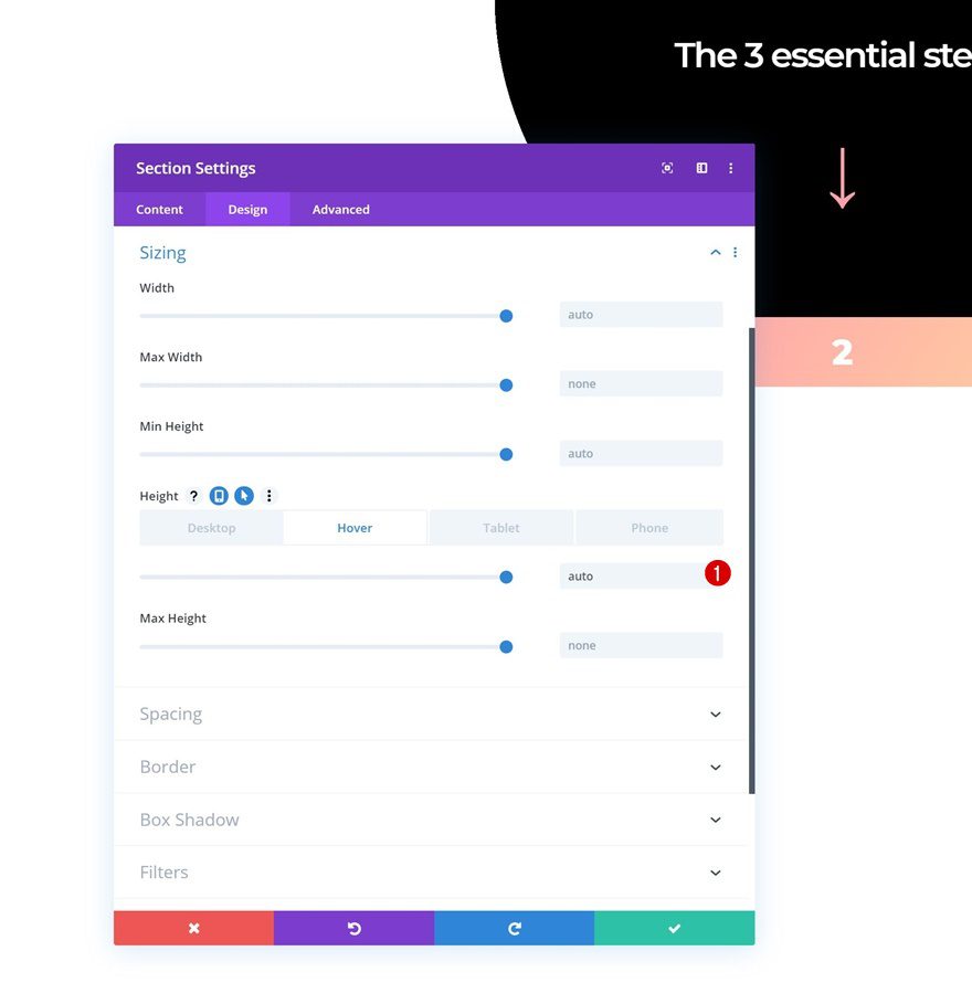
Hover Height
Bring back the height on hover and you’re done!
- Height: auto
Preview
Now that we’ve gone through all the steps, let’s take a final look at the outcome across different screen sizes.
Desktop
Mobile
Final Thoughts
In this post, we’ve shown you how to create a 3-step blurb reveal using Divi’s new sizing options. The outcome of the example is highly responsive and allows you to add extra interaction to your page. We hope this tutorial inspires you to create your own alternative 3-step designs as well. If you have any questions or suggestions, make sure you leave a comment in the comment section below!
If you’re eager to learn more about Divi and get more Divi freebies, make sure you subscribe to our email newsletter and YouTube channel so you’ll always be one of the first people to know and get benefits from this free content.


This would be really cool if I actually HAD the default and hover options for background! What gives? I have the most up to date version of DIVI. Why do I not have this?
very nice. great tutorial !
Thanks for given valuable information..
Thanks & Regards,
GA Insurance Brokers
Good lord! After a tutorial of this length I should be able to pilot the Space Shuttle!