

Creating websites is all about making sure every detail is right. Paying attention to small details in your design will quickly add up and elevate the quality of your website. With Divi and its new hover options, you can effortlessly add small interactions on your website. Hover options apply to almost all design settings. You can, for instance, indirectly change a gradient background on hover to create a nice transition. That’s exactly what we’re going to show you in this blog post. Apart from achieving the gradient transition, we’ll also create a stunning design example from scratch that you’re free to use for any kind of website you build.
Let’s get to it!
- 1 Preview
- 2 Download The Illustrations for FREE
- 3 Download For Free
- 4 You have successfully subscribed. Please check your email address to confirm your subscription and get access to free weekly Divi layout packs!
-
5
Let’s Start Creating!
- 5.1 Add Section #1
- 5.2 Add Row #1
- 5.3 Add Image Module to Column 1
- 5.4 Add Title Text Module to Column 2
- 5.5 Add Description Text Module to Column 2
- 5.6 Add Button Module to Column 2
- 5.7 Add Section #2
- 5.8 Add Row #2
- 5.9 Duplicate Text Modules & Button Module of Row #1
- 5.10 Place Duplicates in Column 1 of Row #2
- 5.11 Clone Image Module of Row #2
- 5.12 Place Duplicate in Column 2 of Row #2
- 6 Preview
- 7 Final Thoughts
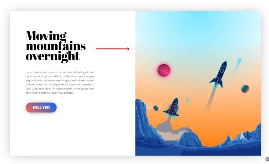
Preview
Before we dive into the tutorial, let’s take a quick look at the end result on different screen sizes.
Static
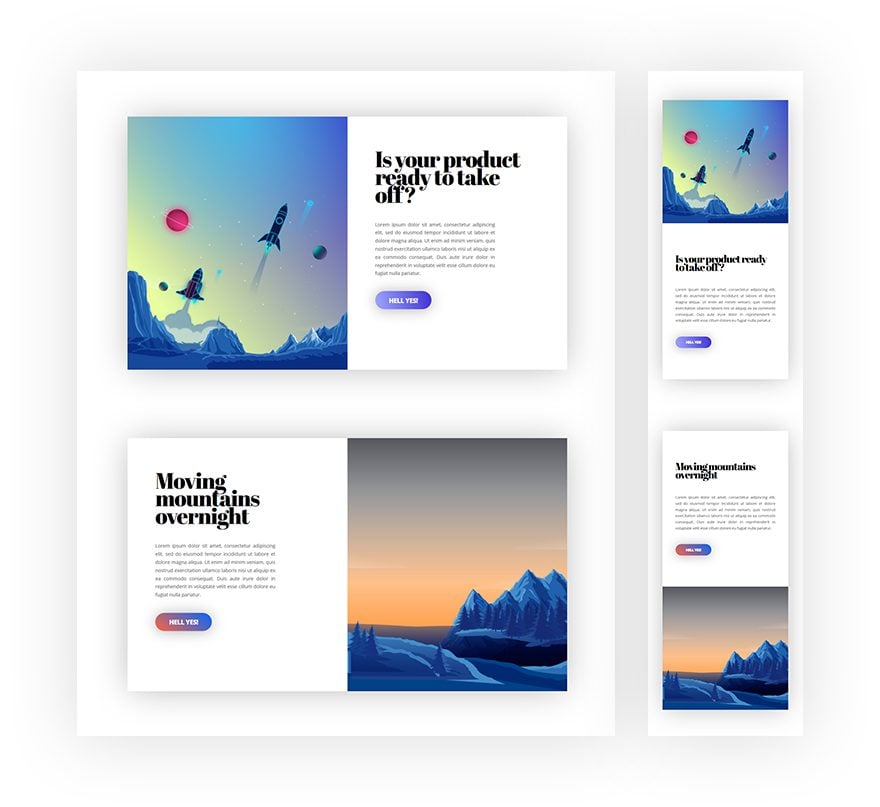
Hover
Download The Illustrations for FREE
To lay your hands on the free illustrations that originate from the Video Game Layout Pack, you will first need to download them using the button below. To gain access to the download you will need to subscribe to our newsletter by using the form below. As a new subscriber, you will receive even more Divi goodness and a free Divi Layout pack every Monday and Friday! If you’re already on the list, simply enter your email address below and click download. You will not be “resubscribed” or receive extra emails.

Let’s Start Creating!
Subscribe To Our Youtube Channel
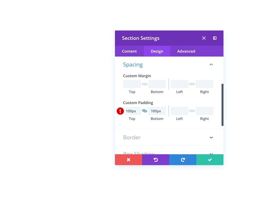
Add Section #1
Spacing
The first thing you will need to do is create a new page or open an existing one and add a new regular section to it. Open the settings and add some custom top and bottom margin.
- Top Padding: 100px
- Bottom Padding: 100px
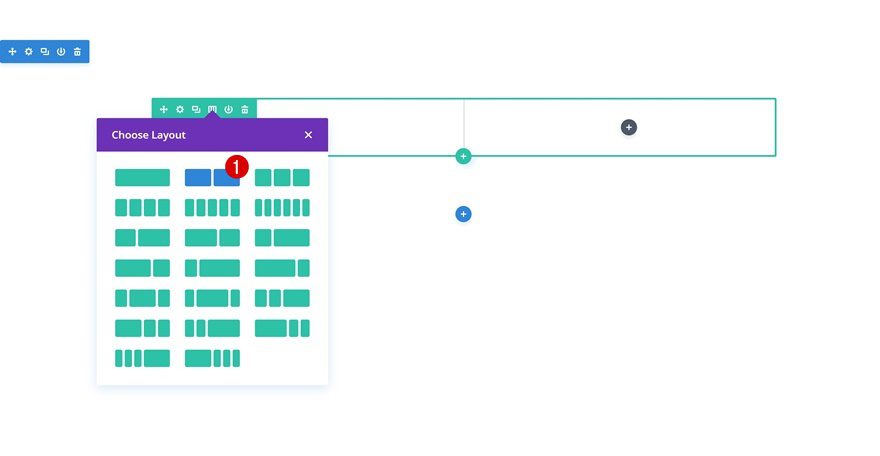
Add Row #1
Column Structure
Continue by adding a new row using the following column structure:
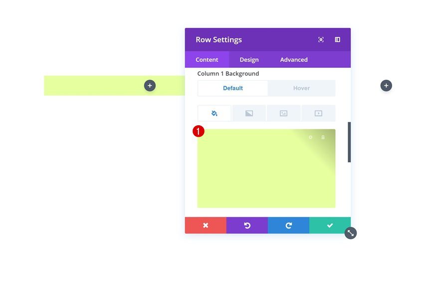
Column 1 Default Background Color
Without adding any modules yet, open the row settings and add the following default background color to column 1:
- Background Color: #e7ffa0
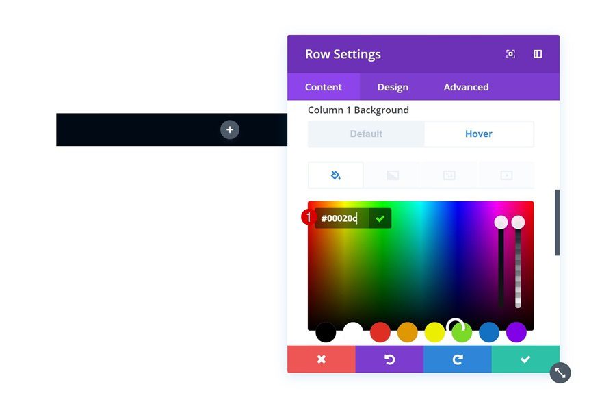
Column 1 Hover Background Color
Change this background color on hover.
- Background Color: #00020c
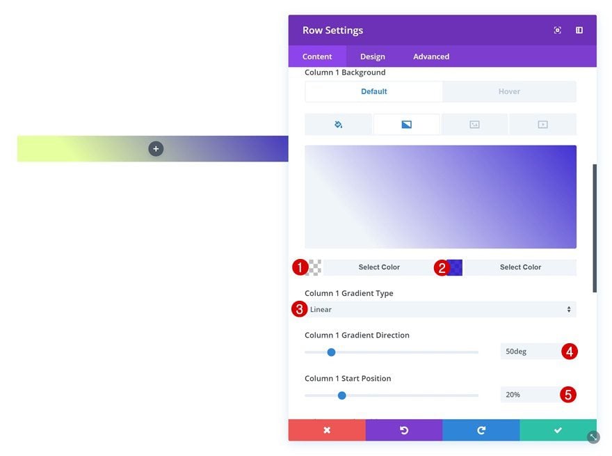
Column 1 Gradient Background
Add a gradient background color to column 1 as well. You’ll notice that we’re using one completely transparent color. This color will allow the background color to show through, which in its turn changes on hover.
- Color 1: rgba(255,255,255,0)
- Color 2: rgba(16,0,201,0.8)
- Column 1 Gradient Type: Linear
- Column 1 Gradient Direction: 50deg
- Column 1 Start Position: 20%
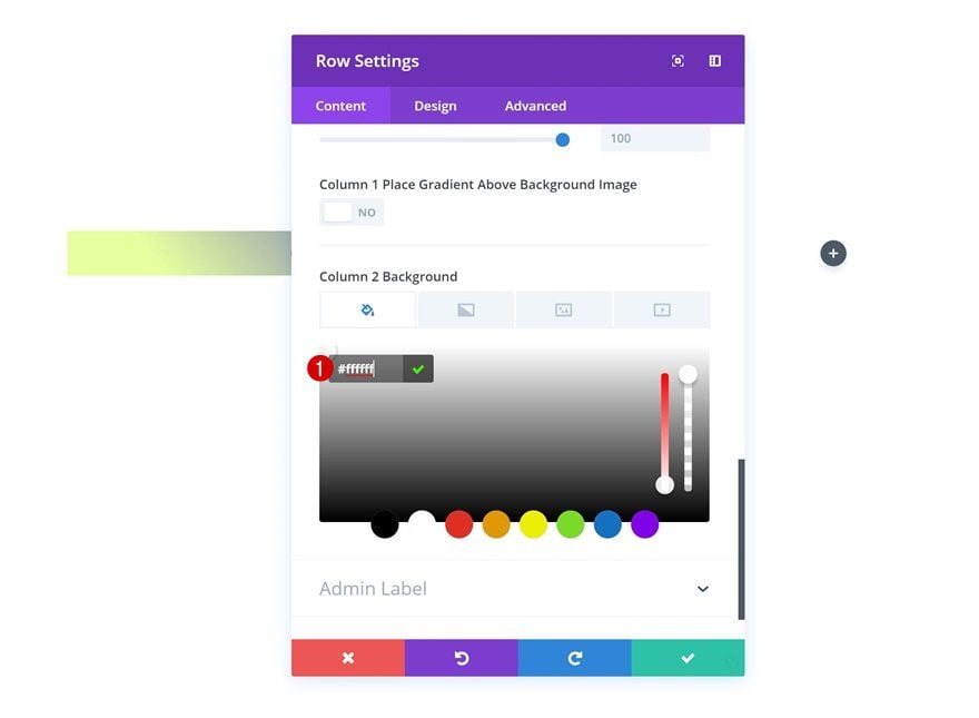
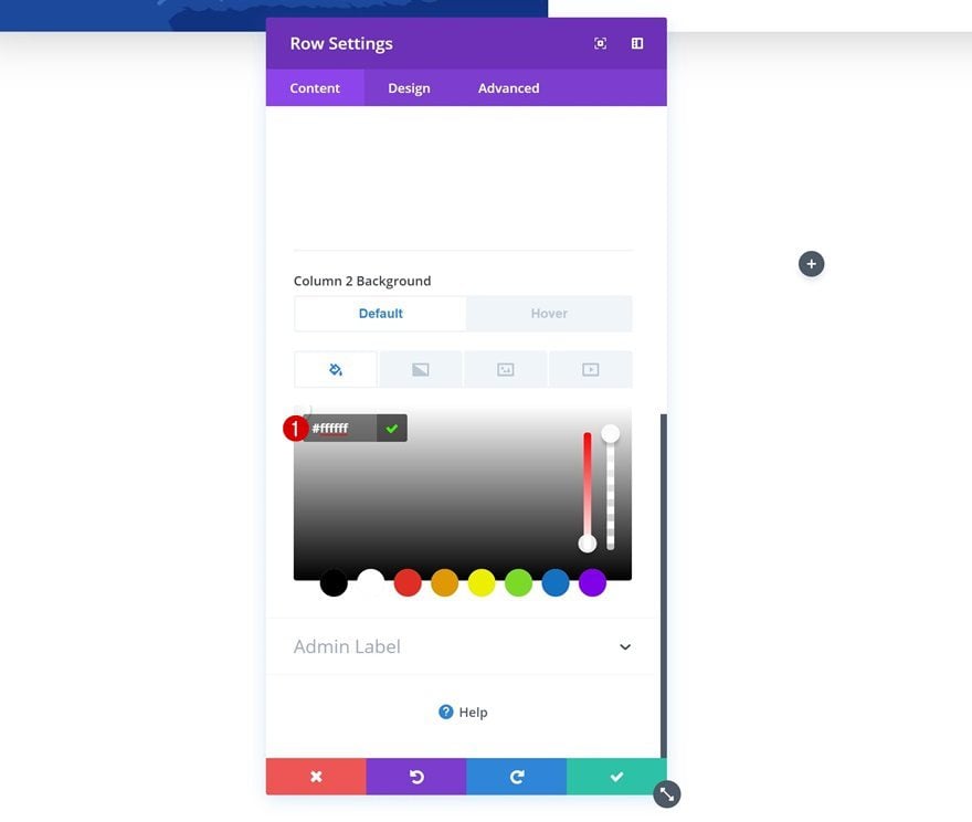
Column 2 Background Color
Add a column 2 background color as well.
- Column 2 Background Color: #ffffff
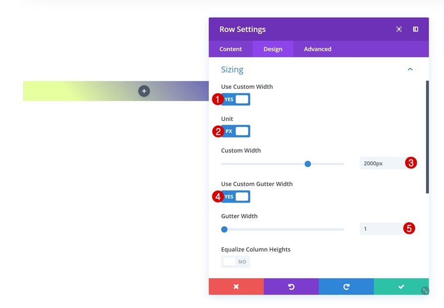
Sizing
Then, go to the design tab and change the sizing settings.
- Use Custom Width: Yes
- Unit: PX
- Custom Width: 2000px
- Use Custom Gutter Width: Yes
- Gutter Width: 1
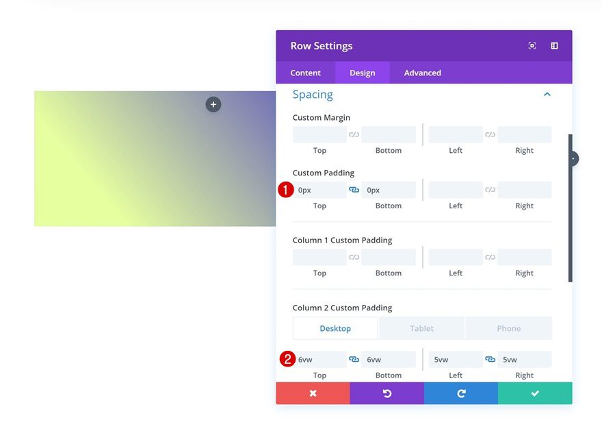
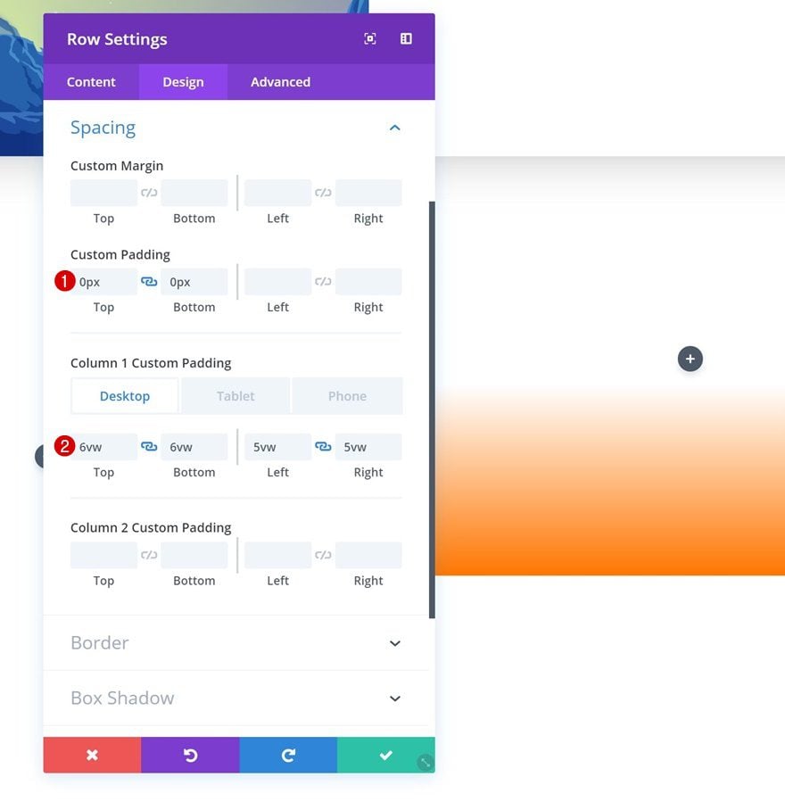
Spacing
Continue by adding some custom padding values in the spacing settings.
- Top Padding: 0px
- Bottom Padding: 0px
- Column 2 Top Padding: 6vw (Desktop), 120px (Tablet & Phone)
- Column 2 Bottom Padding: 6vw (Desktop), 120px (Tablet & Phone)
- Column 2 Left Padding: 5vw (Desktop), 80px (Tablet), 50px (Phone)
- Column 2 Right Padding: 5vw (Desktop), 80px (Tablet), 50px (Phone)
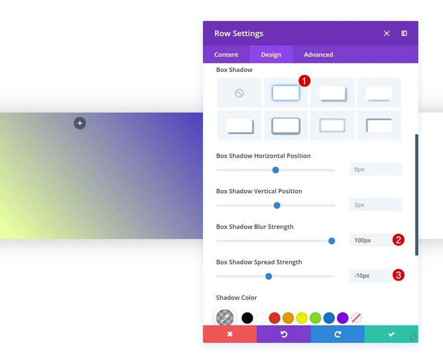
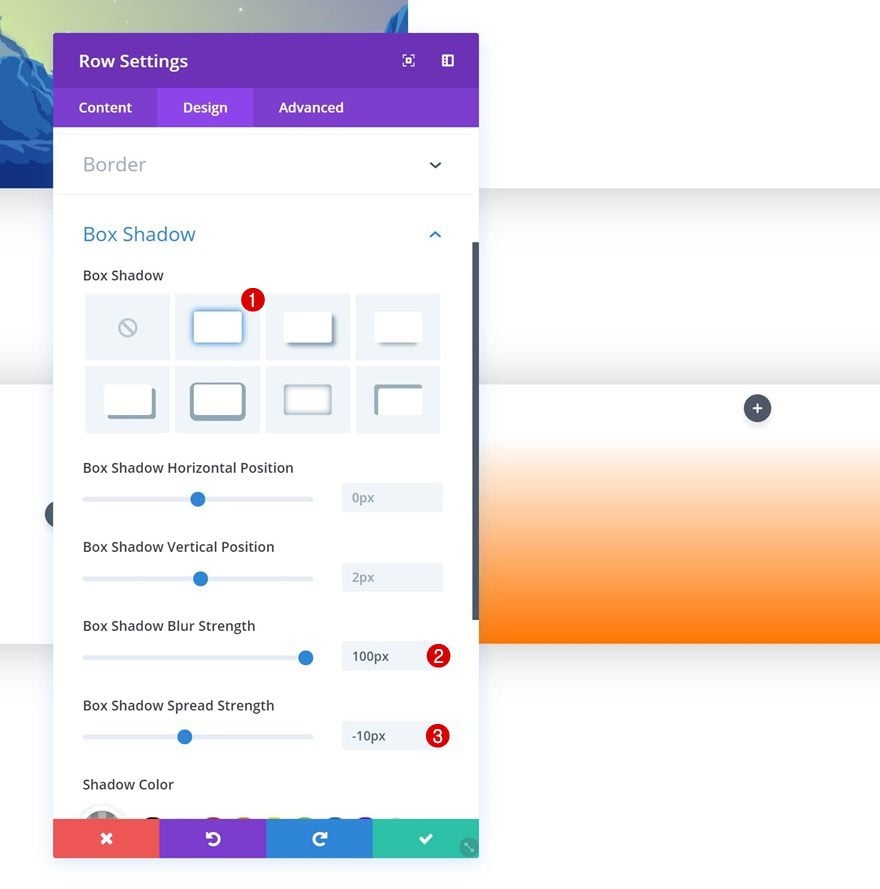
Box Shadow
And give the row a subtle box shadow as well.
- Box Shadow Blur Strength: 100px
- Box Shadow Spread Strength: -10px
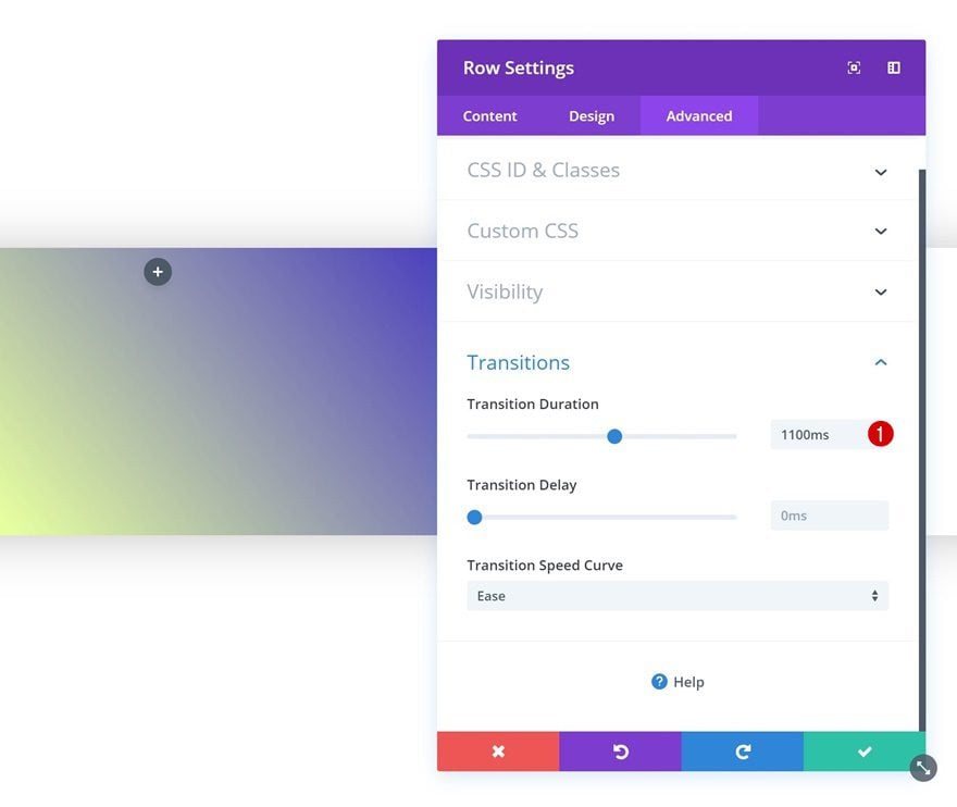
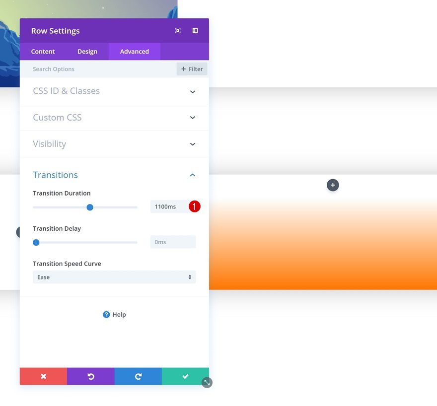
Transitions
Last but not least, we’re going to create a smooth gradient background transition by increasing the transition duration in the advanced tab.
- Transition Duration: 1100ms
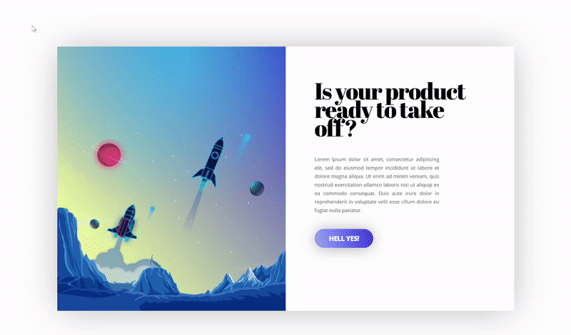
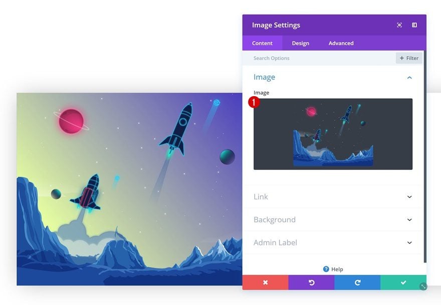
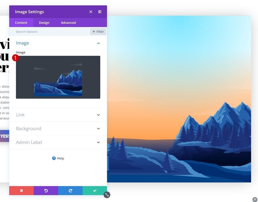
Add Image Module to Column 1
Upload Image
Time to start adding modules! Add an Image Module to the first column and upload the ‘divi-gradient-background-on-hover-illustration-1.png‘ file which you can find in the zipped folder you’ve downloaded at the beginning of this post.
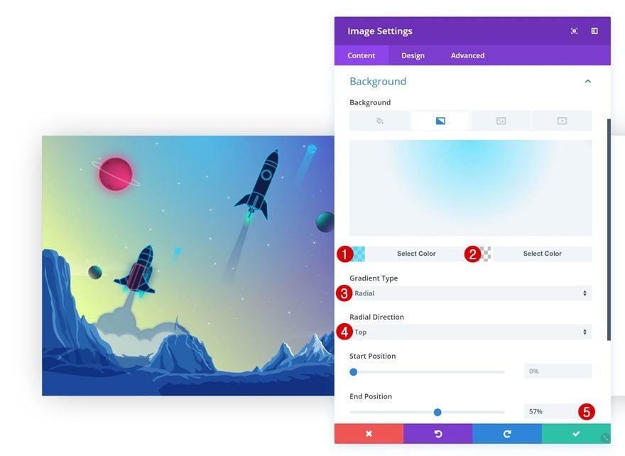
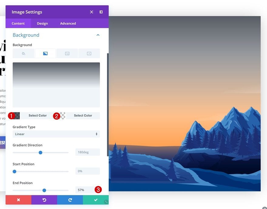
Gradient Background
Go to the background settings of this Image Module and add a gradient background. We’re again using one fully transparent color to allow the other colors to show through.
- Color 1: rgba(50,217,255,0.66)
- Color 2: rgba(255,255,255,0)
- Gradient Type: Radial
- Radial Direction: Top
- End Position: 57%
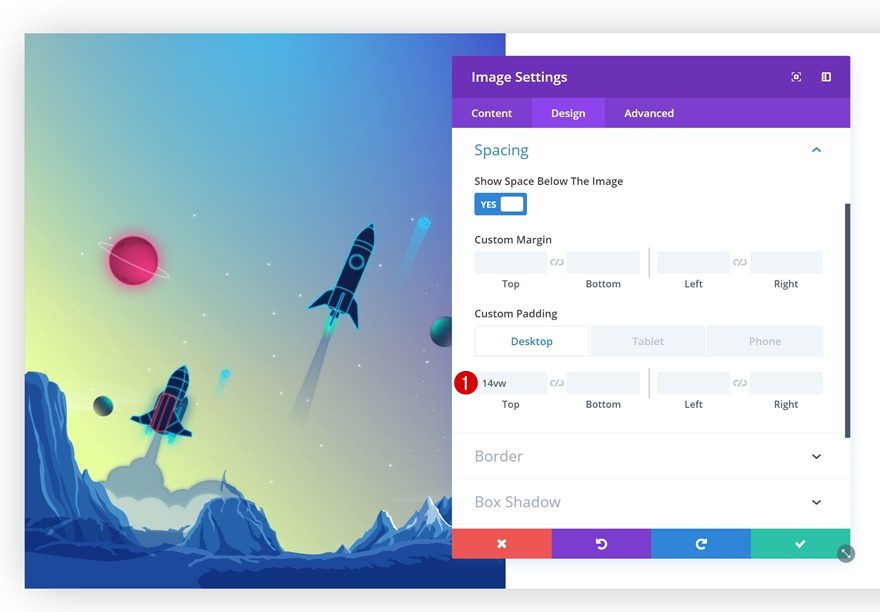
Spacing
Then, add some custom top padding to the module.
- Top Padding: 14vw
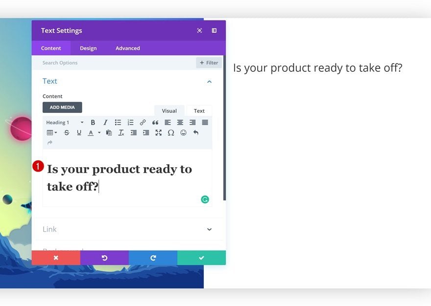
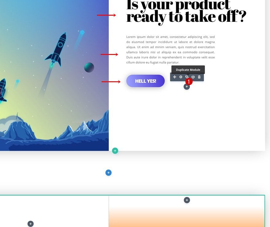
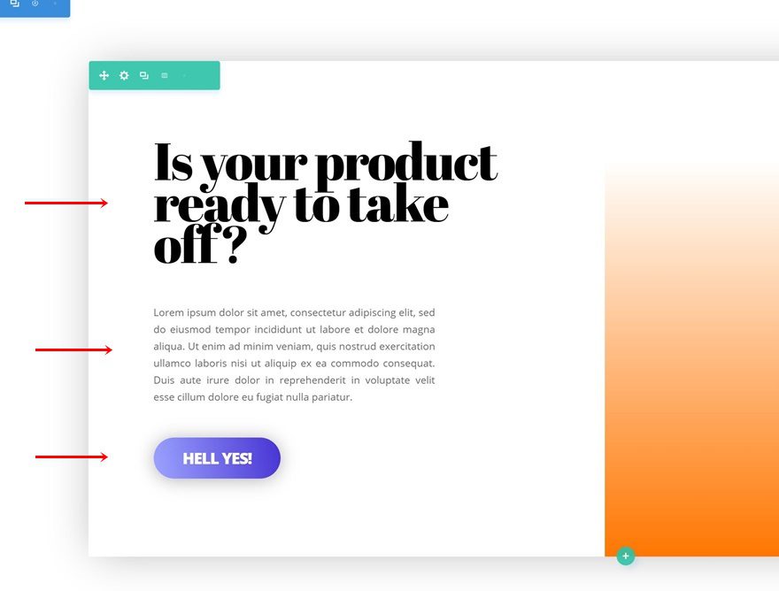
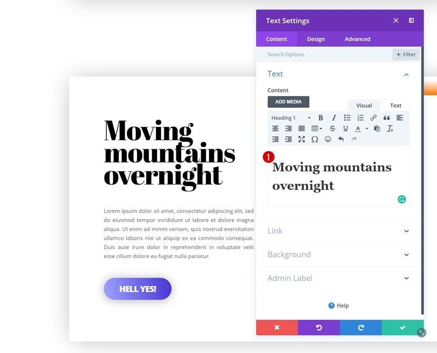
Add Title Text Module to Column 2
Add Content
On to the second column! The first module we’ll need there is a title Text Module. Go ahead and add some heading content of choice.
Heading Text Settings
Then, go to heading text settings and make some changes.
- Heading Font: Abril Fatface
- Heading Text Color: #000000
- Heading Text Size: 4vw (Desktop), 60px (Tablet), 40px (Phone)

Add Description Text Module to Column 2
Add Content
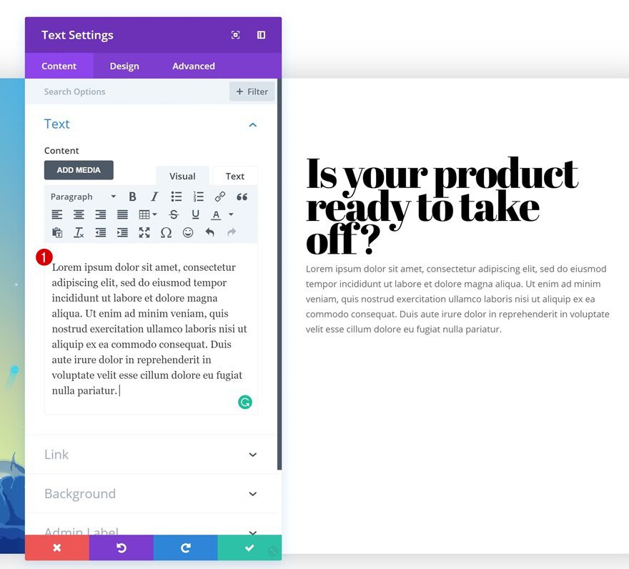
The second module we’ll need is another Text Module. Add some content of choice.
Text Settings
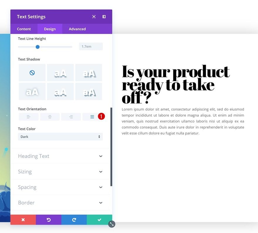
Then, go to the text settings and change the text orientation.
- Text Orientation: Justify
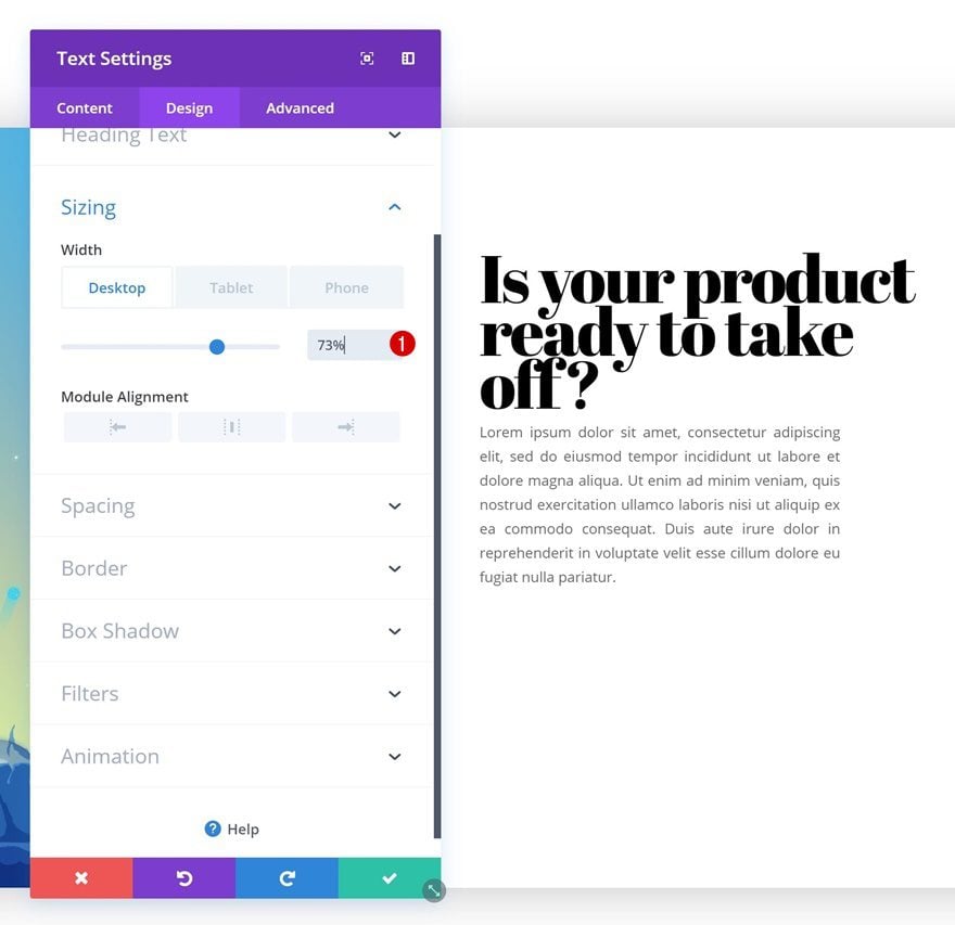
Sizing
Adjust the width in the sizing settings as well.
- Width: 73% (Desktop), 100% (Tablet & Phone)
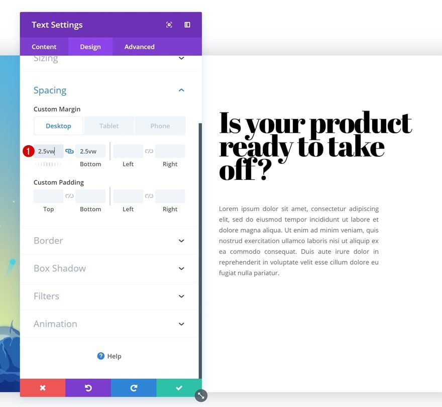
Spacing
Lastly, add some custom top and bottom margin to the module to create whitespace.
- Top Margin: 2.5vw (Desktop), 50px (Tablet & Phone)
- Bottom Margin: 2.5vw (Desktop), 50px (Tablet & Phone)
Add Copy
The third and last module we’ll need in the second column is a Button Module. Add some copy of your choice.
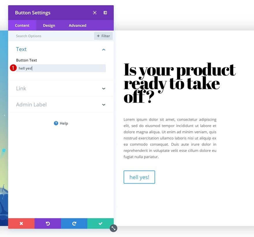
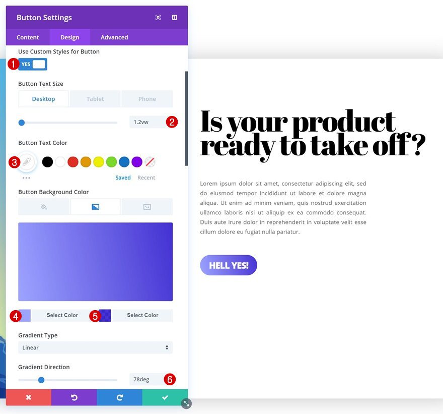
Button Settings
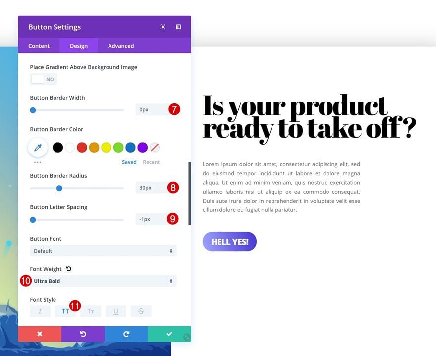
Modify the button settings next.
- Use Custom Styles for Button: Yes
- Button Text Size: 1.2vw (Desktop), 14px (Tablet & Phone)
- Button Text Color: #ffffff
- Gradient Color 1: #9ea6ff
- Gradient Color 2: rgba(16,0,201,0.8)
- Gradient Direction: 78deg
- Button Border Width: 0px
- Button Border Radius: 30px
- Button Letter Spacing: -1px
- Font Weight: Ultra Bold
- Font Style: Uppercase
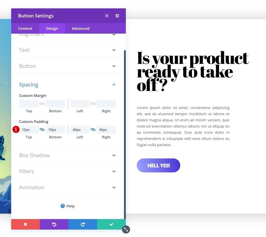
Spacing
Add some custom padding values as well.
- Top Padding: 10px
- Bottom Padding: 10px
- Left Padding: 40px
- Right Padding: 40px
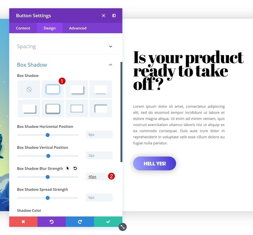
Box Shadow
And apply a subtle box shadow to the button.
- Box Shadow Blur Strength: 40px
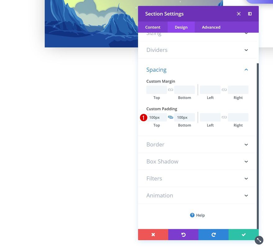
Add Section #2
Spacing
Now that we’ve finished the first section, we’ll move on to the next. Add a new regular section using the following custom padding values:
- Top Padding: 100px
- Bottom Padding: 100px
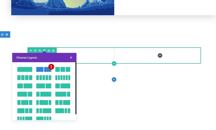
Add Row #2
Column Structure
Continue by adding a new row to the section using the following column structure:
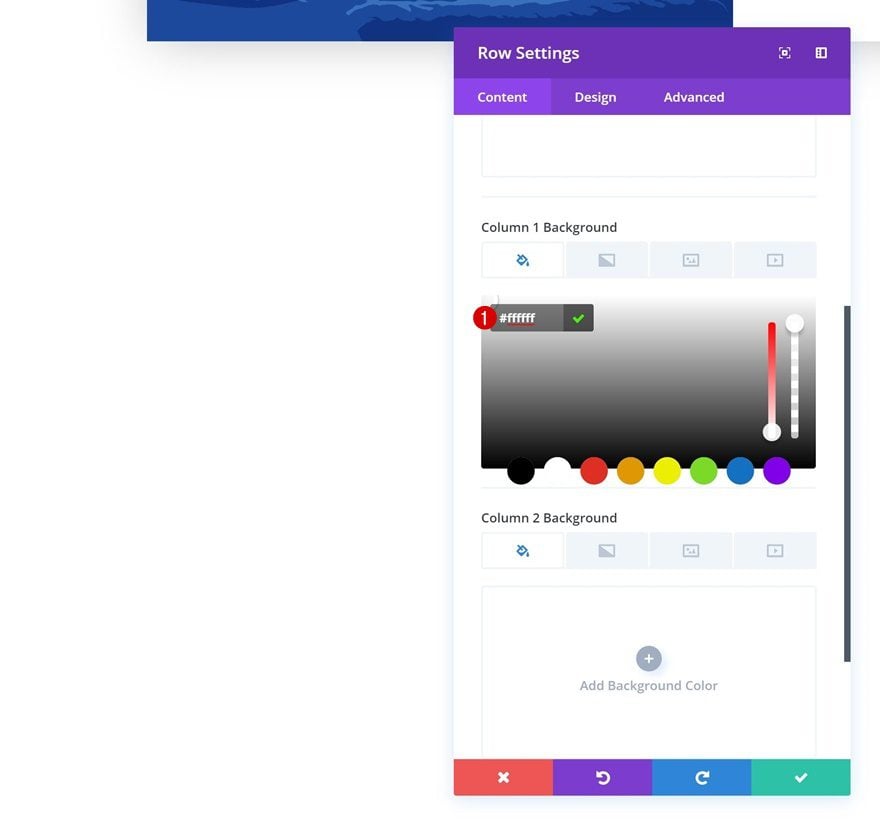
Column 1 Background Color
Without adding any modules yet, open the row settings and add the following background color to column 1:
- Column 1 Background Color: #ffffff
Column 2 Default Background Color
Add the following background color to column 2.
- Column 2 Background Color: #ffffff
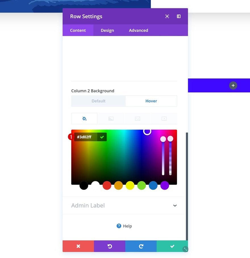
Column 2 Hover Background Color
And change this background color on hover.
- Column 2 Background Color: #3d02ff
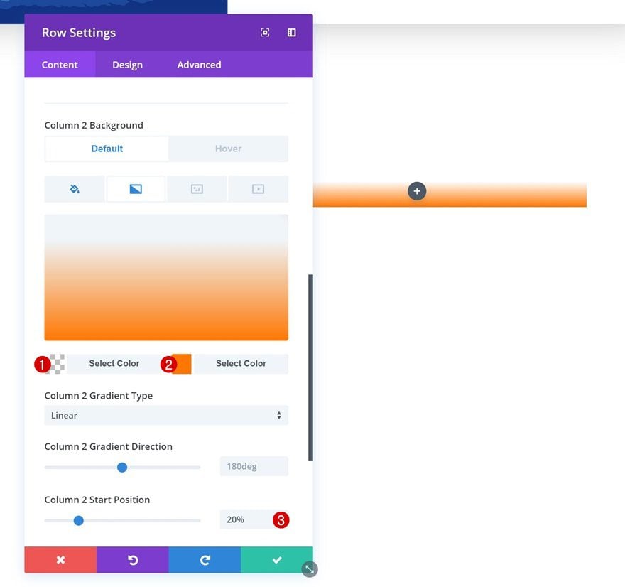
Column 2 Gradient Background
Add a gradient background to the column as well.
- Color 1: rgba(255,255,255,0)
- Color 2: #ff7700
- Column 2 Start Position: 20%
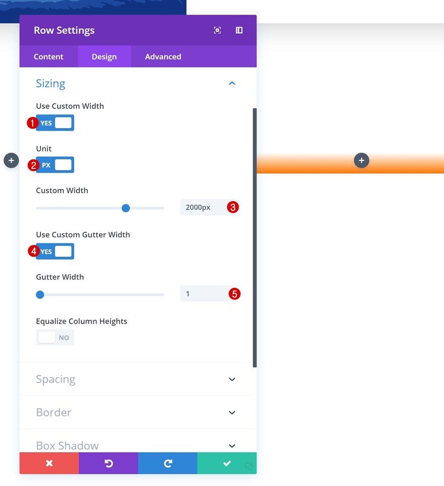
Sizing
Then, go to the sizing settings and make some changes.
- Use Custom Width: Yes
- Unit: PX
- Custom Width: 2000px
- Use Custom Gutter Width: Yes
- Gutter Width: 1
Spacing
Continue by adding custom padding values in the spacing settings.
- Top Padding: 0px
- Bottom Padding: 0px
- Column 1 Top Padding: 6vw (Desktop), 120px (Tablet & Phone)
- Column 1 Bottom Padding: 6vw (Desktop), 120px (Tablet & Phone)
- Column 1 Left Padding: 5vw (Desktop), 80px (Tablet), 50px (Phone)
- Column 1 Right Padding: 5vw (Desktop), 80px (Tablet), 50px (Phone)
Box Shadow
And add a subtle box shadow to this row as well.
- Box Shadow Blur Strength: 100px
- Box Shadow Spread Strength: -10px
Transitions
Last but not least, create a smooth transition by increasing the transition duration in the advanced tab.
- Transition Duration: 1100ms
Since we already have all the modules we need in the previous section, we’re going to save time by cloning them.
Place Duplicates in Column 1 of Row #2
And placing the duplicates in the first column of the new row.
Change Content
Make sure you change the content of your modules.
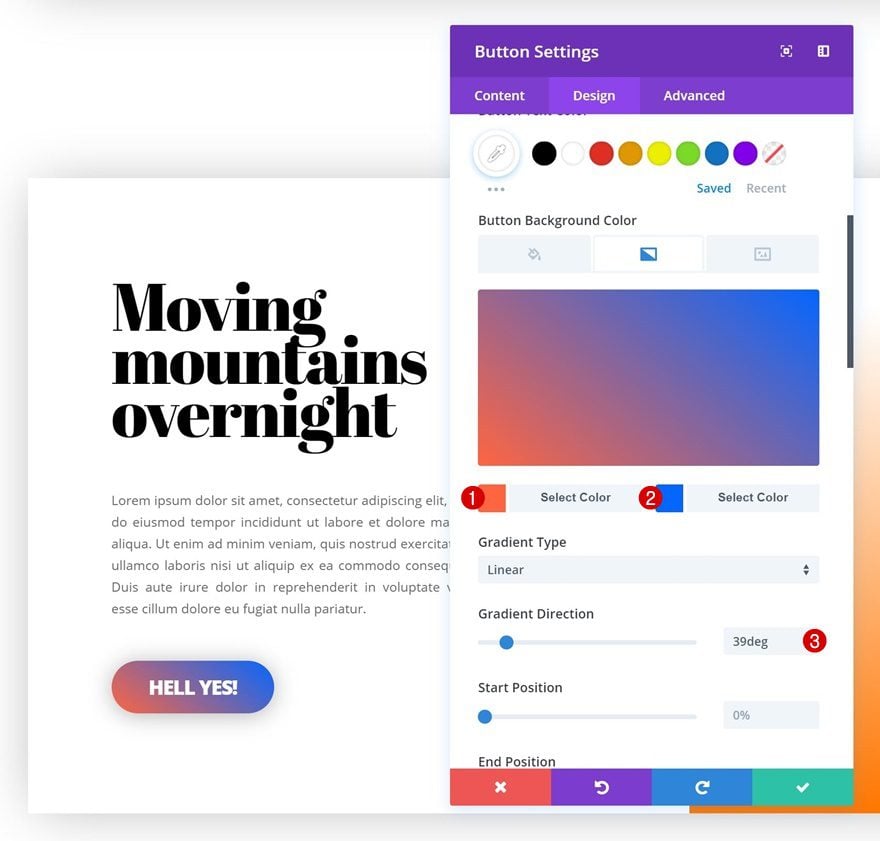
Change Button Gradient Background
Change the button gradient background too.
- Color 1: #ff653f
- Color 2: #0066ff
- Gradient Direction: 39deg
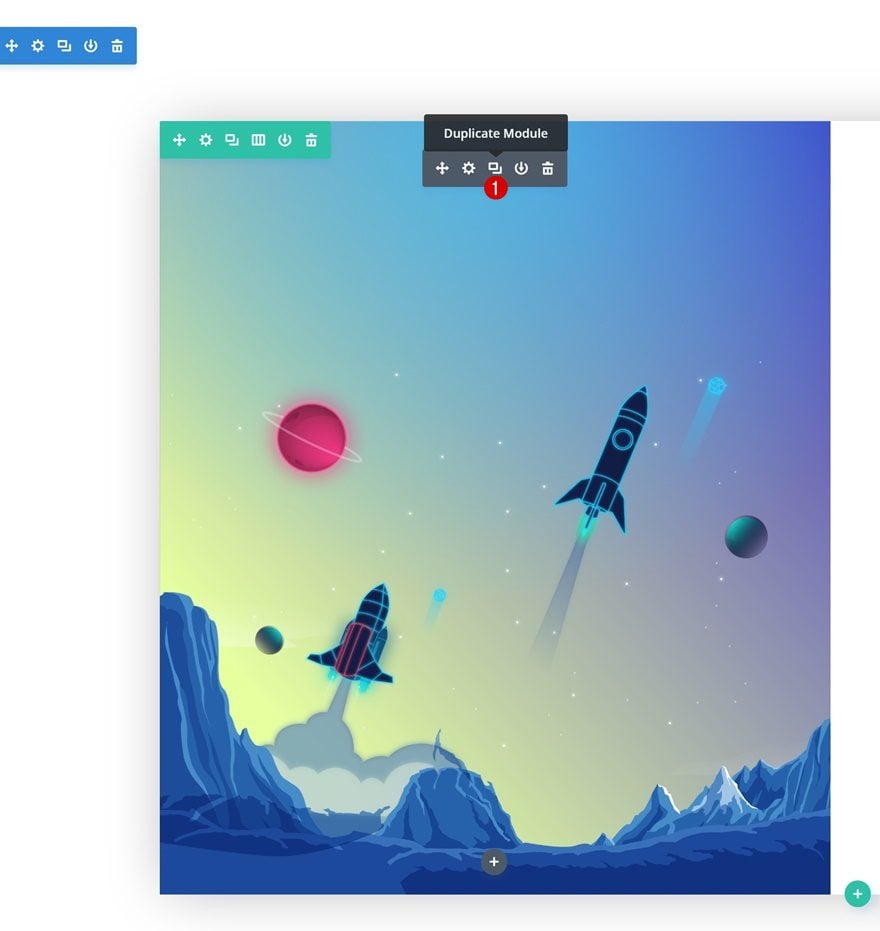
Clone Image Module of Row #2
Clone the Image Module you can find in the first column of the previous row as well.
Place Duplicate in Column 2 of Row #2
And place the duplicate in the second column of the new row.
Change Image
Change the image to the ‘divi-gradient-background-on-hover-illustration-2.png‘ file you can find in the zipped folder which you’ve downloaded at the beginning of this post.
Change Gradient Background
Last but not least, change the gradient background of the Image Module.
- Color 1: rgba(0,2,12,0.66)
- Color 2: rgba(255,255,255,0)
- End Position: 57%
Preview
Now that we’ve gone through all steps, let’s take a final look at the end result on different screen sizes!
Static
Hover
Final Thoughts
In this post, we’ve shown you how to change a gradient background on hover using Divi. We’ve also created a stunning design example from scratch that uses this approach. You’re free to use the design and illustrations for any kind of website you’re building. If you have any questions or suggestions, make sure you leave a comment in the comment section below!


I really like your video tutorials. I’ve been using them to learn how to use the front-end visual builder. They do go a tad fast and I have to replay some parts 4 or 5 times, especially to see where it is you are clicking as your cursor is not prominent. I’m looking forward to more of your tutorials.
nice information thanks a lot
thanks for sharing your article.
There are many different interesting things to change the gradient background but takes a little forethought to get it right, partly because not many graphic designers think about layering images keep sharing this type of article
Nicely done.
Saludos desde Perú, excelente tutorial muy bueno.
Lo recomiendo.
Beautiful gradient and UI one of the best on wordpress
Thank you for the interesting tutorial on how to add some dynamism to images. The technique is great, but takes a little forethought to get it right, partly because not many graphic designers think about layering images with the use of multiple html layers of colours and gradients. Do you have any resources that may appeal to graphic designers on how to design to take advantage of html/css techniques?
Hello,
that’s a very nice tuto,
but I think working only in this condition,
the image’s background must be transparent
Best regards
Love it! So cool!!
Please make a tutorial, on how to activate hover on the image when hovering the row not just the image! 🙂
This is lovely. Really appreciate the creative posts!
This is fantastic thank you! I would love to see it finished as a working row if possible, so we can get a better feel on how we can adopt it in our designs!
Thank you again!!
Nice feature, however I wanted to give it a try to learn how to do it, and the Hover for the column background doesn’t appear on my Divi. I double checked and it is the latest Divi version. No idea why the option is not there.
Sam as Van. Nice tutorial but something clearly missing. Toad’s response did not help. I checked to ensure I had latest DIVI. Not so. As for: Column 1 Hover Background Color
Change this background color on hover.
Nothing resembling “Column 1 Hover Background Colour”
Image settings ➤ Content ➤ Background
Position your cursor over the black ‘Background’ text.
A white arrow in a blue circle appears. Click it.
Two tabs appear: Default and Hover
Good Luck!
Question. If using hover for anything, do you still use on mobile?
Doesn’t it result in it not being a true hover at that point, it becomes a click?
How do you effectively use hover for mobile?
Anyone?
So why is it not possible to set a gradient as hover? Was wondering this for a while now.
It is because of Divi structure. You can not add gradient on :after/:before pseudoelements around Divi image module image.
To solve it – you can create 1 parent item (e.g. via javascript) and apply a gradient to it.
Amazing! Can’t wait to try it out 🙂