

The new Divi transform options have opened a ton of new doors towards creating visually-appealing web design. It brings us one step closer to not needing any image editing software when designing a website from scratch. We can transform it to look exactly the way we want to while still having a 100% responsive design.
In this post, we’re going to use the new transform options to beautifully stack portfolio items. This is a great approach for showcasing previously made websites, for instance. We’ll also make sure the images stay right where they are, no matter what screen size visitors are using. We hope this tutorial inspires you to get creative with Divi’s new transform options when customizing a website to your needs.
Let’s get to it!
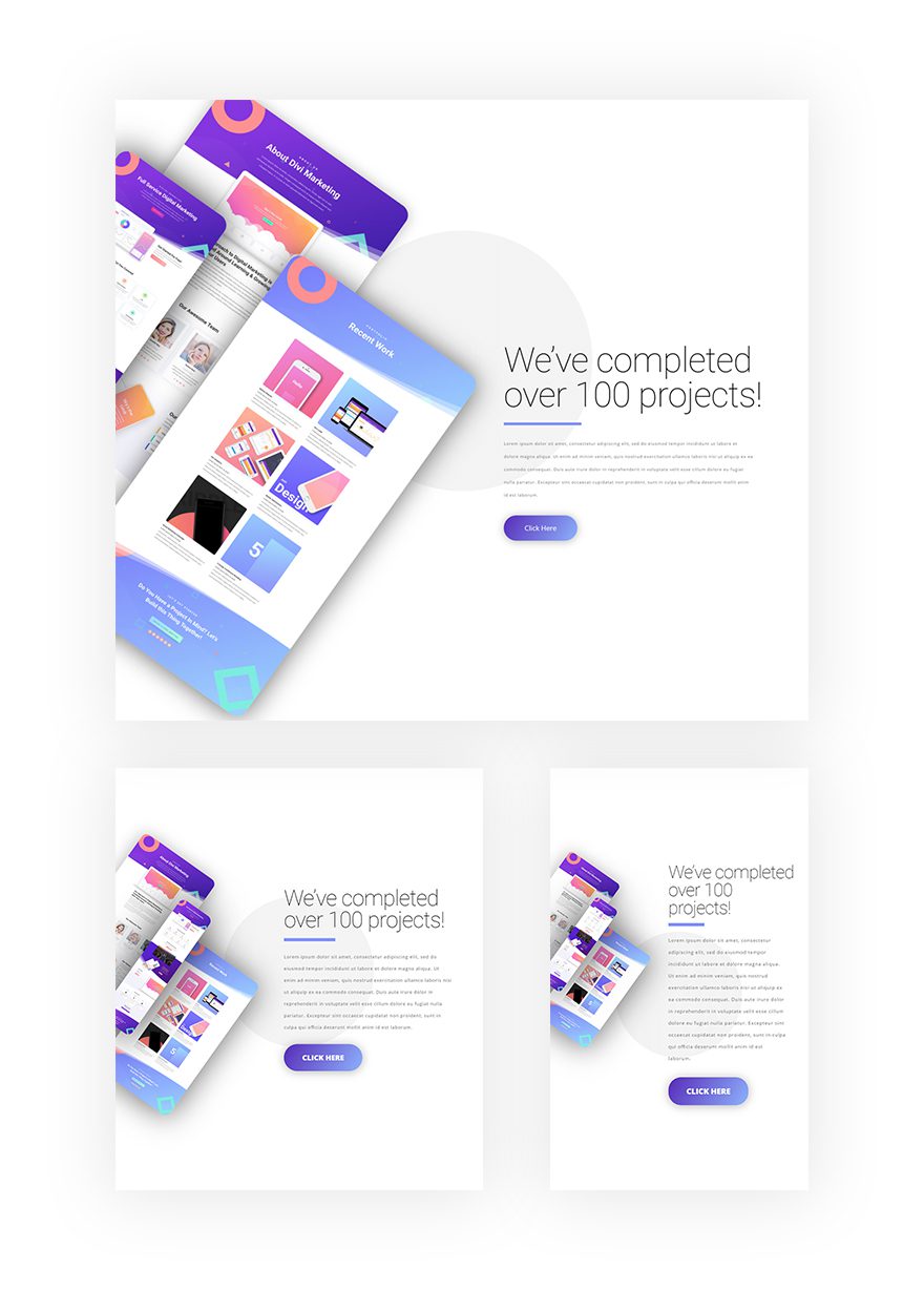
Preview
Before we dive into the tutorial, let’s take a quick look at the outcome on different screen sizes.
Let’s Start Recreating!
Add New Section
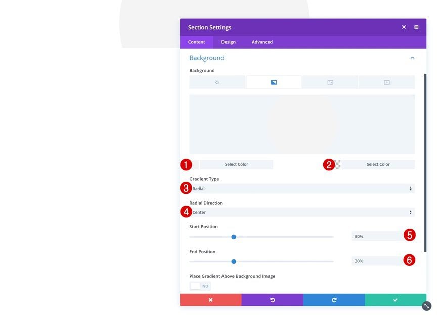
Gradient Background
Start by adding a new section to your page. Open the section settings and add a gradient background to it.
- Color 1: #f4f4f4
- Color 2: rgba(255,255,255,0)
- Gradient Type: Radial
- Radial Direction: Center
- Start Position: 30%
- End Position: 30%
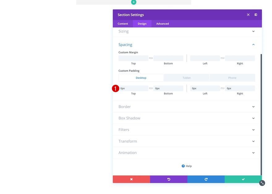
Spacing
Then, go to the design tab and modify the custom padding values in the spacing settings.
- Top Padding: 0px (Desktop), 18vw (Tablet), 40vw (Phone)
- Bottom Padding: 0px (Desktop), 18vw (Tablet), 40vw (Phone)
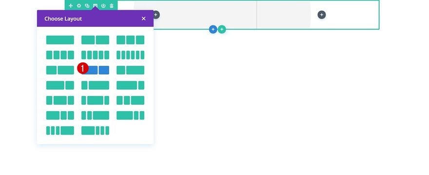
Add New Row
Column Structure
Continue by adding a new row to the section using the following column structure:
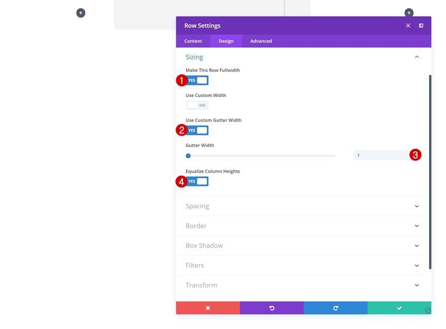
Sizing
Without adding any modules yet, open the row settings and change the sizing settings.
- Make This Row Fullwidth: Yes
- Use Custom Gutter Width: Yes
- Gutter Width: 1
- Equalize Column Heights: Yes
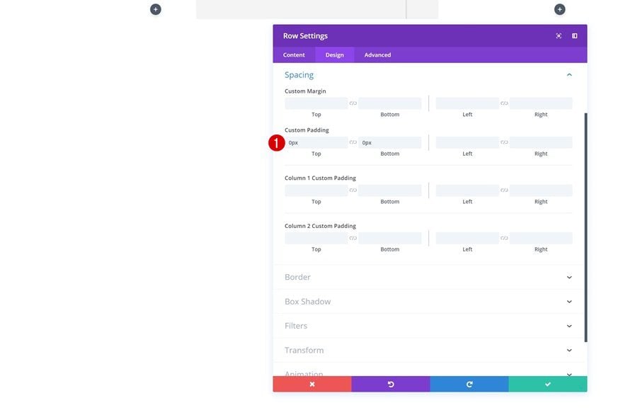
Spacing
Then, go to the spacing settings and remove the top and bottom default padding.
- Top Padding: 0px
- Bottom Padding: 0px
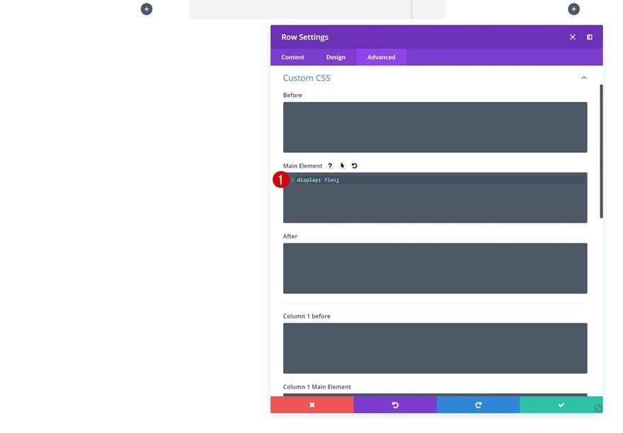
Display
We’re also making sure both columns appear next to each other on smaller screen sizes. To do that, we’ll need to add one single line of CSS code to the main element of the row.
display: flex;
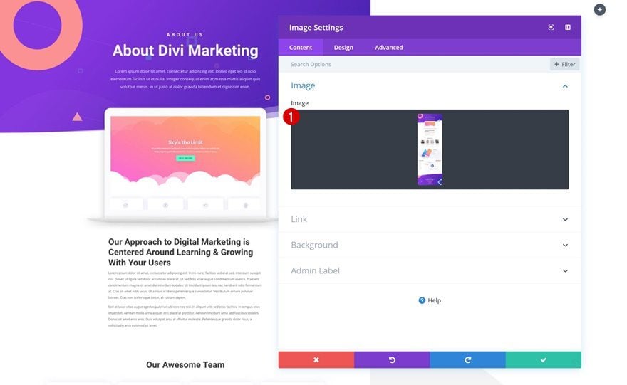
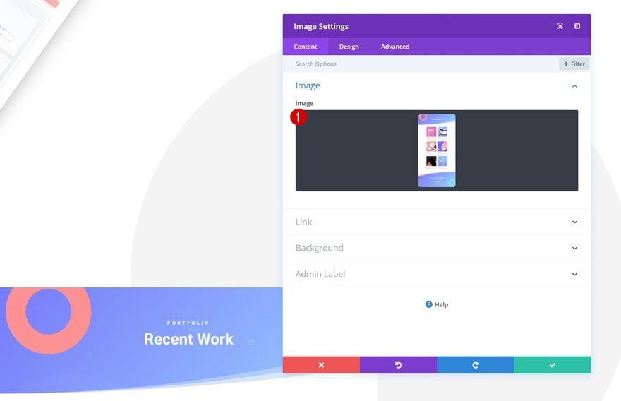
Add Image Module #1 to Column 1
Upload Image
We can now start adding the different modules! For the sake of being able to follow this tutorial, go ahead and save the following print screen to your computer:

Upload the print screen to an Image Module in the first column.
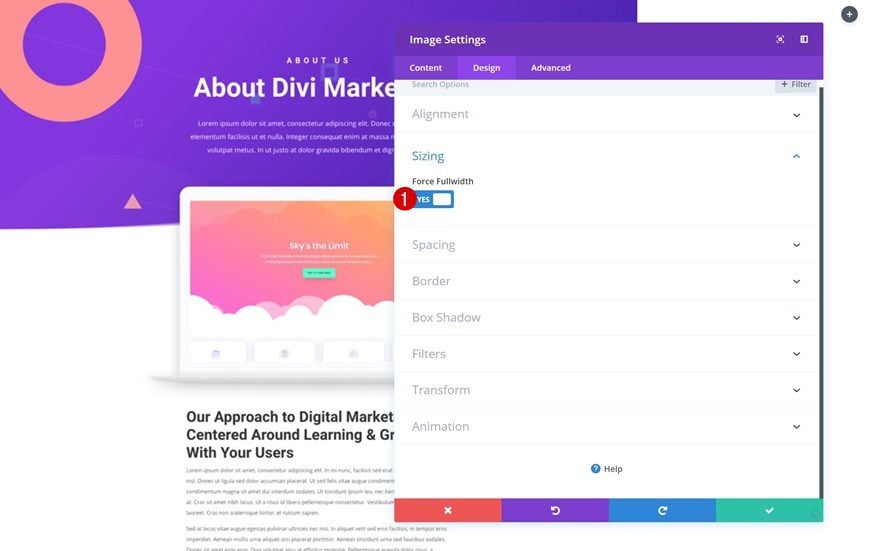
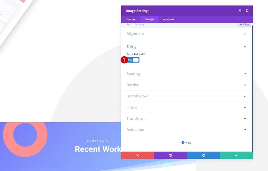
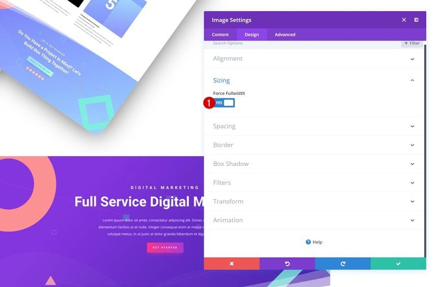
Sizing
Then, go to the design tab and enable the ‘Force Fullwidth’ option. Once you do, the image will take up the entire width of the column.
- Force Fullwidth: Yes
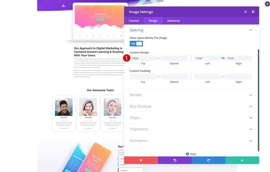
Spacing
To shrink the size of the image, we’re going to add some custom left and right margin. You’ll notice that we’re using a viewport unit to make sure the size of the image remains intact, no matter the screen size.
- Top Margin: -10vw
- Left Padding: 11vw
- Right Padding: 11vw
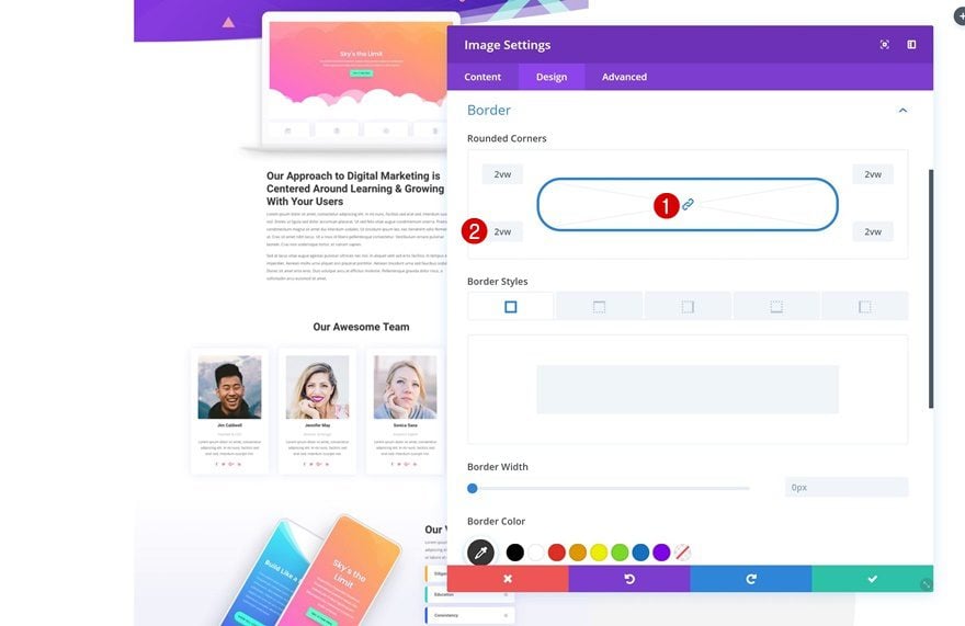
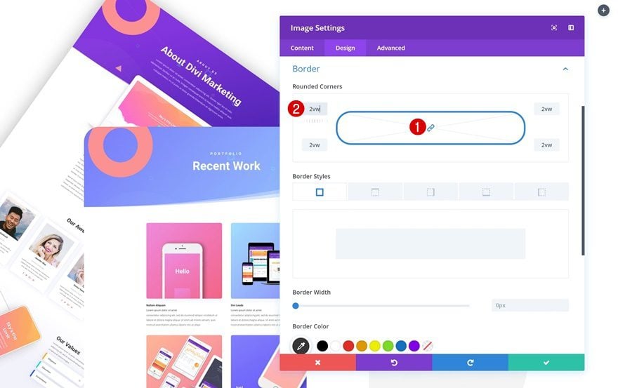
Border
Add ‘2vw’ to each one of the corners in the border settings next.
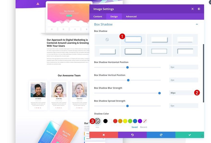
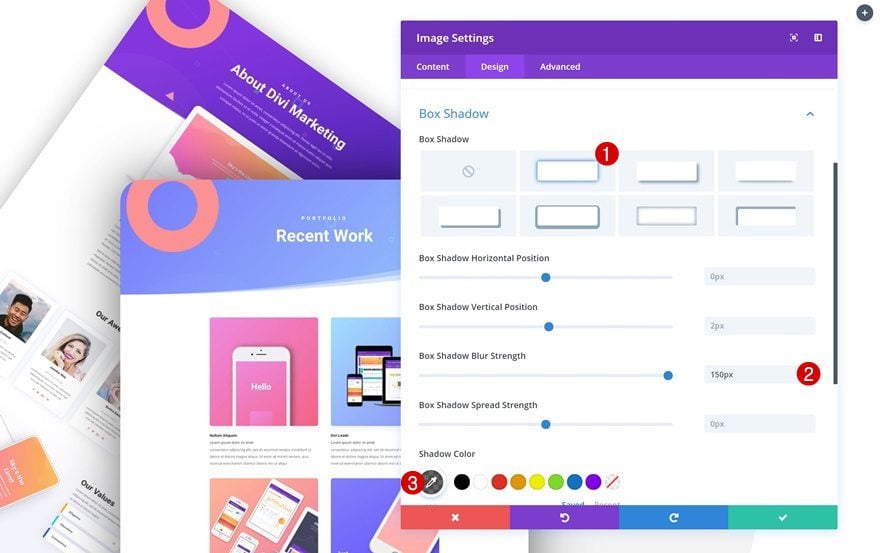
Box Shadow
Along with a box shadow.
- Box Shadow Blur Strength: 80px
- Shadow Color: rgba(0,0,0,0.3)
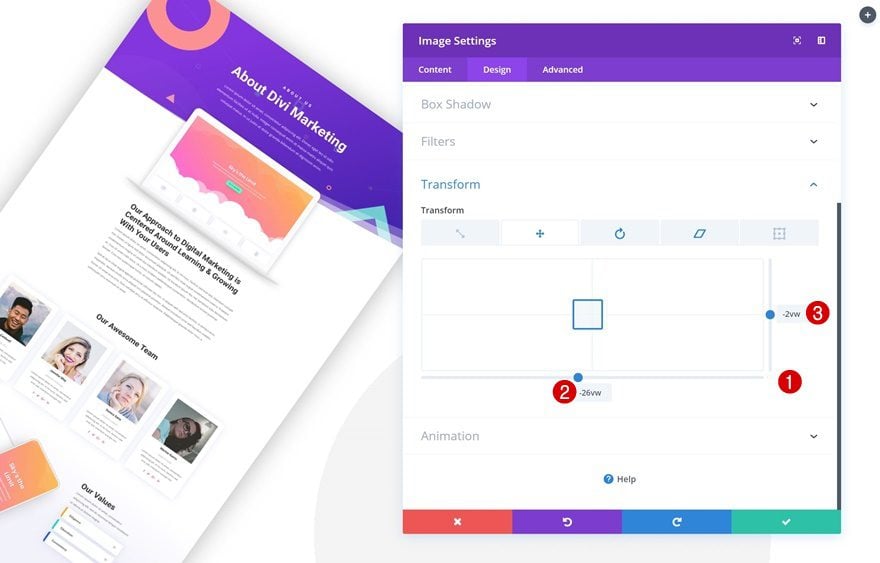
Transform Translate
Now we can start transforming the image! Add the following values to the transform translate tab of the transform options:
- Bottom: -26vw
- Right: -2vw
The values you add here depend on the width and height of your image so if you’re using a different image, you’ll have to modify the values accordingly. Make sure you’re using viewport units to make sure the position of the image remains the same across all screen sizes.
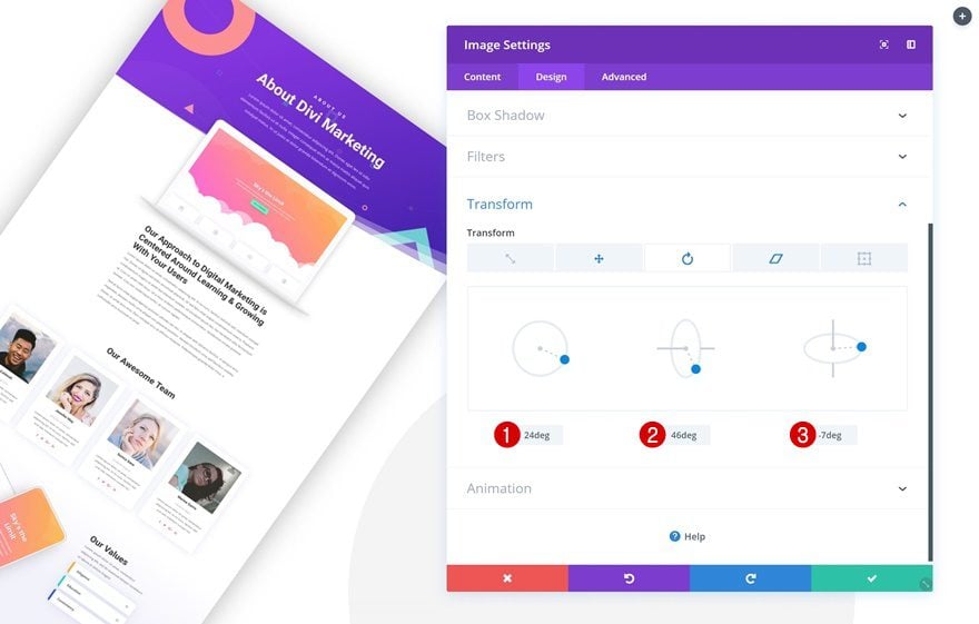
Transform Rotate
Move on to the transform rotate tab and rotate the image accordingly:
- Left: 24deg
- Center: 46deg
- Right: -7deg
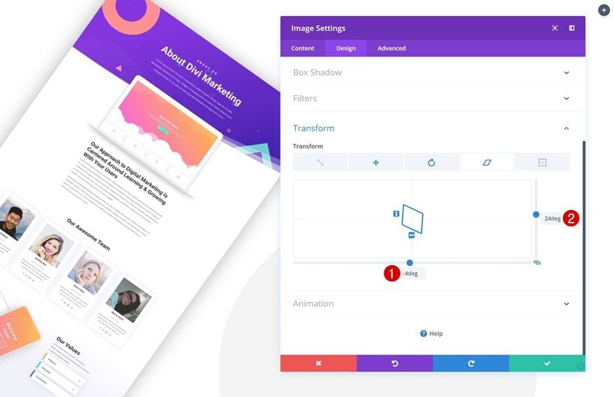
Translate Skew
Last but not least, enable translate skew with the following values:
- Bottom: -4deg
- Right: 24deg
Add Image Module #2 to Column 1
Upload Image
On to the next Image Module! Save the following print screen to your computer or use another print screen of your choice:
Continue by uploading the print screen to the second Image Module in column 1.
Sizing
Then, go to the sizing settings and enable the ‘Force Fullwidth’ option.
- Force Fullwidth: Yes
Spacing
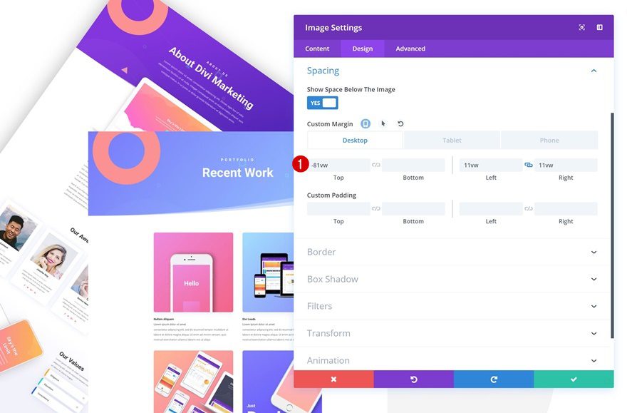
We’re shrinking the size of the image and making it overlap with the previous image by using some custom margin values in the spacing settings.
- Top Margin: -81vw (Desktop), -50vw (Tablet & Phone)
- Left Margin: 11vw
- Right Margin: 11vw
Border
We’ll add ‘2vw’ to each one of the corners in the border settings next.
Box Shadow
And we’ll add a box shadow too. Notice how we’re using a darker box shadow for the second portfolio item image. This will help you create more depth between the portfolio items.
- Box Shadow Blur Strength: 150px
- Shadow Color: rgba(0,0,0,0.6)
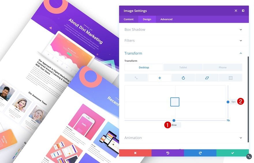
Transform Translate
Then, go to the transform settings and modify the transform translate values:
- Bottom: -8vw
- Right: 0px
Again, these values really depend on how you want to position the print screen and what dimensions your print screen has. The smaller the image, the more you’ll have to push it to the left by using a larger negative value.
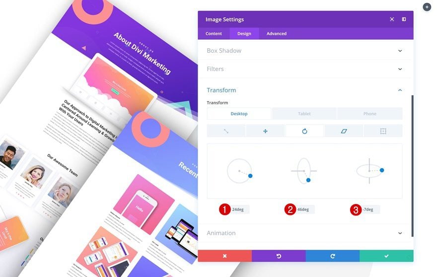
Transform Rotate
Move on to the transform rotate tab and play around with all three values.
- Left: 24deg
- Center: 46deg
- Right: -7deg
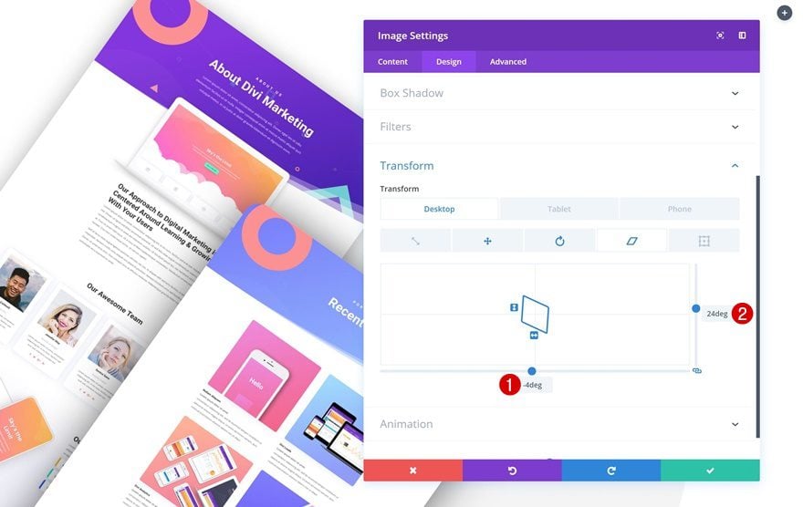
Translate Skew
Last but not least, modify the translate skew values:
- Bottom: -4deg
- Right: 24deg
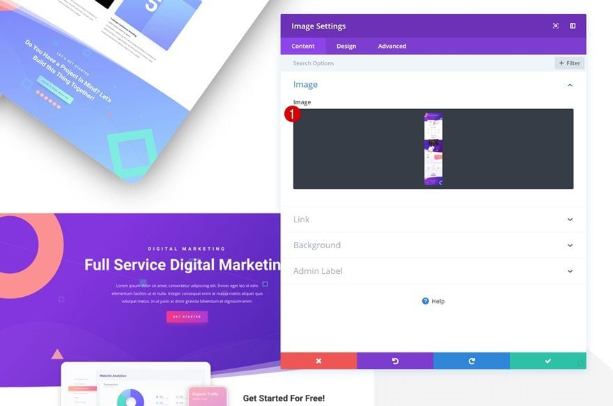
Add Image Module #3 to Column 1
Upload Image
On to the next and last Image Module we need in column 1. Save the following print screen to your computer or use any other print screen of your choice:

Add the print screen you’ve saved to a new Image Module.
Sizing
Then, go to the sizing settings and enable the ‘Force Fullwidth’ option.
- Force Fullwidth: Yes
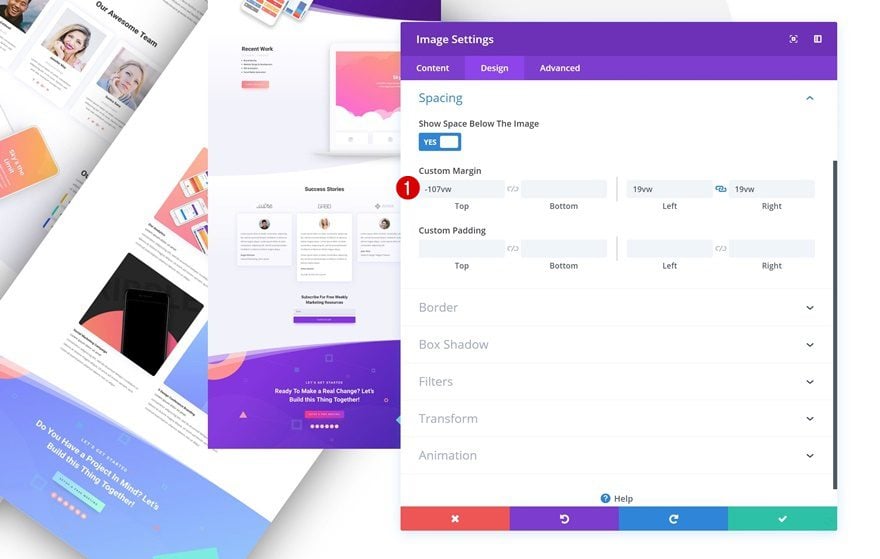
Spacing
Go to the spacing settings next and modify the margin values accordingly:
- Top Margin: -107vw
- Left Margin: 19vw
- Right Margin: 19vw
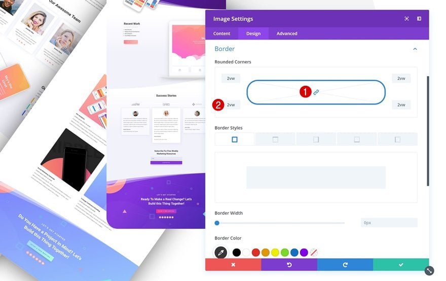
Border
Continue by adding ‘2vw’ to each one of the corners of the Image Module.
Box Shadow
Add a box shadow next. Again, we’re using a stronger shadow color than the ones we’ve used for the two previous Image Modules.
- Box Shadow Blur Strength: 200px
- Shadow Color: rgba(0,0,0,0.82)
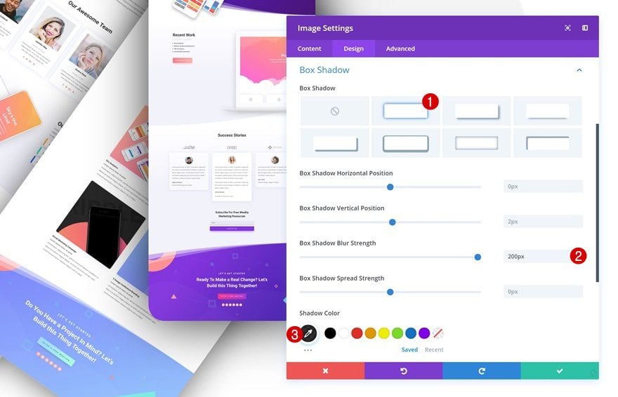
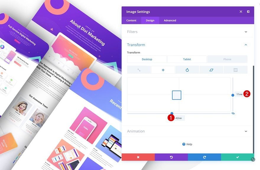
Transform Translate
Then, go to the transform settings and modify the transform translate values:
- Bottom: -42vw
- Right: 11vw
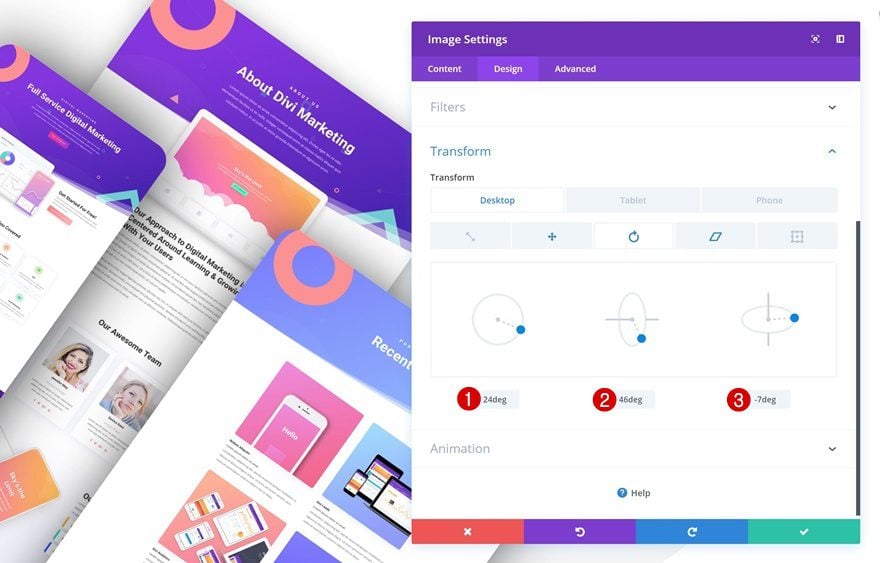
Transform Rotate
Move on to the transform rotate tab and make some changes there too.
- Left: 24deg
- Center: 46deg
- Right: -7deg
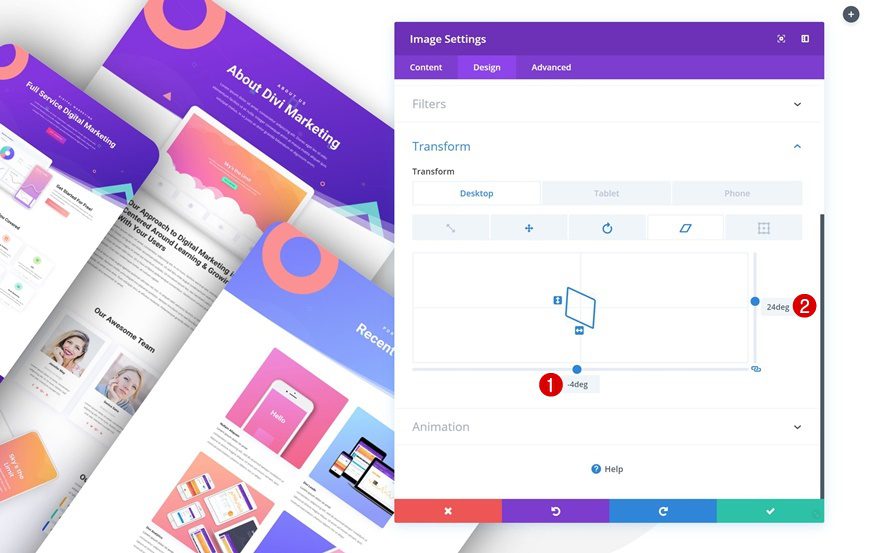
Translate Skew
Last but not least, modify the translate skew values.
- Bottom: -4deg
- Right: 24deg
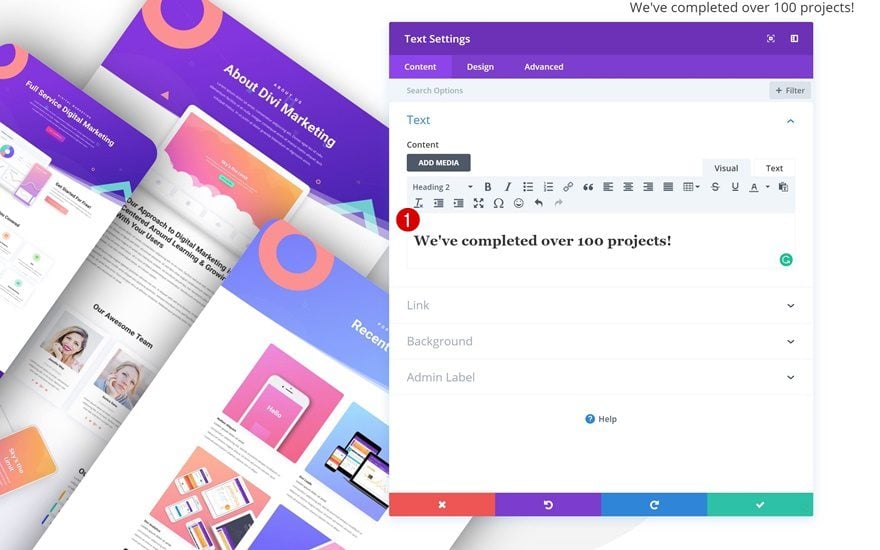
Add Title Text Module to Column 2
Add H2 Copy
On to the second column! Add a Text Module with some H2 content of your choice.
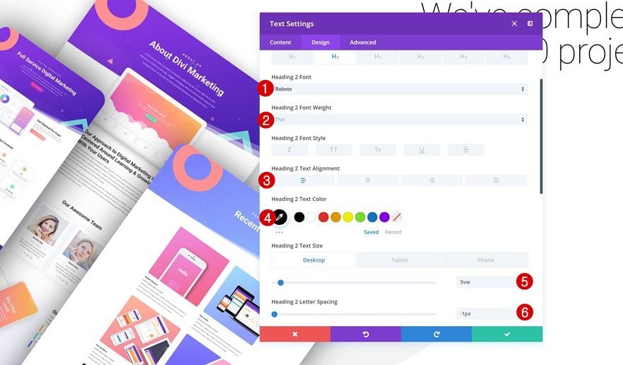
H2 Text Settings
Go to the H2 text settings next and make some changes.
- Heading 2 Font: Roboto
- Heading 2 Font Weight: Thin
- Heading 2 Text Alignment: Left
- Heading 2 Text Color: #000000
- Heading 2 Text Size: 5vw (Desktop), 6vw (Tablet), 7vw (Phone)
- Heading 2 Letter Spacing: -1px
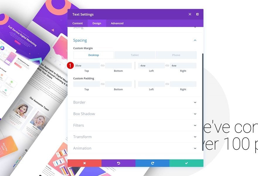
Spacing
Continue by adding some custom margin values in the spacing settings.
- Top Margin: 35vw (Desktop), 10vw (Tablet), 0vw (Phone)
- Left Margin: -4vw
- Right Margin: 4vw
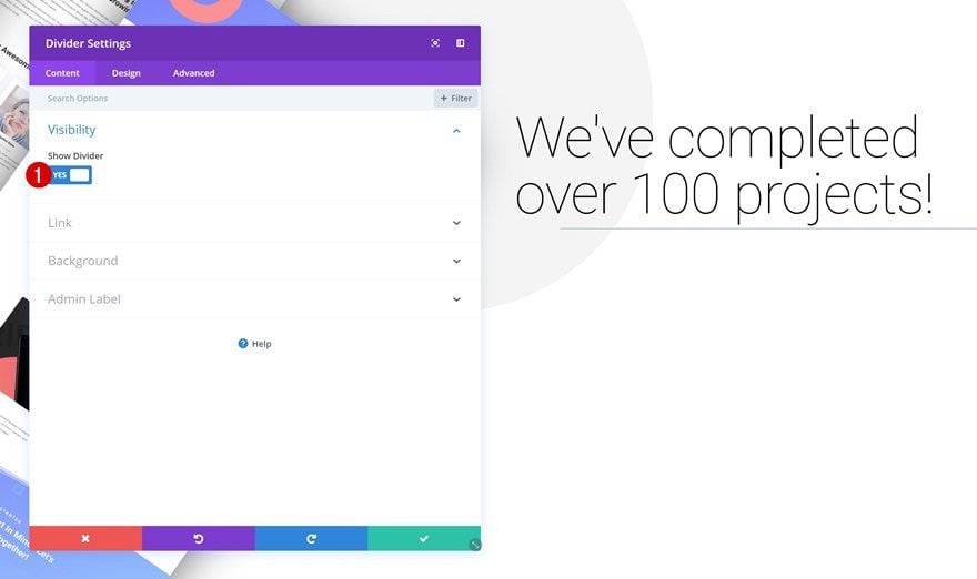
Add Divider Module to Column 2
Visibility
The next module we need in column 2 is a Divider Module. Make sure the ‘Show Divider’ option is enabled.
- Show Divider: Yes
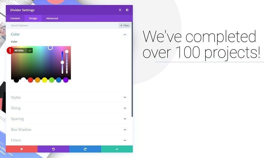
Color
Then, go to the design tab and change the divider color.
- Color: #8193fa
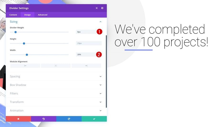
Sizing
Modify the sizing settings too.
- Divider Weight: 8px
- Width: 28%
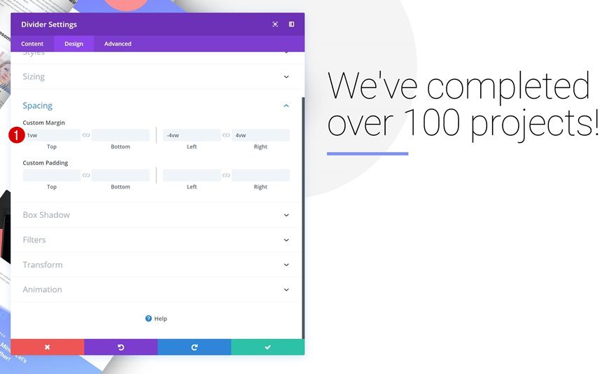
Spacing
And add some custom margin values.
- Top Margin: 1vw
- Left Margin: -4vw
- Right Margin: 4vw
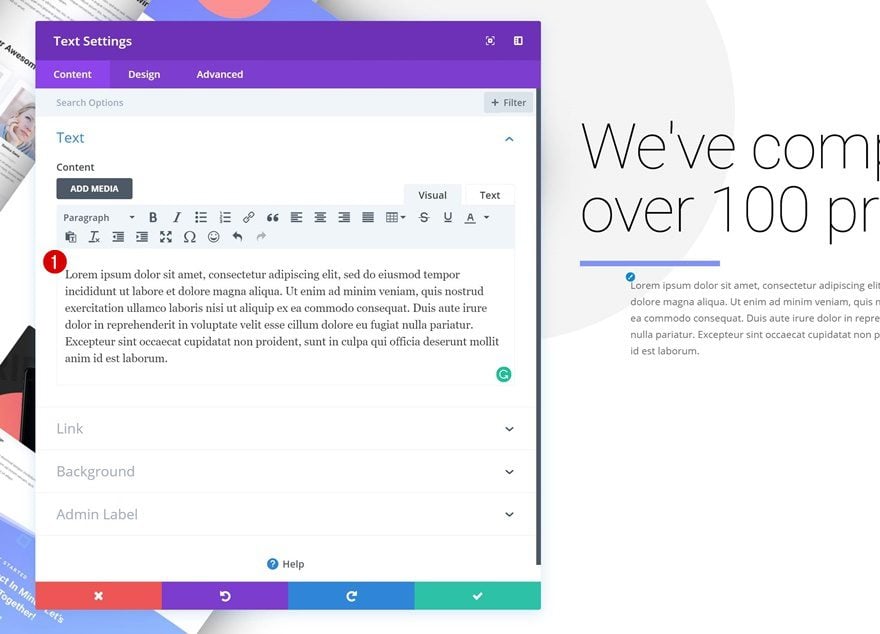
Add Description Text Module to Column 2
Add Content
The next module we need in column 2 is another Text Module. Add some paragraph content of your choice.
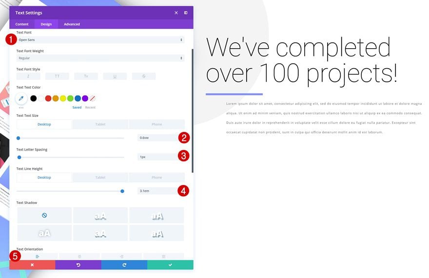
Text Settings
Then, go to the text settings and make some changes.
- Text Font: Open Sans
- Text Size: 0.6vw (Desktop), 1.2vw (Tablet), 1.8vw (Phone)
- Text Line Height: 3.1em (Desktop), 2.7em (Tablet), 2.6em (Phone)
- Text Orientation: Left
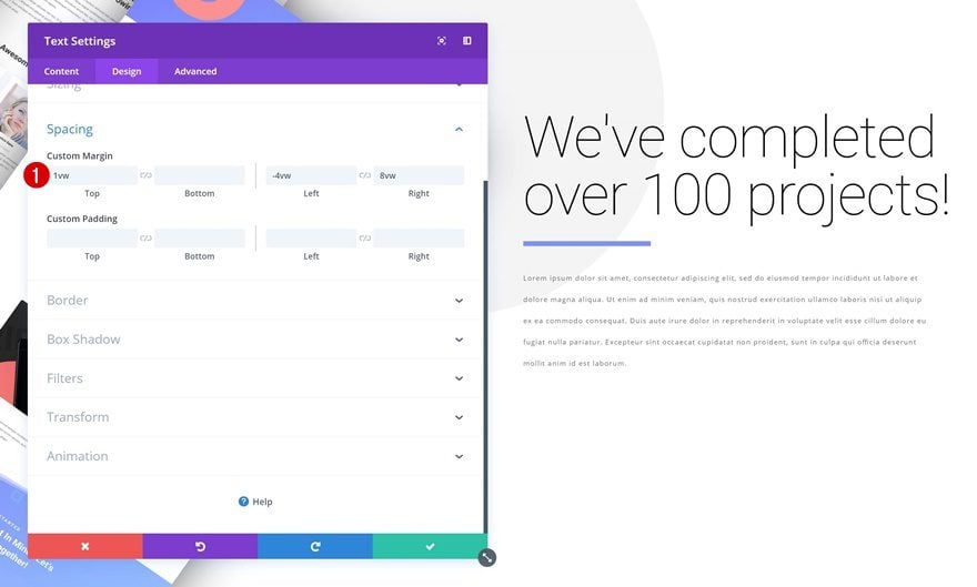
Spacing
Add some custom margin values next.
- Top Margin: 1vw
- Left Margin: -4vw
- Right Margin: 4vw
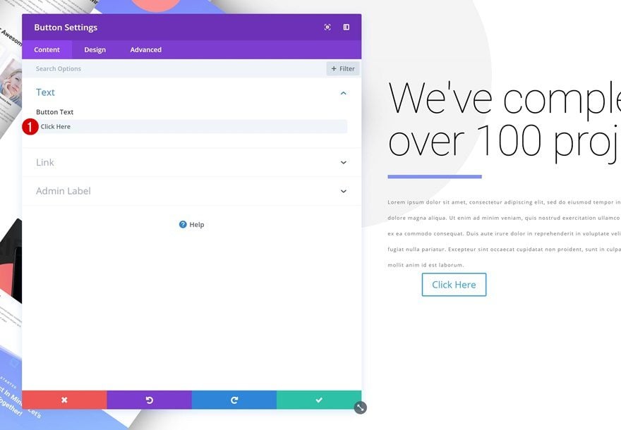
Add Copy
The next and last module we need to complete the design is a Button Module. Add some copy of choice.
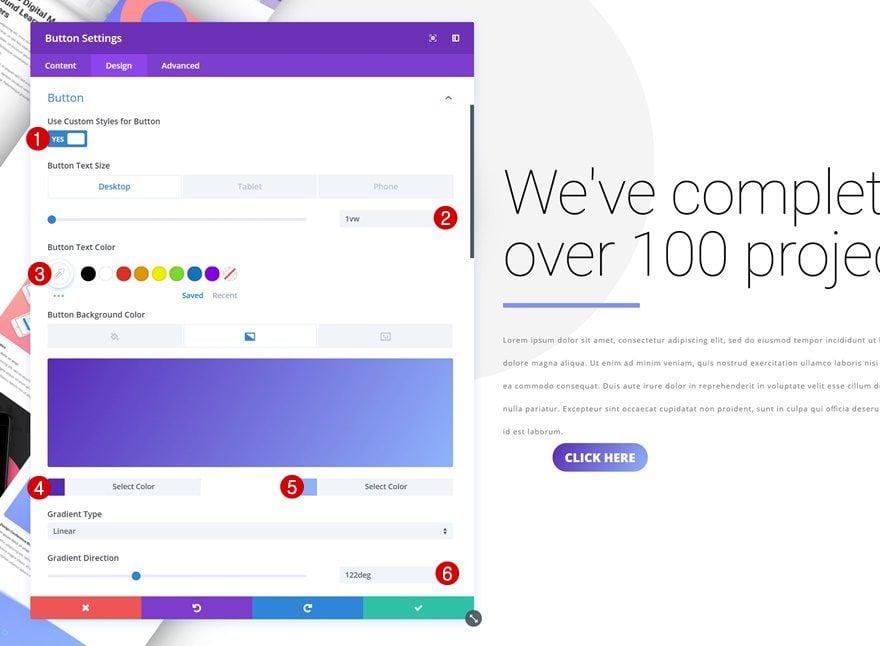
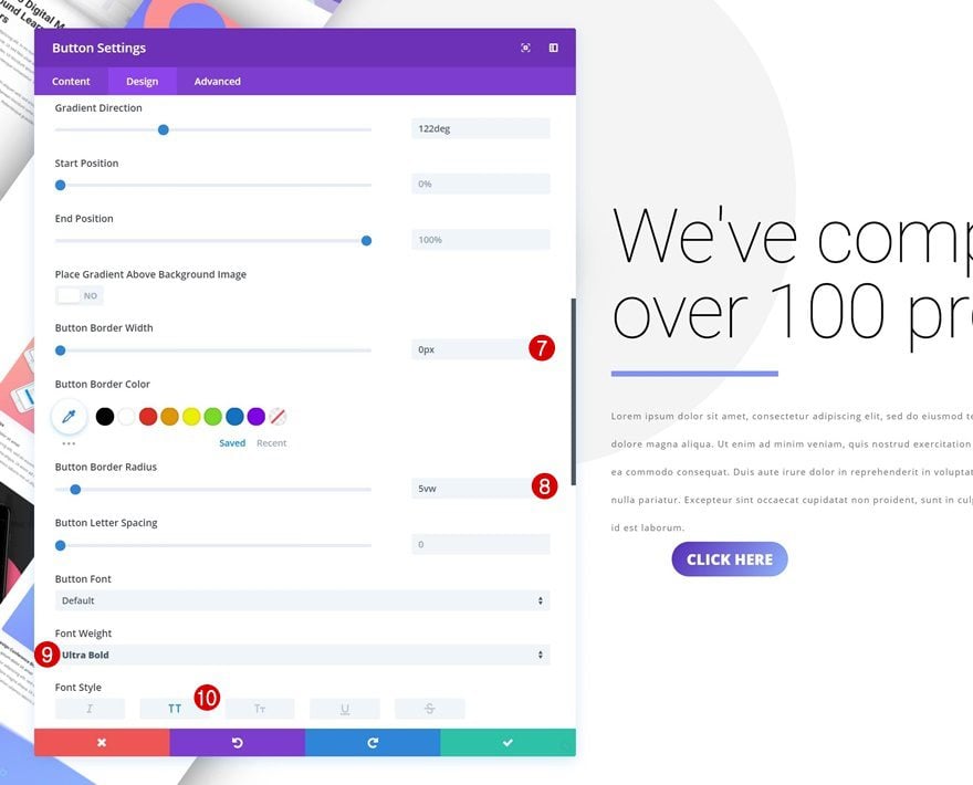
Button Settings
Then, go to the design tab and modify the button settings.
- Use Custom Styles for Button: Yes
- Button Text Size: 1vw (Desktop), 2vw (Tablet), 3vw (Phone)
- Color 1: #5627ba
- Color 2: #8fb5fc
- Gradient Direction: 122deg
- Button Border Width: 0px
- Font Weight: Ultra Bold
- Font Style: Uppercase
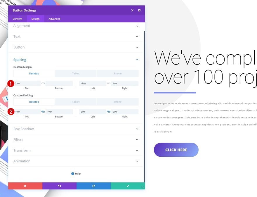
Spacing
Change the custom margin and padding values too.
- Top Margin: 2vw (Desktop), 3vw (Tablet), 5vw (Phone)
- Bottom Margin: 6vw (Tablet), 8vw (Phone)
- Left Margin: -4vw
- Right Margin: 4vw
- Top Padding: 1vw (Desktop), 2vw (Tablet), 3vw (Phone)
- Bottom Padding: 1vw (Desktop), 2vw (Tablet), 3vw (Phone)
- Left Padding: 3vw (Desktop), 5vw (Tablet), 7vw (Phone)
- Right Padding: 3vw (Desktop), 5vw (Tablet), 7vw (Phone)
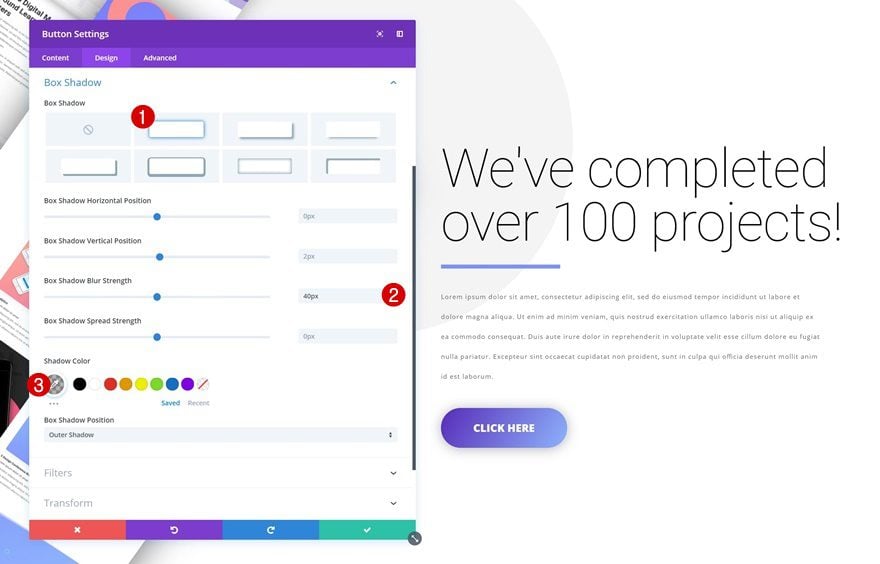
Box Shadow
Last but not least, add a subtle box shadow and you’re done!
- Box Shadow Blur Strength: 40px
- Shadow Color: rgba(0,0,0,0.3)
Preview
Now that we’ve gone through all the steps, let’s take a final look at the outcome on different screen sizes.
Final Thoughts
In this post, we’ve shown you how to get creative with Divi’s new transform options. More specifically, we’ve stacked portfolio items to create a nice and visually-appealing design. We’ve also made sure that the images look great across all screen sizes. If you have any questions or suggestions, make sure you leave a comment in the comment section below!


I do not get it – where is the beef?
By the way, just tried transformation feature and do not get nice animations yet. For example spinning on mouse over does flickering a lot, which I cannot use anywhere….
I do not get it – where is the beef?
By the way, just tried transformation feature and do not get nice animations yet. For example spinning on mouse over does flickering a lot, which I cannot use anywhere….
Interesting! Did not play with the new transform tool yet but it looks really good!
Ah ha! I see screenshots in the post. Apologies if I whinged earlier about lack of images.
Ah ha! I see screenshots in the post. Apologies if I whinged earlier about lack of images.
Thanks I.m begining with Divi so good idea to have a demo
Thank you for the detailed article. Can I please request a step by step video with examples if possible?
That’s all good but demo?
Hi,
Great stuff buddy.
Great post, I have read this post here I got very useful information. This is a very useful article for online review readers. Keep it up such a nice posting like this. I started a Blog and Hopefully, it will be successful like you.
Thanks for the share.
I would like to know if its possible to do transform actions on page scroll only using the divi builder?
Yep, a lot of work without seeing the demos in action first – jason file is a good idea too.
Is all transform things are compatible with all modern browsers?
Thank you
Agree, its a good idea
I agree with Trish. Please list of URL to a demo. Thanks.
As per a previous post, could we please have demos and/or a JSON file???
Thank you 🙂
+1
Or at least provide the assets so we aren’t looking for images to fit the design.
+1
It would be nice if you added a link to a live example.
Thanks for this post, Divi is increasingly appealing features and possibilities, this new feature is amazing, plus would still use photoshop to crop the images in the off-screen parts. This feature with Hover effects makes it worth the loading of multiple image files by looking SEO
Looks great.. again please stop posting static pictures of how things will look.. I assume you use divi on this site? Maybe just post the actual item as if you were on the internet, and as if this was a web site 😉