

Since the WooCommerce Modules have become part of Divi, we’ve shown you a couple of product page designs you can create using Divi’s built-in options. Today, we’re adding a new tutorial to that list by showing you how to create a beautiful fullscreen product page. We’re fitting all the product content in one single section while creating a stunning design. Although we’re limiting the vertical scrolling that is required on the product page, the design doesn’t look overwhelming by any means. We’ve also made sure the design remains beautiful and responsive across small screen sizes. You’ll be able to download the JSON file for free as well!
Let’s get to it.
- 1 Preview
- 2 Download The Fullscreen Product Layout for FREE
- 3 Download For Free
- 4 You have successfully subscribed. Please check your email address to confirm your subscription and get access to free weekly Divi layout packs!
- 5 Let’s Start Recreating!
- 6 Turn Product Page Into Template
- 7 Preview
- 8 Final Thoughts
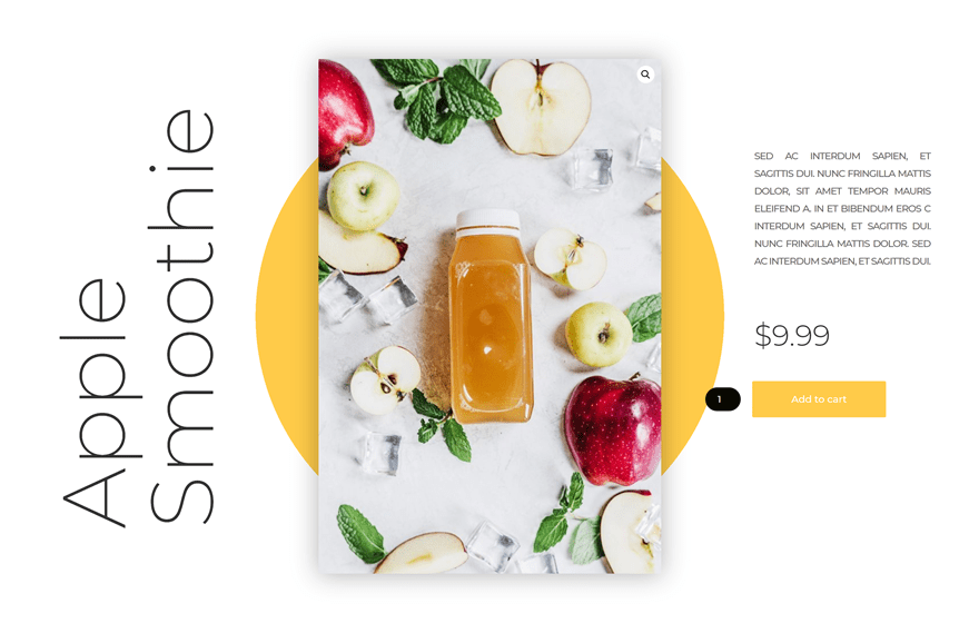
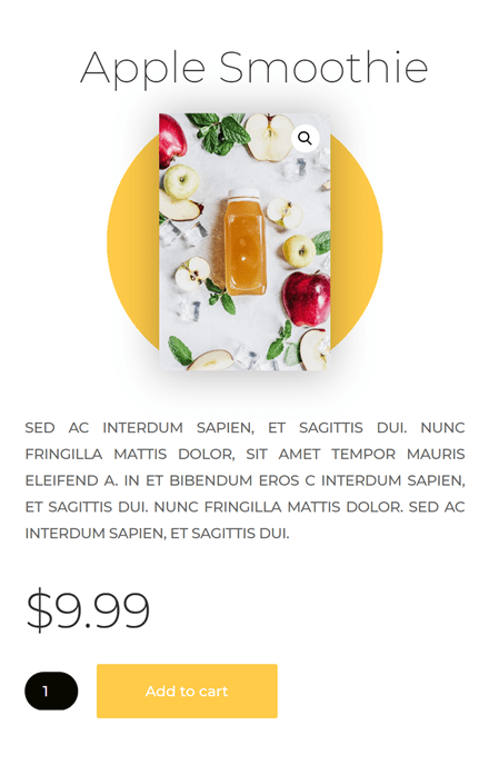
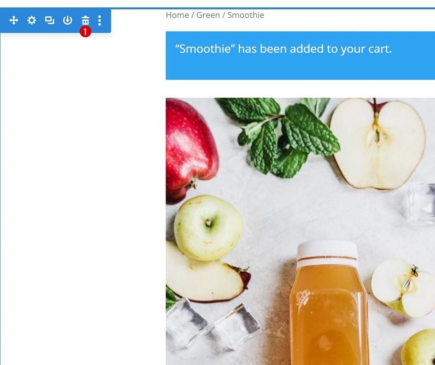
Preview
Before we dive into the tutorial, let’s take a quick look at the outcome across different screen sizes.
Desktop
Mobile
Download The Fullscreen Product Layout for FREE
To lay your hands on the free fullscreen product layout, you will first need to download it using the button below. To gain access to the download you will need to subscribe to our newsletter by using the form below. As a new subscriber, you will receive even more Divi goodness and a free Divi Layout pack every Monday! If you’re already on the list, simply enter your email address below and click download. You will not be “resubscribed” or receive extra emails.

Subscribe To Our Youtube Channel
Let’s Start Recreating!
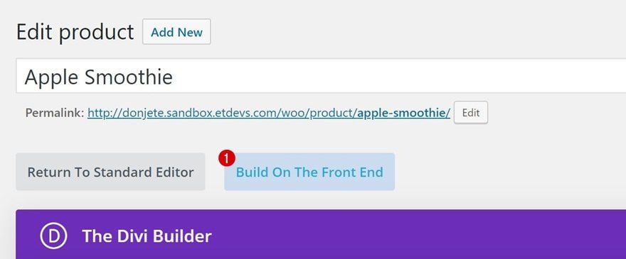
Open Existing Product Page
The first thing you’ll need to do is open an existing product page or create a new one. For this particular layout, we’ve added the following elements to our product page:
- Product title
- Featured image
- Short description
- Description
- Price
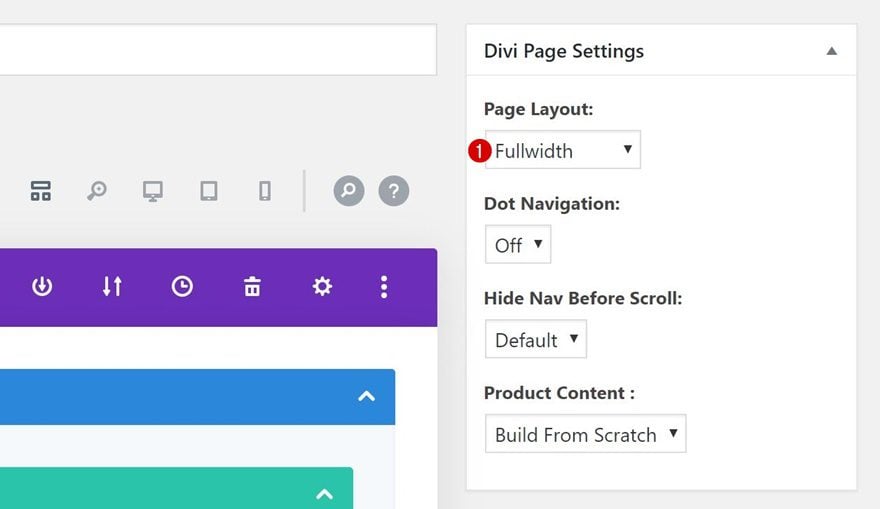
Enable Divi & Modify Page Settings
Continue by enabling Divi and changing the page layout in the page settings.
Switch Over to Visual Builder
Once that’s done, you can switch over to Visual Builder.
Delete Existing Section
Inside the Visual Builder, you’ll notice a section with the default product page items. You can go ahead and delete this entire section. In the next steps of this post, we’ll recreate our own alternative design.
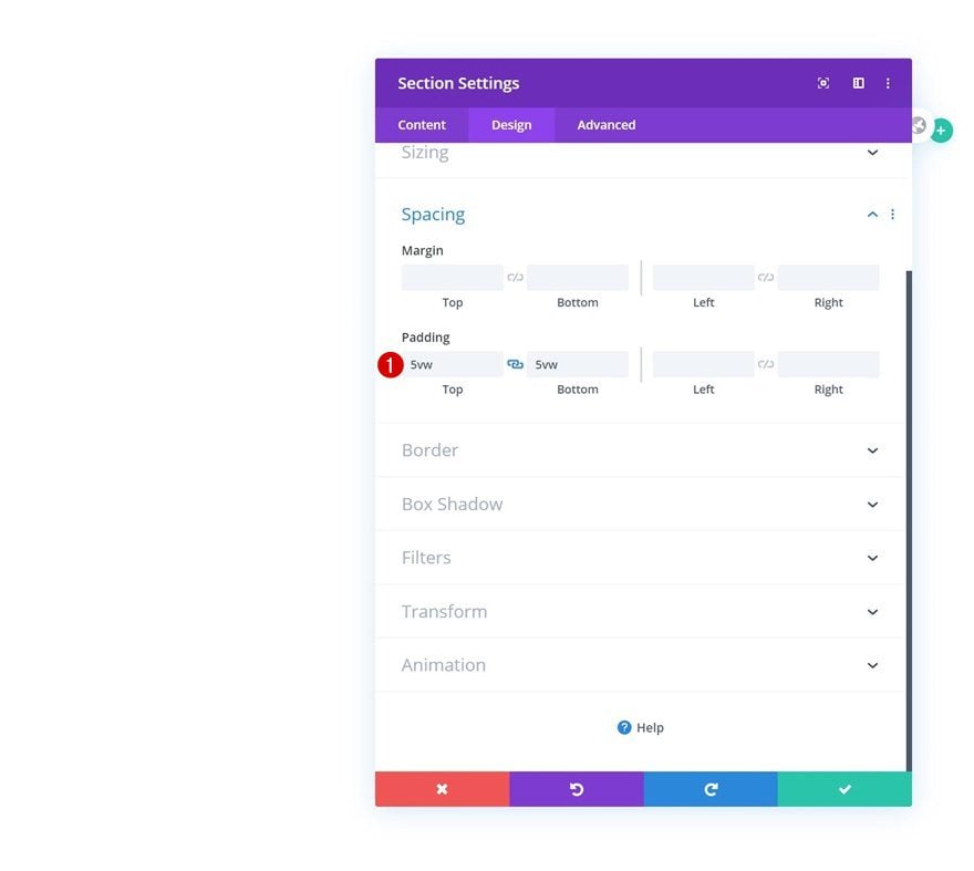
Add New Section
Spacing
Time to start creating! Add a new section, open the section settings and modify the top and bottom padding values.
- Top Padding: 5vw
- Bottom Padding: 5vw
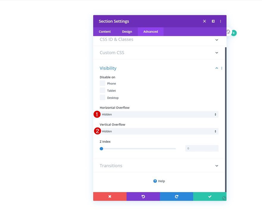
Overflows
Hide the section’s overflows as well.
- Horizontal Overflow: Hidden
- Vertical Overflow: Hidden
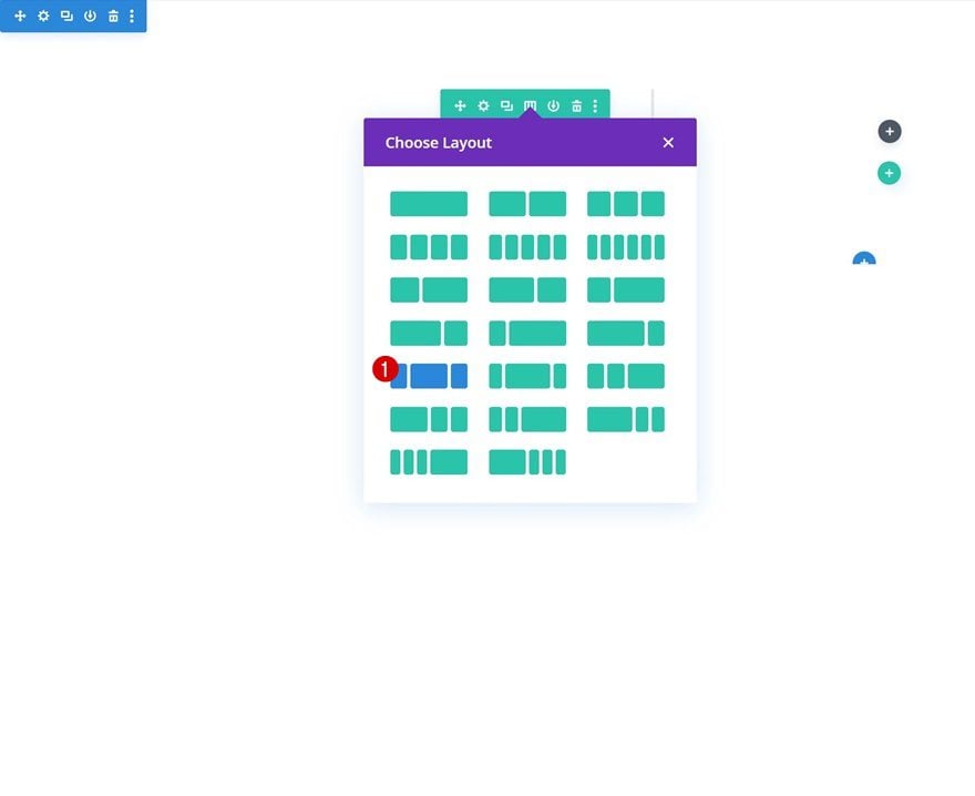
Add New Row
Column Structure
Continue by adding a new row to the section using the following column structure:
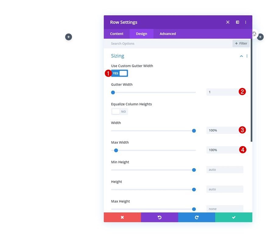
Sizing
Without adding any modules yet, open the row settings and adjust the sizing settings as follows:
- Use Custom Gutter Width: Yes
- Gutter Width: 1
- Width: 100%
- Max Width: 100%
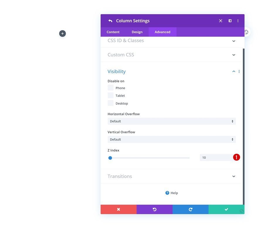
Column 1
Z Index
We’re also increasing the first column’s z index in the visibility settings.
- Z Index: 10
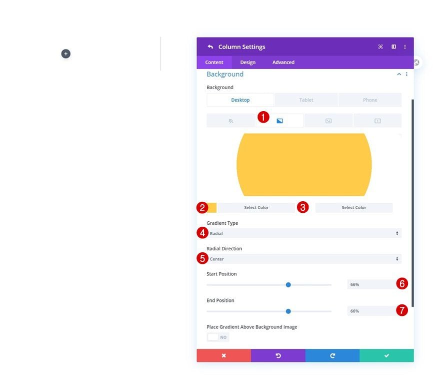
Column 2
Gradient Background
Open the column 2 settings next and add a gradient background across different screen sizes:
- Color 1: #ffcb49
- Color 2: #ffffff
- Gradient Type: Radial
- Radial Direction: Center
- Start Position: 66% (Desktop), 50% (Tablet & Phone)
- End Position: 66% (Desktop), 50% (Tablet & Phone)
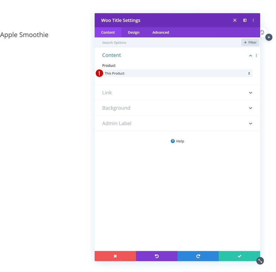
Add Woo Title Module to Column 1
Dynamic Content
Time to start adding modules! In column 1, the only module we need is a Woo Title Module.
- Product: This Product
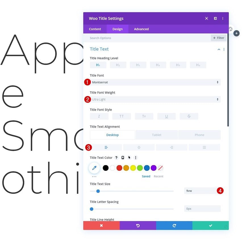
Title Text Settings
Move on to the module’s design tab and change the title text settings as follows:
- Title Font: Montserrat
- Title Font Weight: Ultra Light
- Title Text Alignment: Left (Desktop), Center (Tablet & Phone)
- Title Text Size: 9vw
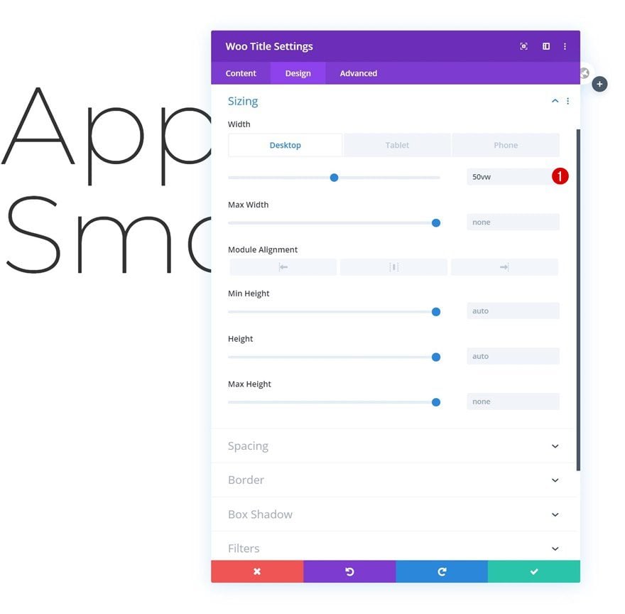
Sizing
Modify the sizing of the module too.
- Width: 50vw (Desktop), 100% (Tablet & Phone)
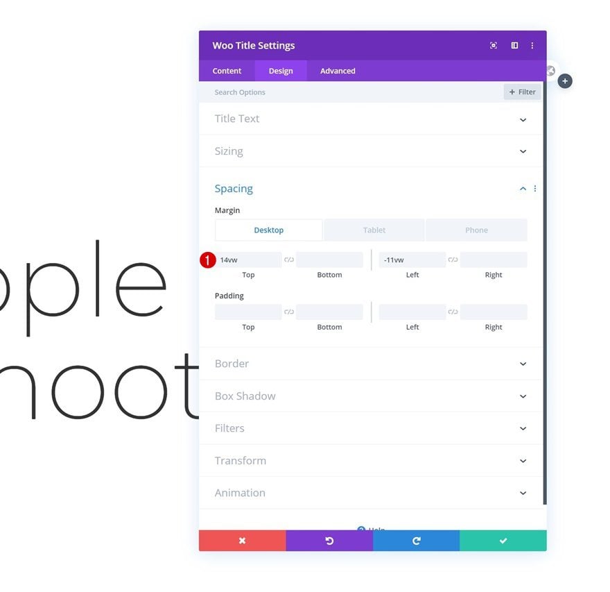
Spacing
Along with the spacing settings.
- Top Margin: 14vw (Desktop), 0vw (Tablet & Phone)
- Bottom Margin: 5vw (Tablet & Phone)
- Left Margin: -11vw (Desktop), 2vw (Tablet & Phone)
- Right Margin: 2vw (Tablet & Phone)
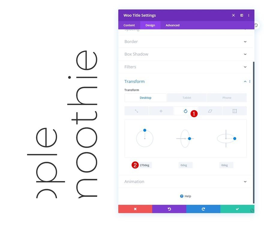
Transform Rotate
Last but not least, rotate the entire module in the transform settings.
- Left: 270deg (Desktop), 0deg (Tablet & Phone)
Add Woo Images Module to Column 2
Dynamic Content
On to the second module! There, the only module we need is the Woo Image Module.
- Product: This Product
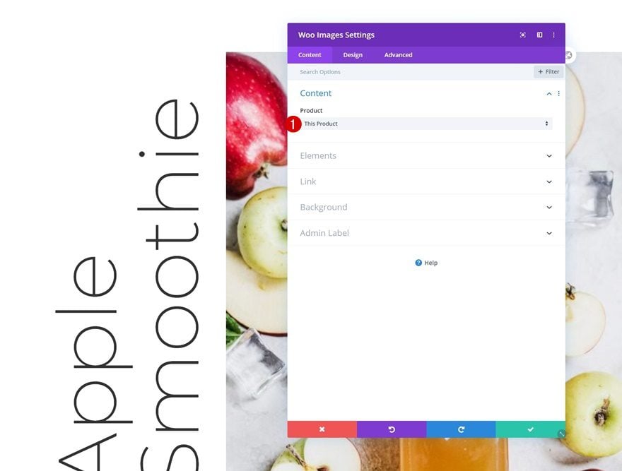
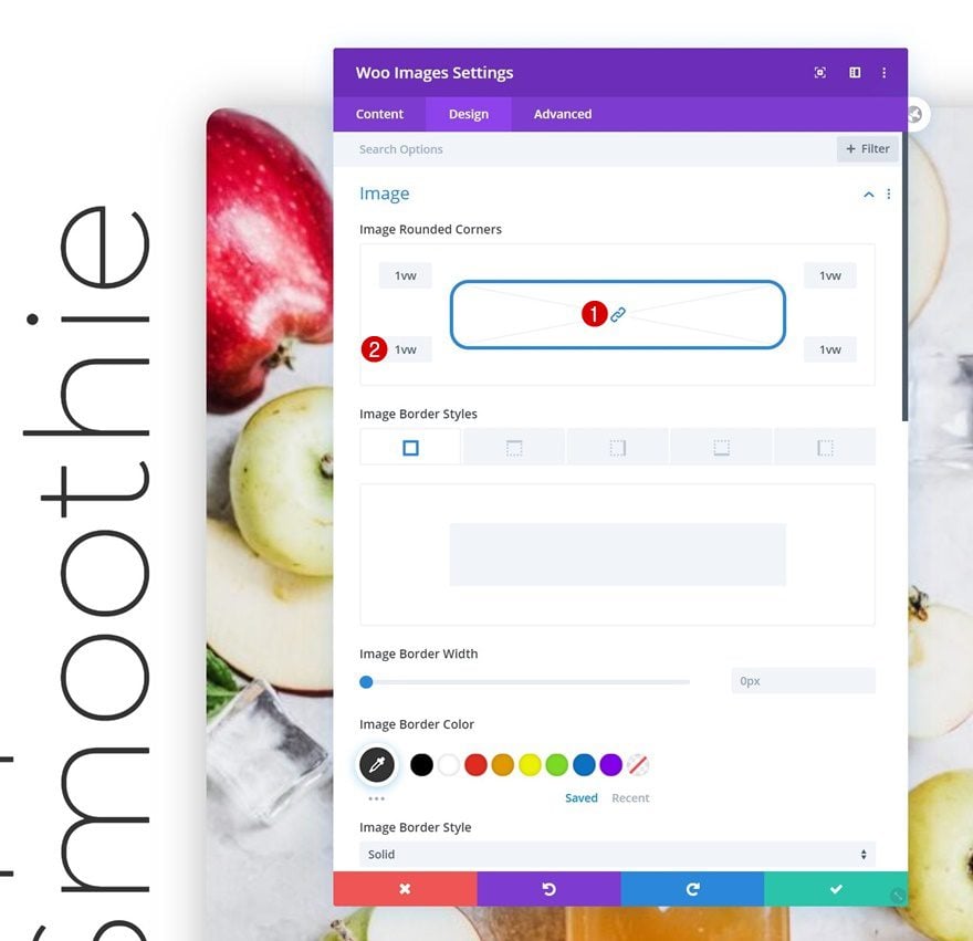
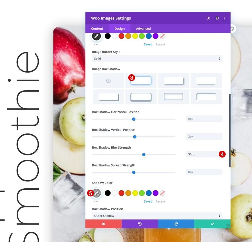
Image Settings
Move on to the module’s design tab and change the image settings as follows:
- Image Rounded Corners: 1vw (All Corners)
- Box Shadow Blur Strength: 50px
- Shadow Color: rgba(0,0,0,0.3)
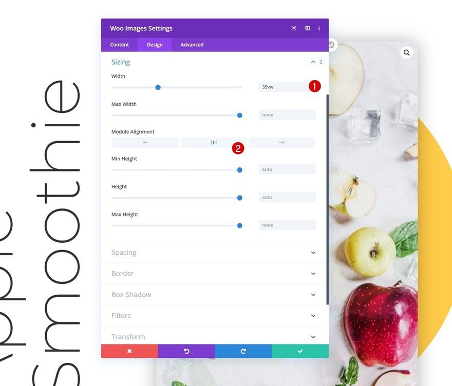
Sizing
Complete the Woo Image Module’s settings by changing the width and module alignment in the sizing settings.
- Width: 35vw
- Module Alignment: Center
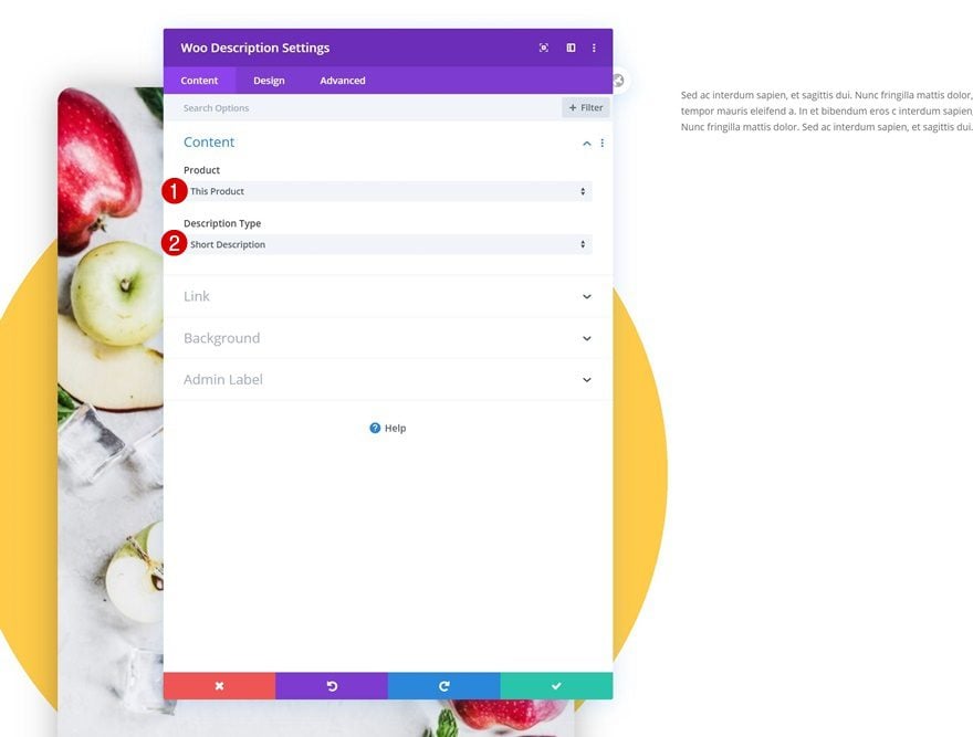
Add Woo Description Module #1 to Column 3
Dynamic Content
On to the last column! There, the first module we need is the Woo Description Module.
- Product: This Product
- Description Type: Short Description
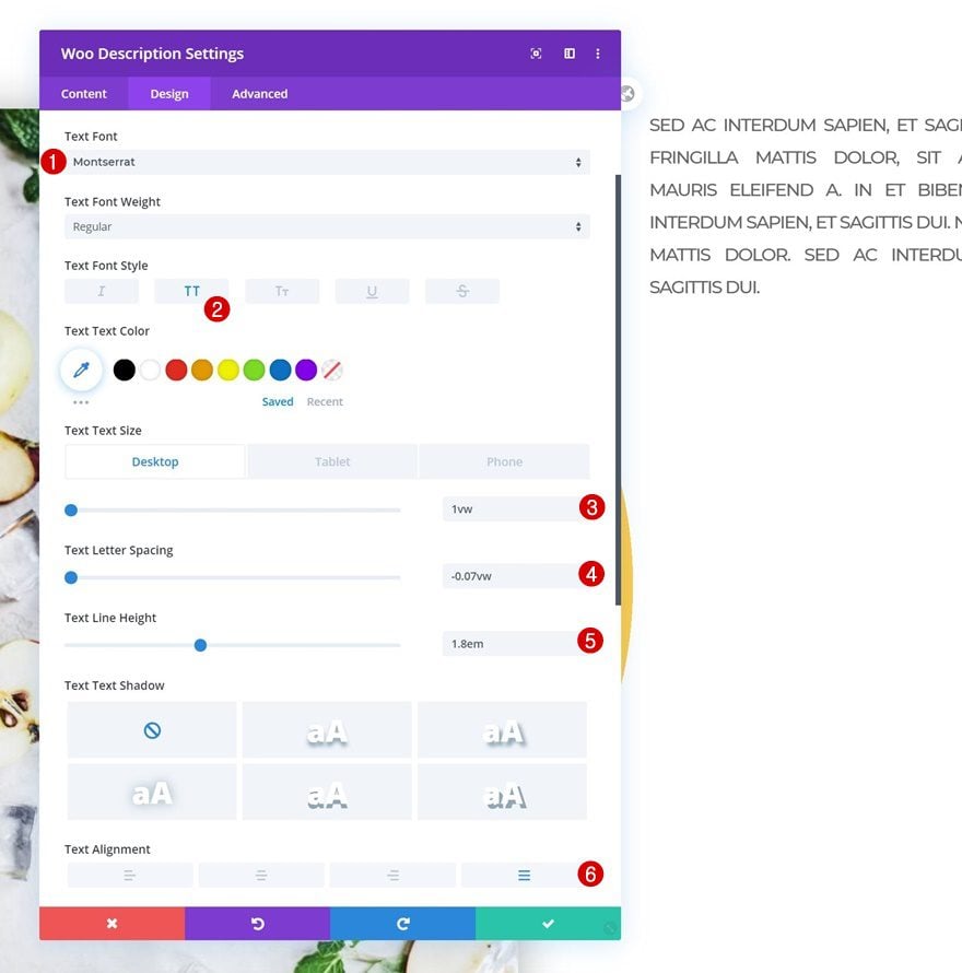
Text Settings
Move on to the module’s design tab and change the text settings as follows:
- Text Font: Montserrat
- Text Font Style: Uppercase
- Text Size: 1vw (Desktop), 2vw (Tablet), 3vw (Phone)
- Text Letter Spacing: -0.07vw
- Text Line Height: 1.8em
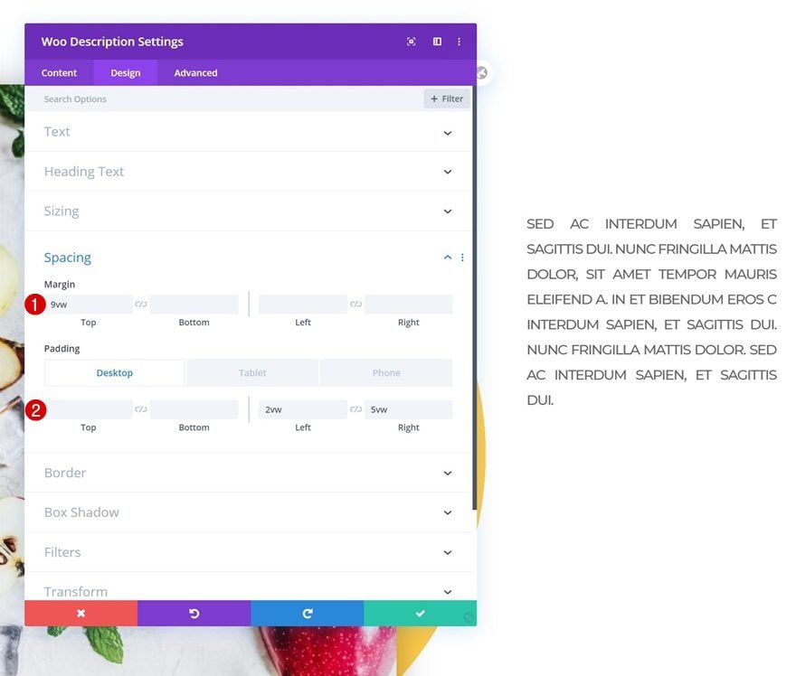
Spacing
Modify the spacing settings too.
- Top Margin: 9vw
- Left Padding: 2vw (Desktop), 5vw (Tablet & Phone)
- Right Padding: 5vw
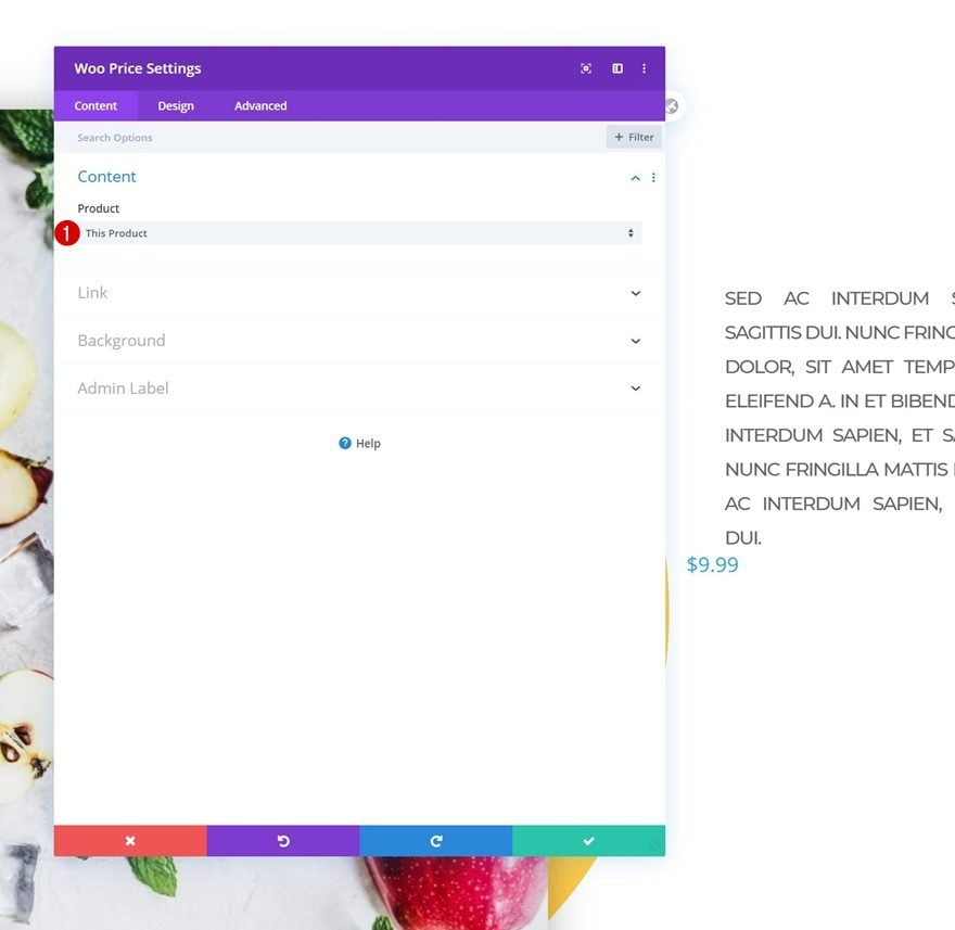
Add Woo Price Module to Column 3
Dynamic Content
On to the next module, which is the Woo Price Module.
- Product: This Product
Price Text Settings
Change the module’s price text settings as follows:
- Price Font: Montserrat
- Price Text Color: #333333
- Price Text Size: 3vw (Desktop), 7vw (Tablet), 10vw (Phone)
- Price Line Height: 1.8em
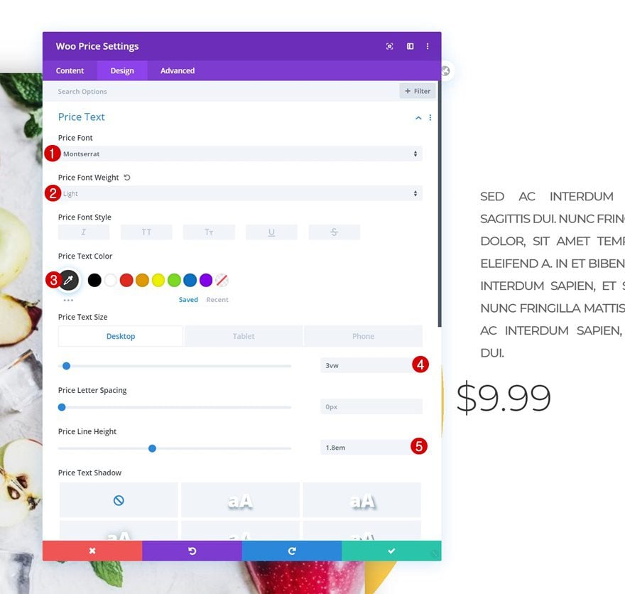
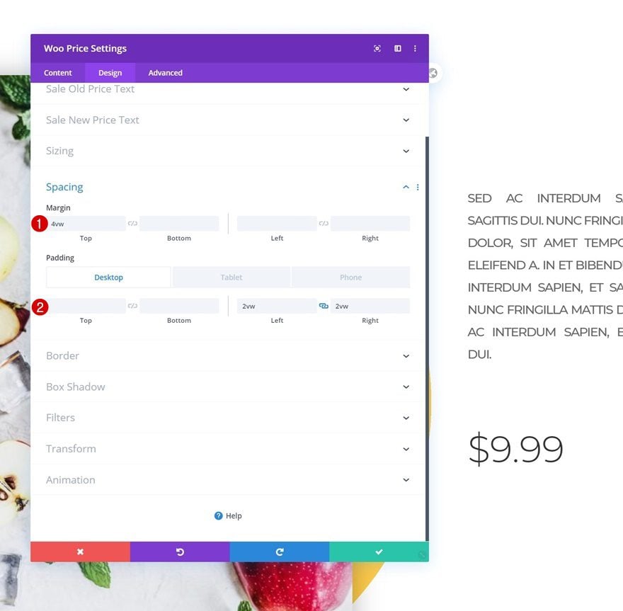
Spacing
Modify the spacing settings too.
- Top Margin: 4vw
- Left Padding: 2vw (Desktop), 5vw (Tablet & Phone)
- Right Padding: 2vw (Desktop), 5vw (Tablet & Phone)
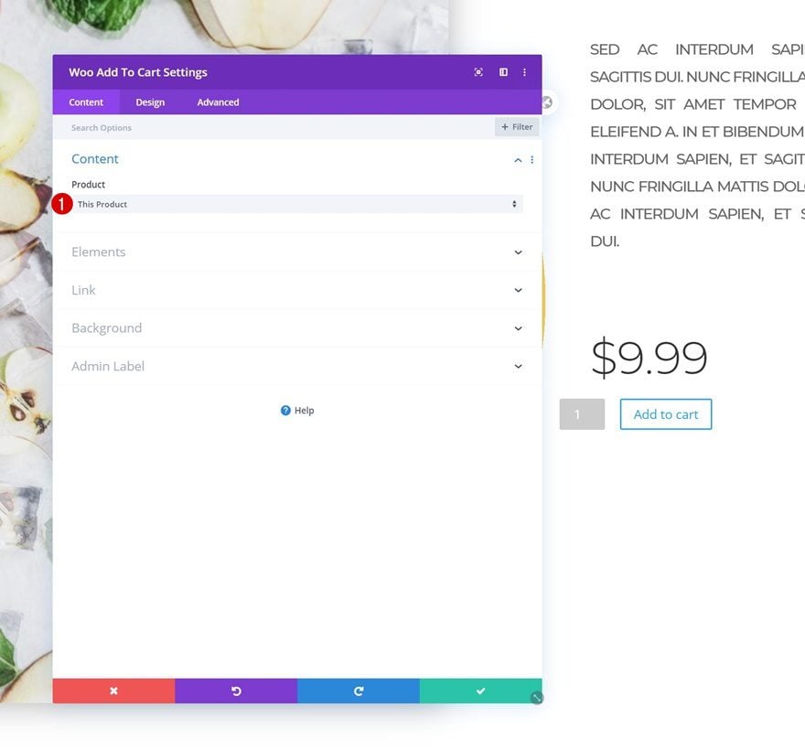
Add Woo Add To Cart Module to Column 3
Dynamic Content
The next and last module we need to complete this design is the Woo Add To Cart Module.
- Product: This Product
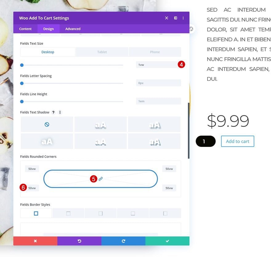
Fields Settings
Change the module’s fields settings as follows:
- Fields Background Color: #0a0900
- Fields Text Color: #ffffff
- Fields Font: Montserrat
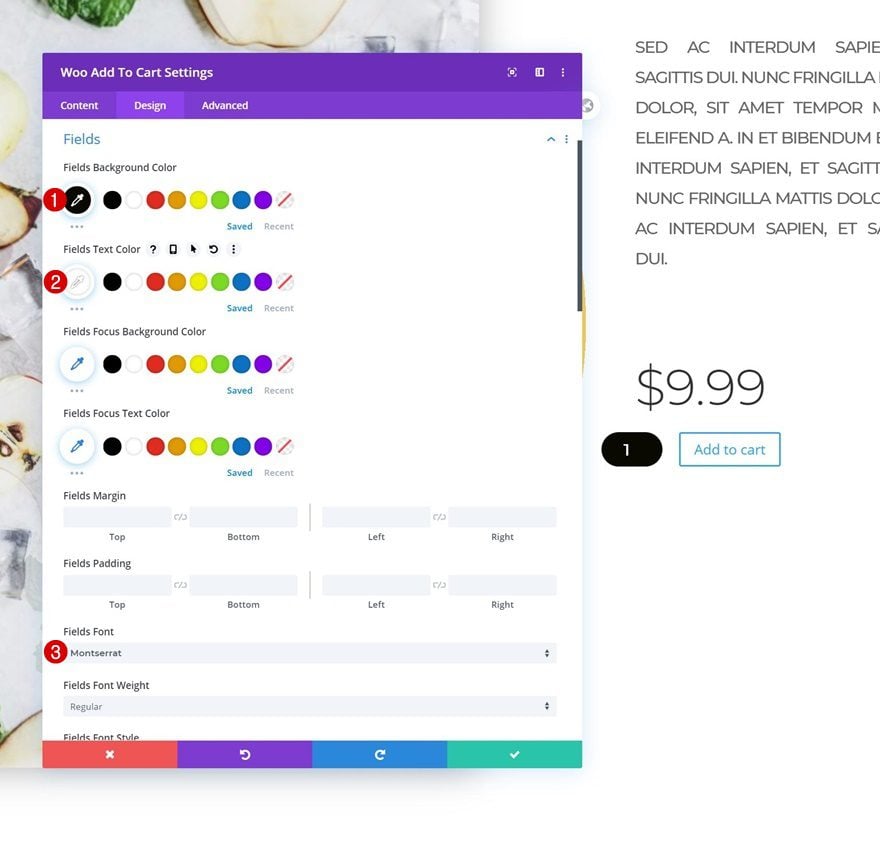
- Fields Text Size: 1vw (Desktop), 2vw (Tablet), 3vw (Phone)
- Fields Rounded Corners: 50vw (All Corners)
Button Settings
Play around with the button settings as well.
- Use Custom Styles For Button: Yes
- Button Text Size: 1vw (Desktop), 2vw (Tablet), 3vw (Phone)
- Button Text Color: #ffffff
- Button Background Color: #ffcb49
- Button Border Width: 0px
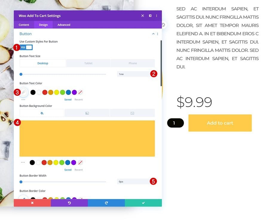
- Button Font: Montserrat
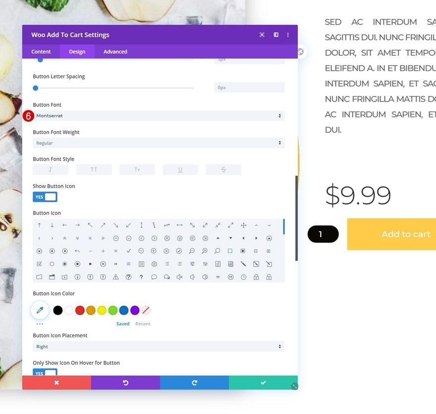
- Top Padding: 1vw (Desktop), 2vw (Tablet), 3vw (Phone)
- Bottom Padding: 1vw (Desktop), 2vw (Tablet), 3vw (Phone)
- Left Padding: 4vw (Desktop), 8vw (Tablet), 10vw (Phone)
- Right Padding: 4vw (Desktop), 8vw (Tablet), 10vw (Phone)
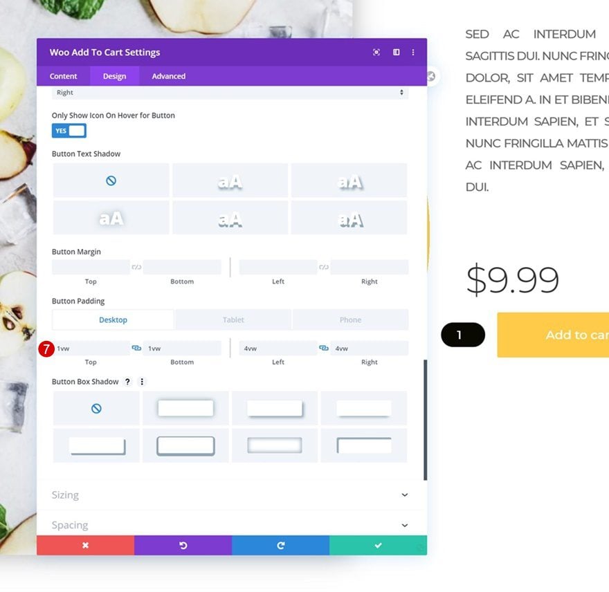
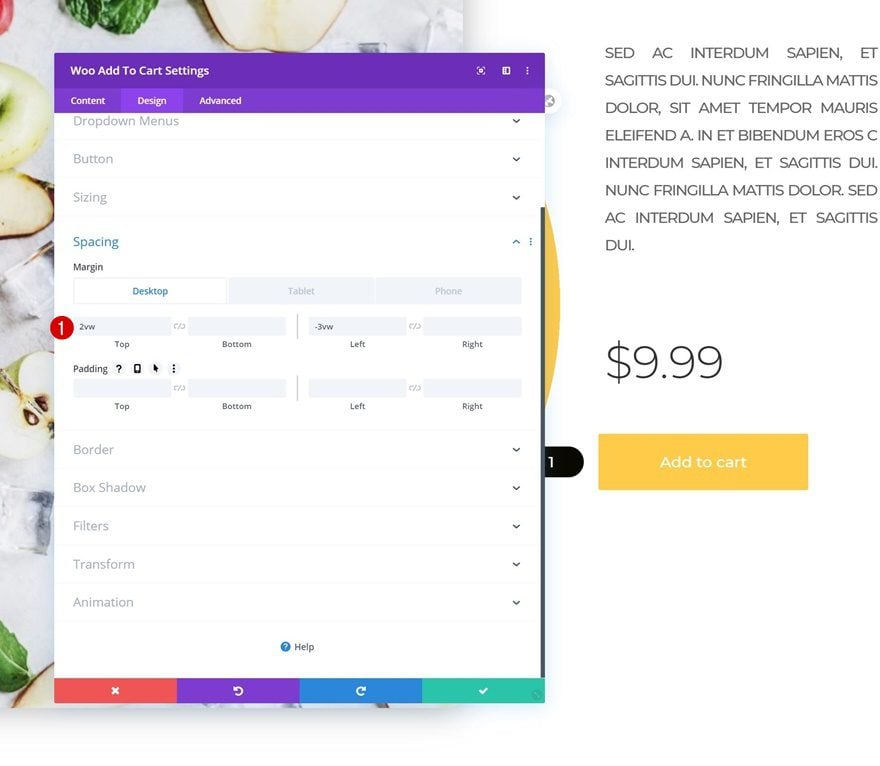
Spacing
And complete the module’s settings by adding some custom spacing values across different screen sizes.
- Top Margin: 2vw
- Left Margin: -3vw (Desktop), 5vw (Tablet & Phone)
- Right Margin: 5vw (Tablet & Phone)
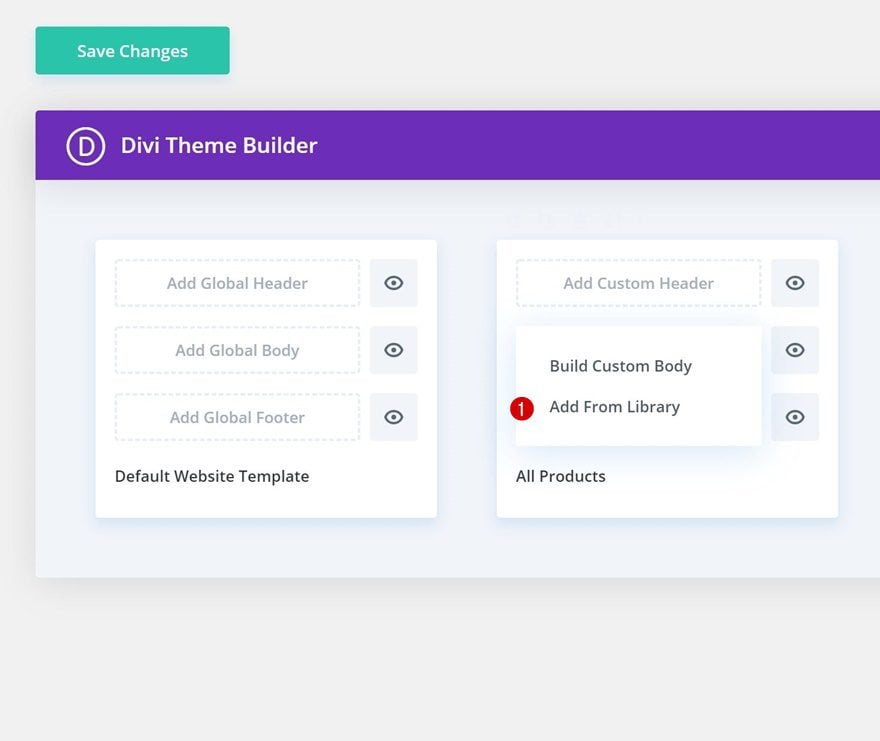
Turn Product Page Into Template
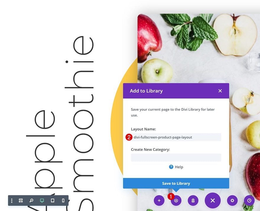
Save Page Layout to Divi Library
Once you’ve completed the fullscreen product page, you can use it for each one of your products using Divi’s Theme Builder. To do that, save the layout you’ve just created in your Divi Library.
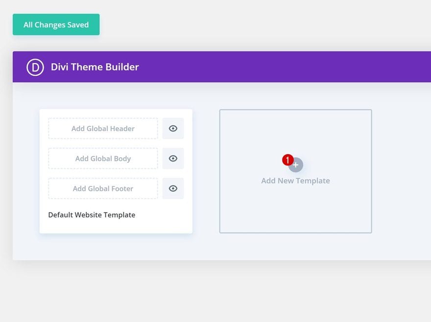
Add New Template to Theme Builder
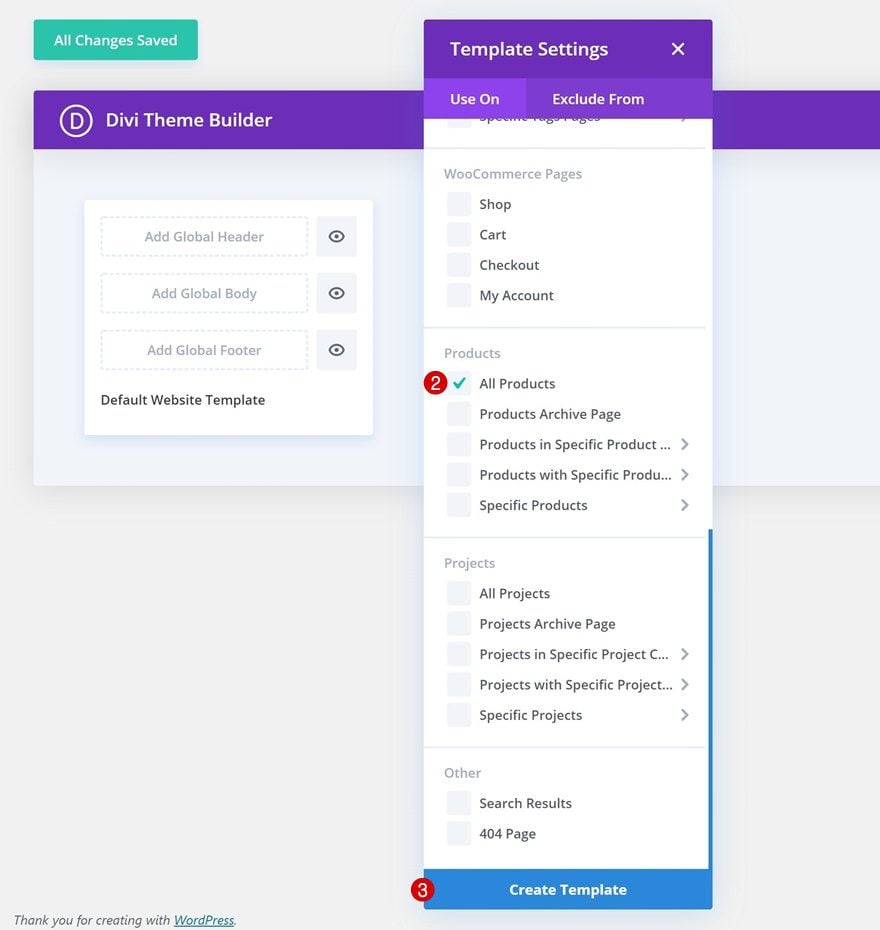
Move on to the Theme Builder in your Divi settings and add a new template.
Select the product pages you want this layout to show up on.
Upload Layout to Template’s Body
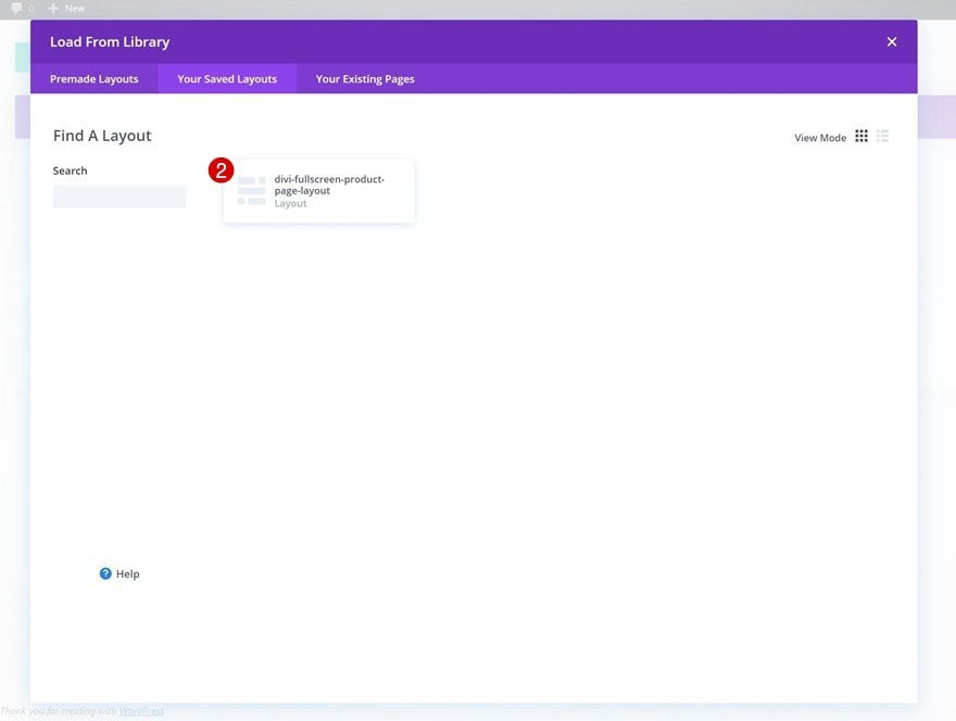
Then, click on ‘Add Global Body’ and select ‘Add From Library’.
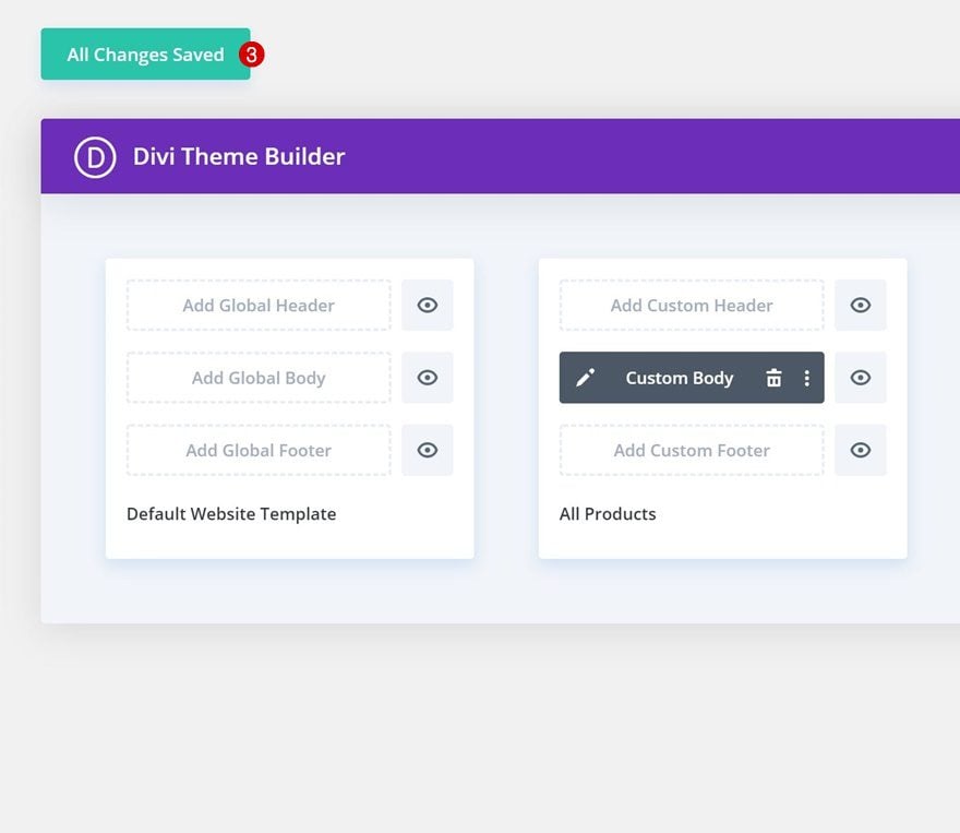
Pick your layout in the ‘Your Saved Layouts’ tab.
And save all your changes!
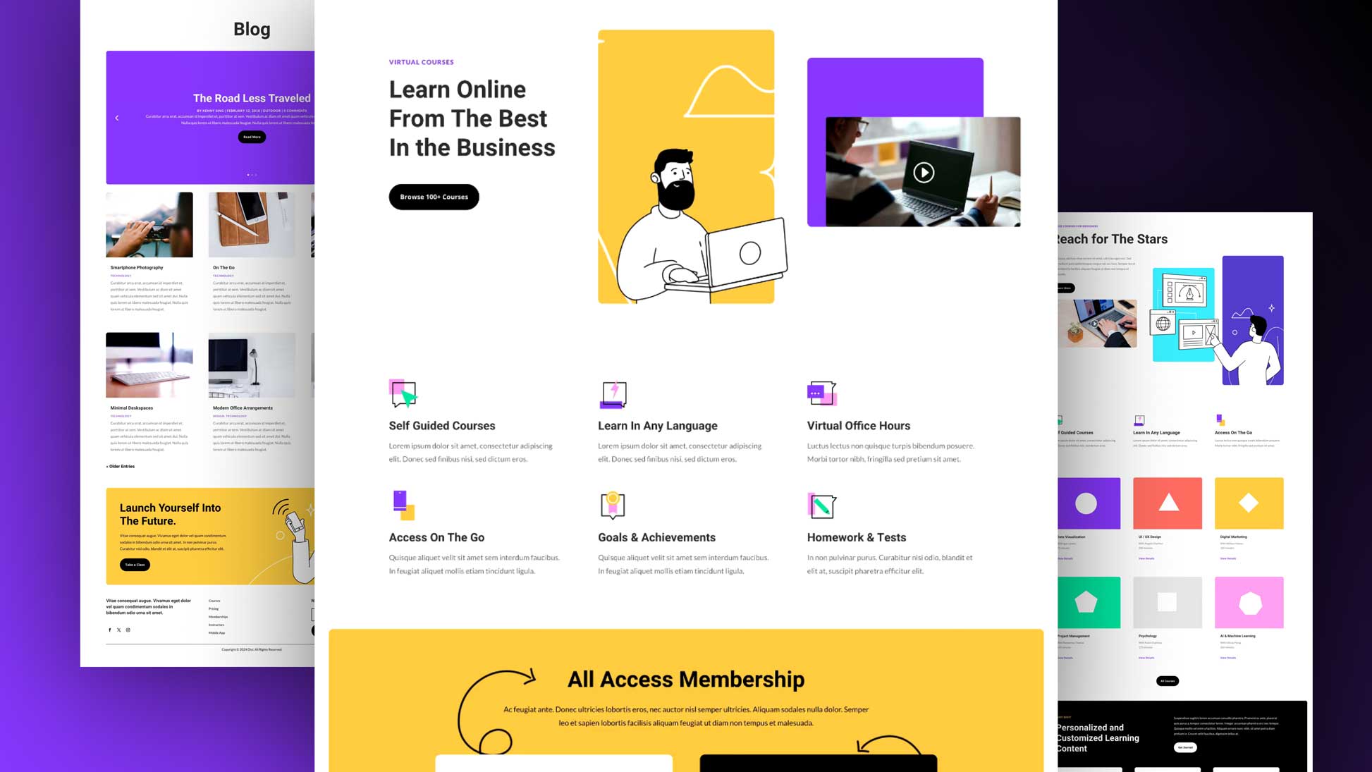
Preview
Now that we’ve gone through all the steps, let’s take a final look at the outcome across different screen sizes.
Desktop
Mobile
Final Thoughts
In this post, we’ve shown you how to recreate a beautiful fullscreen product page that you can use for any kind of eCommerce website you’re setting up. We’ve matched the settings of the various woo modules to create a stunning outcome and limit the vertical scrolling that is required. We hope this design inspires you to create your own fullscreen product pages as well! If you have any questions, feel free to leave a comment in the comment section below.
If you’re eager to learn more about Divi and get more Divi freebies, make sure you subscribe to our email newsletter and YouTube channel so you’ll always be one of the first people to know and get benefits from this free content.


I can’t adjust the image width for the woocommerce product image. Any fix?
Nice article and good explanation!
But what to do when you need more than a price and color button, I sell printed ribbons and I need more buttons, a font button, one for length, and one for width, and how do I get it added to my web store?I cant find a way to make this, can you help me?
Awesome! Going to give this a try with my next landing page.
Happy to hear you’ve enjoyed the tutorial, Chase! 🙂
where is the live preview? Cant imagine ti well without it.
+1
+2. I see most of the tutorials lack a preview.
Brilliant, great post 🙂
Nice to hear, Gary, thanks! 🙂
Nice article and good explanation
Happy you like it! 🙂