

Next Image Effect Pro is a third-party plugin for Divi that adds lots of image hover effects that help draw attention to your images and links. The plugin adds 7 modules to the Divi Builder, each with its own set of designs and effects. In this article, we’ll look at Next Image Effect Pro and see what it can do.
Next Image Effect Pro Installation
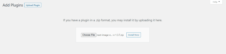
Purchase and download the plugin from the Divi Marketplace. Follow these steps to install it:
- In the WordPress dashboard, go to Plugins > Add New
- Upload the plugin from your computer
- Click Install Now
- Once the plugin is installed, click Activate
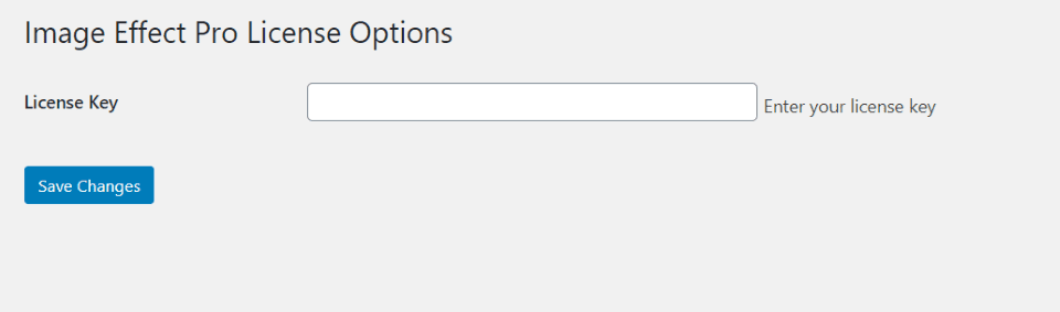
Next, you’ll need to activate the license. Go to Plugins > Image Effect Pro License. Enter your license key and save the changes.
Next Image Effect Pro Modules
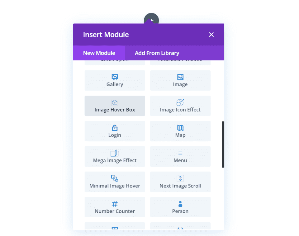
Image Effect Pro adds a set of modules to the Divi Builder that include styled combinations of images and text. They add hundreds of hover effects and direction combinations. Text styling options include independent controls for headings, focus text, content, and their backgrounds.
Modules include:
- Circular Image Hover
- Image Hover Box
- Image Icon Effect
- Mega Image Effect
- Minimal Image Hover
- Next Image Scroll
- Ultimate Image Hover
Circular Image Hover
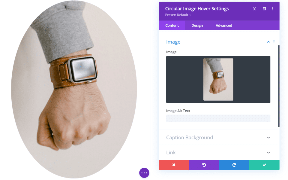
Circular Image Hover has two main sections: the image and the text (hover content). I’ve added a rectangular image. It displays the image in its original shape but then makes it circular. If the image was square, this would be a perfect circle.
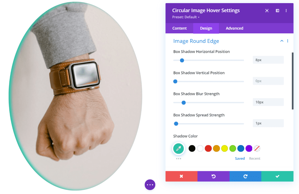
The design settings for the image include box shadow position, strength, and color.
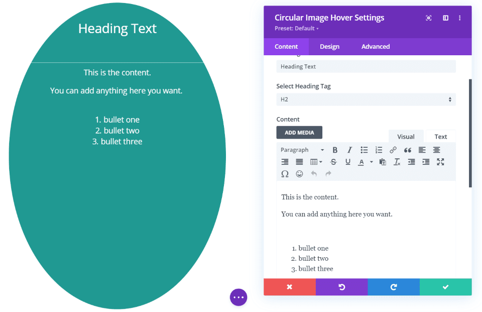
The text includes a section to add the title and content. You can style them in the design settings. I’ve increased the sizes in this example.
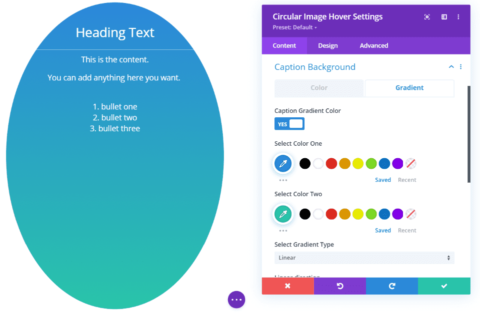
The caption background can be either a solid color or a gradient. This one uses the default gradient.
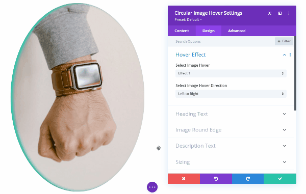
It has 19 hover effects with 4 direction options for each effect. This is effect 1. The effects have various ways to transition the image out and transition the content in. They include zooms, flips, slides, and lots more.
Image Hover Box
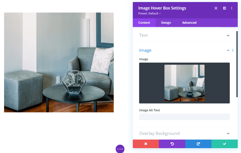
The Image Hover Box also includes the image with hover content. It doesn’t change the shape of the image.
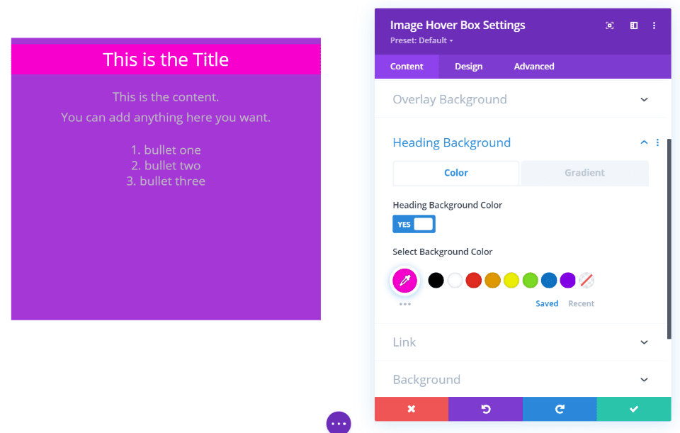
It also includes the overlay (or background that shows through and looks like an overlay) and adds a heading background. Both backgrounds can include solid colors and gradients. This example uses the default overlay background. I’ve changed the color of the heading background and increased the size of the text.
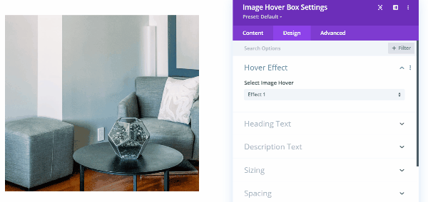
It has 13 different hover effects including flips, slides, fades, zooms, etc. Several of the effects add options for directions. This is effect 1.
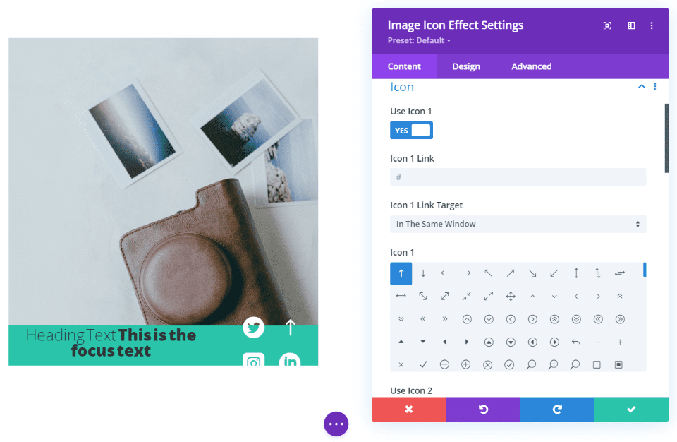
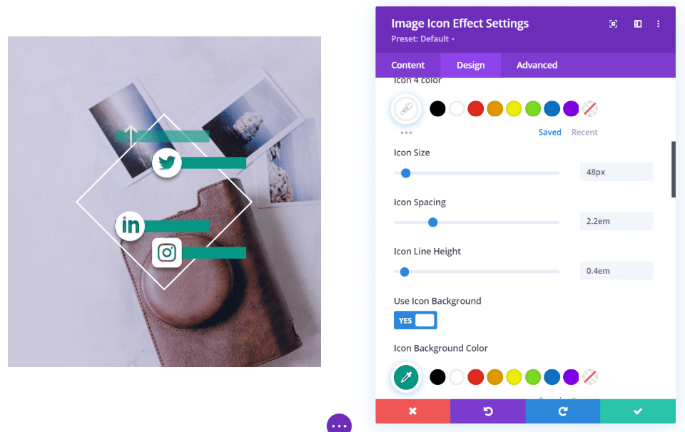
Image Icon Effect
Image Icon Effect adds a hover element that displays a title and focus text over the image. Like the others, you can change the background color with either a solid color or a gradient, and it includes multiple hover effects. The hover effects in this one bring in borders and look especially elegant. This is the Zoe hover effect.
What sets this one apart is the icons. You can add 4 different icons and have them open in the same window or a new window.
The icon settings include color, size, spacing, line height, background color, shadow, border, etc. In this example, I’ve added a background color and reduced the line height to create a line. I’ve also added a shadow. This is hover effect Hera.
This is hover effect Terry. I’ve changed the colors of the title and focus text and used the settings for the font sizes and icons from the previous example.
Mega Image Effect
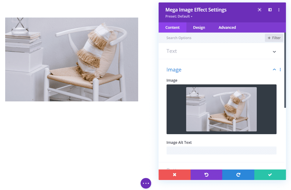
Mega Image Effect is another 2-sided card with an image on one side and content on the other. The front side displays an image as normal.
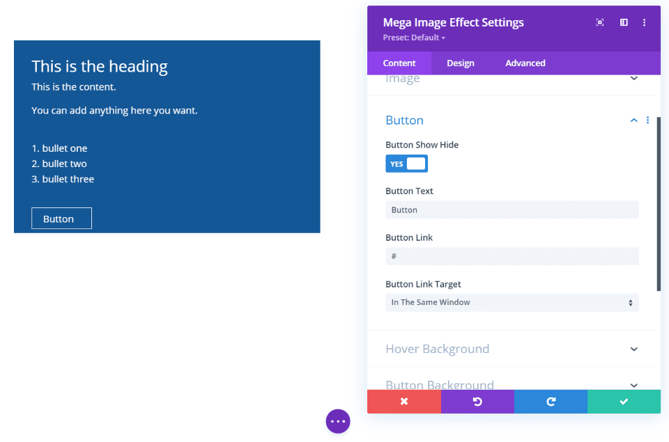
The backside of the card displays the content as normal and includes font and background adjustments. What sets it apart is the ability to add a button.
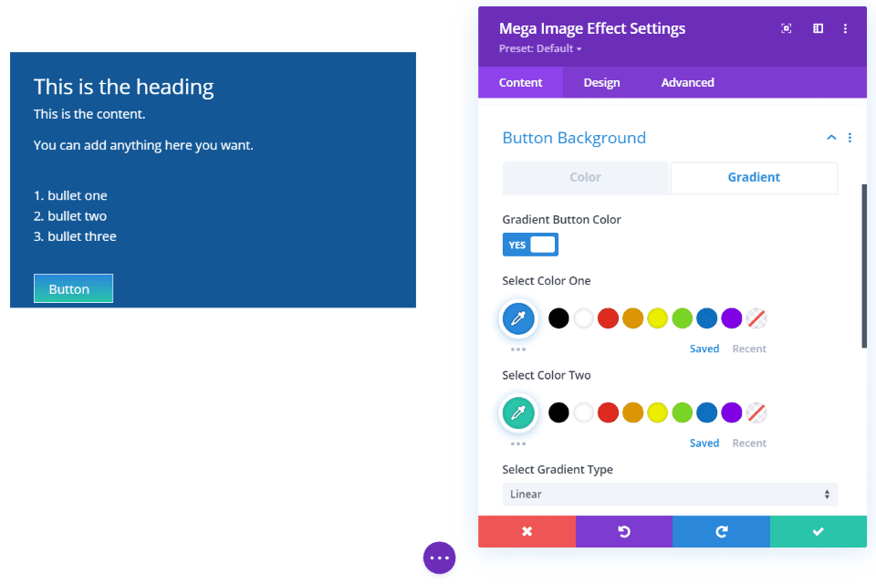
You have complete control over the button design including the same solid color and gradient options as the standard background. This example shows a gradient for the button’s background.
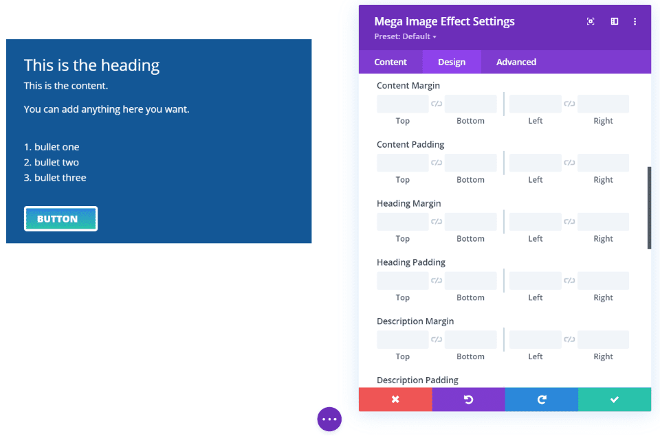
You have full control over the button’s styling for the fonts and background. I’ve adjustment the font and border in this example. Every element of the module also has spacing adjustments. I’ve added 20 pixels to the bottom of the button. Each of the modules has these spacing adjustments.
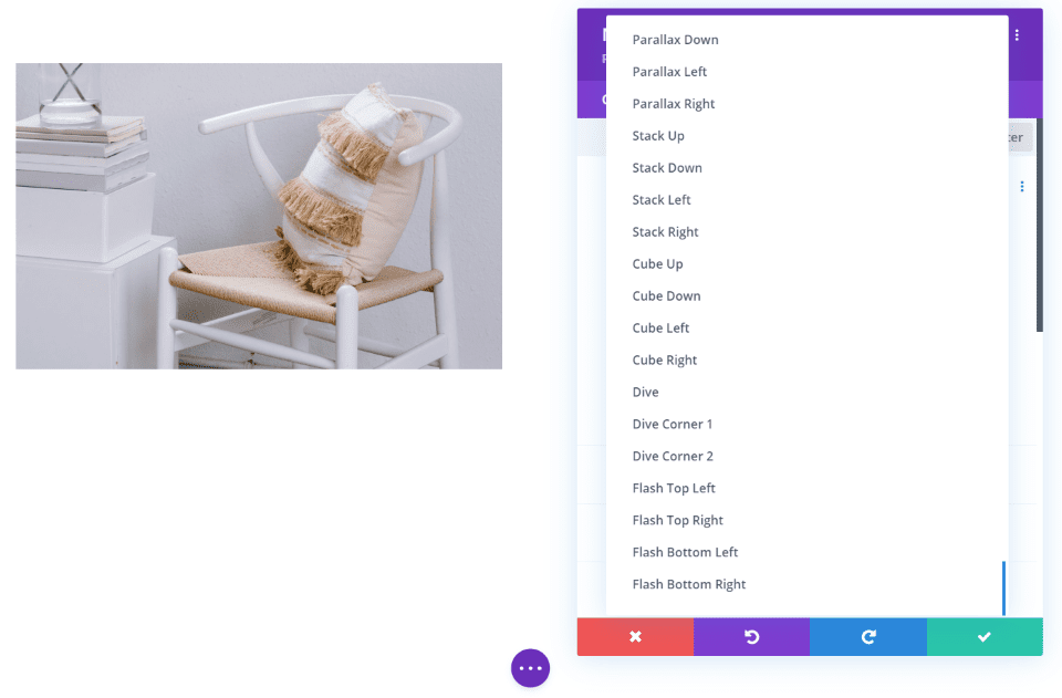
This module has too many hover effects to count. Just the image effects alone are impressive, but it also has lots of text effects. You can adjust the image hover and text hover separately and set the timing for the text effect.
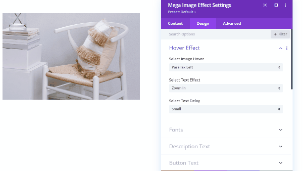
This example the Parallel Left image hover, the Zoom In text effect, and a small text delay.
Minimal Image Hover
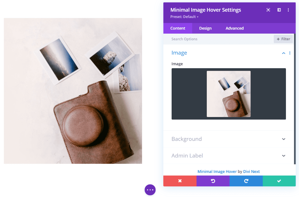
Minimal Image Effect is the simplest module in the set. It displays an image with hover effects.
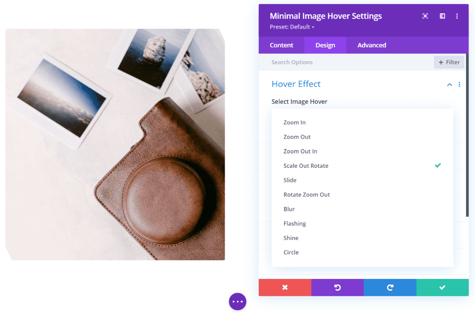
The only custom setting is the hover effects. It includes 10 effects to choose from. We’ll look at a few.
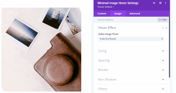
This example is Scale Out Rotate. The image is scaled out and rotated just a little in its normal state. On hover, the image zooms in and rotates to its normal state.
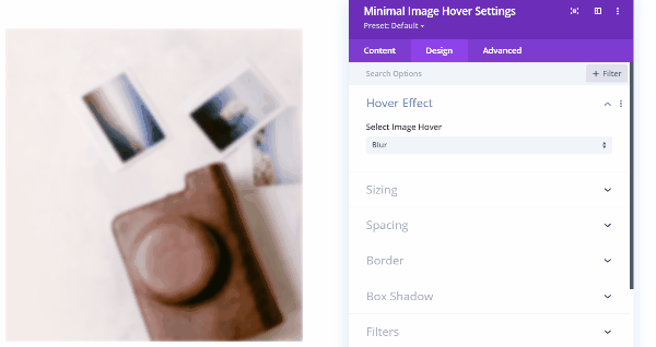
This is Blur. The image is blurred until you hover, then it slowly un-blurs until it’s sharp.
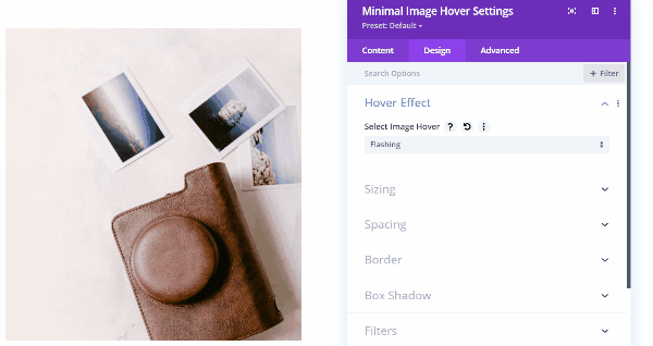
This is Flashing. A burst of white flashes over the image and then clears away as you hover.
Next Image Scroll

Next Image Scroll places an overlay over the image and adds a button to the upper right corner. You can adjust the button’s color for both solid colors and gradients. This example shows the default settings.
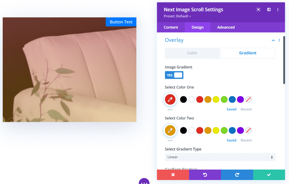
You can also adjust the overlay. Set a solid color or a gradient. It also includes gradient types and standard controls.
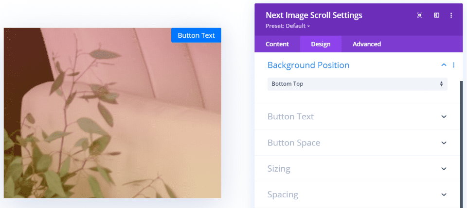
The background position lets you display the top or the bottom of the image.
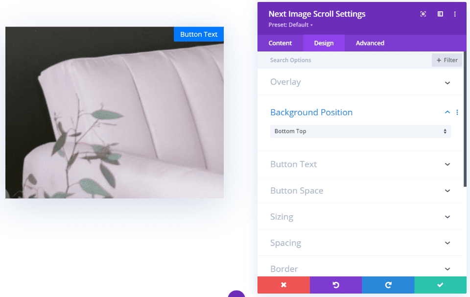
The image moves to the top or bottom on hover. In this example, the module shows the bottom of the image and scrolls to the top of the image on hover.
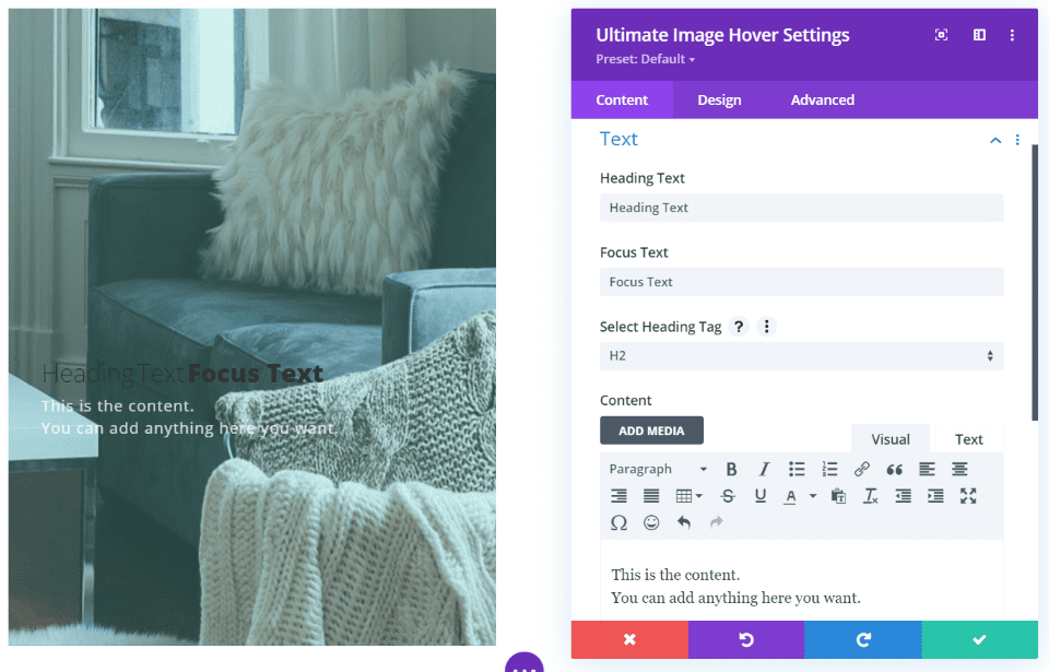
Ultimate Image Hover
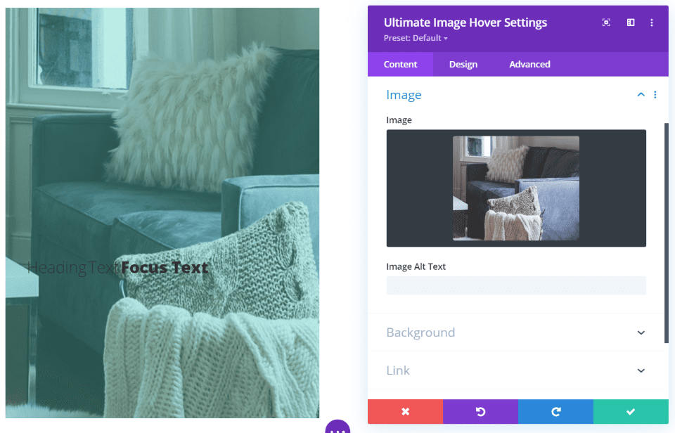
Ultimate Image Hover displays the size and shape based on the effect you choose. This is Effect 1. It shows a portion of the photo in a tall rectangular image. It includes the title and focus text, content, and an overlay. The overlay includes adjustments for the color as a solid or a gradient.
On hover, the overlay lightens and the text is revealed.
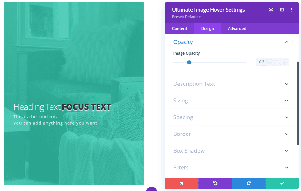
Image opacity lets you adjust the amount of the background that can be seen. In this example, I’ve reduced the opacity, changed the size of the heading and focus text, the heading text color, the focus text boldness, made the focus text all-caps, and added a text shadow to the focus text.
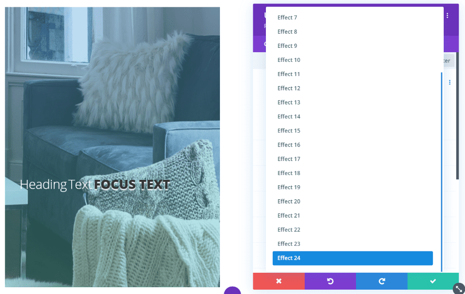
This module has 24 hover effects. They display the image in different sizes, levels of opacity, placement of text, and add borders.
This is Effect 4. It displays the image in a square and adds a border around the inside that overlaps on the ends.
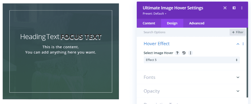
This is Effect 5. It darkens the overlay and adds a border around the inside of the image and displays the image in a square.
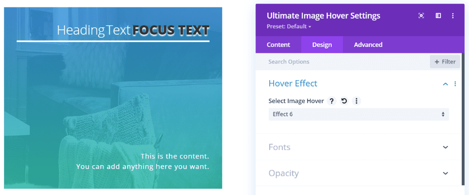
Effect 6 places the heading and focus text at the top with a line under them, and the content at the bottom.
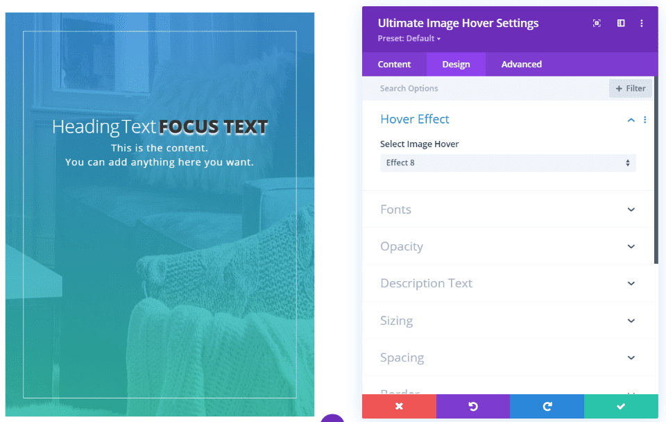
Effect 8 keeps the large rectangular size and adds a thin border.
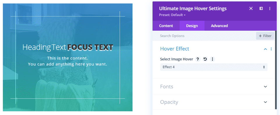
This is Effect 10. On hover, the image zooms, the line becomes an x, and the gradient appears.
Next Image Effect Pro Example
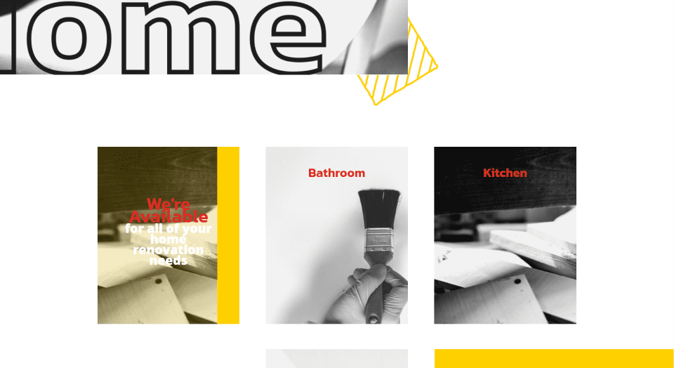
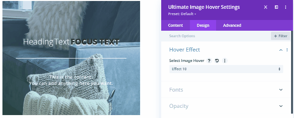
For a simple example, here’s a look at the Divi Home Renovation layout with the Ultimate Image Hover module added to create a CTA. I’ve added it to the left of the image and used colors from the layout.
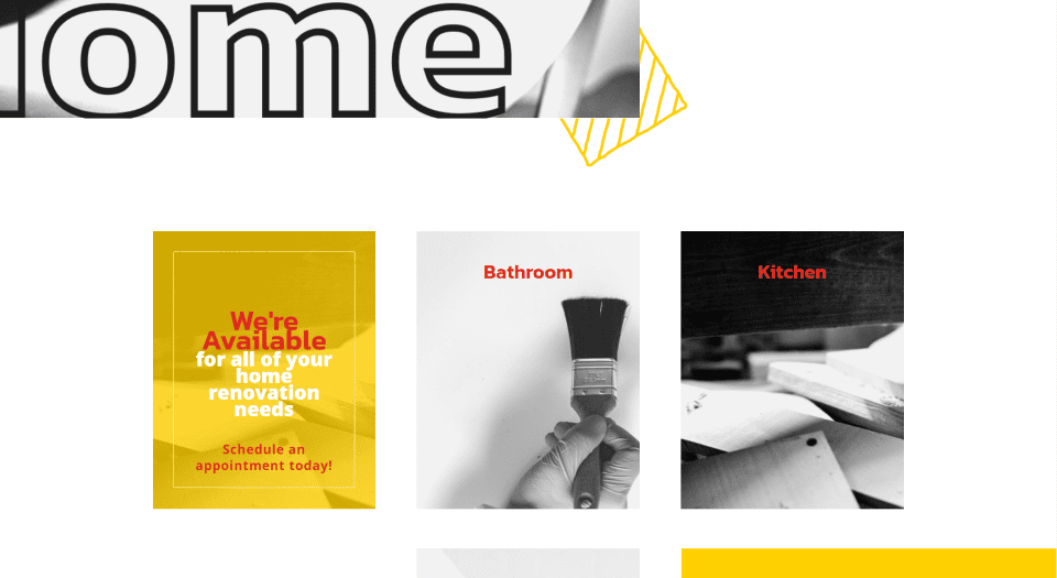
On hover, the image slides to the right, the CTA is revealed, the image becomes less opaque (which lets more of the background color through) and a border is added. This example uses hover effect 8.
Purchase Next Image Effect Pro
Next Image Effect Pro is available in the Divi Marketplace for $49. It includes unlimited website usage, a 30-day money-back guarantee, and 1 year of support and updates.
Ending Thoughts
That’s our look at Next Image Effect Pro for Divi. The 7 modules add a lot of image features that make your site stand out. Using them is intuitive. The number of effects and combinations between all of the modules is impressive. Each module is unique, but most add images, headings, and content to provide a lot of design possibilities for CTAs, team members, testimonials, general information, contact information, and lots more.
We want to hear from you. Have you tried Next Image Effect Pro? Let us know what you think about it in the comments.
Featured Image via elenabsl / shutterstock.com


Great , it’s a much needed function.