

It’s that time again for our monthly Divi Showcase, where we take a look at ten amazing Divi websites made by our community members. Each month we showcase the best Divi websites that were submitted from our community and today we want to share with you the top ten websites for the month of November. Throughout the post, I’ll point out some of my favorite design features that draw me to each of the websites.
I hope you like them!
Divi Design Showcase: New Submissions from November 2020
1. Progress
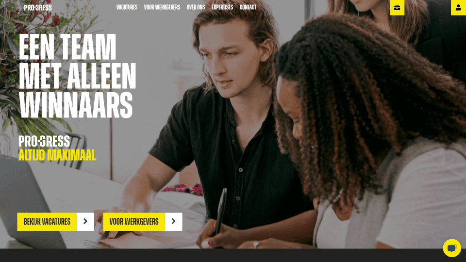
This site was submitted by Azer Gunes. It uses lots of black backgrounds with large white text and bright yellow highlights throughout. The navigation menu starts with a transparent background and displays the logo, links, and a couple of CTAs with a yellow background. After scrolling, the header changes to a black background, the CTAs now have titles, and the menu links are moved to a hamburger menu that appears on the left side. The buttons throughout the website swap colors on hover. Jobs are shown as a custom post type and include a square image with a clickable link in the corner. Team members are shown in a slider that’s placed over a background pattern on one side. The footer displays information over a yellow background and places social media links within a block pattern. I love the use of yellow and black on this website.
2. The Dungeon of Neheulbeuk
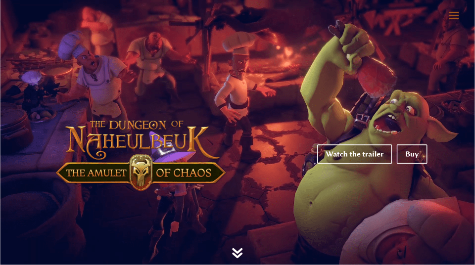
This site was submitted by Thibault Jullian. If you’re an RPG gamer, this site will draw you in immediately. A background video creates the appearance of an animated slider by sliding from one scene to another and showing the scene in slow motion. The foreground displays the styled title and CTA buttons. Studio logos are placed over a drawing of stone blocks above a door where a cartoon character is entering the room. As you scroll to that section, blurry text slides from the sides and comes into focus when they reach their location. Information about the game is shown within blurbs using custom icons and styled text with gold highlights. A video is embedded over a background that works as a game poster. Screenshots are shown within a masonry gallery. This site makes excellent use of graphics and gold text over black backgrounds.
3. Trafoos
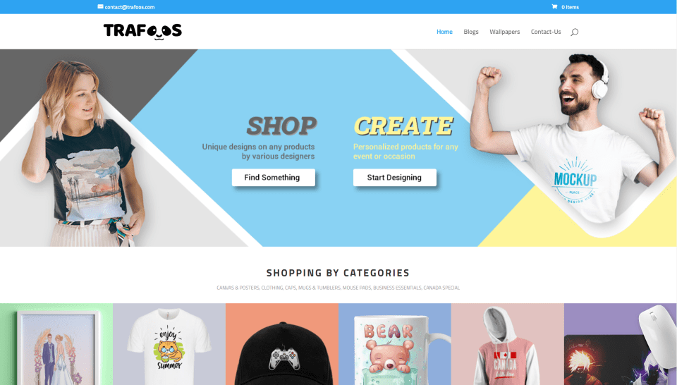
This site was submitted by samant jaitli. This website is an online store that finds an interesting way to use color. The hero section displays images on the right and left and buttons in the center over a background with soft yellow and blue colors from the site. The background colors of the product’s images also use these colors and several others. Some of the product images have a shadow that makes the product stand out from the background. A countdown timer shows a logo. Other products include a border to one side with the image placed over a colored background to the other side that creates a color-overlap using the blue and yellow from the hero section. A section of new arrivals adds box shadows to the products. The footer is also interesting. It splits the screen with a large column of blue and a smaller column of yellow. Each of the columns provides different information. Cartoon drawings of pandas appear throughout the site, including the logo.
4. Nancomcy
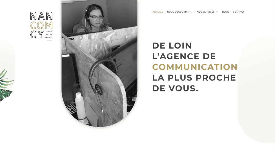
This site was submitted by Marc HENRY. This site uses lots of graphical elements with shapes with rounded edges that show background images. The hero section shows several of these vertically with the most prominent one displaying a background video. Others display color or images. Another section shows several horizontally. These are much thinner, take almost the full width of the screen, and are placed in an alternating layout. They include background images with extra-large text as a title and smaller text under the graphical element as a description. A section of number counters is similar to these and includes a blue/black background gradient with gold text. Testimonials are placed over a background image with the text in the overlay. I also like the section that shows the graphical element in the center and blurbs on both sides. The center graphic is placed over a graphic of leaves to make it stand out.
5. Foster & Associates
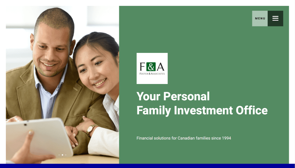
This site was submitted by Flavio Mester. This one makes interesting use of color blocks, starting with the menu. The header is a set of two blocks that sit in the upper right corner and remain in place. The left block includes the title over a white translucent background. The extra-large hamburger menu sits in the right block with a black translucent background. Each section slides into place as you scroll down the site. The sections are separated from the hero section with a blue stripe. A color block sits to the far left of the section and includes alternating shades of tan and dark gray. The sections themselves alternate between white and light gray. A testimonial takes the full width of the screen and places text over a background image with a dark overlay. The Publications page includes embedded podcasts.
6. Design Up
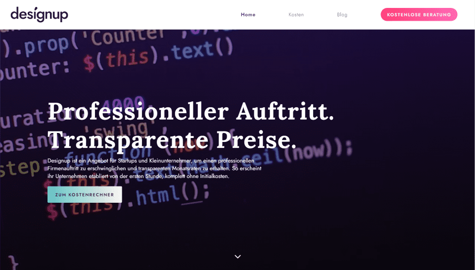
This site was submitted by Tobija from Designup. This one makes excellent use of purple and related colors for branding. The hero section displays a video behind a purple overlay with a description and CTA in the foreground. The header includes links with lots of space between them and a CTA in bold red gradient. Several sections include a purple background, background patterns, or both. The section for success stories shows images of work on computer screens with purple buttons to see the work. Another section uses blurbs with purple icons. A section fits between these two with a green gradient background that stands out. The background patterns from the previous and next sections overlap this one. The Cost page has a unique calculator with a red section that sticks to the bottom of the page until you reach that section while scrolling. The branded colors work well to tie this design together.
7. Always Keep Progressing
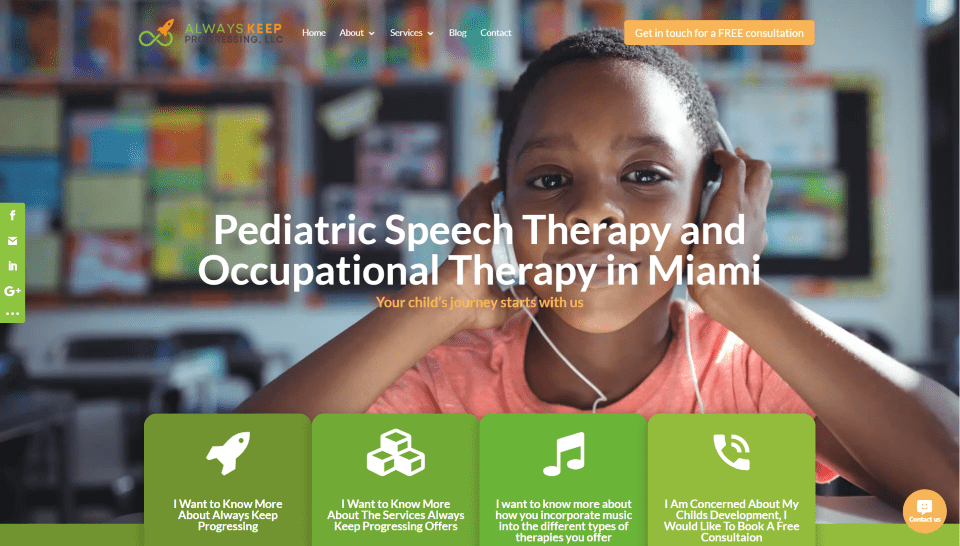
This site was submitted by Ragz Thompson. This site makes elegant use of green and orange for the branded colors, starting in the logo and CTA in the header. The hero section displays four blurbs that overlap the full-screen image. They include rounded corners, large icons, different shades of green backgrounds, inward box shadows, and change to orange on hover. The inward shadows give the blurbs an overlapping effect, making them appear to overlap each other. Green is used a lot for titles, blurbs, and icons. Orange is used a lot for background colors of buttons. Most of the buttons include box shadows to stand out. The floating social media buttons are also in green and change to orange on hover. Wavy section dividers make the sections stand apart from each other with style while the background colors keep the division subtle.
8. florianboetler.com
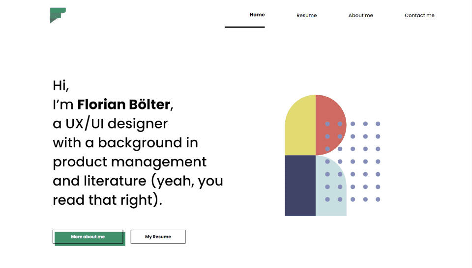
This site was submitted by Florian Bölter. This is an excellent example of a resume website. It makes interesting use of color for highlights throughout the website while giving all of the web elements plenty of room. Large text to one side of the hero section introduces the site owner and includes styled buttons with an offset background behind one. A styled graphic on the other side includes colors that repeat throughout the site. I like the sections of projects. It displays a case study with an image on one side and a title, description, keywords, a styled button, and a graphic on the other. The projects are placed in an alternating layout and each one has a different graphic using bold colors. A contact section displays large social icons that tilt on hover. The case studies make great use of photography.
9. Aspire Attestation

This site was submitted by Dijimoe. This one uses lots of dark blue for backgrounds and light green for highlights. The colors work perfectly together to give the site an interesting design. The hero section displays a background image with a blue and green gradient to blend the colors together. It also uses a down arrow section divider that blends into the next section, which shows popular countries as large blurbs with an image and blue overlays. The foreground shows the name and button in light green and information in white. Hovering changes the overlay to green and adds an inside border in green and a line in white. The image zooms on hover (if you want to create a similar effect on your website, try one of these image zoom plugins). I also like the map that displays light green over a dark blue background. It includes that shows location names on hover. The left side displays rotating text with location names. Blurbs use green letters as a background element to speel the word FAST.
10. Devise
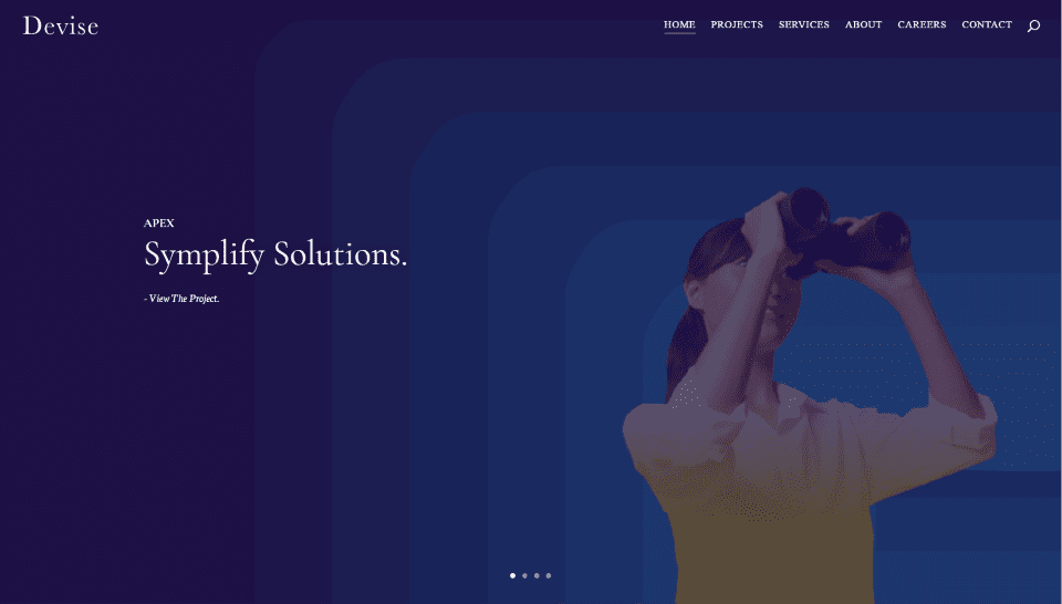
This site was submitted by Narathip from Devise. It uses shades of black and white to create a sophisticated design. The hero section has a full-screen slider with each slide showing a background image and a different colored overlay. Text on one side shows the title and description. The images for the slides display in parallax. Each of the site’s sections includes an underlined title on the left and an even larger font for a description in the center. The backgrounds are either off-white, black, or dark gray. The section about their approach shows example images with descriptions. The section about their work shows projects as large images and a link to see more. The client’s logos are shown in white over a dark gray background. The pages for the projects are even more elegant and include large detailed photos over styled backgrounds. Job openings are shown within blurbs. I love the photography and colors on this site.
In Closing
That’s our 10 best community Divi website submissions for the month of November. These sites look amazing and as always we want to thank everyone for your submissions!
If you’d like your own design considered please feel free to email our editor at nathan at elegant themes dot com. Be sure to make the subject of the email “DIVI SITE SUBMISSION”.
We’d also like to hear from you in the comments! Tell us what you like about these websites and if there is anything they’ve done you want us to teach on the blog.
Featured Image via Jemastock / shutterstock.com


These are some awesome designs 🙂
currently, I am on hosting. I was looking for other hosting service. Is there any Offer from Bluehost.