

It’s that time again for our monthly Divi Showcase, where we take a look at eight awesome Divi websites made by our community members. Each month we showcase the best Divi websites that were submitted from our community and today we want to share with you the top ten websites for the month of May. Throughout the post, I’ll point out some of my favorite design features that draw me to each of the websites.
I hope you like them!
Divi Design Showcase: New Submissions from May 2020
1. Svadobná agentúra Terezy Kližanovej
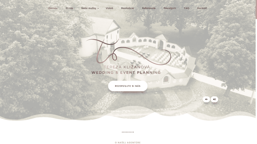
This site was submitted by Ľubomír Mičúch. This site plays a full-screen background video and includes an audio player with music that matches the video. The audio is off by default and can be turned on easily. The foreground also displays the logo, tagline, and CTA in the center with a styled section separator that leads to the About section. This section includes a few rows with text and a blurb in two columns in an alternating layout. The blurb is styled with an overlapping button. Testimonials show images with a link to read more. A video gallery shows clips from weddings. FAQs are placed within styled toggles. I love the custom footer with a background image and styled social buttons. The site also includes a styled sliding bar and back-to-top button. Its elegance matches its topic perfectly.
2. Techint Labs
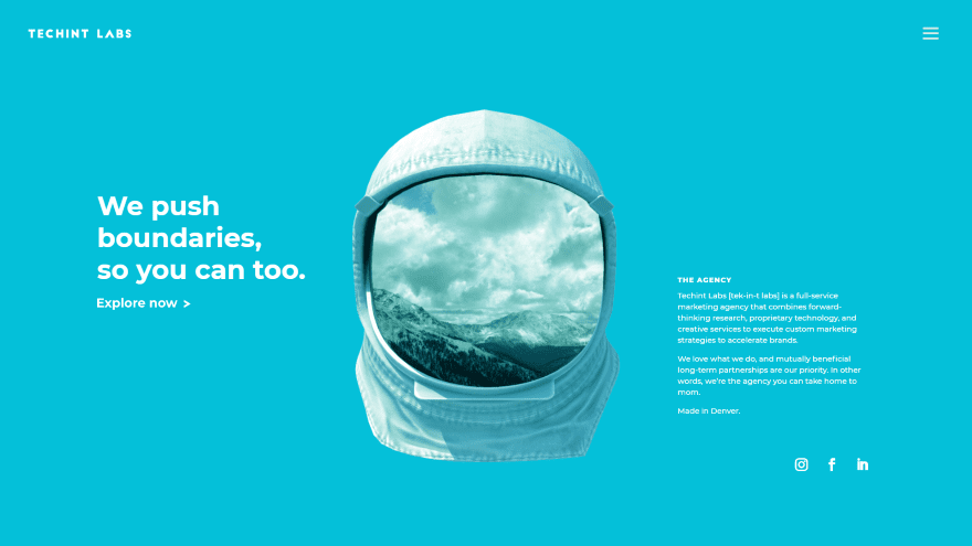
This site was submitted by Ben Schroeder. Your mouse cursor is changed to a red + as you hover anywhere on the screen. The home page is full-screen with a blue background with a space helmet sitting in the center. The face of the helmet plays a video of clouds moving over the mountains. It includes a large white text with a CTA on the left and information about the company with social buttons on the right. The header displays the logo and a hamburger menu. The menu is especially interesting. It displays a white background on about half of the screen. Links are single words in extra-large black fonts. They’re numbered with even larger gray fonts that turn blue on hover. Several of the pages follow the same color scheme or have an animated black stary background.
3. Focal Point Marketing
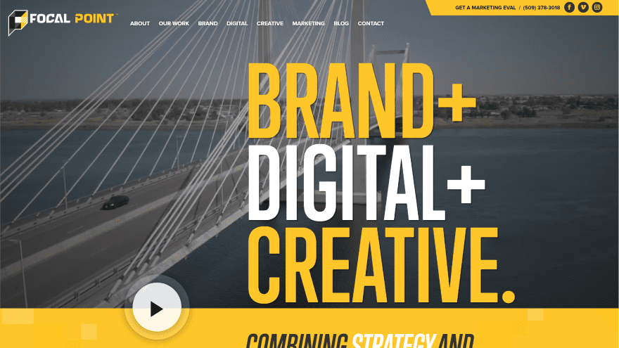
This site was submitted by Derek Nelson. This site uses lots of large bold text in yellow, white, and black throughout the site. The hero section includes a full-screen background video while the foreground displays a large tagline. The secondary menu includes a styled background and the next section uses the bold yellow for the background. It includes a pattern in true parallax with a large CTA and a video button that overlaps this and the hero section. I love the next section which displays a graphic of the space shuttle that launches upward on scroll. This section also includes a CTA and a cloud section separator. A similar section displays the Erath rotating on hover. Others include animated examples of work, projects shown at an angle, extra-large icons, and a styled blog using the branded colors.
4. Breathe Festival
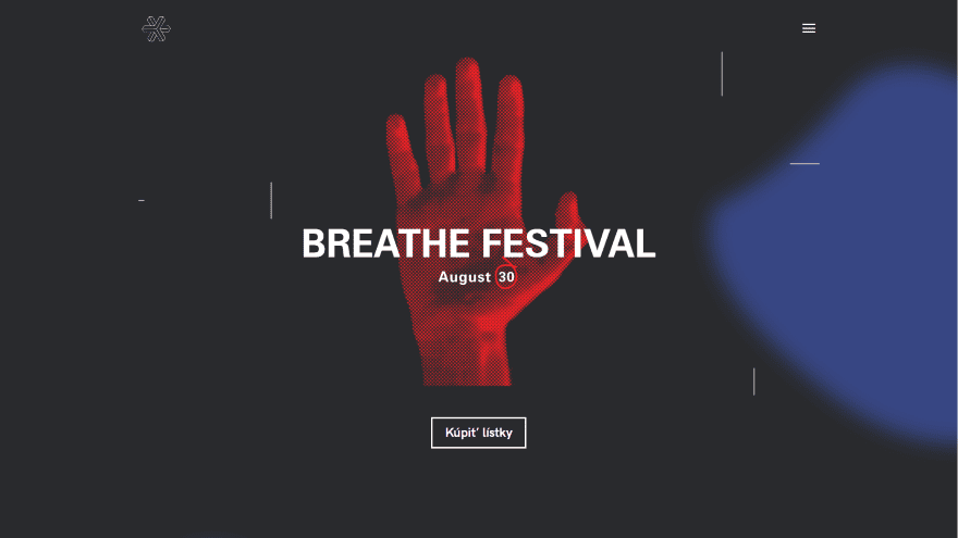
This site was submitted by Radko Sedlák. It uses a dark color scheme with red and blue highlights. The hero section displays a black background with a blue shape to one side. A red hand is placed in the center with a CTA over it. Small lines in true parallax provide some visual patterns throughout the site. The next section displays another CTA with text to one side and an image on the other. The text includes the blue shaped background while the image is red. Its black background starts to turn blue as a section of styled images links to Facebook posts. It also includes a purchase CTA, a styled newsletter form with an image in parallax, and white logos of partners. The menu displays a hamburger icon which opens the menu in full-screen.
5. Mind Only
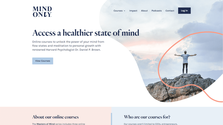
This site was submitted by Chetan Gupta. This site uses soft colors throughout to help inform about the topic and appeal to the ideal audience. The hero section displays a white background with a CTA on one side and an image on the other side with a styled shape. A section with information about the courses displays in two columns with each column in a different background color. Another section of information displays graphics with the same cutout shapes. A section with courses displays a course as a card with a box shadow on one side, information and a button on the other side, and the title in an extra-large font at the bottom. Each of the courses has different colors in an alternating layout. Blurbs provide information with styled icons. Information about the instructor includes CTAs and a styled image. A full-width sign-up form includes the branded colors for the elements and graphics.
6. Tried & True
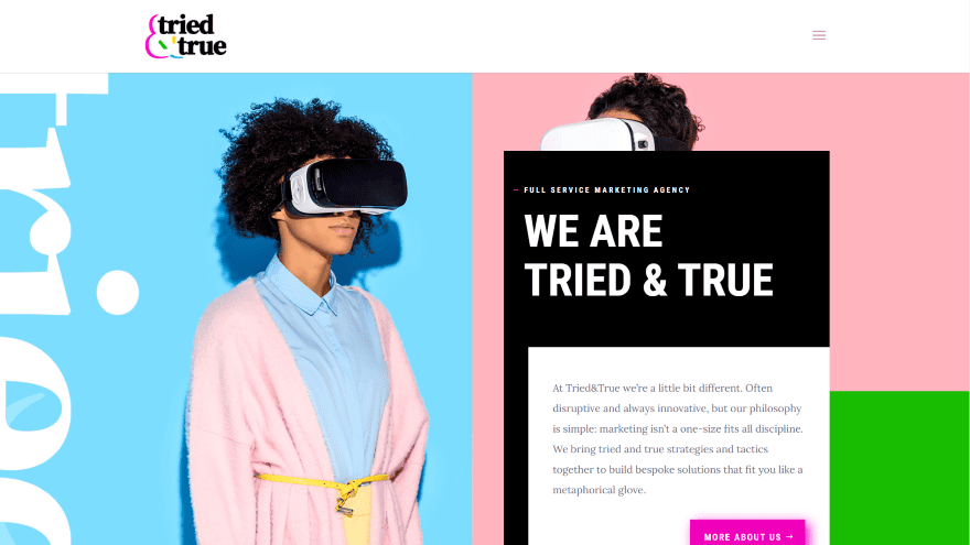
This site was submitted by Mick Tilley. It uses lots of bright colors throughout the site. The hero section displays two columns. On the left is an image with a blue background. The right shows an image with a pink background and has a CTA over the image with a green background that ties into the next section, which is a CTA to start a project. Information about the company includes a vertical title and images that overlap. An email opt-in with a blue background leads to the next section, which shows services within blurbs with graphics using the branded colors. A portfolio section shows the latest projects as large screenshots. A client’s section displays logos with a testimonial over a background image. The blog and contact sections include the branded colors in the images, text, and backgrounds.
7. Artillery Media
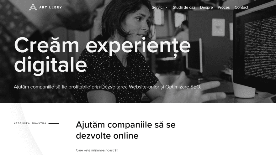
This site was submitted by Siscanu Mihail. It uses large text with lots of black and white that are offset by yellow sections. The hero section displays a full-width image with a large title and tagline. Each of the other sections is labeled with a description and a divider. A mission statement is displayed over a light gray pattern followed by information over a black background. Services are shown within cards that include images that zoom on hover and large yellow buttons to see the service in detail. Client logos are presented in black and gray over a yellow background. Following this are sections with a contact form, the work process, and a blog – each with alternating backgrounds of gray and black. The blog cards tie the black and yellow together with black buttons that change to yellow on hover.
8. From Scratch
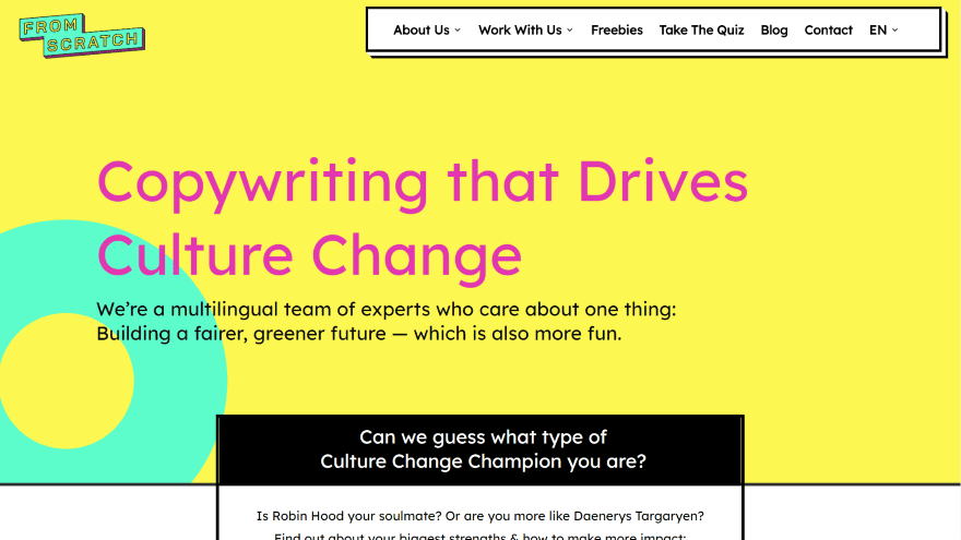
This site was submitted by Philipp Stakenborg. It has lots of bright yellow, green, magenta as branded colors throughout the site. The header displays a yellow background and the links are placed within a white box, while the logo and links overlap the header. The hero section uses the same yellow for the background and has a green circle to one side. In the foreground is a large title and tagline. Text with a black background sits at the top and a white background at the bottom overlaps the hero and next section. A CTA is created with a section of text that uses a yellow background behind large text on one side and a white background on the other. A similar design creates a testimonial with a larger quote at the top. Blurbs with box shadows in the branded colors show the services. The contact form ties it all together with the three main colors. Even the popup newsletter form follows this design.
In Closing
That’s our eight best community Divi website submissions for the month of May. These sites look amazing and as always we want to thank everyone for your submissions!
If you’d like your own design considered please feel free to email our editor at nathan at elegant themes dot com. Be sure to make the subject of the email “DIVI SITE SUBMISSION”.
We’d also like to hear from you in the comments! Tell us what you like about these websites and if there is anything they’ve done you want us to teach on the blog.
Featured Image via PODIS / shutterstock.com


The design showcase is one of my favourite regular posts on ET, but it used to have a lot more detail about what the author liked about each site. Now it’s just an explanation of what the site looks like, which we can see for ourselves by clicking on them. Can we go back to a more detailed explanation of what makes the site different and unique? I find it more useful, as a website designer, to know that a site made it on this list because of the way a gradient was used consistently through various aspects of the site, or because of the interesting use of a font, things I may not pay attention to otherwise.
Great job to all submissions!
Design aesthetics are clearly important but so is performance, page speed, page size etc. as a page that takes far too long to load won’t be looked at by anyone. A lot of the sites shown in the showcases, although looking great, really don’t perform well. It is possible to have a good looking site that can get a page speed score >90% and load in under a couple of seconds using Divi but a lot of the time we see sites that really don’t perform well and can actually make people think that Divi is a bad theme/page builder to go with because you just end up with a bloated, slow website. It’d be good if this sort of thing is also looked at when picking sites to showcase so that everyone in the Divi community can see how great Divi sites can be. Just my tuppence worth.
Nice collection! #5 is my favorite.
Superb designs – great inspiration! I love the helmet animation in #2
Number 3 is probably one of the best examples of Divi i have seen for a while, great work!
Really enjoyed Focal Point Marketing site. I looked at every page! Great use of effects.
#2 has a 20Mb Gif on the index page!
Awful example to have in a showcase….?
Come on, ET. Do the right thing. Please take #7 down. They stole our logo. Blatant IP theft.
What is it about #7 that merits its place in this showcase, it’s nothing out of the ordinary…?
#7 Artillery stoke our logo. Just FYI. I’ll contact them.
Lolol stole not stoke.
I apologize. I will remove from my website.
Mihai,
I noticed the logo is still on your site. Please remove. Thank you!
Thanks Mihai! Cheers 🎉
My vote is for #2.
Great design.
Wow!
Thak you amigos de Divi. Saludos desde La Paz, Baja California Sur, México.
Sus páginas web son vusualmente poderosas y atractivas.
I´ll try my english….
The work done its amazing. Very compelling and allucinating scroll sffect to impress anyone.
I have a question for the experts, please:
I analized the Focal Point Marketing on Google Page Speed Insights and the overall score was 23/100 which is extremely low.
It´s always been strong challenge to any web developer to find a balance between “Beauty” Vs Load Speed of the page.
¿What would you do to help the Focal Point Marketing website to perform better, increase page speed score while keeping the functions and the beauty intact.
I think…. this might be not possible….
Happy to read any comment about this.
Some awesome designs. Love the From Scratch and Focal Point Marketing ones. They load up fast too!