

It’s that time again for our monthly Divi Showcase, where we take a look at eight awesome Divi websites made by our community members. Each month we showcase the best Divi websites that were submitted from our community and today we want to share with you the top ten websites for the month of July. Throughout the post, I’ll point out some of my favorite design features that draw me to each of the websites.
I hope you like them!
Divi Design Showcase: New Submissions from July 2020
1. Poptin
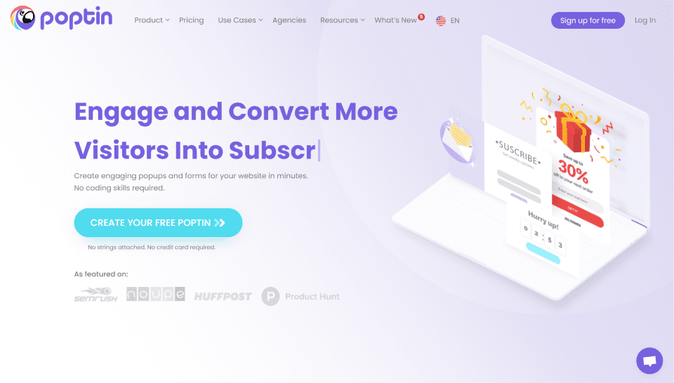
This site was submitted by Tomer Aharon. The site uses lots of purple for the text and background gradients, and similar shades of red, yellow, and blue for highlights. The menu even includes blurbs with icons in those colors. The hero section displays a typing effect for the keyword, which changes the tagline and message of the CTA. An interesting feature is a set of sections that display buttons in a vertical stack next to a mockup computer screen in an alternating layout. Clicking any of the buttons changes what’s displayed on the mockup screen. A similar section displays tabs with icons above the mockup screen. The site’s multi-lingual, allowing you to choose from 7 languages.
2. LVP Empire
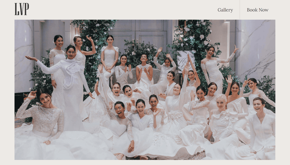
This site was submitted by Nadzim Al-Rash. It uses lots of tan for backgrounds with black text. The navigation menu is kept simple with a link to see the gallery and one to book a session. Hover effects change their background to a darker color. A fading effect fades images in or out as you scroll, including the hero image and certain galleries. The footer displays a dark green background that stands apart but complements the tan. It includes a navigation menu with a tan line at the top and hover effects. The galleries display large images in a single column to showcase the work. The page for bookings displays multiple locations with maps for each.
3. Andy Hooke
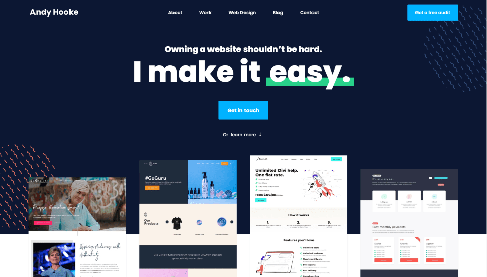
This site was submitted by Andy Hooke. It uses lots of dark blue for backgrounds and text throughout the site. The menu displays icons for submenu navigation. The hero section shows screenshots of work that overlaps the next section. It also includes several background patterns in true parallax to stand out. Several keywords within the titles are underlined. I especially like the set of sections for recent work that combines the testimonial with screenshots and a link to view the project. Each of these sections switches to a different background color as you scroll, going from dark blue to a medium blue, and then to orange. The blog and other pages also include the same background patterns as the home page. A few of the pages add them to icons.
4. South of Scruffy Podcast
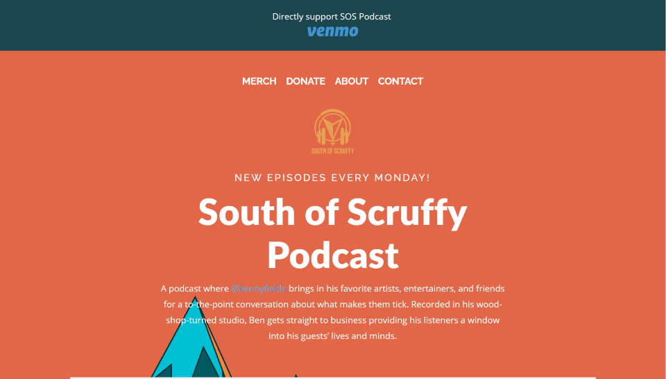
This site was submitted by Brent Collier. The site uses lots of orange and dark blue for the backgrounds and patterns. The background is a styled drawing of a mountain with bold colors. A styled audio player with the latest podcast is placed under the tagline in the hero section. Its image includes the artwork and colors from the website. Another section displays background patterns in bold colors in true parallax. Styled icons link to the various places where you can hear the podcast. I also like the contact section. It includes an orange background with the contact form to one side in a different color, but the fields overlap the two colors.
5. Palavras Cruzadas
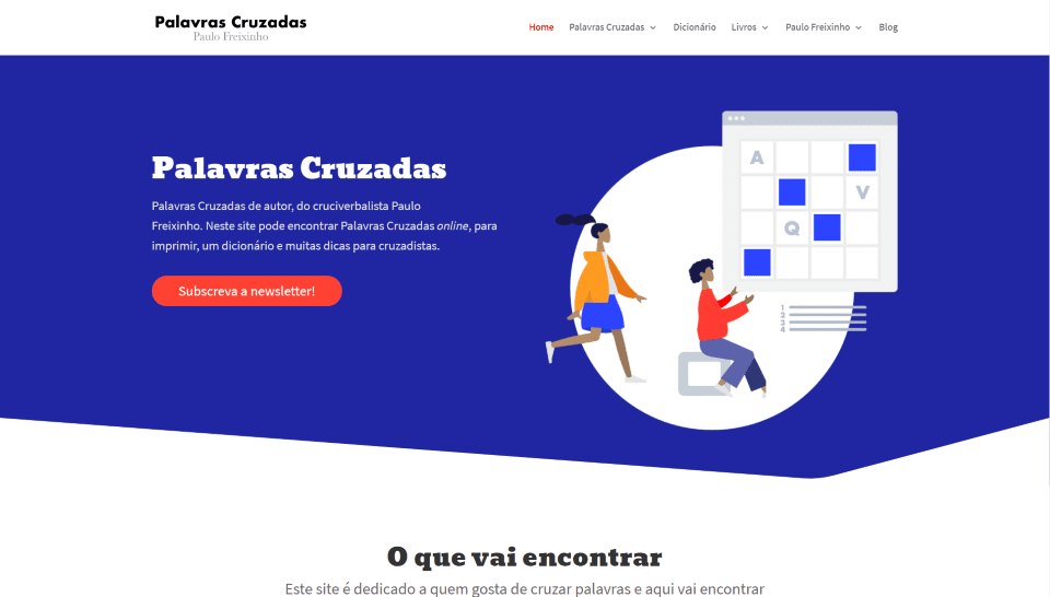
This site was submitted by Rui Edmond. The site uses a bold blue in the backgrounds, buttons, and titles. It mostly follows a 2-column design with sections alternating from blue to white. Each of the sections includes CTAs with descriptions and links to the products. Graphics accent the links to the products. Puzzles are integrated within the project post-type. Testimonials display circled images with styled backgrounds. The site includes several CTAs with alternating layouts. The clean design ensures that each one stands apart from the others.
6. Meg Lonergan
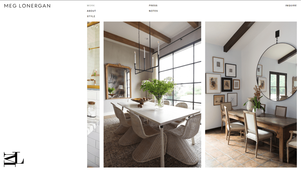
This site was submitted by Kurt Maddern. The layout is simple, with just a menu, logo, copyright notification, and a slider. The focus is on the slider, but it uses white-space to draw attention to it. The slider takes two-thirds of the right side of the screen. The left one-third is clear, with the site’s title at the top and the logo at the bottom. The navigation menu sits above the slider and displays the links in two columns over the left side of the slider. An inquiry link sits above the right side of the slider. As you scroll, the stacked columns of the menu become a normal menu with all of the links in a horizontal row, The slider displays images of varying widths to showcase the work. The Notes page displays blog posts with large images and navigation links that are added to the left.
7. Recova
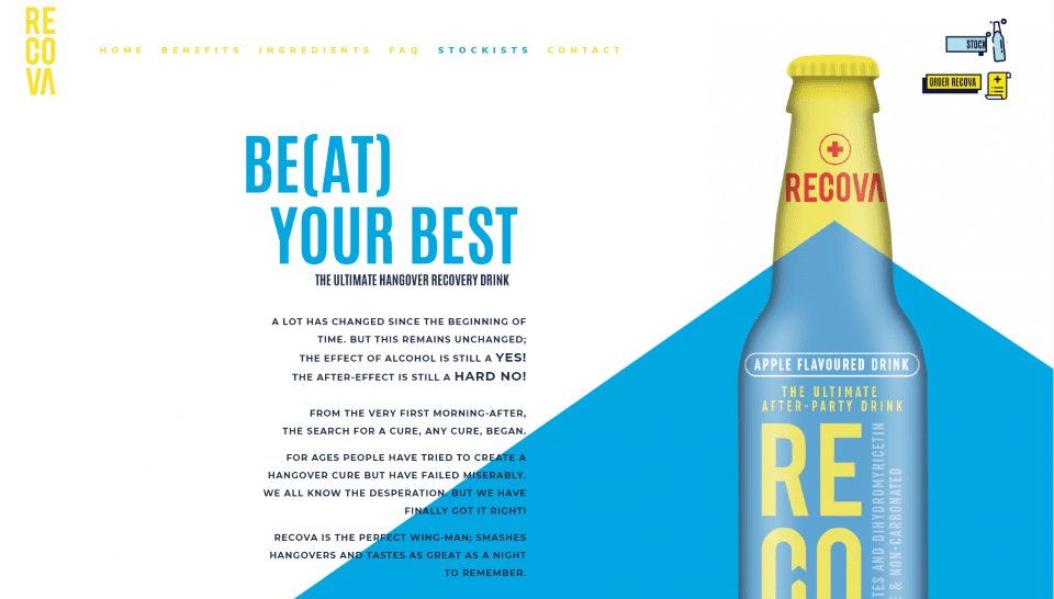
This site was submitted by Christina Oosthuizen. It uses branded blue and yellow throughout with a touch of red here and there. The menu includes animated links in blue and yellow. The hero section displays a product image that blends with the background. Taglines are created with ultra-large text in white with the keyword in yellow. Othe titles place text in yellow and blue. Large buttons display with solid black shadows that stand out. The site also includes lots of styled counters, blurbs, testimonials, a matching contact form, and social buttons. I especially like a section that shows a graphic of the product in two colors. The background on one side matches the product’s color on the other side. The contact page uses a similar design.
8. PlantVibe
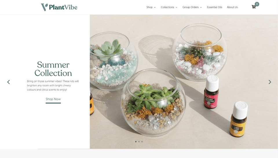
This site was submitted by DJ Wheeler. The site uses green for the branded color in the section backgrounds, graphics, and text. The hero section includes a slider with CTA’s in alternating layouts that show the image on one side and the information on the other. Simple CTA’s with graphics and text display over a green background with a styled pattern. A section of collections shows the various options in a product slider. This slider includes deep green highlights for the title, links, and navigation. The contact form uses the same green for the submit button. Even the product photos have background colors that are used in certain sections to make them a part of the website design.
9. Armedes
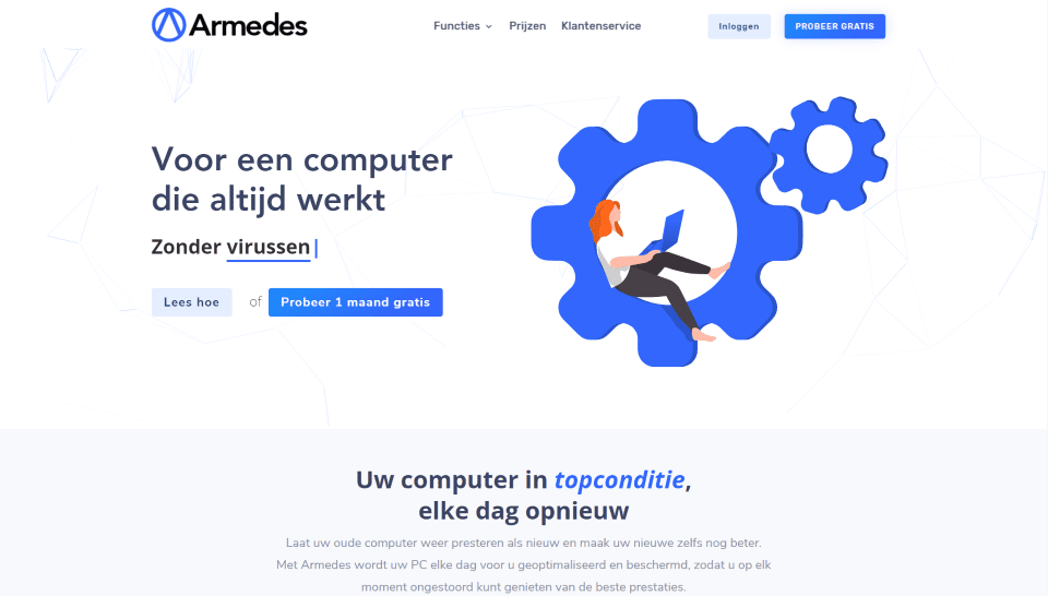
This site was submitted by Thomas van der Wolde. The site uses lots of blue in the backgrounds, graphics, text, and the CTAs on the navigation menu. The hero section displays a CTA with a typing effect that changes the keywords. A section of blurbs displays a different color for the top border for each blurb and includes graphics with a blob background pattern. A section of numbered steps displays the numbers in large blue fonts with text on one side and a graphic on the other in an alternating layout. The other pages follow a similar simple and clean design that highlights services and benefits.
10. MJS Media
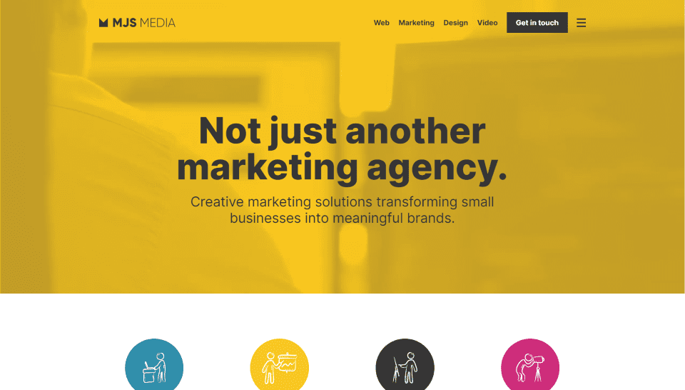
This site was submitted by Matt Southam. It uses a bold yellow for the branded color with several other colors to support it. The hero section places a yellow overlay over a background video that just barely shows through. The yellow background is also used for a full-width testimonial and for the contact button. Several blurbs display graphics with circled backgrounds in various colors. I like the section with a case study that shows an image in the background behind a gray overlay. The full-screen menu places links in large text in three columns that make it easy to see the navigation, services, and contact information. The background is blurred but visible. I also like the clean blog design.
In Closing
That’s our ten best community Divi website submissions for the month of July. These sites look amazing and as always we want to thank everyone for your submissions!
If you’d like your own design considered please feel free to email our editor at nathan at elegant themes dot com. Be sure to make the subject of the email “DIVI SITE SUBMISSION”.
We’d also like to hear from you in the comments! Tell us what you like about these websites and if there is anything they’ve done you want us to teach on the blog.
Featured Image via DRogatnev / shutterstock.com


Nice designs! I like 1 and 3 the most. The other designs are also very impressive 😃!
Thanks for this ! Because of you I signed up with Poptin 😅👌🏼
Beautiful designs, well done everyone! 😍