

It’s time again for our monthly Divi Showcase where we take a look at 10 amazing Divi websites made by our community members. Each month we showcase the best Divi websites that were submitted from our community and today we want to share with you the top ten websites for the month of April. Throughout the post, I’ll point out some of my favorite design features that draw me to each of the websites.
I hope you like them!
Divi Design Showcase: New Submissions from April 2019
1. Motion University
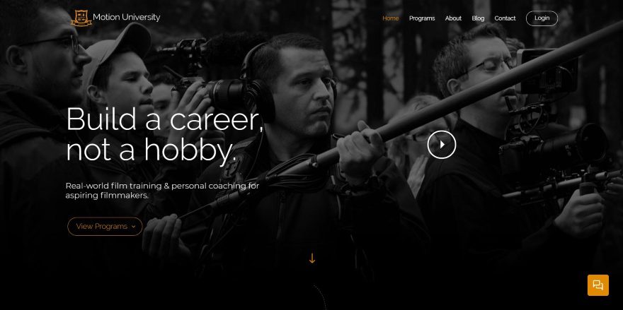
This site was submitted by Andrew Bartlett. The site uses a dark background with white text with yellow and orangish (technically it’s dirty brown) highlights. All background images are dark. The hero section shows a background image that describes the site. The text in the overlay includes a tagline and CTA on the left and a play button on the right. The play button changes on hover and opens a video in a popup when clicked. Other sections show information in two columns with text and images. The layout alternates as you scroll. Between the sections, there are small thumbnails with speech balloons for testimonials. A full-width CTA provides an image with a subscription form. More testimonial speech balloons create a revealed footer.
2. JD Designs
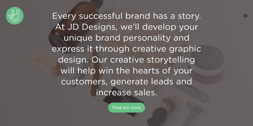
This site was submitted by James Dawson. It displays a full-screen slider with background images and dark overlays. The overlays use large text to describe the site and provide a CTA. Scrolling reveals another section with large text over a white background that describes the company. Services are shown in text with an interesting dot divider between the title and description. The portfolio section shows images with overlays. This section uses wavy section dividers and a gray background that stands out just enough from the rest of the layout. Several other sections use this design but with blue backgrounds. I like the section with extra large client logos. They’re shown in dark gray in four columns.
3. Swwwish
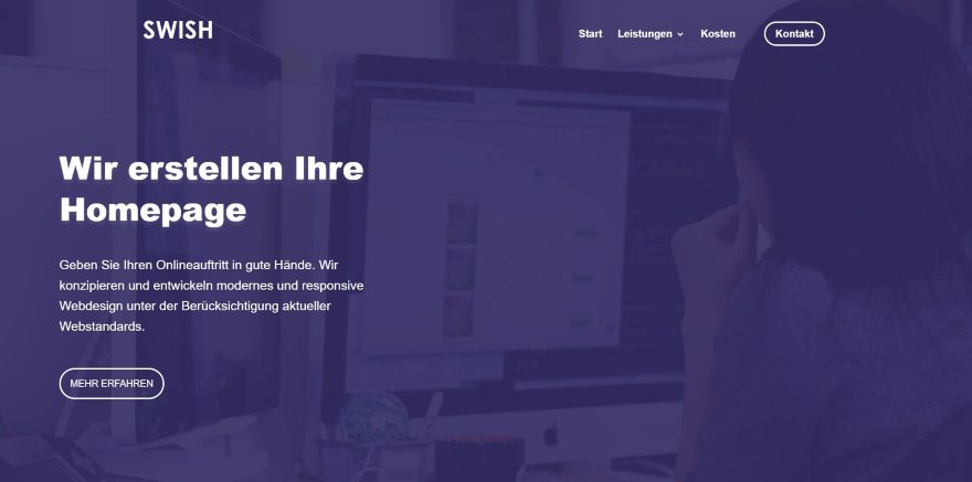
This site was submitted by Daniel Neumann. The site displays a full-screen background with a dark blue overlay and a CTA in white text to one side. Services are shown in blurbs with a box shadow and animated icons. The background pattern is seen through the blurb. Hovering intensifies the box shadow effect so they stand out and makes the blurb fully opaque. Several two-column sections alternate their layouts with text on one side and images on the other side. The text in these sections shows animated icons and highlighted text. The pricing page makes excellent use of a simple blue and white design with white pricing tables. I like the red glow from the pricing table’s buttons. The red highlights bring in just enough color and stand out perfectly.
4. HH Instruments
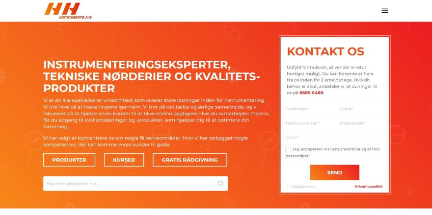
This site was submitted by Mathias Rue. The site uses an orange to red gradient background with icons to create an engineering design. The overlay displays company information, buttons, and a search feature on one side and a contact form on the other. The drop-down menu includes a full-width button to the contact page. Partner logos are shown in a slider with a link to the supplier’s page. Blurbs are used for links to services and information. They include 2-color images as icons and they have an interesting border to make the blurbs stand out. A section for references uses a similar design but they’re much larger and include client logos for the images. The design is also used for the blog section. The layout also includes embedded articles from LinkedIn over the same background as the hero section.
5. IQ Animation Studio
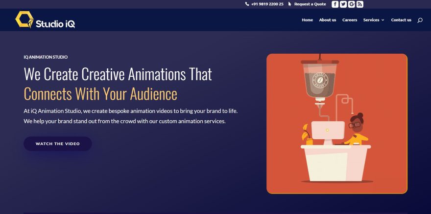
This site was submitted by Saurabh Patil. The hero section shows the tagline, information, and CTA on one side and an animated graphic on the other side over a dark blue background gradient. The animated graphic is fun to watch. I want one of these coffee dispensers. An even darker blue is used for the rest of the backgrounds and for the buttons. Four columns of blurbs show animated icons with a title. They use a dark blue background and a gray border that’s just light enough to stand apart from each other. Hovering over any of the blurbs turns their background to orange. Similar designs are used for other blurbs that provide information. An interesting about section showcases an animation over cool artwork in parallax. The pages also show a cool loading animation.
6. Miss Kindergarten
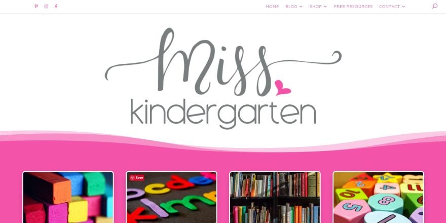
This site was submitted by Chris Cadalzo. The site displays an extra-large logo in the center, under the menu. The next section uses wavy section separators for the top and bottom – each with a different design and in multiple shades of the background color. This section also shows the topics as square images that zoom out and change their border on hover. A section for resources and the blog section (but with taller images) use this same design. An about section shows the site owner in a circled image and the same scripted font style as the logo. The signup form shows the freebie with the scripted font for the title. The blog and sidebar are also styled to match the site’s branded design.
7. Delmain
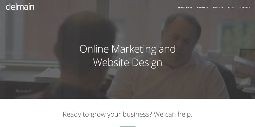
This site was submitted by Jake Braught. A video background plays behind the overlay with tagline. Scrolling reveals multi-colored icons for the services to specific types of clients. A similar section of services displays at the bottom of the page. A testimonial displays in full-width over a green background with angled section dividers. This section stands out perfectly. A larger section of testimonials appears at the bottom of the layout in multiple columns with alternating colors and styled images. Several sections show clients’ stories with an embedded video and stats in large text and a link for more information. The images for the videos show the websites on multiple devices. Nearing the footer starts with a mountain in parallax behind a mountain cutout, a contact form with angled section dividers, and a section that shows logos of review sites with a stat counter.
8. Supa International
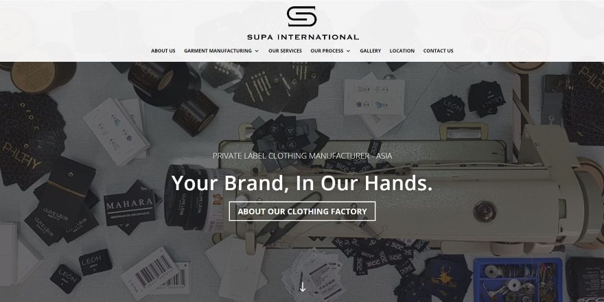
This site was submitted by Ben Dale. This is a 2-page design. Labels for the products are shown in the background in parallax with a tagline and CTA in the overlay. The next section shows detailed information on one side in a smaller font and a shortened statement in larger text on the other. The next couple of sections show images of the products with titles and text. The images are vertically offset from each other, giving the design an interesting visual style. Services are shown with images that include overlays with titles and numbered text. More products are displayed in the large, 4-column, gallery. This site makes great use of large title text and images.
9. Hero For You
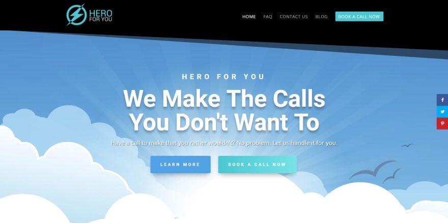
This site was submitted by Bram Chauvin. This site makes interesting use of graphics. The hero section uses a top section divider that actually styles the header. The title text is large and displays a tagline and several buttons. The background shows in true parallax and includes clouds that are overlapped by the cloud section divider of the next section. Blurbs show services using circled graphics. The buttons in the blurbs overlap the blurb. I like the CTA which shows a large graphic of a superhero smartphone. The footer is also interesting. It shows a graphic background in true parallax with an angled section divider and a contact CTA in the overlay. The blog follows the same design and uses the header and footer elements.
10. VS & Assemble
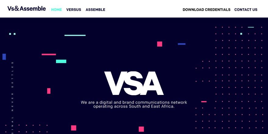
This site was submitted by MJ Swart. This site makes interesting use of graphical elements and large blocks to create the layout. The hero section uses a dark background with different colored blocks, dots, and vertical text to create visual patterns. These patterns follow through the rest of the layout. The next sections use a multi-column layout with blocks of color for the backgrounds, styled titles, extra large titles, and sliders to show their services, information about the company, experience, culture, offices, and more. Clicking the contact link in the menu opens a contact form in the menu. I love the use of color, text, and sliders in this site.
In Closing
That’s our 10 best community Divi website submissions for the month of April. These sites look amazing and as always we want to thank everyone for your submissions!
If you’d like your own design considered please feel free to email our editor at nathan at elegant themes dot com. Be sure to make the subject of the email “DIVI SITE SUBMISSION”.
We’d also like to hear from you in the comments! Tell us what you like about these websites and if there is anything they’ve done you want us to teach on the blog.
Featured image via MSSA / shutterstock.com


Why would you select a site with grammatical errors on the hero image? I’ll not call it out here, but it does beg the question on how the decision making process.
Not to call it out here but do you realize your reply has a grammatical error? To answer your question though: I assume that is because this is a Divi showcase, not a “Grammarly.com” showcase. They want to show what can be designed using Divi. I personally think all 10 designs are great.
Ok this is really going to bug me. What grammatical error? I must’ve skipped a few English lessons. Help me out?
‘We create creative animations that connects with your audience’
These all look great! But as we know, design is subjective and with that said I do like 4. HH Instruments because there’s something to me about the colour orange 🙂
Hi,
The first and the fifth ones are quite good…
How can I send my websites for your consideration?
I agree on #1 and #5.
I’m liking the Divi dividers adding a bit more personality to websites. Nice selection!
IQ animation studio seems to be best suited for our business.
Is #9 a real business? I can’t tell if that’s a joke.
I am going to say it is a real business. I do not think it is going to be a very profitable one though.
Hello,
Many thanks ! they are so nice…!
I find the loading page, with the logo (gif), of IQ Animation Studio (# 5) look really good.
Someone know how could i do the same thing with a logo svg ?
(a loading page that last about 2 sec?)
Thank you guys
Seriously? In the first place the page that PageSpeed Google has a score of 8/100?
Design is not everything…
Nice collection of trendy designs.
Thank you friends for appreciating iQ animation studio website. I will get the grammatical mistakes corrected by someone. Thank you Divi theme for adding my theme here.