

In this post, we’re going to explore one of Divi’s most popular features, the Blurb Module. Although seemingly simple out of the gate, it has many customizable features that can bring your website elements to life. Generally, the Blurb Module is used for things like services, benefits, contact information, etc, but with Divi, the possibilities are endless.
Let’s have some fun!
- 1 Sneak Peek
- 2 5 Creative Divi Blurb Module Designs
- 3 Getting Started
- 4 1. Pop-Out Blurbs with Feature Lists
- 5 2. Promotional Blurb with Custom Background Image.
- 6 3. Circle Blurb Style using Background Gradient
- 7 4. Framed Blurb with Borders and Box Shadows
- 8 5. Styling Blurbs as Curved List
- 9 More Blurb Style Inspiration
Sneak Peek
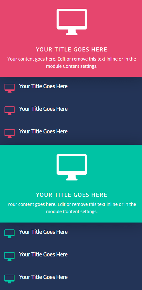
Here is a sneak peek of the 5 blurb module styles I’ll be creating in this tutorial.
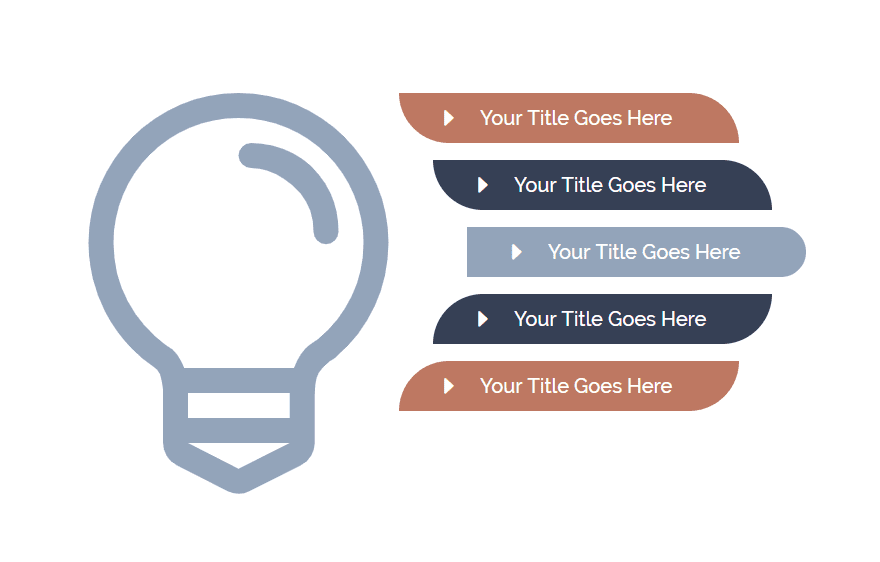
5 Creative Divi Blurb Module Designs
Subscribe To Our Youtube Channel
Getting Started
To get started, you will need to create a new page. From your WordPress Dashboard, navigate to Pages > Add New. Then give your page a title and deploy the visual builder. Select the option “Build From Scratch”. Once the visual builder loads on the page, you are ready to start designing.
This tutorial is designed to make it easy to create each of these blurb style designs individually so feel free to jump down the post to the design you want to build. In other words, you don’t have to start with the first one.
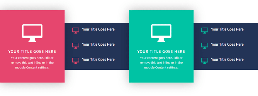
1. Pop-Out Blurbs with Feature Lists
In this first example, we are going to have a little fun with expanding blurbs outside of the row to create a pop-out effect. Then we can use the adjacent columns next to each to add a few blurbs with left aligned icons to serve as featured list items.
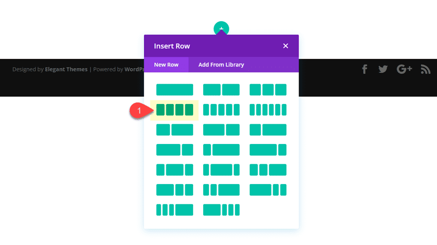
To start, create a new section and a row with a four-column structure.
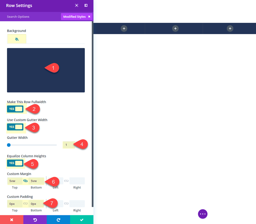
Then go ahead and update the row settings as follows:
Background Color: #2e3858
Make This Row Fullwidth: YES
Use Custom Gutter Width: YES
Gutter Width: 1
Equalize Column Heights: YES
Custom Margin: 5vw Top, 5vw Bottom
Custom Padding: 0px top, 0px bottom
Save settings.
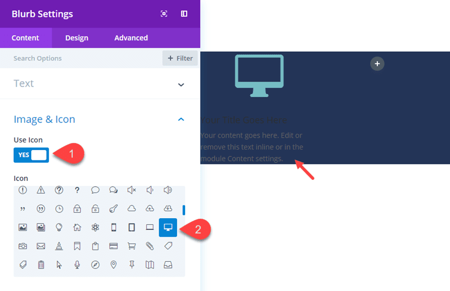
Then in the first column, add your first blurb module.
Take out the last sentence in the content box to shorten the amount of text a bit. Then select to use an icon instead of an image and choose an icon (anyone will do).
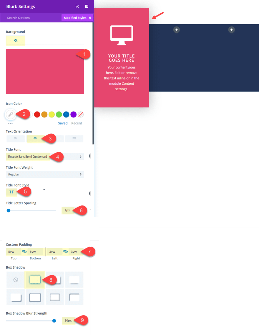
Then update the following:
Background Color: #df4570
Icon Color: #ffffff
Text Orientation: Center
Title Font: Encode Sans Semi Condensed
Title Font Style: TT
Title Letter Spacing: 2px
Custom Margin (desktop): -5vw Top, -5vw Bottom
Custom Margin (tablet): 0px Top, 0px Bottom
Custom Padding: 5vw Top, 5vw Bottom, 3vw Left, 3vw Right
Box Shadow: see screenshot
Box Shadow blur Strength: 80px
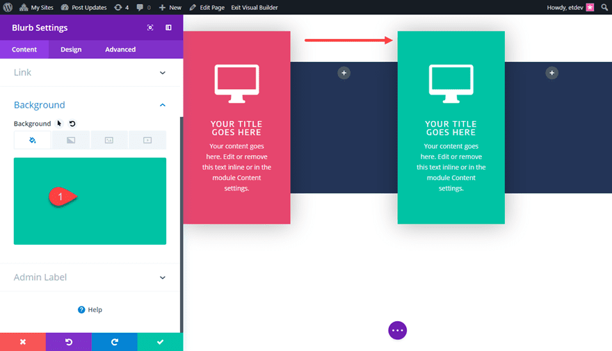
Using the right click menu option or the cmd+c and cmd+v shortkeys, copy the module you just created and paste it into column 3. Then update the new blurb module settings with another bright (but complimentary) background color:
Background Color: #24c4a3
Now it’s time to add the list item blurbs adjacent to the pop-out blurbs we just created.
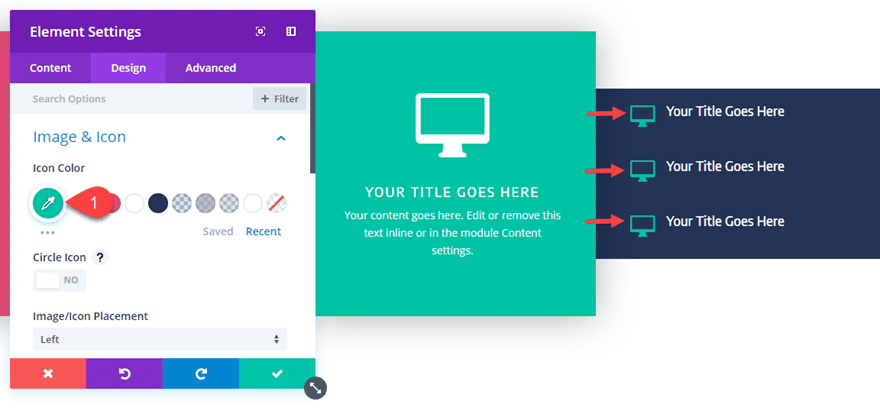
To do this add a new blurb in column 2. Then take out the mock text in the content box so that only the title text remains. Then add an icon to replace your image just as before. Then update the design settings as follows:
Icon Color: #df4570
Image/Icon Placement: Left
Title Font: Encode Sans Semi Condensed
Custom Padding: 20px Top, 20px Bottom, 3vw Left, 3vw Right
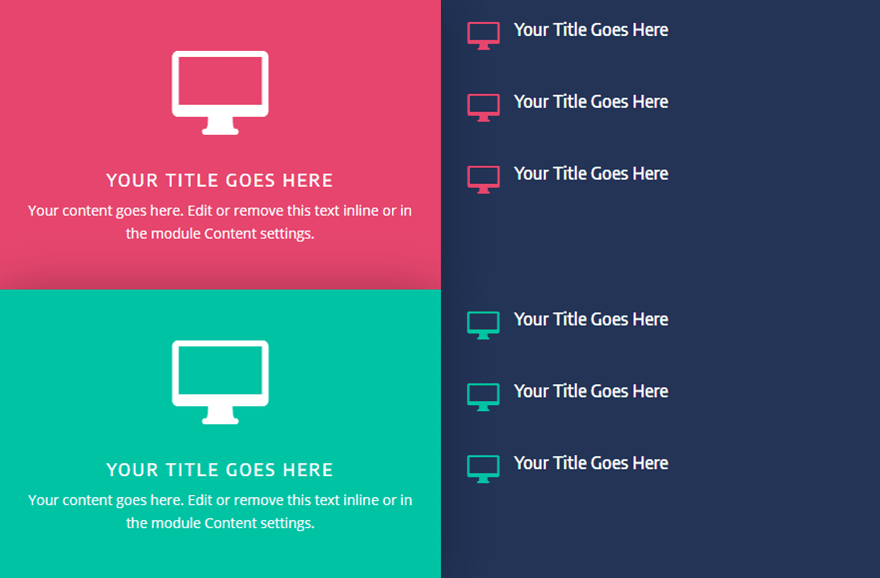
Duplicate the blurb twice so that you get three total list blurbs in the column. Then use Divi’s Multiselect feature to select all three blurbs and then copy and paste them into column 4.
You can also use multiselect to select all three blurbs in column 4 and bulk edit the element settings to change the icon color of all three to #24c4a3.
That’s it! Creating pop-out blurbs is a fun way to make your blurbs stand out and having adjacent list blurbs on the side gives you some additional options for more creative designs.
Here is the final result.
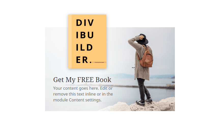
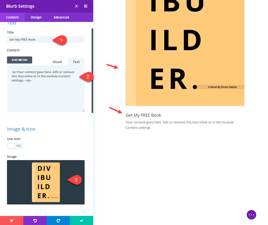
2. Promotional Blurb with Custom Background Image.
This blurb style is great for featuring content and promotional offers like a free book. The basic idea is to position the blurb content to the left of the module in order to make room for the custom background image. Let’s get to it.
First add a regular section with a two-column row structure. In the left column add a new blurb module.
Update the Title text and take out the last sentence of the mock content to cut down on the amount of text. Then update your image with a book image (or an image of your product). An icon of a book or something will also work as well.
I’m using the image assets from the Travel Blog Layout Pack so feel free to jump start the design by grabbing those images.
TIP:You could also add a Module Link URL to this module in order to make the entire module clickable since it can serve as a promotion.
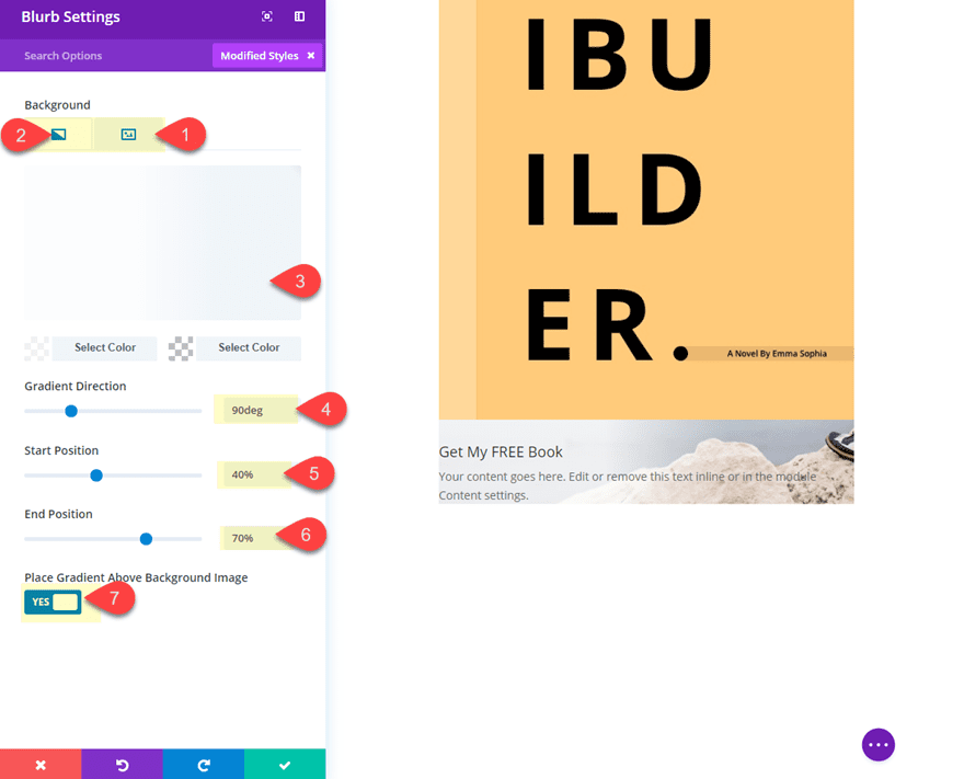
Next, add a background image to the module. Make sure the background image is a header like image with the focal point of the image to the right side that way you can add your content to the left of the image with it the background distracting from the text.
Then add a background gradient to serve as a partial overlay that sits behind the content and overlays the background image to make the text more readable. To add the background gradient update the following:
Background Gradient Left Color: rgba(255,255,255,0.8)
Background Gradient Right Color: rgba(255,255,255,0)
Gradient Direction: 90deg
Start Position: 40%
End Position: 70%
Place Gradient Above Background Image: YES
Then update the following:
Image Box Shadow: see screenshot
Title Font: Noto Serif
Title Text Size: 26px
Body Font: Noto Sans
Body Text Size: 16px
Image Width: 150px
Content Width (desktop): 60%
Content Width: (smartphone): 80%
Custom Padding: 2vw Bottom, 2vw Left, 2vw Right
The key design technique here is giving both the image and the content a custom width so that the content can be positioned to the left later on.
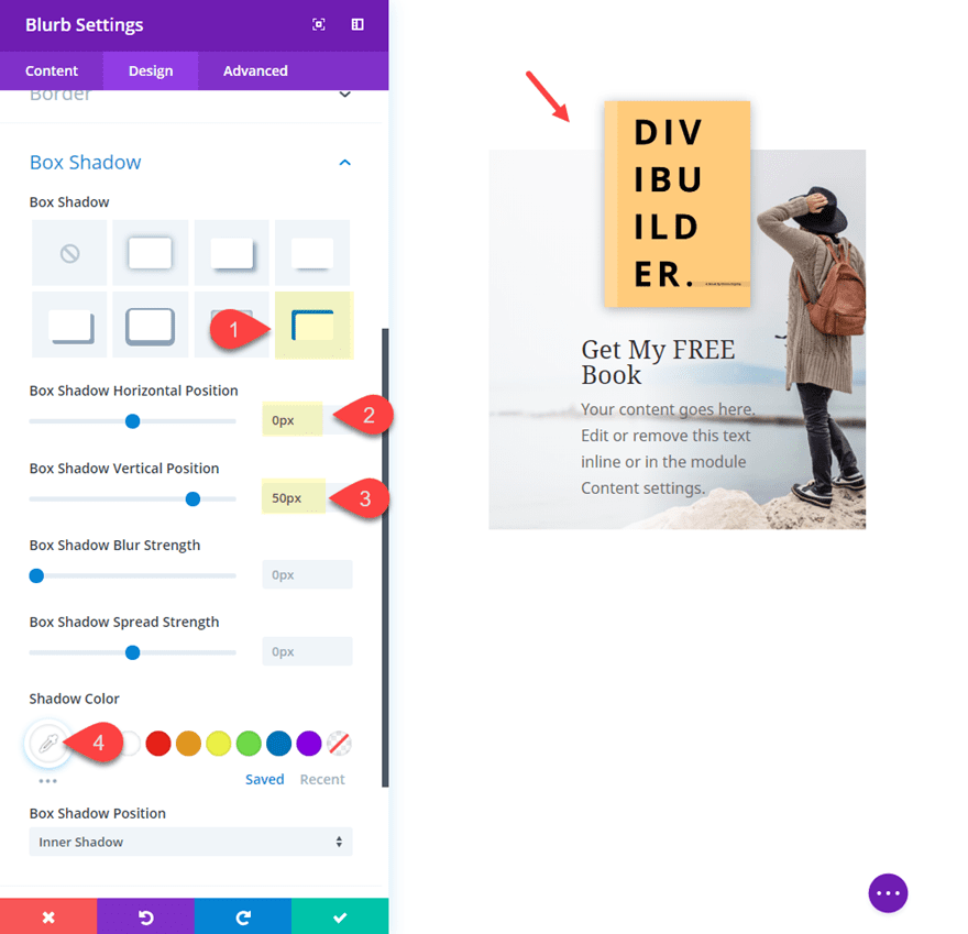
Now we need to add a box shadow at the top of the blurb to create the impression that book image is extending above the module for a nice overlapping effect. To do this, update the following:
Box Shadow: See Screenshot
Box Shadow Horizontal Position: 0px
Box Shadow Vertical Position: 50px
Shadow Color: #ffffff
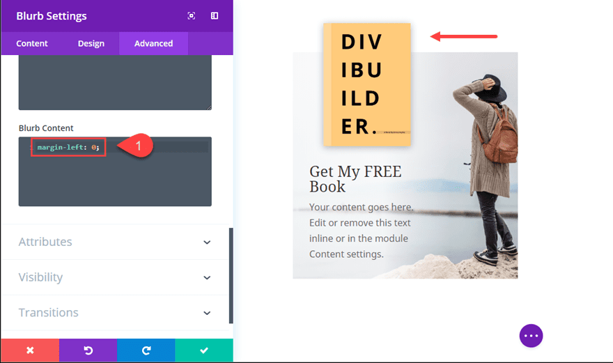
The last step involves a short snippet of custom CSS needed to align the blurb content to the left side of the module. To do this, go to the advanced tab and add the following custom CSS under the Blurb Content input box:
margin-left: 0;
Now Check out the result!
TIP: Don’t forget about the hover options that are available. Try giving the book image a border on hover to make things come alive!
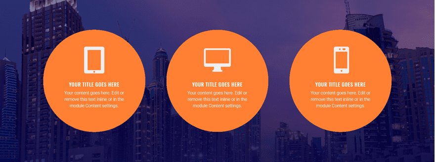
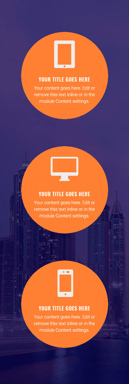
3. Circle Blurb Style using Background Gradient
This simple blurb style uses background gradients to serve as a circle background to your blurb content. This is a fun alternative to turning your entire blurb module into a circle using custom CSS.
Start by add a new regular section with a three column row structure.
Then add a blurb module to the left column.
Then take out the last sentence of the content to decrease the amount of text. It is important for this design to keep the text amount somewhat small because you will be fitting it inside of a circle.
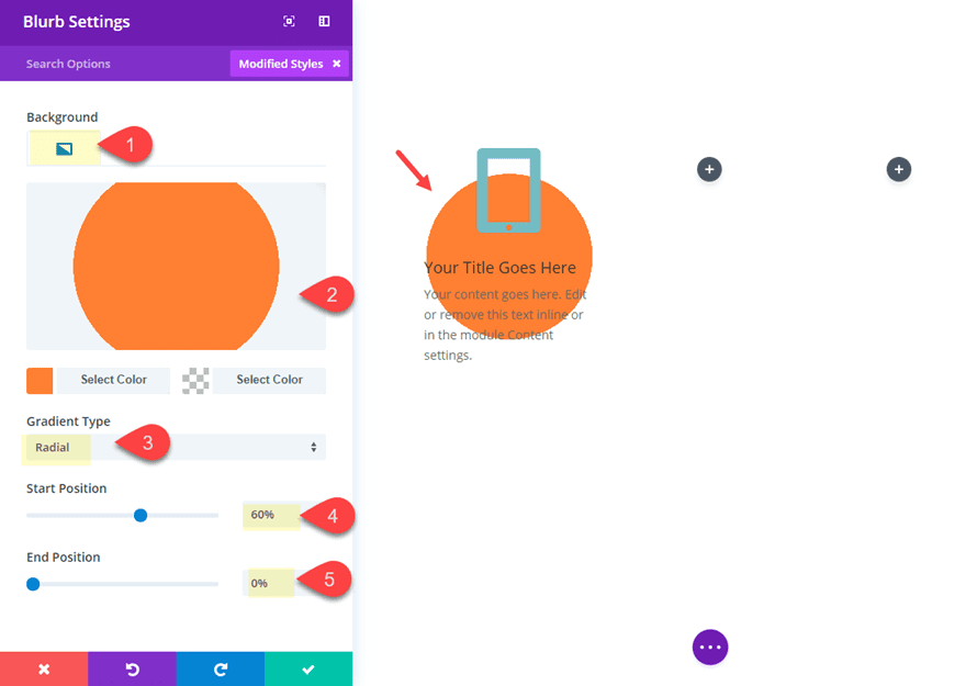
Then add a background gradient to create the circle background as follows:
Background Gradient Left Color: #fa7f28
Background Gradient Right Color: rgba(255,255,255,0)
Gradient Type: radial
Start Position: 60%
End Position: 0%
Place Gradient Above Background Image: YES
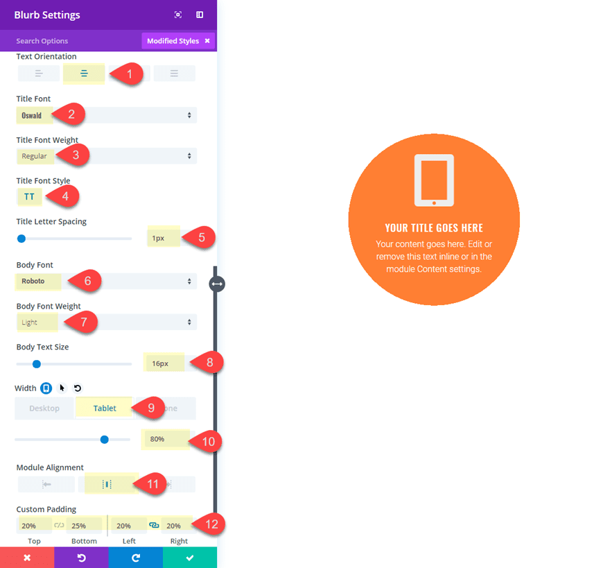
Then update the rest of the design settings as follows:
Text Orientation: Center
Title Font: Oswald
Title Font Style: TT
Title Letter Spacing: 1px
Body Font: Robot
Body Font Weight: Light
Body Text Size: 16px
Width (tablet): 80%
Module Alignment: Center
Custom Padding (desktop): 20% Top, 25% Bottom, 20% Left, 20% Right
Custom Padding (smartphone): 20% Top, 25% Bottom, 10% Left, 10% Right
The key here is to get the custom padding adjusted correctly so that the background circle is aligned with the content in the center. You may need to adjust these settings depending on the amount of content you have.
Now you can copy and paste the module into the remaining columns.
Then update the row settings so that it has a custom width of 80% and a Gutter width of 1.
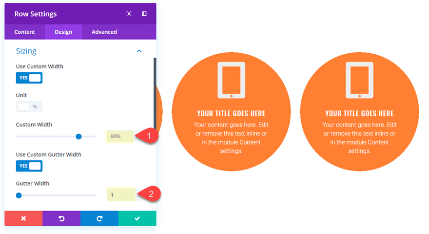
To complete the design, you can add a background image and gradient to your section as follows:
Add Background Image
Background Gradient Left Color: rgba(2,0,76,0.51)
Background Gradient Right Color: rgba(2,0,76,0.84)
Place Gradient Above Background Image: YES
That’s it! Check out the final design!
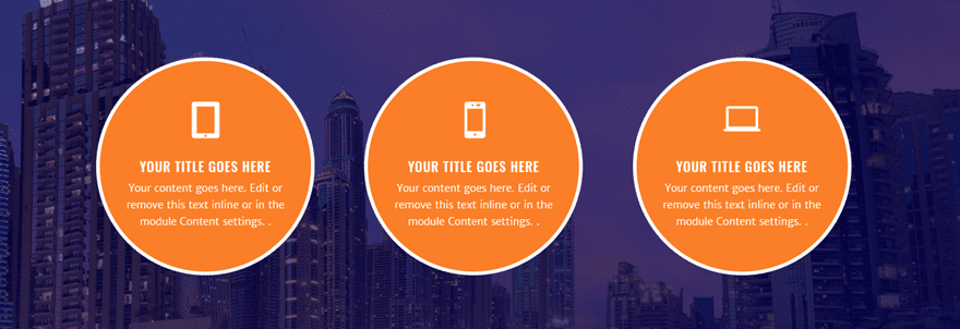
For additional space, you can always decrease the size of the blurb icon to something like 50px in order to keep the circles from colliding on smaller browser widths. When making adjustments, don’t forget to take advantage of Divi’s Multiselect feature to make bulk edits to all modules at once.
Bonus Tip: Making the Entire Blurb Module a Circle with Custom CSS
If you were looking to turn the entire module into a circle (instead of using the background gradient), replace the gradient with a regular background color and add this custom CSS under the Advanced Tab of the blurb module settings:
In the Main Element box:
height: 300px;
width: 300px;
border-radius: 100%;
border: 5px solid #ffffff;
padding: 5% !important;
display: flex;
In the Blurb Content box:
margin: auto;
This custom CSS overrides the padding set in the blurb module settings so you may need to take that snippet out if you want to gain back control of those settings. Also, this css uses flex to center the blurb content within the circle. This will come in handy.
It will look something like this if applied to all three modules.
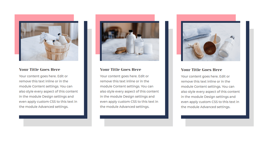
4. Framed Blurb with Borders and Box Shadows
One of my all time favorite Divi design features to have fun with is box shadows. We already featured a creative use for box shadows in our promotion blurb design earlier where we created the overlap effect. But you can also use box shadows as a creative way to frame your content with broken grid designs. In this design, I’ll show you how to combine borders and box shadows in a unique way.
To start, add a new regular section with a three column row structure. Then add the blurb module to the first column.
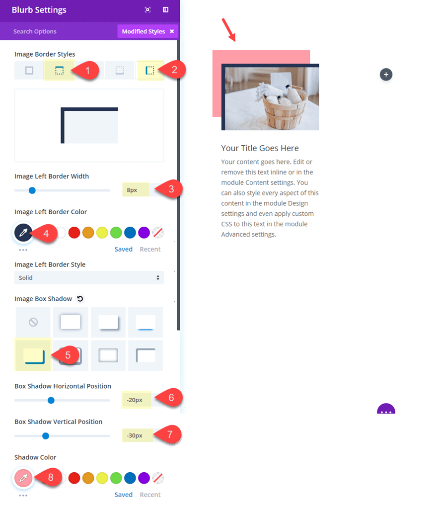
Add an image to the blurb. Then give the blurb image a border and box shadow by updating the design settings as follows:
Image Top Border Width: 8px
Image Top Border Color: #2f3854
Image Left Border Width: 8px
Image Left Border Color: #2f3854
Image Box Shadow: See Screenshot
Box Shadow Horizontal Position: -20px
Box Shadow Vertical Position: -30px
Shadow Color: #f89da9
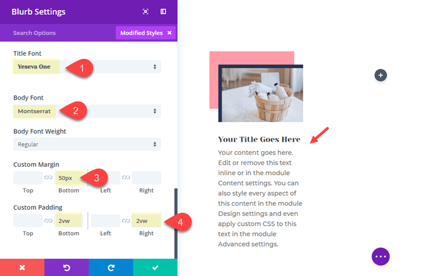
Then update the Title and Body font and spacing as follows:
Title Font: Yeseva One
Body Font: Montserrat
Custom Margin: 50px Bottom
Custom Padding: 2vw Bottom
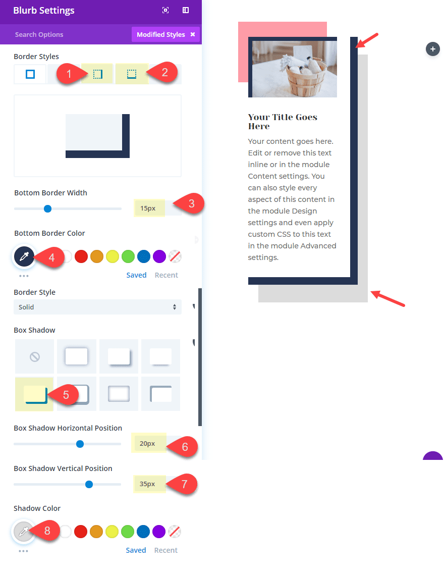
Finally, give your blurb module a custom border and box shadow to balance out the frame design as follows:
Right Border Width: 15px
Right Border Color: #2f3854
Bottom Border Width: 15px
Bottom Border Color: #2f3854
Image Box Shadow: See Screenshot
Box Shadow Horizontal Position: 20px
Box Shadow Vertical Position: 35px
Shadow Color: #dddddd
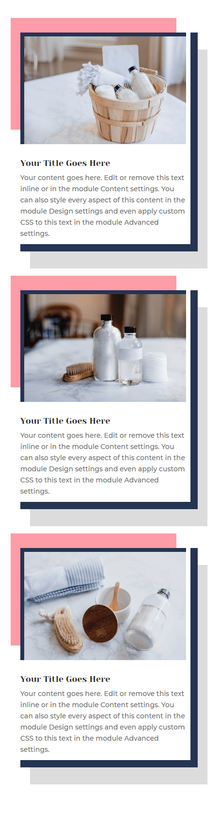
Now copy and paste the module in column 2 and 3 and update the blurb images to finish off the design.
Here is the final result.
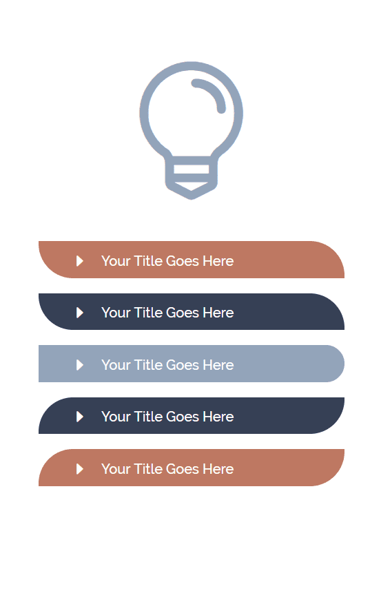
5. Styling Blurbs as Curved List
This next design is a fun way to create lists using blurbs. Using some custom margins, you can curve your blurb list items to wrap around elements on your page. In this example, I’m going to curve the list to wrap around the right side of a large blurb icon. And you can get a little creative
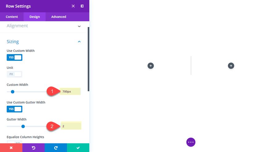
First, add a new regular section with a two column row structure.
Before you add any blurb modules, give your row a custom width and gutter width by updating your row settings as follows:
Custom Width: 700px
Gutter Width: 2
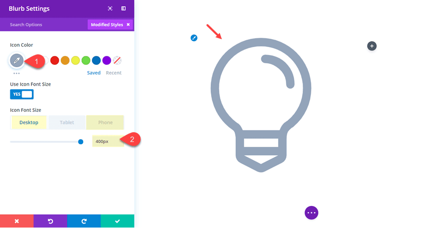
Now let’s create the large blurb icon by adding blurb module in the left column. Then take out the Title Text and content. And then choose the light bulb icon. Now only the icon should be visible. Next, update the color and size of the icon as follows:
Icon Color: #96a6bd
Icon Font Size (desktop): 400px
Icon Font Size (smartphone): 200px
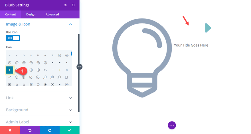
In the right column, add a new blurb module. This will be the first of five total blurbs that will make up our list. Then open the module settings and take out the content leaving only the title text. Then choose the right arrow icon for the blurb.
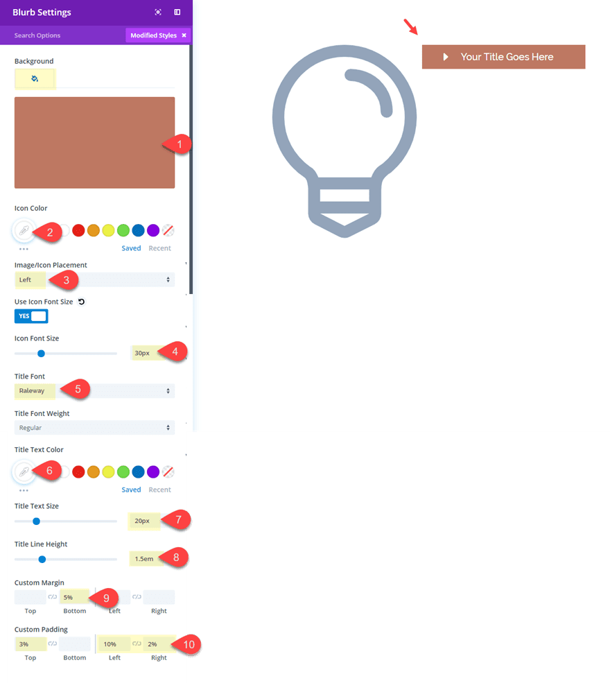
Next update the design settings as follows:
Background Color: #bb7860
Icon Color: #ffffff
Image/Icon Placement: Left
Use Icon Font Size: YES
Icon Font Size: 30px
Title Font: Raleway
Title Text Color: #ffffff
Title Text Size: 20px
Title Line Height: 1.5em
Custom margin: 5% bottom
Custom Padding: 3% Top, 10% Left, 2% Right
Duplicate the module four times until you get a total of five blurbs stacked in the right column.
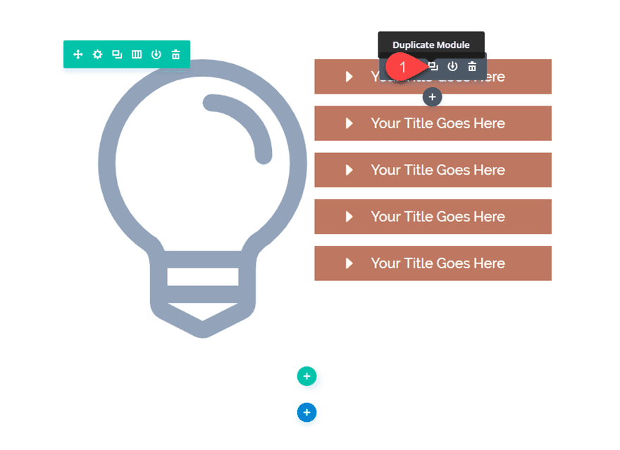
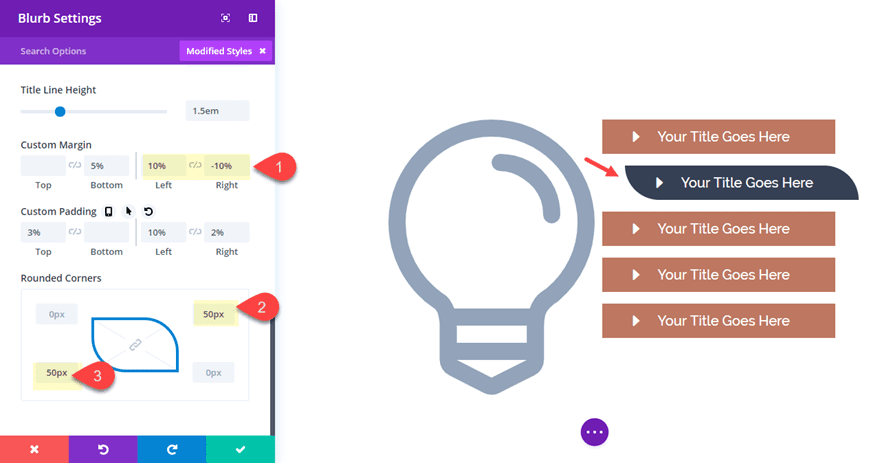
Then give the second blurb a new color, custom margins to push it to the right, and creative rounded corners as follows:
Background Color: #393e56
Custom margin (desktop): 10% Left, -10% Right
Custom margin (tablet): 0% Left, 0% Right
Rounded Corners: 50px top right, 50px bottom left
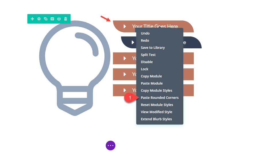
Before you leave this module, copy the rounded corners by right clicking on the option in the blurb settings.
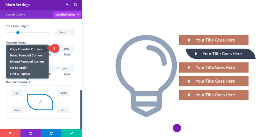
Then save the blurb settings and right click on the first (top) module you created and paste the rounded corners style the module.
Now let’s continue to update the last three modules with proper colors, spacing and rounded corner designs.
For the third blurb in the column, update the following:
Background Color: #96a6bd
Custom margin (desktop): 20% Left, -20% Right
Custom margin (tablet): 0% Left, 0% Right
Rounded Corners: 50px top right, 50px bottom right
For the fourth blurb, update the following:
Background Color: #393e56
Custom margin (desktop): 10% Left, -10% Right
Custom margin (tablet): 0% Left, 0% Right
Rounded Corners: 50px top left, 50px bottom right
For the fifth blurb, simply copy the rounded corners in the fourth blurb and paste them in.
That’s it! Let’s check out the final design.
More Blurb Style Inspiration
If you are interested exploring more fun blurb module designs, check out the links below:
- You can use asymmetrically curved backgrounds for blurbs.
- You can frame your blurb modules with creative designs using section dividers.
- You can create your own background image shape to build a geometric grid layout.
- Learn how to combine blurb icons to create a centered graphic element for your section on the post on one-sided box shadows.
- And don’t forget to explore our free Divi premade layouts available within the Divi Builder for even more inspirational blurb styles
Well I hope these examples have inspired you to see what’s possible with The Divi Blurb Module! The sky’s the limit here. This module is extremely popular and will probably be used on almost every site you build so it’s good to have a versatile set of ideas so designs don’t start looking the same. Sometimes, just changing the colors and fonts can give these a whole new look so feel free to take these ideas and make them your own!
I look forward to hearing from you in the comments.
Cheers!


This was helpful information since I am new to Divi. When I use the Blurb module, though, I’d love to be able to tighten up the spacing between the image and the header text. It doesn’t look like that’s customizable in the module, though. Is that a custom CSS add? Thanks.
This is weird. What about my comments with missing part in blurbs 2 & 3 in the turorial? This will be fun for people who don’t know how to solve this… 😉
Hi,
Not being an IT person I love these step by step tutorials, especially once having mastered them I can see the visual results within my own website pages. Not sure if I am asking in the right place, but I tried doing #2 but can’t seem to get my image to sit above the background image as you have done with the book. I have repeated the instructions a few times but it isn’t working. What am I missing?
Diane
Sorry for the confusion.This is done by adding a box shadow to the blurb module.
Box Shadow Horizontal Position: 0px
Box Shadow Vertical Position: 50px
Shadow Color: #ffffff
(make sure it is an inner shadow)
Since the box shadow matches the color of the background, it creates the overlapping effect.
This is in the article right before adding the custom CSS.
Can you please give me an answer to my question above this comment. THX
It worked that time. Thank you Jason 🙂
Hey Jason
Thanks for the great design ideas.
Even if I could do it myself, I don’t have the time to rebuild them.
Hence the plea to you: Can’t you also make these things available for download?
The users, who want to learn something, don’t have to use the download.
I think it’s just a little silly to force the interested users to build it themselves.
Furthermore I would like to ask you again a very simple request:
I am a speed-nerd and reach 100/100 with all my projects at Google Insights.
However I have to compress the DIVI-PNG-LOGO again after each DIVI update, because it costs one percentage point.
It is a compliment that such values are achieved with DIVI.
Therefore, please use the compressed PNG logo in the future.
Is that possible?
Thank you very much for your services
Eric – Germany
Thanks for your comment, Eric. This Divi tutorial and many others like it really are meant to teach some valuable techniques for using Divi in new and creative ways. As such, these designs aren’t meant to stand alone as downloadable layouts as much as they are meant to illustrate the concept and hopefully inspire users to create even better designs on there own.
That being said, I completely understand the benefit it may provide you and others and we will definitely consider this going forward.
And thanks for the suggestion on the Divi logo. I wasn’t aware.
Only The Best of Friend &The Worst of Enemies Visit Us
Great stuff Jason.Thank you. i think Kamil has a good suggestion.
Plz create a webhosting layouts.
frendly with whm & whmcs.
Wow! +1
+2 lol
Very well designed and nicely presented. You present so many designs (at least 1 a week I think) so perhaps you could add new DIVI feature: module and section library – just like the layout library. Your competitors have it and you already create the content so why not build it right into DIVI?
Thanks for the suggestion Kamil!
To move the book up add
margin-top: -25%;
to advanced tab > custom css > Blurb Image field
Blurb #2 has errors too. Screenshot settings image box shadow is missing as well as the explanation how to move the image of the book up with a negative top margin
Christian,
Sorry for the confusion. The book image isn’t moved up with a negative margin in this tutorial. This is done by adding a box shadow to the blurb module.
Box Shadow Horizontal Position: 0px
Box Shadow Vertical Position: 50px
Shadow Color: #ffffff
This is in the article right before add the custom CSS.
Jason, you still have not added the actual SCREENSHOT to your tutorial of the settings that you mention here for Blurb No. 2:
“Then update the following:
Image Box Shadow: see screenshot <——— !!!
Title Font: Noto Serif
Title Text Size: 26px
Body Font: Noto Sans
Body Text Size: 16px
Image Width: 150px
Content Width (desktop): 60%
Content Width: (smartphone): 80%
Custom Padding: 2vw Bottom, 2vw Left, 2vw Right
The key design technique here is giving both the image and the content a custom width so that the content can be positioned to the left later on.
Now we need to add a box shadow at the top of the blurb to create the impression that book image is extending above the module for a nice overlapping effect. To do this, update the following:
Box Shadow: See Screenshot <——— !!!
Box Shadow Horizontal Position: 0px
Box Shadow Vertical Position: 50px
Shadow Color: #ffffff
Thanks Jason, these are really cool.
Glad you liked them, Richard.
On blurb #4 you’ve been copy/pasting the border info and the settings (color / border sides) are now incorrect… 😉
Christian,
Good catch! I will get that updated.
Thanks.