

Creating a custom scroll button on your fullscreen header is a great design boost to improve user experience, allowing the user to scroll to the next section of your page without having to scroll. Adding some eye-catching animation to your button may also improve your conversions. Divi already has a built-in scroll button to make things really easy for you to add this feature on fullwidth headers. But today I thought I would show you how to use the button module to accomplish the same functionality with some modern design features.
In this tutorial, I’m going to show you how to turn a button module into a custom scroll button that pops up at the bottom of the screen when you load the page. I’ll also be throwing in a few design tips along the way for inspiration.
Let’s get started.
- 1 Sneak Peek
- 2 Divi is All You Need for This Tutorial
- 3 Designing the Fullscreen Header
- 4 Creating the Custom Scroll Button Section
- 5 Creating Section #3: The menu box and featured content
- 6 Create the Last Section
- 7 Changing your Scroll Button Location
- 8 Consider the Widespread Application
- 9 Looks Great on Mobile Too
- 10 Final Thoughts
Sneak Peek
Here is a peek at the design we will be building together.

Check out how the learn more CTA pops up when loading the page and scrolls to the next section when clicked.
Divi is All You Need for This Tutorial
For this tutorial, all you need is Divi. I’ll be using an image from one of the layout packs, some design magic with the visual builder, and a few custom css snippets to add a final touch to our scroll button.
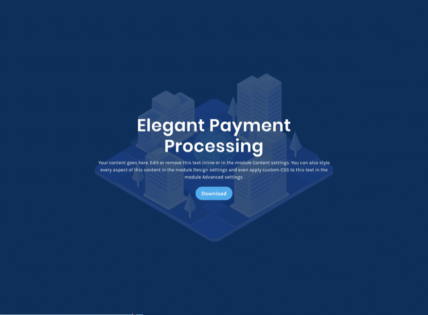
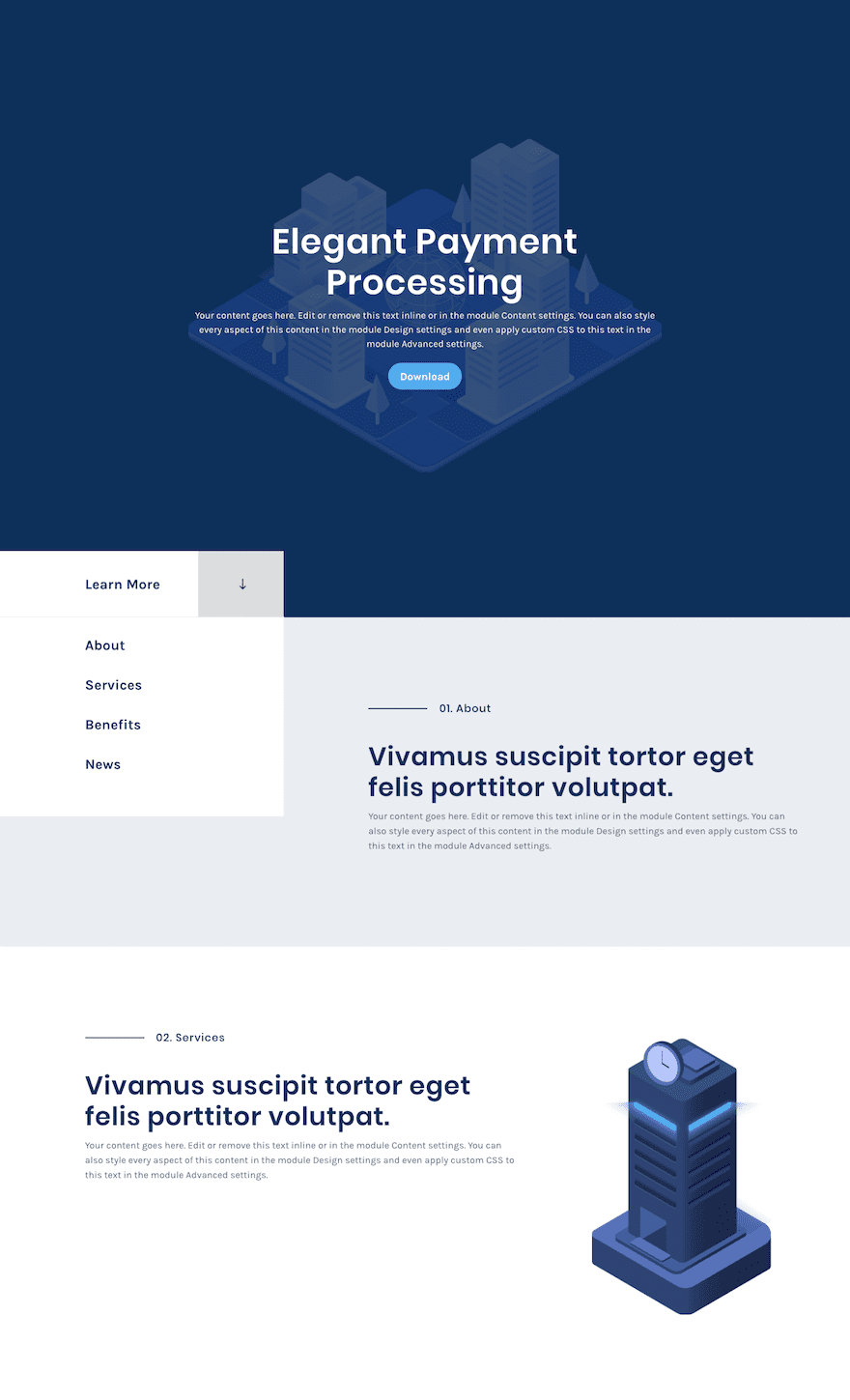
Designing the Fullscreen Header
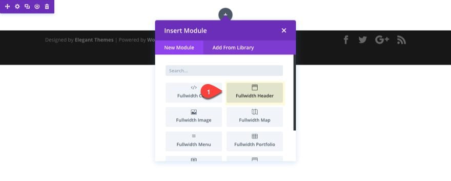
To design the fullscreen header, create a new page and deploy the visual builder. Then add a fullwidth section with a fullwidth header module.
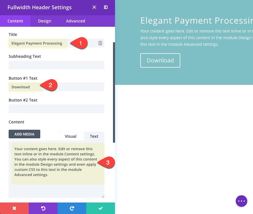
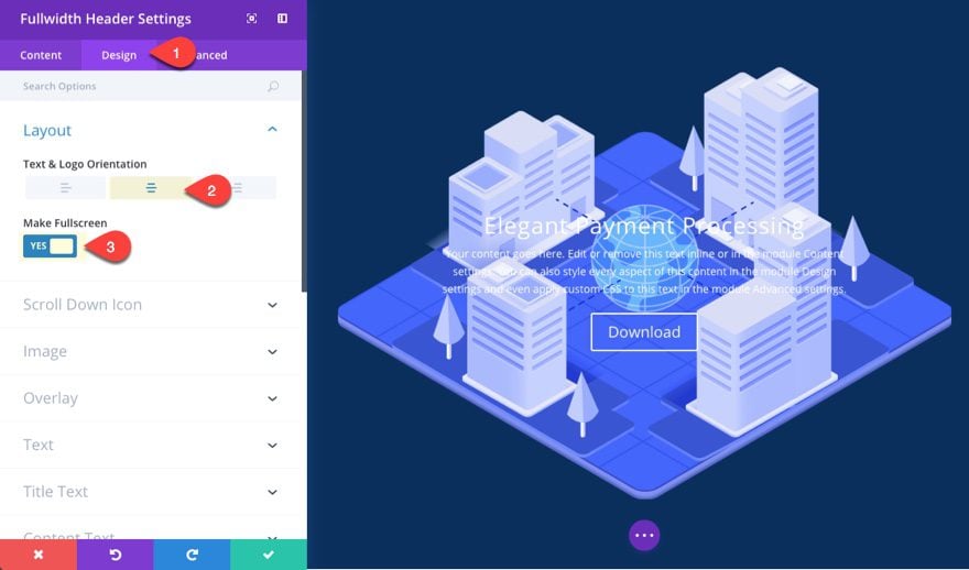
Next, update the fullwidth header settings as follows:
Title: [enter title]
Button #1 Text: [enter text]
Content: [enter content]
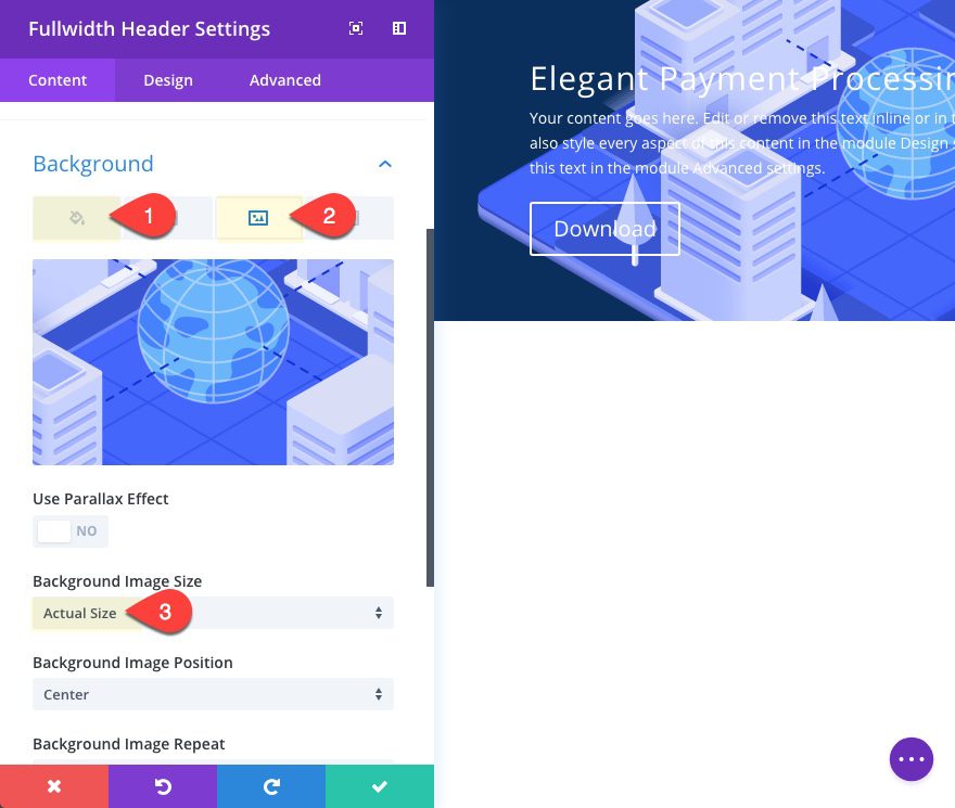
Background Color: #0a2f5e
Background Image: [enter 800×500 image]
Background Image Size: Actual Size
Under the design tab, change the layout to centered orientation and select to make it full screen.
Text & Logo Orientation: Center
Make Fullscreen: YES
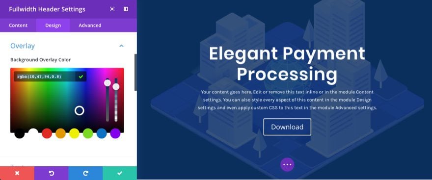
Give your header an overlay color so that you can read your text easier.
Background Overlay Color: rgba(10,47,94,0.8)
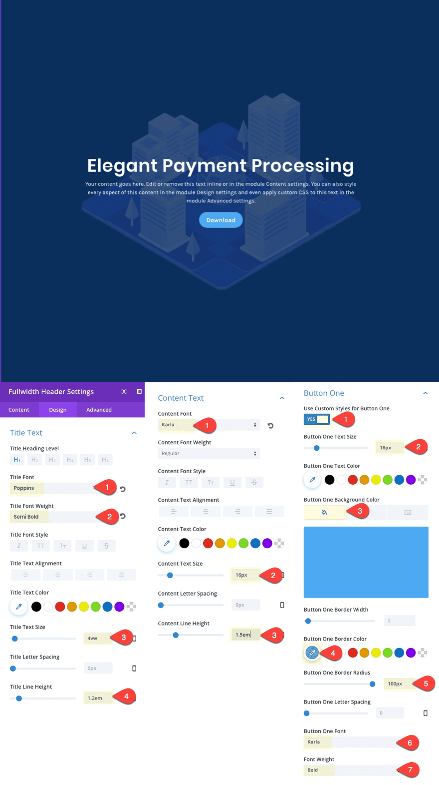
Then design your title text, content text and button #1 with the following settings:
Title Font: Poppins
Title Font Weight: Semi Bold
Title Text Size: 4vw
Title Line Height: 1.2em
Content Font: Karla
Content Font Weight: Regular
Content Text Size: 16px
Content Line Height: 1.5em
Use Custom Styles for Button One: YES
Button One Text Size: 18px
Button One Background Color: #4daaf2
Button One Border Color: #4daaf2
Button One Border Radius: 100px
Button One Font: Karla
Button One Weight: Bold
That will do it for our fullwidth header. Now for the fun stuff!
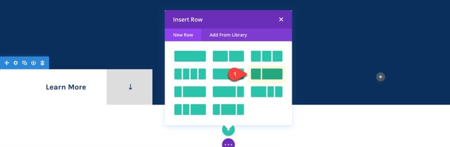
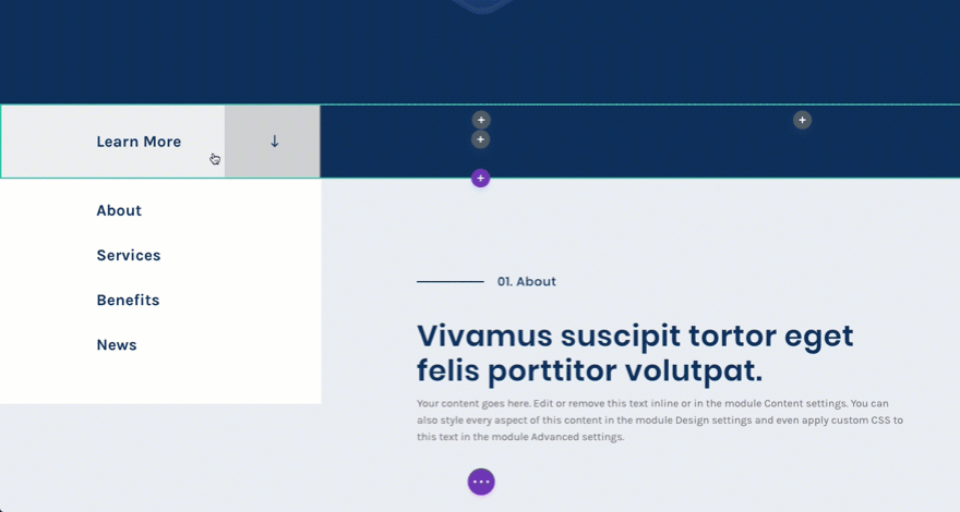
For this scroll button, I want it to sit flush on the left side of the page. So add a three column row to your section.
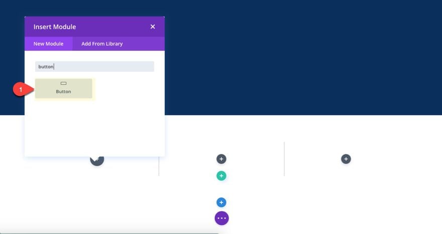
Then add a button module to the left column.
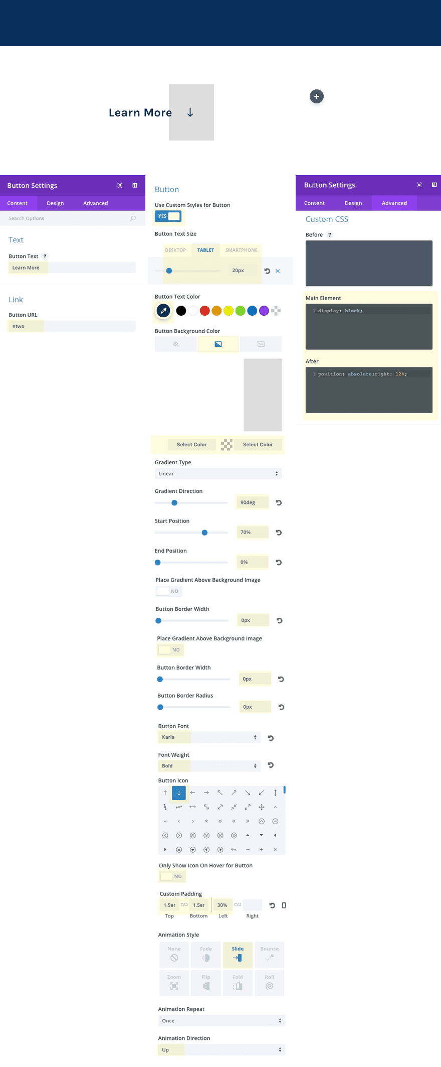
Update the button module settings as follows:
Button Text: Learn More
Button URL: #two
The #two URL will serve as an anchor link to the top of the next section which will include the matching CSS ID “two”. This is the basic functionality of creating a custom scroll button.
Use Custom Styles for Button One: YES
Button Text Size: 24px (desktop), 20px (tablet)
Button Text Color: #0a2f5e
Button Background Gradient Left: #ffffff
Button Background Gradient Right: #dddddd
Gradient Direction: 90deg
Start Position: 70%
End Position: 0%
Button Border Width: 0px
Button Border Radius: 0px
Button Font: Karla
Button Weight: Bold
Button Icon: [down arrow]
Only Show Icon On Hover for Button: NO
Custom Padding: 1.5em Top, 1.5em Bottom, 30% Left
Animation: Slide
Animation Direction: Up
Under the Advanced tab, add the following custom css to the main element input box:
display: block !important;
This allows the button to span the full width of the column.
Then add the following css to the After input box:
position: absolute; right: 12%;
This positions the arrow icon to the right of the button.
Save your settings.
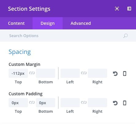
Customize Section Settings
Now we need to customize the section settings to bring the button up over the fullwidth section above and get the spacing right.
Update the following section settings:
Background Color: rgba(255,255,255,0)
Custom Margin: -112px Top
Custom Padding: 0px Top 0px Bottom
Adjust Row Spacing
Now we need to adjust the row spacing as well. Update the following row settings.
Make this Row Fullwidth: YES
Use Custom Gutter Width: YES
Gutter Width: 1
Custom Padding: 0px Top, 0px Bottom
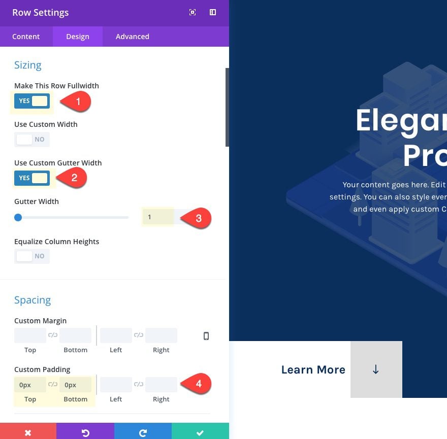
Now check out the live page. You will see a button popup on the bottom left of your fullscreen header when the page loads.
Now that we have our button ready to scroll, let’s add another section to create a unique scroll-to section.
Create a regular section with a one-third two-thirds column structure.
This column structure is key because it will allow us to create a left column the same size as the one directly above it with our button.
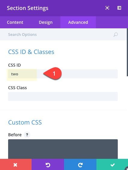
Section Settings
Before you start adding modules, let’s first update our settings for the section with the following:
Background Color: #eaedf2
Custom Padding: 0px Top, 0px Bottom
In the Advanced tab, add the Custom CSS ID “two”. This will allow you button to scroll to the top of this section.
Row Settings
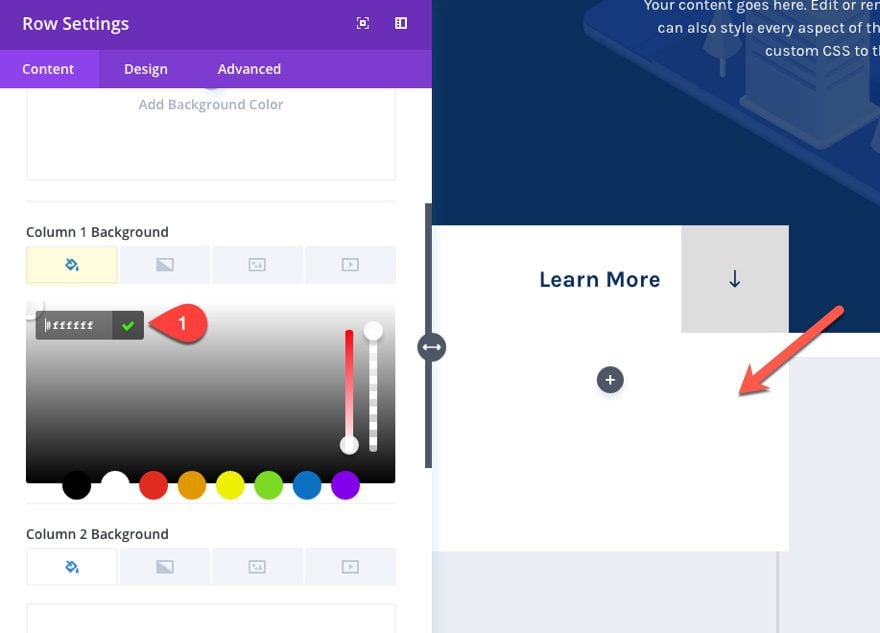
To speed things up, copy the row style of the row containing the button in the above section. Then paste the row style for your new row.
In the content tab, update column 1 background color to #ffffff. This will serve as the background of your menu box under your button.
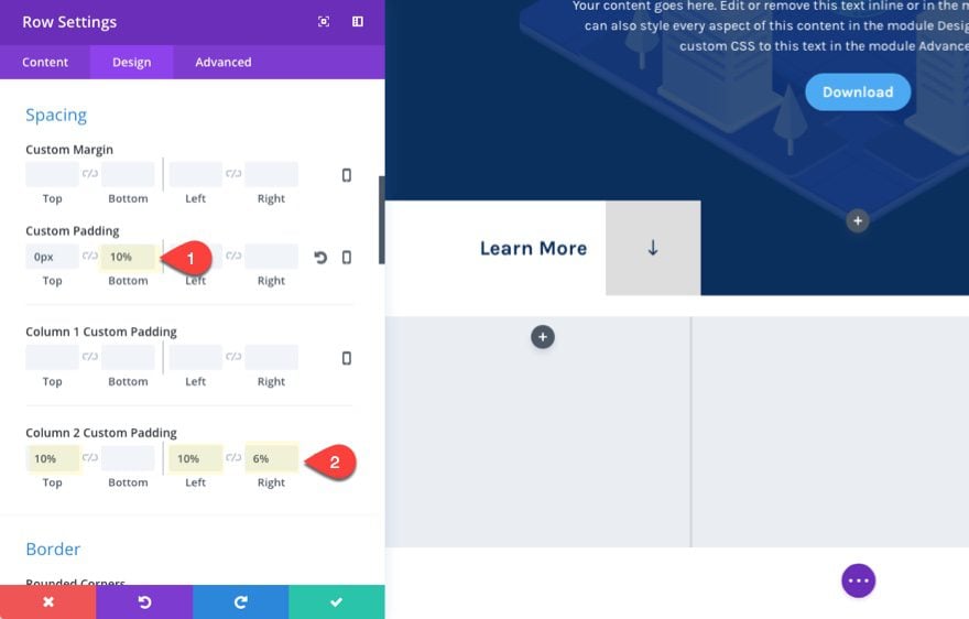
Then update the following padding for your columns:
Custom Padding: 10% bottom
Column 2 Custom Padding: 10% Top, 10% Left, 6% Right
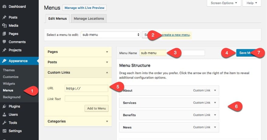
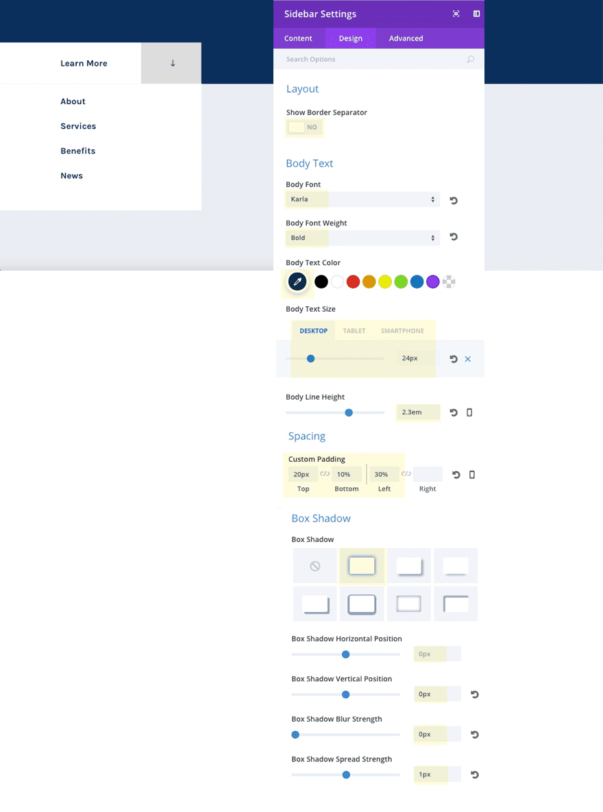
Now we are ready to add our sidebar module to our left column. But before we do that, you need to create a custom menu.
For sake of time, I’m going to give you the short explanation of how to create a menu. Here goes:
- Navigate to Appearance > Menus
- Click Create New Menu
- Add Menu Title
- Click Create Menu button
- Select Pages, posts, etc. that you want to include in your menu. Or create custom links.
- Organize the Menu Structure
- Save Menu
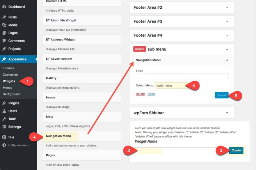
Follow these steps to create a navigation menu widget so that we can add it to our page via the visual builder.
- Navigate to Appearance > Widgets
- Create a new widget area by entering the widget name and clicking the create button
- Drag the Navigation Menu Widget into the new widget area you created.
- Toggle open the widget settings and select the menu you just created.
- Click Save
Now we can go back to our page and deploy the visual builder.
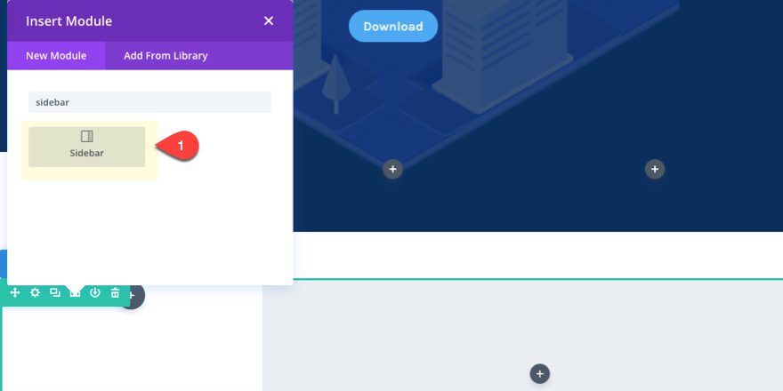
In the left column of our bottom section, add a sidebar module.
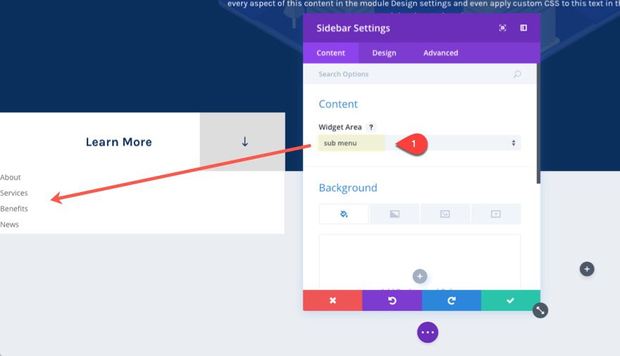
Update the sidebar to include the widget area you just created:
Now you can match the design of your menu links with the layout by updating the following design settings:
Show Border Separator: NO
Body Font: Karla
Body Font: Bold
Body Text Color: #0a2f5e
Body Text Size: 24px (desktop), 20px (tablet)
Body Line Height: 2.3em
Custom Padding: 20px Top, 10% Bottom, 30% Left
The 30% left padding is helpful to line up with the button text above which also has a left padding of 30%.
Box Shadow: [see screenshot]
Box Shadow Horizontal Position: 0px
Box Shadow Vertical Position: 0px
Box Shadow blur Strength: 0px
Box Shadow Spread Strength: 1px
Shadow Color: #f1f1f1
This is a creative way to add a border outside of our box and add a slight separation between the scroll button and the menu box.
Adding Content to the Right Column
In the right two-thirds column of the section, we are going to add a some content to give you an idea of how you use this layout for your own website.
First, add a divider module with the following settings:
Color: #0a2f5e
Divider Position: Vertically Centered
Divider Weight: 2px
Height: 18px
Width: 100px
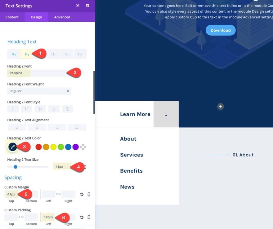
Under the Divider Module, add a text module with the following content:
<h2>01. About</h2>
Then update the design settings as follows:
Heading 2 Font: Poppins
Heading 2 Text Color: #0a2f5e
Heading 2 Text Size: 18px
Custom Margin: -17px Top
Custom Padding: 120px Left
Tip: In order to get the divider to be on the left and vertically centered of the header, match the divider height (18px) with the px value of your header text (18px). Then use custom margin to bring move the header up the same number of pixels (minus one to account for the width of the divider line) using the negative pixel value (-17px). After that, give your header enough left padding to account for the 100px length of the divider line (120px).
Then add another text module underneath with the following settings:
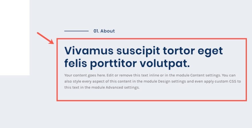
Content:
<h3>Vivamus suscipit tortor eget felis porttitor volutpat.</h3>
<p>Your content goes here. Edit or remove this text inline or in the module Content settings. You can also style every aspect of this content in the module Design settings and even apply custom CSS to this text in the module Advanced settings.</p>
Text Font: Karla
Text Text Size: 16px
Text Line Height: 1.6em
Heading 3 Font: Poppins
Heading 3 Font Weight: Semi Bold
Heading 3 Text Color: #0a2f5e
Heading 3 Text Size: 3vw (tablet), 40px (tablet)
Heading 3 Line Height: 1.2em
Custom Padding: 5% Top, 2% Bottom
Save Settings.
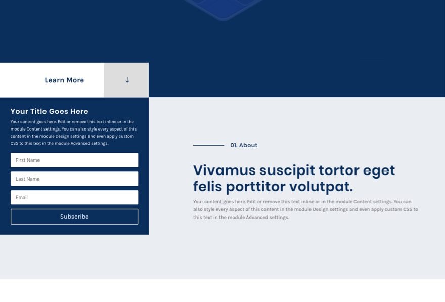
Create the Last Section
To create the last section, follow these steps:
- Duplicate the last section.
- Update the section background color to #ffffff
- Change row column to two-thirds one-third structure.
- Under row settings, change the custom top padding to 10%.
- Add Column 1 Custom padding: 10% Left, 6% Right
- Restore Column 2 Custom Padding to default.
- Save settings.
- Delete the sidebar module in the left column.
- Move all modules in the right column over to the left column and update the content.
- Then add an image in the right column.
Here the the final result…
To change your button location, simply drag it to one of the three columns in the row. Simple as that!
Consider the Widespread Application
This custom scroll button with the menu box should definitely get you thinking about all of the different applications. For starters, you can supplement the menu in the box under the scroll button with anything! This would be a great place for a contact form, email optin, or another call to action of some kind.
Here is an example of what an email optin might look like…
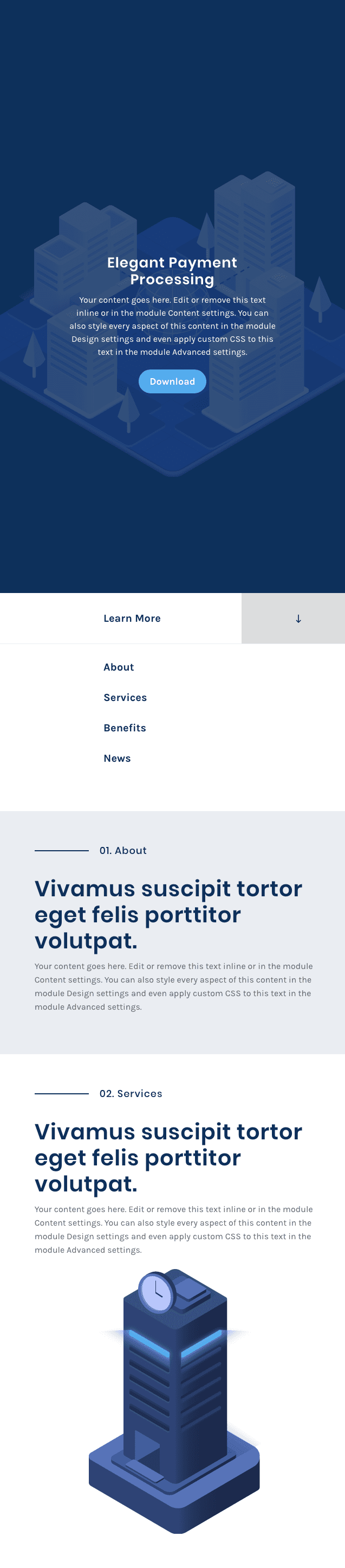
Looks Great on Mobile Too
This layout scales pretty well on mobile. The scroll button will simply scale the full width of the screen on tablet and smartphone.
Final Thoughts
I really enjoyed building this layout and exploring the possibilities it brings to the table. The custom scroll button alone is great way to make your fullscreen sections more prominent. I hope this design will help inspire you to create even more unique buttons and CTA’s for your own website.
I look forward to hearing from you in the comments.
Cheers!


Am I the only one with this problem with my sidebar? It won’t stay under the “learn more” button
http://cloud.nudg.ca/3n2w3S3H190J
Any help is appreciated
I’m not sure. What causes it to move out of place?
Could it be that you possibly duplicated the section with the button and then carried over the negative top margin? You may have two sections overlapping.
I love this layout and am using it for a new project. However, I can’t seem to get the menu to ‘stick’ underneath the ‘Learn More’ button. It works for a while, but then mysteriously moves to the middle of the page.
Any ideas:
http://cloud.nudg.ca/05041F0Z082J
Hello and thank you! Very nice inspirational for a site I have under construction.
This site has multiple menu items. Your design is for front page. I wonder if you have suggestions for matching “page 2” designs? I need two pages presenting 3-4 product options and call for action; “fill in form and click send”. Also, we will have a blog page.
Cheers from
Norchris
Is there a library download for this?
Most curious as to a couple of things:
Why did you choose a responsive unit (vw) for title text size, and a non-responsive unit (px) for the body?
What is the reasoning behind using vw for the title size, instead of em or %?
Thanks in advance for the explanation.
Patrick,
Using vw for titles accomplishes two main things: 1) It scales the font size to the browser width so when viewing the title on large screen sizes, the title is more proportional. 2) Because it scales with browser width, the line length remains consistent as well so you don’t have to deal with line breaks when resizing your browser window.
The trick is to make sure you override this vw value with a px value on mobile so that the text doesn’t scale to a size that is too small. In short, it is a way to keep the design of your header text looking the same on varying desktop browser widths.
I usually avoid using vw on body font because readers usually expect a consistent size for better readability.
Hi,
There is no link to see it in action?
Thank you!
Same here. A demo page would really help!
The inspiration is here: http://www.digitalasset.com
Hey guys,
amazing tutorial as usual.. Is there any chance to download the images you use?Thanks a lot
Thanks Vincent. These images are from the digital payments layout pack. https://www.elegantthemes.com/blog/divi-resources/download-a-free-elegant-digital-payments-layout-for-divi
There is a button to download the images at the bottom of the article.
Or you can import one of the layouts from the Divi Library and the images will be added to your media library.
I just love this. Thanks Mr C!
Quick question: is there a way that you know to make this leap from section to section so that it is linked to the viewers “scroll” behavior and not to a button?
Aloha,
JR
Unfortunately, I do not now of an easy way to do this. But I have found this answer helpful: https://stackoverflow.com/questions/21450095/how-to-make-mouse-wheel-scroll-to-section-like-in-mediafire-com
Are you sure you’re suppose to add the following css to the After input box: “position: absolute; right: 12%;” in the button setting? Seems like the arrow gets squished into the “Learn More” text.
Am I the only one ending up with a button like this?
https://i.gyazo.com/6fdb7fffc72c204f3fb5e449a621a81b.png
Under button settings advanced tab, replace “display:block” with “display:block !important”. Sorry about that. I’ll update the post.
That fixed it, thanks! 🙂
Good work Jason! A creative use of Divi to get my imagination going!
Great tutorial, as usual. But one question: How can I make a scroll down button that can be used on other modules?
Thanks!
Thanks Norman. Not sure I understand completely. But if you notice in the tutorial, the button is not used with the full width header module. And the button is actually an anchor link that scrolls to the next section with the class that matches the button url. So if you use an anchor link you can pretty much add “scroll down” or “scroll up” buttons anywhere you want. It is the same concept behind building one page websites:
https://www.elegantthemes.com/documentation/divi/one-page-website/
Here is recent post on adding custom “scroll up” anchor links along with the header module scroll button that may be helpful: https://www.elegantthemes.com/blog/divi-resources/how-to-create-full-screen-sections-with-top-and-bottom-scroll-links-with-divi
Correction… “the button is actually an anchor link that scrolls to the next section with the CSS ID that matches the button url.”
Great tutorial – as usual. But one question: how can I make a scroll down button that can be used on modules other than the full width header?
Thanks!
Champagne pour tout le monde !
Thanks that’s a neat appraoch.
Great work! This is beautiful.