

Every week, we provide you with new and free Divi layout packs which you can use for your next project. For one of the layout packs, we also share a use case that’ll help you take your website to the next level.
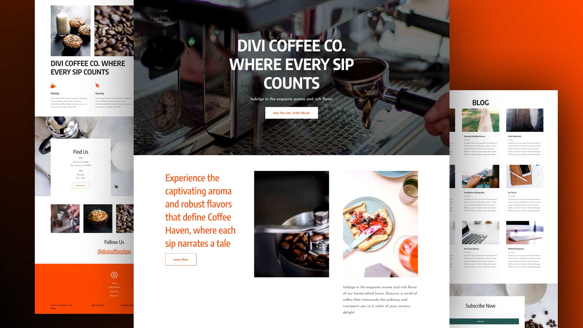
This week, as part of our ongoing Divi design initiative, we’re going to show you how to create an interactive question card grid for your next about page with Divi. We’ll be using the Internet Service Provider Layout Pack’s about page but you can use the approach on any page you’re working on. It gives a different user experience to visitors and allows you to interact with them on the information you’re sharing. Once you get the approach, you can create alternative question card grid designs of your choice by playing around with Divi’s built-in options.
Let’s get to it!
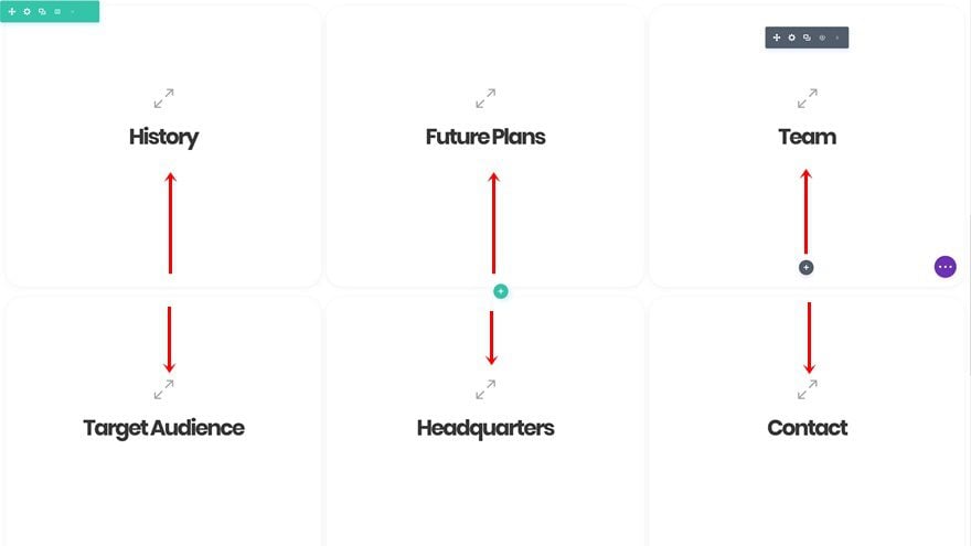
Preview
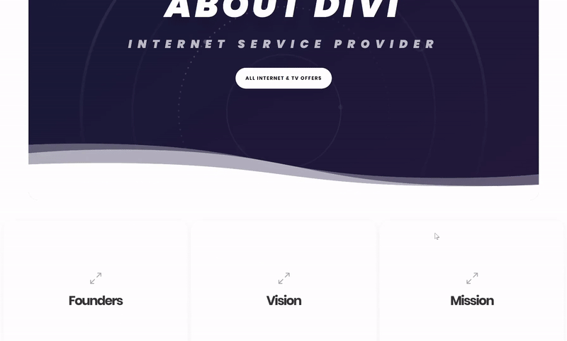
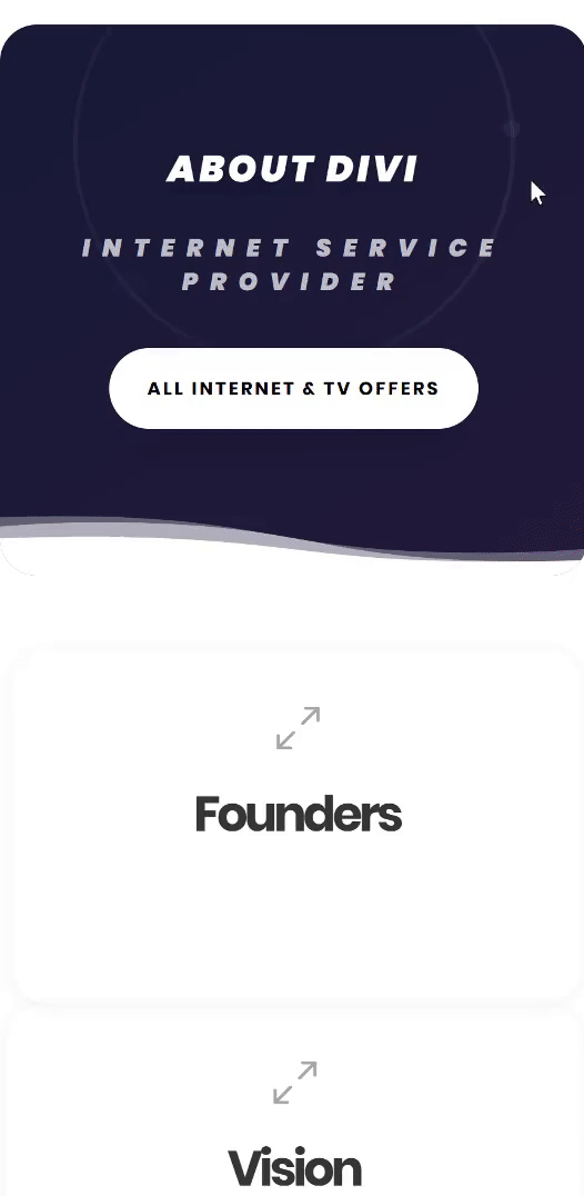
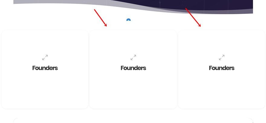
Before we dive into the tutorial, let’s take a quick look at the question card grid we’ll be recreating from scratch.
Desktop
Mobile
Let’s Start Creating!
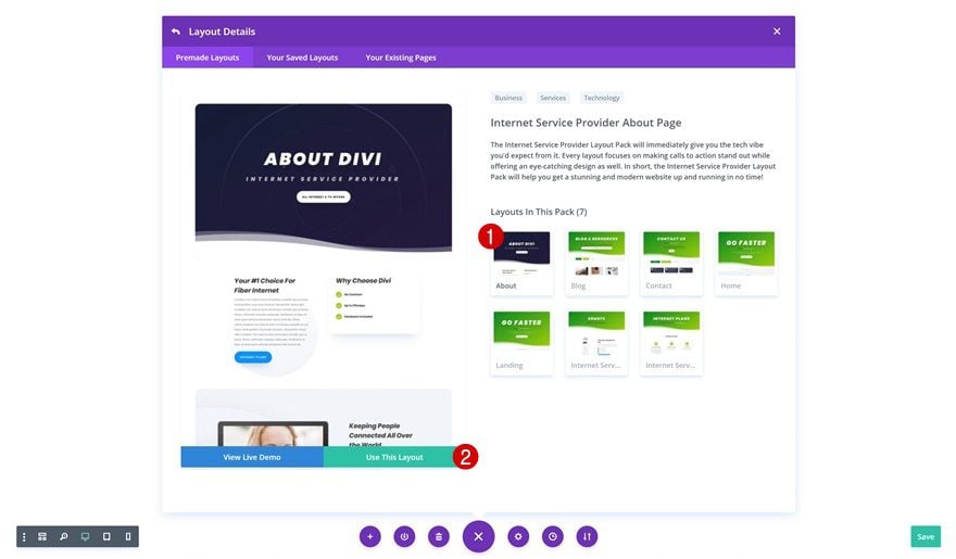
Create New Page Using The ISP Layout Pack’s About Page
To create the design we’ve shown above, we’re going to use the Internet Service Provider Layout Pack’s about page so go ahead and create a new page using this layout. As usual, you can find it in your premade layouts.
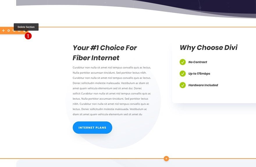
We’ll replace all the current content with a question grid card. To do that, we’ll first need to remove all sections in between the hero section and footer.
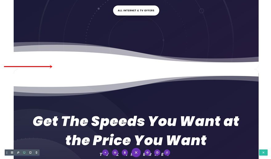
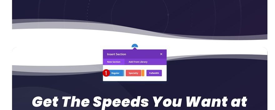
Add New Section in Between
The question card grid we’ll be creating can contain any kind of company questions you want to answer. You can also use the grid to showcase frequently asked questions. Continue by adding a new regular section in between the hero section and footer of the page.
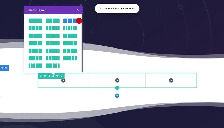
Add New Row
Column Structure
Without making any changes to the section settings, add a new row using the following column structure:
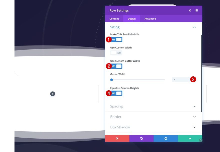
Sizing
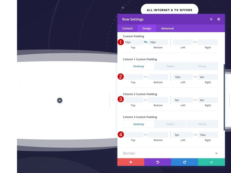
We’re going to remove all the default space between columns. Open the row settings and make some changes to the sizing settings.
- Make This Row Fullwidth: Yes
- Use Custom Gutter Width: Yes
- Gutter Width: 1
- Equalize Column Heights: Yes
Spacing
We’ll still need some space between columns to have a nice-looking design. Go to the spacing settings and add some custom padding values.
- Top Padding: 10px
- Bottom Padding: 10px
- Column 1 Left Padding: 10px (Desktop), 5px (Tablet & Phone)
- Column 1 Right Padding: 5px
- Column 2 Left Padding: 5px
- Column 2 Right Padding: 5px
- Column 3 Left Padding: 5px
- Column 3 Right Padding: 10px (Desktop), 5px (Tablet & Phone)
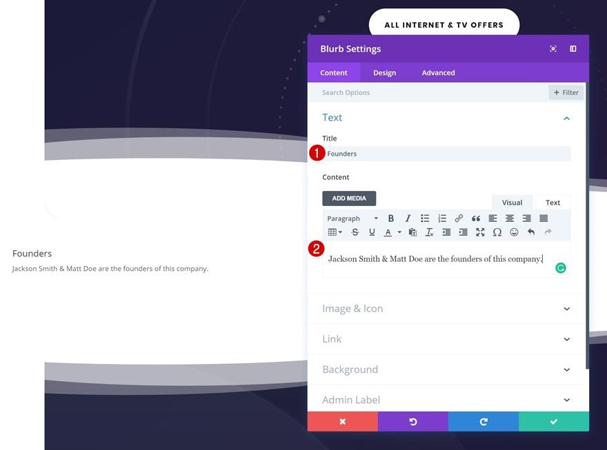
Add New Blurb Module to Column 1
Add Content
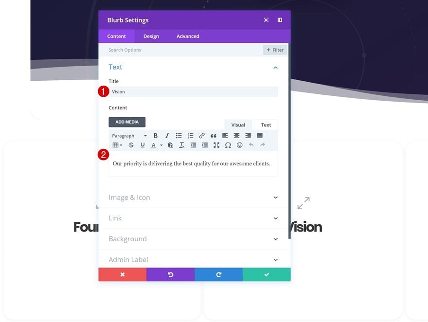
To create the hover effect, the only module we’ll be needing is a Blurb Module. We’ll start by creating one and clone it afterwards to create the entire outcome. Add a Blurb Module to column one. Add the question you want to answer to the title field and the answer to the content box.
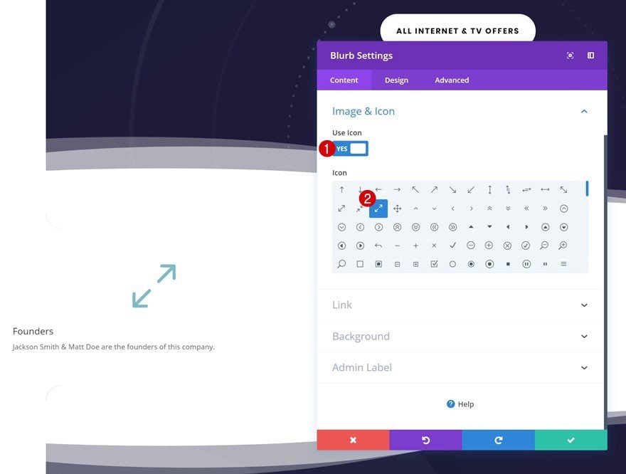
Select Icon
Then, select a fitting icon in the image & icon settings. This icon will help your visitors understand that they have to hover the question card to see the answer.
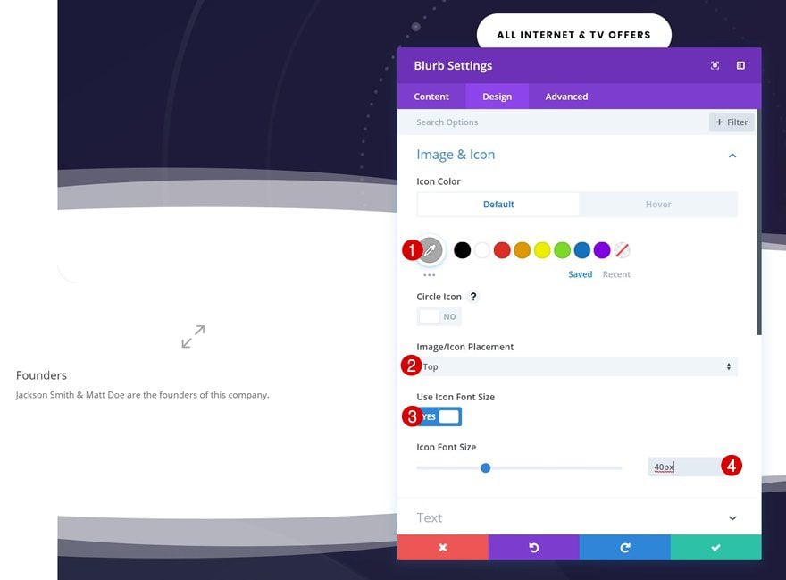
Default Icon Settings
Continue by changing the icon settings in the design tab.
- Icon Color: #aaaaaa
- Icon Placement: Top
- Use Icon Font Size: Yes
- Icon Font Size: 40px
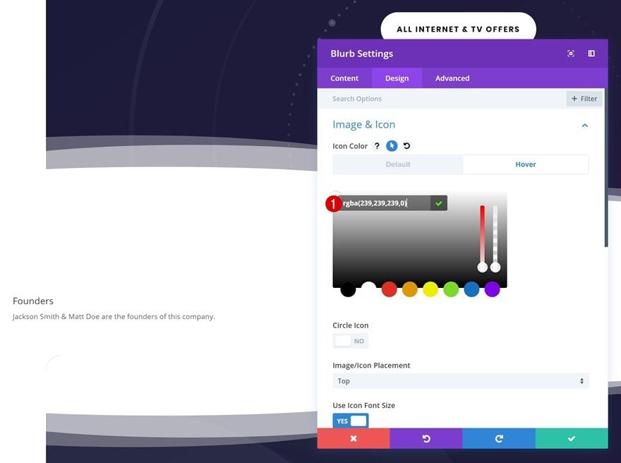
Hover Icon Settings
And modify the icon color on hover. We’re using an entirely transparent color on hover to make the icon disappear on hover.
- Icon Color: rgba(255,255,255,0)
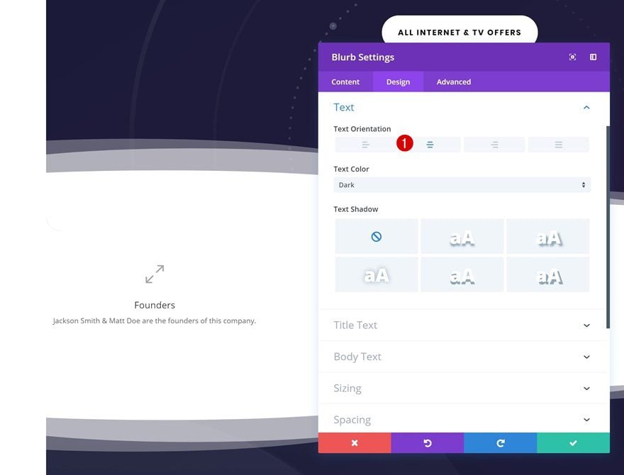
Text Settings
Next, change the text orientation in the text settings.
- Text Orientation: Center
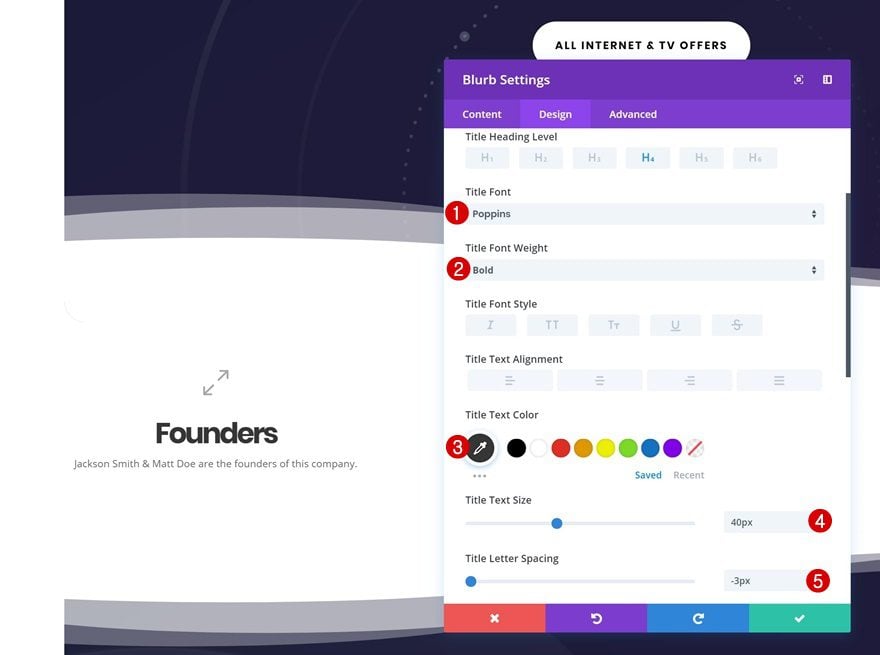
Default Title Text Settings
Make some changes to the title text settings as well.
- Title Font: Poppins
- Title Font Weight: Bold
- Title Text Color: #333333
- Title Text Size: 40px
- Title Letter Spacing: -3px
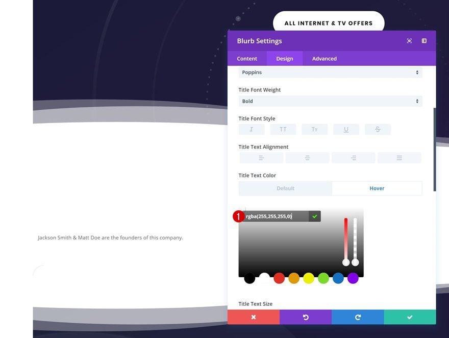
Hover Title Text Settings
And change the title text color on hover. We’re, again, using an entirely transparent color to make sure the question doesn’t show up once someone hovers the Blurb Module.
- Title Text Color: rgba(255,255,255,0)
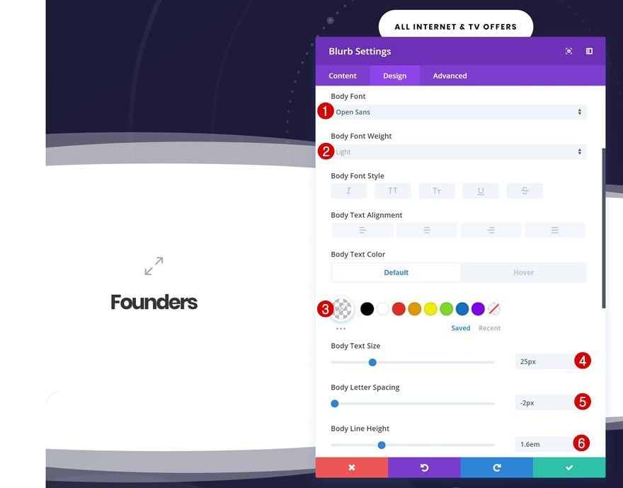
Default Body Text Settings
Continue by changing the body text settings.
- Body Font: Open Sans
- Body Font Weight: Light
- Body Text Color: rgba(255,255,255,0)
- Body Text Size: 25px
- Body Letter Spacing: -2px
- Body Line Height: 1.6em
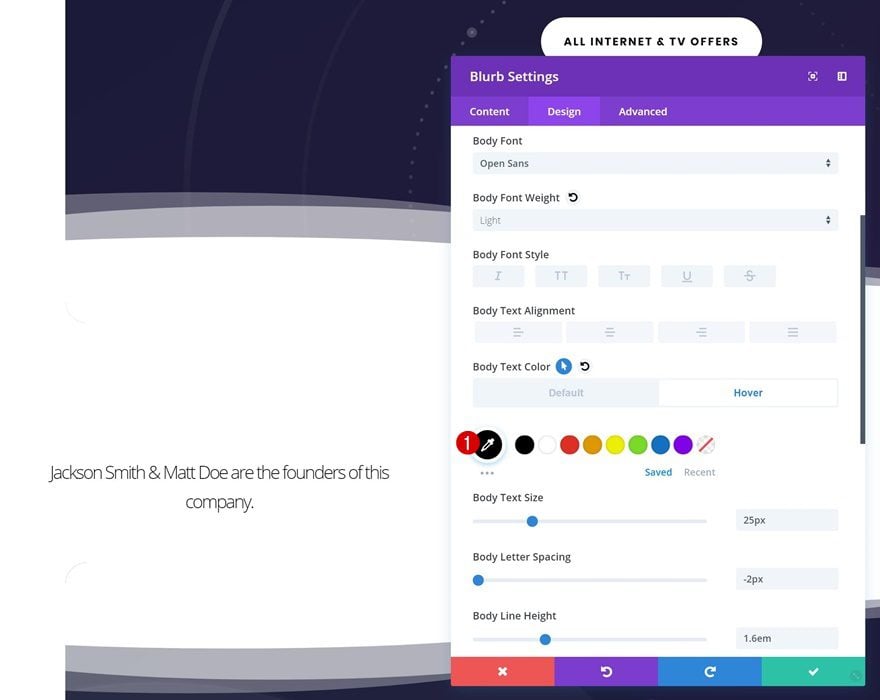
Hover Body Text Settings
And change the body text color on hover.
- Body Text Color: #000000
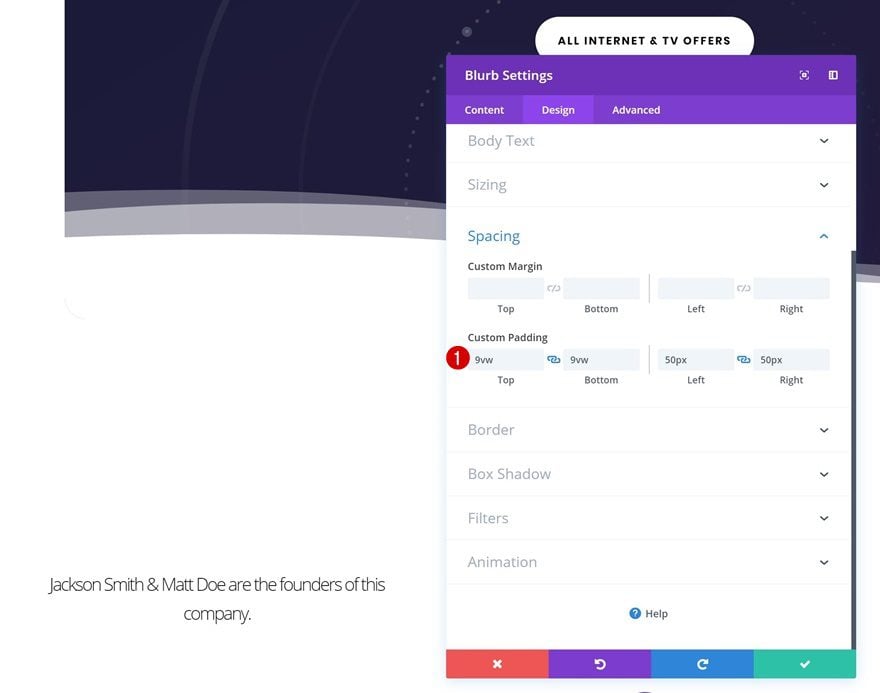
Spacing
To shape our module into a square, we’ll add some custom padding values.
- Top Padding: 9vw
- Bottom Padding: 9vw
- Left Padding: 50px
- Right Padding: 50px
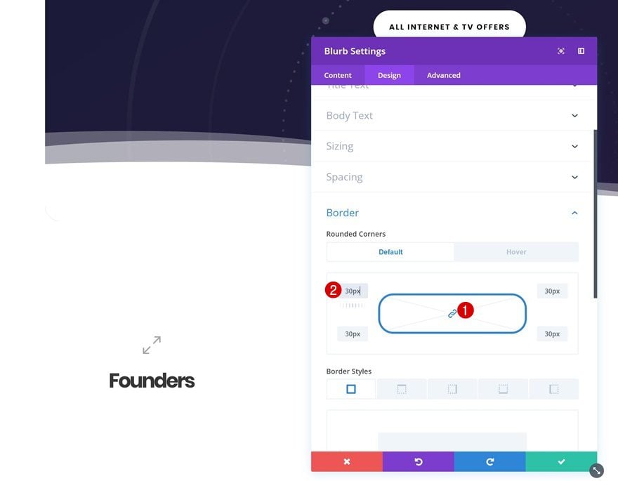
Default Rounded Corners
We’re also giving our module ’30px’ of rounded corners.
Hover Rounded Corners
We’re removing these rounded corners on hover.

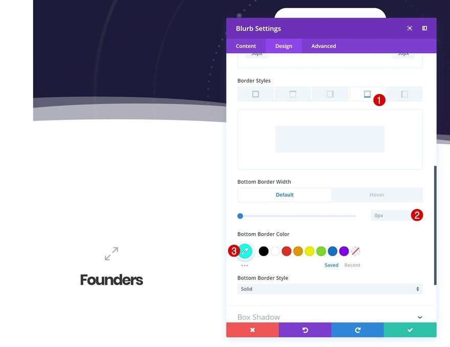
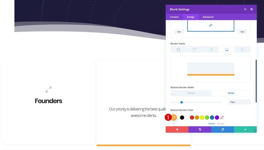
Default Border
And we’ll add a bottom border.
- Bottom Border Width: 0px
- Bottom Border Color: #0fffeb
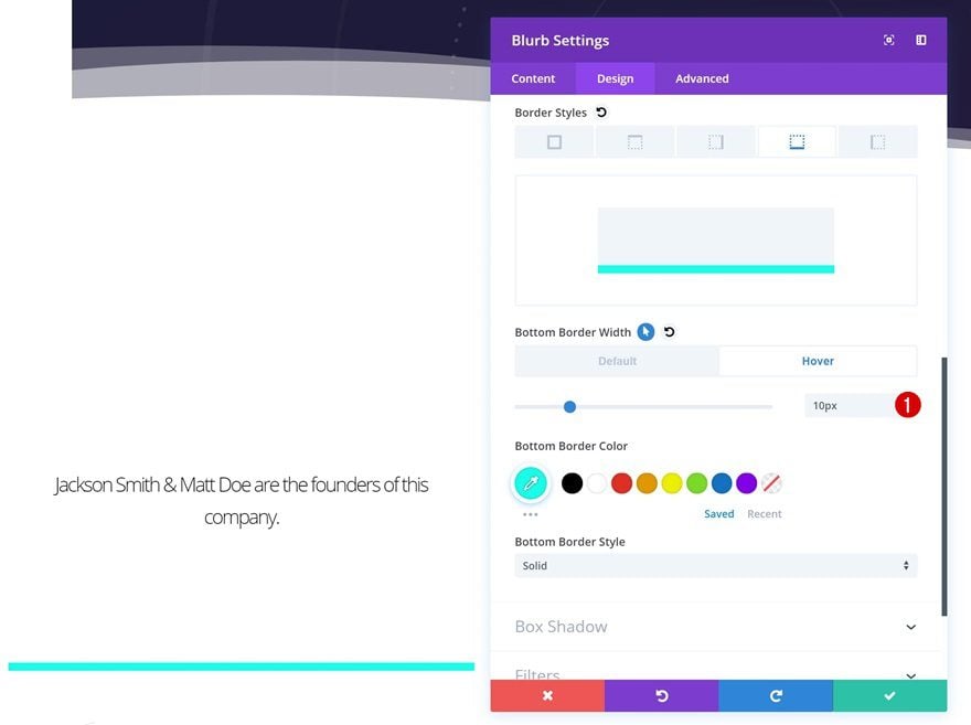
Hover Border
Change the bottom border width on hover for it to appear.
- Bottom Border Width: 10px
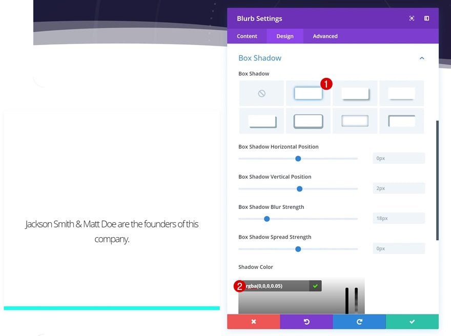
Box Shadow
To add some depth, we’ll use a box shadow as well.
- Shadow Color: rgba(0,0,0,0.05)
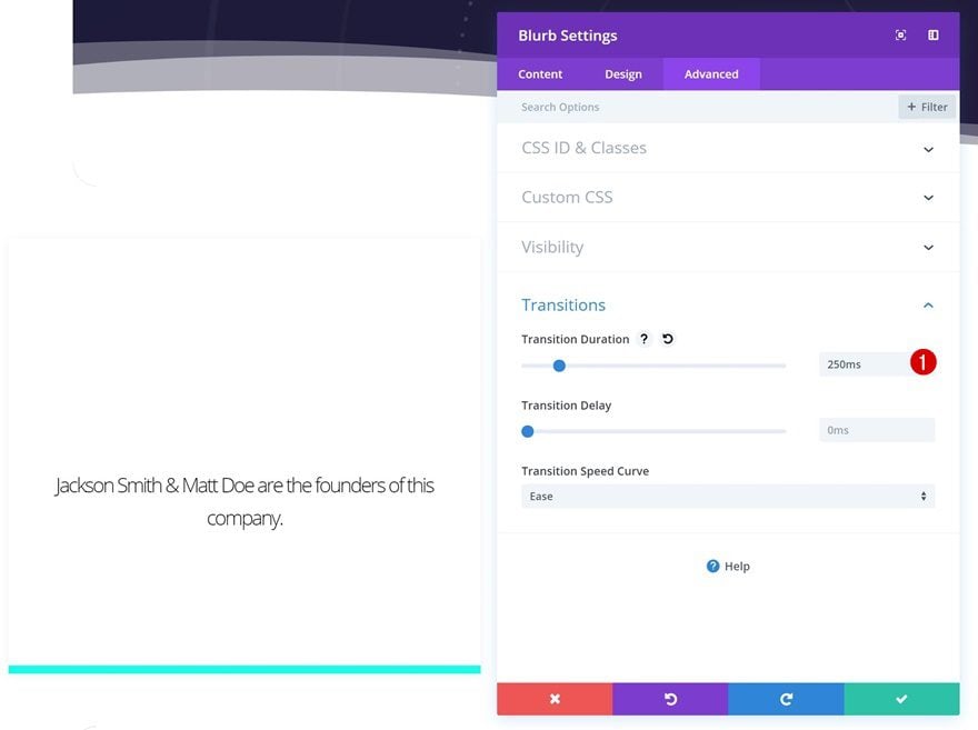
Transitions
Last but not least, we’ll reduce the transition duration in the advanced tab.
- Transition Duration: 250ms
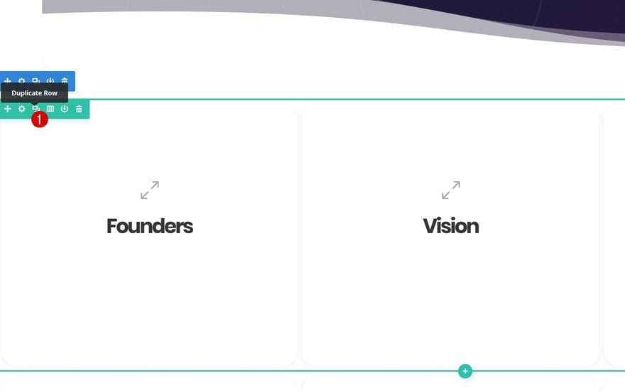
Clone Blurb Module Twice & Place in Remaining Columns
Now that your first Blurb Module is done, you can save time by cloning it and placing the duplicates in the two remaining columns.
Change Content
Make sure you change the content of each one of the duplicates.
Change Bottom Border Colors
Along with the bottom border color.
Clone Entire Row Twice
You can create the question card grid by cloning the row up to as many times as you want.
Change Content & Bottom Colors For Each Item Individually
But don’t forget to change the content and bottom colors to make each one of the question cards unique!
Preview
Now that we’ve gone through all the steps, let’s take a final look at the end result on different screen sizes.
Desktop
Mobile
Final Thoughts
In this post, we’ve shown you how to create an interactive question card grid using Divi’s Internet Service Provider Layout Pack. Although we’ve made sure the design matches the layout pack’s style, you can use this method to transform any about page into one that’s interactive as well. If you have any questions or suggestions, make sure you leave a comment in the comment section below!


There are no hover effects on mobile, so why bother doing it in mobile too?
Think the problem with hover on mobile is there is no pointing device (mouse) to hover. Once your finger touches the screen, it’s a click.
I think, it is a general issue: what to do with massive hover-effects displaying relevant Content. Here would be some kind of toggle-effect great instead of hover…
I wondered this too!
Thank you so much! your tutorials are abolutly great and DIVI is the my top favorite Theme.
You’re welcome, Frank! Glad you’re enjoying the tutorials 🙂
This is great – and very helpful. Seeing the new features you’re constantly releasing, along with new layout packs, and these types of demo’s, are one of the reasons why I went with Divi… keep up the good work, and know that your lifetime subscribers appreciate it!
Good to have you part of the community, Chris!