

Welcome to part 2 of our mini series “Effective Divi Web Design Principles” where we’re exploring effective design practices to help empower new web designers and those who identify as someone without an “eye for design.”
In our previous post, we covered preparing your mindset and went over some ways of learning how to develop a better eye for design. In this post, we’re going to focus on some universal principles of good design that you can apply immediately to your web design endeavors in order to become better at the “design” side of web design.
Let’s get right to it!
3 Effective Web Design Principles for the “Non-Designer”
As mentioned in part 1 of this series, there is no right or wrong when it comes to design. What we’ll go over in this post is largely and universally accepted as good design principles within the web design community at large. This is also my personal guideline as a graphic/print designer turned Divi web designer with nearly a decade of experience and more importantly, hundreds of happy and satisfied clients. I employ these principles to every Divi website design I build and while there’s always that one client who wants something atrocious or off the wall, these will serve you well at least 9 out of 10 times 🙂
1) Rule of Thirds
One of the most common practices across web design, graphic design, print design, photography and other creative mediums, is to follow one simple rule – The Rule of Thirds. In short, the Rule of Thirds is all about symmetry and balance. The objective of the rule of thirds is meant to help you achieve more balance and harmony in design. And the best part is – you can apply the Rule of Thirds to graphics, images, entire web page layouts and more!
There are numerous conversations online as to whether the Rule of Thirds is scientific or not, but regardless, popular opinion shows that if an image or design is too similar in both the left half and right half or top and bottom, the audience might find it dull or boring. If anything, the rule of thirds keeps it interesting and can lead to good flow which we’ll cover below.
In our previous post on Design Tips to Optimize Your Divi Web Content, it’s also referenced as a grid system which is a great way to visually think about it. Imagine a grid that looks like this:
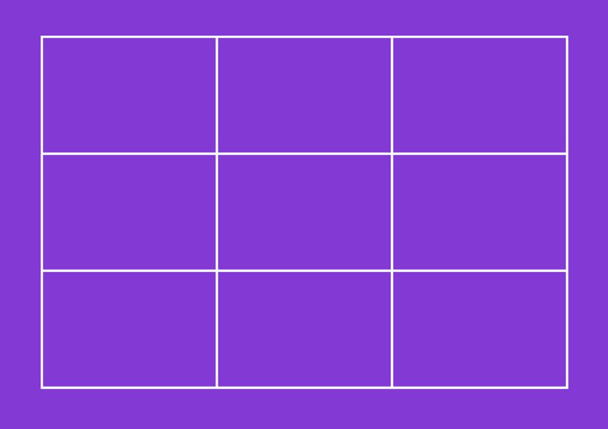
With this imaginary grid on your image, graphic or layout, you can easily place content near one or more of the main intersection points.
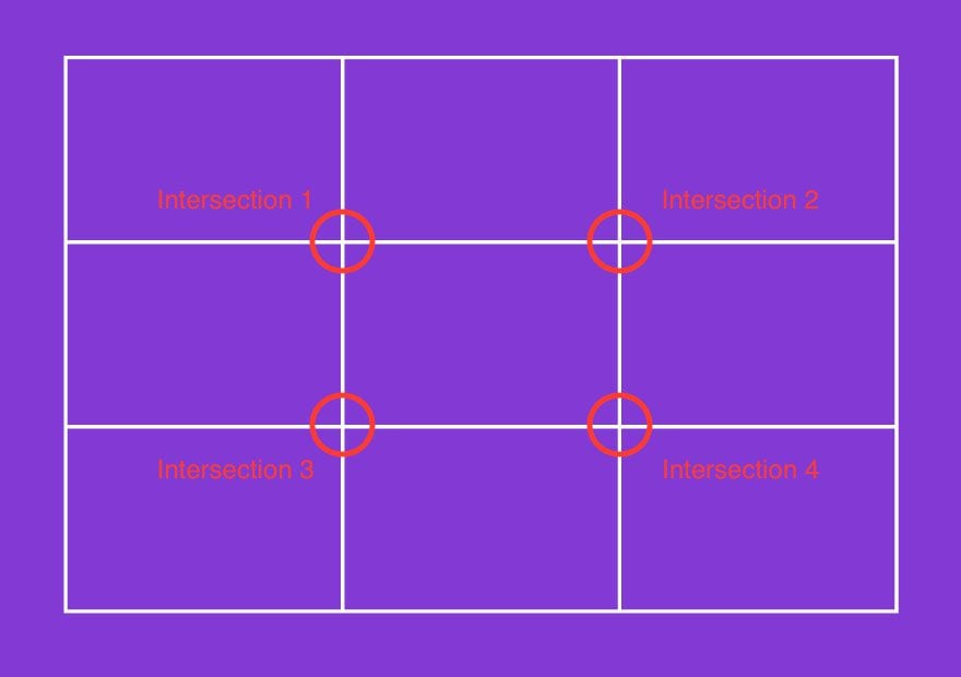
Keeping objects and focal points at 1 or more of the 4 intersection points will often achieve a much more balanced, symmetrical look as opposed to the second example where the subject is below the intersection point. Take a look at the image below. The first example is NOT following the rule of thirds.

This example IS following the rule of thirds.

While the first example is still a nice image, using the rule of thirds provides an entirely different feel to the image by intersecting the foreground with the bottom intersection points in the rule of thirds. Let’s look at the image with the rule of thirds grid.

Now let’s look at the image without lining up the rule of thirds intersections.

You can see a big difference in regards to how the eye-pleasing designs will often line up with one or more of the intersection points. While the Rule of Thirds is most commonly talked about in photography and videography, it’s equally as important for website design. I’ll show you how I applied the rule of thirds to my personal site. Here’s a snapshot of the initial design “above the fold,” which applies to what the viewer sees before scrolling down.
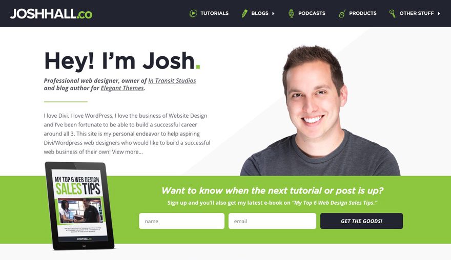
Now, let’s put the rule of thirds grid over the main section and see how it looks. In this case, I’m going to focus on the content below the primary menu where I implemented the rule of thirds.
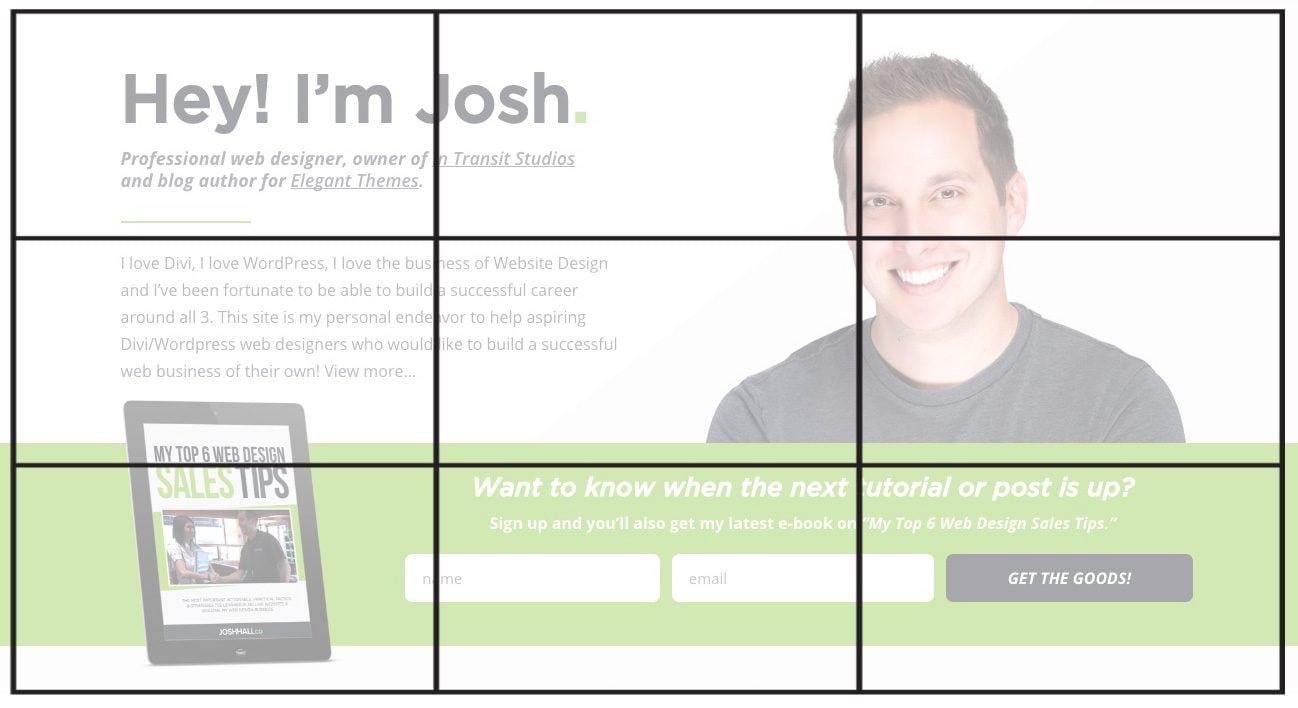
In this example, there are 4 main elements that are on or close to the intersection points. In short, I wanted to accent the following:
- A brief description of who I am and what this site is all about.
- A picture that allows new users to feel more comfortable and trusted by seeing who they’re going to hear from.
- A graphic of my latest e-book giving folks a reason to sign up.
- Finally, a call-to-action email sign up in the final 2 frames which is where the user’s eye will end.
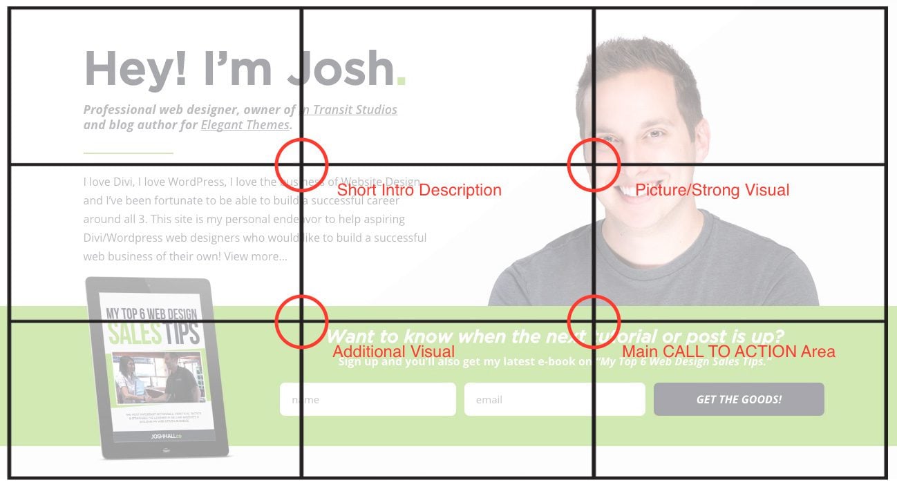
With the rule of thirds, it’s generally not best practice to have something at every intersection point (particular in photography) but I often follow this layout in my website builds. And on a side note: since we read from left to right, I often have call-to-actions in the middle or right side of the screen since that is where our eye ends. We’ll go into call to actions in more detail in the final post in this series but this is a good example how I implemented the Rule of Thirds into my design.
So if you’re not sure about how to layout a webpage or are struggling with mixing images, text and perhaps a call to action, try following the rule of thirds and let that be your guide.
2) Layout and Flow
When it comes to laying out and designing a web page, there again is no right or wrong style. It often depends on the project, your client’s wishes, your design style and often the market you’re targeting. More often than not, in digital or services like web design agencies, fashion and photography more modern and trendy designs with a minimalistic look and feel. With modern design often comes more open space, less text driven content, more imagery and perhaps more scrolling. (Some of my old-fashioned clients just shuddered!)
In more traditional business markets such as manufacturing, law firms, blue collar industries, etc, you’ll likely find websites with more text driven content, less open space and undoubtedly with imagery and design elements that are less…appealing. And for whatever reason, the majority of my clients in these industries are severely opposed to too much scrolling. So knowing how to design a layout with good flow is key! I’ve found often that I have to try and balance MY creative design style with what works within my client’s industry, target demographic and my client’s wants and needs. With all that said, there are some basic layout and flow principles that can be applied no matter who you’re working with or what industry they’re in.
Looking back at the previous post mentioned above, a very important guideline to follow is a z-pattern of design. You’ll find this frequently with many of the new professional Divi layout kits that are provided weekly.
Let’s take a look at what I mean.
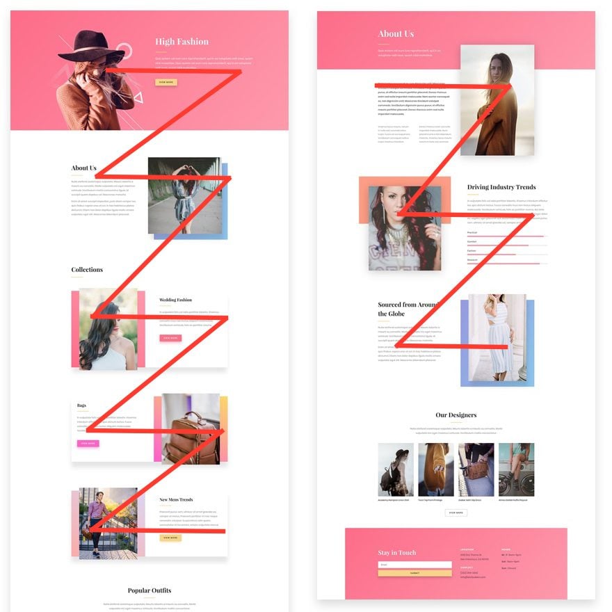
In the first example on the left, there’s an image on the left, text on the right with a nice call to action button then your eye reads down and to the left to a another section of text/CTA then with another image on the right and repeat. Vis versa, on the image to right, a reversed pattern is there. Text to image to image to text, etc. Following this z style pattern is a great way to keep readers interested and is a wonderful way to balance text and images together.
This isn’t’ the only option for layout in flow in good page design but it’s good practice being that we take in content from left to right then down. Then left to right then down and so on. So when in doubt, try following the z style pattern as a way to help organize the flow of your page content. And one final note on scrolling – I tend to keep my sites within 3-5 scrolls. More often than not, the more you have to scroll the larger the page will be and the slower it will load. Again, there’s no right or wrong in regard to scrolling but if you haven’t yet worked with clients of a more old fashioned mindset, you’re guaranteed to run into some opposition. I try to reaffirm those clients that scrolling is not to be feared. Social media has trained us to scroll constantly and take in content quickly.
3) Visual Hierarchy
The last main principle I’d like to point out here is visual hierarchy. In short, hierarchy helps the user know what the most important information is and provides them with a very clear direction of where their eye should go in your design. Hierarchy is often referenced with typography (which we’ll get into in our third post) but it can also be very important in the graphic elements, images and the overall design of the site.
I’m not going to intentionally point out sites that I feel lack in the “good design” department but I’m sure you have come across plenty of sites that have a smorgasbord of text and images that are all the same size with no clear call to actions, right? That’s what we want to avoid. Using good hierarchy is the best way to guide your website user in knowing WHAT they should click on or do next.
Here’s an example of a recent design I created with hierarchy in mind:

While the logo and phone number in the top right are clearly big and visible, the largest content and most vibrant color above the fold is the call to action to click the button.

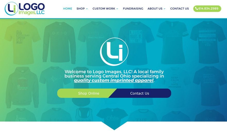
My client specifically wanted people to easily request an inspection right when they got on the site so I used this idea of visual hierarchy to hopefully achieve just that! Another example of how I used hierarchy recently is the design above the fold in this site:
In this case, the client’s main call to actions are to either Shop Online or Contact them directly. The logo, short description and even the phone number are prevalent but the Divi Double Button is the largest element you see initially in hopes to get users to click what they’re looking for if they don’t scroll any further.
So again, while those are just a couple of examples of visual hierarchy, it can be a very powerful method in directing your website users to do what you want them to do or go where you want them to go! As an aside, I highly recommend checking out our previous post on Common Web Design Errors to Avoid.
In Closing
I hope these effective design principles have helped you in your design endeavors whether you’re new to web design or are looking to get better at design! Again, there are many principles we could go over but these are the top 3 that try to implement in all my website designs.
If you have any other design principles you’d like to share, let us know in the comments below!
Tomorrow: 3 Important Areas of Design to Focus on for Every Website Build

Now that we’ve covered preparing our mindset, how to learn to have a better eye for design and have gone over some basic design principles, our final post is going to explore a few of the most important aspects of web design to focus on for every website build. Till then!
Be sure to subscribe to our email newsletter and YouTube channel so that you never miss a big announcement, useful tip, or Divi freebie!


Very nice and helpful tips, will bookmark this website immediately for faster access
Useful stuff, and keeping it down to just three simple ideas, means there’s a good chance it’ll stay in my head when talking to my next client and laying out future designs.
Thanks
Smashing article, congratulations!
Thank you, Thiago! Appreciate the feedback 🙂
Josh, the way you lay out this post- with the design and resources- is so helpful! Thanks for doing it smart and putting a great model out there for the rest of the designers to follow.
Thanks so much for the awesome feedback, Tracy! Much appreciated and so glad that this post helped you out!
Hi Abhishek
If you installed the SSL Certificate and your wordpress is http you should change permalinksin wordpress from http to https. You should go Settings > General > and make the changes on wordpress url and site url. It is also necesary to do some changes on database to serve all your site under https but to make it easier i reccomend you the following plugin. “Better Search Replace” it is on wordpress repository.
Am not and expert but i used it and works perfectly.
Hi Dave,
The query is bit off topic but want to clear the confusion. If you already have a SSL certificate installed in server while installing WordPress would you install it on http and then set the 301 redirect to serve from https or direct install WordPress on https?
Thank you, Abhishek
The ideas you can extract from this post are awesome. You can design the perfect landing page or web design if you place your content on the right place. I will practice all i have learned here on my next project and will try to do some A/B Test and will ask facebook followers opinion to get a feedback. Soon i will let you know about results. Thanks for sharing this great post.
That’s awesome, Yuni. Thanks so much for your feedback!
Hi Josh,
Great article! I thought I knew the thirds rule. I never knew about lining things up with the points of intersection. Make a lot of sense!
I was a bit confused by the line “Now let’s look at the image without lining up the rule of thirds intersections.” which is followed by an image where they do line up. Is that a typo?
Thanks Dave! I probably could’ve used a better image example but the first image actually doesn’t line up directly on the points. It’s most sky. But by shifting the mountain up and giving the image some foreground, it gives the image a totally different feel. Again I probably could’ve found a better example so that one’s on me! But thank you for your feedback!
Very nice and helpful tips, will bookmark this website for faster access.
Thanks, Siyabonga. I may be biased but I certainly consider the ET blog to be well worthy as a bookmark! Really appreciate your feedback.
Good read. I knew about the rule of thirds and always have that grid on my camera display. Never thought using it for my websites too. Thanks!
Awesome. Yeah I’ve found that general design rules translate just as well to web. Thanks for your feedback on that John-Pierre!
Great detailed article! Josh Hall
Thanks for the feedback!
Cool.
Thanks, Britt!
Thanks Josh! I’m enjoying your series. I also really like the way you formatted the double button on the logo images site. Is there a post that explains how to get that look where the buttons touch with the angle in between?
Thanks Susan! Really appreciate the feedback. Yep here’s the link to my Double Button design if you want to check it out: joshhall.co/product/divi-double-button/
Interesting. Thank you!
Thanks, David!
Josh! You’re the man, thanks for laying out something that is prob so simple to designers, yet no so obvious to me. This is the reason why I don’t do web design and rather pay someone to do it. I’m a firm believer that one can learn anything, but this web design stuff is definitely not for me. After reading this, makes me want to delete my site and start again from scratch. Thanks for sharing dude
Love it, Nick! Thanks for sharing your feedback man. Yeah I think it’s a great mindset to hire people “better than you” at certain jobs but I do strongly feel that anyone can at least learn the basics of good design principles and it’ll go a long way. Like I said, I’ll spare showing off my first few designs back in the day 🙂
Thanks again for the feedback and best of luck with designing in the future!
Hi Josh,
The double button? Does each side navigate to specific places?
Hey Stephen, yep! It’s essentially to call to action buttons side by side. More details here if you want to check it out: joshhall.co/product/divi-double-button/
As a definite non-designer this is helpful. It helps understand why I like certain designs. Thanks.
Thanks for the feedback, Gene! Glad to hear this post helped!