The Divi Email Optin Module
How to add, configure and customize the Divi email optin module.
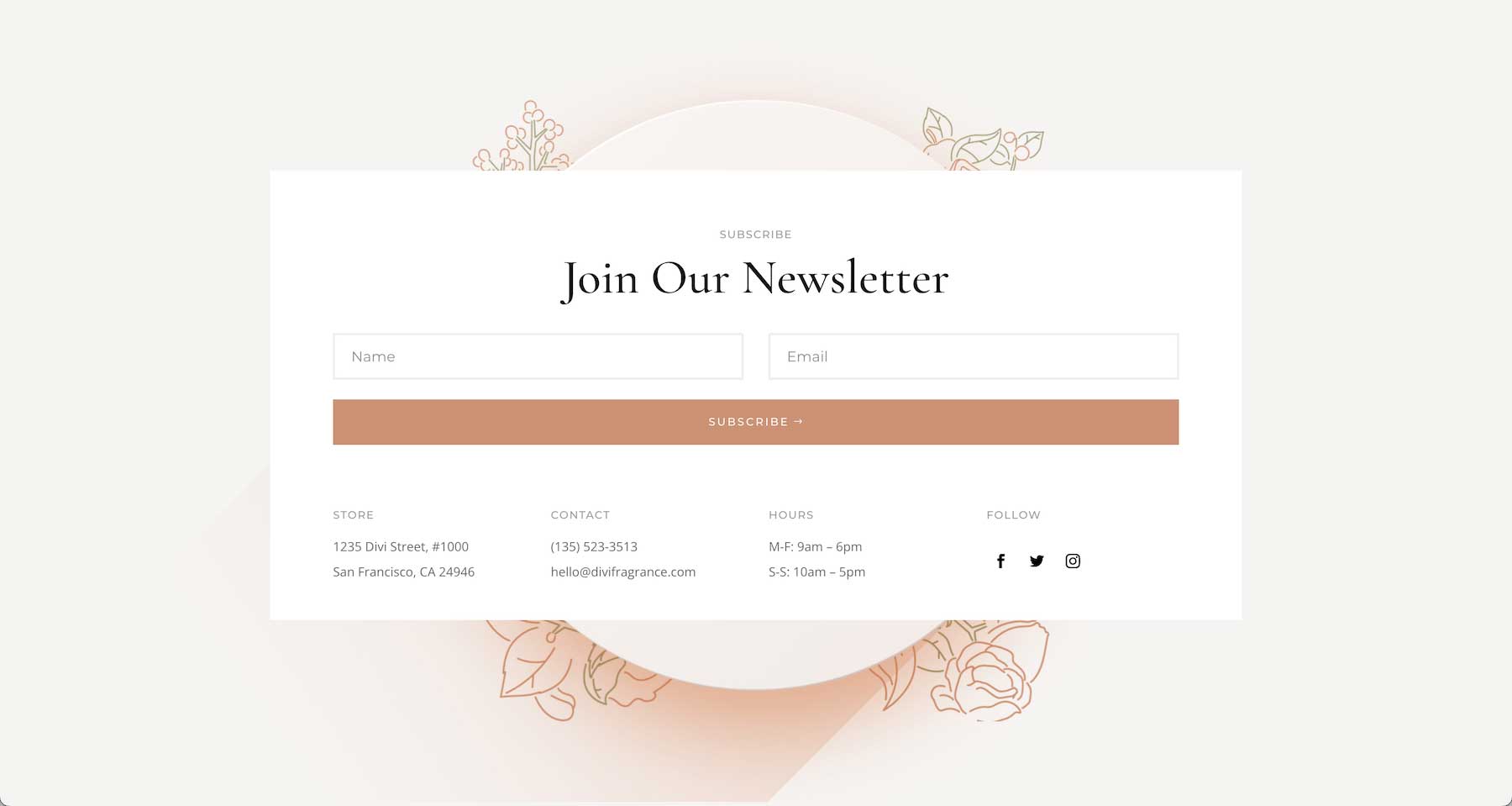
The Divi Email Optin Module makes it easy to grow your email subscriptions with attractive signup forms and seamless integration with 21 popular email software companies. You can add this module anywhere in your website design, including header and footers.
View A Live Demo Of This Module
How To Add the Divi Email Optin Module To Your Page
Before you can add the Divi Email Optin module to your website, you’ll need to have the Divi theme installed on your WordPress website. Learn how to install the Divi theme on your WordPress website here. Once you have the Divi theme installed and activated, we can begin using the features and functionalities of Divi.
Add a Page and Load the Divi Builder
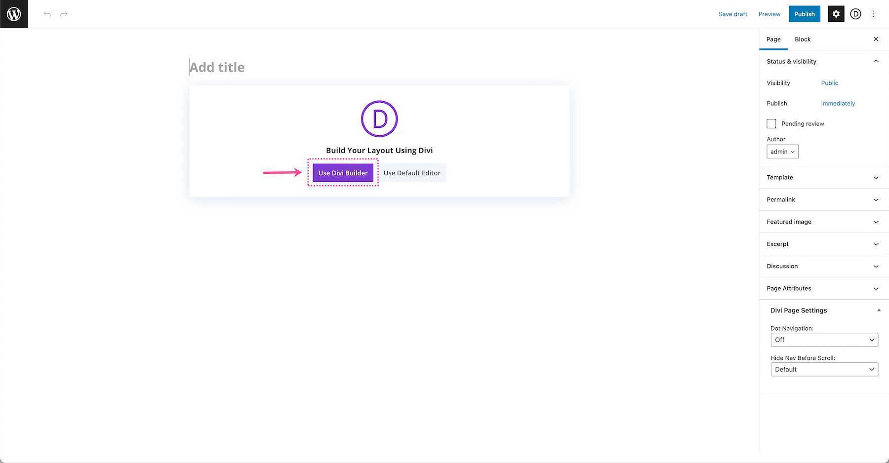
To get started, add a new page to your website. By default, the Standard Gutenberg Editor loads whenever a new post or page is added in WordPress. To load the Divi builder on any post or page, click the purple button underneath the page title that says “Use The Divi Builder”.
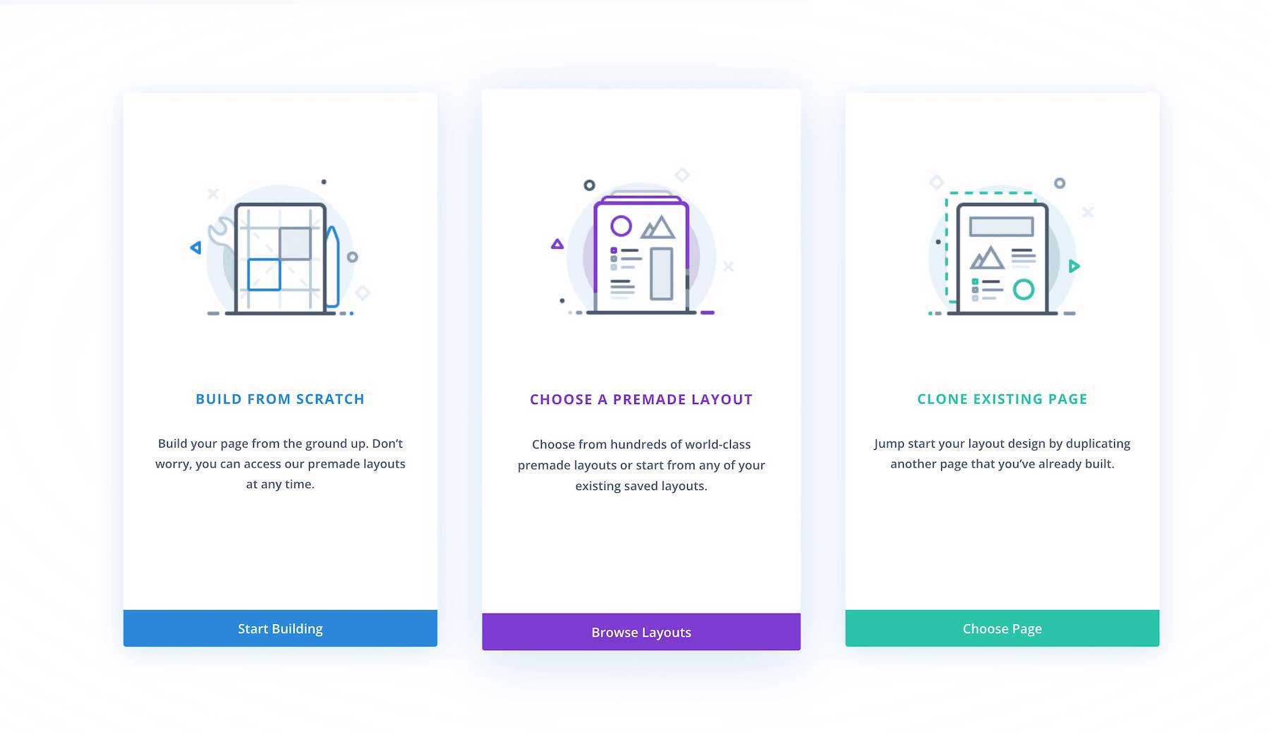
Once clicked, this will reload the page with the Divi Visual Builder. As your page reloads, you’ll notice three options that come up: Build From Scratch, Choose A Premade Layout, and Clone An Existing Page.
Build From Scratch
This option loads the Divi Builder with a blank page design. Choose this option if you’d like to start your page design from scratch.
Choose a Premade Layout
This option allows you to choose from our large library of pre-designed Divi layouts. You can choose from premade layouts by Divi, pre-made layouts you’ve designed and saved to your Divi Library, and existing pages on your website that you can clone.
Clone an Existing Page
This option allows you to copy another page design on your website and use it for the page you’re editing. Select this option if you’d like to load an exact copy of an existing page that you’ve already designed on your website.
Select, Build From Scratch.
Add the Divi Email Optin Module
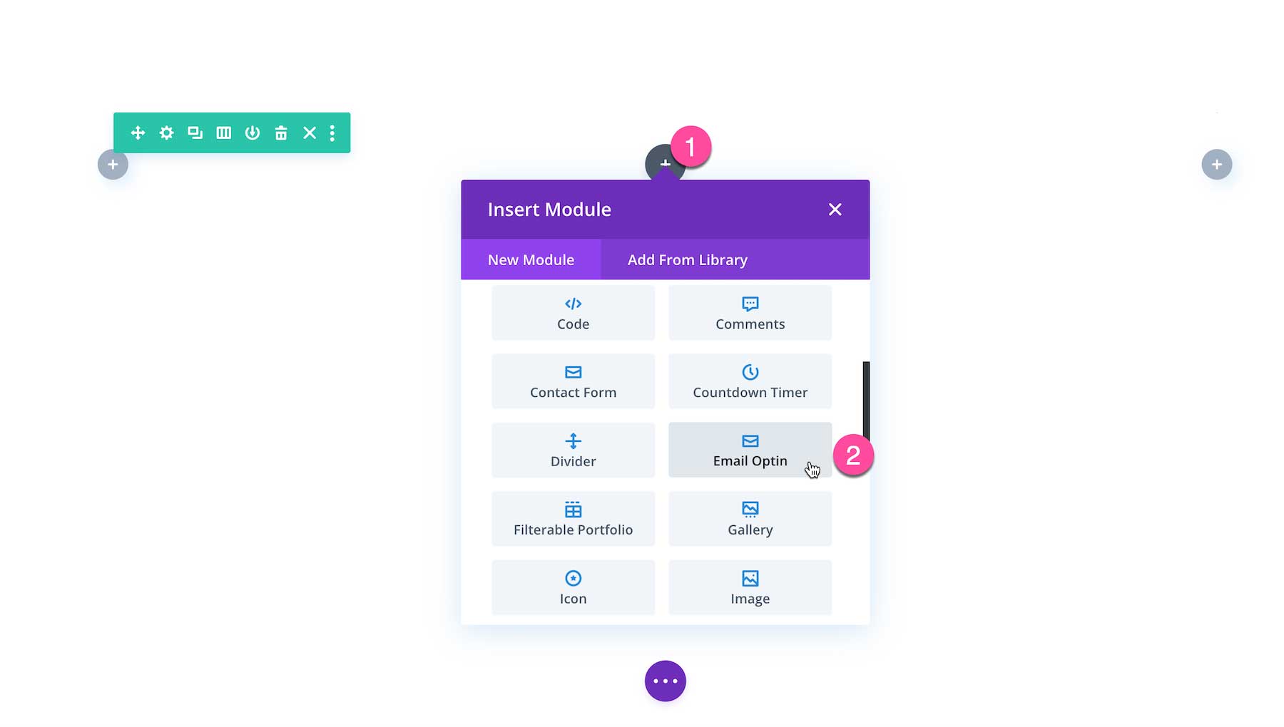
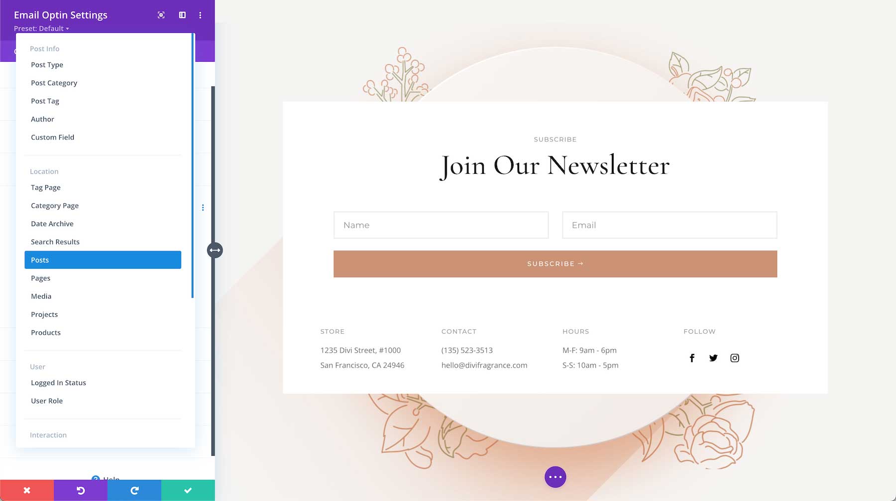
When you load the Visual Builder, Divi automatically adds a section and a row. You can learn more about how to modify and customize sections here and rows here. Once the section, row, and columns are set up, click on the grey “+” icon inside the row. This brings up the Divi Module Library which contains all the modules included with the Divi theme. Scroll down to Email Optin and click on it to load the module. The module library is also searchable. Type the name of the module you want in the search bar at the top.
All Divi Email Optin Module Options Explained
Once you’ve added the Email Optin module, the module settings automatically pop up. This is where all of the content and design styles for this module are configured. These settings are organized into three groups via the tabs at the top of the module: Content, Design, and Advanced.
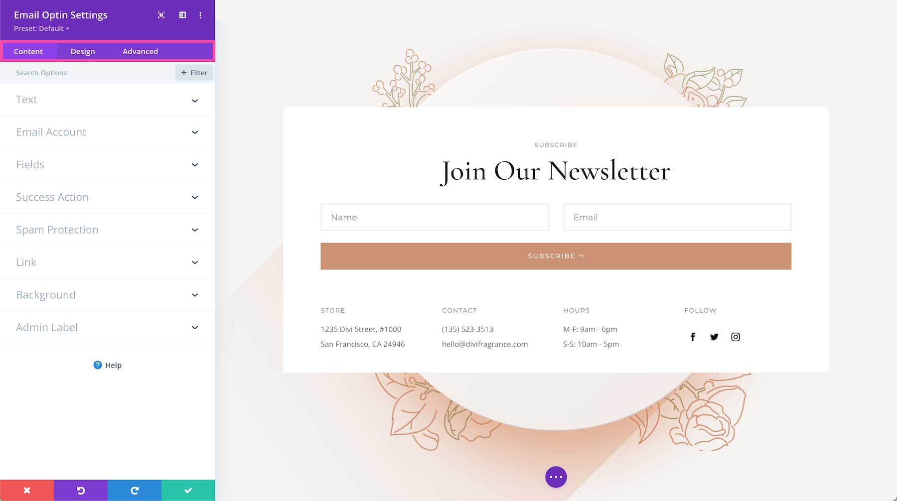
Content
Inside this tab, you’ll find the content options available for the Div Email Optin module.

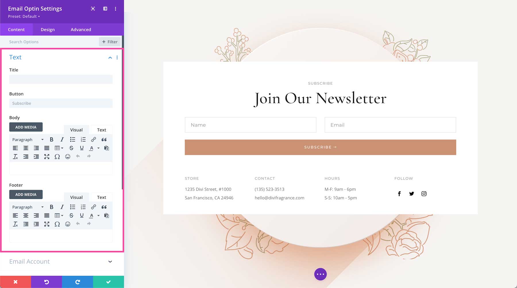
Text
This is where you can add the content for the Divi Email Optin module.
- Title – If you would like to add a title to this module, type it here. If this field is left blank, this field will not be displayed.
- Button – Type the text of the button here. By default, it says “subscribe”.
- Body – Type the body text you’d like displayed here. If you don’t want the body text to display, leave this field blank. To add an image to the body text area click the button “Add Image” and select an image from your media library or upload a new one.
- Footer – Type the footer text you’d like displayed here. The footer text displays underneath the form’s button. If you don’t want footer text to display, leave this field blank. To add an image to the footer text area click the button “Add Image” and select an image from your media library or upload a new one.
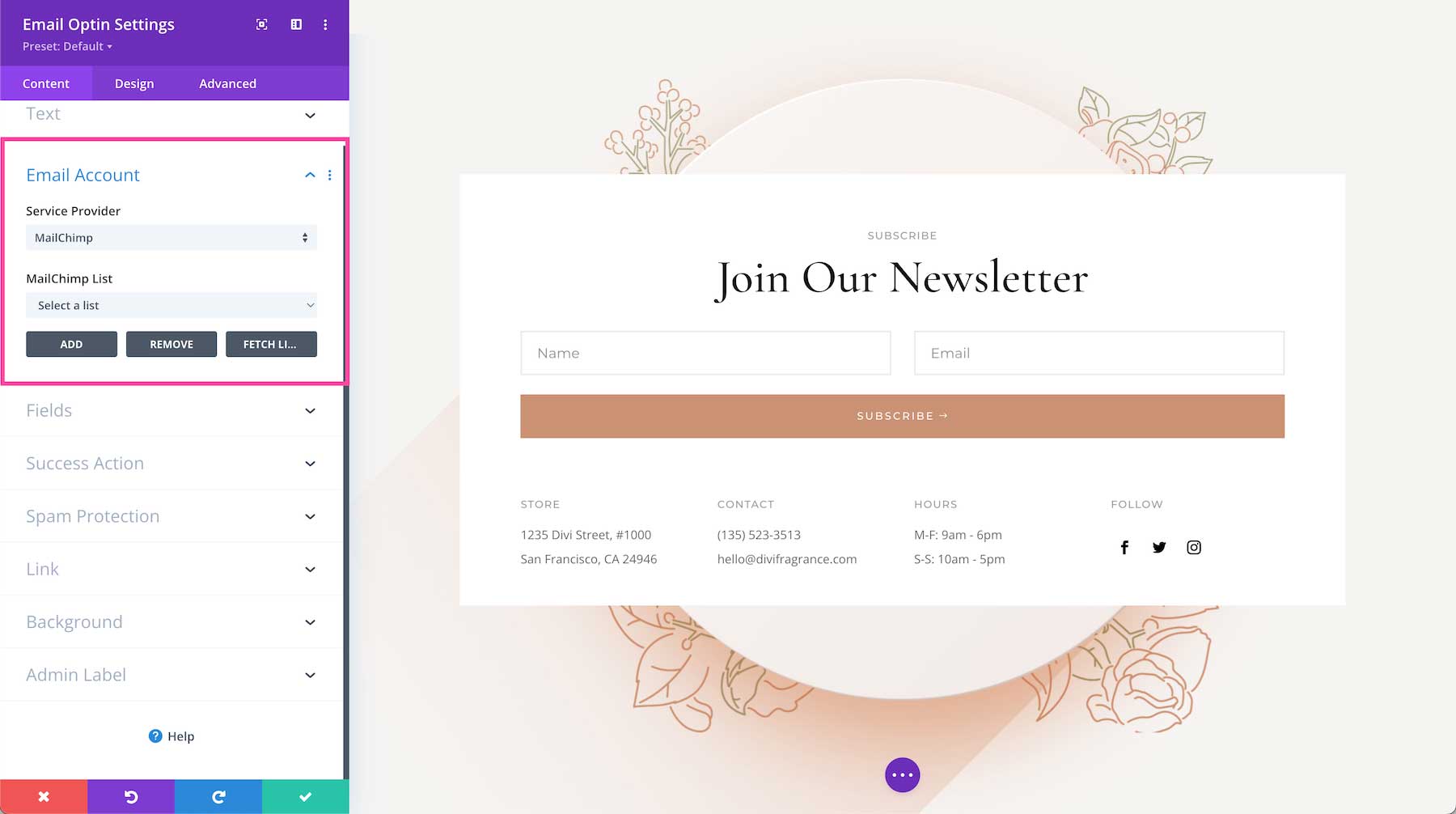
Email Account
This is where you connect your email provider to the email option module.
- Service Provider – Click the dropdown to select one of the 21 email providers you want to connect with. Note: You must already have an account registered with that provider in order for the integration to work.
- List – Once your email provider is successfully connected, you’ll be able to select the subscriber list you want to connect with this module. Subscriber lists are created and managed inside your email provider platform.
- Add – Once you have selected your service provider and email list, click the “Add” button. Once you click “add” fields to populate the account details will appear. You’ll need an Account Name, API Key, and API Secret which you’ll need to get from your email provider.
Example: Adding a ConvertKit Account
- Select ConvertKit as your email provider from the downtown menu.
- Click the “Add” button
- Account Name – Type what you’d like to name this account here.
- API Key – Paste your unique API Key here. You can find your ConverKit API Key in your ConvertKit account under “Settings”.
- API Secret – Paste your unique API Secret here. You can find your ConverKit API Secret in your ConvertKit account under “Settings”.
- Click the “Submit Button”.
- When the account is successfully connected you’ll be redirected to the previous fields where you can now see additional buttons that say “Remove” and “Fetch Lists”.
- To select a subscriber list, click the dropdown menu and click the list you want. These lists are created and managed on your email provider platform, so if you want to create a new list or make changes to existing lists, you’ll have to do so on your email provider platform. Subscriber lists are automatically imported from your email provider, however, you can manually fetch lists by clicking the “Fetch Lists” buttons.
- If you would like to remove this email account then click the “Remove” button.
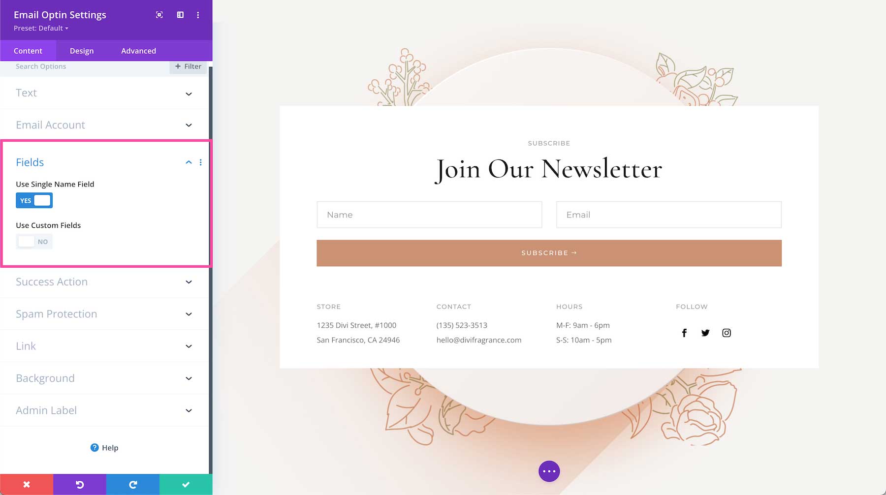
Fields
- Name – Toggle this option “yes” if you want the Name field included in the form or “no” if you do not.
- Use Custom Fields – Custom fields are configured in your email provider account. If you’d like to use them in this form then toggle this option to “yes”. Once you have defined some custom fields, click the “Fetch Lists” button in the Email Account toggle above to re-synch
Learn more here.
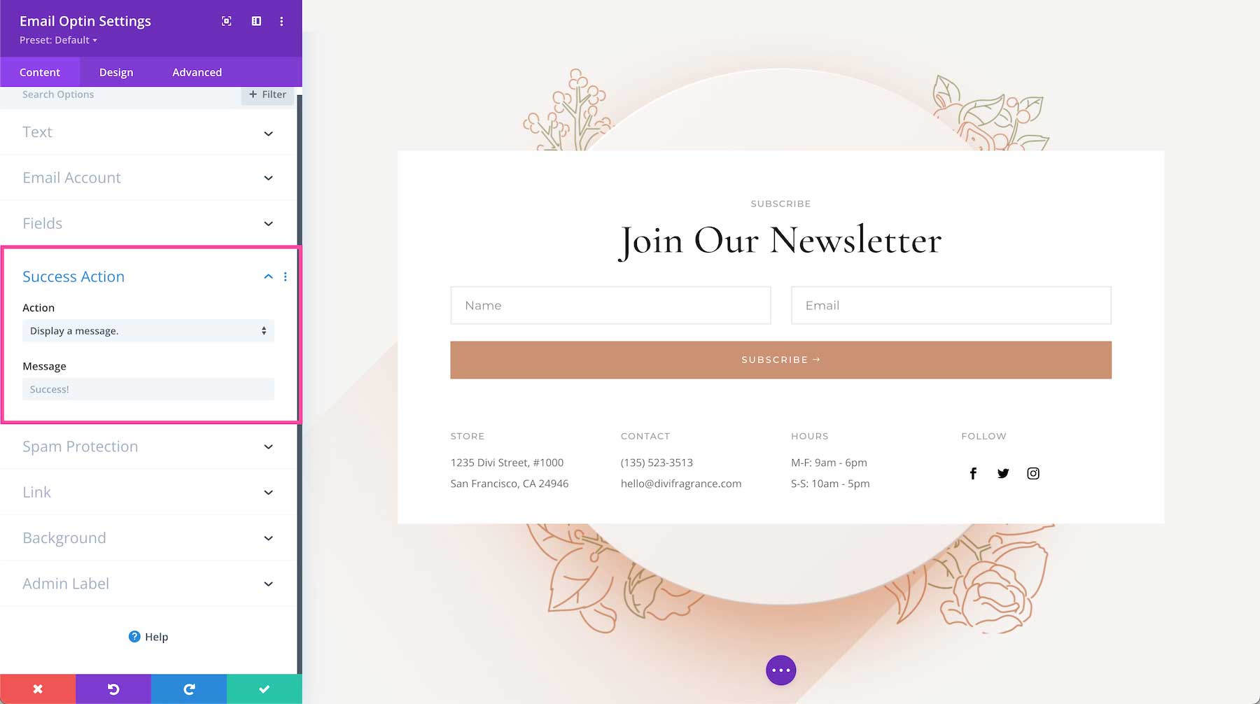
Success Action
- Action – Once a user clicks the button to subscribe to your email list, you have two choices for a success action: display a success message upon submission or redirect them to a custom URL upon submission. Using the Custom URL Redirection is helpful to use if you want to re-direct your visitors to a private access page or downloadable resource once they sign up for your email list. If you select the custom URL redirection a field will appear where you can paste the URL. You can also choose what data (if any) to include in the redirect URL as query arguments by click the checkboxes next to the data fields you want queried in the redirect URL.
- Message – This is where you can type a custom success message that is displayed once the form is successfully submitted. By default, the message says “Success!”.
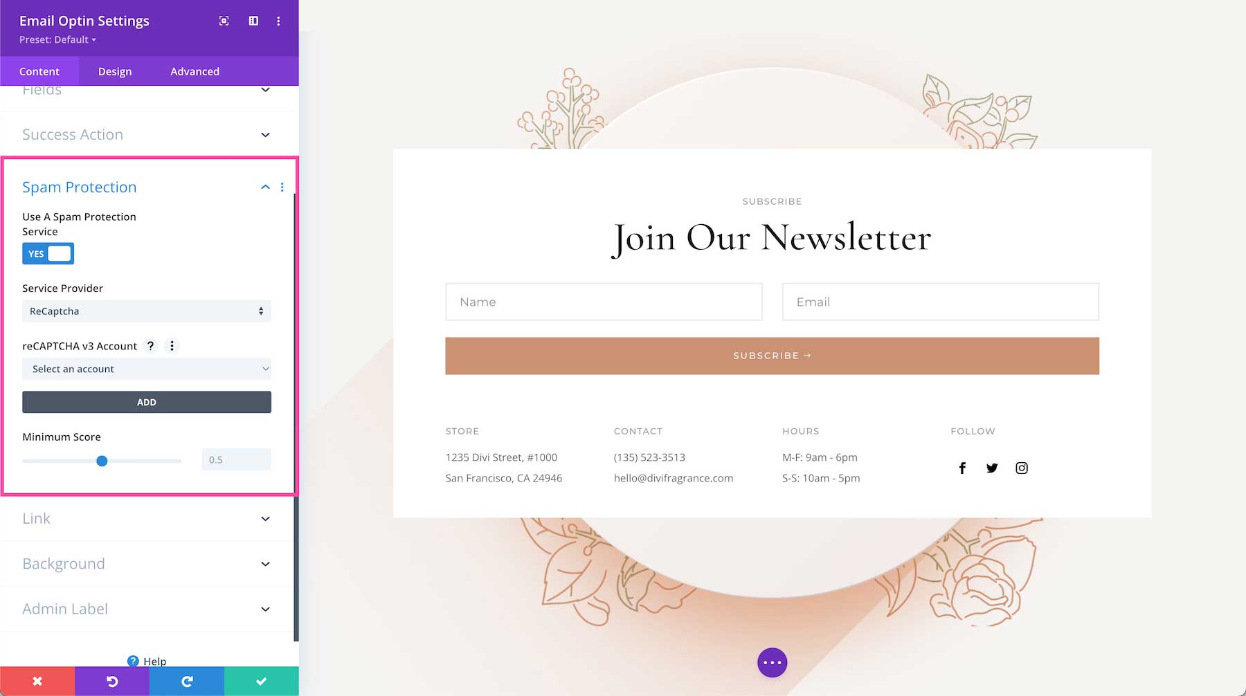
Spam Protection
Enabling spam protection helps prevent fake submissions from bots. The contact form module comes with the ability to use a basic captcha math problem, however, you can also use a 3rd party spam protection service like Google reCAPTCHA. In order to use Google reCAPTCHA, you’ll need to have a Google account. If you do not have one, you can register for a free Google account.
- Use A Spam Protection Service – Toggle this option to “yes” if you’d like to use a third party spam protection service like Google reCAPTCHA.
- Service Provider – Click the dropdown and choose ‘ReCaptcha’ to use Google reCAPTCHA.
- reCaptcha v3 account – Click the dropdown, select “add account”. Navigate to the reCAPTCHA website and follow these instructions on how to create a reCAPTCHA key for your site. Once your site keys are created add the account name, the site key (v3) and the secret key (v3).
- Minium Score – Choose a minimum score that determines whether or not a bot or human is interacting with the contact form. A score between 0 and 1 is likely to be a good interaction and 0 is likely to be a bot. The minimum score is 0.5 by default.
Link
If you would like to apply a clickable link to the entire module, you can do so here.
- Module Link URL – Paste the URL of the link you would like to apply to this module here. This makes the entire module clickable and when clicked it will direct visitors to the URL pasted here.
- Module Link Target – Defining a link target determines whether the link, when clicked, opens in a new tab or in the same window. Choose “In The Same Window” if you want the link to open in the same window and click “In The New Tab” if you would like that link to open in a new tab. By default, “In The Same Window” is selected.

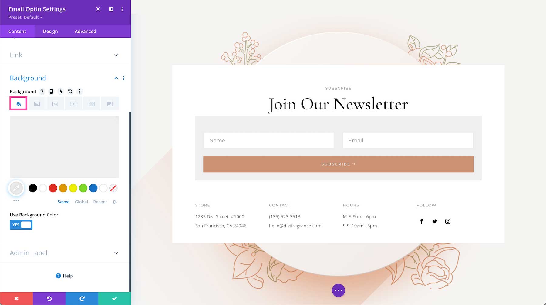
Background
This is where you can add a background color, gradient, image, video, pattern, or mask to this module.
How to Add a Background Color
To add a background color to the entire module, toggle on “Use Background Color” and click the first icon, the paint bucket. Then choose from your site’s color palette or use the eyedropper icon to find a new color.
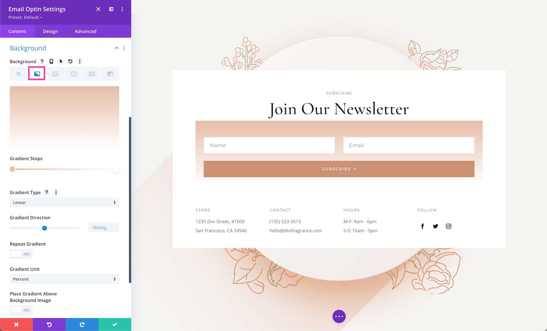
How to Add a Background Gradient
To add a background gradient, click the second tab, the gradient tab, then click “Add Background Gradient.”
To change the gradient colors, click on the gradient stops and select a color from your site’s color palette or use the eyedropper icon to choose a new color. Gradient stops allow you to add more colors to the gradient. Simply click anywhere on the range slider to add a new stop.
- Gradient Type – You can change the gradient type by clicking the dropdown menu and selecting the gradient type you’d like.
- Gradient Direction – You can change the direction of the gradient by dragging the range slider or typing in a numerical value.
- Repeat Gradient – Toggle this option to “yes” if you’d like the gradient to repeat.
- Gradient Unit – The gradient unit changes how the gradient stop points are calculated. Select the dropdown to change the unit.
- Place Gradient Above Background Image – If you have a background image applied, then you can choose to place the gradient above the background image by toggling this option to “yes”.
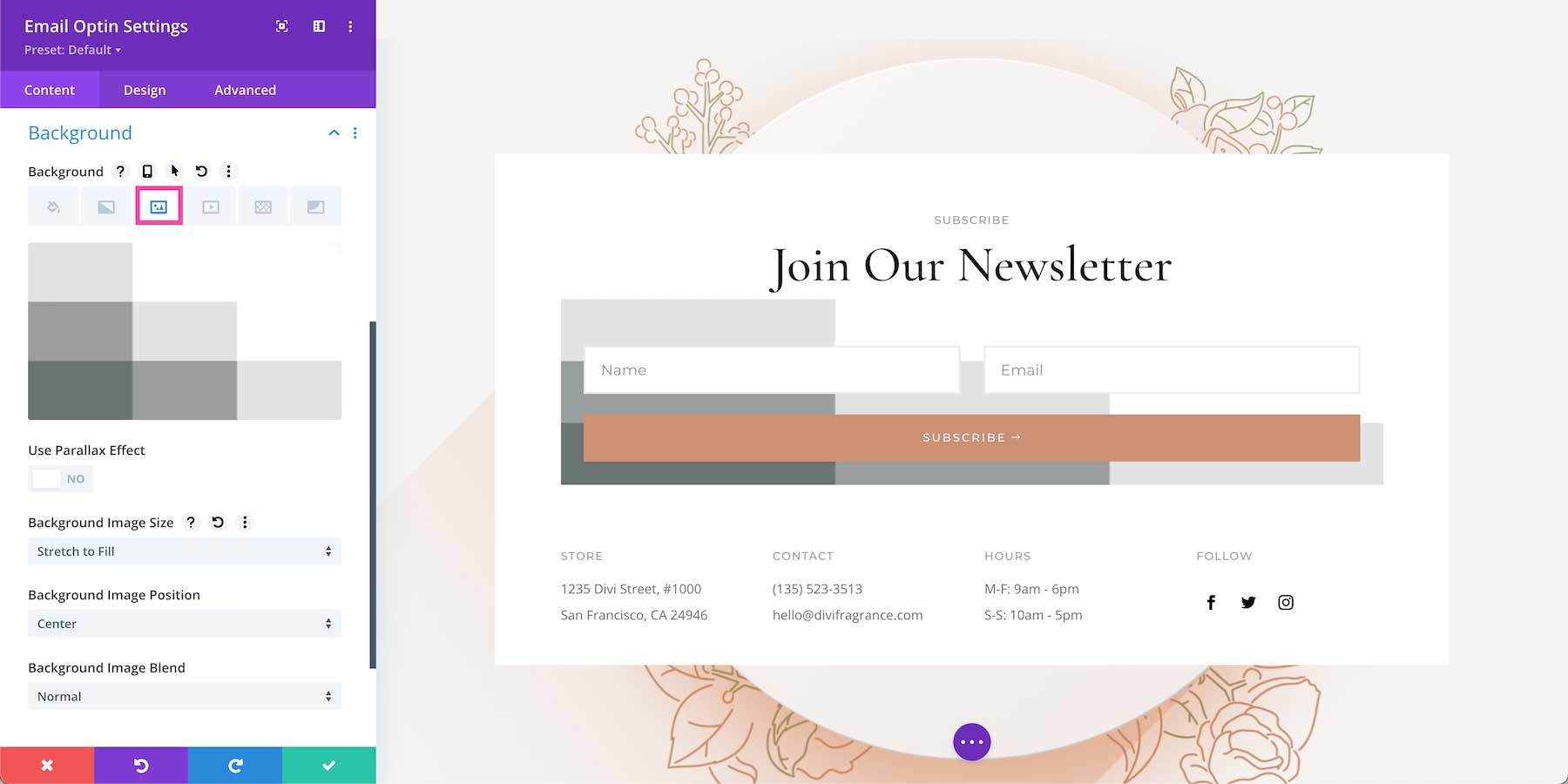
How to Add a Background Image
To add a background image, click the third tab, the image tab. Then, click the gray “+” sign to bring up the media library where you can select an already uploaded photo from your library or upload a new one.
- Use Parallax Effect – To apply a parallax effect to the image (where the image scrolls faster than the foreground content, giving the illusion of a 3D effect) then toggle this option to “on.” By default, this setting is set to “off.”
- Background Image Size – Choose the size of your background image by selecting a size from the dropdown menu.
- Background Image Position – Choose the position of the background image by selecting a position from the dropdown menu.
- Background Image Repeat – Choose if and how the background image repeats by selecting an option from the dropdown menu.
- Background Image Blend – Choose how the background blends with other layers in the module by selecting an option from the dropdown menu.
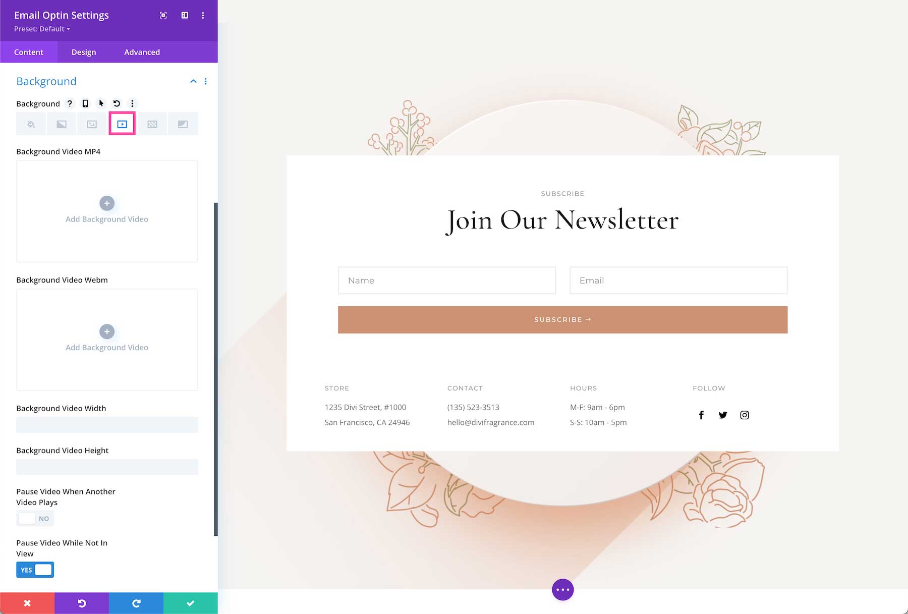
How To Add a Background Video
To add a background video, click the fourth tab, the video tab. Click the gray “+” sign to bring up the media library, where you can select an already uploaded photo from your library or upload a new one.
- Mp4 vs Webm. – We recommend uploading both an mp4 version and webm version of the video because not all browsers support webm video formats. Uploading both file types ensure your video will play on all devices and browsers.
- Background Video Width – Set the width of the video by typing in a numerical value.
- Background Video Height – Se the height of the video by typing in a numerical value.
- Pause Video When Another Video Plays – If you’d like the background video to pause when another video is playing, toggle that option to “yes.” By default, the video will pause when not in view. If you’d like the video to continue playing, toggle this option to “no.”
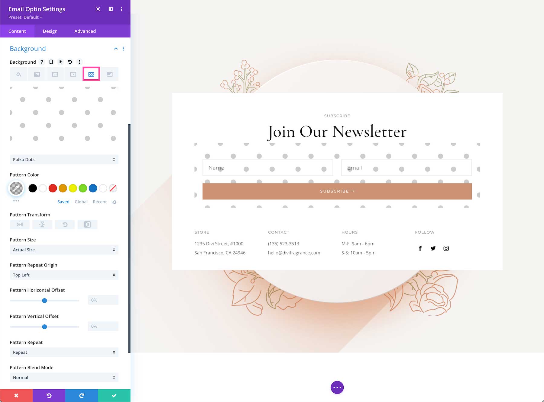
How to Add a Background Pattern
To add a background pattern, click the 5th tab, the pattern tab, then click “add background pattern.” Choose the pattern type you want from the dropdown.
- Pattern Color – Select the pattern color from your site’s color palette or use the eyedropper icon to find a new color.
- Pattern Transform – This is where you can transform the pattern horizontally, vertically, rotate it, or invert it.
- Pattern Size – Pattern size is where you can select the pattern size: the actual size, cover, fit, stretch to fill or custom size. If you select custom size, the following options will appear: pattern width and pattern height. Drag the range slider or type in a numerical value to define those options.
- Pattern Repeat Origin – Here you can select the origin from which the pattern repeats.
- Pattern Horizontal and Vertical Offset – You can also adjust the horizontal and vertical offsets for the pattern.
- Pattern Repeat – Here you can choose how the pattern repeats – horizontally, vertically, and more.
- Pattern Blend Mode – This defines how the pattern layer interacts with the layers beneath it. Select from one of the 16 blend modes available from the dropdown.
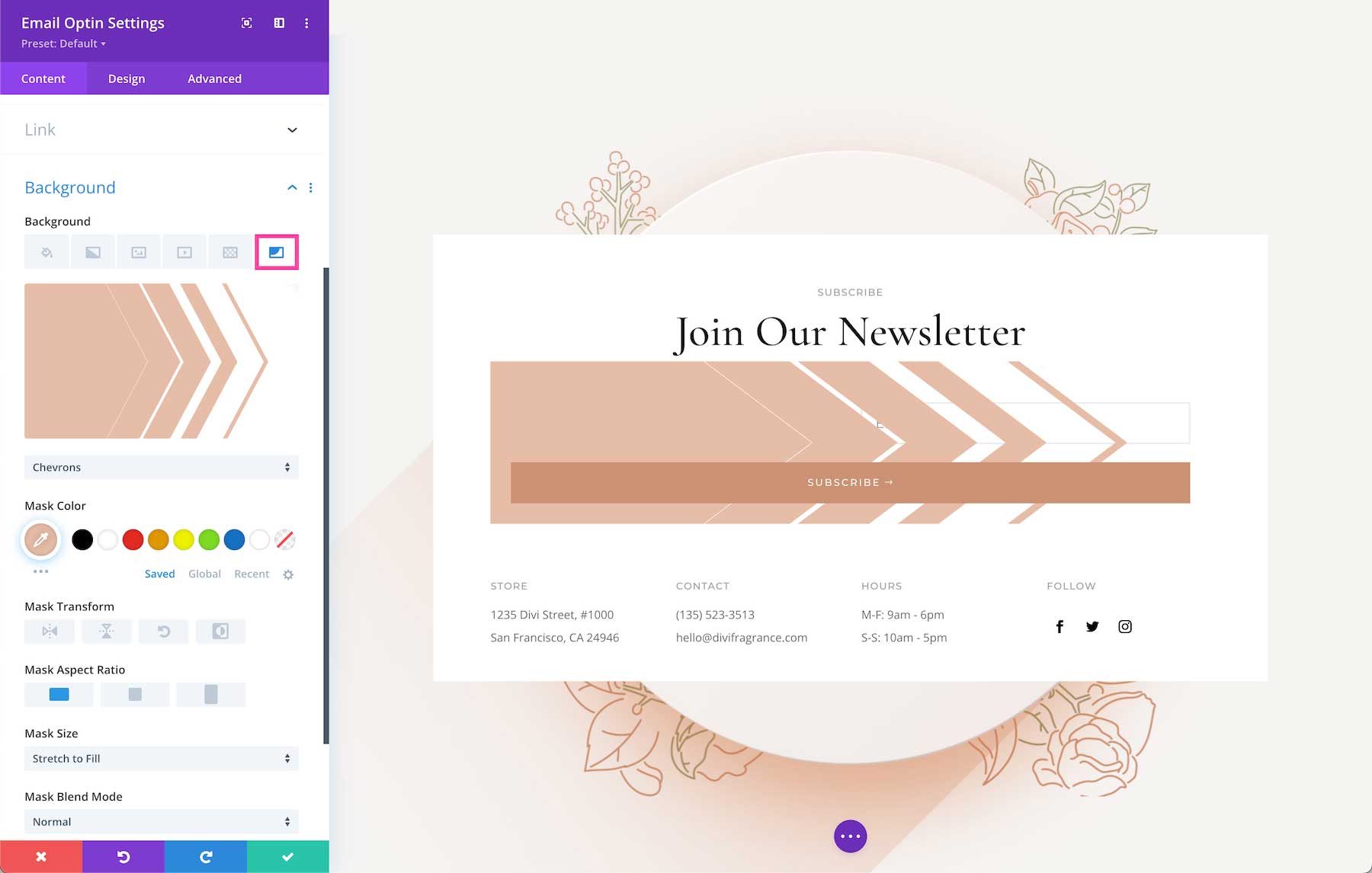
How to Add a Background Mask
To add a background mask, click the 6th tab, the mask tab and then click “add background mask”. Select the mask type you want via the dropdown menu.
- Mask Color – Choose the mask color from your site’s color palette or use the eyedropper icon to find a new color.
- Mask Transform – Here you can transform the mask horizontally, vertically, rotate it, or invert it.
- Mask Aspect Ration – Here you can set the aspect ratio of the mask. The aspect ratio of an image is the ratio of its width to its height.
- Mask Size – This is where you can select the mask size: the actual size, cover, fit, stretch to fill or custom size. If you select custom size, the following options will appear: mask width and mask height. Drag the range slider or type in a numerical value to define those options.
- Mask Blend Mode – This defines how the mask layer interacts with the layers beneath it. Select from one of the 16 blend modes available from the dropdown.
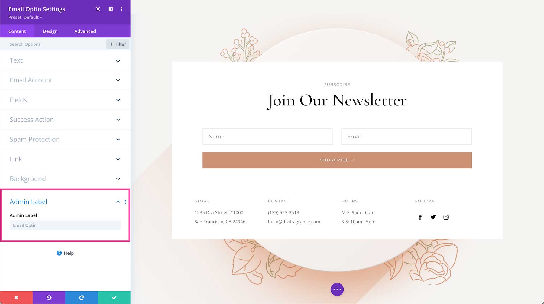
Admin Label
The Admin Label is where you can give the module a name only visible to you in order to assist in keeping things organized and easy to understand on the back end. By default, the admin label will be the name of the module. You can change the text of the admin label to reflect what you’d like.
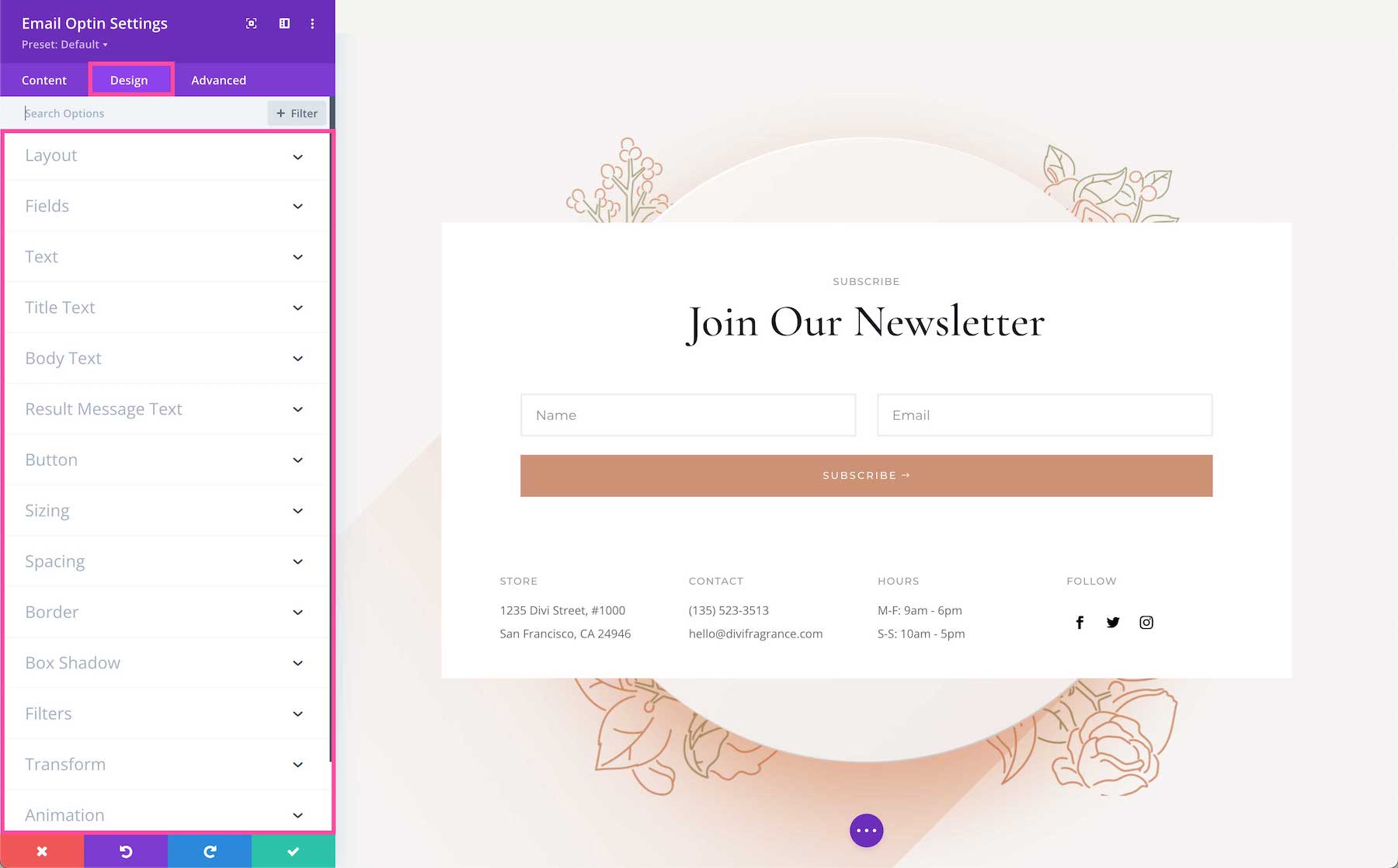
Design
Inside this tab, you’ll find all the design styles and options for the Email Optin module.
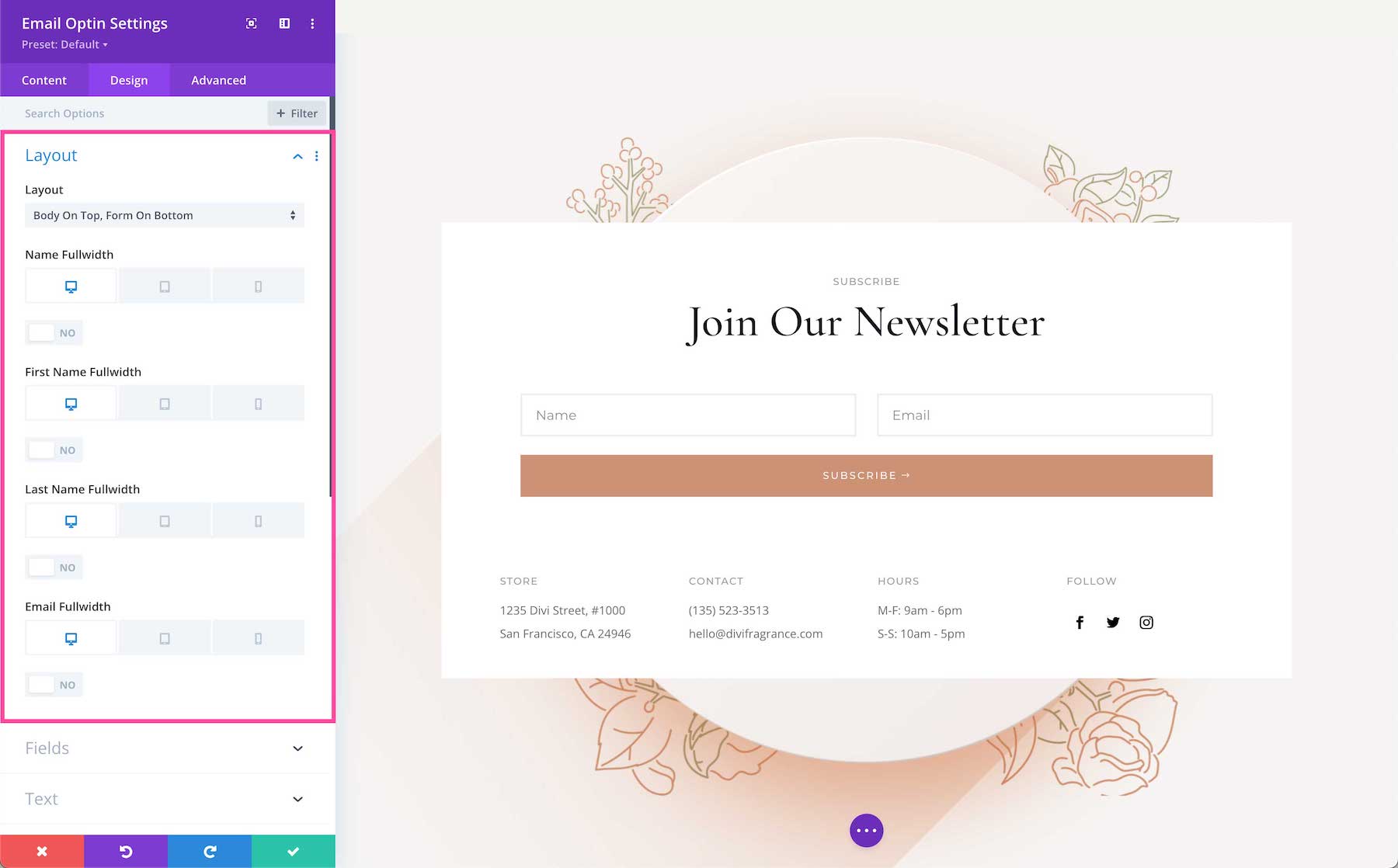
Layout
- Layout – Select the layout of the form by clicking the dropdown menu and selecting one of the options.
- First Name Fullwidth – Toggle this option to “yes” if you want the first name field to be full-width. If “no” is selected the field will be half-width. When fields are halfwidth, they will align inline (next to each other on the same line).
- Last Name Fullwidth – Toggle this option to “yes” if you want the last name field to be full-width. If “no” is selected the field will be halfwidth.
- Email Fullwidth – Toggle this option to “yes” if you want the email name field to be full-width. If “no” is selected the field will be halfwidth.
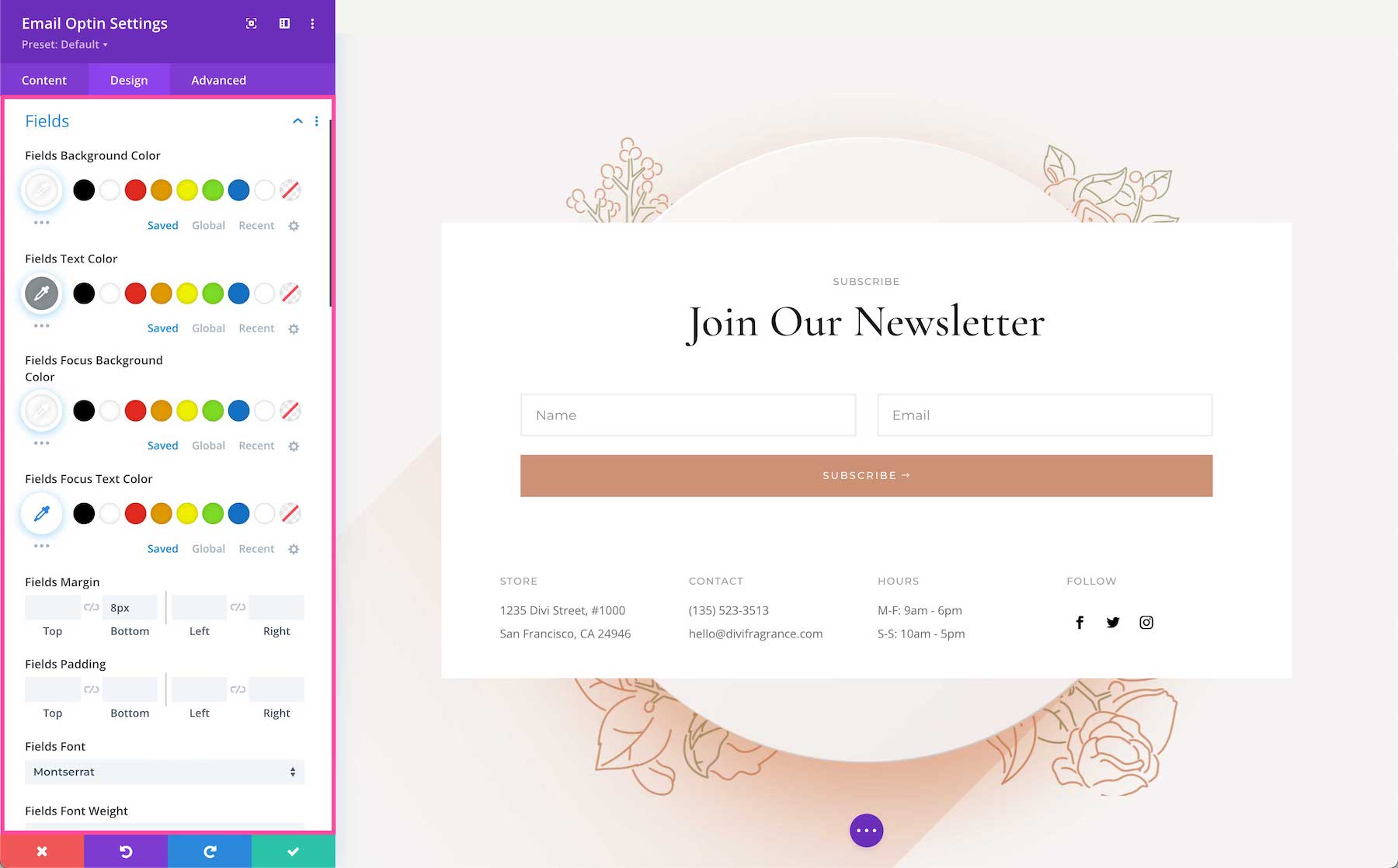
Fields
- Fields Background Color – Choose the background color of the fields here. Select a color from your site’s color palette or use the dropper icon to find a new color.
- Fields Text Color – Choose the color of the field’s text here. Select a color from your site’s color palette or use the dropper icon to find a new color.
- Fields Focus Background Color – Field Focus means fields that are actively being typed in. If you would like the field focus background color to be different to highlight the area that’s being typed in, then choose that color here. Select a color from your site’s color palette or use the dropper icon to find a new color.
- Fields Focus Text Color – Choose the color of the fields focus text here. Select a color from your site’s color palette or use the dropper icon to find a new color.
- Fields Margin – This is where you can add margins to the form fields. Margins add space outside the module element. To lock in ratios and keep the values the same, you can click the chainlink icon between the values you want to always be identical (ex: top and bottom).
- Fields Padding – This is where you can add padding to the form fields. Padding adds space inside the module element. To lock in ratios and keep the values the same, you can click the chainlink icon between the values you want to always be identical (ex: top and bottom).
- Fields Font – Choose the font you want to use for the text inside the fields. The default font is automatically selected; however, you can choose a different font or upload a custom font by clicking the dropdown box.
- Fields Font Weight – Click the dropdown to select the boldness of the field’s text font.
- Fields Font Style – Choose the style of the Results Message Text font: italicized, capitalized, small capitals, underlined, or strike-through.
- Fields Text Alignment – Choose the text alignment specifically to the Results Message Text only; left, center, right, or justify.
- Fields Text Size – Choose the font size of the Results Message Text by dragging the range slider or typing in a numerical value.
- Fields Letter Spacing – Choose the letter-spacing of the Results Message Text by dragging the range slider or by typing in a numerical value. Letter spacing is the space between each individual letter. The higher the number, the more space.
- Fields Line Height – Choose the line-height of the Results Message Text by dragging the range slider or by typing in a numerical value. The line-height is the amount of space between each line of text. The higher the number, the more space.
- Fields Text Shadow – Here you can add a drop shadow to the Results Message Text. Once a style is selected, you’ll be able to configure the direction of the shadow (horizontal and vertical), the strength of the drop shadow blur, and the shadow color.
- Fields Rounded Corners – If you would like to have round border corners, type in a numerical value. The higher the number, the rounder the corners will be. The corner values are automatically linked (as seen by the highlighted blue chainlink in the middle) however if you’d like to have different values for each corner, simply click the blue chainlink to unlink the values. If the values are automatically linked that means they will always have the same value and update automatically if one value is changed.
- Fields Border Styles – Here you can add a border to all sides of the module or to individual sides (top, right, bottom, and left).
- Fields Border Width – This is where you set the width of the border. For a thicker border, increase the number. The border width must be at least 1px in order to show.
- Fields Border Color – This is where you can pick the color of the border. You can select a color from your default site color palette already displayed, or click on the eyedropper icon to find a new color.
- Fields Border Style – Here you can select what style of border you’d like: solid, dashed, dotted, double, groove, ridge, inset, outset, or none.
- Use Focus Borders – If you would like to style the border of fields that are actively being typed in (fields that are “in focus”) then toggle this option to “yes”. The design styles and settings for focus borders will appear in the module.
- Fields Box Shadow – Here you can add a drop shadow to the fields. Once a shadow style is clicked, you can customize the position of the drop shadow (horizontal and vertical), the strength of the blur, and the spread strength by adjusting the range slider or inputting numerical values. Select the drop shadow’s color from your site’s color palette or click the eyedropper to find a new color. Choose the box-shadow position to be inside the container or outside the container via the dropdown.
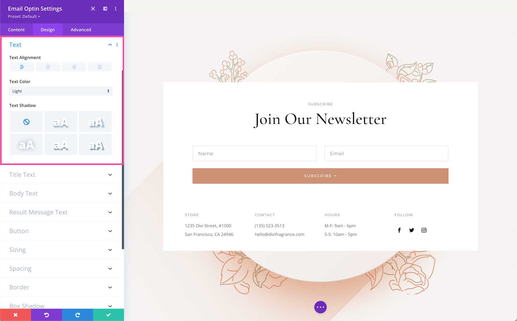
Text
This sets the overall text styles for this module; however, you can set specific styles of specific text in other toggles like Title Text, Body Text, and Results Message Text.
- Text Alignment – This allows you to choose how the text aligns: left, center, right, or justify.
- Text Color – Select the default text color palette for this module: light or dark. The default light color palette and dark color palettes can be configured in the Divi Theme Options.
- Text Shadow – Here you can apply a drop shadow to all the text inside this module. When a shadow type is selected, it will apply to all of the content, both the number and the form title text.
Title Text
These are the settings for specific styling and configuration for the Title Text.
- Text Heading Level – Choose the heading level you want assigned to the title text: h1, h2, h3, h4, h5, or h6.
- Title Font – Choose the font you want to use for the title text. The default font is automatically selected; however, you can choose a different font or upload a custom font by clicking the dropdown box.
- Title Font Weight – Click the dropdown to select the boldness of the title text font.
- Title Font Style – Choose the style of the title text font: italicized, capitalized, small capitals, underlined, or strike-through.
- Title Text Alignment – Choose the text alignment specifically to the title text only; left, center, right, or justify.
- Title Text Color – Choose a specific color for the title text. Select from your site’s color palette or click the eyedropper icon to find a new color.
- Title Text Size – Choose the font size of the title text by dragging the range slider or typing in a numerical value.
- Title Letter Spacing – Choose the letter-spacing of the title text by dragging the range slider or by typing in a numerical value. Letter spacing is the space between each individual letter. The higher the number, the more space.
- Title Line Height – Choose the line height of the title text by dragging the range slider or by typing in a numerical value. The line-height is the amount of space between each line of text. The higher the number, the more space.
- Title Text Shadow – Here you can add a drop shadow to the title text. Once a style is selected, you’ll be able to configure the direction of the shadow (horizontal and vertical), the strength of the drop shadow blur, and the shadow color.

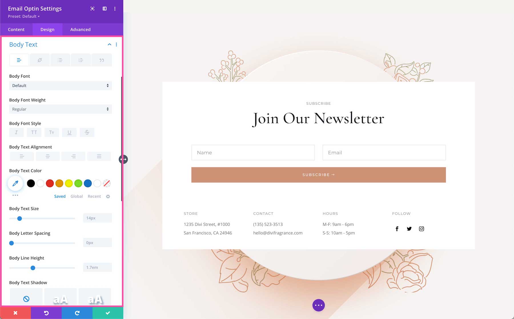
Body Text
These are the settings for specific styling and configuration for the Body Text.
- Body Font – Choose the font you want to use for the body text. The default font is automatically selected; however, you can choose a different font or upload a custom font by clicking the dropdown box.
- Body Font Weight – Click the dropdown to select the boldness of the body text font.
- Body Font Style – Choose the style of the body text font: italicized, capitalized, small capitals, underlined, or strike-through.
- Body Text Alignment – Choose the text alignment specifically to the body text only; left, center, right, or justify.
- Body Text Color – Choose a specific color for the body text. Select from your site’s color palette or click the eyedropper icon to find a new color.
- Body Text Size – Choose the font size of the body text by dragging the range slider or typing in a numerical value.
- Body Letter Spacing – Choose the letter-spacing of the body text by dragging the range slider or by typing in a numerical value. Letter spacing is the space between each individual letter. The higher the number, the more space.
- Body Line Height – Choose the line height of the body text by dragging the range slider or by typing in a numerical value. The line-height is the amount of space between each line of text. The higher the number, the more space.
- Body Text Shadow – Here you can add a drop shadow to the body text. Once a style is selected, you’ll be able to configure the direction of the shadow (horizontal and vertical), the strength of the drop shadow blur, and the shadow color.
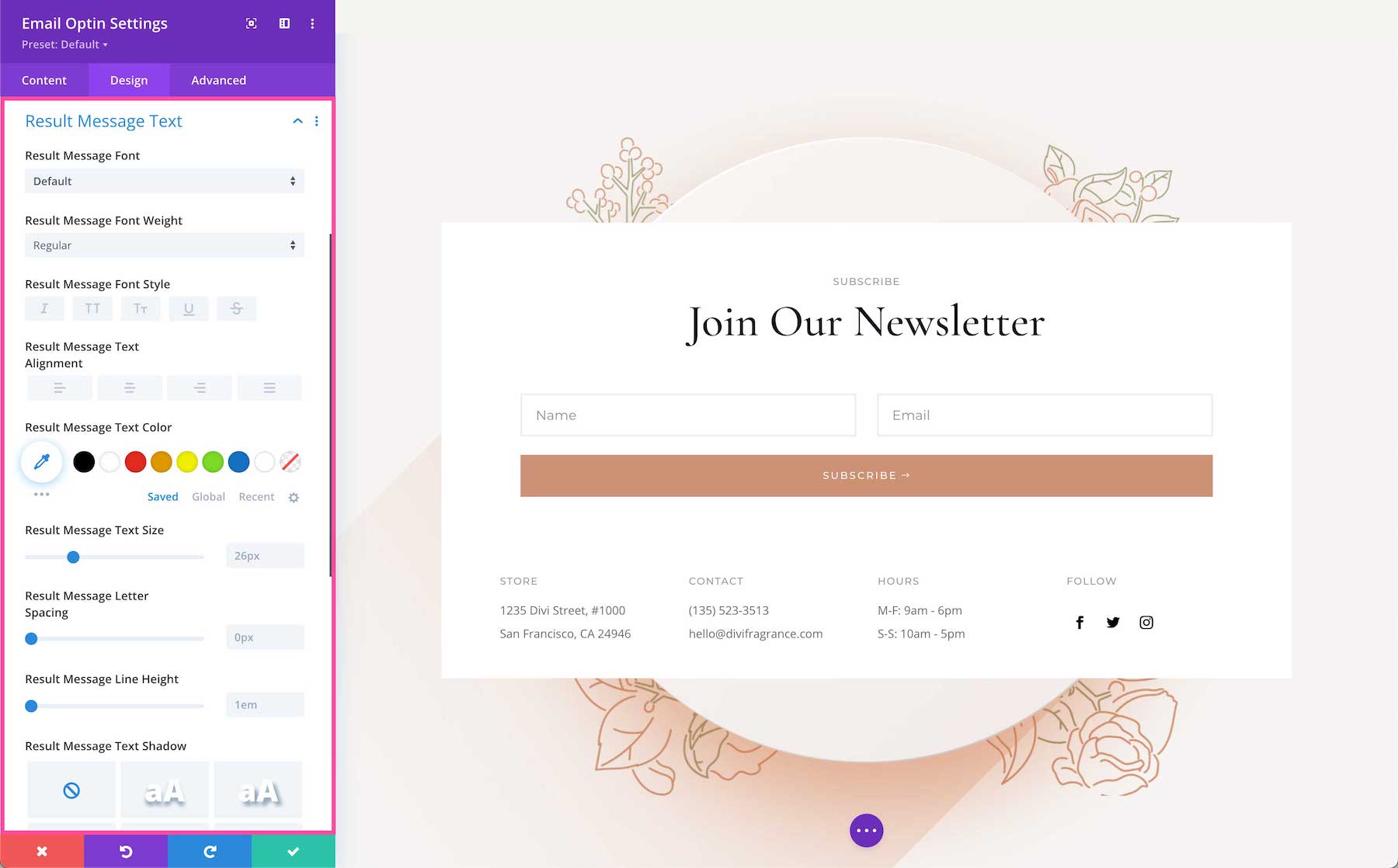
Results Message Text
These are the settings for specific styling and configuration for the Results Message Text.
- Results Message Font – Choose the font you want to use for the Results Message Text. The default font is automatically selected; however, you can choose a different font or upload a custom font by clicking the dropdown box.
- Results Message Font Weight – Click the dropdown to select the boldness of the Results Message Text font.
- Results Message Font Style – Choose the style of the Results Message Text font: italicized, capitalized, small capitals, underlined, or strike-through.
- Results Message Text Alignment – Choose the text alignment specifically to the Results Message Text only; left, center, right, or justify.
- Results Message Text Color – Choose a specific color for the Results Message Text. Select from your site’s color palette or click the eyedropper icon to find a new color.
- Results Message Text Size – Choose the font size of the Results Message Text by dragging the range slider or typing in a numerical value.
- Results Message Letter Spacing – Choose the letter-spacing of the Results Message Text by dragging the range slider or by typing in a numerical value. Letter spacing is the space between each individual letter. The higher the number, the more space.
- Results Message Line Height – Choose the line height of the Results Message Text by dragging the range slider or by typing in a numerical value. The line-height is the amount of space between each line of text. The higher the number, the more space.
- Results Message Text Shadow – Here you can add a drop shadow to the Results Message Text. Once a style is selected, you’ll be able to configure the direction of the shadow (horizontal and vertical), the strength of the drop shadow blur, and the shadow color.
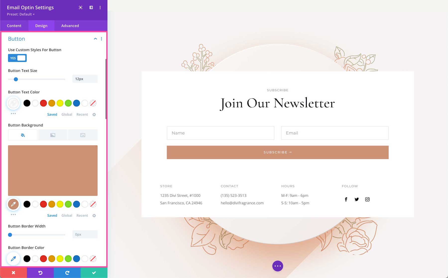
Button
By default, buttons inherit the global design styles set in the WordPress Customizer, however, you can apply a custom design style to the subscribe button here.
- Use Custom Styles For Button – To design a custom style for this button, toggle this option to yes. Then the following options will appear.
- Button Text Size – Choose the size of the button font here. Drag the range slider to adjust the size or type a numerical value in the textbook.
- Button Text Color – Choose the color of the button font here. Select a color from your site’s color palette or use the dropper icon to find a new color.
- Button Background – Choose the background color of the button here. Select a color from your site’s color palette or use the dropper icon to find a new color.
- Button Border Width – Set the button border width here. Drag the range slider to adjust the width or type a numerical value in the textbox.
- Button Border Color – Choose the color of the border here. Select a color from your site’s color palette or use the dropper icon to find a new color.
- Button Border Radius – Set the button’s border radius here. The radius refers to how round the corners are. The higher the number, the more round the corners are. Drag the range slider to adjust the radius or type a numerical value in the textbox.
- Button Letter Spacing – Choose the letter-spacing of the title text by dragging the range slider or by typing in a numerical value. Letter spacing is the space between each individual letter. The higher the number, the more space.
- Button Font – Choose the font you want to use for the button text. The default font is automatically selected; however, you can choose a different font or upload a custom font by clicking the dropdown box.
- Button Font Weight – Click the dropdown to select the boldness of the button font.
- Button Font Style – Choose the style of the button font: italicized, capitalized, small capitals, underlined, or strike-through.
- Show Button Icon – Toggle this option “yes” or “no” to show or hide a button icon.<l/i>
- Button Icon – If the previous option is set to “yes”, you can select the button icon here.
- Button Icon Color – Choose the color of the icon here. Select a color from your site’s color palette or use the dropper icon to find a new color.
- Button Icon Placement – Choose where you want the button icon to be: to the right or left of the button text.
- Only Show Icon On Hover For Button – By default, this option is set to “yes” which means the icon will only appear on hover. If you’d like the icon to always be visible, toggle this option to “no”.
- Button Text Shadow – Here you can apply a drop shadow to the button text. Choose the style of drop shadow you’d like to use and you can customize it using the following options.
- Button Text Shadow Horizontal Length – Adjusts the horizontal positioning of the button text shadow.
- Button Text Shadow Vertical Length – Adjusts the vertical positioning of the button text shadow.
- Button Text Shadow Blur Strength – Adjusts the shadow blur strength of the shadow applied to the button text. The higher the number, the more blur.
- Button Text Shadow Color – Choose the color of the button text shadow. Select a color from your site’s color palette or use the dropper icon to find a new color.
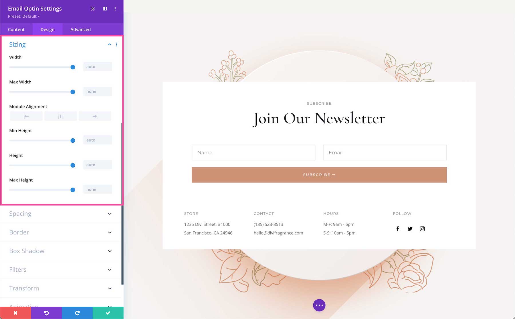
Sizing
This section defines the sizing (width and height) of the module. You can set a max-width and a max-height and a min-height for the module. Choose the module alignment (left, center, or right) by clicking the arrows. By default, modules align center.
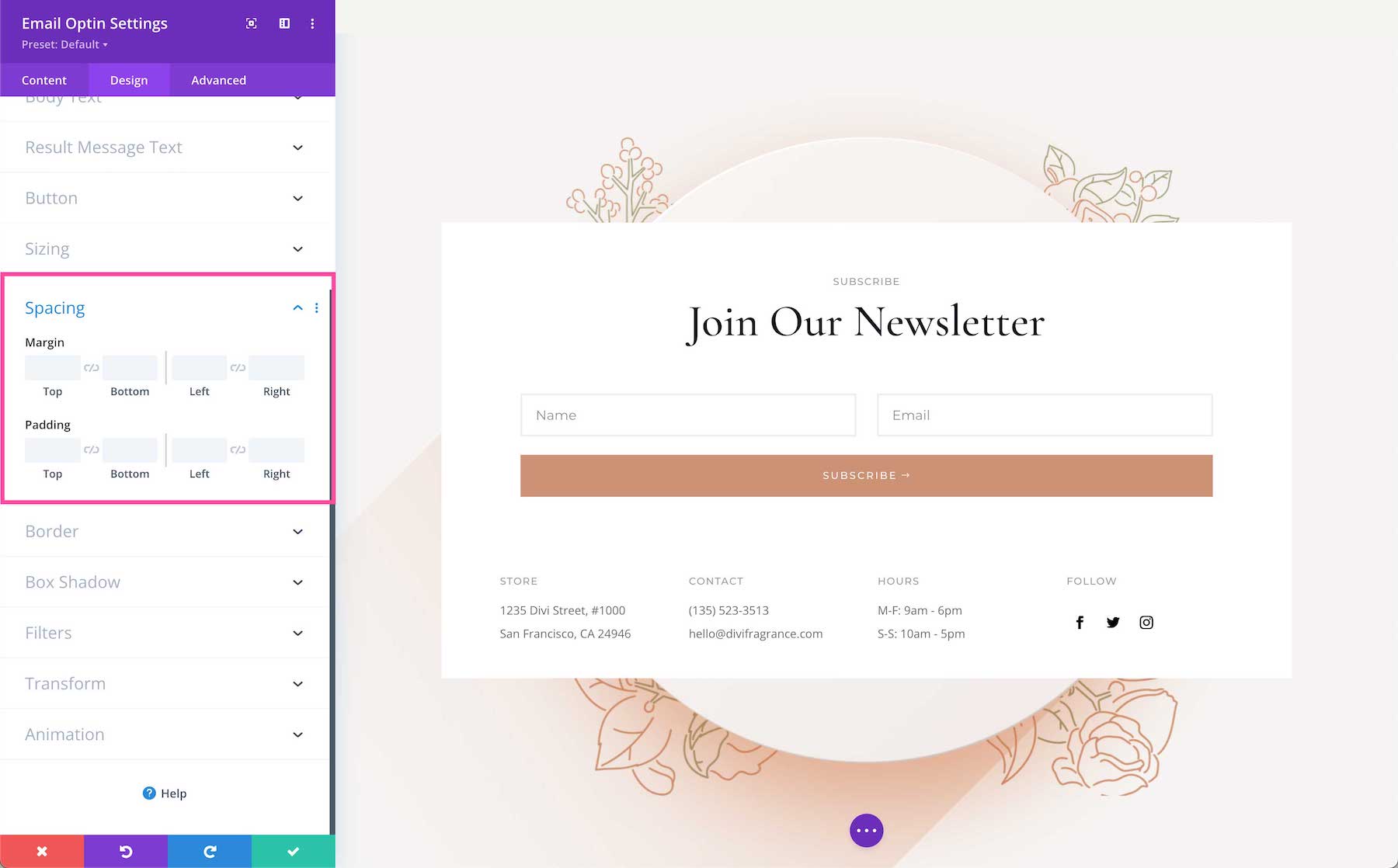
Spacing
Here is where you can add margins or spacing to this module by typing in numerical values. Margins add space outside the module element, and padding adds space inside the module element. To lock in ratios and keep the values the same, you can click the chainlink icon between the values you want to always be identical (ex: top and bottom).
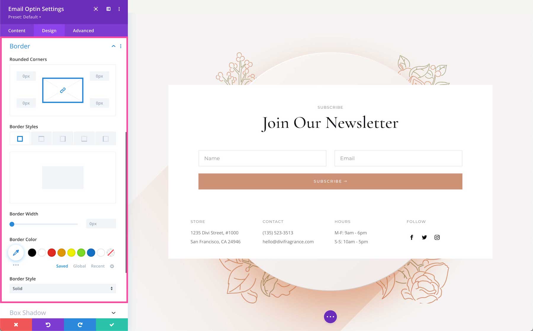
Border
Add a border to the module. You can add a complete border or add a border to only one side of the module. Adjust the width via the range slider and select a color. Choose a border style by clicking the dropdown.
- Rounded Corners – If you would like to have round border corners, type in a numerical value. The higher the number, the rounder the corners will be. The corner values are automatically linked (as seen by the highlighted blue chainlink in the middle) however if you’d like to have different values for each corner, simply click the blue chainlink to unlink the values. If the values are automatically linked that means they will always have the same value and update automatically if one value is changed.
- Border Styles – Here you can add a border to all sides of the module or to individual sides (top, right, bottom, and left).
- Border Width – This is where you set the width of the border. For a thicker border, increase the number. The border width must be at least 1px in order to show.
- Border Color – This is where you can pick the color of the border. You can select a color from your default site color palette already displayed, or click on the eyedropper icon to find a new color.
- Border Style – Here you can select what style of border you’d like: solid, dashed, dotted, double, groove, ridge, inset, outset, or none.
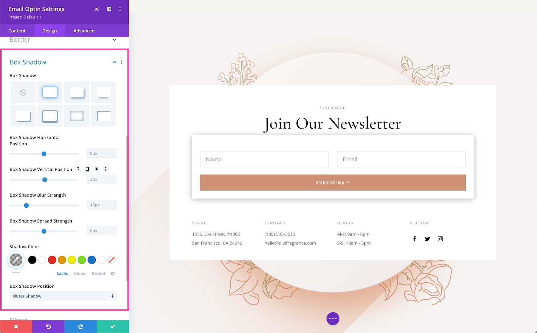
Box Shadow
Here you can add a drop shadow to the entire module. Once a shadow style is clicked, you can customize the position of the drop shadow (horizontal and vertical), the strength of the blur, and the spread strength by adjusting the range slider or inputting numerical values. Select the drop shadow’s color from your site’s color palette or click the eyedropper to find a new color. Choose the box-shadow position to be inside the container or outside the container via the dropdown.
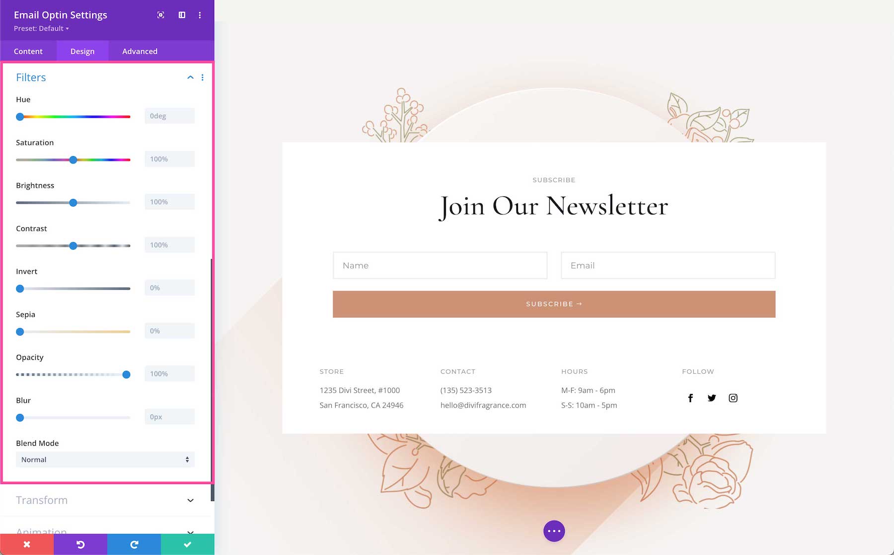
Filters
Adjust the hue, saturation, brightness, contrast, color tones (inverted colors or sepia), opacity, and blur of this module. The Blend Mode refers to how the module blends with the layers beneath it. By default, “normal” will be selected.
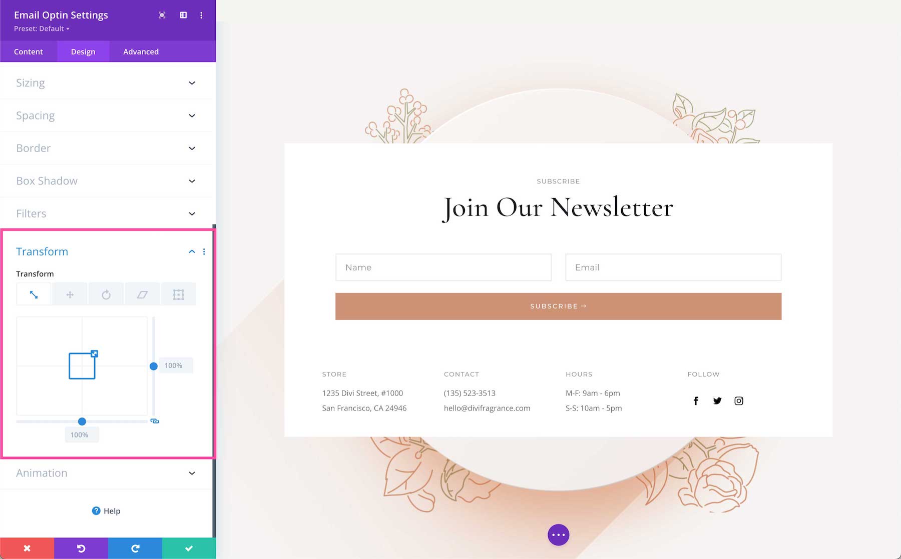
Transform
Scale, translate, rotate, skew, and set origin points for this module. Tab through to access each feature. Configure each feature by inputting numerical values or dragging and expanding the box or circle. You can lock in these values to always be identical by clicking the chain link icon at the bottom right.
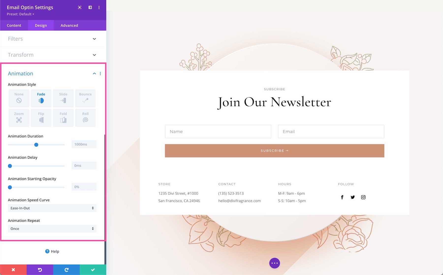
Animation
Here you can apply animation to the module. Once you choose an option you can also adjust the duration, delay, opacity, and speed of the animation and whether you want it to continually repeat or just happen once.
Advanced
This is where the advanced customization settings are for this module.
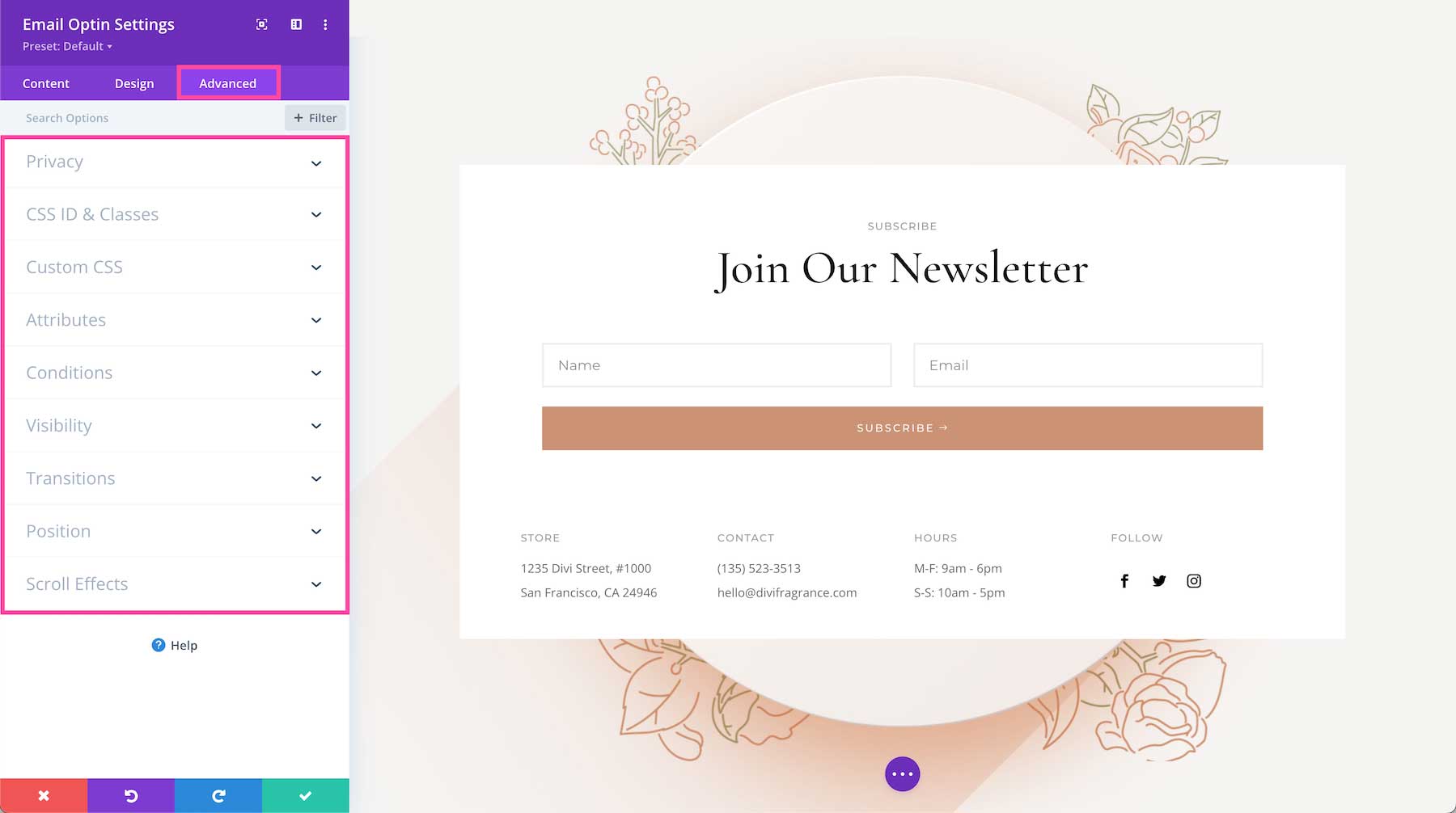
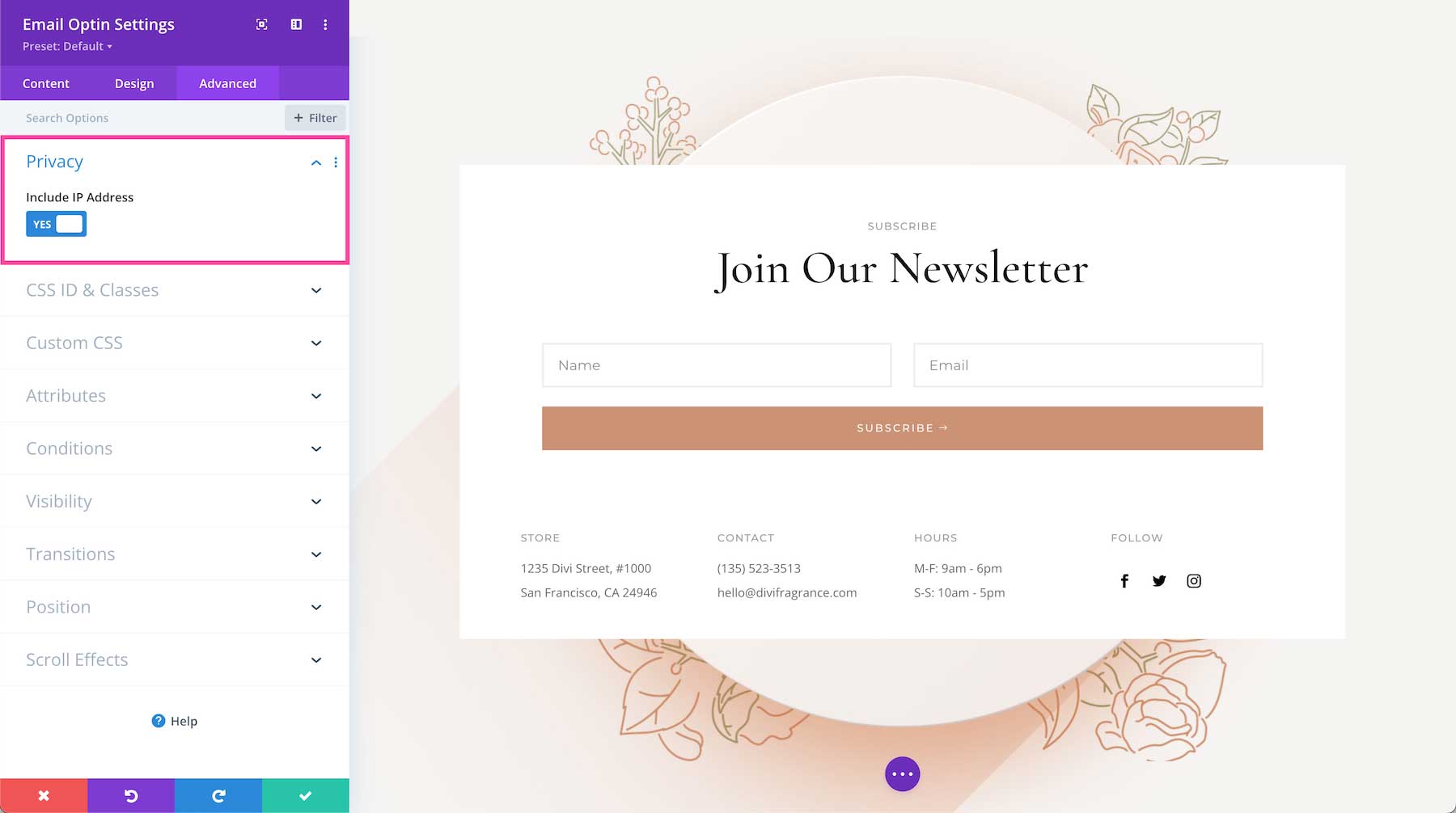
Privacy
- Include IP Address – Toggle this option “yes” or “no” if you want the subscriber’s IP Address included or excluded in the data that’s sent to your email provider when the form is completed. By default, this is set to “yes”.
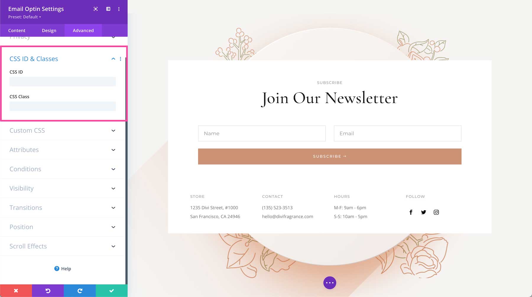
CSS ID & Classes
This is where you can assign a specific CSS ID or class to this module. This is helpful when you’d like to apply custom CSS to a module by using your child theme’s stylesheet.
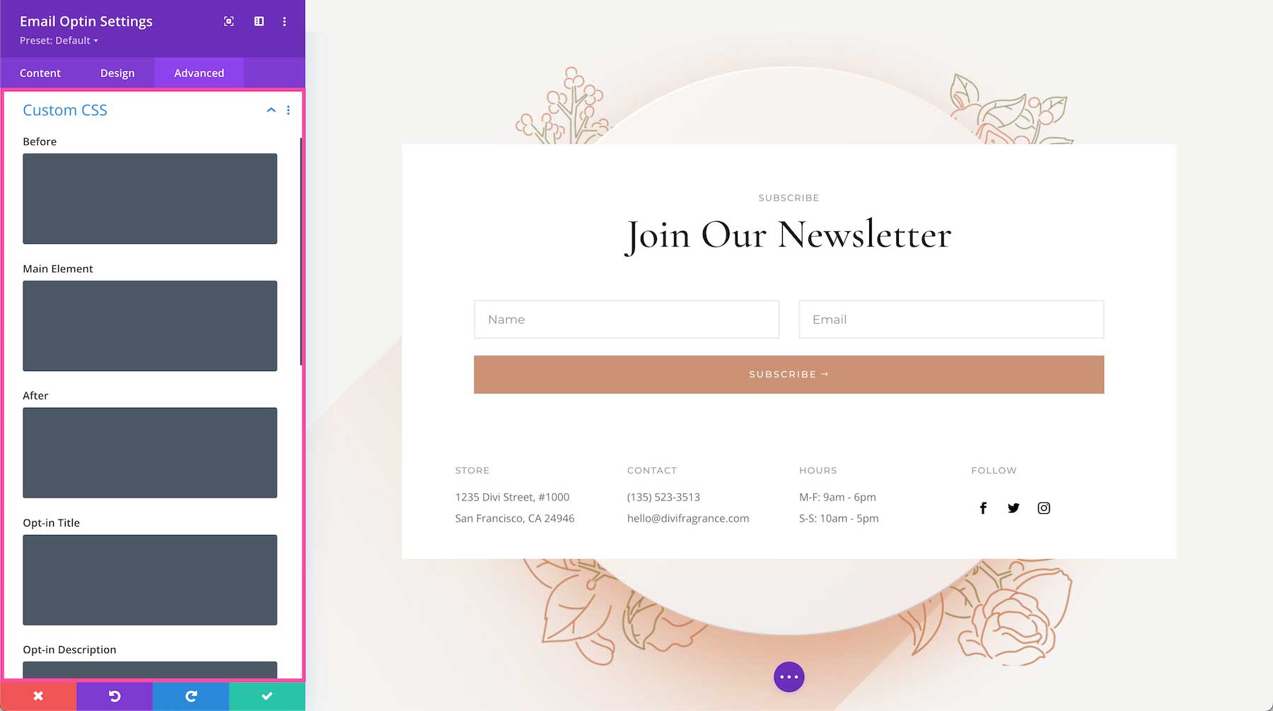
Custom CSS
You can also apply custom CSS to this module by pasting it in this tab. When you click on the Custom CSS tab, you’ll see individual sections where you can add CSS to specific elements in the module.
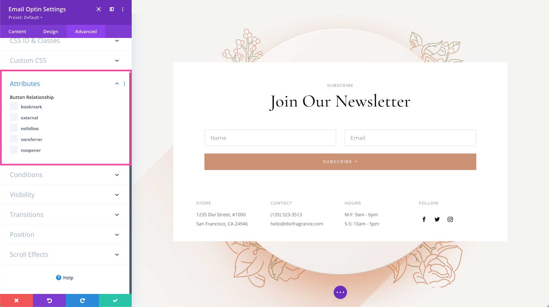
Attributes
This defines the link’s relationship between the source you are linking to and the page you are linking from.
Conditions
This tab allows you to choose when to display this module based on a set of conditions, like what time a user is visiting the page if they’ve already purchased from your company before, what browser they are using, what operating system they’re using, and more. You can add one condition or multiple conditions.
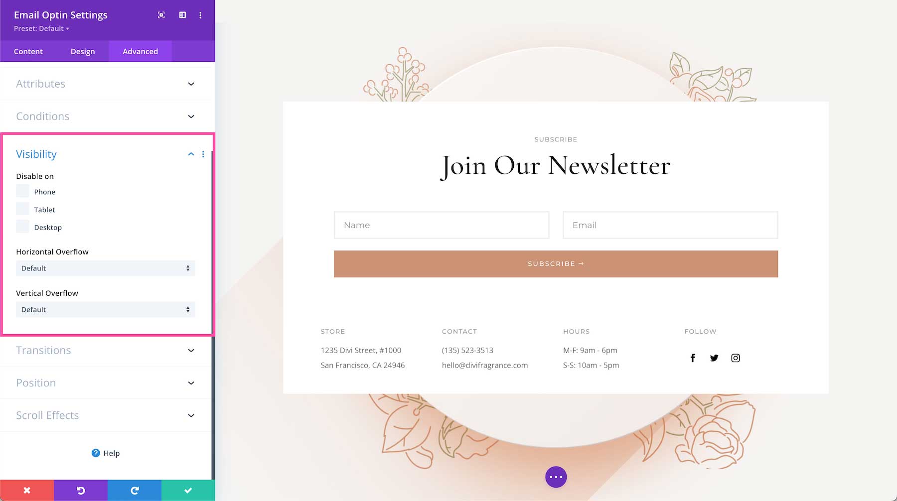
Visibility
This defines the visibility of the module. You can choose to disable it (hide it from view) when the display window is a Phone, Tablet, or Desktop by clicking the corresponding checkbox. You can also determine how you want overflow content to be displayed if the content overflows the element that it is in. You can choose visible, scroll, hidden, or auto for both horizontal and vertical content. By default, “auto” is selected.
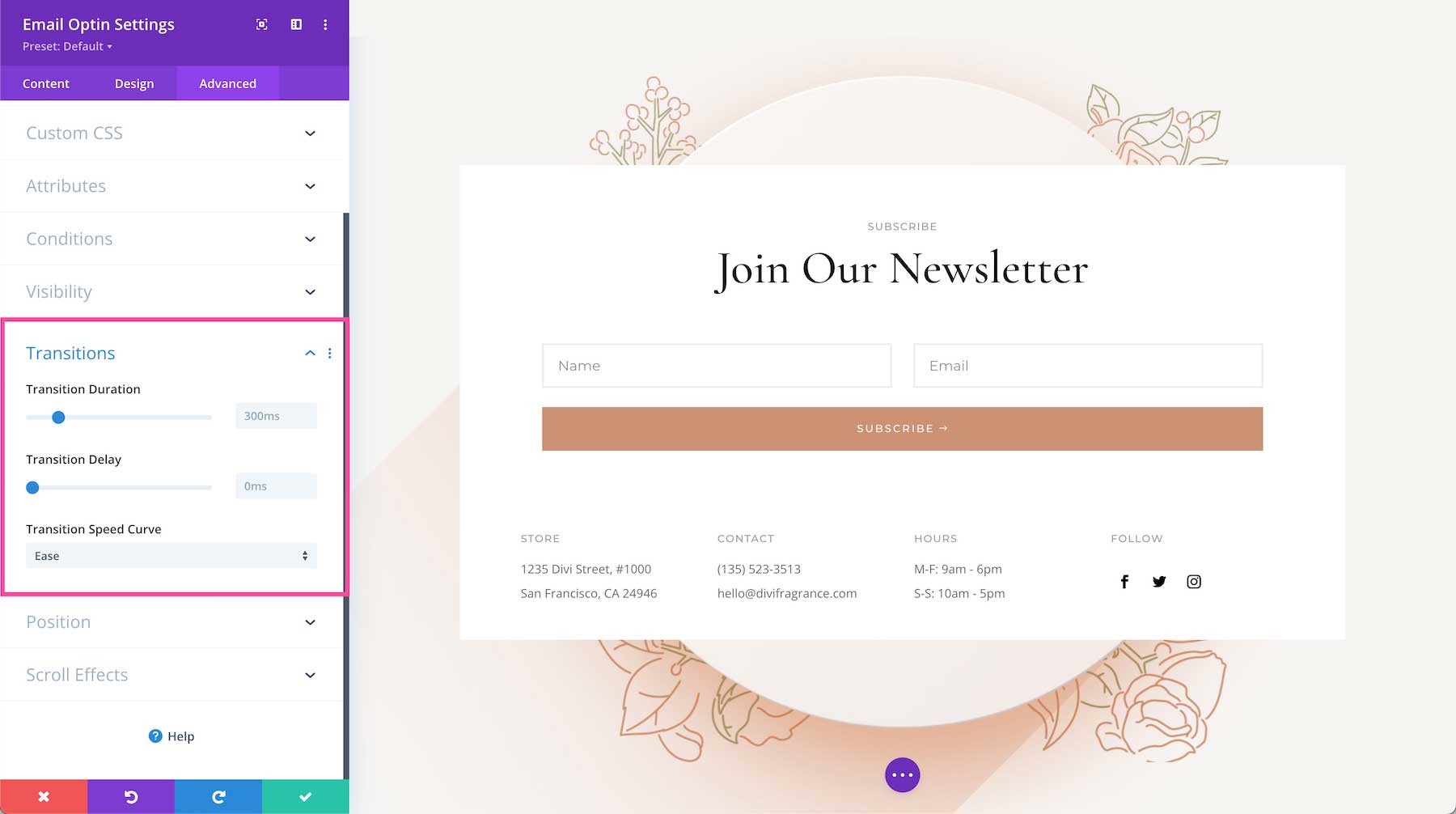
Transitions
This controls the transition duration of the hover animation as well as the delay, and speed curve.
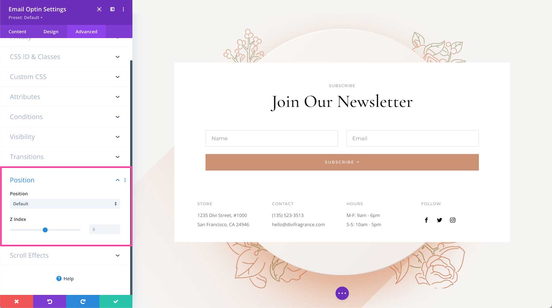
Position
This defines the position of the module as well as the offset origin, vertical and horizontal offsets, and the z-index of the module. The available positions are default (which is automatically selected), relative, absolute, and fixed. Defining the z-index allows you to specify the stack order of elements. Elements with a higher z-index number overlap elements with a lower z-index.
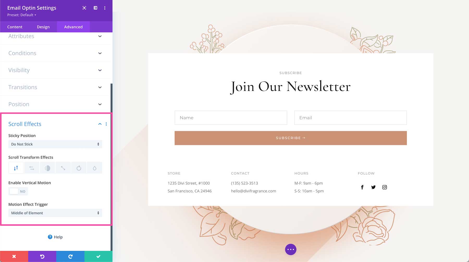
Scroll Effects
This defines how the module behaves upon scroll. You can make the module sticky (to top, bottom, or top and bottom), and choose if the module transforms upon scroll. You can also enable vertical motion on this module which allows you to adjust the speed at which this element scrolls (making it faster or slower) without affecting the surrounding elements. The Motion Trigger Effect allows you to choose when the scroll effect you just applied is triggered: when the top of the element is in view, the middle, or the bottom.
Save Your Design
Once you are finished styling and configuring the module, click the green arrow at the bottom right of the module to save your design. If you close the module without saving, your work will be lost.
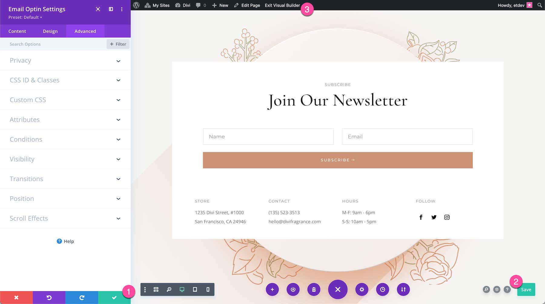
Next, Save the Page Design
To save the page design, you can type CMD + S on a Mac or CTRL + S on a PC. You can also use the bottom Divi toolbar to save your page design by clicking the circle purple icon with the three dots “…” to expand the toolbar, and then clicking the green “Save” button at the bottom right.
Exit the Visual Builder
Now that all your changes are saved, click “Exit Visual Builder” on the admin toolbar at the top to exit the Visual Builder.
Continue Learning
- Browse Divi Modules Documentation
- Learn The Divi Basics
- How to Set Up Your Email Account in Divi’s Email Optin Module
- How to Use a Spam Protection Service in Divi’s Email Optin Module
- How to Redirect After Filling Out an Email Optin Form in Divi
- How to Create a Sticky Email Optin in Divi That Draws Attention
- How to Include an Email Optin in Your Divi Footer
- How to Add a Motion Slide-Out Email Optin Box with Divi’s Scroll Effects
- How to Add a Divi Email Optin to Your Gutenberg Blog Post
- How to Trigger an Optin Form After Specific Page Visits
- Stay up to date with all of our latest Divi Email Optin tutorials by checking out our #divi-email-optin page.