

So you used Divi to build a gorgeous website, filled it with top-notch content and went through all the checkboxes to guarantee good search engine optimization. Yet after some time, your conversions aren’t quite where you’d expect. Now you might be asking yourself, “Did I do something wrong?”
There’s no need to panic and hit the reset button quite yet. Sometimes small changes can have a great impact in your conversions, and one of the best things you can do in terms of reward is optimize your calls to action.
Over the course of this article we’ll cover exactly what makes a call to action good, some of the psychology behind their workings, show you some great examples, and finally, teach you how to implement a sticky CTA in your Divi website.
CTA 101
It’s no exaggeration to say that there’s an entire science behind calls to action. Pretty much every aspect of them (copy, colors, size, width, etc.) can be broken down and analyzed until exhaustion, but some of them stand out in their importance.
Color
Most people associate yellow with optimism, red with energy, blue with trust, green with wealth and relaxation, orange with aggressiveness, pink with the feminine side, black with power, and so on and on. This is merely a superficial analysis, but depending on the kind of service or product you’re selling some specific colors will be more effective than others.
Copy
Color alone isn’t enough to compel unless it’s accompanied by the right words. According to research, 52% of customers are more likely to enter a store if simply asked to – be it a sign on the road or a flyer. The problem, though, is that users are so accustomed to being constantly bombarded with advertisements everywhere they go, they get pretty good at ignoring these kinds of messages.
Given this fact, your copy needs to be strong and concise when it comes to CTAs. For example, using active verbs is preferable to filler text such as “Click here”, which does nothing as far as enticing a customer goes. “Sign up for a free copy!” might get better results if the user deems the content interesting enough for a no-strings-attached look.
Buildup
On top of the text of the CTA itself, the buildup can also influence your rate of conversions. Take landing pages built for sales funneling as an example – they’re specifically made to entice customers into buying a product or service and often follow a similar structure: lay out a problem using a person as an example and then move onto telling how their product managed to help them out where all other options failed, then finally offer you the opportunity to apply their teachings to your own problems (it’s never a sale, always an opportunity).
A great call to action is, therefore, a combination of simply suggesting an action at the right time, creating a sense of anticipation, then using a compelling design and the correct words to entice your customers into making one initial choice. It sounds like a lot to process, but the road to creating a good CTA is well-trodden and there’s a lot of resources available to those who want to delve deeper into the subject.
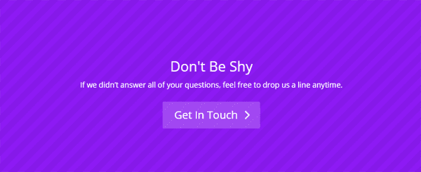
Let’s take a look at a simple example built using Divi, which doesn’t make much use of a buildup for its main call to action.

The whole main page is littered with calls to action designed in a compelling manner, but the main one doesn’t beat much around the bush. “We love keeping you active, healthy and happy. Make an appointment.” is short, concise and gives a sense of urgency while placing the decision in your hands.
The Divi Call to Action Module
In order to make your life easier, Divi comes with a built-in CTA module. This enables you to implement CTAs at the click of a button using the Divi builder and enjoy the same level of customization available with all of its modules.
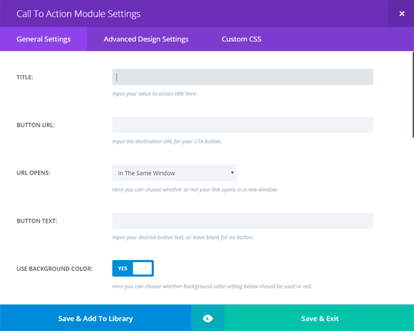
The module includes all the options you can imagine, such as colors, text orientation, customizable labels, IDs and classes, advanced design settings and the option to add changes via CSS.
An example of a call to action built using Divi.
While the module does have a lot of options, getting a call to action to remain fixed as you scroll through a page isn’t one of them by default. Thankfully, Divi makes it very easy to play around with some advanced tweaks through a combination of child theme usage and some simple CSS. So roll up your sleeves and get ready to play around with some code. (It’ll be painless, we promise!)
Creating a Sticky CTA with Divi
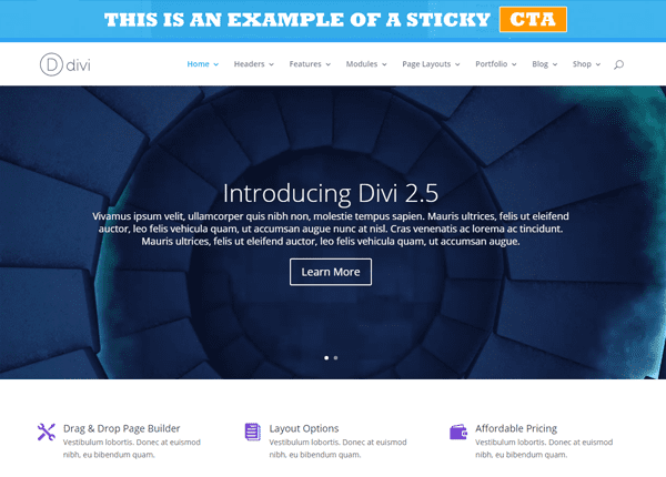
A sticky CTA in action using one of Divi’s demo pages.
A fixed call to action can be a simple solution to increasing conversions, as long as it’s not overly intrusive or otherwise breaks the flow of your websites design. Ideally, you want it to meld into the layout but still serve as a potential reminder to customers that they can opt into your services at any time.
As we mentioned earlier, this isn’t a default option on the CTA module, but thankfully, the folks over at Elegant Tweaks came up with a simple method to implement this feature.
First of all, you’ll need to copy your header.php file into a child theme and find the following lines of code:
<body <?php body_class(); ?>>
<div id="page-container">
In the following code snippet we’re creating a new unique ID called top-cta, whose name is self-explanatory. If you want to change the text of the CTA, replace the necessary lines of code after pasting.
<div id="top-cta">
<a href="#">This is an<span class="cta_gray">
example</span>of a sticky</a>
<span class="blurb_button">
<a class="et_pb_promo_button cta" href="#">
CTA
</a>
</span>
</div>
Now you’ll need to delve into some CSS to customize your brand new sticky CTA, which you can deploy using the Custom CSS field at the bottom of the ePanel.
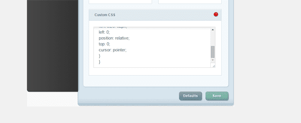
The Custom CSS field included within the Divi ePanel.
Much of this code should already be familiar to you, and even if you’re not that used to dealing with CSS, it’s pretty easy to navigate. Let’s go over it step by step.
The first section covers the general design of the CTA bar, including the background, text alignment, padding, forcing the text into uppercase, stating the bar should occupy the full width of the browser, and the z-index (which is set to a high value to supersede all others).
Each successive section deals with the classes we previously outlined in header.php and include minor stylistic details which you can tweak to your heart’s content.
Finally, we have some media queries that helpfully resize the CTA bar for smaller resolutions so it doesn’t take over half the screen and scare all your visitors away (trust us, you don’t want to omit that part).
#top-cta {

background-color: #Insert your preferred color here;

background-color: rgba(57, 178, 235, .9);

text-align: center;

padding: 5px 0 5px;

text-transform: uppercase;

position: fixed;

top: 0;

width: 100%;

z-index: 9997;

}

#top-cta a {

color: #fff;

font-size: 28px;

font-weight: 700;

display: inline-block;

}

#top-cta a span.cta_gray {

color: #dfdfdf;

text-shadow: 1px 1px 1px #5a5a5a;

}

#top-cta .blurb_button {

padding-left: 20px;

}

#top-cta a.cta {

background-color: #ff9900;

}

#top-cta a.cta:hover {

background-color:#FFAD33;

}

/*-------------------[768px]------------------*/

@media only screen and ( max-width: 980px ) {

#top-cta {

padding: 10px 0 10px;

}

#top-cta a {

font-size: 20px;

}

}

/*-------------------[480px]------------------*/

@media only screen and ( max-width: 767px ) {

#top-cta {

padding: 7px 0 7px;

}

#top-cta a {

font-size: 18px;

}

#top-cta .et_pb_promo_button {

padding: 4px 15px;

}

}

/*-------------------[320px]------------------*/

@media only screen and ( max-width: 479px ) {

#top-cta {

padding: 5px 0 5px;

line-height: 1.2em;

}

#top-cta a {

font-size: 16px;

}

#top-cta .et_pb_promo_button {

padding: 2px 10px;

}

}
It’s Time for Split Testing!
As you might have noticed in our previous section, even with such a simple bar, there’s a ton of customization options available to really make it your own. You could, of course, simply pick a nice style, put your CTA up and cross your fingers, or we could take things a step further.
It’s a simple truth that visitors will respond better to some designs than others, and although you can follow all the latest trends, there will always be some room for optimization. The smart way to choose which changes to implement is by using analytics to guide yourself.
For example, if you have two designs available for your sticky CTA, you should proceed to test how each affects your metrics during a specific period of time and then stick with the clear winner. This allows you to build upon the knowledge of what works for your specific viewers and really tailor your content as much as possible.
Split testing becomes a bit more complicated when you have a wide variety of options available. If you include wildly different designs within the same tests you’re liable to get skewed results. Therefore, if you have the time and patience to do so, you should try to build upon the results of previous tests (using each bit of knowledge to improve your designs) until you’re satisfied with your metrics.
Don’t be scared, though – this is much easier than we’re making it sound. Your tests can be as long or as short as you want (as long as you’ve received enough traffic to reach an informed decision) and the metrics aren’t hard to read. Are you getting more clicks? Is your bounce rate falling? Most importantly, are you getting more sales? If so, then kick back and enjoy it, you’re earned it.
Conclusion
You can have all the visitors in the world or the most popular products, but sometimes people simply require a little nudge before they decide to sign up for your services or crack their wallet open. That nudge can be as simple as an effective call to action.
Find inspiration in our examples of great CTAs built using Divi, follow the steps outlined above to create your own sticky calls to action, and remember to use split testing to optimize your conversions.
Have you had any success using calls to action? Share your experiences with us in the comments section below!
Article thumbnail image by Bplanet / shutterstock.com


I just followed the steps you have mentioned and its working. Thanks for the awesome post man.
Thanks, Pavan. 🙂
Really a nice post with good detail loved it <3
Thanks, Tejas. 🙂
Hey good work Tom, Working great!!!
Thanks.
Thanks. 😀
Working like a charm! Thanks buddy.
By the way, I was searching for coupon theme by elegantthemes but unfortunately I didn’t found any.
Do you have any such plans in future?
Nice and very informative article. Awesome Bro.
Thanks, Shahil. 🙂
Hi Tom, I simply followed your mentioned instructions steps by steps, and its working. Thank you Tom, Nice post
No problem, Rantu!
This is for wordpress ?
Yes.
Awesome article Tom. Surely this technique works very well in photography website. People tends to sign up quickly if they see a attractive sticky CTA
Thanks Bhabesh!
Hi Team, should my Divi stop working after the end of my subscription? (last month)….
Divi “don´t want” to delete the blocs, i can put normaly, but wen i click on the “X” button nothing happens….
tnx in advance
Felipe
Hello, Felipe. That certainly doesn’t sound like normal behavior. You may want to contact the Elegant Themes support team here – http://www.elegantthemes.com/contact.html.
Hello Tom,
Germany also like your CTA, but it didn´t really work with my EXTRA/Divi Bulider Theme Combination?! It covers my Secondary menu.
Do you have any Idea for a solution?
Vielen Dank und viele Grüße aus Bremen/Deutschland
Integrating with Extra and Divi is a little outside the scope of this article; however, you could always post a question in our forums – https://www.elegantthemes.com/forum/. The community may have an answer for you. 🙂
Thanks for this tip Tom.
You always publish very useful posts 🙂
Thanks, Chathura!
Awesome tip. Having easy access to creating CTA is a real game changer for businesses who formerly only relied on their “Contact” page for conversions.
Thanks for the kind words, Chris. 🙂
Like many others, if we had an opportunity to see one in action, we might have a better idea of what your talking about. I assume the CTA stays at the top and never goes away as the user scrolls thru the page. However, to me, this seems annoying and might cause people to simply exit and run for the hills. Too much in your face, me thinks!
John, an example was posted in a previous comment. See this link – http://demo.eleganttweaks.com/fixed-top-cta/
I think it would be awesome if some new version of Divi included sticky module(s), so we could for instance have a half of the screen static (with some sliders, text, cat’s…) while the other half is scrolling up and down. That way we could utilize the large real estate of modern screens, while making space better utilized. Also, we could have the main image and copy there all the time. I am trying to figure this one out for a while but no success yet…
You can always make that suggestion in our Theme Suggestions forum – https://www.elegantthemes.com/forum/
🙂
Sounds like a good idea Haris!
Thanks for the shoutout Tom!! I added a demo link to the top of my tutorial.
http://www.eleganttweaks.com/divi/fixed-cta-bar/
You have to disable the fixed navigation in Divi theme options for this to work. Otherwise the fixed CTA bar will be hidden behind the fixed header. I added an easy solution for this to the bottom of my tutorial if you only want the CTA bar on one page and want to keep the fixed navigation on all other pages.
Good stuff, Brad – thanks for your input!
Thanks Brad! Looks great 🙂
Hello,
Can you tell me how to make this footer as an example ?
Hi Yashveer, which footer?
Every time I’m having a problem or need to fix something it is on this blog. You guys are awesome this way. Thank you for providing this very valuable CTA instruction. Everything you offer is so valuable!
That’s our goal Mike! Thanks for reading 🙂
Hey Nathan,
Can you please address my unresolved issue? My CTA banner is still hidden behind my secondary nav. Any suggestions? (see above)
Thanks,
Susanne
Hi Susanne,
Sorry you’re having trouble getting this to work for you. I think your best bet is to create a support ticket in our forum.
http://elegantthemes.com/forum
Best,
Nathan
Thanks for the http://www.eleganttweaks.com/ site. Great tip!
Agreed Emile, we love it when the community creates such useful resources!
I can’t get this to work… 🙁
It seems to be hiding behind my page.
Are there any special requirements or conditions that need to be met?
You also need to make sure you have the “Fixed Navigation Bar” disabled in the Divi Theme Options. Otherwise the fixed navigation will sit on top of the fixed CTA bar
Yup, I did that too. Still not working.
Hello Susanne. Make sure that your top-cta ID is pasted after the page-container ID, and not in place of it. I suspect that could be a potential reason.
I did… still not working.
Susanne, I’m stumped. I’d suggest you contact Elegant Themes support here – http://www.elegantthemes.com/contact.html – to see if there may be an underlying problem.
Hello,
Nice post. I suspect for many designs it would be more helpful to have a CTA that floated in the viewport. For example, if you hide the top header on scroll.
I’d imagine I could figure it out by hacking the code for the little “back to top” icon I use…but if you have it handy it would be helpful.
Thanks again for a nice post.
Patrick
Hello Patrick. Coding of that nature is slightly outside the scope of this article, but of course, feel free to come back with a suggestion for the other users here. 🙂
Thanks for your kind words about the post!
Sounds like a good feature to add to the CTA modules.
Maybe it’s something you can mention on the Theme Suggestions forum – https://www.elegantthemes.com/forum/? 🙂
Live demo (and screenshots of current Divi version) would indeed be helpful.
Brad Crawford created a live demo here: http://www.eleganttweaks.com/divi/fixed-cta-bar/
a live demo will be helpful
Hi, how to make this footer as an example ?
Tomek, a footer isn’t “sticky” by default (that is, always displayed, regardless of scrolling).
The point about the CTA is that you should always try to offer the opportunity for conversion. In this case, it’s always at the top of the screen.
An alternative approach (and necessary if your design hides the header and navigation on scroll) would be to “float” a CTA at a fixed position in the viewport. That way it would always be visible as well.
I guess:
#top-cta {
top: 0; /* -> change to bottom: 0; */
}
A link to a demo would be highly appreciated
some great tips…i recently changed the headline copy on some signup forms (that are using bloom) and subscriptions have doubled… so. i would totally agree with this “Sometimes small changes can have a great impact in your conversions”
Good stuff, Craig! Glad to see our advice being put into action. 🙂