

You’ve invested a lot of time into making your new website perfect, so why does it look so fuzzy when you view it on your iPhone? You made sure to use beautiful high quality images but they don’t seem to be displaying correctly at all. Cue panic!
Many people don’t realize that newer devices – especially those from Apple – use advanced display technology that affects how images are displayed. Fortunately, there are some tricks you can use to make sure your images are optimized to ensure your website looks perfect on devices like your iPhone.
This article will introduce the topic of retina display and how it impacts your website images, then show you how to create image assets that will display well on retina screens.
Retina Display Images Explained
Device screens have continued to improve in quality over the last several years, and Apple in particular have been working on making their screens extremely clear and viewable – in fact, ‘Retina Display’ is a brand name from Apple used to describe the screens of their newer devices.
Retina screens aim to display text and images as sharp as possible, with no pixels visible to the naked eye. The challenge for designers is that retina displays is not a standard – it varies depending on the size of the device’s display (for example, a watch screen compared to a tablet), and how close a typical user would be to the screen.
When talking about retina displays we have to think about pixel density, which is the number of pixels a display can fit into a fixed distance. This is not the same as resolution, which is the number of pixels across the entire height and width of a device. A smaller screen (such as an iPhone) with the same resolution as a larger one (such as an iPad) would have a greater pixel density.
Dividing the physical width of the display by the number of pixels displayed horizontally gives us the pixels per inch (ppi, also called dpi for dots per inch). ‘High DPI’ is used to refer to any device that has over 200 pixels per inch. This includes all retina display devices from Apple, and some devices from other manufacturers. For a more in depth explanation, check out this article on the Designer’s Guide to DPI.
Traditionally, web graphics were optimized at 72dpi. An image at that density displayed on any high DPI device (especially a retina display) will be displayed in one of two ways:
- As a fraction of the size if shown at the device’s DPI.
- Shown at the original dimensions with extra pixels guessed (interpolated) and filled in reducing the quality of the image.
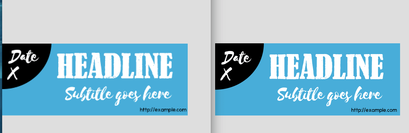
Images not optimized for retina displays will show pixelation like the image on the left.
This means that for the best quality image display on retina display devices, you need to be working with higher resolution images. This ensures that the image can be displayed at a pixel density appropriate for these newer screens. Let’s take a look at how you can do that within your Photoshop.
How to Use Photoshop to Create Retina Display Images
Working with images at double or quadruple the resolution means you may need to zoom in to be able to see any fine detail, but extremely large image files can create performance issues and file storage challenges.
The solution for most designers has been to either create multiple layers and groups, turning them on and off as needed using the comps feature of Photoshop, or to work at the the original resolution and export the sizes they need (using an action like retinize.it).
The challenge with both of these methods is that you cannot see multiple images at the same time. If you need to view the differences in the images at the necessary sizes, you have to switch between them or export and then rework.
Fortunately for us Photoshop lovers, Adobe has added functionality that makes creating multiple images even easier. Now you can create multiple canvases side by side using the artboard feature, and create multiple image sizes using Generate. Let’s see how this works to create images for retina displays.
1. Create Your First Artboard
The new Artboard tool, introduced in Photoshop CC 2015, can be found hidden behind the Move tool. You can either click on the tool in the menu, or use Shift+V to switch between Move and Artboard:
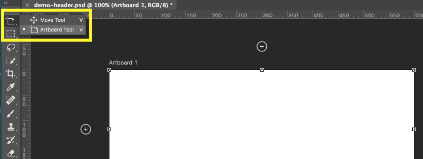
To create an artboard, click and drag an area. The new artboard will be displayed in the Layers panel with a default name of Artboard 1.
2. Set Up Your Artboard
You can add any layers you need to your artboard, and they will be nested similar to layer groups – enabling you to create an appropriate layer structure. We would suggest adding your various assets, such as shapes and type, so that they’re positioned as you need them before moving on to the next step.
3. Duplicate Your Artboard
Once your first artboard is set up to suit your needs, you can duplicate it using the contextual menu. Right-click on Artboard 1 in the Layers panel and select Duplicate Artboard. This creates another artboard of the same size and position, containing the exact same layer structure with all the included assets:
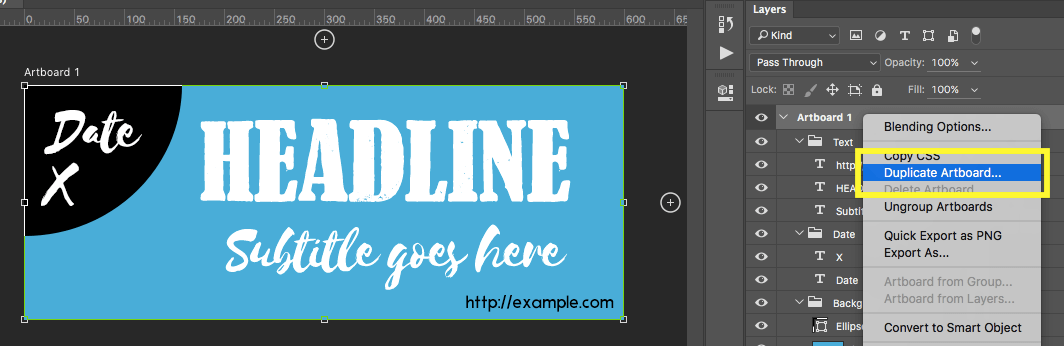
Duplicating your artboard gives you a pixel perfect copy of the layout.
4. Position Your Artboards
The big advantage of using artboards is being able to see all of your images at the same time. To do this, just position your artboards as needed. There are several ways to move an artboard:
- Use the Properties panel that displays when an artboard is selected to enter the X and Y coordinates for the top left corner of the artboard.
- Drag the selected artboard to any position inside Photoshop. The artboard is smart guide enabled, so you can automatically align multiple artboards and their positions will lock to the previous spacing.
- Use your keyboard arrow keys to move a selected artboard. An arrow key by itself will nudge the board by one pixel, while holding Shift+Arrow will move it by ten pixels.
5. Resize Your Artboards (If Needed)
If you need to adjust the size of your artboards, you again have multiple options:
- Resize them using the handles that appear when you select an artboard.
- Use the Options panel just below the File menu to choose preset sizes, set custom widths or heights, or switch between portrait and landscape orientation.
- Use the Properties panel that displays when an artboard is selected to change the size and access the preset sizes.
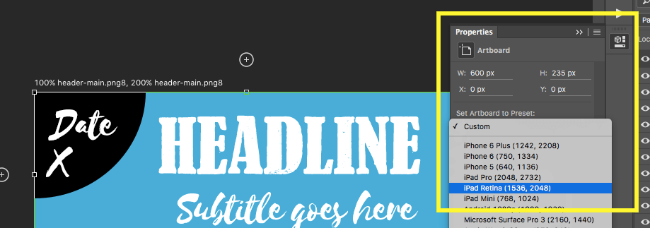
You can choose a preset size for your artboard using the Properties tab.
6. Create Your Art
You can now work with your artboards, replacing image assets and making changes as needed. Assuming your original setup went well, you’ll now have pixel perfect images with all assets in the right place.
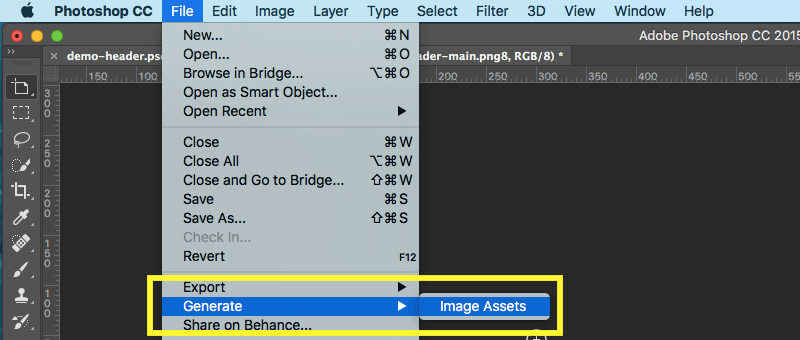
7. Set Up the Generate Tool
Generate enables you to export artboards, layers, or groups by using a special naming syntax. It acts as a Save for Web shortcut. To ensure Generate is turned on for your PSD go to File > Generate > Image Assets:
8. Rename Your Artboards
Generate works by saving image assets as you work based on options you set in the name of the layer group – or in this case, your artboard. There are a few options you can set:
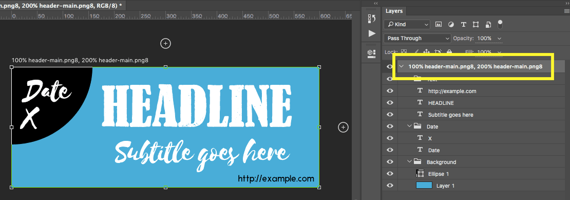
- File format. Add an extension ( such as -opt.jpg, .gif or .png) to save the relevant file – for example, header-main.png. The image assets will be saved in the same folder as the PSD file, but with an -assets suffix.
- File compression. After the extension, you can add a figure denoting the level compression used. For opt.jpg you can use percentages, and for .png use 8, 24, or 32 for the respective bit formats – for example, header-main.png8.
- Output scale. You can set the scale of the output by adding either the percentage, or pixels (width by height) before the image name (e.g. 100% header-main.png8).
- Multiple images. You can export multiple images from the same artboard by using either a comma or a plus sign to separate the image names. Each image can thus have its own options so long as each image name is unique – for example, 100% header-main.png8, 200% header-main.png8.
Combining these options enables you to consistently create complex image assets from your artboards:
If standard images are needed for all of your artboards, the Generate tool enables you to create a default setting to apply to each one. To create this setting, add an empty layer at the top of your document with the following options:
- Default keyword: The name must start with this to let Generate know to use it as the default.
- Output scale: As before, set the scale of the output with a percentage or pixels (width by height).
- Folder/suffix: Set the folder name where images should be saved, and a suffix to add to the filenames.
By adding multiple options, you can automatically create the images you need for retina displays – for example, default 100% end/@1x, 200% end/@2x, 300% end/@3x. You can then add extensions to any boards you want exported using the default option.
If you use other design tools such as Sketch, they have their own export mechanisms – but if you are a Photoshop fan, this workflow will drastically cut the amount of time it takes you to create the multiple images needed for retina displays.
How to Optimize Your Retina Display Image Assets
File size is always a major consideration when creating images for your website. Images have to be loaded into your visitor’s browsers, so the larger the file sizes the slower your site will load. A beautiful website that takes forever to load will likely not be seen by your visitors as they won’t want to wait.
You can start optimizing your website images by making sure you are using the relevant options when saving your files in Photoshop. As we covered in the workflow above, you’ll be saving your images as either JPEG or PNG files. The JPEG format is better for photographs with many colors as it uses compression to reduce the file size. The PNG format works best for screenshots and design images such as icons and buttons, but it uses lossless compression so the file sizes are higher.
WordPress also offers you some assistance in optimizing, by creating multiple image sizes when you upload images to your WordPress site. This helps to ensure that you use an appropriate size image – for example, thumbnails would be used in listings of multiple posts. Additionally, there are image optimization plugins to help optimize any images as they are uploaded.
Conclusion
It’s all very well selecting amazing, high-resolution images for your website, but if you haven’t prepared them correctly before uploading, they could look unexpectedly pixelated when viewed on newer retina display devices.
Creating retina display images in Photoshop is a piece of cake – let’s recap the steps:
- Create your artboards, taking care to setup, duplicate and position them correctly.
- Resize your artboards if needed, before creating the images in question.
- Setup the Generate tool to assist in exporting your images.
- Rename your artboards within Generate, setting them up as default options if necessary.
The tips shared above should help you understand how to create images that are optimized for display on newer device screens – enabling you to create beautiful images that look the way you expect on all screens.
If you have some experience working with retina display image assets, we would love to hear your tips and tricks for creating and optimizing them by subscribing to the comments section below!
Article thumbnail image by Blablo101 / Drawn Keeper / shutterstock.com


I would hope that we see the time when the suppliers of themes and maybe WordPress itself, have systems integrated to handle this automatically.
Maybe then we could just upload images at say 200dpi and the media query would deliver the right resolution to the respective screens.
What do you think ET?
Yes please!
I like many designers got off the costly Adobe upgrade path when they went to CC monthly rentals. I have Adobe Creative Suite CS6 Premium so I have Photoshop 6 Extended–last version before CC came out. I may run a PSD action or batch export to optimize images.
Can’t you pls post ‘ideal’ jpeg and PNG image specs or retina display viewing? I’m working on one. Essential for do it yourselfers to know what they should be outputting.
iMac Retina 5K, 27″ (5120 x 2880)
iPad Retina
iPad Mini Retina
iPhone 6 Plus
Unfortunately, there isn’t one ideal size for retina images, as you’re already discovering. It’s simply a case of creating different images based on the various device resolutions out there. Good luck. 🙂
Let’s talk specifics here….. for WordPress Hero and Slider creators:
I have a WP 4.5.x hero Image that would display correctly on My 23″ 1920×1080 monitor if uploaded at 1920x1080px at 72dpi.
However, I see stunning images in themes and on other’s web pages that are only 1500px wide and 4:3 ratio. Some, even in the same gallery are 144dpi, some are 300dpi and some at 72dpi.
Bottom line is ( to keep it simple, stupid) if I upload an hero or slider image 1920×1200 for a parallax display set at 144dpi, using the Free Retina Plugin, will I automatically obtain 1x and @2x images SERVED to the right device, at the right time?????
I don’t mind batch exporting 200 gallery images, ONCE and let tech handle the rest.
What is the consensus??
a. 1920x @ 72dpi
[ b.1920x @144dpi equal to: c.2860×1440 @ 72dpi, RIGHT???? ]
d.2860×1440 @ 144dpi???
edit, I meant: 2560×1440
This article is very much debatable since WordPress automatically creates various sizes for different elements and displays. Also the discussion in this thread about dpi of the images is very confused. It matters not what dpi the images are, only what the pixel values are for width and height. We need some experts to weigh in here but all those raising doubts are right to question the article and the comments.
Great post! I have noticed when creating images that look great on larger screens it does not correlate to smaller screens like the iPhone. The pixel density makes sense. One thing that makes it more difficult is now you have to specify each image to be displayed on a particular device. I suppose this can be done in DIVI, but now instead of one image, I’m uploading three (Desktop, Tablet, Phone). This can be way too time consuming and with ongoing screen size changes would never be able to keep up. I just wish everything would go to SVG’s and then we would not have this problem. Everything would be infinitely scalable without any loss of quality, at least for anything not a photograph.
Hello Matt,
SVGs are becoming more and more relevant as time goes on. In fact, we recently posted an article on creating SVGs – https://www.elegantthemes.com/blog/resources/how-to-create-an-animated-logo-with-svg-and-css.
Is this meant to be multiple artboards for the same image at multiple sizes? If so when you resize an artboard the assets don’t resize. Also if you make changes to one artboard you have to make the same changes to the second… so I’m confused by the benefits of multiple artboards for the sake of retina images?
Hello Alex,
It is meant to be multiple artboards for the same image, yes.
There are pros and cons to working with them, and I think we’ve outlined a good approach here. Ultimately, you have to decide how best to work given your time and inclination.
Thanks for your comment. 🙂
Hi Tom Ewer,
First thanks for sharing this post, I learned a lot from it. After going through this post I myself got an idea. Sure i will keep reading your articles.
Keep up your great work.
Thanks again,
Hema
Thanks, Hema. 🙂
Nice post shared …I would really like to thank you or sharing this wonderful content with us .These points are important to get attractive website design and cannot be overlooked .
“The challenge for designers is that retina displays is not a standard…”
There’s other things Apple do that’s not a Standard for Web Designers, such as introducing their retrieval for a apple ‘favicon’ (/apple-touch-icon.png)
I won’t go on a rant here, but you do see what Apple are doing?
I understand Apple’s motives for providing these solutions – they’re doing what any company would ideally like to do. Our challenge is to try and offer all users the bets possible experience – and if that’s creating retina images, so be it. 🙂
hey thanks for sharing this amazing post, i never knew this would possible with our ordinary images i will surely give it a try & make it count.
Thanks, Rahul. 🙂
Tom,
Mark Terborg raises a valid point given that we’re now practically singing the praises of Divi. That would be totally awesome means I have less to worry about.
Awesome. I was trying to figure out how to turn my website logo in a Retina logo. I had a chance to use my friend’s MacBook Pro Retina display and I was shocked to see my website logo in such poor quality.
I have been trying different techniques to come over this Retina puzzle.
Cheers!
Hello Hamza,
This article should steer you in the right direction. 🙂 Thanks for your comment!
I’m using Photoshop CS5.1. Any tips on how to create retina-ready images with it? Or do I need to upgrade?
Hello Andrew, I’m unsure to be honest as I don’t have that version. If your current version doesn’t have these options, you could either find a workaround in 5.1, or upgrade.
I’ve not done it in that version, but if it has the same settings then you absolutely can. If not, then you’ll have to upgrade to get the new functionality.
Plus one for people asking about designing for mobile and desktop – and speed vs quality issue.
We hear all of you, Mike! We’ll see what we can do in the future.
This blog is awesome! <3
Do I have to optimize all images of a gallery for retina display? Even if the client is a photographer and has more than 200 photos in his gallery?
Yes, every element would need to be optimized. This is where things like actions and batch tasks can come in very handy in Photoshop.
http://www.elegantthemes.com/blog/tips-tricks/pre-made-photoshop-actions-for-web-designers
Thanks, I learned a little more, but I still don’t know how I should save the images. Is it just as simple as using a DPI higher then 200+ rather then 72?
Most of the time I use irfanview to quickly crop and resize images. While doing that I reduce the DPI to 72. Should I not do that anymore? It doesn’t make a difference in disk file size (kb), it only reduces the print size (as indicated by irfanview).
For example, an image of 600x399px
– @350 DPI, print size is 4.4 x 2.9 cm or 1.71 x 1.14 inches is 75kb
– @72 DPI, 21.2 x 14.1 cm or 8.33 x 5.54 inches is 75kb
Here is an example: http://test.xenonis.nl/retina-image-dpi/
To me they look the same, including the size in the lightbox, but I don’t have a device with a retina screen to check.
They look very similar to me too, and I’m on a retina MacBook. However, you may want to look at the tech specifications for current Apple devices to see what they’re using and adapt your settings.
Excellent article. I’ve been playing around with shooting more of my images for websites and local places . It’s amazing how quickly the smart phone invasion has been . Being able to continue the task of keeping up with tends , this article is perfect for my needs . I play with Gimp, and a couple others , some limitations on those but this tutorial can be used to Segway into Gimp.
Cheers .
Thanks, Jon! It’s simple enough to adapt most of these into GIMP – if you have the time and the inclination, that is. There are others here looking for solutions too, so it’s definitely a popular piece of software.
Sorry for posting again but I thought I should pass on my experience with image editing programmes.
A number of these programmes do not give you both good image resizing/cropping and resolution changing abilities but Paint.NET and GIMP both have these abilities and they are free.
I originally used Paint.NET, which is good, but have recently changed to GIMP partly as it has more precise re-sizing functions. Paint.NET is very easy to use and whilst GIMP has more functionality it does have a bigger learning curve.
I have come to love GIMP as my “go to” tool of choice
Hi Martin,
GIMP is really a wonderful application that can create some very professional images. Love it!
Thanks for sharing your techniques, Martin. GIMP is a great piece of kit, and best of all it’s open-source – just like WordPress itself. 🙂
Thanks for sharing Martin!
I am not a graphic designer but have developed a “cowboy” approach to higher image resolution which seems to work.
The thing is that recent advances in screens demands higher resolutions so that lower resolution images (such as 72dpi) on higher resolution screens makes your images look like “Cr@#”
Right, 72dpi x 72dpi gives a pixel density of 5,184px. However if you double the resolution to 144dpi the density becomes 144dpi x 144dpi or 20,736 or four times the density at 72dpi.
Now to get the image to load faster I use Compress PNG/JPEG and use a CDN (I use Cloudflare) I also use a New Zealand-based server to reduce latency as the majority of the viewers of my sites come from New Zealand.
This is not as elegant as using a Retina 2 plugin working on media enquiry but it works for me and gives the users of all devices including higher resolution devices great looking images which load really fast.
My view is that lower resolution screens will gradually disappear from use so we need to do something to provide a good user experience.
So where is info on how to make divi or wordpress display the right images for the right decice?
Hello Mark, we have a number of responsive themes that will adapt your images here – http://www.elegantthemes.com/gallery/category/responsive/.
If you meant something else, however, you’ll need to offer up a bit more of an explanation.
Excellent tut Tom, thank you so much.
As Mark says, the trick now is to display the right image to the right device so that we give the best output possible, while reducing file load time as much as possible and keeping ‘The Google’ happy that our sites are mobile friendly.
Regards,
John.
Yes, I’d mentioned to Mark above that I’d need a little more to go on, but I understand now – there’s no guarantees, of course, but we’ll see what we can do in the future. 🙂
I have the same question
yes… that’s what we are all looking for… how to serve the correct image to the right device?
Great step by step tips, Tom.
I have always found images a little tricky to work with given the novice that I am. I have previously not had much of a chance to explore many of the technology features of Photoshop except of course to delete background.
I just might set aside some time to try out these tips.
Thanks
Thanks Tahir – it will be worth it, I promise. 🙂
Some content management sites and their third party plug ins use algorithms that automatically resize anything you upload; this has always frustrated me because no matter how sharp my images are, they get clobbered by WordPress and Facebook…
Hello Barbara,
Yes, this is a common concern; however, the WordPress defaults can be changed with a little PHP. Facebook, unfortunately has no settings you can change, and they seem to compress very heavily.
Great if you’re a Photoshop user. Any tips or best practices for the GIMP users in the bunch?
I agree with Ray. Not everybody is willing and/or able to accept Adobe’s CC system of “extortion”. I know quite a bunch of media designers that have switched to other tools since Adobe decided touse a rental system (SaaS) instead of selling their creative suite. While I value ET’s blog very much, the strong focus on Adobe products makes me feel kind of “discriminated” from time to time. Please include at least basic information, how the desired effects can be achieved with other tools. It does not have to be a tutorial including screenshots, but in this case a simple table of common file dimensions used in Divi with their respective ppi/dpi values for retina displays would have been sufficient enough for my taste.
Besides that I am grateful for your valuable tips and tricks in the ET blog. Keep up the good work!
Thanks, Will. We’ll take your comments onboard!
It’s definitely something worth taking a look at in the future, so we’ll see what we can do!
Following, hope Tom will reply…
I’m also interested about using the GIMP!
I agree with Ray. I love GIMP and would second any help along those lines.
Wouldn’t these higher res images create larger files which could impact the loading speed of a website on devices?
Hello Moira – yes they would. It’s about making the right balance. Of course, you should be optimizing your images before uploading them to the web in any case. We recently posted an article looking at some image optimization plugins that might be of interest to you – https://www.elegantthemes.com/blog/resources/best-wordpress-image-optimization-plugins.
You can use SMUSH PRO to optimize image size without losing quality.
Yes, there will be chances to impact loading speed as the file size would be change.