

Not all clients initially come to you looking for a brand new website. That may be what’s needed, but often the starting point is an existing site. It might be outdated or in a state of disrepair, or maybe it’s built using a theme that’s no longer supported.
Landing clients who have an existing WordPress site can present a few unique challenges. Not only do you have to sell them on you and your company, you need to sell them on the idea that a new website might actually provide a superior return on their investment.
Your ability to properly critique their existing website is critical to the process of selling them on the benefits of an update. It doesn’t matter whether we’re talking about a mild refresh or a complete redesign, you’ve got an uphill battle to climb if they already have an existing website in place. You’ll need to justify the expense in a way that makes sense to them.
That’s exactly what we’re going to discuss today: How to assess and critique a new client’s website in a way that will make the advantages clear to them and, most importantly, increase your chances of landing the job.
Justify Through ROI
When a potential client comes to you with a new business and no website, they’re not in a position of having to justify the expense. They already know they need a site, it’s just a matter of deciding who will build it. Sell them on your ability to solve their problem and you’ve got yourself a new client.
But when a client comes to you with an existing website, they usually have questions about how a redesign might benefit them. This can make the sales process more challenging. They’ll be asking:
- Is their existing website good enough to get the job done?
- Will a new website help them build their business?
- Could the money possibly be used more efficiently elsewhere?
Before they can make a decision, you’ll need to help them answer these questions and more.
So which areas should you focus on when reviewing their website? Any area where you think you can improve their return on investment. Demonstrate how a redesign will help them attract more customers or sales. In theory, the rest of the process should be easy.
Let’s take a look at some key areas where you might be able to score some quick wins or even make a dramatic improvement in the results your new clients are seeing.
Appearance, Layout and User Experience
There’s never a second chance to make a first impression – or so they say. Generally this holds true for websites as well. When you first visit your client’s website, make note of your initial impressions. What’s your gut feeling? Chances are, their prospects and customers feel the same way.
Next, put yourself in the shoes of a real visitor, because this is who the website should be built for:
- Is the navigation where you’d expect it to be?
- Is the navigation terminology clear (ie. “Contact” versus “Reach Out”)?
- Are there any broken navigation links?
- Is there excess clutter in the form of graphics or text?
- Are the colors pleasing to the eye or do they give you a headache?
Beyond the obvious navigation, general layout and color selection, does the site feel intuitive? Are things where you’d expect them to be? More specifically, is the existing design trying too hard to be creative at the expense of simplicity?

If your client’s website already looks like muse – with clear navigation and a striking call to action – you might be in trouble.
Remember, not every visitor is as tech-savvy as you are. Make sure you’re looking at the website from the perspective of the end user. A financial planning website for baby-boomers must be clear and easy to navigate. A website built for gamers probably has a little more leeway with creativity.
There is something called “Jakob’s Law Of The Web User Experience”. It states that:
Users spend most of their time on other websites.
It’s obvious but it’s often overlooked. Basically what it means is that if your site is too different than the average of other websites, you might not be presenting a great user experience.
Web design is not the same as graphic design. You’re not creating a piece of art, you’re creating something that needs to be functional and user-friendly.
You can find more fascinating information on evidence-based user experience over at the Nielsen Norman Group.
Improving the U/X of your client’s site – especially if it’s poor to begin with – can have a dramatic effect on the results they’ll achieve. It’s one of the first things you should be looking at.
Messaging and Content
Having assessed the user experience, the next item to consider is the message and content of the site, particularly on the home page.
We all know by now that your client’s visitors might (if you’re lucky) grant ten seconds to confirm that they’re in the right place. Your client’s website must present a clear message in order to maximize their results. Here are some key points you should look at closely:
- Is the text on the homepage clean and simple? There should be a distinct lack of clutter and excess messaging. Is the font large enough to be easily read and do the headlines stand out?
- Is it clear what the website is about? When considering the ten-second rule, this is one of those areas where there should be no doubt in the visitor’s mind. What does your client’s business do and who do they do it for?
- As a visitor, are your most important questions answered quickly? We’ve all visited a website and experienced the frustration of having to search for pricing or detailed information on services. Those are the types of situations you want to avoid. It’s one thing to answer questions through blog content, but make sure that there are links on the homepage that lead directly to the answers that a new visitor might seek. This is where it really helps to have a thorough understanding of your client’s business as well as their customers.
- Is there a reasonable degree of transparency? Meaning, who is behind the business? A simple about page is fine as long as it contains the information that people are looking for. In almost all cases, this includes a photo and a brief bio. It’s always nice to know who you’re doing business with, wouldn’t you agree?
Take Zombie Law as an entertaining example:
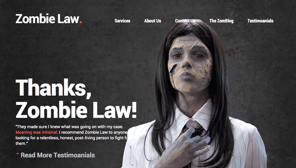
Yes, it’s a fictitious law firm, but its message, typography and content grabs your attention right away. Great contrast, a clean and simple font and striking imagery practically guarantees the visitors will take some time to learn more.
Optimize for Conversions
You might be thinking that making sure your client’s site is optimized for conversions should be one of the first things you assess, but it’s not. For the simple reason that if the other ducks are not in order (meaning a clean, user-friendly website with clear messaging), then what’s the point of optimizing?
Optimization for conversions means making sure your client’s website serves a purpose – it doesn’t necessarily mean a big red “BUY NOW” button – although your end objective for the visitor should be clear.
If your client is a physiotherapist, they’ll want to book appointments; a lawyer will want to book a free consultation; a real-estate agent might be looking to capture an email address for anyone interested in the local market. Whatever qualifies as a conversion for your particular client, make sure their website is 100% focused on achieving that objective. Everything else is just noise.
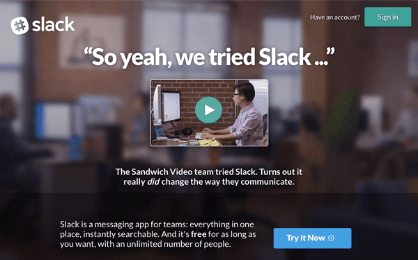
Slack presents a clear call-to-action right next to their primary value-proposition. You’ll waste no time figuring out how to signup.
Conversion and conversion optimization is an area where you’ll find a large percentage of client’s websites to be lacking. There will be no CTA and no clear purpose. Or, you might find that their website asks visitors to choose between multiple actions – a sure fire way to achieve nothing at all. If you have a new client whose existing site is not set up to convert, you have an opportunity to pick some low-hanging fruit.
If possible, refer to their analytics when you start talking about the potential to increase conversions. If your client is receiving qualified traffic to their website, show them actual numbers and present ideas that could improve their conversions. How would each additional conversion benefit them and how quickly could they cover their costs?
Perform a Basic SEO Audit
Even if you don’t provide extensive SEO services as part of your day-to-day business, it’s still worth performing a basic audit of your client’s SEO – both on-page and off-page. It’s unusual not to find a least a few glaring problems that allow for some quick, easy wins.
For example, you might discover that your client has multiple unverified Google My Business Pages. Maybe they set one up and forgot, or maybe an employee set one up as part of their personal profile. Consolidating and verifying their pages could provide an instant boost to their local rankings.
Here are a few other things to look for:
- Does their website have an appropriate site title and meta description?
- Are the major pages of their site optimized with an appropriate title, meta description, and content?
- Is their permalink structure set-up properly?
- If they’re a brick-and-mortar business, is their address and contact information in the footer of each page?
- Is their NAP (name, address and phone number) consistent across all their profiles (website, social & business listings)?
Obviously, this is not a complete list – that would be a post in and of itself. But it’s a starting point, and if you find problems here, you’ll likely find more as you dig a little deeper.
It’s also worth mentioning the trap of over-optimization. If your new client has come to you with an existing website that’s more than a few years old, there is a good chance their SEO tactics are out of date. Look for keyword stuffing, along with ridiculously long titles and meta descriptions that resemble a short essay.
Present Solutions to Problems
Once you’ve taken the time to gather and prepare all the relevant information, arrange a time to meet with your client. You might be thinking – and correctly so – that it’s easier to just email your assessment in a nicely prepared PDF file. It also allows your client to review the document at their leisure. Wrong. By doing it this way, not only will you be at the mercy of your client’s timetable, you risk losing the opportunity to speak to them at all.
Here are the steps I would recommend instead:
- Perform your analysis and critique.
- Assemble all of your findings into a simple PDF document.
- Get in touch with your client to arrange a time to meet (in person or over the phone).
- Confirm your appointment with your client 24 hours in advance.
- Email your PDF document 15 minutes before your scheduled meeting time.
- Kick-off your meeting with a quick review of your report before jumping into a more detailed analysis.
- Use screen sharing to properly cover each applicable point or if meeting in person, bring your laptop.
By running your appointments this way, you’re providing fewer ways for your prospect to back out of the meeting at the last second. Using a screen also allows them to have a visual perspective – vital for someone who doesn’t necessarily understand the terminology you’ll be using. Show them some competitors who are outranking them and present some reasons why that might be happening. Show them what you can do to improve their situation.
Conclusion
The first important point we’ve touched on in this post is that the process of selling a client on a first website is different than that of selling them on a refresh or redesign.
A client who is looking to beef up or revamp their online presence will need more help justifying the expense. They’re not faced with start-up expenses anymore; they’re dealing with overhead, marketing budgets, payroll, and other expenditures. Any capital they are going to invest in a website will require a corresponding return on their investment.
Focus on where their existing website falls short. Where can you make improvements, and how will those improvements benefit their bottom line?
What kinds of challenges have you faced when sending proposals to clients who already have an existing website? What are some of the objections you had to deal with? Let us know in the comments!
Image Credit: Macrovector / Shutterstock


Thanks Tom, this is great.
Thanks. Next question. One I keep running into recently. Clients “old” site is done in Joomla…
Nice tips. But I’d like to add another one. In most of the revamp jobs I’ve taken, what I did was listening to the client first about their problems and then present solutions focusing on that part. If a client comes to you complaining about his site being outdated, your SEO analysis or conversion optimization isn’t going to mean much to him. I’ll suggest offering these services at the end of the job as additional improvements rather than putting everything.
in there at the beginning. The magic of upselling!
Thanks for this article. There’s some good info to digest as I am new to providing website services.
I have recently taken on a client where I am merely meant to do some simple editing and adding of info which is simple enough. I have taken over this task from the person that originally developed the site. (I have not been asked to ‘maintain’ the site as such, but I’m about to offer that service).
I have now been asked to make the site responsive, which is also at my recommendation, because it fails dismally in that regard. This is also easy enough.
My dilemma has become that the more I evaluate the current state of the site, the more of a mess I find it to be in and I’m hesitant to do work on it as I find the foundation of the site to be less than adequate. My main concerns are that it uses a custom theme (without a child theme), the coding is messy with poor formatting, numerous plugins have not been updated in a while (and the theme is not updateable by me) and images are spread between the WP Media folder and an ‘images’ folder in the root directory (outside of WP – seriously?!).
I feel I have no option but to recommend the use of a new commercial theme to update the site to provide a stable and updateable website (I am loving Divi from what I’ve seen so far 🙂 ), but then I feel I’m taking a cheap stab at up-selling.
I’m at the point where I just have to make my recommendation and be prepared to lose the client, rather than risk getting myself into a difficult situation with having to provide fix on top of fix. If I agree only to make the site responsive, I don’t feel I’m doing my job properly.
Apologies for the long comment, but you did ask for our experiences 😀
I suggested a redesign for a client near the end if last year and submitted a basic estimated. They director wants a redesign, but it had to be approved by a board and the current web guy was just maintaining a 10yr old HTML site. Seriously out of date. I followed up after the director returned from maternity leave and still nothing. Finally, back in July she said they want to move forward. I submitted a proper proposal and began consultations. The site went live last night and will launch tomorrow. I gave a six week timeline for the site and 8-9 mos from the first estimate they have a new site built with Divi 2.4. It took awhile, but sometimes you have to give people a chance to get out of a rut or comfort zone. I also now provide their hosting too. I took over everything and they source me for other projects too.
I recently had a similar situation. New client didn’t want a new site. Just updates and for me to manage hosting and maintenance.
Simple answer: I don’t fix someone’s work. Ever. You never know what is there and any attempt to quote will end up a losing proposition.
This particular client was a real estate agent, so I said, “Sounds like you’re asking me to manage your property, it doesn’t need any work, just a new kitchen and bathroom…” He laughed. We’re working together now. I’m getting paid.
I doubt you will lose the client. I’ve had similar cases. Normally, I just lead with “Something you may want to consider in the future…” then list (as this post pointed out) the benefits of a makeover (ROI). They may not be ready to make the commitment now, but you’ve opened the door. As they get to know you and work with you, and with subtle hints and reminders, they will come around. Especially if they are made aware that current site changes are taking 2-5 times longer to complete due to the structure of the current site. They will save money in the long run with a complete makeover. Good luck!
Hi Tom, great article and very easy to digest. Although I’ve moved on from ET templates, I keep coming back to read every article you post. Great work and keep it up.