

It’s September! Which means fall is here, the pumpkin spice lattes are flowing, and the end of 2014 is in sight. We can now begin to look at the web design trends of 2014 (so far) and make some predictions as to what will have staying power in 2015. At least that’s what I plan to attempt in today’s post. And of course, since Elegant Themes exists at the intersection of web design and WordPress, I’ll be talking throughout about how these trends have and will impact the WordPress Community–from existing WordPress themes and plugins to the new opportunities these trends will provide. Let’s get into it!
- 1 1. Responsive or Go Home
- 2 2. Ghost Buttons
- 3 3. Bigger Emphasis on Typography
- 4 4. Large, Beautiful Background Images & Videos
- 5 5. Scrolling Over Clicking
- 6 6. Card Design Will Continue (Get Better)
- 7 7. Flat Design is Growing Up (or, The Rise of Material Design?)
- 8 8. Microinteractions
- 9 9. Interactive Storytelling
- 10 10. Personalized UX
- 11 A Few Fantastic Examples
- 12 In Conclusion
1. Responsive or Go Home
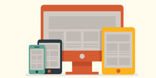
Ok, so maybe you don’t have to go home. Maybe you have a really good reason for not using responsive design? I just doubt it. Over the last few years responsive design has solidified itself as the new standard for web design in general and WordPress themes in particular. Sure, there are still arguments over implementation, but no one is saying, “let’s get rid of responsive design” and in fact more and more sites are opting to go in that direction. That was certainly the case in 2014 and I wouldn’t look for it to go anywhere in 2015. This one has ceased to be a trend and can now be considered the new norm.
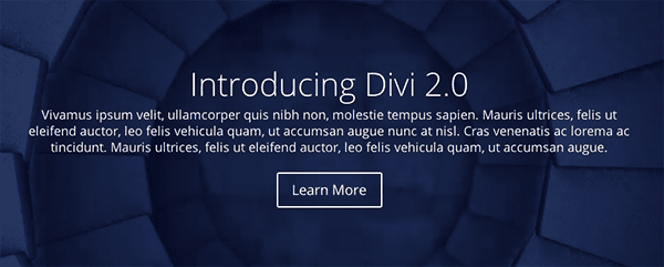
Ghost buttons are a prominent design feature in Divi–the flagship theme here at Elegant Themes–and it’s easy to see why. They’re minimal, stylish, and with the subtle hover animation they’re a delight to use. Look for this trend to continue into 2015; especially considering how well they pair with the large background images and videos we’ll talk about in #4.
3. Bigger Emphasis on Typography
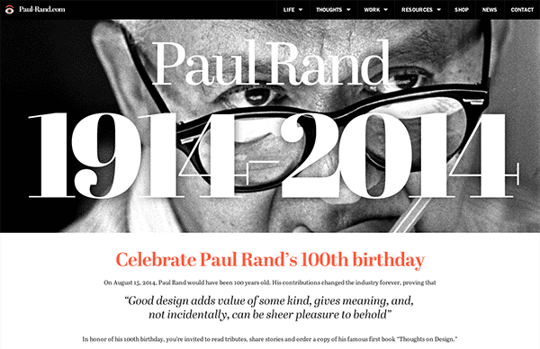
Image via Paul Rand
Traditionally web type-kits that allowed for beautiful fonts and typefaces to be used on websites have been expensive. Meaning that sites leaning heavily on typographic design tended to require larger budgets–leaving the small guys (and most WordPress users) out of the fun. That however, is changing. Type kits are becoming more affordable (or free in the case of Google Fonts) and that means there is more freedom for designers working with a smaller budget to bring their typography skills to the web design table. Additionally, this allows WordPress theme designers to include more typographic flexibility in their themes, making stylish type-centric design attainable for anyone with a well designed WordPress theme.
4. Large, Beautiful Background Images & Videos
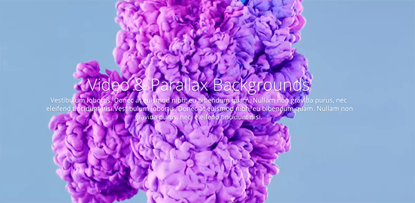
Another staple of Divi which has been and will continue to be a big hit are the large, beautiful background images and videos. One of the simplest ways to make your site stand out is by having great content displayed prominently. This trend is a wonderful way to accomplish that and when folded into a larger design style/philosophy it doesn’t feel gimmicky but powerful and elegant.
5. Scrolling Over Clicking
As the mobile web continues to grow and web design continues to skew in the direction of a more effective and enjoyable mobile experience, scrolling will continue to dominate clicking. It’s more intuitive, easier to do, cuts down on load times and allows for more dynamic interaction to take place between the user and the website.
6. Card Design Will Continue (Get Better)
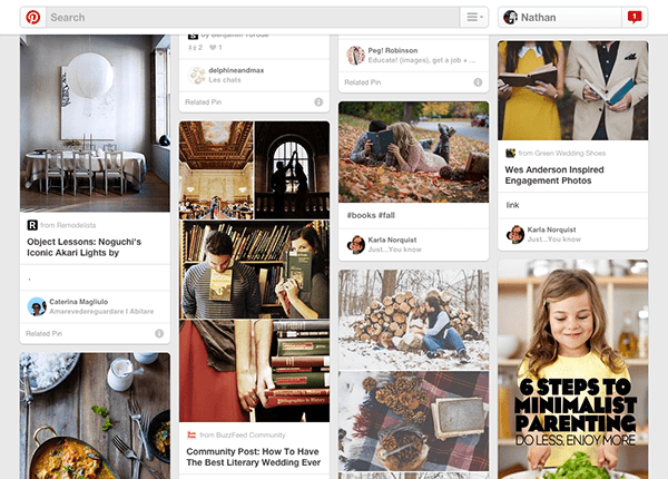
Image via Pinterest
“Card” design, while not new, has proven to be a great tool for designers working on responsive websites. Cards are a great way to keep things modular, rearrange columns without things getting sloppy or disorganized, to browse a lot of general data, but also to prompt users to drill down and see more. In short, cards are clean and simple with a lot of versatility. Exactly what the web needs. So expect to see more of it in the remainder of 2014 and throughout 2015.
7. Flat Design is Growing Up (or, The Rise of Material Design?)
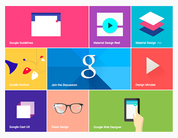
Image via Google Design
Flat design has achieved a lot of momentum over the last year or two and it appears to have staying power into 2015. However, it might be possible that as a concept, flat design is growing up. Perhaps into material design. So, what is material design?
Material design is something Google unveiled this year as their new direction for mobile (and design in general). “Material,” to quote their brief, “is the metaphor. A material metaphor is the unifying theory of rationalized space and a system of motion. Our material is grounded in tactile reality, inspired by our study of paper and ink, yet open to imagination and magic.”
Outside of marketing speak (and including the observation that they’ve settled on something that might otherwise be called “almost flat design”) we can see that what the designers at Google mean when they say Material Design is a mostly flat design that uses very subtle gradients, layering, and animation to retain a sense of the tangible world (physical space and objects) while still achieving all the advantages of flat design. Some may disagree but personally, I think this is where flat design as a whole is headed and I look forward to seeing more companies and individuals adopt it in the remainder of 2014 and beyond.
8. Microinteractions
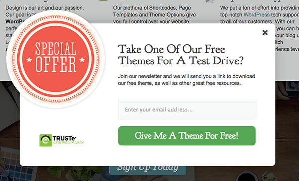
Microinteractions are a good trend to talk about after material design. What are microinteractions? They are contained experiences or moments within a product (or perhaps a module on a website) that revolve around a single use case. One example of this is the email signup box that pops up on this website. It sort of wiggles back and forth on the screen, giving a playful personality to an otherwise static graphic. This microinteraction promotes an increase in user engagement; which in this particular case means more email signups. I’d look for this theory to further permeate web design in the coming years. I’d love to see more WordPress theme and plugin developers begin to think in this vein. In particular, I’d like to see plugins that don’t just add new features to a WordPress website but add new experiences.
9. Interactive Storytelling
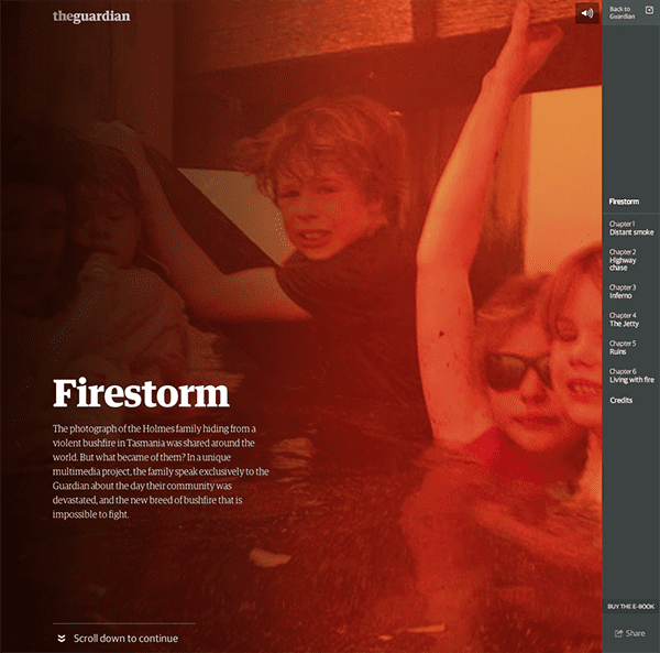
Image via The Guardian
What do you get when you put all of that together? Something I’ve written about extensively here at Elegant Themes: a better platform for telling compelling stories and narratives. Now of course I do not mean that every web page has to tell a fairy tale, yarn or other bit of fiction. That’s not what I mean when I say story or narrative. What I mean is that your brand is made up of a series of concepts or values (elegance, creativity, simplicity, etc.) and everything from your page layout to your font choice to your web copy and microinteractive page elements are narrative tools with which you can tell stories that embody those concepts and values by showing them in action. A perfect example of this is the Tesla website, which I talk about below.
10. Personalized UX
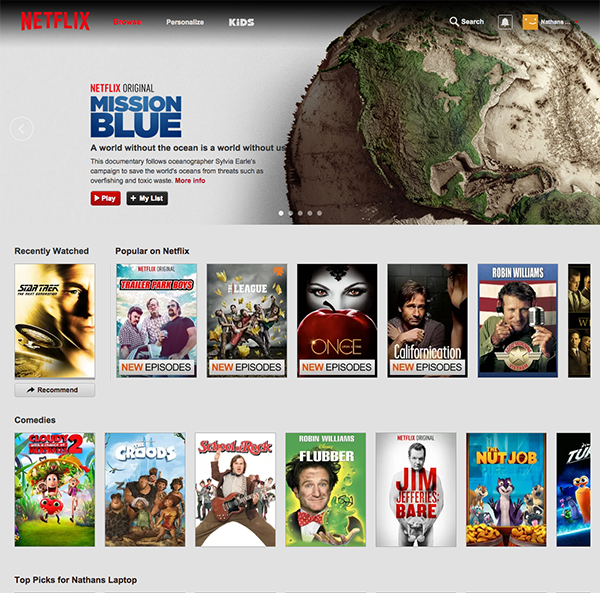
Image via Netflix
The idea of using cookies to help you display more relevant content to repeat visitors is nothing new. However, just as certain spammy practices (such as the popup) have made a classier return with better design and best practices in place, so too can the technique of using cookies to display certain content to repeat visitors be used for more than spam and shameless upselling. Netflix uses it to remember what you’ve recently watched. So does YouTube. Would it be so odd for a large editorial site to create a “recently read” sidebar widget for quick access to articles you may have enjoyed and/or commented on? Or perhaps hiding recently viewed content in order to highlight new posts/pages? I don’t think so and I think we’ll see more tasteful uses of this technique in the months to come. I’d also love to see that happening more in the WordPress community via plugins.
A Few Fantastic Examples
Sometimes reading about all these design concepts can make it hard to imagine them working together seamlessly “in the wild”. To help remedy that I’ve put together a short list of three examples that collectively embody all of the web design trends I’ve mentioned in this post.
1. Apple
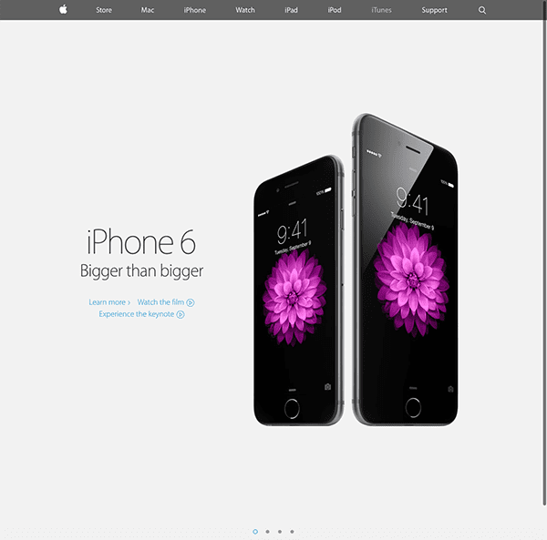
You don’t have to be an Apple fan boy to appreciate good web design. Something that Apple has always accomplished with their trademark simplicity, and yet, continue to manage to squeeze in a remarkable number of current and future design trends. If you’re looking to learn but not mimic them, I think the thing to keep in mind is not that you have to create a site exactly like theirs but rather copy their insistency on subtlety to avoid making a trend come off as gimmick.
2. Tesla
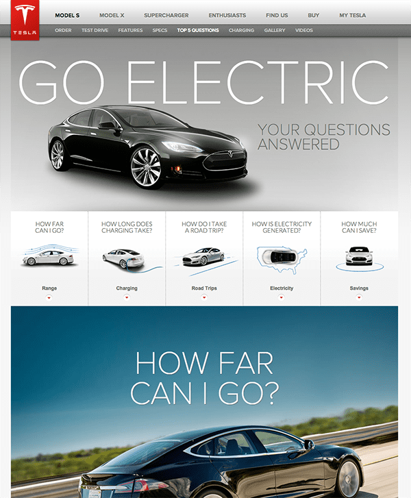
One of my favorite websites right now, not just because I also love their products, is Tesla’s website. They combine all of my favorite trends into one fluid experience. I especially love their Go Electric page which uses large images, long scrolling, embedded infographics and interactive storytelling to explain their top five FAQ’s. It’s a brilliant bit of design chock full of delightful microinteractions that turns a traditionally boring part of most websites into a jaw-dropping showcase.
3. Divi
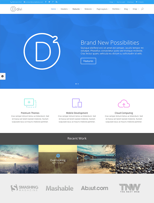
Finally, we have an example that is not to be drooled over and dreamed of as hopelessly out of reach, but something that we can get our hands on and work with. Divi is without a doubt the best WordPress theme for the average user with limited (or zero) coding ability to achieve all of the trends covered in this article on their very own WordPress website. It’s possibly one of the most empowering WordPress themes I’ve ever come across. The drag-and-drop page builder takes advantage of interactive modules to help you create beautiful and effective pages of any length. And of course, thanks to its responsive design, that look and work beautifully on any device.
In Conclusion
The the dominant trends of 2014 look as if they will carry on into 2015, with a few of them maturing (perhaps in the way responsive went from a possible solution to a design problem, to a trend, to a new standard). In this case I’m speaking particularly about material design and microinteractions. The latter of which is the reason I didn’t include parallax in this post, as I would consider it a type of microinteraction that may or may not fade out in the next year but whose underlying concept will undoubtedly remain and mature.
As for what all this means for the WordPress community, I would think that we will see more themes follow the lead of Divi in creating more seamless ways for non-coding users to take advantage of these design trends. I also believe that as certain microinteractions become more popular in situations that have traditionally required custom development, the community will provide turn-key solutions via plugins; like they have with various popup form plugins.
Most of all, I think the future of these trends will be decided by how far we push them in the months to come. Where will we find limitations that require refinement or perhaps going in a new direction altogether? I know I’m looking forward to watching it all unfold.
If, however, you already have some ideas or thoughts on where things are headed in 2015 or my take on the design trends in this post, please feel free to leave them in the comments below!
Article thumbnail image by Sergey Korkin / shutterstock.com


Hi Nathan
I’ve built my website with Divi and would like to use ‘cards’ as per your point 6 in the article. Could you please advise if Divi has a Card module or anything to help create them?
Thanks
Divi does not have a card module, but you can use the grid layout for your blog–which is based on card design.
Great overview of the year that was for web design. Will you be offering your insights in 2016? Now I am getting into another Divi pag 🙂
We use the Divi theme exclusively now across all of our builds. It is hugely versatile – keep up the great work!
I am delighted with this article because I work in web design, what I ask my clients is the parallax effect is extremely nice, but tell them that for SEO do not know yet whether this prepared, but the page you will be beautiful. The advantage is that Divi use for my designs and I can create all the new design in a single template, congratulations on the post, Greetings
It didn’t go unnoticed that this site is NOT responsive.
Thanks for the share. Now I can back up my reasoning when I choose ghost buttons. These are great, I am glad I am not surprised my what is trending!
Really nice rundown of website development in 2015 and beyond. Today’s user experience is leaps and bounds better than it was just a couple years ago. Thanks again for the completion.
Conversion is so important, but we all ignore it… all the time! What about ensuring that the users that are on the site are able to carry accross their feedback immediately? This is something I find lack in many companies’ websites. If I (a potential customer) have feedback, it makes little sense for the company to ignore me
Very nice article!!Specially the examples described over here are really good.
Which plugin you have used for the Microinteractions? I want to learn about it.
Agree a lot of what you have here. We’re pretty big on large imagery combined with stunning typography
Its a great post. I would like to thank you for posting such a wonderful information here.
Used Divi for one site. The best part about the theme is that it is elegant along with fast. Very few themes possess this combination
Its a nice post. I like the info you have put forward here. Thanks for sharing.
This is a great read and one which I wished I had read sooner. Very independent of this, I had recently worked on creating a cheat sheet to aid designers to be able to make their design decisions whilst knowing what the tradeoffs are. It’s great to know what the trends are, but the very best designers are also super aware of when and how to use them. I hope this cheat sheet is valuable to you! https://gumroad.com/products/thJX/edit
1. Picture Perfect Designing
2. Attractive Typography
3. Use of Dynamic Background
4. Blurred Backgrounds & Themes
5. Minimal Designing
6. Responsive Designing
7. Interactive Features
8. The Tile Look
9. Micro-interactions
10. Parallax Scrolling
These are being followed in 2015 as the latest useful strategies for website designing.
This was a great read Nathan. I agree with you 100% on these styles and trends. I also believe that parallax design is going to get bigger and visually better. Thank you for sharing this article. It was great reading and scrolling through the great imagery you shared. I hope to come across more articles like this one!
Great article. Responsive web designs and flat designs are to play a major role in coming time. These Microinteractions are also looking very interesting.
I have to disagree with #5. My index finger is starting get a case of trigger finger with sites and pages like this one where I have to scroll for miles just to see a full article. Big images and videos look great but they tend to make the vertical page height to long and in the example image of #4 it is hard to read that paragraph.
Very nice and useful post. By seeing the above trends one can create a ravishing web presence, by developing an effective and efficient web designs.
HOW ABOUT PRICING TRENDS?
A trend that is really disheartening to watch expand, is the “PRICING MODELS” that are affecting a lot of new products. As a freelancer, with very limited budget, I’ve never had to deal with “one year licenses.” So I build a site for a client, they pay me $1000, for one year everything is fine.
If in a year a new upgrade comes out for the product I installed, with better features, or to fix a bug, etc. I won’t be covered. I’ll have to buy a whole new license. So I basically either buy the product every year (bravo to the selfish genius who thought this through), or pay 3 to 5 times the price to have access to upgrades. Even then, they still will have clauses and limitations to get you to spend money again.
And the price for purchasing a theme, let’s say, on many ThemeForest themes is now: $28 for PERSONAL use. And $140 if you are going to be paid to install it for someone! Yikes!
Same with Visual Composer, Thrive Content Builder, etc. It seems like the world has gone mad again…
A trend that is really disheartening to watch expand, is the “PRICING MODELS”
This is really a great and useful article for web and graphics design. 2015 is indeed a year of mobile and web transformation and these information shared above are truly relevant in coping up with the trend. It could be of benefit for businesses as well as web designs company such as Toronto Designed (http://torontodesigned.com/), in order to have a glimpse of what technology brings this year.
I think 3 contradicts a bit to 1…some smartphones get slow or do not load type kits… in first world countries most of these points can work perfectly , but where people do not have such a wide cyber culture can be a disaster.
Agree with a lot of that except the single page/long scrolling trend. Well, I don’t say it won’t continue to be big in 2015. But it is an ill-advised trend, so is bound to get dropped eventually. It’s SEO-unfriendly and tends to make page content unfocused. Those are sufficient reasons for me to limit to a few use cases (e.g. it makes sense in a social context like Facebook, or maybe a product search, but not a business information site or any of the other more longstanding types of web site).
One thing is clear – the mobile web is where its at! With 1.3 billion on Facebook now and over 25% using it ONLY on their phone, that’s where the big stakes are. Check out my own version of what’s going to happen in 2015: http://brandinabox.org/web-design-trends-in-2015/
I really like the concept of the article and agree with you that the trends is now moving on towards flat designs which is now making good sense of everything in a place. While i found divi theme is perfect choice for number of designs one can easily customize it at any level. A great theme to work with…
DIVI Theme is so complete, there isn’t a need of any other theme to exist. Agree with most of the trends. Also not to forget the use of cookies, language customization, call to actions.
Good job!
Thanks for sharing your thoughts (vision) about future web design. I personally use jupiter theme but my opinion is all nowadays wp theme are great for preparing a promising website.
I don’t like one page design neither building or using like a customer. But maybe you are right because of mobil using.
I am going to use your article like a standard in my future job.
(An article especial about typography (font fitting) would be good.)
Interesting. What do you think about this list? – http://blog.usabilitytools.com/web-design-advertising-trending-factors-for-2015/
We look forward to hearing about the new theme Extra. What for when this asset?
Some refreshing themes are present here which we can use to make our blog intereting so that more people visit our blog.
Hi there, very informative post! i love how parallax/microinteractions coupled with story telling gives away the most interactive feel and experience of a website, i am sure designers are going to make master pieces with this concoction.
And one thing more! don’t you think, you missed webgraphics a.k.a improvised infographics with more digestible information that increases user retention. i am sure you are going to see them a lot in 2015
I see all these trends 2015 today. Nice website. Fabulous overview of future website trends and the examples have given me some great ideas.
Thanks & Regards,
Fox Designers
“You have spoken after my heart” Nathan, i was thinking that we can use our own way to expressing our own language instead of search engines rules and regulation. Doesn’t matter what design we want to create or what way we choose.. I am damn sure that in coming days we are going to interact with highly skilled and unique way of web design technology. Keep sharing your thoughts Nathan….
Though we can go to our destination by foot, we use vehicle, why? As using vehicle we can reach easily & within short time to our destination. Like this though we have websites but we need to have a responsive website because within 2015; a large amount of visitors will try to visit their desire websites using different kinds of devices. So, I think Responsive WordPress sites will be the most valuable trends on 2015.
In my opinion, and from experience, I don’t think that one page sites are applicable everywhere. Sure, the idea of scrolling a little instead of clicking sounds great; but what we do when we have to present a lot of information? It would result in endless scrolling and I have seen some users who get annoyed by it.
Anyway, great article, Nathan. Good Work.
I love those 2015 trends. I didn’t know for ‘material design’. It’s interesting that flat design style is growing and innovating more. Also didn’t know that borders buttons are called ‘ghost buttons’. Also I like that micro interaction on your web site. It’s like popup but little different, and I must say it’s nice and smooth.
Scrolling over clicking and Flat design will be in trend in 2015 for sure. After seeing such polarities, I can forecast this at least.
Our team is consultants in understanding business necessities and delivering prime quality business net solutions and web site services. More information http://www.zyber.co.nz
I see all these trends for themes available for sale today. Some are a bit bloated the way they are implemented by the customer with way too many features, I guess it’s tough to cut out only the essential features you need.
Please please please don’t try to defend unsolicited pop-ups. They’re so annoying. Always. There’s never an exception. Modal pop-ups that are launched by an action such as asking to log-in are OK, but just sticking a spammy box in the way of the content a visitor has come to see simply drives them away from the site.
Some great themes in here. Divi in particular is fantastic – thanks
I think responsive is a must, in case you don’t have a totally different design for web devices.
I personally dislike the “scrolling over clicking” trend, but I see it everywhere now. I think it doesn’t look good on non-mobile devices.
Well organized and well written. I agree with most points, however…
…Responsive is dead for ecommerce. It’s always been a shortcut to approximate the optimal squeeze to a smaller screen.
Adaptive design is the key to an optimal content presentation and ultimately conversion – designing specifically to the device and screen size. We are seeing tremeandous traction with our retail clients building adaptive, immersive shopping experiences (deliberately not m.com sites, which are merely a checkout device).
Is there something ironic about an article that says “go responsive our go home”, yet is not displayed on a responsive site?
Otherwise interesting list. If full page background videos are in, does that mean flat design is falling out of favor?
I liked the theme design http://www.elegantthemes.com/demo/?theme=Divi very much. It is stunning and looking very nice. All component and button are placed in perfect manner.
“Microinteractions” is a fancy word for pop-ups.
pop-ups (‘microinteraction’) are not classy nor can they be made that way unless the user has intentionally triggered and is expecting it. This is especially true on mobile when they are hard or impossible to clear. Readers want content not some annoying add that SHOUTS AT THEM.
Hi Everyone
Nathan mentions metro/material flat design as a continuing trend in 2015. Is there any Divi theme built on that design philosophy? I’ll appreciate your thoughts.
I understand why people are raving about parallax design but for me personally its a bit distracting. I understand it fits well for certain websites, but as usual I think people are overdoing it and using it unnecessarily in some websites. Some really interesting things to look forward though.
Very informative post. It is a fact that web design trends keep on changing regularly. But there are a few web design trends that compelled us to pay good attention to them.
Excellent post. I like responsive design and flat designs.
The irony is, elegant theme’s site is not looking that much responsive…!!
I noticed on the Nexflix thumb that your recently watched show was Star Trek TNG. Now I’m a bigger fan of Elegant themes 🙂
Excellent article Nathan. I agree Divi is a great theme, in fact we use Divi on our own business website http://www.inventtatte.com. Thanks for the reading!
Great article, as always, but could you show me some examples of material design. I just don’t understand exactly what it is or what it looks like compared to regular flat design. Thanks!!!
Excellent article Nathan. Besides these trends that are in the wild, I would like to ask Nathan and the rest of the commenters about new, exciting innovative trends that are scarce or on the rise? Love to hear feedback and let the rest of the audience know :).
Three things. First, I’m happy to say you guy’s blog has been a regular read for some time now, and that’s refreshing, to see a company do a traffic blog that’s well worth reading.
Second, I hope flat design dies in a fire, but I think it’s only me that feels that way, so it probably won’t.
Third, I would physically bring you a cookie if you could make that newsletter pop-up NOT pop-up every time I come to read your excellent ‘blog. I’ve been a subscriber for so many years now… But, every single time. >.<
But, it's worth it. Great 'blog, as usual. 🙂
Thanks for the thoughts.
I also love the Tesla site and the cars. I spent a lot of time last night looking at the Apple Watch portion of the Apple site—awesome.
I do wish you had not used Divi quite as much as your example. I do love the theme but sometimes a completely unbiased approach makes for a stronger message.
But thanks again. Did I mention the Apple Watch site!
Card Design is actually called Grid Design, or Masonry 😉
I’d like to add animated svg icons. That’s getting used more and more now.
I do agree on most everything. Especially number #5 Scrolling Over Clicking as now people are getting so used to view website over the phones / tablets and I specifically like to scrolling instead of clicking so I even design my own portfolio site (http://will-leung.com/) like that no buttons just scrolling across the whole site.
I do like the Ghost buttons you mention in item 2. The only problem I’m having is there is no easy way to control the transparency of the background of the button or the text on a slider image.
With more complex images it is almost impossible to read much of the valuable text that you might want to overlay on a graphic. It might be a trend but if it fails to reach your readers it fails altogether.
Otherwise I love DIVI and have been using it for almost all new websites we are creating.
Thanks, Nathan for this article. Some interesting insights. I also believe that interactive storytelling is going to grow a lot stronger. Not only in the field of journalism as seen with various NYT, Guardian etc examples but also in the corporate world be it for image campaigns, product presentations, case studies, events or even recruitment. Good interactive “stories” can be far more understandable and compelling than pages of text and static graphs.
I’m very wary of “trending” though. It’s become really easy to spot a WordPress website and sometimes even a specific theme. Sites become interchangeable. I want to be able to design completely different looking sites (preferably with the same theme/engine). For example this is a more classical looking website for a rental apartment: http://hausgecco.gut-pictures.ch whilst this is more of an interactive storytelling site: http://book.gut-pictures.ch
The second is my attempt at creating an online version of a printed book and adding a lot more images, some video and audio plus “live” aspects.
Both sites were made using Divi. I think ET are heading in the right direction. I’m hoping there will be further possibilities added for even better interactive storytelling – that work on smart devices too.
Btw – both of the above websites are in german which might make navigation more difficult for English speakers.
Thanks again!
Just amazing and well taught out! I see more of one page scroll(even for long form blog/magazine site), video bg, more of ajax effect, flat (just got wind of material design, thanks), retina display and mega menu. If WordPress can be use to build site like FireStorm, it will trend. In my community, people want a site as little to scroll as nothing, page must load up on their face at their command…kingship mentality. Thanks for this wonderful review Nathan, love the way you write.
As seeing the list 2015 will be colorful than ever. Nice set of list. Images are the core think and also videos which are viewed more. Rather than the text images are preferred.
Great post.
Very well written article !
Great examples of the upcoming design strategies and best practices to implement! The Tesla example was definitely my favorite!
Thanks for the well written blog article
fabulous writing…
This was a great post! I have definitely noticed most of these trends taking off. Typography is of more and more interest to me lately and hope to learn more about it. 🙂 Cheers!
Nice post … except it’s Spring here !
Is it the “AddThis” Conversion Lightbox that you are using for your Microinteractions example? (It looks nice.)
Nice post, I agree Divi is a great theme and the support is outstanding. I would like to know what are you using for the popup here with the microinteraction,
Cheers!
Thanks Nathan great article, this has been what I have wanted to implement when I decided to give my website a whole new look. Using Divi was easy to achieve a whole new modern look until it came to the shopping cart, I updated to woo commerce. Divi doesn’t make the shop look that elegant compared to other themes, and it also doesn’t support Categories.
When I went into the forum to see how I could use the categories in the drag and drop in Divi the forum said that Divi doesn’t support categories and yet that is the main function in how to get your different range of products on different pages. I thought that was a stupid thing to overlook in Divi, So I ended up over at themeforest and bought a new theme that makes the shop look great and supports categories. So something as simple as categories Divi was deleted.
I’m excited to see the flat design trend continue. It cycles through so many decades: thinking especially of 60’s Mod, post-WWI Art Deco motifs, way back to Egyptian hieroglyphics. When done well on a website, it adds a level of sleek originality that can enhance or even trump stock images.
This is quite helpful. Esp. the distinction between flat design and material design, which I’ve been wondering about.
I’m wondering — re: Microinteractions, are you referring to how it wiggles, or just that it’s a pop-up in general. I hate popups and I’m never going to use them, web trend or no web trend. I’m wondering exactly what you mean by Microinteractions and how the popup qualifies.
Thanks!
As a relatively new web developer I love trying to keep up with web trends and you have given me a great start to 2015. It’s also doubley(sp? is this even a word or did I just make it up!) nice to work and utilize such a diverse theme as Divi. Great read Nathan thank you.
Good article! I would like to hear more about typography in a future post. I notice that your site actually uses serif fonts for headings–yay! I’m probably old school, but am tired of reading long paragraphs of san serif type and find the fonts more difficult to read. Seems like the verdict on readability is still out. What do you think?
Divi, Divi, Divi, Divi, Divi.
We get it, Divi is great. Extraordinary.
Exept it isn’t. In reality, it’s just one of MANY similar themes available at the moment, and though it’s certainly not bad, I’ve seen themes performing better in a lot of aspects.
Don’t get me wrong, I like Elegant Themes, I used to use their themes exclusively, but not any more. Of the nearly 80 themes available here, only the newer ones (on the first page) are still okay to propose to my clients, the rest is simply outdated, in design and/or functionality.
In fact, the above list points out exactly why.
Ofcourse Divi is quite versatile, but have just a handfull of modern themes to choose from is not enough imho. I LOVE the frequent blog postings the last months here at Elegant Themes, but I would gladly see a few extra themes instead of blog postings…
psst! I’d love to know which themes you prefer now. Is it against the rules to post such things here?
I now primairily use Themeforrest for my themes, and there’s many, many general, multipurpose theme’s to be found there.
The basics are the same as with Divi; a pagebuilder that lets you make all kinds of pages, and various elements to use in those pages. Most of those themes offer more settings to fine tune the elements (margins etc.) and more diverse elements to choose from.
X, The7 and Be come to mind.
However, I mostly use other, less generic themes, and I guess thats what I was trying to say above: themes like Divi are great and versatile, but the mostly lack there own flavour or persona.
Everybody does parallax and uses animations, but I want to wow my clients with themes that have their own style.
Hi Met, I used Tforest sometimes but lately, I’ve rested on Divi FRAMEWORK because of the responsive support I got. I created a bespoke site sliced by our graphics specialist using Divi…peep: http://deefrentng.com/dreamtreat/#
with the help of ET support.
…while Tforest is good, most of the theme lacks responsive support and update. Good for intermediate designer/developers. Cheers! 🙂
Once in a while I have a look at themeforest but it seems way more expensive as et.
If you buy a theme, you can only use it once, right?
Hi, it IS more expensive, most themes are about $40 and $60 and can only be used once. That’s a valid point for sure.
To me thowever hat’s not really an issue, on the total amount my client pays it’s not that much of a deal, and I strive to make a unique website for each client so I’ve never used the same theme more than once anyway.
That being daid, in theory I like the model ET uses, but I find the selection of themes still up to the standards of what clients want to be rather small lately, so all the other themes I can freely use are of no real meaning to me to be honest.
Thx for the answer @MetMarc.
Shure got a point there, since divi is out I can’t use any of the older themes anymore and that makes the selection quite small :-).
Would love to learn more about Microinteractions. Are there any blog posts on say, how you do yours? 😉
Hi Nathan,
Great article and I think you’re dead right. I will certainly take this into account!
Great summary with very actionable points. I’m already using the Divi theme, and now you’ve inspired me to better leverage its functionalities.
Good use of buzzwords there.
Great actionable info. Could you guys publish design trends like this more often? I find this stuff really helpful.
what is the plugin for the Microinteractions use in your sample and on your website?
good article. thanks.
Hi Rubin,
Microinteractions are not a plugin but a design concept. It’s the idea that small features can become experiences or “microinteractions” that illicit a positive visceral response from users. If you’re interested in learning more, I believe the term was coined in the book by the same title. A google search for it should get you there quickly.
Best,
Nathan
I wonder If ET has looked at their microtransaction advertisement on iOS? It comes complete with no close button.
Hi Rubin,
Microinteractions are not a plugin but a design concept. It’s the idea that small features can become experiences or “microinteractions” that illicit a positive visceral response from users. If you’re interested in learning more, I believe the term was coined in the book by the same title. A google search for it should get you there quickly.
Best,
Nathan
I do like the idea of microinteractions in certain contexts. For example, using infographics and video to enhance blog posts is an awesome idea.
That being said, I think popups were, and always have been, bad marketing. Usability studies always show that these things annoy users. Perhaps they increase signups, but conversions? I’d be hard-pressed to do this to my site.
People come to see specific content and popups break continuity, get in the way, and trump your own amazing content.
I love the other suggestions and ideas though.
totally agree. I read a lot of css and web design blogs and I QUICKLY tire of having these huge modal windows pop up in my face.
I’m wondering too…
Nice thinking! I would add one more trend: video galleries. Our brand clients are all creating them. Wish Divi included them. We bought the Elegant theme to use Divi for our video content web site, but without video gallery options can’t use it. Let me know when you add them (in an update, not plugins).
Hi Nathan
Fabulous overview of future website trends and the examples have given me some great ideas.
Off I go to work on another Divi page.
We look forward to hearing about the new theme Extra. What for when this asset?
I love Divi and we’re using it for our new site, but i do wish the default paragraph font size was bigger. All the good blogs and sites, including this blog, use larger type.
I hope Divi 2.1 includes an easy choice of font size for us non-coders.
Jim, you can add custom CSS in the Divi options without having to actually edit the CSS files. I’m not a coder either, but I know a little CSS (you can look it up on Google) — enough to change a font size or color.
Great article!! Thanks. One question, what is the Name of the tool/plugin for the Microinteraction zou mention here that pop-ups on ET? Where can I get it?
I think webdesign in 2015 is going to be more responsive. Too many websites already not responsive. For our Webdesigner and SEO Plattform http://www.venderoo.com we also use a responsive Template. We like elegantthemes. Great Job!
I love the simple and clean designs, especially the flat designs in Android and now in iOS. It gives you a clean paper look.
Since more and more people are going mobile, I suggest everyone to focus on responsive designs for website. Responsive designs are cool and you don’t have to maintain another version of your website for mobile users.
I agree! Unreal designs will come out of this year. I just wanted to ensure our designer knows that she’s doing. From the looks of it we’re good! Haha!
Great read!
Jullian
the flat design and simple fonts and designs were not popularized by Android or iOS was Microsoft with their Metro design in the earlier introductions of Windows phone and full use for the new windows OS for computers.
at the beginning they were laughed and described as boring and ugly, but of course the other 2 start using it and they are pioneers of design…
Hah yes, I was going to say the same thing. Nice to see Apple and Android following the direction of good design set out by MS, and once they do, the pundits soon “realise” it was good after all 🙂
Great read Nathan. I agree with you 100% on these styles and trends. I think parallax design is going to get bigger as well and visually better. Divi is a great example for majority of what you spoke about. I used Divi on my own business website http://gregorymarandola.com as well as two of my clients websites, http://www.royalbankamerica.com and http://www.kaykayscakes.com.
Hey Gregory, I just checked out your website and I am IN LOVE with the overall look and feel of it. I haven’t checked out the other links you posted on here yet but judging from your site, I can bet they’re nothing short of AMAZING!!! From one Designer to another, keep doing your thing, man. SUPER INSPIRATIONAL INDEED!!!
Hey! Greg
Excellent web sites. Congratulations and many more hits. when i grow up I want to be like you. Greetings …
Thanks for the compliments Alexander. But please, be yourself and not like me or anyone else. The more unique and different you are, the better 🙂
I went to look at your sites. Pretty cool. But i noticed that some of click-able links had id pages instead of the rightfully url to which it points and load. Is that by choice or do your permalinks need to be adjusted. Anyway just thought I’d mention it. BTW I really liked the picture of the CEO with the call to action button entitled e-mail the CEO. It really has a powerful effect. In these days of talking to machines you can actually reach THE man. Pretty cool stuff. It gave me the idea of doing this on one site I’m building where I try to emphasize the “personal” part of personalized service. Thanks for the great idea 😉
Have a great day and “elegant” day 🙂
Hi Roger, thanks for the compliments and feedback on my work. If you’re referring to the Royal Bank America site with the id (#) for the navigation, that was intentional, because I thought it was unnecessary to click on a link that would take you to another page that shows you all the links for that category. That is the nice thing about the mega menu with Divi.
And I am honored that my work has inspired you for designing one of your websites. Keep up the good work and thanks again for the compliments and feedback.
Take care!
Hi. Sort of a follow-up comment and question. I noticed in your Bank site that “about us” and “investor relations” were not clickable but the drop downs are.
I did this recently for a client using Divi but I used a plugin called “page links to” to get this to work. And it did beautifully and easily but I did not realize, if I understand your answer above, that I could have achieved this within Divi using Mega menus. I will have to look deeper…
Thanks again.
Thanks you Ernest for commenting. I’m glad that my feedback helped you out, hopefully you accomplish what you are trying to do.
Best regards.