

Just like color, photos can have a psychological effect on your readers. The right photo will send a strong message on your behalf. It can tell your readers about you: that you’re safe, playful, cheerful, elegant, grounded, solid, experienced, energetic, thoughtful, kind, etc.
One of the best places on your website to use photos is as a background. Background images are great for adding texture and color to your website. Finding the right image can be difficult. Many sites now use full background images and parallax scrolling. Developers place them behind posts, within sliders, behind individual sections, and within pages. The key is context. If not used in the right context they could have the opposite effect of what you’re looking for and send your readers running.
I searched the ‘net for free high quality images for use on your WordPress website. I looked for interesting lighting, colors, and textures. Selected images need to look great but not take over and become the center of attention. Some colors work better in certain seasons and some patterns are better suited for some uses than others. Nature and architecture are interesting. I also like patterns, reflections, and objects.
- 1 About Licensing
- 2 About Size
- 3 35 Free Background Images to Use on Your WordPress Website
- 4 Board Wood Textures Pack 1
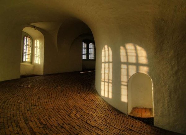
- 5 Round Hall HDR
- 6 Fjord HDR
- 7 Trevi fountain
- 8 Wooden Hearts
- 9 Reflections 4
- 10 Test of time
- 11 Reflections
- 12 Reflections
- 13 Reflection
- 14 Reflection
- 15 Sunset
- 16 Goldfractalzzz 23
- 17 Goldfractalzzz 24
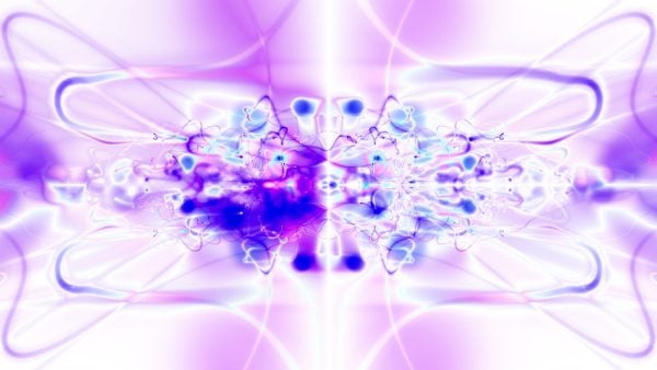
- 18 White Background with Fuschia, Blue and Black
- 19 Pink, Purple, and Fuchsia Orbs
- 20 Boat in Water
- 21 House of World Cultures
- 22 Bad Pyrmont
- 23 Vietnam
- 24 Falling Leaves Out of Focus
- 25 Mountains
- 26 Rocks and Stars in Long Exposure
- 27 Arc de Triomphe
- 28 Flowers
- 29 Spiral Jetty
- 30 Tea
- 31 Life Guard
- 32 Stump
- 33 Wooden Wall
- 34 Barn
- 35 Broken Bridge
- 36 Lions, Tigers, and Leopards Oh My
- 37 Ship
- 38 Brick Wall
- 39 Final Thoughts
About Licensing
All of these images are free. Most providers give detailed licensing information about how their images can be used. Most allow for general commercial use without requiring photo credit, but not to be included in products for resale. Be sure to check the terms of use to see if your specific use is included. Free doesn’t have to mean low quality.
About Size
The ideal image size is 1920 pixels wide x 1080 pixels high. If you have the option then I recommend downloading a larger image and resizing it. It’s easier to reduce the size and keep a high quality image than it is to increase the size.
35 Free Background Images to Use on Your WordPress Website
In some cases, the photos I found didn’t have names. In these cases I’ve given it a name based on its description. I’ve also given a short description of why I like the photo and the types of moods I think it can portray. I’ve included simple and complex images. Some are generic and work for virtually any situation. Others are more specialized.
Now that you’ve heard plenty of talk from me about my selection process, on to the images!
Board Wood Textures Pack 1
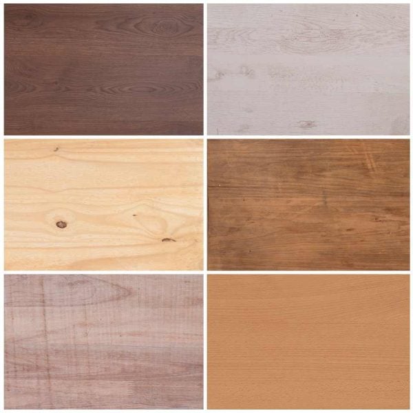
Wood has a natural texture that goes with a lot of colors and designs. It can be used with many topics and niches. This pack includes various shades that can help with virtually any mood or setting.
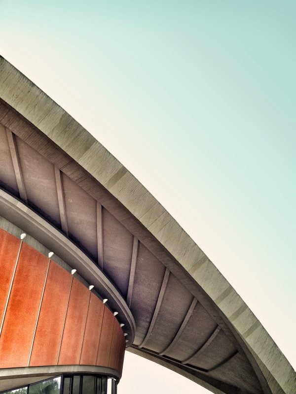
Round Hall HDR
The main elements in this image are slightly tilted, with the floor and walls being circular, giving the image a feeling of movement. The multiple areas of light are interesting, with two windows for light sources and one of them throwing light against two different walls, the other in shadow. The dark shadow around the corner inspires mystery.
Fjord HDR
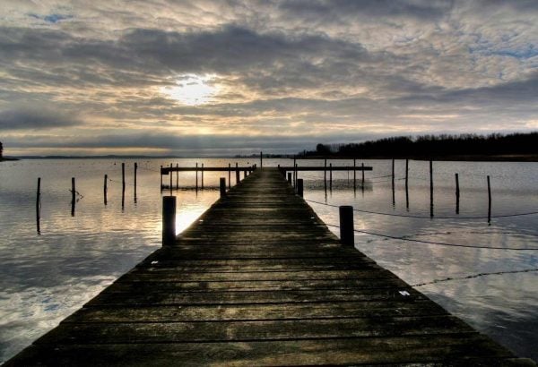
This one doesn’t have a lot of color, but the colors it does have shine through and highlight the clouds and water. The dock and the trees in shadow give it a dark grounding. The clouds and water give it texture. The stillness can inspire calm.
Trevi fountain
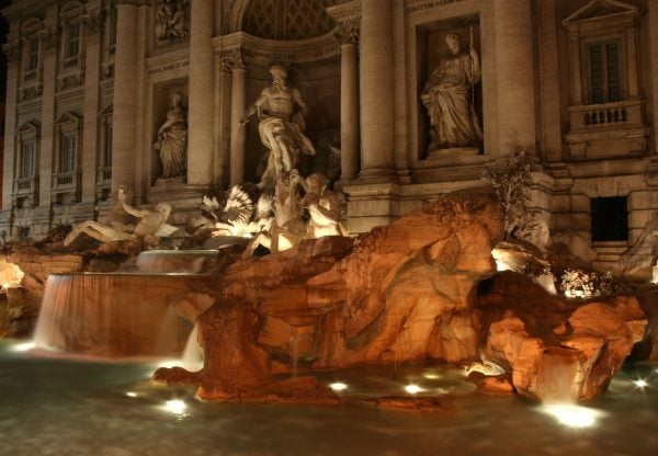
Light against architecture, statues, and rock give this one an interesting tone. The shadows make the statues stand out. I like how the water is barely noticeable here. This one gives a sense of creativity.
Wooden Hearts
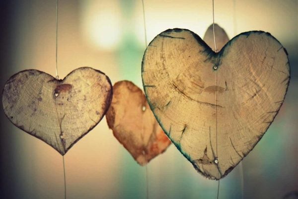
This one feels playful while maintaining a touch of nature. The colors work well for texture. Its simplicity shows craftiness and innocence.
Reflections 4
The soft reflection gives this image just enough contrast to create a color pattern of dark to light. The sunken boat adds a touch of mystery. The stillness of the water inspires a soothing and relaxing calm.
Test of time
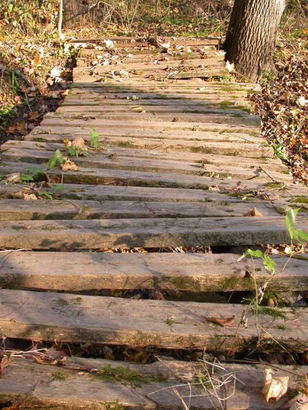
The natural color of wood, grass, and shadow on this small bridge is something that almost everyone reading this has seen before. They’ll know they’ve walked across a path like this, but they’ll still wonder where it leads.
Reflections
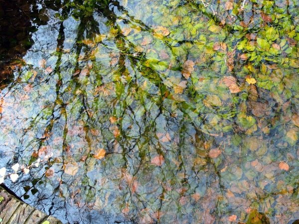
The reflection of the tree’s shadow and the light in the water create an interesting pattern across the greenery in the water. It creates an interesting texture with natural color.
Reflections
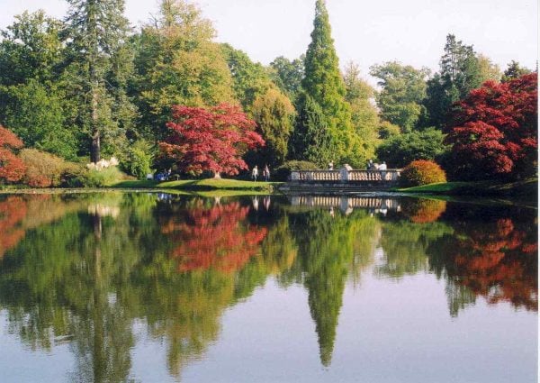
The typical fall colors in this image show a reflection against the rippled water that creates a distorted mirrored effect. The people and the bridge give your eye something to latch onto. I like that the bridge is slightly off-center. I find the color and textures interesting here.
Reflection
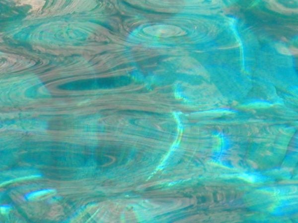
The light reflecting on the water almost looks more like a pattern than a photo. There’s just enough color variation to perceive circular shapes. This image should do well to inspire calm for a spa or health-related website.
Reflection
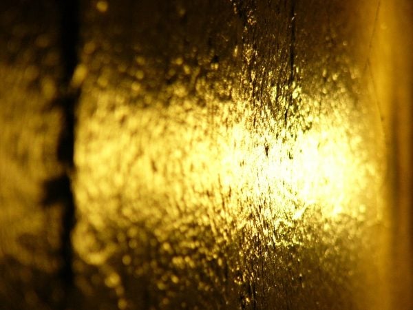
I like the hard contrast of gold against the shadow. I also like the texture that’s created by the close-up focal point. It creates a hot spot that leads the eye.
Sunset
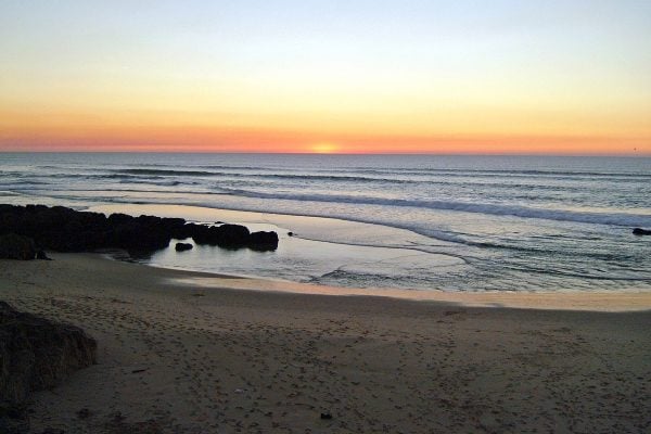
Sunsets are always pretty. I especially love a sunset on the beach. This photo has the right blend of bright and dark colors. The waves in the ocean give it some texture while the orange to blue sky give it a nice gradient.
Goldfractalzzz 23
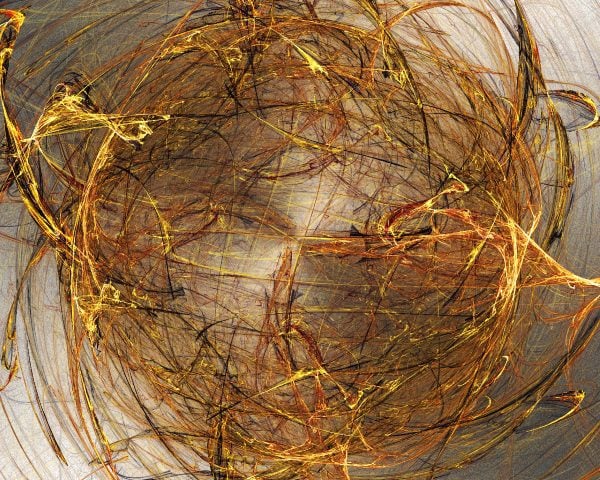
This image has some interesting contrast within the circular pattern. The colors and light feel natural while giving it a good texture. I like the way light and dark highlights were used to add contrast. It has a loose pattern that’s not too distracting.
Goldfractalzzz 24
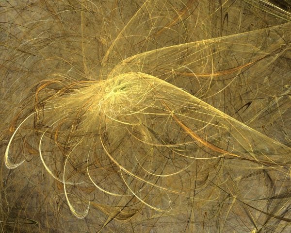
The contrast in this one is interesting. It’s all various shades of orangey-brown but the emphasis is on highlights that make it stand out and give it greater depth. This is a good choice for a loose pattern to give your background some visual texture.
White Background with Fuschia, Blue and Black
The fuschia in this one creates some interesting swirls. The blue and black create a blotchy texture. I admit it could be too loud for a lot of uses and it’s not for everyone, but it would make a nice background for a parallax scroll where just enough color peaks through to catch your reader’s eye.
Pink, Purple, and Fuchsia Orbs
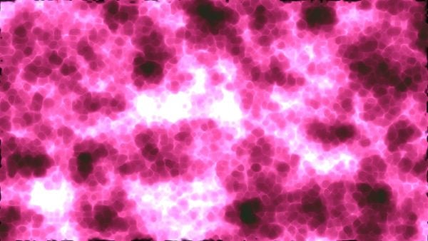
I see this one being used in the same way as the one above, but just a little bolder with its statement. The colors could strike the right chord if it’s placed strategically around other elements to create contrast.
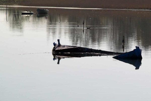
Boat in Water
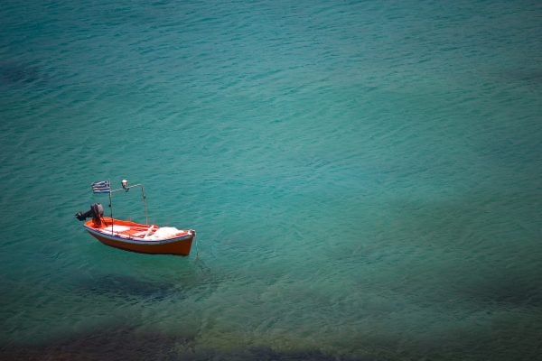
This one has a solid shade of color with just enough ripples in the water to give it texture. The orange and white boat in the corner offer the right amount of contrast against the blue/green of the water. The dark colors and openness give lots of places to add text.
House of World Cultures
I love the textures and colors in this image. It looks exactly like something you would expect to see in an Elegant Themes demo. The way the colors blend and change capture my eye. The blend of straight and angled lines that cross each other at just the right place seem to add a sense of architectural wonder. Every shadow tells a story. Simply elegant.
Bad Pyrmont
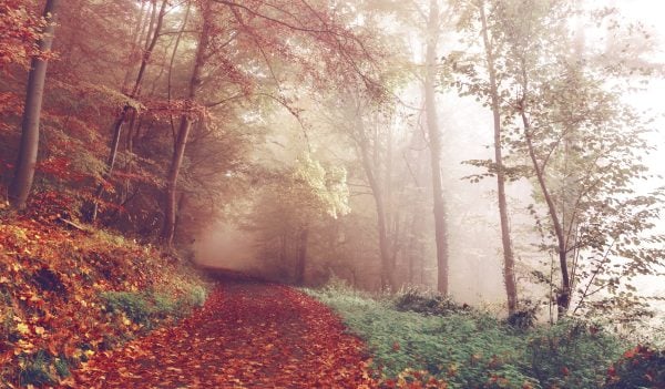
The blend of mist in the trees with the darker orange that changes to red and green almost makes the white highlights invisible. Once you see them they stand out but not in too much contrast to the beautiful color around them. I would take a long walk down this road. I’m sure readers will enjoy the view.
Vietnam
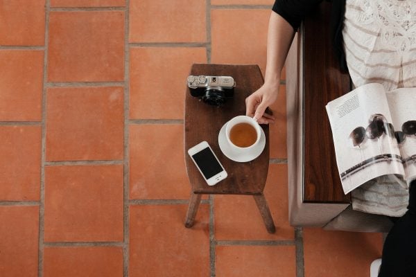
Props are a great way to make the reader feel included. They can relate. They have either been here or they want to be. The tones and shades on the brick look elegant. The natural browns of the wood on the table and chair can make the reader feel at home. The person relaxing with a magazine sets a comfortable mood. Or, you know, maybe I just want coffee.
Falling Leaves Out of Focus
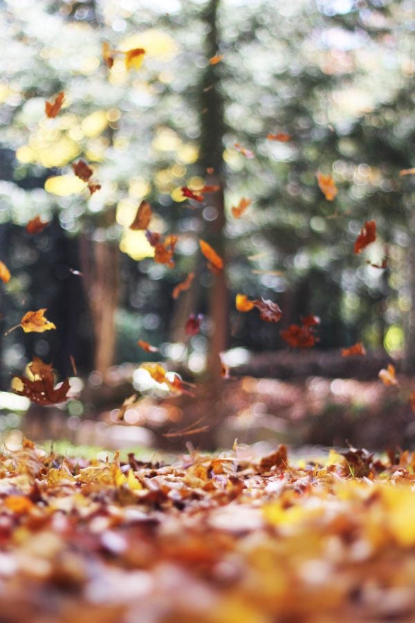
There’s something about this photo that inspires relaxation and energy at the same time. It has an interesting balance of color and focus. The colors blend in a way that provide excitement in an unexpected place.
Mountains
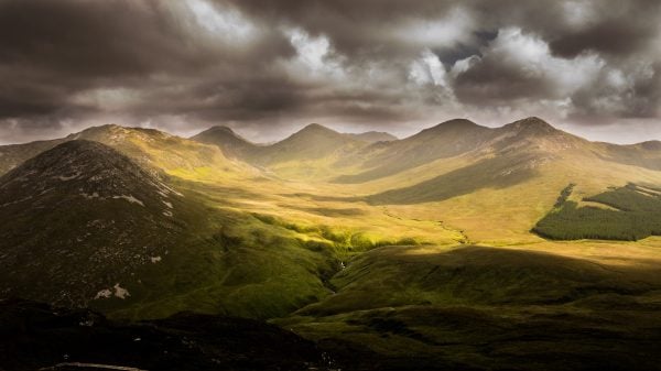
Mountains are beautiful, especially when the sunlight hits them just right. In this case the sunlight comes through the dark clouds and provides bursts of color through the shadows. The dark clouds are ominous but just over the horizon there’s hope. I feel a sense of adventure. It makes me wonder what’s on the other side of the mountain.
Rocks and Stars in Long Exposure
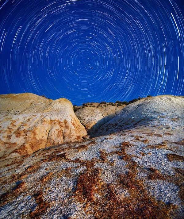
Long exposures that show starlight as the earth spins on its axis have always intrigued me. Usually the stars are against the dark backdrop of space with nothing else in the image. This time we have a blue sky as we sit on the rocks and watch the world spin.
Arc de Triomphe
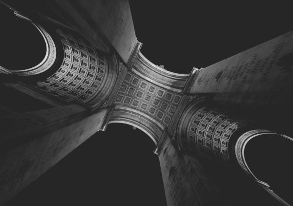
The beauty of this architecture creates some monochrome drama as light highlights the carved patterns on the walls of the arch. Add to that the round columns, the writing on the flat surfaces, the decorative bands, and interesting angle and you have a photo that’s sure the capture your reader’s attention.
Flowers
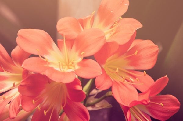
I confess I don’t know a lot about flowers. I also confess that I love the drama that’s created with these colors. The yellow gives just enough contrast to stand apart and creates a warm spot that demands my attention. The texture and color of the petals catch my eye and draw me in. I want to touch and smell them. I want to give them to someone special. I want them on my website!
Spiral Jetty
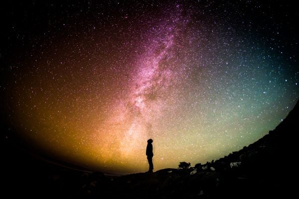
Space has always given me a sense of awe and wonder. When it looks like this I could look at it and study it for hours. This photo contains lots of interesting color that’s sure to inspire a sense of wonder in your site visitors.
Tea
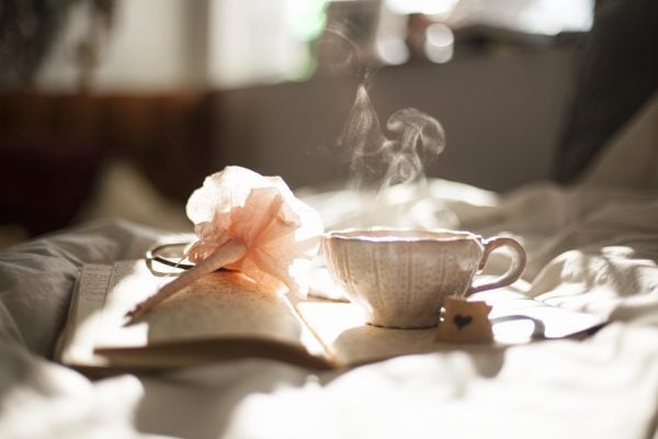
I find the soft lighting, color, and textures in this photo to be soothing. If feels peaceful and sets a mood of elegance. There’s just enough shadow in the right places to lead your eye to the foreground. The hand-written pages with the flowered pen make me wonder if someone is writing in a diary or maybe their memoir. Either way, the story isn’t over.
Life Guard
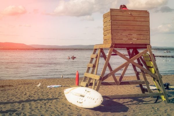
The content within photos can help portray and demonstrate your message. A photo of a lifeguard can make your readers think of safety. A lifeguard helps when someone’s in danger. It says to your readers or customers “I’ve got your back”, “We’re here for you”, and “You’re safe with us.” This photo does that will elegant and warms tones that are inviting.
Stump
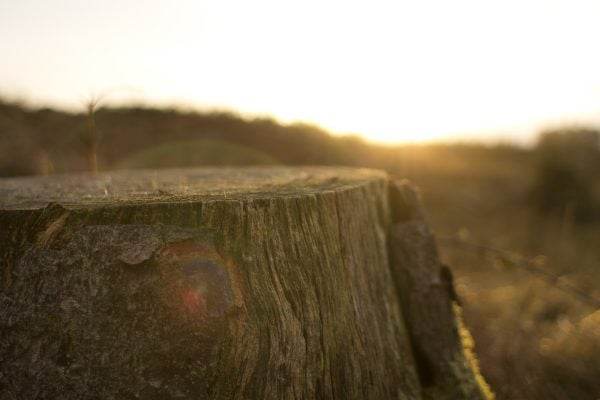
This is another photo that could be used to provide interesting textures. The sun shining over the trees brightens the image and even includes some nice lens flares with a rainbow effect. With the focus on the wooden texture of the stump the background blends and creates nice patterns. It feels warms and inviting.
Wooden Wall
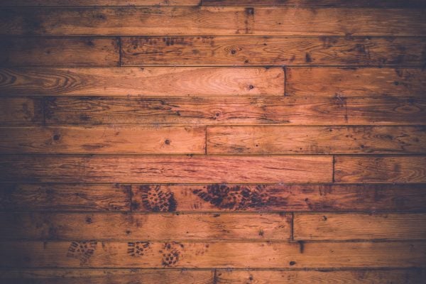
Wood-textured walls create that natural color tone of browns and oranges that blend well with any setting. The wall says “We are solid. You can trust us.” The color is warm and inviting while at the same time doesn’t try to take over.
Barn
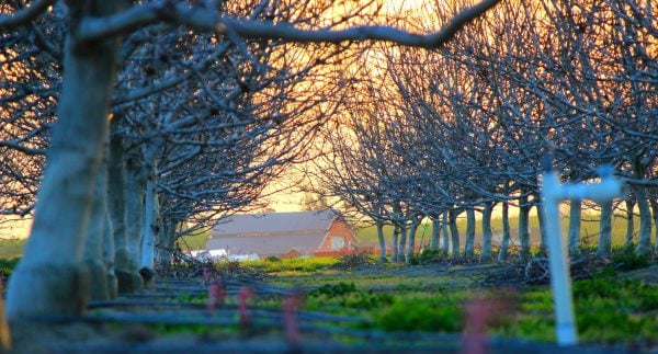
This one has a good range of colors that don’t try to compete for your attention. The green, yellow, and red play well together. I love the way the light shines to highlight the barn in the distance while leaving the trees in shadow.
Broken Bridge
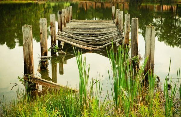
This photo has a lot of natural earth-tones. The reflection in the water shows the trees and you can almost make out a brick building that could be a school. The stillness of the water is relaxing. I think of tranquility when I look at this photo.
Lions, Tigers, and Leopards Oh My
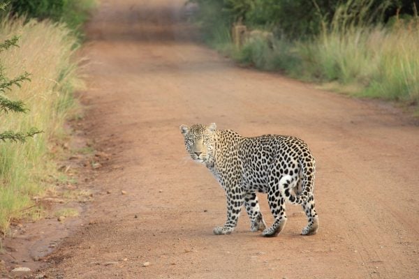
I don’t see any lions or tigers but there’s no doubt in my mind that this leopard sees me. I want to go down that road and it’s looking back to see if I’m brave enough to follow. This cat demands my attention. Big cats have always made me think of big adventure. The greens and browns highlight the leopard’s spots beautifully.
Ship
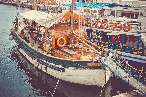
This photo is filled with color but the tones have been darkened or filtered to make the ship stand out while still feeling grounded. Orange, green, yellow, blue, red, white, brown, and black are all here but none of them compete for your attention over the others. They work together nicely to create a peaceful and relaxing setting.
Brick Wall
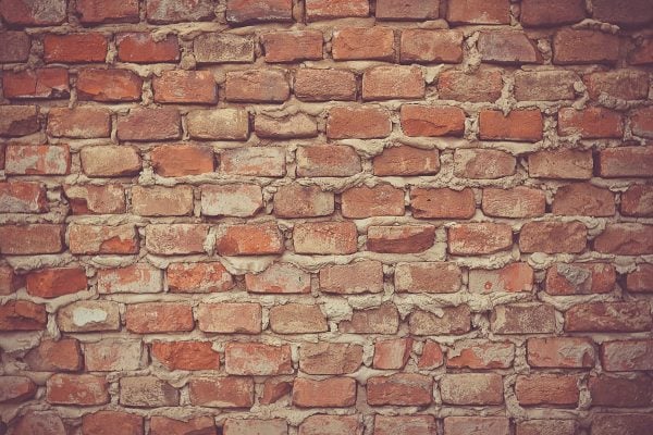
Brick walls are solid. They tell your visitors that you are strong. The color tones of brick and mortar create an interesting pattern that works well and gives the sense of security. It says “we have a strong foundation and we’re not going anywhere. You’re safe with us.”
Final Thoughts
Background images can make your site stand out from the crowd. If chosen correctly, they can help lead and guide your readers and set the mood that you want for your brand. There are lots of high-quality photos available that make great free background images and this article covers just a few of the amazing ones currently available for download.
What kind of images do you find yourself needing most often in your designs? Let us know in the comments.
Article thumbnail image by PhotoAmpRetouch / shutterstock.com


superb images
thanks for the share
had a doubt how to download them
got it cleared from the comments
Regards,
I recognized and used some of them. They are actually public domains and some also found on “pixabay.com” which is great and easy to search for what you’re looking for. And “unsplash.com” wow really high-res stuff. For background free videos a good site to look at is “Coverr.co”. Also look up “gratisography.com” and “jaymantri.com” For vintage color and B&W I don’t really know anything better than the site New Old Stock at “nos.twnsnd.co” really I mean really rare stuff and impressive. Also check out the free photo sections of “getrefe.com” and “morguefile.com” again top notch stuff.
Ok so enjoy these 🙂
P.S. I would like to see a digital book compilation from your team or as feeds from all users of the front end equivalent of a backend chosen layout. IFTT type of stuff. It would make my work quicker since I know use almost exclusively the Divi theme. Thanks and keep up the good work.
If chosen correctly, background images can set the right mood for the brand. Thank you for sharing these awesome images.
Awesome collection of images for the wordpress websites…I will use these for creating various infographics…Thank you very much Randy..
As I heard that too many plugins decrease the site and web server speed so these plugins would also affect the overall performance of WordPress and other content management system websites?
Beautiful helpful images. May use for banners on my new site…Thanks!!
Some of those are really great! Would love to see macros or bokeh type photos to use in articles. Specifically essential oils and the plants they come from as well as food / ingredients.
Puting signing up for a stock website on my to do list.
I sincerely find the ET blog useful, from the beginners to advance users and this post is not the exception.
Keep up the GREAT work.
These are generally most lovely along with valuable.i like your posts.Thank you.
For those interested (and maybe for Randy, if you wish to correct the title), the second image is from the Round Tower in Copenhagen.
Thanks Peter!
Excellent source, saved us a lot of time.
Background are stunning but not the great resolution …
Hi Nathan,
I like this post, thank you.
If I may give a suggestion to make it even better in the future, I’d suggest to make an analysis of what kind of pictures could be used to serve a specific goal or target. Finding out an emotional pic for the visitors of a Website is not easy (at least for me)!
Have a nice day
Lillo
Thanks for the feedback. I think that’s a great idea. I’m sure we can do more of those in the future for specific use cases–business websites, lifestyle websites, etc.
I liket “Bad Pyrmont” Thanks for sharing
excellent! love the wooden wall and the vietnam picture. very interesting.
I agree not much value here…
Gotta say it hoow it is.. i normally enjoy the posts here
Most of these pictures look great… BUT it sounds strange to me to use a picture with the focus in the middle (like Trevi or the boat) as a background which will be covered with the actual content. How would that work?? Also I think some of these are too rich in details and would disturb the content.
And more practical questions re. backgrounds: what setting do you recommend for screens larger than the picture size (strech out, duplicate horizontally and vertically?). How can the edges match well whens you duplicate? Won’t it look chaotic? Does the wp theme optimize the picture for every available screen size?
I’d love to see some good examples of background pictures used WELL 😉
Hi Agnes,
Images with the content is in the middle are best used for parallax scrolling. Smaller pictures can be used within modules rather than the entire screen.
Hi Randy,
The article is fabulous and awesome just like the images. I believe that the images are meant for various kind of moods and genre. For example, ‘Boat in Water’ is great for continental & hippie travellers (just a thought).
Spiral Jetty is the one I am going to use because it shows magnificence, hope and wish to explore.
Thanks,
Shekhar
Most of the background images you have shared in your post are beautiful. Surely I’ll try few of them. Thanks for the awesome share.
Re licensing: STANDARD for all clip art, free or paid. Of course they don’t want it to be downloadable. Even free. They track cookies or get yr name or keep track or whatever when downloaded from sites where artists and designers work resides.
This is not an unusual license. Basically, don’t give away their work or make it easy to be given away. STANDARD stuff. But good to mention.
LOVE IT! One thing stands out: SUPERIOR images. Randy has quite the eye.
Plus I appreciate Randy’s commentaries. Very informative and educational. I dunno why anyone would object to anything on this post!
One thing I do find missing: ppl never comment about complimentary colors. The reason the small orange boat provides contrast to the blue water is a simple fact of optics and color theory. They are complimentary or opposite each other on the paint color wheel. I say paint, cos print can be CMYK or RGB (photos from high end lab), online is RGB.
By understanding a bit of color theory, stating complimentary colors (yel + purple, red + green, orange + purple) make for GREAT color combos.
It gets deeper than that, but mentioning something about color theory helps ppl design and choose images.
But on blogs like this (specifically Canva), I’m not seeing that info. Just might wanna look into it. Or not.
Randy’s info stands on its own merits. Which are many! Thanks!
Thanks Jenny! I’m so glad you mentioned color theory (I should have mentioned that).
Thank you – these are all beautiful and useful. I do have to mention, isn’t the Wooden Wall actualy a Wooden Floor, judging by the footstep marks on it? Unless there is some gravity defiance involved. 🙂
Maybe it was Lionel Richie’s house and he was dancing on the ceiling 🙂
Hi Ed. I think is was a floor turned into a wall 🙂
What would be even better? a fabulous little download pack of all of these images in a pretty little bundle? pretty please? 😀
CANNOT bundle these for reasons of copyright infringement. People don’t just give away things. They collect cookies, names, track stuff. They have the right to determine who gets what. If you want bundles, you have to go to sites where they licensed the work to be offered as a bundle. LEGAL ISSUES demand we download, one at a time. That’s life and the laws.
Hi Jenny,
can you tell me where cookies would be located. I pay for free images from a stock photo place.
And, then I often open the image in adobe acrobat, and go to images to see if they have a copyright listed within the about the image: or a link to a website, or author listed. If there is none of this and I have paid for the stock photo licensing. After I pay, and check I assume that there are no license issues, and no cookies but I must not understand the cookie thing. Can you explain it to me? Rose Offner
Read the license terms carefully. The Freeimages.com site, specifically, has the following under “Restrictions of use”:
“No Standalone File Use. You may not use content in any way that allows others to download, extract, or redistribute content as a standalone file (meaning just the content file itself, separate from the project or end use).”
In other words, don’t use it online as anyone can download it as a standalone file.
Then why does this blog’s title say “35 Free Background Images to Use on Your WordPress Website”? John Sawyer’s post specifically contradicts the post title! PLEASE CLARIFY.
According to the license you are free to use these in blog posts or as part of your website. In regard to the particular concern raised above about the images from freeimages, you can use a plugin like this one to protect yourself from people being able to save the image file directly from your site.
https://wordpress.org/plugins/wp-content-copy-protector/
Hi, does this plugin affect the SEO?
No it will not affect SEO.
What is the best way to get the pictures out of the blog to use in a divi site?
Some of the ones I looked at are only 600 pixels wide @ 72 dpi. I don’ t know how they would be large enough to fit your suggested size. “The ideal image size is 1920 pixels wide x 1080 pixels high.”
Love the selection. Just don’t understand how to use them correctly.
Thanks
Click on the title of the image to go to its source and download. There you will be able to get the full size image.
But not all are available in 1920×1080 — e.g., this one: http://www.freeimages.com/photo/reflection-1508561
That is simply the ideal size for a full-width background image. Particularly with Divi and its sections/modules there are a number of places one could use a smaller (but still high quality) background image.
Thank you so much for linking to such fabulous Creative Commons photos — I love the colors, texture mixes and captivating scenery found within these selections.
Cheers!
I always love your posts. Thanks!
Unusual woven fabrics make for some interesting backgrounds. I have had fun with traditional plaid and Herringbone designs (they offer little color and great subtlety) but also heather-y solids fabrics as well.
Hi John. Great idea! I love the textures that fabric makes.
Hand models for nails, computer businesses, kids playing or dancing,
Where can you download these images? Thank you.
The title of each image is linked to its source.
Is it just me or in Reflections 4 does the boat look like it’s half filled with water? It doesn’t fill me with peace, I kinda panicked that there might have been people in there and hoped they hadn’t drowned!
LOVE that spiral jetty pic 🙂
Good point Rosie. It does depend on your perspective.
Thanks Randy for sharing those images! If anyone needs also free background images, one of my favorite resources the website Search Creative Common.org. Great way to get free images with different type of copyright.
I love it and thank you. Flowers and tea are my favorites! So pretty.
Thank you so much Randy! This is extremely useful.
Great read, beautiful images. I use a lot of business and personal images to connect readers to my connect, example the tea and the coffee picture are great photos to make a post more relaxed and friendly. Your blog is always worth reading keep up the great work.
Nice Backgrounds images. Moreover, they are completely free.
Thanks for this post.
Please, stop pblishing this type of posts, seriously
I am a big fan of elegant themes and they have published quality things always, whats wrong with this ?
No please Don;t stop posting. interesting article and some great finds.
Please keep posting…always helpful..
In reply to Reida Dana… If you don’t like it, don’t read it. Many people do like this post, including me. Have a nice day 🙂
Yes, seriously you should leave publishing this type of posts, Reida Dana! 😉
Seriously Guy?
Why? Then don’t read this type of posts. It’s that simple.. I find this post very interesting and it helps me a lot when it comes to the point where I think about using background images for a website or blogpost!
You know, I set out to find the nugget in everything that I undertake. I came away with a couple of good nuggets here, so the post was well worth it. And I’m just curious about what you found objectionable? Maybe I’m missing something.
It’s nice to see artful, thoughtful photos. If ppl are only looking at code or layouts, they are missing a huge component in web design and life. It’s like walking around with blinders in the dark. bring on the colors, shapes, light and dark and all that jazz. Thanks Randy!
These type of tips are helpful to me as well as my clients to see where their thought process for images might be wrong. Why do you want him to stop these types of post. Don’t stop – I think if this not what you are looking for you can do like I do delete just that email notice and read til you see something that interest you. These writers must fit the needs of many not just one.
What do you find wrong with this type of post? What would you rather see?
Nothing wrong with it, Nathan. Keep em coming!
Nothing wrong with it.
(but pls consider adding an option to the comment system to subscribe to e-mail notifications when someone replies to your comment)
Agreed. Love posts with free resources. Trolls are just people spreading random acts of mean-ness….with no other reason than to just stir the pot…Thanks for your adult approach to the evil ugly trolls.
Resources for developers/designers are always nice and appreciated. I would just note though that when the majority of them are from one site and requires registration to access, it starts feeling like a promo — specially when any of the photos from that site can be accessed with registration.
I for one love these types of post. Please do not stop.
It takes a certain kind of person to post a miserable comment without providing a viable solution as to how it could be better.
People who are angry with issues of their own will often lash out at other people or things have absolutely nothing to do with the actual reason for their outrage. Unfortunately, cowardice prevents those sorts of individuals from tackling the real issue, so instead they take their anger out on innocent bystanders or, in this case, a blog post about high quality, free background images.
Kudos to you for responding in such a kind and considerate way despite the inappropriate tone of the other party.
On behalf of everyone else, great post! I really enjoyed it and have now added a few new pics to my “for future use” folder. Nice work and thanks for sharing this info!
And it takes a certain kind of person to stand way up high on their dainty little pedestal to tell everyone the painfully obvious in an attempt to make themselves appear that their sh!t don’t stink.
Thanks Ashley for your insight – otherwise nobody would have realized this was a troll.
To keep the trolls under the bridge today you almost have to manually approve every comment.