

Welcome to Day 50 of our Divi 100 Marathon. Keep tuning in for 100 days in a row of awesome Divi resources as we count down to the amazing release of Divi 3.0 on the final day of the series!
In today’s post we’re going to run through a series of tips and best practices we recommend you adopt when preparing image elements for use in Divi Builder posts and pages. These best practices will help to assure that your images conform to accepted design principles, ideal Divi image dimensions, and contribute to faster loading speeds.
Oh, and let’s not forget, they’ll look pretty cool too!
- 1 Selecting the Right Images
- 2 5 Ways to Get Creative with Divi Image Asset Preparation in Photoshop
- 3 1. Add Your Own Background Color Overlays
- 4 2. Create Collages
- 5 3. Create Multi-Image “Layers” for More Dramatic Parallax
- 6 4. Leave (or Create) Space for Other Divi Content
- 7 5. Create Seamless Section Transitions
- 8 Saving Your Image Files Properly
- 9 Wrapping Up
- 10 Divi 100 Day 50
- 11 The Countdown To Divi 3.0
Selecting the Right Images

Before we get into the photoshop tips below it’s important to realize that not every image you come across, relevant to your content topic or not, is good enough to make it onto your website. In every case you should consider the following points and if necessary create your own visual elements in order to conform to these guidelines. Your finished content will likely be stronger as a result.
Image Dimensions: As a rule, it’s always a good idea to start with high quality/large dimensions and work your way down. The largest images you will need on a Divi website are section background images. 1920px wide by 1080px height is ideal for these. If an image starts out smaller than this, it’s likely not a good candidate for a section background. You can however scale it down for other use cases, which we will get into below.
A divi section background image often needs to span the complete width of the screen.
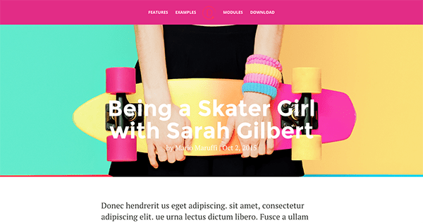
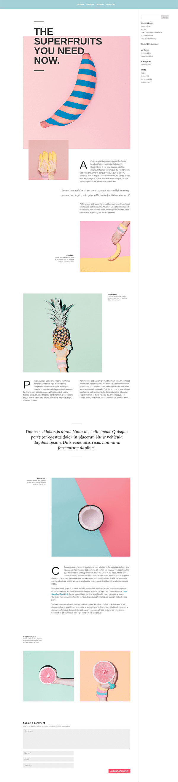
Think in image sets: One great way to establish the tone of a Divi Builder page or post and keep it consistent throughout is to use a single set of images that are stylistically the same. Ideally, the same camera settings, subject matter, and editing process.
This set of images really ties the post together.
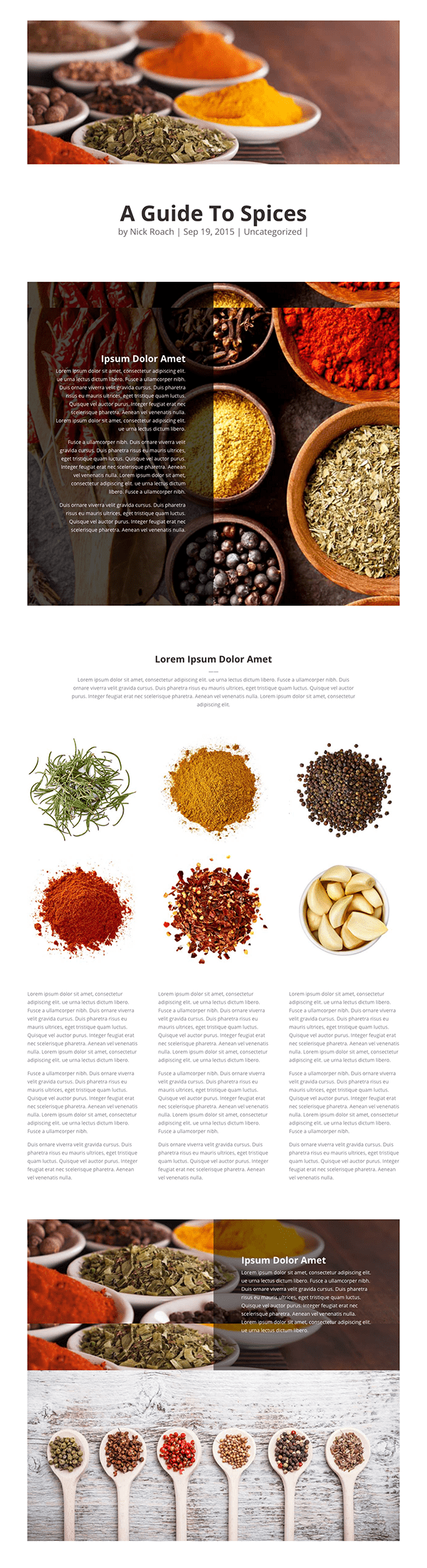
Keep colors consistent: It’s important that the images on your post or page–and the colors they contain–are able to blend in and work well with the color palette on your site. If you plan to have a wide variety of images with various color palettes regularly featured on your site, you may want to choose a minimal color scheme that allows your content to set the tone from page to page. Or, edit your images to fit with your chosen color palette.
The colors in the images are consistent with the site’s color scheme.
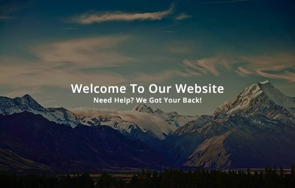
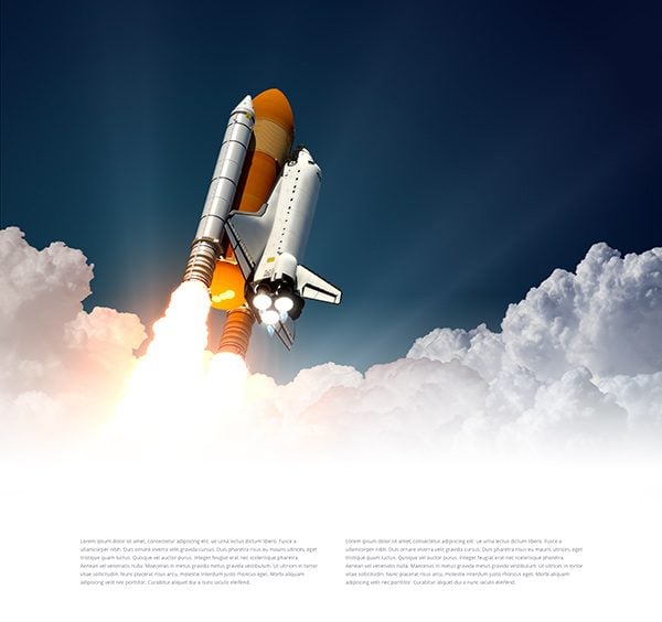
Keep background images “quiet” and subtle: It’s hard for a background image to “fade into the background” if it’s really busy and/or begging for attention in other ways. This is why we prefer to use subtle “texture” images, blurry or “softened” images, and simple patterns–all of which make great backgrounds.
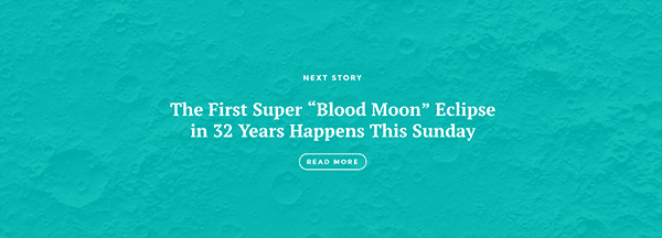
This close-up of the moon functions well with the post title and as a subtle texture or pattern. Especially with a color overlay added to it.
5 Ways to Get Creative with Divi Image Asset Preparation in Photoshop

Now that we have a sort of baseline for what makes an image right for Divi posts or pages in the first place, let’s take a look at five ways you can get creative in preparing your Divi image assets in photoshop.
1. Add Your Own Background Color Overlays
One popular feature of our fullwidth header module is the background color overlay. This feature allows you to create a colored overlay with adjustable transparency over whatever image you choose as your background image. There are other areas in which you may want a colored image overlay on your site though. In those cases you’ll need to add one to the image itself using photoshop or another image editing software.
For example, in the image below we have a text module being used atop a section with a background image. In its unaltered state, the text becomes almost unreadable. This is a very common occurrence when attempting to use background images behind text. Sometimes the background image can be too bright, and other times it can be too busy. Modifying the image with a subtle background overlay can tone down the image and solve these problems with ease.
First of all, you need to open up your image in Photoshop (or a similar photo editing software). Above the image, create a new layer. This is the layer we will be using for our overlay.
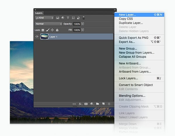
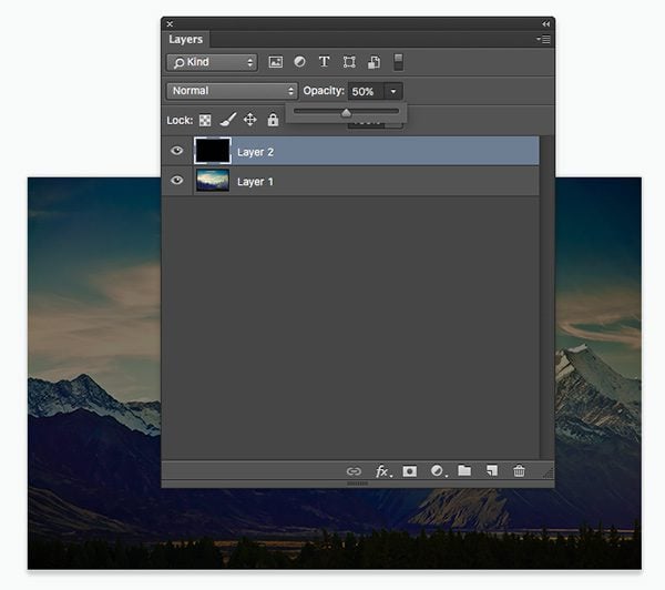
Once the layer has been created, use the paint bucket tool to fill the layer with solid black and then use the layer’s opacity slider to reduce the opacity down to 50%. You can play with the percentage depending on the brightness of your photo.
Once the image has been saved and re-uploaded to your Divi site, you can see that the background image overlay has made the overlapping text much easier to read!
2. Create Collages
One way you can “cheat” and still use small images on your website is by grouping a large number of them together into a collage. When combined with an image overlay as in the example below, collages make great section backgrounds.
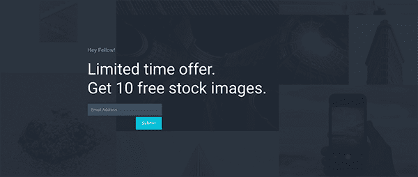
This is a great example of a collage background.
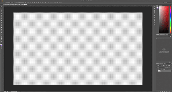
To create your own, first you’ll need to create a new document in photoshop. As I mentioned above, 1920px by 1080px is usually a good size to start with. You can always adjust down if need be.
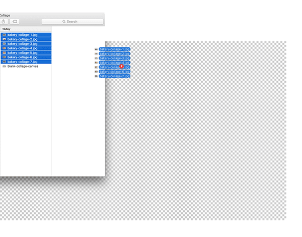
Next, you’ll want to gather up your other images and put them in a single folder; either on your desktop or wherever you are organizing the files for this particular project.
You can simply drag the image elements into your collage’s “blank canvas” to get started.
It will start out looking like this.
Each image will be in its own layer but they will all be directly on top of each other. Use command + T to transform the images to your preferred sizes. Be sure to hold down the shift key while resizing so that things scale proportionally. Otherwise the image will look stretched or squished. Then, use the move tool to position them.
Once you’re happy with the results you can choose to add a color overlay or not depending on how you’d like to use it within Divi.
3. Create Multi-Image “Layers” for More Dramatic Parallax
In Divi section and row settings you’re able to turn on an effect called “parallax”. When the parallax effect is enable it gives your background images the appearance of staying fixed in one spot while the rest of the viewport scrolls past it. This effect can be emphasized even more when a single image is split up into multiple images that scroll past each other. In fact, the parallax effect by definition is created when comparing two objects at different distances. By adding an image on top of your parallax image, the effect is heightened through the interplay between the two. The trick is choosing two images that work well together.
Here is an example:
As you can see, the background image has been set to “true parallax” mode in the Divi section settings. As you scroll down the page, the image in the background moves at a similar, yet slightly slower, speed than the overall page. This creates the parallax effect. The difference in speed between the elements on the page when compared to the speed at which the section’s background image moves creates an illusion of depth.
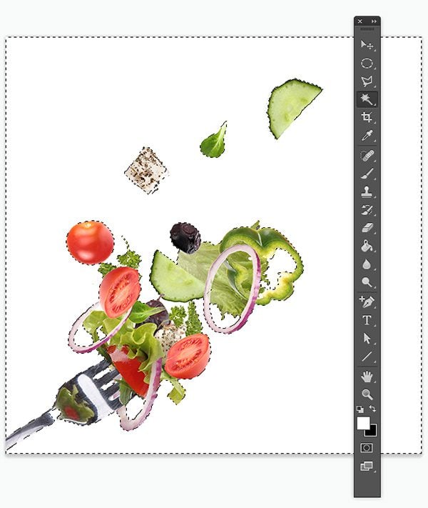
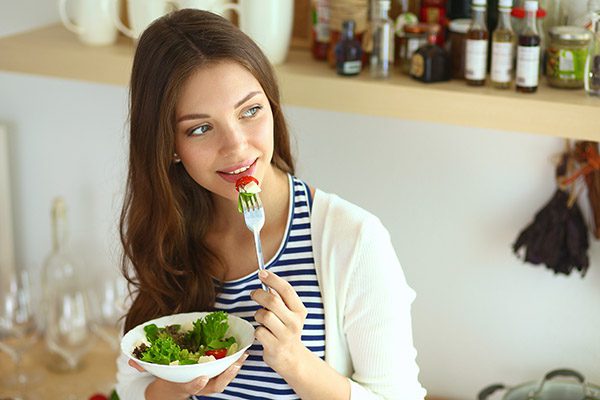
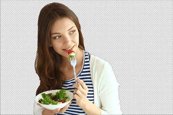
The image atop the section moves along with the rest of page, and since it’s a transparent PNG image, we can peer through the gaps in the image to see the parallax image behind it! This is just a normal Divi image module. The trick is selecting two images that work great together, and then turning the image on top into a transparent PNG.
Here are the two images used in the example above:
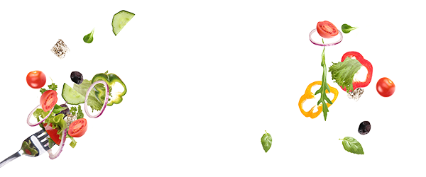
As you can see, the image on the left (the image module that sits atop the parallax background image) is a PNG with a transparent background. All of the white space has been deleted so that you can see the parallax image below. In Photoshop, this is quite easy to do so long as you are working with an image that has a plain (ideally white) background.
Open up the image and use the Magic Wand tool to select the white space between each item in the image. Once everything has been selected, click the delete key to remove the white background. Click Save > Export > Quick Export As PNG and you’re done!
4. Leave (or Create) Space for Other Divi Content

This tip is maybe the simplest but no less visually striking than the others. The trick here is to either find an image with extra blank background space in it (like the image above) or to create some in photoshop so that there is room to place other Divi modules “inside” it.
The trick here (in Divi) is setting the image as the section background. Then, adding two modules to the row: whichever module you’d like to display (in this case, a call to action module) and a divider module to create the desired amount of “blank space” beneath it, which ultimately displays the background image. It’s also important to set the call to action module’s background color to 100% transparent.
If your image does not already have extra space on the top or bottom like this one you can do the following:
Open the image up in photoshop and use either the lasso tool, quick selector, or magic wand to select your main subject. Delete their background and replace it with a solid color.
Be sure to leave space to one of the four sides where your Divi content will go. You may also want or need to resize the canvas as well. I adjusted mine to 1920px by 1080px and moved my subject farther to the left.
In this image I’ve chosen to open up the space in the direction that she is looking. This will create a nice visual cue for anyone visiting my site, encouraging them to look where I want them to.
Now, when I use this image in Divi I can place a call to action in the open space I’ve created.
5. Create Seamless Section Transitions
When using images within Divi Builder posts and pages it’s important to think about how those images will relate to the surrounding content. Once you know how a single image fits into the whole you can come up with fun little ways of blending many elements into one piece of seamless content.
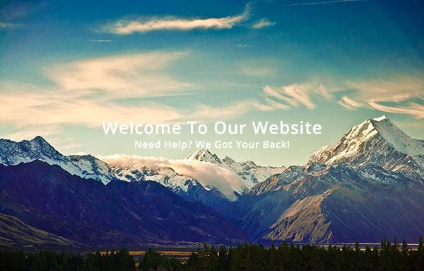
One way you might do this is by adding transitional gradients to the tops and bottoms of your images so that they seem to fade into the next section–as in the image below taken from one of our many Divi Builder demos..
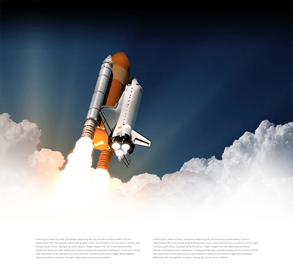
The clouds appear to fade into the white section below, but this isn’t just a lucky coincidence. In fact, the original image looked something like this:
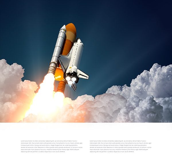
As you can see, there is a stark barrier between the white section and the image module above. With a simple gradient over the image, however, we can create a beautiful transition between the two.
To apply the gradient, you will first need to open up your image in Photoshop. Since we want to transition to the section below the image, and since the section below has a white background, we will be applying a white gradient to the bottom of the image. As long as the final row of pixels at the bottom of the image is white, the transition will be smooth.
Select the gradient tool, and then select the color that you want to fade to. Drag the gradient tool from the bottom upwards while holding the shift key to ensure that the gradient is applied at a perfect 90 degree angle.

Once the image has been saved and uploaded back to our site, you can see that the white gradient has created a smooth transition between the bottom of the image and the section below. This same concept can be applied to any image and any section background color, however, it’s best to choose a color that is as close as possible to the dominant color in the image you have chosen. Attempting to fade to a color that does not exist in the image will result in an unnatural transition.
Saving Your Image Files Properly
When you’ve finished your creative exercises above, we recommend using the following tips to save your files properly. These tips will ensure that your files are in the right format and small. In doing so you will be contributing to faster page speeds by only using images that are as light weight as possible.
Image Formats: in most cases you will want to use the JPG format. This is good for saving images with millions of colors, so it’s perfect for photographs and graphics that have a lot of shades and gradients. In instances when you need a transparent background or you’re going to place the image behind a color overlay, the PNG file format is ideal.
File Size: From smallest to largest your image file sizes should range from as small as 40 Kb to 200 Kb. No bigger. This is especially important when exporting Divi layouts. I’ve noticed that some errors can occur when image file sizes are large.
Save For Web: When you’re saving an image for use on the web from photoshop, go to File > Export > Save for Web (legacy) and choose between the checkboxes “optimized” and “progressive”. Either will work, but one benefit of progressive is that at first it will look a bit blurry but once loaded clearer than non-progressive images. This little bit of clarity can give your images (and by extension your site) a bit of an edge.
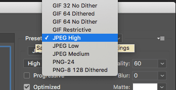
When choosing between “high” and “low” quality, factor in how the image will be used. You might want to use “high” if the image will be standing alone on the post or page. Or choose “medium” to “low” if it will be used as a background. But ultimately you will always be attempting to strike the right balance between image quality and compression. When you’ve found it, click save.
Wrapping Up
Of course there are many more tips and creative ways you could prepare your image assets to get better and more dynamic Divi Builder posts and pages. If there is something you’ve seen us do in our Divi demo pages feel free to ask us about it in the comments section below and we’ll write a follow up post to show you how we did it.
Also, be sure to subscribe to our email newsletter and YouTube channel so that you never miss a big announcement, useful tip, or Divi freebie!
Divi 100 Day 50
The Countdown To Divi 3.0
This post is part of our Divi 100 marathon. Follow along as we post free Divi resources for 100 days in a row! This 100-day countdown will end with the game-changing release of Divi 3.0, including our brand new visual editor built from the ground up using React. Divi 3.0 will change the way you build websites with the Divi Builder forever!
Let the countdown begin.


Is the example page “the super fruits you need now” under “Keep colors consistent:” somewhere live to see? is it anyhow downloadable as a template or sth. like this? cause it looks awesome – I especially like the picture-over-picture effect …
Thanks and respect for you freakin-high-ampount-of-output!
Here are the demos http://elegantthemes.com/preview/Divi-Builder/
and the superfruits: http://elegantthemes.com/preview/Divi-Builder/superfruits/
I dont know yet if this package is available for download, but so far I remember the image over image effect was done by using negative top-margin for the 2nd image.
thanks! alles gut 🙂 as always …
Great tip and tutorial! Just like the youtube channel as well.
Elegant themes has a amazing team, especially the support team, they are the best in the business.
Just one question:
Any possible to integrate the Extra Theme with Divi, and put the post and category area inside Divi???
It comes something like that in Divi 3.0???
This countdown to divi 3.0 are amazing, many ideas and free stuff.
Thank you very much elegant theme team and Nathan.
Luciano
From Brazil
Great post! thanks!
Nathan, this is just fabulous and so helpful. Thank you 🙂
The double parallax effect is very cool. I always suspected that it was done that way. Thanks for the explanation.
Thanks for the post. Suppose you want to embed an infographic. Assuming each of the following have been fully optimized, which would result in faster page load?
full infographic in single image
infographic divided into multiple smaller images
While the smaller images could be possibly lazy loaded, they would result in multiple connections and responses. I will split test but curious if this has already been done and the results?
Elegant Themes Blog | Brian commented on 5 Ways to Get Creative with Divi Image Asset Preparation in PhotoshopI would vote for 1 single image. lazy load is often a UX pain. If possible check server environment for caching features/options and give the image an directive to being cached. thats the fastest. several small images may can be fast if CDN is used, however you`re adding dns requestes and serverprocesses or childs, so it also depends on the server location and the user location or the distance btw. them. in general: less hops and less requests = better & faster, fastest is single ram-cached image.
Hi,
First of all thank for the tips, your blog is amazing.
I´ve followed one of your tips, the one which talks about putting and image as a background. Looks great in my desktop but the image does not appears in mobile devices.
What can I do?
Thanks
All great info but I have one question. You say to limit all images to 200kb, which I do not, because I have clients which require huge images. I am also worried about retina display and keeping the quality of the images. If I compress a large image down to 200kb the quality will be awful. Thoughts?
There are always exceptions to the rule but if you work hard to keep the file sizes as low as possible with the highest quality possible they shouldn’t get too terribly big.
This post was very useful. Keep it up guys!
Thanks, will do!
Very helpfull. Thank you
No problem, glad you like it.
I love PS tips and refreshers! I too am self taught since PS4. Before Youtube, I had to purchase several videotape lessons and bought books. Most of what I have learned is obsolete. For example, I mastered the Drop Shadow effect. I made a few bucks doing DS on objects. Now all that can be done with a simple click. Even my paycheck went ‘click’ to zero!
For those of you who know just enough about PS to get into trouble, I would recommend to exploring PS tricks via Youtube. There are hundreds of entertaining PS lessons and thousands of boring PS lessons (yawn).
Donnie of “My Damn Channel” does a series called “You suck at Photoshop” a comedic approach to learning. https://youtu.be/U_X5uR7VC4M?list=PLD19BCF9D57320E03
Some of his latest videos gets into speeding up your workflow to using 3D objects inside PS. Yes, mind blow! You can build 3D worlds inside of PS. Donnie’s videos are a good place to start.
No more searching for the perfect image to go into your webpage. Now you can mash up some clips to make the image that fits your site without having to hire a photographer or paying for images online.
Cool resource, thanks!
Very useful tips. Thank you Nathan.
No problem 🙂
Nathan once again thank you, great tips.
No problem, Jonatan. Thanks for stopping by the blog.
Great post Nathan.I’m a newbie wordpress user & I’m trying to learn a lot of stuff.I like divi theme.we can customize divi theme without having a lot of technical knowledge.I think before publishing any image on our blog,we should select the right image related to our main topic.photoshop is a great tool for website designer
Sounds like a good rule of thumb Tonu.
Great post. I must say that I have enjoyed the 100 days of Divi a lot! The layouts and now these tips have been really helpful and as a novice, I love reading professional tips using the same tools that I am.
PS: when will the Elegant Themes website be converted using Divi?
Thanks, Justin. I don’t think it’s likely we’ll re-do our whole site in Divi for many technical reasons I can’t get into here. But it’s certainly possible that we might be able to start creating articles with it in the near(ish) future. We’ll just have to see how our scheduled re-design goes after the Divi 3.0 launch.
Some great suggestions there Nathan. Thanks.
Thanks, Anthony. No problem 🙂
Thanks for this excellent article. I’m assuming that Adobe will at some point, get rid of the “save for web legacy” feature. Is there a way to get the same result simply using the export function?
The export function is pretty similar. I imagine that when they do finally get rid of the legacy save for web feature the parts that are still used will be merged. Or at least I hope. We’ll have to wait and see.
Great post! This is going to be so helpful for my clients, thanks!
Woohoo! Always good to hear 🙂
Great post!
I need redesign my website
Thanks, Vick. Good luck!
Love the multi layer image effect. Thanks for sharing that. Seen it before and always thought there mustve been some fancy scripting going on. Gonna get this on my site right away. Cheers mate ?
Thanks, Filpod. It’s pretty wild how many cool effects can be achieved simply. I love getting to share stuff like this 🙂
Day 50 of the DIVI 100 Half way! (already)
Now, I like to see myself as a positive Glass Half Full attitude kind of guy but today it feels like half empty…
Great Post and although I’m a Gimp user, your tips here are great 🙂
It’s been a fun journey so far and now that we’re half-way though I feel like we’re headed down a slope, picking up speed. Divi 3.0 will be here before you know it!
Really enjoying this series of posts as we count down to divi3.0 – this image stuff is so useful and a great reminder about being creative. The file size information is invaluable. Thank you – and Keep making Divi great!
Thanks, Adrian 🙂
why isnt my reply didnt published?
Depending on when comments come in it can take a little while for them to go through moderation.
Great tutorial. Loved the way you break down into steps. You could mention sources of images eg Unsplash great when looking for sets of images for a project. ☺☺☺
Thanks, Rich. Yes Unsplash is a great resource. For our demos we tend to use licensed images from shutterstock.com. We’ve actually done quite a few posts curating free images or pointing people to places where free images can be found. Check the archives for lots of goodies 🙂
Can these examples be performed with less expensive software? Say Photoshop Elements?
Hi Paul,
PaintShop Pro X8 Ultimate is less than $40 and it can create the gradient effect in exactly the same manner shown in this post. PhotoShop it is not, but it is very useful for creating images and photo editing.
GIMP is free for windows and may do what you want.
Affinity Photo is in free beta at the moment and might be what you want.
I don’t use photoshop, I use pixelmator for Mac OS and the iPad IOS app, tools are basically the same as Photoshop. I save in the cloud so if I can work from either device.
There is also canva also available as IOS apps which is a bit more limiting but great if you need a simple job done quick.
For logo and vector work I use Graphic Mac OS and IOS iPad which allows me to use SVG vector files. If I need to import EPS file I use the cloudconvert app to change EPS into SVG then import those into Graphic.
Pixelmator doesn’t have the same amount of file types to save as photoshop but for image compression on the web I use a plugin to compress. You can open photoshop files in pixelmator and save as photoshop files as well as JPG, PNG, PDF.
I don’t miss photoshop at all as there are enough clever apps to get around the Adobe system.
I haven’t tried them with anything else but I’m sure at least some of these tricks are possible with other softwares.
I’m a Photoshop lover since 2000, but this year I find myself using Affinity Photo more and more.
And for those looking for a more affordable alternative, it’s only 49 bucks, 1 time-payment
Wow,
Another helpfull Divi 100 Gift to use !
Thanks Elegants Team !!!
No problem, thanks for stopping by the blog and participating in the conversation 🙂
agree
Thank you so much for this and all other updates in the Divi 100 countdown. You are levels above the competition with the effort and quality!
I have searched for a 2.5D tutorial for a while and nothing out there has been clear enough, and you explained it so simply, thank you!
Please do keep it up!
Glad we could help you figure that out Damir.
Great and useful post. Love the dramatic parallax efect. Divi 3.0 is closer than ever. Than you guys.
Yep, half-way there!
Thank you so much for this very helpful tutorial, this is a great starting point for a PS-newbie as i am!
No problem 🙂
Awesome, super useful post!
Thanks, Tami.
I’m a self-taught photoshop user (since PS6), and this answers so many questions I’ve had but never voiced. I’m usually a trial and error type of photoshop’er, this post is really useful. Thank you. 🙂
Good to hear, Beate!
Excellent and extremely education post. Having limited knowledge of the ins/outs of PhotoShop I feel as though I have taken a crash course and learned a great deal. Thank you!
Woohoo! Glad you got some value out of it. Let us know if there is ever something you’re trying to figure out in terms of web design/Divi and we’ll likely be able to put together a blog post on it 🙂
I’m not a Graphics Designer by any stretch of the imagination and I learned so much from this article.
Good to hear Jim, hope we can continue to provide good resources for people at all stages of design experience.
Good post Nathan. I noticed what works most is when background image is not too crowded.
Agreed, James.
Very good article to help our site prettier.
Thanks, Emily.
Great post. Elegant themes obviously has some great design skills which can be seen in their product pages.Bookmarked.
Thanks, Osgow.
Excellent article Nathan! This is the kind of information that really helps when you need to build a website with Divi. More posts like this one!
“More posts like this one!”
Coming up!
#3 & #5 – mind…blown…
Now I really need to find somewhere to use both of those techniques – fast. 🙂
Those are my favorites too. Super fun 🙂
Great list of tips. I’m going to have to try a 2 layer parallax inside of Divi. That looks great.
It’s not directly inside Photoshop (unless you have the plugin) but I always use TinyPNG/TinyJPG to compress images after exporting from PS. I find it almost always reduces it further than Save to Web.
I agree, TinyPNG and TinyJPG are great, really reduces the file size a lot, and better than any of the programs I have used. Unless I find something better I will keep using them. Everyone should definitely be using these to compress their images.
Thanks for naming those programs. When saving a JPEG in Photoshop I usually choose 8 or 9 quality, but have been using Imagify as a WordPress Plugin lately. It’s free, does a good job, and allows me to be lazy without having to compress through an external program if it’s a no-need-to-edit CC0 image. Cheers!
+1 for TinyPNG and TinyJPG. I use them all the time.
Nice job guys…very helpful….
Glad to hear it!
Great article with valuable and specific information. Thank you so much! Major “saver” post that I will refer to often.
Thanks Susan, appreciate it 🙂
One thing that would really help is a guide for sizes for images e.g. 1 column, 2 column etc. I have to waste days with trial and error getting images to the right size. Al post on this topic would be great
Since Divi Builder columns go responsive and therefore fullwidth at 980px, that is the width I use for all column images.
+1
Great article. Yes agree with Kim’s remark on usefulness of a guide for image sizes for columns – I too waste days on image-sizing ..
I agree, Kim. I too would greatly appreciate an image dimensions guide for Divi.
1 column: 1080 pixels
¾ column: 795 pixels
⅔ column: 700 pixels
½ column: 510 pixels
⅓ column: 320 pixels
¼ column: 225 pixels
Enjoy
Kim and Susan and all other Divi users, maybe this will help i found it last week !
http://www.elegantthemes.com/blog/resources/divi-image-templates
Ha! I actually forgot we made that one. Jeroen. I’ll be linking to this more often myself now 🙂
I saw your reply to me and its a time ago that Elegantthemes made this one, but its helpfull.
I see a lot off questions and because i’m a newbie i read all the blogs from start on till now and see a lot answers pass by.
only one thing i cant find to do is ; how to put a imagebanner between the sec and primairy menu (responsive), maybe you have a solution for that?!
Thanks for all the effort you guys putt in to make divi a toptheme, oh no it is already a toptheme, wow!
agree
Somebody posted here before regarding image sizes, so I take no credit for this list. From my experience it is accurate, but of course, it cannot take into account custom padding, gutter, etc. So be sure to keep that in mind.
Full Screen / Headers: 1920×1080
1 column: 1080 pixels
3/4 column: 795 pixels
2/3 column: 700 pixels
1/2 column: 510 pixels
1/3 column: 320 pixels
1/4 column: 225 pixels
Parallax: 1280px by 768px
Thanks James! 🙂
Great read. This ill certainly help some people out.
We made it half way, yeah!!!
Whew! Half-way there!
cool , thanks for your nice post 🙂
but I miss the info that the best image formats as the slider , in columns 3 or 4th row can be used an for profile pictures?
Thanks
Biggi
In the meantime this post may help: http://www.elegantthemes.com/blog/resources/divi-image-templates
We might need to cover all image formats/dimensions in a different post. I’ve wanted to create a downloadable pdf guide of this for a while but time has been a constraint. It’s on my to-do list though!
Wow, great post Nathan! I am a photoshop wannabe, I spend entirely too much time there for a novice, but I love it so. There are so many creative things you can do with pages and blog posts, thanks for helping open my mind to new possibilities with the Divi builder.
No problem David! I know what you mean, photoshop is so full of options it is sometimes hard to know what to do. But starting with simple but effective stuff like we’ve featured here should get everyone off to a good start 🙂
One of the best posts you guys have ever published! Great stuff, very useful.
Thanks Steve, really appreciate that. As is the case with almost all of our Divi 100 posts this was a team effort. Myself, Nick, and Mario all collaborated on this post in different ways. Glad you enjoyed it!
Amazing tips, thank you so much for sharing some really great image processing techniques.
WRT #3: Create Multi-Image “Layers” for More Dramatic Parallax – it is worth noting that before deleting the whitespace, make sure that that your’re working on a layer and not a background layer.
Thanks Bronson!
Excellent tips and PS tricks! I’m so impressed that you guys not inly created a marvellous theme/plugin, and all the free layouts, but design advice and more sophisticated tutorials like this one are what makes you stand out heads above the competition and we love you for it;) Keep us the awesome #Divi100 countdown, you’re all nailing it!
Thanks Amy, that is definitely our goal 🙂
It’s great hearing from the community that you are benefiting from the resources we’re creating!
This is another very helpful post. Questions regarding this come up all the time in the Facebook support groups. I will be sure to forward this to my clients who will be updating and managing their own sites. A bookmark for sure.
Thanks Geno!