

Out of the box, the Divi Header Module can create striking header designs with only a few adjustments. This makes it an extremely popular module when designing headers for your website in Divi. And with a little out-of-the-box thinking, you can create some really unique designs using only the built-in settings (no custom CSS). So for those of you who want to explore some new header designs, I’m going to show you 5 Divi header module styles that may inspire you.
Enjoy!
Sneak Peek of the 5 Divi Header Module Styles
Style #1: The Abstract Gradient
Style #2: The Triple Threat
Style #3: The Rounded Frame
Style #4: The Blended Lefty
Style #5: The Large Scaling Type
What you need to get started
To get started you will need the Divi Theme. I will be using the Divi Builder to build the designs on the front end. You will also need a few images to complete the tutorial. Remember that you can always import the images of a premade layout. In fact, for this tutorial, I will be using images from the Cleaning Company Layout Pack, the Business Coach Layout Pack, and the Web Freelancer Layout Pack.
Let’s get started!
Subscribe To Our Youtube Channel
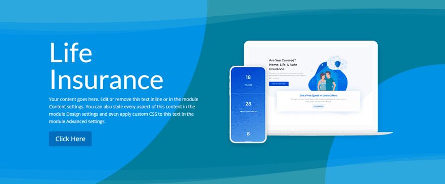
Style #1: The Abstract Gadient
This first Divi header module design is a simple, multipurpose design that uses gradient backgrounds in a creative way.
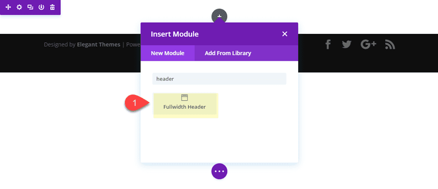
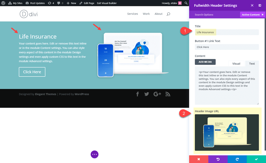
To get started, add a new fullwidth section with a fullwidth header module.
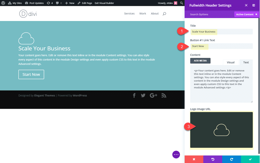
Update the header settings content with a new title and a Header Image.
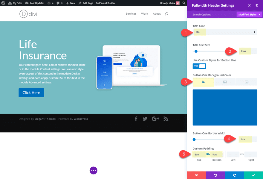
Then update the design settings as follows:
Title Font: Lato
Title Text Size: 6vw
Button One Background Color: #0c71c3
Button One Border Width: 0px
Custom Padding: 8vw top, 8vw bottom
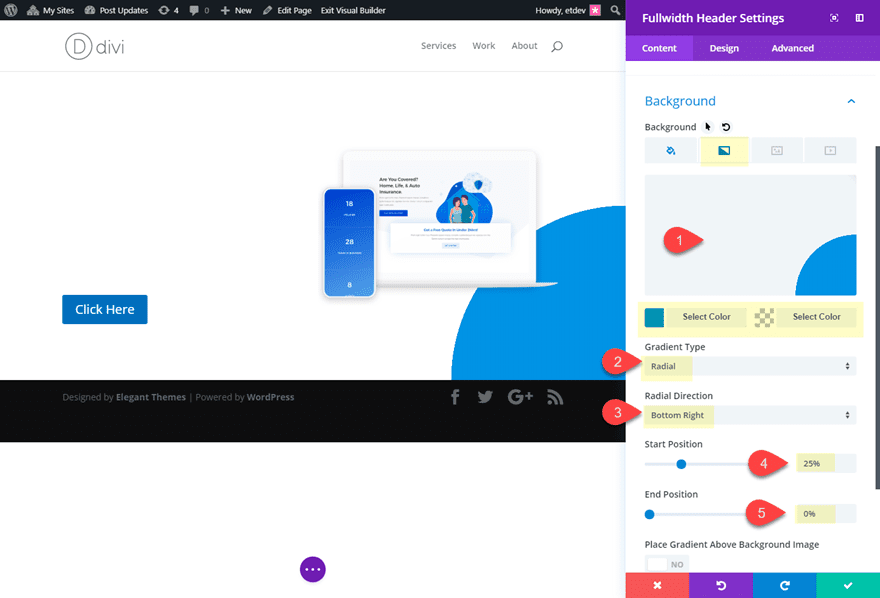
Before we add our section background, we must first make the header module background transparent and give it a custom gradient to create our circle shape in the bottom right corner. Go back to the content tab and update the background as follows:
Background Color: rgba(255,255,255,0)
Background Gradient Left Color: #0096eb
Background Gradient Right Color: rgba(255,255,255,0)
Gradient Type: Radial
Radial Direction: Bottom Right
Start Position: 25%
End Position: 0%
Save Settings
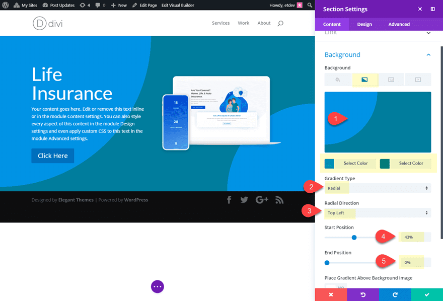
Next we need to add our background designs to the section which will sit behind our header module. To do this, open the section settings and update the following:
Background Gradient Left Color: #0096eb
Background Gradient Right Color: #007ea1
Gradient Type: Radial
Radial Direction: Top Left
Start Position: 43%
End Position: 0%
Design Tip: If you are looking for some colors to try out for your own header gradients, I suggest pulling the colors used in the header image/graphic you may be using.
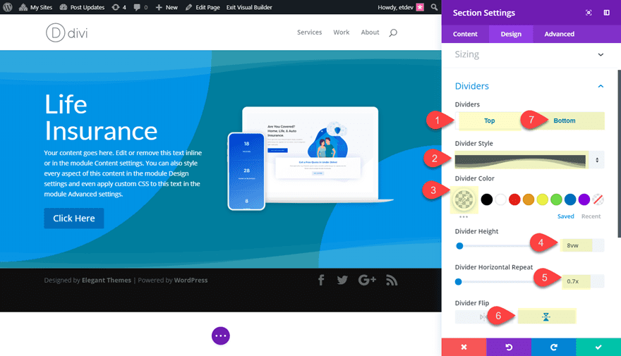
To add another subtle design element to our abstract background, we can add a top and bottom section divider. To do this, go to the design tab and add the following dividers:
Top Divider Style: see screenshot
Top Divider Color: rgba(150,210,210,0.2)
Top Divider Height: 8vw
Top Divider Horizontal Repeat: 0.7x
Top Divider Flip: Vertical
Bottom Divider Style: see screenshot
Bottom Divider Color: rgba(150,210,210,0.2)
Bottom Divider Height: 10vw
Bottom Divider Horizontal Repeat: 0.5x
Bottom Divider Flip: Vertical
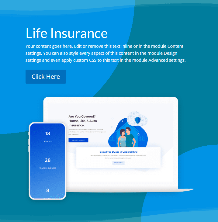
That’s it! Check out the final design.
Style #2: The Triple Threat

This next divi header module style includes three calls to action including the two buttons and the scroll to bottom icon. Matching the button icons with the scroll icon helps the symmetrical aspect of the design. And the section dividers create a nice abstract triangular design that leads the users down the page.
Create a new fullwidth section with a fullwidth header.
Then update text for the Title, Button #1 Link Text, and Button #2 Link Text.
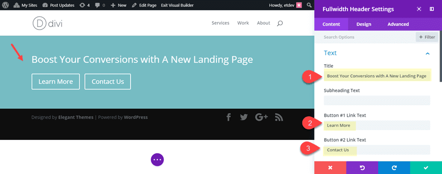
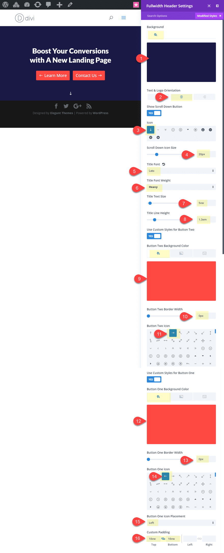
Then update the rest of the design as follows:
Background Color: #1a1844
Text & Logo Orientation: Center
Icon: see screenshot
Scroll Down Icon Size: 20px
Title Font: Lato
Title Font Weight: Heavy
Title Text Size: 5vw (desktop), 40px (tablet), 30px (smartphone)
Title Line Height: 1.3em
Button Two Background Color: #fe4943
Button Two Border Width: 0px
Button Two Icon: right arrow (see screenshot)
Button One Background Color: #fe4943
Button One Border Width: 0px
Button One Icon: left arrow (see screenshot)
Button One Icon Placement: Left
Custom Padding: 10vw top, 10vw left
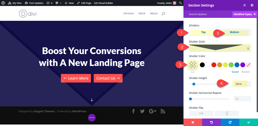
Now all we have to do is add our section dividers to create the triangular background design. Open the section settings and update the following design settings:
Top Divider Style: see screenshot
Top Divider Color: rgba(255,255,255,0.3)
Top Divider Height: 45vw
Top Divider Style: see screenshot
Top Divider Color: rgba(255,255,255,0.1)
Top Divider Height: 45vw
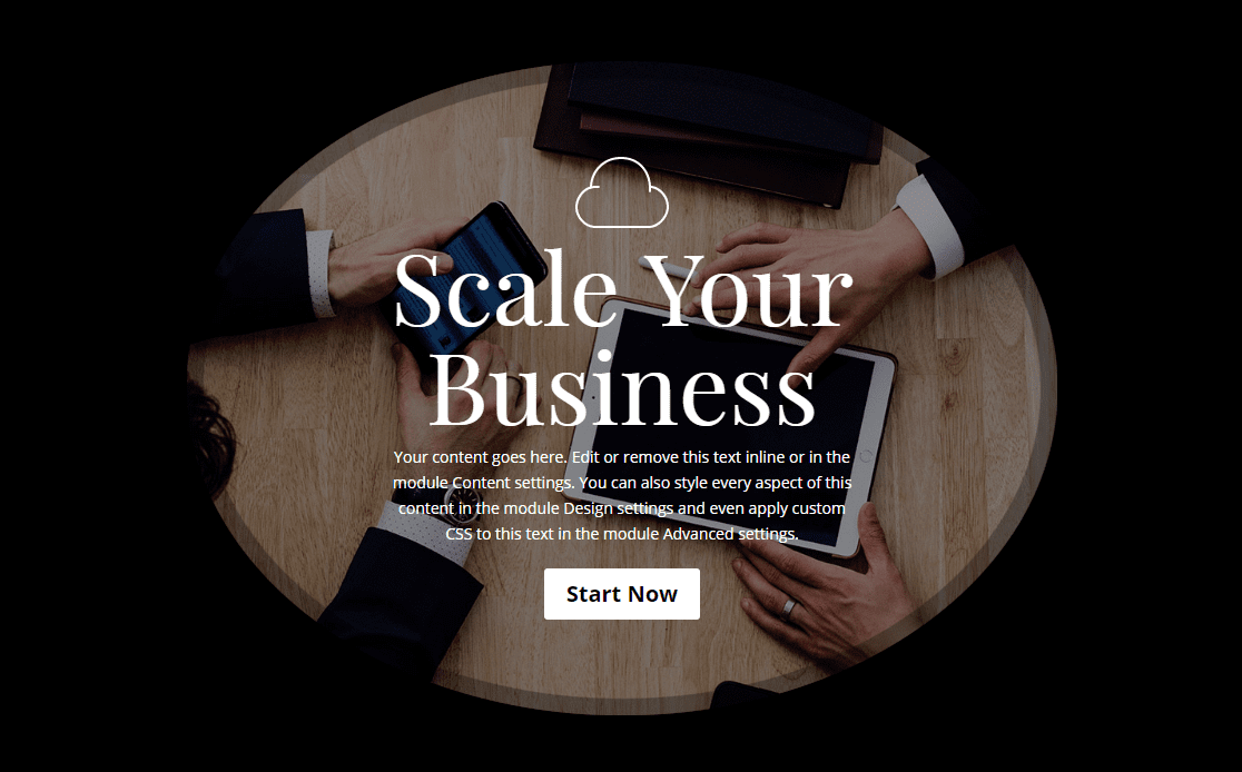
Now let’s check out the final design:
I know I said no custom CSS, but this is a non-essential extra flourish I thought some of you would enjoy. You may notice that for headers with two buttons, the second button has a left margin that throws off the design on smartphones. For a cleaner design on smartphones, you can add a snippet of custom CSS to your page settings in order to make the buttons the same width and without the second button margin.
Open the page settings in the Divi Builder and add the following CSS
@media (max-width: 550px){
.et_pb_fullwidth_header .et_pb_fullwidth_header_container .et_pb_button {
  display: block;
  width: 100%;
margin-left: 0px;
  }
}
Now look at the design on mobile.

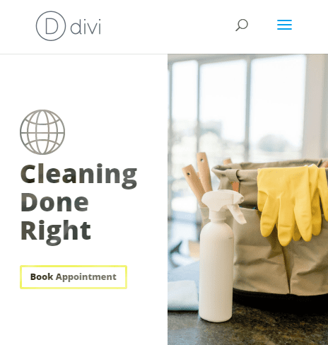
Style #3: The Rounded Frame
This rounded divi header module design is a great way to frame your background image and header content to bring even more focus to your call to action. All it takes is some adjustments to the border radius of your header, a box shadow and some custom spacing.
To start, create a new fullwidth section with a fullwidth header.
First, let’s update the content elements for the header by adding the Title, the Button #1 Link text, and a Logo image.
Next add a background image that is large enough to span the height and width of the header. Since this will be a rounded header, try to use an image with the same height and width (like 1000px by 1000px).
Then update the rest of the design settings as follows:
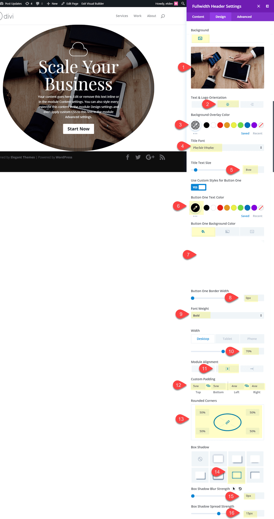
Save Settings.
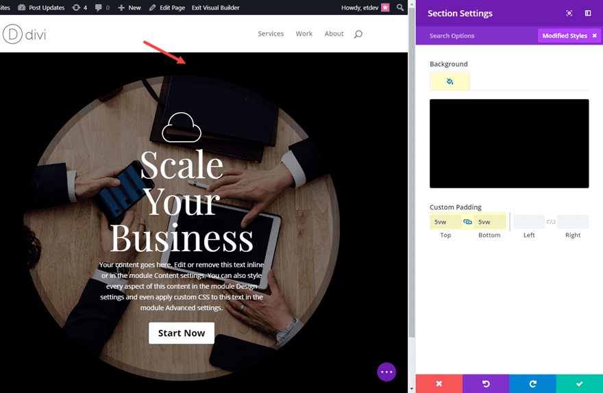
Then open the section settings to add the background color and spacing as follows:
Background Color: #000000
Custom Padding: 5vw top, 5vw bottom
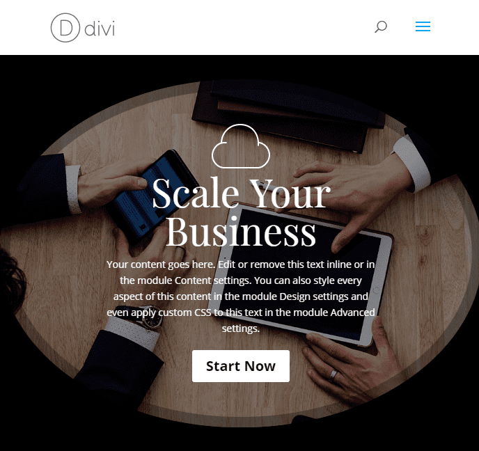
Now check out the final design.
The Blended Lefty

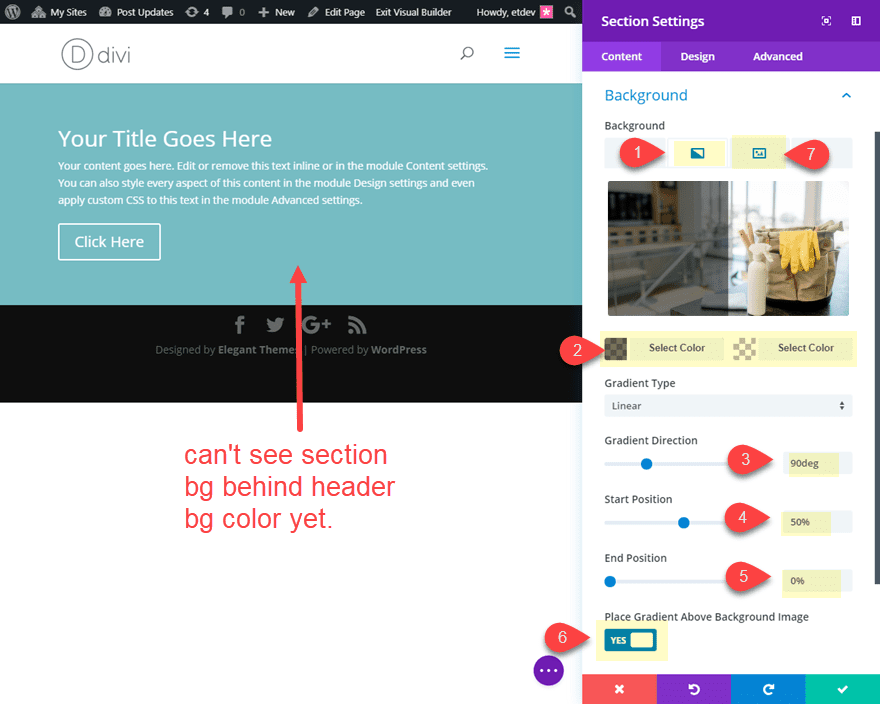
This header design has a few unique design features. The header module is actually resized and left-aligned to expose the right half of the section background image. And the header module content has a blending effect that exposes the background image through the content. To pull this off, you will need the right kind of background image for your section. Generally, you will want the image to have darker elements so that the blended content will be more visible.
Let’s get started.
First, create a new fullwidth section with a fullwidth header.
Before we start updating our header styles, jump on over to the section settings first and add the following background:
Add a background image with the focal point of the image to the right.
Background Gradient Left Color: rgba(0,0,0,0.54)
Background Gradient Right Color: rgba(255,255,255,0)
Gradient Direction: 90deg
Radial Direction: Bottom Right
Start Position: 50%
End Position: 0%
Place Gradient Above Background Image: YES
The purpose of the gradient is to make the left side of the image darker so that when we blend the header module content it will be more readable. Also, you won’t be able to see the section background right now because the default header background color is still active. We will change that next.
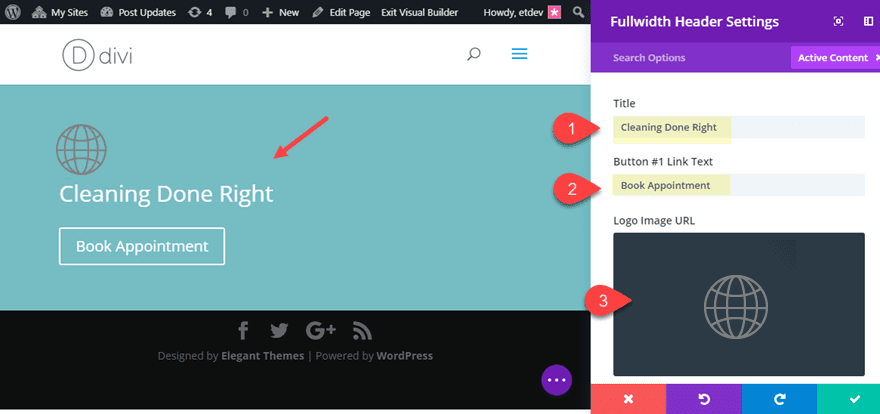
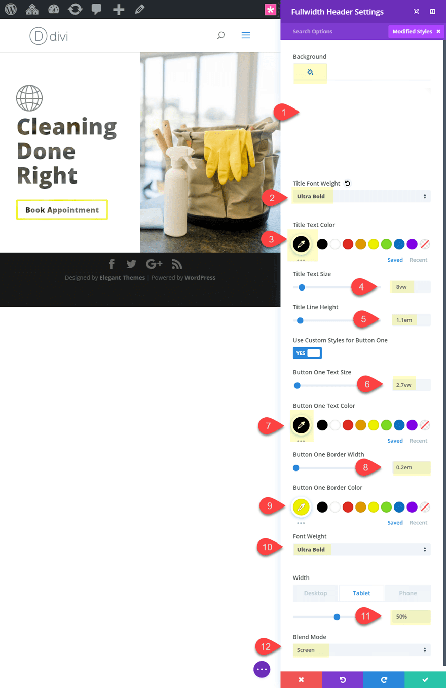
Open the header settings and update the content with a Title, Button #1 Link Text, and a dark logo.
Now change the background color to white.
Then update the following:
Title Font Weight: Ultra Bold
Title Text Color: #000000
Title text Size: 8vw
Title Line Height: 1.1em
Button ONe text Size: 2.7vw
Button One Text color: #000000
Button One Border Width: 0.2em
Button One Border Color: #edf000
Font Weight: Ultra Bold
Width: 50% (desktop, tablet and smartphone)
Blend Mode: Screen
Here is the final design.
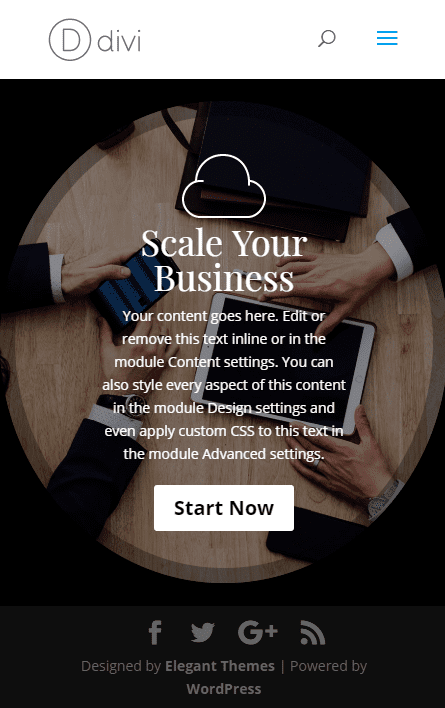
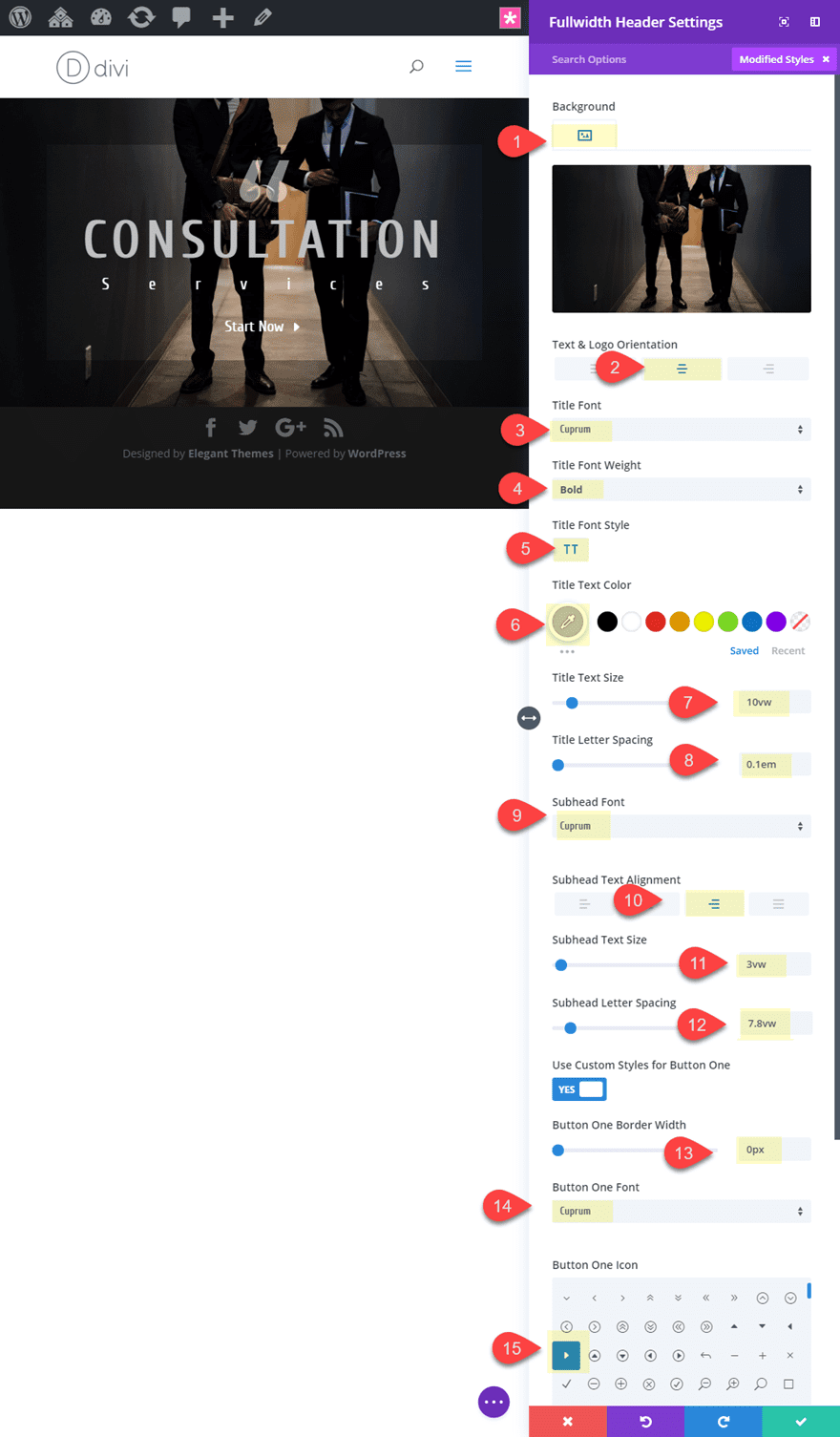
Style #5: The Large Scaling Type
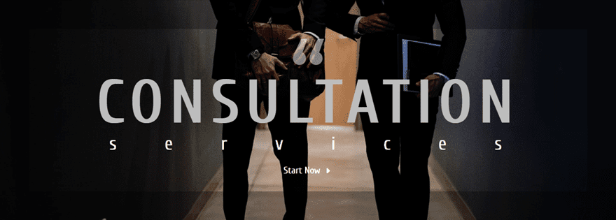
This Divi header module design introduces a simple and effective way to create large text that scales with the browser window without compromising the design. Since we are using a fullwidth header module, we will need to expand our content area a bit. Then we need to use the vw length unit to size our text. This design would be great for section headers.
To start, create a new fullwidth section with a fullwidth header.
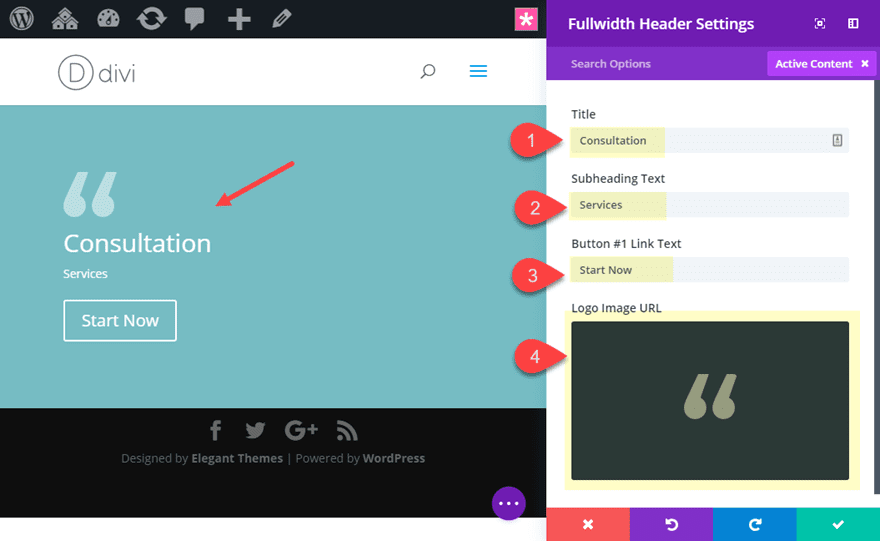
In the fullwidth header settings, update the following:
Title: Consultation
Subheading Text: Services
Button #1 Link Text: Start Now
Delete the default text in the content box.
Then add a light logo image.
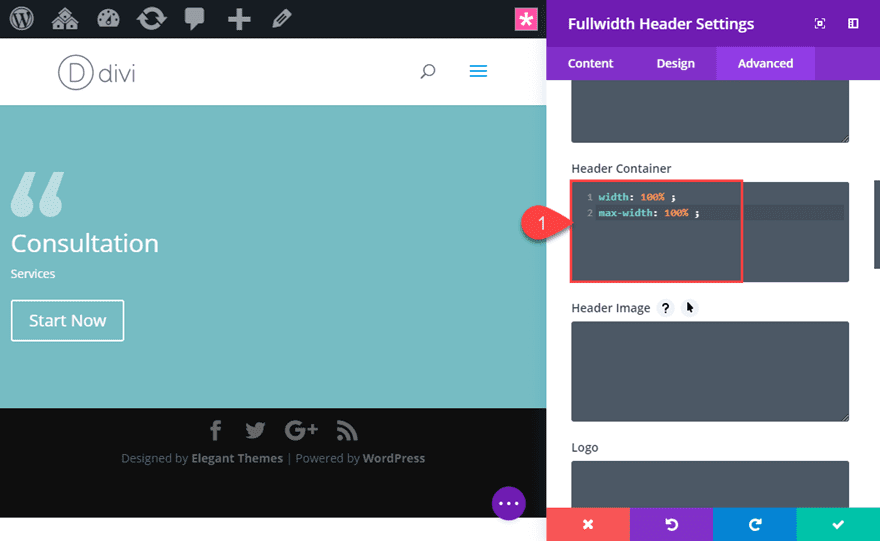
Next we are going to increase the default max-width of our header container in order to create more horizontal space for your header. To do this go to the advanced tab and add the follow CSS under Header Container:
width: 100% ;
max-width: 100% ;
Now update the rest of the design settings as follows:
Add a background image.
Text & Logo Orientation: Center
Title Font: Cuprum
Title Font Weight: Bold
Title Font Style: TT
Title Text Color: #bfbfbf
Title text Size: 10vw
Title Letter Spacing: 0.1em
Subhead Font: Cuprum
Subhead Text Alignment: Right (this helps center the text with letter spacing)
Subhead Text Size: 3vw
Subhead Letter Spacing: 7.8vw
Button One Border Width: 0px
Button One Font: Cuprum
Button One Icon: see screenshot
The trick is to use the vw length unit for the text. Then adjust the subhead letter spacing to line up with the title text the best you can.
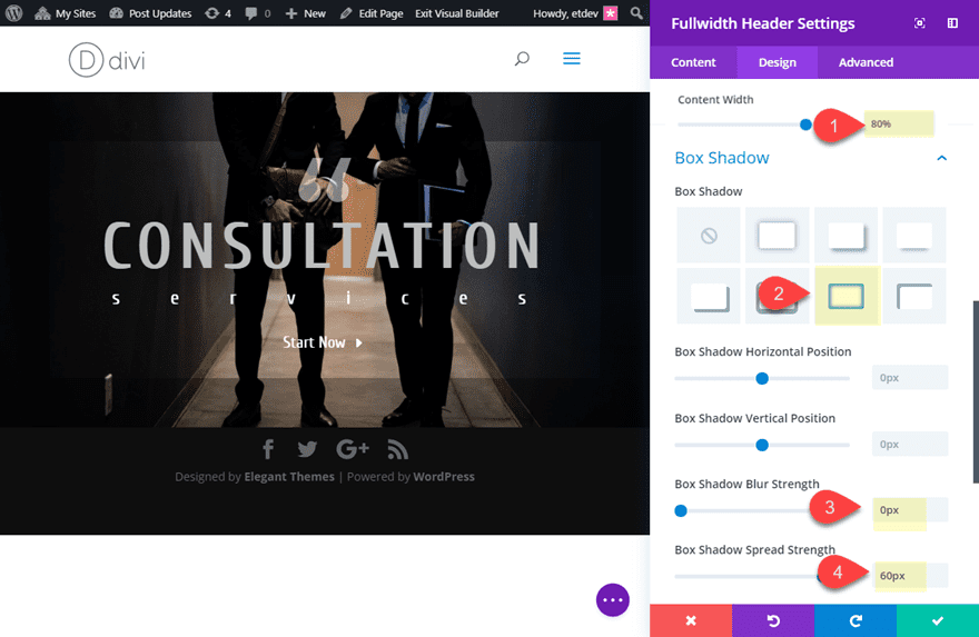
In order to maximize our horizontal spacing, we need to add a custom width to our header content as follows:
Content Width: 80%;
Even though this is less than the default 100%, changing the setting will override the default and adjust with the custom css we added earlier.
Finally, a add a box shadow to complete the design:
Box Shadow: see screenshot
Box Shadow Blur Strength: 0px
Box Shadow Spread Strength: 60px
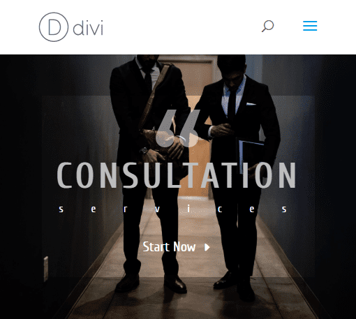
Now check out the final result.
Turn Them Into Fullscreen Headers!
The designs above can easily be made fullscreen with a click of a button. This is a powerful feature of the fullwidth header module. Simply go to the header design settings and select the “Make Fullscreen” option.
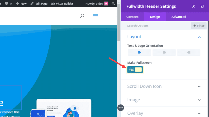
Also, you will need to take out the custom padding for these designs in order for the header to fit perfectly within the browser window.
Final Thoughts
These are just a few of the header design possibilities available with the Divi Header Module. And experimenting with all the design settings can be a lot of fun. If anything, I hope these examples will serve as a little inspiration for your next project.
I look forward to hearing from you in the comments below.
Cheers!


Great job, thanks for the tutorials.
I noticed in Style #2 that the instructions don’t match up exactly with the screenshots or the results and some steps are missing too. These are things I found out the hard way, lol.
Examples:
#1 Custom Padding: 10vw top, 10vw left
In the screenshot it’s top and bottom not top and left.
#2 You forgot to mention that “Only show icon on hover for button one” should be set to no otherwise the arrows don’t show up.
#3 You only gave instructions for the Top Divider and then repeated it. The only exception is the color difference.
“Now all we have to do is add our section dividers to create the triangular background design. Open the section settings and update the following design settings:
Top Divider Style: see screenshot
Top Divider Color: rgba(255,255,255,0.3)
Top Divider Height: 45vw
Top Divider Style: see screenshot
Top Divider Color: rgba(255,255,255,0.1)
Top Divider Height: 45vw”
#4 When you get to the “Now let’s check out the final design:” section of Style #2 My version has a different color for the lid of the envelope, its a much lighter shade of purple than the example and the buttons are faded until you move your cursor into anywhere in the section then it lights up like its supposed to look all the time. I also noticed that the tip of the envelope dips down into the section below it. I would add a screenshot but it won’t allow it.
I know it seems like small stuff, but we all know “its all in the details” that make the huge difference especially for those of us learning and still finding our way around Divi.
Another thing I ran across in Style #1 was when you mention adding a top and bottom section divider.
“Top Divider Style: see screenshot”
If you look at the screenshot and then try to match it in the drop down menu, you can’t because it doesn’t exist. You showed us a screenshot of the divider after you had modified it, not before.
Again I know its small stuff, but to those of us beginners or anyone just trying to learn something new by learning by example and trying to pay attention to every detail so that we do it right, its a little bigger.
Thanks again
I Love it!
Your tutorial died immediately after I saw that you were using viewport sized typography. Why did you do that? I have no idea how to access vw or vh etc. in Divi. I have no system of conversion. Very disappointing!
It would be awesome if you could use the header module to build a “sitewide” header that was displayed in place of any of the standard divi header options for the theme. Save it as a Global item in the Divi library and have it selectable from the dropdown in the Theme Customizer.
Very Usefull Post. Thanks for sharing!
Love your tutorials! Now…Can I take style#5 and make it a slide show? I’d like it to rotate thru 4 different pictures. Can it be done here??
Thanks, Deb!
Like Richard said, you can use the fullwidth slider module to do this. Should be pretty straight forward.
Could try that out with the fullwidth slider module and see what happens.
Could also do a google search for the DIVI anything slider plugin.
Thanks. We continue learning. Happy new year.
Happy new year!