

Welcome to Day 6 of our Divi 100 Marathon. Keep tuning in for 100 days in a row of awesome Divi resources as we count down to the amazing release of Divi 3.0 on the final day of the series!
A lot of people think that sites built using a theme framework may as well be cookies baked with the same mold. After all, they’re all made using similar layouts, widgets and buttons, right? Simply change a few images, type in your text and you’re good to go.
While this may be the case for some themes, Divi offers enough flexibility to satisfy even the most nitpicky users in matters of customization. So why not play around and see what you can put together with a little brainstorming?
If you need a little help to get those creative juices flowing, you’re in luck. We’ve scoured the web to find some unique sites built using the Divi theme, and we’ll be going over exactly what makes them so special below.
Our 10 Awesome Divi Sites That You Would Never Recognize
1. Metricool
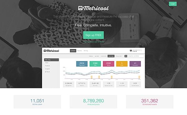
Metricool is a metrics service for websites and blogs. They’re set apart from the competition by a concise set of features and a gorgeous (and intuitive) dashboard which helps you keep track of all the basics such as page views, number of visitors, comment activity, and social media interactions. On top of that, they provide users with information as to the best times during which to post new content or interact with their visitors by calculating the peak times of social media usage among their followers.
Their landing page was built using Divi and perfectly exemplifies how to capture tons of information using simple graphics. As you scroll down you get progressively introduced to new elements of their service using screenshots of the dashboard along with informational blurbs.
You might have noticed the website uses white space interspersed with more colorful sections. In colorful websites, this serves to let the viewer’s eyes ‘rest’ (so to speak) through the use of contrast, and has the added benefit of visually separating each section.
Metricool’s landing page is a great example of how to use colors to highlight the contents of a page and to establish a personal style by re-using the same colors sprinkled throughout a design.
2. Webbyra Stockholm & Are
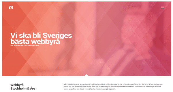
When even web development agencies choose your theme to power their business websites, you know you’re doing something right. Webbyra Stockholm & Are are a firm specializing in web development, graphic design and conceptualization, programming tasks, and API integration.
The fist thing you’ll notice as soon as you hit the site is the HTML5 video background which incorporates the header. It achieves an attractive contrast through the use of white and a few shades of red, as well as sporting an expandable navigation bar which opens in a unique fashion.
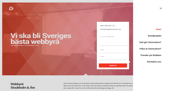
The navigation bar icon uses an animation both for opening and closing, and aside from the menu also shows a compact contact form that is sure to increase conversions.
As for the rest of the website, it’s fairly attractive, but the main page is certainly the main draw. Webbyra Stockholm & Are make good use of contrast throughout each page to make information and calls to action jump out while also providing a good deal of information.
3. Ifinity
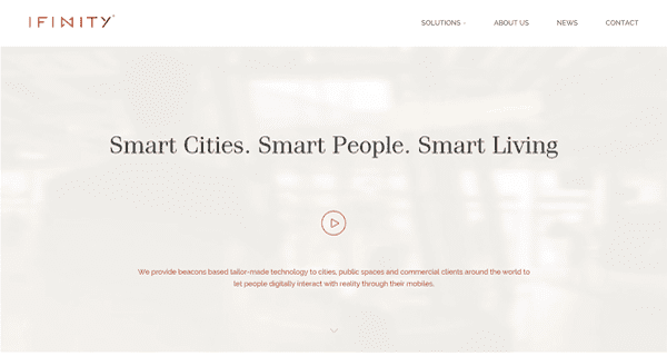
Ifinity is a Europe-based company that’s in the business of “adding a digital layer” to urban areas and transforming them into smart-cities. Some examples would be the ability to locate public transport vehicles in real time, virtual maps of official buildings, virtual queuing, and parking space management. The technology you never knew you wanted until the second you find out about it (seriously, virtual queuing? Sign us up!).
Their website isn’t anything quite so sci-fi, though. You can tell right away it’s a corporate website, but this isn’t necessarily a bad thing. The layout, for example, features a classic strong logo and no-nonsense navigation bar, followed by a video introduction to the Ifinity service (you can make out a video subtle animation in the back).
The above is followed by a regular grid with some nice photography linking to the rest of the site. This particular grid looks great thanks to the use of staggered dimensions, making each division easily recognizable and the use of different colors.
All in all, Ifinity shows that Divi can tackle corporate websites with aplomb.
4. Aline Collective
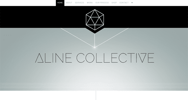
The Aline Collective is an outfit devoted to branding, photography, website, and print design. One quick look at their website is enough to determine that they’ve got the branding stuff down pat. While their design choices may not appeal to all sensibilities, the site certainly stands out thanks to some unique design choices.
From the header to the bottom, the design on this website is meant to point the eye downwards into the point-by-point breakdown of the services provided by the Aline Collective, which features a unique take on bullet points.
This trend repeats itself all over the website, as well as some strategic use of bold fonts to emphasize certain points (hardly groundbreaking, we know, but their use here is top-notch), and a positive review here and there to nudge potential customers in the right direction.
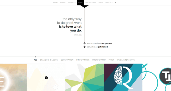
Finally, their portfolio page is a sight for sore eyes. Rather than using general branding screenshots for their gallery, they chose to focus on specific aspects of each project, and the remaining images within are all full-width and colorful.
5. M for Montreal
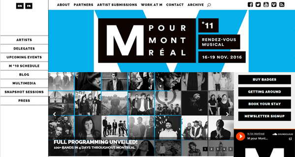
M for Montreal is both an annual event and a full-time independent organization dedicated to showcasing emerging musicians and help them expand their careers outside the icy borders of Canada.
Their website doesn’t attempt to reinvent the wheel, but it boasts a unique personality thanks to a few simply stylistic choices. For example, their use of black and blue establishes a personal style, which is seen repeated throughout the site. The left sidebar is highlighted blue when being hovered over, as is the top navigation bar although using a different style.
Also worth noting is the use of black boxes, which follows the design of their logo. Each of these design choices is not necessarily worth noting in isolation, but they come together to form a unique style on top of the Divi framework.
6. Oxette
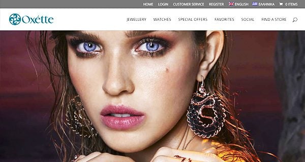
Oxette is an online jewelry and accessory shop for women looking for high-end products. It’s also the only e-commerce store featured on our list, a spot earned thanks to its elegant yet simple layout and design choices.
The black and red colors are a good choice for the brand, and when combined with high-definition photography and parallax scrolling, make for a nice effect (aided by their striking models, of course). The fact that each product has the same sort of white-background photography also serves to give the page a clean look (although having to click twice to reach the product details page is a big no-no when it comes to usability).
7. Engage Live Photography
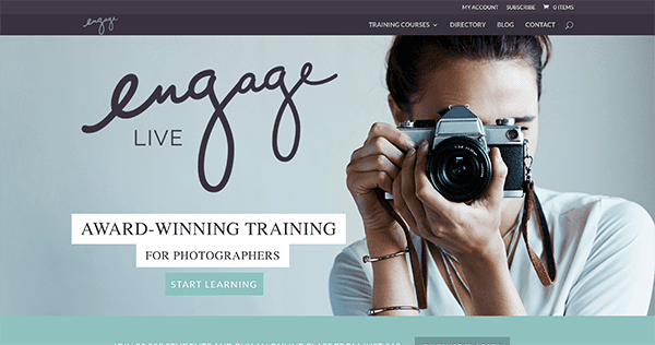
Engage Live Photography is a service meant to help photographers hone their craft through workshops, training courses, mentoring opportunities and even online lessons.
Although their site may not look like anything special, there’s one design choice which earned them a spot on our list. Their main page features a vertical calendar which displays all the upcoming classes, with a subtle hover animation for each, and the ability to expand each section and add your preferred class to your cart (as well as see additional information) without having to leave the main page.
The only clunky part of this feature is the inclusion of the expanded thumbnail images when each option is selected. A more elegant-looking solution would be to simply display the option to add the lesson to your cart and the additional information.
Still, this option is much easier to navigate than the usual clunky calendars when trying to schedule a class and could be easily adapted to other kinds of services.
8. Creative Technologies by Jamdonut
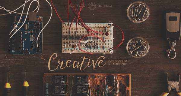
Creative Technologies is a one-in-all outfit which can handle anything from video, animation, software development, to electronics and campaign optimization.
Although their website might look sparse in comparison with other corporate offerings, it’s also as creative as their name would imply.
What makes the site work are the simple animations sprinkled throughout the service and showcase sections, even if the blog and contact links lead to nowhere as of right now. While an unfinished website is never an optimal state of affairs, this is a good example of how you can set up a one-page website for a business that doesn’t scream ‘corporate’.
9. Opoveiro
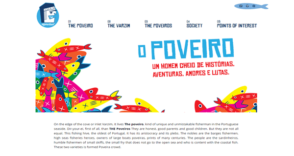
Opoveiro is an informational website built around the cultural identity of Povoa de Varzim, a Portuguese city.
This may be the site on our list whose lineage can be most easily traced back to its Divi roots, but it still remains a worthy example of how a unique visual identity can serve to separate a site from others built using the same theme.
Here the uniqueness comes in the form of a few simple additions. A styled navigation bar and social media sharing bar on the left side (most websites simply throw this on as an afterthought), plus, the same design style across all images featured on the site (although many of them could stand to be resized).
10. Pixel & Oak
![]()
Pixel & Oak is a small design studio geared towards creatives who need websites to showcase their work and keep them focused on what they do best–their craft.
Based out of the mountains of Tennessee, web designer Molly Prior works with small businesses all over the world. For her own site she’s created a tasteful example of what Divi can do for designers, web studios, and design/advertising agencies.
![]()
We particularly enjoy what she’s done with Divi’s blog module. From the colors and hover effects to the post layouts and content itself, her blog radiates sophistication. A great example of the editorial expression made possible with Divi’s blog.
![]()
Conclusion
While it’s true that a lot of themes tend to give birth to similar sites, in a lot of cases this can be chalked up to a simple lack of imagination during the development process. There’s no reason why your Divi site shouldn’t look and feel every bit as professional as a custom made one if you’re willing to think a little outside the box.
If you’re in need of inspiration, look back to some of the unique stylistic choices showcased through the article, such as animations, good use of contrasting colors, bold sidebars, etc. Every aspect of your website can be rendered unique if you apply a small dose of creativity.
If you have a site you would like featured in a future showcase of Divi designs, you can submit it to our editor at Nathan at ElegantThemes.com with the subject line DIVI SITE SUBMISSION.
Divi 100 Day 6
The Countdown To Divi 3.0
This post is part of our Divi 100 marathon. Follow along as we post free Divi resources for 100 days in a row! This 100-day countdown will end with the game-changing release of Divi 3.0, including our brand new visual editor built from the ground up using React. Divi 3.0 will change the way you build websites with the Divi Builder forever!
Let the countdown begin.


Thank you for sharing these, Tom. As a newbie to both WordPress and Divi, It’s exciting to see what amazing sites others have created, using the same tools as I have to hand. It’s also a great way to discover new content and connect with like-minded people. I am delighted to have been introduced to Pixel & Oak and Molly’s beautifully stylish and informative blog is now winging its way into my inbox.
Great stuff, Sue! We’re glad you’re quickly getting to grips with both WordPress and Divi. 🙂
Great inspiration here! You can make a lot of different sites with divi. Thanks for all these examples and for the inspiration!
Thanks, Krish!
Hello: I want to contact Nathan to you him my site balcondelgolf.com made with Divi.
Regards,
Raúl
Hello Raúl, you can do that here – http://www.elegantthemes.com/contact.html
I’m in the process of creating my two pages on a Divi theme:
http://screencut.pl
http://photocut.pl
By the way, thanks for the help given in the support 🙂
No problem, Andrzej. 🙂
Does anyone know how Aline Collective did their portfolio section? It looks really cool how the have the pagination buttons styled and how it is full width. Is that a plugin or is it a customization of Divi
Greg, if you inspect the element, you’ll see that it’s possible with Divi. 🙂
I like the design of the Metricool website, it looks very beautiful and professional, and their website loads very quickly.
That’s why we thought they were awesome! Thanks for your comment. 🙂
Wow, INCREDIBLE WORKS!
Thanks 🙂
how did the Jamdonut site include those animated icons? are the gifs?
Animated .gif files.
The list is great , need more of them . this makes creative juice flow. Great work ET Themes Team.
Looking forward
Thanks, Amit. 🙂
Nice sites indeed. Here is one I am designing in Divi that is not even half finished that I believe will top this list :). For an Electrician in Wyoming. http://hbarhelectric.com
Hello
on the theme # 1 Metricool, there is a record button that runs as lightbox, as you do that ??
In the theme No. 2 Webbyrå, when clicking on the menu, plus shows a registration form How is it done?
Thank you
Hello James,
I’m struggling to find the functionality you mention for Metricool. You may need to give a few more clues as to where it is!
As for the second, there’s a way I find this stuff out that may be useful. Inspect the element in your favorite browser, copy one line of coe, and paste it into a search engine. You’ll no doubt find out what you need to know.
There may be a better way, and others will chime in I’m sure if there is! Good luck. 🙂
Hi Tom
the button that I mention is “Sign up free” theme No. 1 Metricool
I do not speak English and I use google translator, apologize if I do not understand.
thanks
That looks like a bit of extra coding, James. Google will be your friend to find out more. 🙂
Thank you for the inspiration! I’ve just put a few new ideas on my list to try out later.
About Webbyra: “The navigation bar icon uses an animation both for opening and closing, and aside from the menu also shows a compact contact form that is sure to increase conversions.”
Does anyone know how this is done? I’d love to use it in a current project.
The Webbyra website does use the Gravityforms and that show up when you click on the menu.
For the hamburger menu icon Look at this:
https://codepen.io/designcouch/pen/Atyop
That might be what you want.
Stay tuned for tomorrow’s post…
oooooohhhhh….
Divi is just great. I always enjoy all creativity enabled by divi. I love also my site which has been done by Divi. It looks fantastic 🙂
Thank you guys!
Thanks, Payam!
Very interesting article on the potential of DiVi.
I approached recently to DiVi world and I’m considering them carefully.
I would like to know if the sites shown, changes have been made to the code, or everything has been made possible by combining creatively modules packaged in DiVi?
It is more than just DIVI with these sites. Take the Oxette website for instance.
Not only is it DIVI: it is also…
Sitepress Multilingual Cms
WP Pagenavi
Gravityforms
Woocommerce Multilingual
Woocommerce Buy For Me
And other plugins to get the design just right.
Hello Davide – welcome!
You’ll find a mixture of Divi functionality and customization in certain places. You may have to inspect the element in your favorite browser to figure it out.
Good luck. 🙂
Amazing! Love the results! This is the reason I am here. I will love to see a list with more Divi sites.
Thanks, Jordan!
Beautiful!
Two questions if I may:
#3 Infinity – what module is used to create “Prev”-“next” slider?
#7 Engage Live – – What module is used to create the calendar?
Thanks 🙂
For #3 if you are talking about the slider I see on the front page they are using the premium Slider Pro plugin you can get at codecanyon
For #7 on the front page they are using the premium EventOn plugin for wordpress that you can also get at codecanyon
Thank you!
Ahem ! Where is Day 5 ??? 🙂
Right here 🙂
I think this is not a bad example as well http://eventcreative.com/
not bad at all… i did a quick right click just to see it was actually Divi 😉 id like that call us hover effect more if the number was then clickable
Hi,
#7 engage live. How did they move the CTA button to the left and get the text to the left? It seems like they have total control on where they want the text.
My issue now is that I can only move the text left, center, right. However I need more control on exactly where the text goes. Am I missing something in Divi?
Hello Gregory,
Try inspecting the elements in question with your favorite browser. That way, you’ll find out for sure!
Without looking though, I’d suspect a little CSS customization.
Hello Gregory,
I can help you get that customization.
Let me know.
Does anybody have a good example of a really great Location page in Divi? I design for a group of medical offices and each location has its own page. I have been struggling for creativity in this aspect.
Hello Dean,
I don’t I’m afraid. You could always take a gander at our showcase here – http://www.elegantthemes.com/showcase/. There’s plenty there to offer some inspiration. 🙂
Being huge fans of the ET team and their products, you can imagine our surprise and excitement to see our site featured here.
Thanks so much for the write up Tom and the comments.
You guys rock, keep up all the great work!
No problem, James – a worthy inclusion!
I LOVE seeing what people do with this theme — I constantly use inspiration like this to make my own designs! Great post! ?
Thanks for your kind words, Mark. 🙂
Ive actually spoken with Taylor @ Aline, always thought her site was great, awesome to see it here! As always, thanks for the post ET., and Tom today, you guys rock.
No problem, Dehn. Thanks for your comment. 🙂
Metericool is an example of a site that looks good but has usability problems. I tried to sign up but picked a username that was in use. I was presented with a screen to add email and password, but could not change my username so I got the same error message and gave up.
I look forward to checking more of these sites – they look interesting. But to me usability always comes first and frills later.
Robin, I tried a username and it told me it was in use. No way, but Itried another one of my dedicated “sign-up email addresses” and that one worked. http://www.excaliburwebsites.com
Hi Robin. We are very sorry with your experience with Metricool. User experience is very important for us.
Maybe you have been registered twice but you never received the activation email in your inbox. Can you write an email to info at metricool.com with your username (email address) so we can activate your account manually?
Great post! I’m going to hate myself for being Mr. Nitpicky but it’s bugging me… the jamdonut.net site has some pages with light brown text on lighter brown background and it’s awful to read. Cool website otherwise, but an example of where being arty damages readability.
I also agree (my opinion). The animation reminds me of the animated GIFs from some 15 years ago. Cute, trendy but doesn’t add to the site. In fact it takes the user’s attention to these, instead of the message.
I also agree, the main menu is not as evident/prominent as it should be. the bg competes with the font/words.
But if you prefer different… this one gets marks.
Cheers,
G
Hello Richard,
It’s important to discover what you don’t like too! That way you can sidestep that type of thing for your own sites.
Thanks for your comment!
I am going to agree with you here. That animations make the site special, buttt you are not seeing anything extra special being used with the theme.
great list saw one using DIVI 2.3 something. Yes you can do a lot with DIVI, but as you can easily see with some of these sites they have made modifications to the theme to get the look just right.
Thanks, Richard. 🙂
Great inspiration here! You can make a lot of different sites with divi. Thanks for all these examples and for the inspiration!
Thanks, Tania 🙂
Really nice example sites!
Thanks Sasha-Shae!
Great sites. They don’t look divishopped at all.
Thanks for your comment, Roberto!
Wow! Some insanely good inspiration here, thanks! 😀
No problem, Leslie!
Great list! TY – #6.. when you click the image, it’s a broken link.
Hello Brandon,
I’m not getting that issue, so it looks like it’s been fixed.
Take of the gr. at the front of the URL and it works.
nice! a couple there that need adding to DTE 🙂 I actually have a category for “is it Divi?” at http://www.divithemeexamples.com/divi-showcase-category/is-it-divi-theme/ … it’s always good when i have to right click to see if it really is a Divi site 🙂
Good stuff, Craig. 🙂